10,000 search results
(0.039 seconds)
- Jolly Jester by Deniart Systems,
$20.00 Jolly Jester is an irregular and whimsical typeface inspired by old type playing card jokers. Great for any humorous occasion, whether you're designing headlines, greetings, fairy tales or any number of other projects. Jolly Jester includes a large assortment of extended characters to support many of Europe's languages, including Czech, Danish, Dutch, Esperanto, Finnish, French, German, Italian, Hungarian, Polish, Portuguese, Romanian, Spanish, Swedish, Turkish & Welsh.
 - Better Faster by Omotu,
$18.00 BETTER FASTER! A handwritten display brush font. Comes with 2 styls, regular & slant. BETTER FASTER font is suitable for branding, logotype, apparel, T-shirt, Hoodie, product packaging, quotes, flyer, poster, book cover, advertising, etc. Whats Include? 1. Opentype support 2. Multilingual support 3. PUA encoded 4. Features: Uppercase, lowercase, numerals, punctuations, alternate, and ligatures 5. Accessible in the Adobe Illustrator Glyphs panel, or under Stylistic Alternates in the Adobe Photoshop OpenType menu, Adobe InDesign, Corel Draw, even work on Microsoft Word 6. Please message me if you’re unsure of any language support.
 - Happy Easter by Trim Studio,
$15.00 **Happy Easter **A cute script font that's perfect for Easter-themed moments is whimsical and playful. It has flowing, organic lines that resemble the curves of an Easter egg or the curling petals of a spring flower. The letters are so airy, with a gentle bounce that gives them a sense of movement and liveliness. --- File Include: - Readme.pdf Thank you for let us be your design partner, If you have any questions please don't hesitate to drop me a message
 - Master Photograph by Subectype,
$17.00 Master Photograph is a Monoline Signature Font, font with a touch of handwriting style. This font is perfect for creating signature logos and watermarks for photography studio or wedding invitation. Master Photograph includes full set of beautiful hand lettered uppercase and lowercase letters, numerals, a large range of punctuation and many beautiful ligatures. You will get: Regular and Italic Version 100+ Ligatures Thank You, Subectype
 - Good Faster by Mans Greback,
$59.00 Good Faster is a bold script typeface. In a quirky calligraphic style, this flowing font has a rustic look and soft lines. The Good Faster family consists of four styles: Regular, Bold, Italic and Bold Italic, complimenting each other for the greatest design possibilities. The font is built with advanced OpenType functionality and has a guaranteed top-notch quality, containing stylistic and contextual alternates, ligatures and more features; all to give you full control and customizability. It has extensive lingual support, covering all Latin-based languages, from Northern Europe to South Africa, from America to South-East Asia. It contains all characters and symbols you'll ever need, including all punctuation and numbers.
 - Easter Gift by Sakha Design,
$14.00 Easter Gift is a fun and playful display font. It has a cute style and great readability. It’s perfect for cards, branding, stationery, blog design, custom art, quote, custom stamps, custom embossers, book, apparel, packaging, headline, or much more!
 - Easter Day by Yoga Letter,
$16.00 Easter Day is a very cute and unique font. The font is embellished with a bunny shape which adds to the funniness of this font. This font is very easy to use because it is specially designed, so it will be very easy to bring out the embellishment of the letters. Easter Day is perfect for Easter celebrations, logos, branding, banners, book titles, movie titles, animation, children's world, promotions, business and more.
 - MoDi Khilari 1 - Unknown license

- KR Moving Day - Unknown license

- AT Move Altera by André Toet Design,
$39.95 ALTERA a typeface based on a logotype André Toet made for a dutch broadcast company. This typeface is in fact carries a transformation in itself: it’s composed of three different weights and shapes. In our humble opinion the possibilities are endless ! So be a sport and use this typeface for logo’s and headings. Kick the can ! Concept/Art Direction/Design: André Toet © 2017
 - AT Move Wyggle by André Toet Design,
$39.95 WYGGLE is a dynamic (capital) font taken from my Alphatool project. It’s an interesting typeface which can be used for interior and/or exterior (3D projects). Concept/Art Direction/Design: André Toet © 2017
 - Moving Message JNL by Jeff Levine,
$29.00 A vintage printer's cut for the masthead of the "Fed-O-Gram" (a monthly publication of the Farm Bureau Federation, Inc.) had its title set in letters that emulated a moving message board. This design formed the basis for what is Moving Message JNL.
 - AT Move Powerplay by André Toet Design,
$39.95 POWERPLAY a monospace lowercase alphabet with a 3D twist. Designed by André Toet in 1976 (during his study at Central School of Art & Design, London, UK) and he redesigned this in 2011. The name Powerplay is based on the Battersea Power Station, London. The remarkable architecture of the building is also used as a decor for films and for one of the covers by Pink Floyd (Animals, the flying pig). Concept/Art Direction/ Design: André Toet © 2017
 - AT Move Nath! by André Toet Design,
$75.00 NATH !* Is a peculiar typeface. It’s design came by the fascination of Optical Illusions and 3D on a flat surface, like with Holborn and Powerplay. The typeface is named after a girlfriend of André Toet. *Made in the UK, 1974, London (Central School of Art & Design). (Redesigned 2013 by André Toet / Jasper Terra). Concept/Art Direction/Design: André Toet © 2017
 - AT Move Decoupe by André Toet Design,
$39.95 Découpé Based on a French children’s play from 1906. In a car boot sale André Toet found a funny looking box containing a lot of cut out cardboard figures, in fact it looked a bit like a geometric puzzle! He played around a bit and succeeded to create a workable typeface with it ! The interesting thing about this particular font is, that in fact it’s organized chaos. The 26 letters of the alphabet are a mix between caps and lowercases, so within one word caps and lowercases will be used next to each other. It’s a very useful font for different projects. Concept/Art Direction/Design: André Toet © 2017
 - AT Move Specx by André Toet Design,
$39.95 SPECX This is my #11/12 Font a slabserif typeface. In fact it’s a very, very basic and extreme strong typeface! We gave this new Font a special touch by adding an extra family-member: a stencil-version of the SPECX. My inspiration for the SPECX is based on the cover of a 1955 French School-Notebook. Concept/Art Direction/Design: André Toet © 2017
 - AT Move Frutta by André Toet Design,
$39.95 FRUTTA (Fruit) is a new typeface made with the ever expanding food industry in mind. But don’t let that deter you from using our font on the cover of the forthcoming cd of the Black Keys or Beady Eye or Damon Albarn or Paul Weller or Daft Punk or Whatever... Concept/Art Direction/Design: André Toet © 2017
 - AT Move Straw by André Toet Design,
$39.95 STRAW The inspiration for this capital alphabet came from those beautiful haystacks you see in summer and the old fashioned Mikado game! We wanted to create a light, fragile and airy typeface with an optical effect. And here it is ... it’s just STRAW ! Concept/Art Direction/Design: André Toet © 2017
 - AT Move Wolfszn by André Toet Design,
$39.95 WOLFSZN Anniversary! WOLFSZN is the tenth Font of André Toet. The inspiration for this capital alphabet came from the trails of an agricultural machine (think tractor) leaves in the soil after working the land. But it’s not meant to be ‘like a heavy workload’, in fact to us it seems like a very useful Font for headings, logotypes, advertising or films. We hope WOLFSZN will be happily and wisely used by my dear colleagues. Concept/Art Direction/Design: André Toet © 2017
 - AT Move Bulky by André Toet Design,
$39.95 BULKY is the 19th Font of André Toet. It’s Unusual, it’s Heavy, it’s Irregular, it’s Rough, it’s Stripy, it’s Angular, it’s BULKY. But it has character and extremely useful for headings, posters and even logotypes. Just-Use-It! Concept/Art Direction/Design: André Toet © 2017
 - AT Move PiPi by André Toet Design,
$39.95 PiPi is named after a happy Italian cat with a remarkable pattern, color and attitude. Designed by Andre Toet in 2011. Every letter is a different expression in itself although it has an identical base. It gives a joyful feeling to use this font in all your designs whether they be graphic or digital. M E O O O W ! Concept/Art Direction/Design: André Toet © 2017
 - Moving Headlines JNL by Jeff Levine,
$29.00 For decades, visitors to Times Square could look up and read the up-to-the-minute news flashes that moved across a giant electric sign on the face of the old New York Times Building (now known simply as One Times Square). According to Wikipedia's article on OneTimes Square: "On November 6, 1928, an electronic news ticker known as the Motograph News Bulletin (colloquially known as the "zipper") was introduced near the base of the building. The zipper originally consisted of 14,800 light bulbs and a chain conveyor system; individual letter elements (a form of movable type) were loaded into frames to spell out news headlines. As the frames moved along the conveyor, the letters themselves triggered electrical contacts which lit the external bulbs (the zipper has since been upgraded to use modern LED technology)." An example of this was seen in the 1933 Warner Bothers film "Picture Snatcher" starring James Cagney. This example inspired Moving Headlines JNL.
 - AT Move Holborn by André Toet Design,
$39.95 HOLBORN Aptly named after ‘High Holborn’, a high-street in London where the Central School of Art & Design was based. A font, just in capitals, based on the original design and the earlier sketches (1976) by André Toet. The strong optical illusion in this alphabet makes it an outstanding typeface. Concept/Art Direction/Design: André Toet © 2017
 - AT Move MMM by André Toet Design,
$75.00 MMM is a sturdy Typeface, the design is based on a old Soap-Powder advertisement. MMM is very useful for headings and/or logotypes. André Toet his 17th Font Caps, Lowercase. With Numbers, Glyphs and the normal Punctuation. Use this Font well, it’s made with the greatest care. Concept/Art Direction: André Toet © 2017 - Design: André Toet / Jasper Terra
 - AT Move Quipo by André Toet Design,
$39.95 QUIPO is a typeface based on my recent survey (Freeflow) on hand drawn logotypes used by American and English pop groups in the 60-70s. We thought it an interesting project and a free flow exercise to design this particular font just in capitals and well... yes it’s rather ‘bulky’. Needless to say it comes with numbers and the normal punctuations ! Concept/Art Direction/Design: André Toet © 2017
 - AT Move Billiard by André Toet Design,
$39.95 BILLIARD was born from the numerous sketches André Toet did for the design of a series of postage stamps in 2011. It’s a capital monospaced and ‘fun’ alphabet, based on the classic billiard play with two white and one red ball. Actually snooker and pool were derived from this rather old sport! In Europe it used to be a sport played by elderly people, practiced in traditional bars, including the smell of beer and the at that time prevalent smell of cigarettes and cigars. These days billiard, snooker and pool are quite popular once again with young people. Hopefully our new font will get the same attention the ‘old sport’ deserves and who knows it might even be used in a sportive way. Concept/Art Direction/Design: André Toet © 2017
 - AT Move Strano by André Toet Design,
$39.95 STRANO Like the name indicates it’s a strange typeface. Just capitals (including punctuation marks and numbers), composed from early sketches for a corporate identity in 2005 by André Toet. The complete font was restyled and translated to a Monospaced version. It’s a quite versatile font: it can be used in a lot of different cases, not only in print but also in architecture and street furniture. Think about lettering on benches, bridges, buildings. Concept/Art Direction/Design: André Toet © 2017
 - AT Move Artu by André Toet Design,
$39.95 Artù ! Strano ma vero, strange but true. A beautiful, intelligent and lively Italian dog and a great friend, unfortunately no longer among us ... but his memory lingers. A typeface designed in Rosennano (Tuscany), its Italian, but executed in Amsterdam. This monospace typeface might prove to be extremely useful for household products like washing powder or any anything like that. Just use it in your designs, let it live! Concept/Art Direction/Design: André Toet © 2017
 - AT Move Tremelo by André Toet Design,
$39.95 TREMELO a typeface based on a logotype (Microtel). We designed it as a complete capital alphabet. The original idea for the logotype font came from the products the firm produced. They provided the parts that go into hearing-aids. We thought the type should have some visual tremor in it. Concept/Art Direction/Design: André Toet © 2017
 - Tipo Movin CDMX by Ixipcalli,
$- La versión propuesta por la SEMOVI (Secretaria de Movilidad) es un estilo más angosto y ortográfico, creadó con la finalidad de aligerar las aplicaciones tipográficas del sistema. Se emplea oficialmente en todas las aplicaciones del sistema de Movilidad Integrada de la Ciudad de México. El creador de la tipografía es Lance Wyman. En esta edición, los tipos minúsculas son una adaptación “no oficial” para el Tipo Movin CDMX, enriqueciendo la tipografía a un estilo visual de altas y bajas, por lo que se prescinde del diseño base como trabajo propio para enfatizar los tipos minúsculas exclusivamente, además de que se han añadido algunos caracteres de acentuación extendiendo su uso a otros lenguajes. Los tipos son una nueva propuesta por Ixipcalli en el presente año 2023. The version proposed by SEMOVI (Secretary of Mobility) is a narrower and more orthographic style, created with the purpose of lightening the typographic applications of the system. It is officially used in all the applications of the Integrated Mobility system of Mexico City. The creator of the typeface is Lance Wyman. In this edition, the lowercase types are an “unofficial” adaptation for the Tipo Movin CDMX, enriching the typography to a visual style of highs and lows, so the base design is dispensed with as my own work to emphasize the lowercase types exclusively, In addition, some accentuation characters have been added, extending their use to other languages. The types are a new proposal by Ixipcalli in the current year 2023.
 - Moving Van JNL by Jeff Levine,
$29.00Moving Van JNL is a classic sign painter's block Roman with angled [instead of rounded] corners and slab serifs. This style of lettering was most popular in the 1920s and 1930s. - AT Move Bloggy by André Toet Design,
$39.95 BLOGGY designed in 2010 by André Toet. In the series of typefaces that were created by our team, BLOGGY stands out as a rough typeface based on a grid. Within this square grid the typeface is enlarged and reduced in size in order to create a dazzling font. A complete ‘extra alphabet’ was added to the font by cutting the letters diagonally. To us typedesign doesn't only mean designing fonts for books but also advertising, posters, film or digital use. We hope that BLOGGY will do the trick ! Concept/Art Direction/Design: André Toet © 2017
 - AT Move Herengracht by André Toet Design,
$39.95 HERENGRACHT (Patricians' Canal or Lord’s Canal) is the first of the three major canals in the city centre of Amsterdam. The canal is named after the heren regeerders who governed the city in the 16th and 17th century. The most fashionable part is called the Golden Bend, with many double wide mansions, inner gardens and coach houses on Keizersgracht. Former bureau of André Toet (SO)Design was situated there for over 32 years, it was about time to name one of our fonts to: HERENGRACHT. Concept/Art Direction/Design: André Toet © 2017
 - Kill your darlings - Unknown license

- Martian Hull Markings - Unknown license

- Parks Department JNL by Jeff Levine,
$29.00 A WPA (Works Progress Administration) sponsored Water Carnival taking place in Central Park in the 1930s had "Department of Parks, City of New York" in the thin Art Deco hand lettering which is now available as Parks Department JNL.
 - 8 bit Darling by Norio Kanisawa,
$5.00 8bit darling is digital taste font. I think digital fonts are bitmap fonts generally, but dared to make digital fonts that are not bitmap fonts and made it. The name "8bit darling" borrowed a name from my favorite song. I made it consciously that it is a digital style but not so much inorganic. It contains hiragana, katakana, alphanumeric characters, some symbols. Horizontal writing only, vertical writing is not possible. Although it is slightly unique, I think choose a scene to use too much. I would be pleased if it could help you. <「エイトビットダーリン」紹介文> カクカクしたデジタル風のフォントです。 デジタル風のフォントといえばビットマップフォントかと一般的には思うのですが、敢えてビットマップフォントではないデジタル風のフォントを作りたいと思って作りました。 「エイトビットダーリン」という名前は私の好きな曲から名前を拝借しました。 デジタル風ではあるけれどもあまり無機質にならないように、と意識して作りました。 収録文字はひらがな、カタカナ、英数字、一部記号です。横書き専用、縦書きはできません。 ちょっと個性的ですがあまり使う場面を選ばないかと思います。 みなさまのお役に立てれば幸いです。 <スタイルカテゴリー> 角ゴシック
 - Park Avenue Script by Linotype,
$29.99Park Avenue is a lighthearted contemporary script designed by Robert E. Smith in 1933 for American Type Founders. This unique design has small x-height lowercase letters with very long ribbon-like ascenders. Park Avenue is a good design for occasional pieces such as invitations and menus. - FF Mark Paneuropean by FontFont,
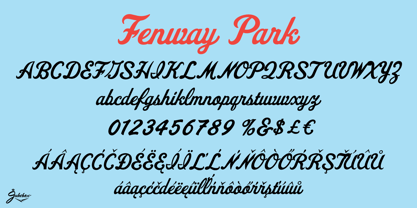
$79.00Geometric sans fonts in the Bauhaus tradition were the inspiration for the design of FF Mark®, for example the Universal font by Herbert Bayer, Erbar® Grotesk, Kabel®, Neuzeit Grotesk and of course Paul Renner's Futura®. From an aesthetic point of view, FF Mark is a descendant of these classics of German typeface design that intends to meet the needs of modern communication. Hannes von Döhren and Christoph Koeberlin had the support of the entire FontFont Type Department in the design of FF Mark, including Erik Spiekermann, who took over the artistic direction of the project. The teamwork resulted in carefully planned, balanced forms, which are responsible for the harmonious overall impression of the font. The capitals are not based on Roman square capitals; rather, they have a uniformly wide letter form in a comfortable ratio to the x-height. Thanks to the x-height, which is significantly larger compared to the historical models, FF Mark is also very legible in small sizes. This makes it a very flexible font in terms of its range of applications. A contrast in the stroke width is barely noticeable. At the same time, light modulation supports readability, especially in the bold styles in small sizes. The uniform line ends are obvious for a contemporary sans family nowadays (unlike some of the historical precedents, which evolved over years). Other details from the predecessors are consciously maintained and provide for added individuality in FF Mark. For example, the limbs in the uppercase "K" and "R" are offset slightly from the stem. Alternative characters with crossbars are available for the numbers "0", "1", "7" and the uppercase "Z" and the lowercase "a" also has an alternative with an open form. German typesetters have the option of uppercase umlauts with points that are set lower, as well as a long "s" from the Fraktur. And last but not least, FF Mark has the very characteristic ft-ligature of Futura. FF Mark is available in ten finely tuned weights ranging from Hairline to Black. A Book style for text setting further emphasizes the well-rounded features of this contemporary typeface. When the font was published, it also included ten carefully designed cursives for all weights. Users also have the option of various numeral sets with old-style and uppercase numbers as well as small capitals. FF Mark also has some geometric shapes and arrows based on the features of Futura. FF Mark is a modern, full-featured, geometric sans serif that you can use without hesitation for large projects in headlines as well as in texts. FF Mark's design is a nod to the historical models and transports their charm, elegance and in some cases unusual design applications into a modern font family equipped with the most current typographical features. NEW: the new FF Mark W1G versions features a pan-European character set for international communications. The W1G character set supports almost all the popular languages/writing systems in western, eastern, and central Europe based on the Latin alphabet and also several based on Cyrillic and Greek alphabets. - Fenway Park JF by Jukebox Collection,
$32.99