10,000 search results
(0.016 seconds)
- AT Move Holborn by André Toet Design,
$39.95 HOLBORN Aptly named after ‘High Holborn’, a high-street in London where the Central School of Art & Design was based. A font, just in capitals, based on the original design and the earlier sketches (1976) by André Toet. The strong optical illusion in this alphabet makes it an outstanding typeface. Concept/Art Direction/Design: André Toet © 2017
 - AT Move MMM by André Toet Design,
$75.00 MMM is a sturdy Typeface, the design is based on a old Soap-Powder advertisement. MMM is very useful for headings and/or logotypes. André Toet his 17th Font Caps, Lowercase. With Numbers, Glyphs and the normal Punctuation. Use this Font well, it’s made with the greatest care. Concept/Art Direction: André Toet © 2017 - Design: André Toet / Jasper Terra
 - AT Move Quipo by André Toet Design,
$39.95 QUIPO is a typeface based on my recent survey (Freeflow) on hand drawn logotypes used by American and English pop groups in the 60-70s. We thought it an interesting project and a free flow exercise to design this particular font just in capitals and well... yes it’s rather ‘bulky’. Needless to say it comes with numbers and the normal punctuations ! Concept/Art Direction/Design: André Toet © 2017
 - AT Move Billiard by André Toet Design,
$39.95 BILLIARD was born from the numerous sketches André Toet did for the design of a series of postage stamps in 2011. It’s a capital monospaced and ‘fun’ alphabet, based on the classic billiard play with two white and one red ball. Actually snooker and pool were derived from this rather old sport! In Europe it used to be a sport played by elderly people, practiced in traditional bars, including the smell of beer and the at that time prevalent smell of cigarettes and cigars. These days billiard, snooker and pool are quite popular once again with young people. Hopefully our new font will get the same attention the ‘old sport’ deserves and who knows it might even be used in a sportive way. Concept/Art Direction/Design: André Toet © 2017
 - AT Move Strano by André Toet Design,
$39.95 STRANO Like the name indicates it’s a strange typeface. Just capitals (including punctuation marks and numbers), composed from early sketches for a corporate identity in 2005 by André Toet. The complete font was restyled and translated to a Monospaced version. It’s a quite versatile font: it can be used in a lot of different cases, not only in print but also in architecture and street furniture. Think about lettering on benches, bridges, buildings. Concept/Art Direction/Design: André Toet © 2017
 - AT Move Artu by André Toet Design,
$39.95 Artù ! Strano ma vero, strange but true. A beautiful, intelligent and lively Italian dog and a great friend, unfortunately no longer among us ... but his memory lingers. A typeface designed in Rosennano (Tuscany), its Italian, but executed in Amsterdam. This monospace typeface might prove to be extremely useful for household products like washing powder or any anything like that. Just use it in your designs, let it live! Concept/Art Direction/Design: André Toet © 2017
 - AT Move Tremelo by André Toet Design,
$39.95 TREMELO a typeface based on a logotype (Microtel). We designed it as a complete capital alphabet. The original idea for the logotype font came from the products the firm produced. They provided the parts that go into hearing-aids. We thought the type should have some visual tremor in it. Concept/Art Direction/Design: André Toet © 2017
 - Tipo Movin CDMX by Ixipcalli,
$- La versión propuesta por la SEMOVI (Secretaria de Movilidad) es un estilo más angosto y ortográfico, creadó con la finalidad de aligerar las aplicaciones tipográficas del sistema. Se emplea oficialmente en todas las aplicaciones del sistema de Movilidad Integrada de la Ciudad de México. El creador de la tipografía es Lance Wyman. En esta edición, los tipos minúsculas son una adaptación “no oficial” para el Tipo Movin CDMX, enriqueciendo la tipografía a un estilo visual de altas y bajas, por lo que se prescinde del diseño base como trabajo propio para enfatizar los tipos minúsculas exclusivamente, además de que se han añadido algunos caracteres de acentuación extendiendo su uso a otros lenguajes. Los tipos son una nueva propuesta por Ixipcalli en el presente año 2023. The version proposed by SEMOVI (Secretary of Mobility) is a narrower and more orthographic style, created with the purpose of lightening the typographic applications of the system. It is officially used in all the applications of the Integrated Mobility system of Mexico City. The creator of the typeface is Lance Wyman. In this edition, the lowercase types are an “unofficial” adaptation for the Tipo Movin CDMX, enriching the typography to a visual style of highs and lows, so the base design is dispensed with as my own work to emphasize the lowercase types exclusively, In addition, some accentuation characters have been added, extending their use to other languages. The types are a new proposal by Ixipcalli in the current year 2023.
 - Moving Van JNL by Jeff Levine,
$29.00Moving Van JNL is a classic sign painter's block Roman with angled [instead of rounded] corners and slab serifs. This style of lettering was most popular in the 1920s and 1930s. - AT Move Bloggy by André Toet Design,
$39.95 BLOGGY designed in 2010 by André Toet. In the series of typefaces that were created by our team, BLOGGY stands out as a rough typeface based on a grid. Within this square grid the typeface is enlarged and reduced in size in order to create a dazzling font. A complete ‘extra alphabet’ was added to the font by cutting the letters diagonally. To us typedesign doesn't only mean designing fonts for books but also advertising, posters, film or digital use. We hope that BLOGGY will do the trick ! Concept/Art Direction/Design: André Toet © 2017
 - AT Move Herengracht by André Toet Design,
$39.95 HERENGRACHT (Patricians' Canal or Lord’s Canal) is the first of the three major canals in the city centre of Amsterdam. The canal is named after the heren regeerders who governed the city in the 16th and 17th century. The most fashionable part is called the Golden Bend, with many double wide mansions, inner gardens and coach houses on Keizersgracht. Former bureau of André Toet (SO)Design was situated there for over 32 years, it was about time to name one of our fonts to: HERENGRACHT. Concept/Art Direction/Design: André Toet © 2017
 - Trekbats - Unknown license

- SteelTongs - Unknown license

- Moi Non Plus by Hanoded,
$15.00 Moi Non Plus is a wonderful, handwritten font. It has a somewhat chaotic look, but is stylish nonetheless. The name was taken from a famous Serge Gainsbourg song called 'Je t'aime - moi non plus', which caused a bit of a scandal when it was released in the '60's, due to its overtly sexual content.
 - HU Mois KR by Heummdesign,
$25.00 HU Mois KR is a calligraphy typeface with a sense of speed and a naturally slanted feel as if writing. It also gave a sense of free rhythm of handwriting. Includes Korean from the existing 'HU Mois' font.
 - the Incredibles - Unknown license

- AT Move Specx Stncl by André Toet Design,
$39.95 SPECX Stencil This is my #11/12 Font a slabserif typeface. In fact it’s a very, very basic and extreme strong typeface! We gave this new Font a special touch by adding an extra family-member: a stencil-version of the SPECX. My inspiration for the SPECX is based on the cover of a 1955 French School-Notebook. Concept/Art Direction/Design: André Toet © 2017
 - Wanted Poster Caps - Unknown license

- Retro Rock Poster - Unknown license

- Posterizer KG Rough by Posterizer KG,
$30.00 Posterizer KG Rough is basically a hand-printed texture version of the Egyptian Slab Serif font Posterizer KG that already exists. Posterizer Kg Rough looks good on substrates with a rustic texture like wood, metal, textile, rough paper. It contains all the Latin and Cyrillic glyphs.
 - Show Poster JNL by Jeff Levine,
$29.00 In the 1960 edition of Samuel Welo’s “Studio Handbook for Artists and Advertisers” is an example of poster lettering with the accompanying blurb “call this Chrysler”. This casual brushstroke design was slightly modified and then reworked into what is now Show Poster JNL and is now available in both regular and oblique versions.
 - Poster Casual JNL by Jeff Levine,
$29.00 Poster Casual JNL is based on the hand lettered title on the cover of the 1929 sheet music for the song "Give Yourself a Pat on the Back"; touted at the time as being "the cheer-up song of England". Available in both regular and oblique versions, the font is perfect for applications where a less-formal look is desired in headlines or brief text.
 - Posterizer KG Rounded by Posterizer KG,
$40.00 Posterizer Kg Rounded, is basically rounded version of Egyptian, Slab Serif font Posterizer Kg. By adding rounded corners on serifs, the strict form disappears, in that way, the font gets softer form. Posterizer Kg Rounded is useful for sweet themes like cookies, puppies, love, joy, or some other similar things.
 - Poster Slabserif JNL by Jeff Levine,
$29.00 Based on one of the many hand lettered typefaces found with in the 1960 edition of Sam Welo’s “Studio Handbook for Artists and Advertisers”, Poster Slabserif JNL is available in both regular and oblique versions.
 - Poster Plain JNL by Jeff Levine,
$29.00 Poster Plain JNL and its oblique counterpart offer the simple, hand-lettered look of home-made poster board projects with a bold, friendly typeface.
 - Poster Contoured JNL by Jeff Levine,
$29.00 Sheet music for a selection from the 1928 musical “New Moon” had the show’s title hand lettered in a bold sans serif that reflected the upcoming Art Deco movement, along with a contoured outline around the letters. This served as the model for Poster Contoured JNL, which is available in both regular and oblique versions.
 - Quick Poster JNL by Jeff Levine,
$29.00 A vintage poster from the British Columbia Forest Service on the subject of forest fire prevention provided the hand lettering that was the design model for Quick Poster JNL; available in both regular and oblique versions.
 - Posterizer KG Inline by Posterizer KG,
$40.00 Posterizer Kg Inline, is basically the Inline version of Egyptian Slab Serif font Posterizer KG. Posterizer KG Inline is useful for diplomas, magazines, headlines and many other things.
 - Poster Inline JNL by Jeff Levine,
$29.00 The word "Signs" hand-lettered on the cover of a 1930s instructional book on sign and poster lettering was the basis for Poster Inline JNL.
 - Lobby Poster JNL by Jeff Levine,
$29.00 The hand lettered cast credits for the 1932 George Arliss film “The Man Who Played God” inspired Lobby Poster JNL, which is available in both regular and oblique versions. A bold and playful Art Deco poster alphabet, its nonconformist character widths and shapes are casual enough for informal designs yet bold enough to get any point across.
 - Nouveau Poster JNL by Jeff Levine,
$29.00 When master letterer Hugh Gordon and his student, Ross F. George developed a set of lettering pens between June 16, 1913 and Sept. 1, 1914, they had no idea that their invention (which they named Speed-Ball®) would still be in use nearly a hundred years later. The C. Howard Hunt pen company [originally of Camden, New Jersey] became the original (and sole) distributor of these pens. By 1915 an instructional booklet entitled "Modern Pen Lettering" was produced, and it was copiously illustrated with examples of layouts, lettering techniques and an assortment of alphabets for the user to learn. Nouveau Poster JNL is Jeff Levine's interpretation of a sanserif design found within the pages of this vintage publication.
 - NS Yorkest Poster by Novi Souldado,
$25.00 Experience the around-the-world traveling vibes from the past with Yorkest Poster. It was inspired by the vintage retro national travel arts and printings from the 60s and 70s eras back in the day. Comes along with 2 styles (Serif and Script) that would never go wrong to be paired. A pack of Stylistic Alternates features to give a personal touch to your design, and also Swashes to cover your visual needs to be stronger in every appearance. Perfectly fit for logo design, headliner, signage, poster, postcard, title, postage stamp, and a lot of other printing works and stuff.
 - Metropolitan Poster Black by Intellecta Design,
$13.90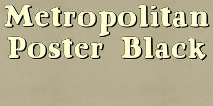
- Political Poster JNL by Jeff Levine,
$29.00 Inspired by the hand lettering on a 1940 campaign poster for Franklin Delano Roosevelt, this condensed, casual sans serif design is now available as Political Poster JNL – in both regular and oblique versions.
 - Industrial Poster JNL by Jeff Levine,
$29.00 A 1917 informational poster for shipbuilders during World War I detailing the importance of their governmental work was hand lettered in a style closely resembling Cooper Black, yet retaining its own look and feel. This inspired Industrial Poster JNL, which is available in both regular and oblique versions.
 - California Poster SG by Spiece Graphics,
$39.00 Known to many eastern artists as the California Poster Letter because it originated in the West, this old 1930s style has reappeared in digital form. Carl Holmes, in his wonderful book on old lettering styles, pays tribute to this uniquely American design. Faintly reminiscent of the lettering of Fred G. Cooper, California Poster Bold is at times wildly exaggerated and boisterous. Letters appear to be inflated and loopy. The design might aptly be described as a kind of rollicking Cooper Black (Oswald Bruce Cooper). An extensive range of alternates and figures has been provided for your convenience. California Poster Bold is now available in the OpenType Std format. Some new characters have been added to this OpenType version as stylistic alternates and historical forms. These advanced features work in current versions of Adobe Creative Suite InDesign, Creative Suite Illustrator, and Quark XPress. Check for OpenType advanced feature support in other applications as it gradually becomes available with upgrades.
 - Poster Pen JNL by Jeff Levine,
$29.00 The bold round point pen lettering on the cover of the 1934 sheet music for “New England in the Rain” was the model and inspiration for Poster Pen JNL, which is available in both regular and oblique versions.
 - Veranda Poster SG by Spiece Graphics,
$39.00 Veranda Poster was derived from a European art supply manufacturer’s logotype done in the Vienna (Wien) Austria style. This distinctive classic style was used by artists such as Julius Klinger and Willy Willrab in the 1920s. Two new faces have been added to the original version - Veranda Poster Small Caps and Veranda Poster Alternates. Here is an extensive collection of capital and small cap alternates plus a wide selection of figures for almost any use. The contemporary alternate additions have a slightly Russian flavor. The combination of all three styles makes for striking logo and display settings. All three styles are now available in the OpenType Std format. Some additional characters have been added to this OpenType version as stylistic alternates. This advanced feature works in current versions of Adobe Creative Suite InDesign, Creative Suite Illustrator, and Quark XPress. Check for OpenType advanced feature support in other applications as it gradually becomes available with upgrades.
 - Vintage Poster JNL by Jeff Levine,
$29.00 Modeled from an example in the book “Lettering” by Harry B. Wright (1950), the poster alphabet shown was reminiscent of the kind of style used in the early 1900s by sign painters and show card artists. Vintage Poster JNL is available in both regular and oblique versions.
 - Brush Poster Grotesk by TypoGraphicDesign,
$19.00 The typeface Brush Poster Grotesk is designed in 2017 for the children exhibition 1,2,3 Kultummel from Labyrinth Kindermuseum Berlin by xplicit, Berlin (Annette Wüsthoff, Alexander Branczyk, Mascha Wansart (illustrations)). Manuel Viergutz extended the font with some further glyphs & extras. The rough sans serif display typeface is created analogous by hand and brush. 875 glyphs incl. 150+ decorative extras like arrows, dingbats, emojis, symbols, geometric shapes, catchwords, decorative ligatures (type the word LOVE for or SMILE for as OpenType-Feature dlig) and stylistic alternates (3+ stylistic sets). For use in logos, magazines, posters, advertisement plus as webfont for decorative headlines. The font works best for display size. Have fun with this font & use the DEMO-FONT (with reduced glyph-set) FOR FREE! Font Name: Brush Poster Grotesk Font Weights: Regular + Misprint + EXTRAS (Illustration) + DEMO (with reduced glyph-set) Font Category: Display for headline size Glyph Set: 875 glyphs Language Support: 28+ for extended Latin. Afrikaans, Albanian, Catalan, Croatian, Czech, Danish, Dutch, English, Estonian, Finnish, French, German, Hungarian, Icelandic, Italian, Latvian, Lithuanian, Maltese, Norwegian, Polish, Portugese, Romanian, Slovak, Slovenian, Spanisch, Swedish, Turkish, Zulu Specials: 150+ decorative extras like arrows, dingbats, emojis, symbols, geometric shapes, catchwords, decorative ligatures (type the word “LOVE” for ❤ or “SMILE” for ☺ as OpenType-Feature dlig ) and stylistic alternates (3+ stylistic sets), German Capital Eszett Design Date: 2017 Type Designer: Annette Wüsthoff, Manuel Viergutz, Alexander Branczyk, Mascha Wansart (Illustration)


