10,000 search results
(0.229 seconds)
- Segmenta by Librito.de,
$15.00Segmenta, a sans serif typeface developed from the gridbased type of the Hamburg S-Bahn (metro). The type is originally used for diplaying informations about the trains. The typeface contains all accents and special letters for extended latin and the baltic languages. - Mardi Gras Improved by Solotype,
$19.95George Bruce's New York foundry had a remarkable number of decorative types, most of which were lost or destroyed when the firm was taken over by the American Type Founders Co. and closed down in 1906. Bruce catalogs are prized among collectors. - JT Energy by OGJ Type Design,
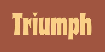
$70.00JT Energy is a new in 2020 interpreted geometric type with optically consistent line thickness and an interesting look and feel. This type is inspired by designs from Paul Renner and Arno Drescher and was long developed until it was something own. - FDI Triumph by FDI,
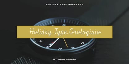
$29.00 - HT Orologiaio by Dharma Type,
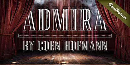
$19.99 - Admira by FontForum,
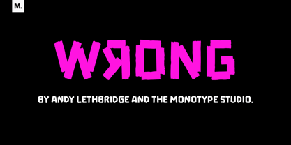
$19.99 - Wrong by Monotype,
$15.99 - Gipsiero by Bumbayo Font Fabrik is a font that arrests the eye with its unique blend of whimsy and elegance. Crafted with keen attention to detail, this typeface embodies a bold and adventurous spiri...
- SF Obliquities - Unknown license
- SF Intellivised - Unknown license
- Delargo DT Informal by DTP Types,
$49.00An original design by Malcolm Wooden of DTP Types Limited. - Vigor DT by DTP Types,
$49.00An original design by Malcolm Wooden of DTP Types Limited. - Mega by BA Graphics,
$45.00A bold engraver type style with a Wall Street look. - American Advertise 008 by Intellecta Design,
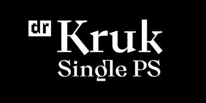
$22.90a decorative caps font digitized in the american type heritage - DR Kruk Single by Dmitry Rastvortsev,
$49.99 - Finalia DT Condensed by DTP Types,
$49.00An original design by Malcolm Wooden of DTP Types Limited. - Pen Tip DT by DTP Types,
$89.00An original design by Malcolm Wooden of DTP Types Limited. - Garamond 96 DT by DTP Types,
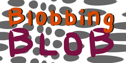
$89.00A revival design by Malcolm Wooden of DTP Types Limited. - Blobbing by Wooden Type Fonts,
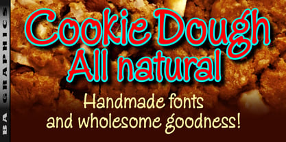
$15.00 - Cookie Dough by BA Graphics,
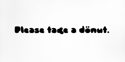
$45.00 - Donut by Vladvertising,
$20.00 - Titanic by Red Rooster Collection,
$45.00Based on an early wood type design. An original creation. - Triple Condensed Gothic by Red Rooster Collection,
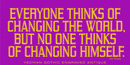
$45.00Based on an early wood type design. An original creation. - Yeoman Gothic by Red Rooster Collection,
$45.00 - Merry Brook by Letterhend,
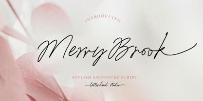
$19.00Merry Brook is a beautiful signature script based on manual hand writing. The stylistic alternate, ligatures and the tick and thin stroke kk make this font looks a real hand writing instead of typing a font. This type of font perfectly made to be applied especially in logo, and the other various formal forms such as invitations, labels, logos, magazines, books, greeting / wedding cards, packaging, fashion, make up, stationery, novels, labels or any type of advertising purpose. - RT Dyans by Veteran Type,
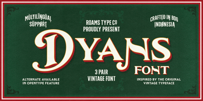
$14.00Dyans Font Family is a type of font that is inspired by vintage handwriting art that is often used in signwood, signpainting and others, usually this font is very suitable for manual hand lettering or hand painting art. This font uses the open type feature so you can explore alternative types in certain letters. Enjoyed This font conssist of: Stylistic Set Alternate Character Multilingual Support Math Symbol Numeral & Punctuation Hope your enjoy using this font Thank You. - QARVIC by Alit Design,
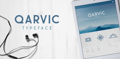
$12.00Introducing QARVIC TYPEFACE, a simple and beautiful font made with persistence and passion. QARVIC has a unique character when compared with the others sans serif font, it has two types of letters (plain type and type grunge) and there also has an outline QARVIC icon characters. QARVIC typeface is suitable for simple logo design, website header, wedding design, badges, menu fonts for website, to design fashion and others that have a minimalist and simple concept. Thank you and enjoy :) - Catalina Shiba by Suza Studio,
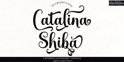
$13.00Catalina Shiba with alternative characters is divided into several Open Type features such as Swash, Stylistic Sets, Stylistic Alternate, Contextual Alternate. The Open Type feature can be accessed using Open Type savvy programs such as Adobe Illustrator, Adobe InDesign, Adobe Photoshop version of Corel Draw X, and Microsoft Word. And this Font has provided PUA unicode (custom coded font). so that all alternative characters can be easily accessed in full by a craftsman or designer. Thank You. - Parangon by ParaType,
$25.00PT Parangon™ was designed in 1986-2002 by Anatoly Kudryavtsev and licensed by ParaType. This type family belonges to Neogrotesque subclass of closed Sans Serif. Letterforms of lower case is based on the tradition of 1710 Civil type and some modern Italic types. The family has a lot of weights and styles including Extra Condensed, Condensed, Regular, Extra Light, Light, Bold, Extra Bold. For advertising and display matter. Also it can be used for texts in advertising magazines. - Chartha by Amarlettering,
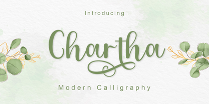
$30.00Chartha come with 250+ glyphs. The alternative characters were divided into several Open Type features such as Swash, Stylistic Sets, Stylistic Alternates, Contextual Alternates. The Open Type features can be accessed by using Open Type savvy programs such as Adobe Illustrator, Adobe InDesign, Adobe Photoshop Corel Draw X version, And Microsoft Word. And this font has given PUA unicode so that all the alternate characters can easily be accessed in full by a craftsman or designer. Email : amarlettering@gmail.com - Hello Falisha by IM Studio,
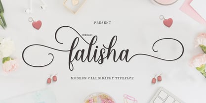
$15.00Hello Falisha amazing script comes with 315+ glyphs. Alternative characters are divided into several Open Type features such as Swash, Stylistic Sets, Stylistic Alternates, Contextual Alternates. The Open Type feature can be accessed using programs that understand Open Type such as Adobe Illustrator, Adobe InDesign, Adobe Photoshop Corel Draw X version, and Microsoft Word. And this font has provided PUA unicode (custom coded font). so that all the stunt doubles are easily accessible to the craftsman or designer. - Mulidey by Amarlettering,
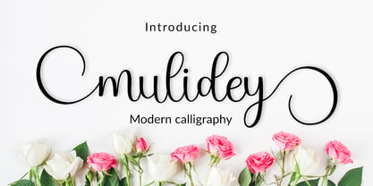
$15.00Mulidey come with 200+ glyphs. The alternative characters were divided into several Open Type features such as Swash, Stylistic Sets, Stylistic Alternates, Contextual Alternates. The Open Type features can be accessed by using Open Type savvy programs such as Adobe Illustrator, Adobe InDesign, Adobe Photoshop Corel Draw X version, And Microsoft Word. And this Font has given PUA unicode (specially coded fonts). so that all the alternate characters can easily be accessed in full by a craftsman or designer. - Isbellium Pro by No Bodoni,
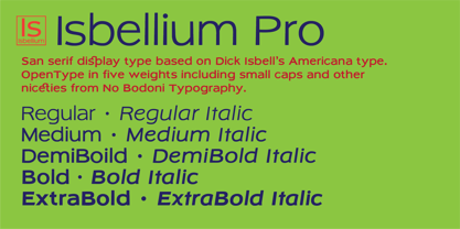
$35.00Isbellium is a sans serif version of Dick Isbell’s Americana type, designed in 1967 and the last type cut in metal by the American Type Founders Co. (ATF). Isbellium retains the large x-height, open character, wide stance and elegance of Americana, but with a quieter voice and polite authority. Isbellium is a display face with broad Latin support along with small caps, fraction support and other typographic niceties are included in the ten font family. - Calla Script by Great Lakes Lettering,
$30.00Calla is a scripted typeface with an interesting personality. Each letter was created many times so you can get a truly distinctive look to your designs. Notice when you type with open type feature switched on, your letters will bounce around and change as you type? This feature ensures you get a new version of each letter throughout the words you use! Want to get even more custom? Pair all caps words with your lowercase words to create hierarchy! - Antique by Storm Type Foundry,
$26.00The concept of the Baroque Roman type face is something which is remote from us. Ungrateful theorists gave Baroque type faces the ill-sounding attribute "Transitional", as if the Baroque Roman type face wilfully diverted from the tradition and at the same time did not manage to mature. This "transition" was originally meant as an intermediate stage between the Aldine/Garamond Roman face of the Renaissance, and its modern counterpart, as represented by Bodoni or Didot. Otherwise there was also a "transition" from a slanted axis of the shadow to a perpendicular one. What a petty detail led to the pejorative designation of Baroque type faces! If a bookseller were to tell his customers that they are about to choose a book which is set in some sort of transitional type face, he would probably go bust. After all, a reader, for his money, would not put up with some typographical experimentation. He wants to read a book without losing his eyesight while doing so. Nevertheless, it was Baroque typography which gave the world the most legible type faces. In those days the craft of punch-cutting was gradually separating itself from that of book-printing, but also from publishing and bookselling. Previously all these activities could be performed by a single person. The punch-cutter, who at that time was already fully occupied with the production of letters, achieved better results than he would have achieved if his creative talents were to be diffused in a printing office or a bookseller's shop. Thus it was possible that for example the printer John Baskerville did not cut a single letter in his entire lifetime, for he used the services of the accomplished punch-cutter John Handy. It became the custom that one type founder supplied type to multiple printing offices, so that the same type faces appeared in various parts of the world. The type face was losing its national character. In the Renaissance period it is still quite easy to distinguish for example a French Roman type face from a Venetian one; in the Baroque period this could be achieved only with great difficulties. Imagination and variety of shapes, which so far have been reserved only to the fine arts, now come into play. Thanks to technological progress, book printers are now able to reproduce hairstrokes and imitate calligraphic type faces. Scripts and elaborate ornaments are no longer the privilege of copper-engravers. Also the appearance of the basic, body design is slowly undergoing a change. The Renaissance canonical stiffness is now replaced with colour and contrast. The page of the book is suddenly darker, its lay-out more varied and its lines more compact. For Baroque type designers made a simple, yet ingenious discovery - they enlarged the x-height and reduced the ascenders to the cap-height. The type face thus became seemingly larger, and hence more legible, but at the same time more economical in composition; the type area was increasing to the detriment of the margins. Paper was expensive, and the aim of all the publishers was, therefore, to sell as many ideas in as small a book block as possible. A narrowed, bold majuscule, designed for use on the title page, appeared for the first time in the Late Baroque period. Also the title page was laid out with the highest possible economy. It comprised as a rule the brief contents of the book and the address of the bookseller, i.e. roughly that which is now placed on the flaps and in the imprint lines. Bold upper-case letters in the first line dramatically give way to the more subtle italics, the third line is highlighted with vermilion; a few words set in lower-case letters are scattered in-between, and then vermilion appears again. Somewhere in the middle there is an ornament, a monogram or an engraving as a kind of climax of the drama, while at the foot of the title-page all this din is quietened by a line with the name of the printer and the year expressed in Roman numerals, set in 8-point body size. Every Baroque title-page could well pass muster as a striking poster. The pride of every book printer was the publication of a type specimen book - a typographical manual. Among these manuals the one published by Fournier stands out - also as regards the selection of the texts for the specimen type matter. It reveals the scope of knowledge and education of the master typographers of that period. The same Fournier established a system of typographical measurement which, revised by Didot, is still used today. Baskerville introduced the smoothing of paper by a hot steel roller, in order that he could print astonishingly sharp letters, etc. ... In other words - Baroque typography deserves anything else but the attribute "transitional". In the first half of the 18th century, besides persons whose names are prominent and well-known up to the present, as was Caslon, there were many type founders who did not manage to publish their manuals or forgot to become famous in some other way. They often imitated the type faces of their more experienced contemporaries, but many of them arrived at a quite strange, even weird originality, which ran completely outside the mainstream of typographical art. The prints from which we have drawn inspiration for these six digital designs come from Paris, Vienna and Prague, from the period around 1750. The transcription of letters in their intact form is our firm principle. Does it mean, therefore, that the task of the digital restorer is to copy meticulously the outline of the letter with all inadequacies of the particular imprint? No. The type face should not to evoke the rustic atmosphere of letterpress after printing, but to analyze the appearance of the punches before they are imprinted. It is also necessary to take account of the size of the type face and to avoid excessive enlargement or reduction. Let us keep in mind that every size requires its own design. The longer we work on the computer where a change in size is child's play, the more we are convinced that the appearance of a letter is tied to its proportions, and therefore, to a fixed size. We are also aware of the fact that the computer is a straightjacket of the type face and that the dictate of mathematical vectors effectively kills any hint of naturalness. That is why we strive to preserve in these six alphabets the numerous anomalies to which later no type designer ever returned due to their obvious eccentricity. Please accept this PostScript study as an attempt (possibly futile, possibly inspirational) to brush up the warm magic of Baroque prints. Hopefully it will give pleasure in today's modern type designer's nihilism. - Pani Sans by Alessio Laiso Type,
$19.99Pani Sans is a contemporary type family in 18 styles designed by Alessio Laiso. It takes inspiration from Italian rationalist and art deco typefaces, bringing them into the present with the mix of its reliable geometric structure and distinctive warm personality. The italics add to the unique character of the family by featuring distinguishing calligraphic touches. Pani Sans is fully equipped for intense professional use for both print and digital applications. It supports 219 languages, covering 100% of the Latin Plus character set, and it ships with powerful OpenType features including beautiful small caps, ligatures, stylistic alternates, fractions, tabular figures, old-style figures, and more. The variable fonts included in the family package allow you to pick the perfect weight, for unlimited design freedom. - Gasco by Joelmaker,
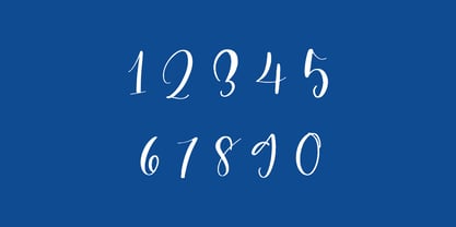
$30.00GASCO is a collection of natural handwritten letters inspired by the retro style of the 70s and 80s, the style seems to take us a little back to the manual era, this type of letter is very unique, you can change from modern to retro or vintage style with a combination of a collection of alternates so it is ready to help To make your design look elegant, in the image shown you can see what this letter can do. There is a condensed version and an italic version of the font included 9 Upright and 9 Italic weights, ranging from Sheer to Black, all coming in 1 Outline style. This font also comes with 1 more elegant display style. - Histories Family by Graptail,
$19.00Since the beginning, “Histories” has been inspired by the shape of the letters displayed on the cover of fairy tale books or animated film covers. Likewise with the naming of the font "Histories" so that the message of the letters is conveyed. And this stylistic combination should also be reflected in the lowercase set which also allows to open up a spectrum of possible uses. Basic calligraphy represents a solid basis for the development of lowercase glyphs, ensuring proper interaction with uppercase letters. “Histories” features multiple ligatures that combine the playerful structure with a more attractive feel. With glyphs, it provides a wide range of uses across ligature combinations, alternate marks, pre-caps, assortments and connectors; each of which can be accessed via Open Type. - Scotland Stories by Redy Studio,
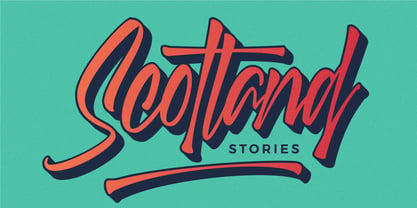
$17.00Scotland Stories | Modern Script Scotland Stories is a Modern Script with fast brushstrokes that make it look elegant and unique. It has a signature style that makes it perfect for logos, branding, print, apparel, and much more. There are also 2 different types: regular, which has no variations, and stamp, which includes a pattern as shown above. Scotland Stories is the perfect font to give your projects a very special look. Scotland Stories features: A full set of upper & lowercase characters Numbers & punctuation Ligatures Stylistic alternate Swashes PUA Encoded Characters – Fully accessible without additional design software. Feel free to give me a message if you have a problem or question. Thank you so much for taking the time to look at one of our products. - Mixcross by Din Studio,
$29.00Mixcross is a display font in the capital letters particularly created in a racing theme to express courage and power, which relates to the theme of racing. It is frequently applicable in 1) titles either to highlight the emphasizing phrases or to attract readers’ attention, and 2) large-sized texts owing to the unique sizes and shapes. Additionally, Mixcross provides interesting features to help designers improve their design products. Features: Multilingual Supports PUA Encoded Numerals and Punctuations This font type works best for any design projects, for instance, posters, banners, logos, book covers, headings, printed products, merchandise, social media, and so on. Find out more ways to use this font by taking a look at the font preview. Thanks a lot for purchasing our font. Happy designing.
