10,000 search results
(0.26 seconds)
- Zabsina by Crowntype Studio,
$14.00 Zabsina is a modern Calligraphy font created in an elegant and professional style with alternate characters. perfect font for creating signature logos and watermarks for photography studios or personal photography logos, best for initial logos or brand signatures. Zabsina includes a full set of beautiful handwritten upper and lower case letters, numbers, assorted punctuation marks. All lowercase letters include starting and ending strokes, providing a realistic handwriting style.
 - Beauty Butterfly by Zeenesia Studio,
$12.00 Beauty Butterfly - A Beauty Typeface Beauty Butterfly is a beauty typeface that's perfect for creating gorgeous headlines and designs with personality. Beauty Butterfly makes an excellent typeface for vintage graphics, and the clean lines, elegant look to logos, wedding invitations, editorials, and more. Create gorgeous headlines with an all caps design, or try the lowercase for a delicate look that's simply beautiful. Download Beauty Butterfly for your next project today.
 - We Love Nature Autumn Leaves by kapitza,
$69.00 We really enjoy going for long walks in the park in autumn, and the beautiful colours and shapes of the fallen leaves inspired us to create this font. We Love Nature Autumn Leaves is a picture font consisting of 52 highly detailed, hand drawn illustrations. The illustrations can be used on their own to create beautiful designs, or in combination with other illustrations in the We Love Nature font collection.
 - Brushwell by Hendra Pratama,
$15.00 Brushwell was made by Hendra Pratama with a real brushpen. This font delivers a dry brush effect to create the natural looks of beautiful handwriting brush calligraphy. µ¸ÀÁÂÃÄÅÆÇÈÉÊËÌÍÎÏÑÒÓÔÕÖ×ØÙÚÛÜÝßàáâãäåæçèéêëìíîïñòóôõöøùúûüýÿ ĀāĂ㥹ĆćĈĉĊċČčĎďĐđĒēĔĕĖėĘęĚěĜĝĞğĠġĢĤĥĨĩĪĬĭĮįİĴĵĶ Ĺ弾ŃńŇňŌōŎŏŐőŒœŔŕŖŘřŚśŜŝŞşŠšŢŤťŨũŪūŬŭŮůŰűŲų ŴŵŶŷŸŹźŻżŽžǼǽǾǿȘˆˇ˘˙˚˛˜˝ẀẁẂẃẄẅỲỳ ÷†‡‰~¢£¥§¨©®¯±´€™ Brushwell is also equipped with a standard OpenType Features such as Ligatures and Stylistic Set Alternates. Please check all the preview images for details. Hope this font will help you to create great projects.
 - The Rufly by Graptail,
$15.00 Introducing The Rufly, a retro-inspired font that evokes 1950s to 90s nostalgia. This font is perfect for creating vintage-themed designs and giving it a touch of nostalgia and personality. The Rufly features a soft, solid design with curved corners and a unique letter shape. This font also includes a variety of alternative characters and ligatures, allowing you to create many different looks with the same font.
 - Muscle by Positype,
$15.00 Muscle came from the original sketches for Sneakers. At the time my concentration with Sneakers was to create a curvier, chunkier display. I left Muscle behind, thinking it was too masculine. Rather than discard those original sketches, I decided to make it even heavier, reduced the total number of weights, create a function small cap system that when integrated with the lowercase makes a great biform component for short display settings.
 - Christel Line by JOEBOB graphics,
$19.00 As a present, my sister in law Christel Marseille-Hoksbergen created a hand-sewn alphabet which I liked so much, I decided to turn it into a font and this is the result. Probably a fun font to use in scrapbooks or magazines about handmade things. As an addition to the christelLine font, Christel Hoksbergen created another hand sewn alphabet which I turned into a font. This time with filled characters.
 - Casanova Serif Display by Typetemp Studio,
$20.00 Casanova Serif Display a modern-style serif font with alternatives and ligatures that create stunning logos, quotes, posts, blog posts. branding projects, magazine imagery, wedding invitations, and much more ncluded : 6 Premade Logo and 25+ Illustration Eps/Ai File FEATURES Stylistic Alternates & Ligatures Numerals & Punctuation Accented characters Illustration Floral Ai/Eps Multiple Languages Supported Contact me with an inbox message If you have any question. Thank you! Happy Creating.
 - Spinosa BT by Bitstream,
$50.99Stephen Chick, of In Your Typeface Productions (IYTP) foundry, has created this rather prickly type design. Although for display, it is surprisingly legible at smaller point sizes. There is an Inline version, and also an Inline Extra version, which has only the inner contours of the Inline itself, which can be combined with the Regular to create cool two-color effects. The extended glyph set supports Central Europe. - Jiwez by Twinletter,
$15.00 Jiwez Arabic style font is a premium Arabic style font that is a great way to bring a new level of luxury to your designs. The classic, yet modern style of this font is perfect for creating elegant titles and cover pages for your projects. With its classy, yet simple structure and easy-to-read fonts, you can use this font to create the perfect typeface for your projects.
 - Maulysia by Gatype,
$12.00 Maulysia is a modern Signature font created in an elegant and professional style with alternate characters. perfect font for creating signature logos and watermarks for photography studios or personal photography logos, best for initial logos or brand signatures. Maulysia includes a full set of beautiful handwritten upper and lower case letters, numbers, assorted punctuation marks. All lowercase letters include starting and ending strokes, providing a realistic handwriting style.
 - Dinfest by Graptail,
$15.00 Introducing Dinfest Bold, a retro-inspired font that evokes 1950s to 90s nostalgia. This font is perfect for creating vintage-themed designs and giving it a touch of nostalgia and personality. Dinfest Bold features a soft, solid design with curved corners and a unique letter shape. This font also includes a variety of alternative characters and ligatures, allowing you to create many different looks with the same font.
 - Mabista Script by stiplinestudios,
$15.00 Introducing a dancing calligraphy font, Mabista Script! Simple way to access is just type a number (1-7) after the letters. example : m3ab5ista2 Mabista Script is perfect for wedding stationery, invitations, lovey cards, logos, bussiness cards, branding and other projects that require a touch of casual and feminine. This font was created with multilingual support and over 484 glyph characters, allowing you to create a fresh look to your projects.
 - Jester Script by Paul O'Connell,
$9.95This comical styled Jester Script font was created to suit various design applications within the typeface market and is aimed at people looking for a clown styled brush script typeface that is very unconventional indeed. Designed and produced by Paul O'Connell of POCT, it is a distinct styled font script, loosely drawn with irregular rounded edges and curves to create a free flowing handwritten font that will appeal to everyone. - Alpinecia by Pista Mova,
$19.00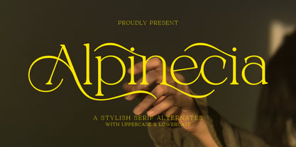 Trendy, classy & modern stylish serif font for your luxury projects. Alpinecia elegant, fashion and classic font style will be a perfect fit for any branding project. Many alternatives and bindings will help you create a unique and original logo or website header design! Multilingual support Uppercase Lowercase Number Punctuation Many alternative characters Lots of ligatures Font network PUA coded. Perfect for modern branding projects! Happy creating new ideas :)
 - Falansia by Crowntype Studio,
$14.00 Falansia is a modern Calligraphy font created in an elegant and professional style with alternate characters. perfect font for creating signature logos and watermarks for photography studios or personal photography logos, best for initial logos or brand signatures. Falansia includes a full set of beautiful handwritten upper and lower case letters, numbers, assorted punctuation marks. All lowercase letters include starting and ending strokes, providing a realistic handwriting style.
 - Aristelle by My Creative Land,
$25.00 Aristelle Family is a beautiful, hand-lettered script that was created using Leonardt III EF nib. Aristelle Script is full of OpenType features such as initial and terminal swashes, ligatures, and ornaments and is best used in an OpenType-aware software. Aristelle Sans and Sans Condensed are well additions to the Aristelle Script and all three fonts shall help you create organic, stylish, and full-of-character designs.
 - Rikafu by Twinletter,
$15.00 Introducing Rikafu Arabic font. Create beautiful Arabic and Islamic ornament designs using this exclusive font. All characters and alternates are beautifully styled. With this stunning font going for a stunning display, you’re sure to add a classic touch of elegance to your projects while presenting them in a variety of styles from modern to classic. This Arabic Style font will be your ultimate tool in creating high-end and luxurious designs.
 - Bleeding Ink by Mvmet,
$20.00 Bleeding Ink is a rough hand-drawn display font but still fun and playful in the same time. It works great for creating cool designs that scream for attention. It’s ideal for anything ranging from t-shirts, book designs, restaurant menu, blog writing, greeting cards to stickers, or anything that needs a casual touch. Fall in love with its incredibly cool style, and use it to create lovely designs!
 - Zn Branch by Zeenesia Studio,
$15.00 Introducing BRANCH - Elegant Serif Typeface BRANCH is a beautiful and smooth serif font created by a romantic and lovely look. I created some natural ligatures to make this font very elegant and look so classy. It is perfect for greeting cards, wedding invitations, posters, logotypes, product branding, and much more. This font is PUA encoded, which means you can access all of the glyphs and swashes with ease!
 - Stories by Aestherica Studio,
$9.00 Stories is a Charming Quotable font with a Brush style and extended kerning, special for your quotes. It puts a bold accent to your projects and it will inspire you to create something playful and unique. Stories will help you create special and touching typographical designs for your display quote projects. It is perfect for headings, flyers, greeting cards, product packaging, book cover, printed quotes, logotype, apparel design, and album covers.
 - SK Primo by Shriftovik,
$16.00 SK Primo is a monumental geometric grotesque created to stand out. An unusual combination of smooth rounded contours and sharp square shapes creates a visual contrast that is noticeable. Carefully adjusted shape and attention to detail make this font a great help in the work of the designer. SK Primo is ideal for headlines, posters, banners, and text highlighting. Two styles, solid and outline, were developed to address all communication needs.
 - Alcapone by Adam Fathony,
$17.00 Alcapone, a name based from legendary donuts on some brand, It's crunchy and melty. So, I've created this fonts while eating this meal. The Concept is Groovy, Retro & Psychedelic look. Created with a base on standard Serif fonts, playing with melted on the serif itself giving more weight to represent the grooviness and retro-ish look. Alcapone are good for Display, Header, Headline, Poster, Logos, or etc on a big typography.
 - Burnic by Storictype,
$19.00 Introducing vintage classic display typeface its called Burnic Typeface. Inspired by antique, mix victorian and art deco period with decorative shapes*. Those all will make you work easily to create : Posters, Logos, Print, Quotes, Headers, Clothing, Labels, Packaging etc. Features : Character Set A-Z Numerals & Punctuations (OpenType Standard) Accents (Multilingual characters) Ligatures Above the description of this font, I hope you're satisfied with what I have created. Thanks and enjoy designing.
 - Aniron - Unknown license

- Quintet by Lauren Ashpole,
$15.00 Quintet is a narrow, stylized sans serif font made up of thin, looping lines. This font tries to walk the line between retro and modern and to incorporate some hand drawn imperfections without being too obvious about it. I kicked off designing without any particular inspiration in mind but, as time went on, started associating it in my head with an old-timey, swingy jazz aesthetic. So hopefully it captures the spirit of the Jeeves and Wooster throwback theme song and opening credits, the music of Stéphane Grappelli and Django Reinhardt (who the name is a nod to), and countless album covers from that era.
 - Fun Signs JNL by Jeff Levine,
$29.00 Fun Signs JNL comprises twenty-six humorous signs from a 1930s-era sales list of products manufactured by the Koehler Sign Company of St. Louis, Missouri. Koehler manufactured a large line of stock cardboard "Blue Signs" (presumably blue backgrounds with white lettering) and alongside the many standard phrases used by various businesses was a list of funny sayings. Such placards were bought by merchants to either evoke interest in their services (such as in a bar or restaurant, or jokingly comment on their business policies (as in credit billing). These novelty signs are a fun addition to a flier, ad, web page or announcement and will leave your readers smiling.
 - Grafika by Alphabet Soup,
$45.00 Grafika is a completely original design, done in an “Art Deco” spirit reminiscent of the 1920s and ‘30s. I designed Grafika many years ago to be typeset for title cards, and both opening and end credits for the Merchant/Ivory feature film “Savages”. After the film, the design languished in my archives until I rediscovered it. I have digitally redrawn Grafika, completing it with all the alternates, ligatures, math, foreign accented characters and punctuation that weren’t required of the original design for film. Grafika is strongest when set in upper and lowercase—its unique caps extending below the baseline—although all caps settings are encouraged as well.
 - Sigillium by ave,
$9.00 Sigillium is a flare serif typefaces, which inspired by early XX centuries sign painting advertising. It has strong historical nature. Letters proportions are very closed to the Roman Capital Letters. Sharp flare serifs endings give special medieval style to the typeface. Sigillium includes: 4 types in Upper- and Lowercases Each style contains more than 250 glyphs which support Latin, Western European, Central European languages (Cyrillic is also included) Files description: regular, carved empty, - not filled 2 styles carved with shadow, - different "light" directions Hope you are enjoying using Sigillium. Please do not hesitate to ask me any questions about the product. (c) Photo credit - Unsplash
 - Equine, crafted by the creative minds at Apostrophic Labs, is a font that captivates attention through its unique design and versatile character. Distinguished by its elegance and the fluidity of its...
- POLIGRA by Borutta Group,
$39.00 POLIGRA is an experimental typefamily and a homage to traditional printing of the pre-war era in Poland. Most of the typefaces based on traditional printing are either clean, geometric typefaces or completely distressed lettering. The POLIGRA project explored everything in between. The letters, cleaned up, redesigned where necessary, and defined in their entirety, have a friendly and warm character, as if taken out of the press. The selection of typefaces was based on theater and sports posters. All of them have blocky and geometric character, each of them is an all-caps typeface. The POLIGRA family includes 13 typefaces.
 - Vaquero by Scriptorium,
$24.00Vaquero is a Wild West style font. It is characteristic of a lot of western era signage, with super-narrow characters and unusual decorative spurs and serifs. There are some similarities in Vaquero to some of our other western fonts. It sort of ties together the historic tradition of western era type and the more fanciful tradition of romantic type derived from the era of the wild west. It has the width, height and general letter shapes of Academy, but the decorative elements are similar to more fanciful fonts like Riudoso. The result is very evocative of the old west. - Ciroke by Hazztype,
$16.00 Ciroke is a distinctive modern blackletter typeface that seamlessly fuses the classic elegance of blackletter with the clean and contemporary aesthetics of sans serif fonts. This unique fusion results in a visually striking and versatile typeface that effortlessly bridges tradition and modernity. Ciroke is an ideal choice for projects that demand a modern yet timeless aesthetic. It works well in branding, editorial design, packaging, and any application where a balance between tradition and contemporary style is desired. The font's versatility ensures that it can be used across various design platforms, from digital screens to print media.
 - Canned Whale by Hanoded,
$15.00 Each year whalers from Japan kill more than 1000 whales. Japan says that the killing of whales is a 'cherished Japanese tradition', and that it is taking 'scientific data'. A portion of the whale meat is canned and marketed as 'traditional food'. How sad is that? A huge whale being reduced to a chunk in a can… Canned Whale is a hand drawn, outline style font with a cartoonesque twist to it. It can be used in ads and posters, it can be filled in with color, or kept as an outline. Canned Whale comes with extensive language support.
 - M Hei PRC by Monotype HK,
$523.99 Although traditional Heiti typefaces may not be as lively as Songti, the modesty of M Hei makes is enduring and stand out from other similar typefaces. M Hei’s design is based on the hallmarks of traditional Heiti typefaces: it has little to no thick-thin contrast in strokes and has square cut terminals. Its dots (點), ticks (剔) and downstrokes (撇、捺) are subtly curved and longer than usual; all stems (豎) and crossbars (橫) remain simple and clear; and hooks (勾) appear rounded. Together they make a harmonious form which is clean but pure, classy but contemporary.
 - Mexborough by Greater Albion Typefounders,
$11.50 Tradition meets tomorrow in Mexborough. Mexborough owes its origins to a challenge from a client of ours- they wanted a clear and easily readable typeface to use for signage in public spaces, but with enough flair and style to be suitable for use in heritage precincts. The result is a family of six Roman faces in a single weight, encompassing Regular, Text, Flamboyant, Small Capitals, Capitals and Title forms. These faces combine legibilty with traditional character, ideal for signage and poster work, where dignity and character are required. Mexborough's simple clean lines also lend themselves readily to web and online use.
 - Sondela by Scholtz Fonts,
$19.00Sondela is a gently rounded, informal font, whose name means "welcome" or "come closer". It echoes the openhearted tradition of the Zulu people, where all who come are welcome. The font is available in regular and display (Pizazz) versions. Sondela Pizazz incorporates the zig-zag pattern that has been used in traditional Zulu beadwork for generations. It is highly effective when used in conjunction with the unadorned Sondela regular. The numerals are mono-spaced so that they will line up correctly in columns of figures. The letters of the alphabet are correctly kerned so that they appear correctly in text. - Holitter Phosphorus - 100% free

- Distant Galaxy Outline - Unknown license

- PsyType - Unknown license


