10,000 search results
(0.191 seconds)
- Lyu Lin by Stefan Stoychev,
$25.88 LyuLin is a modern sans-serif font and contains 24 styles. Available in 6 weights and its italics and condensed forms. LyuLin Heavy Italic weight and LyuLin Light Condensed are free, so you can use them for your projects.
 - Rolanda by Letterena Studios,
$9.00 Rolanda feels equally charming and elegant. It looks stunning on wedding invitations, thank you cards, quotes, greeting cards, logos, business cards and more. This font is PUA encoded which means you can access all glyphs and swashes with ease!
 - Moving Forward by Crumphand,
$20.00 Introducing, Moving Forward a Slab Serif Font. inspired by vintage and modern letterforms with alternate characters and full symbol sets. Moving Forward can be used for posters, web headers, and display text of all kinds. good kerning and readable.
 - Invitation Script by Intellecta Design,
$69.00 Iza W and Intellecta Design are proud to announce Invitation Script, a modern and clean revival of the classic work of the Portuguese master penman Manuel de Andrade de Figueiredo, whose work can be seen in “Nova Escola para aprender a ler, escrever, e contar (...)'' (1722). Invitation Script is the third script superfamily published by Intellecta Design, after Penabico and Van den Velde Script. Invitation Script has original letters designed by Iza W. Creative direction and core programming were provided by Paulo W. Chyrllene K assisted with some work on unusual and archaic styles, resulting in a special font - Invitation Script Archaic (soon available). Invitation started out from Andrade’s script style and evolved into a voluptuous script font family. The result is a typeface ideal for beautiful headings, signatures, art work typography, titles and short pieces of hand-lettered text. Invitation family includes two multi-table Opentype fonts, three supplementary fonts for ornaments and fleurons, and the Archaic font with some of the Andrade’s original characters. Embedded in the regular fonts are additional sets of letters. Over 40 variations are available for certain letters via the Special Sets Opentype table. The two regular versions of Invitation Script contains the following: (i) An extensive set of ligatures providing letterform variations that make eye-popping designs or simulate real handwriting. These are accessible via contextual alternates and other open-type features. (ii) Many stylistic alternates for each letter (upper and lowercase, accessed via the glyph palette, encoded in the ranges of the Special Set Opentype feature). Since there are over 1100 glyphs in each font, we suggest using the glyph palette. (iii) A set of ornaments and fleurons accessed with the glyph palette or using the Ornaments feature. Additional ornaments can be found in the two Invitation Script Ornaments fonts. (iv) Initial and final letters with artistic variations accessible using the initial and final form open-type features. (v) Major kerning work: over 6000 kerning pairs, hand-set to avoid collisions and to create intricate combinations of letters, using swashes and other resources. These powerful features are all accessible in InDesign, Illustrator, QuarkXpress and similar software. We recommend exploring the magic of this font using the glyph palette. Our sample illustrations and PDF brochures showcase the power and pizzazz of this calligraphic script. Let your imagination go wild and use Invitation Script in ways that Andrade could not have foreseen. In non-OpenType-savvy applications, Invitation Script is still an exceptionally beautiful calligraphic typeface that stands up to the competition. The regular fonts contains the complete Latin alphabet, including Central European, Vietnamese, Baltic and Turkish, with a full set of diacritics and punctuation marks. --- 1 FIGUEIREDO, Manuel de Andrade de, 1670-1735 Nova Escola para aprender a ler, escrever, e contar. Offerecida á Augusta Magestade do Senhor Dom Joaõ V. Rey de Portugal. Primeira parte / por Manoel de Andrade de Figueiredo, Mestre desta Arte nas cidades de Lisboa Occidental, e Oriental. - Lisboa Occidental: na Officina de Bernardo da Costa de Carvalho, Impressor do Serenissimo Senhor Infante, 1722. - [18], 156 p., 44 f. grav. a buril : il., ; 2º (31 cm)Engraved royal coat of arms supported by angels over the city of Lisbon, engraved portrait of the author (both of the foregoing by Bernard Picart), (12)ff., 156pp., engraved calligraphic section title, 44 engraved plates. Wood-engraved culs-de-lampe and lettrines. Sm. folio. “Andrade de Figueiredo was born in Espirito Santo, where his father was Governor of the ‘Capitania.’ The fine portrait is dated 1721 and is showing Figueiredo at the age of 48. He was an eminent calligrapher and a creator of the Portuguese handwriting until the reign of Don José I (ca. 1755). His work follows the style of the great Italian masters in its use of clubbed ascenders and descenders, and of Diaz Morante, the famous Spanish writing master, in its very elaborate show of command of hand. By his contemporaries, he was known as the ‘Morante portugues’” (Ekström). “Ce livre est un manuel, composé de quatre parties, destiné à apprendre à lire, à écrire, à conter ainsi que l’orthographe. Les planches comportent des examples d’écritures, d’alphabets et de textes ornés de remarquables traits de plume exécutés d’une main sûre et enjouée” (Jammes).
 - Semilla by Sudtipos,
$79.00 I spend a lot of time following two obsessions: packaging and hand lettering. Alongside a few other minor obsessions, those two have been my major ones for so many years now, I've finally reached the point where I can actually claim them as “obsessions” without getting a dramatic reaction from the little voice in the back of my head. When you spend so much time researching and studying a subject, you become very focused, directionally and objectively. But of course some of the research material you run into turns out to be tangential to whatever your focus happens to be at the time, so you absorb what you can from it, then shelf it — like the celebrity bobblehead that amused you for a while, but is now an almost invisible ornament eating dust and feathers somewhere in your environment. And just like the bobblehead may fall off the shelf one day to remind you of its existence, some of my lettering research material unveiled itself in my head one day for no particular reason. Hand lettering is now mostly perceived as an American art. Someone with my historical knowledge about lettering may be snooty enough to go as far as pointing out the British origins of almost everything American, including lettering — but for the most part, the contemporary perspective associates great lettering with America. The same perspective also associates blackletter, gothics and sans serifs with Germany. So you can imagine my simultaneous surprise and impatience when, in my research for one of my American lettering-based fonts, I ran into a German lettering book from 1953, by an artist called Bentele. It was no use for me because it didn't propel my focus at that particular time, but a few months ago I was marveling at what we take for granted — the sky is blue, blackletter is German, lettering is American — and found myself flipping through the pages of that book again. The lettering in that book is upbeat and casual sign making stuff, but it has a slightly strange and youthful experimentation at its heart. I suppose I find it strange because it deviates a lot from the American stuff I'm used to working with for so long now. To make a long story short, what’s inside that German book served as the semilla, which is Spanish for seed, for the typeface you see all over these pages. With Semilla, my normal routine went out the window. My life for a while was all Bezier all the time. No special analog or digital brushes or pens were used in drawing these forms. They're the product of a true Bezier process, all starting with a point creating a curve to another point, which draws a curve to another point, and so on. It’s a very time-consuming process, but at the end I am satisfied that it can get to pretty much the same results easier and more traditional methods accomplish. And as usual with my fonts, the OpenType is plenty and a lot of fun. Experimenting with substitution and automation is still a great pleasure for me. It is the OpenType that always saves me from the seemingly endless work hours every type designer must inevitably have to face at one point in his career. The artful photos used in this booklet are by French photographer and designer Stéphane Giner. He is very deserving of your patronage, so please keep an eye out for his marvelous work. I hope you like Semilla and enjoy using it. I have a feeling that it marks a transition to a more curious and flexible period in my career, but only time will tell.
 - Balneario by Sudtipos,
$39.00 Cities often have their own voice, a voice that can be read... in each location and each business, voice portraying a cultural fabric with an array of manifestations. Balneario Script is a small tribute to a coastal port and tourist city. Through the Sign Painters, in its golden age, a clear, friendly, practical, and functional way of making itself heard evolved. Far from wanting to be perfect, a typeface seeks to be close, warm, and casual. Inspired by the gestures of the brush, Balneario Script reverts to the use of “Casual Letters” so used by Sign Painters. In this adaptation, we sought to adjust its morphology to optimize its performance in small formats and extend the system to include lower case letters as part of the set. The set of fonts has two script weights in addition to an all caps version. The design emphasizes creating a harmonious morphological criterion. Friendly, rhythmic, and with a firm stroke Balneario Script is unique, ideal for headlines and short texts that need to be gestural but simple and highly functional. This typeface was designed to be used in promotional posters or for relaxed and fun Packagings. Balneario Script goes beyond constructive or functional aspects. It seeks to capture the smell of the sea, the warm summer breeze and the nostalgic feeling of a city that from its daily life, knew how to forge a unique personality. This atmosphere allows it to host millions of tourists year after year, and with them reinforce their spirit each summer.
 - Royalis by Julien Fincker,
$34.95 About Royalis: Royalis is an expressive and extravagant serif typeface family. It is characterized by a high contrast and dynamic features in the details, such as long terminals or deep inktraps. Royalis is available in three versions: a display version in six weights, a corresponding condensed version also for display applications, and a text version for body text in four weights. It also comes with all the corresponding italics. This makes Royalis versatile, especially for editorial, packaging, branding and advertising. The wide range of weights and possibilities allows Royalis to be used variably. The thinner weights are characterized by their elegance, while the thicker weights captivate with their powerful contrast. They complement each other like the three musketeers once did. Be it the charmingly elegant Aramis, the sober strategist Athos, the powerful ruffian Porthos or the charismatic d'Artagnan, who led the group. Features: The Royalis family has a total of 32 weights, from extralight to black with matching italics, as Display, Display Condensed and Text versions. With over 1027 characters, it covers more than 200 Latin-based languages, with a whole range of Open Type features. There are alternative characters as stylistic sets, small caps, automatic fractions - just to name a few. Arrows and numbers: In particular, the extensive selection of arrows and numbers should be mentioned here. Thanks to Open Type features and a simple system, the various designs of arrows and numbers can also be easily "written" without first having to select them in a glyph palette.
 - Trakya Sans by Bülent Yüksel,
$19.00 Thrace (/θreɪs/; Greek: Θράκη, Thráki; Bulgarian: Тракия, Trakiya; Turkish: Trakya) is a geographical and historical region in Southeast Europe, now split among Bulgaria, Greece, and Turkey, which is bounded by the Balkan Mountains to the north, the Aegean Sea to the south, and the Black Sea to the east. It comprises southeastern Bulgaria (Northern Thrace), northeastern Greece (Western Thrace), and the European part of Turkey (East Thrace). Trakya Sans is a modern sans serif with a geometric touch. Futura, Avant Garde and the like. It has a modern streak which is the result of a harmonization of width and height especially in the lowercase letters to support legibility. Ideally suited for advertising and packaging, editorial and publishing, logos, branding and creative industries, posters and billboards, small text, way-finding and signage as well as web and screen design. Trakya Sans provides advanced typographical support for Latin-based languages. An extended character set, supporting Central, Western and Eastern European languages, rounds up the family. The designation “Trakya Sans 500 Regular” forms the central point. The first figure of the number describes the stroke thickness: 100 Thin to 900 Bold. "Trakya Sans" comes in 5 weights with matching italics plus "Trakya Sans Alt", also 5 weights and italics so a total of 20 styles. The family contains a set of 630+ characters. Case-Sensitive Forms, Classes and Features, Small Caps from Letter Cases, Fractions, Superior, Inferior, Denominator, Numerator, Old Style Figures just with one easy touch in all graphic programs. Trakya Sans is the perfect font for web use. You can enjoy using it.
 - Tenez by Plau,
$30.00 Big News! Tenez has been selected for the Tipos Latinos Biennial 2016 and Typographica’s Favorite Typefaces of 2015! Tenez is a Grand Slam display didone typeface from Plau. We designed it for a branding project, further developing the resulting logotype into a typeface we felt could solve many designers’ needs. Its origins are rooted in pointed nib calligraphy which can be seen in contemporary Didot and Bodoni inspired typefaces. But Tenez’s shapes are organic (these modern typefaces were originally cut by hand after all) – in fact that was the challenge we set from the start: to make a typeface as organic in construction as possible. This echoes some of late 19th century typefaces and advertising, yet we thought of it for contemporary uses. One of the several unique features of Tenez is its unusual Thin weight, in which the contrast between thin strokes and the black area left by the serifs makes for a typewriter-like personality. The italics provide a perfect counterpoint to the roman weights. Tenez was unapologetically conceived as a display typeface meant to be used large as in magazine openings, drop caps or everywhere there’s a need for elegant impact. The family includes support for almost all Latin languages available, figure sets for almost every conceivable occasion (tables, text, you name it), alternates for the quirky beautiful R (sometimes simpler is better, but not always!) and Q (with a nice big tail for that article opener). Tenez pairs really well with our no-frills sans-serif Motiva Sans and our cute vertical connected script Primot.
 - Alfie by Monotype,
$29.99 Alfie™ is lively, friendly, inviting and easy on the eyes. What more could you want in a script? How about four flavors of the same design? Alfie Script is a delightful connecting script with a touch of comfortable elegance. Use it for everything from social announcements to headlines and packaging. Alfie Casual is a little more laid-back with letters standing on their own. It works great in short blocks of text copy, subheads and navigational links. Alfie Informal has spirited serifs and its own demeanor, while Alfie Small Caps does a fine job of supporting its other siblings. There’s an immediacy to words and messages set in these lighthearted confections. Jim Ford was practicing drawing with a new brush pen when the inspiration for Alfie came to him. He had filled several pages in a notebook with letters and, at one point, realized that there might be a typeface among them. As it turned out, there were four. The process, however, wasn’t choosing one design and modifying it. The makings of all the designs were on the pages. It was just a matter of culling out the right collection of characters to build the foundations for the four flavors of Alfie. Because they share the same family roots, each design in the Alfie family can be paired and intermixed. Ford admits that there’s a hint of Emil Klumpp’s 1950s Murray Hill typeface (https://www.myfonts.com/fonts/bitstream/murray-hill/) in the Alfie family. Just enough to give the design a 50s vibe. (Some fashions never go out of style.)
 - LaFarge by Typetanic Fonts,
$39.00 LaFarge is a typeface primarily inspired by the historic mosaic titling capitals found in the New York City Subway, designed by architect Squire J. Vickers and his staff between 1915-1927. These elegant but industrial signs are characteristic of early-20th century American architectural lettering, and show an evolution of the classical Roman capitals to lower contrast, bolder serifs, and more regular character widths. The majority of this lettering still remains in subway stations today, and though elements of the style vary from sign to sign, many carry the unique features that are reflected in LaFarge: high-waisted crossbars with angled serifs, elegantly curved “R” leg, and distinctive trapezoidal serifs. LaFarge expands this style into a lower case, taking cues from contemporary typefaces like Bookman, Cheltenham, and Della Robbia. A number of typographic features are included, such as small caps, ordinal indicators / superscript letters, arrows, and a set of borders inspired by early subway tile. The result is a fashionable, architecturally-minded typeface that is just as at home on the façade of a grand public building as it is on packaging, magazines, or the web. LaFarge works well in both text and display settings, remaining readable at small sizes but showing off its elegant details in larger uses. LaFarge has received the Communication Arts Typography Award, the ADC Annual Merit Award, is included in the 2020 STA 100, and was part of designer Greg Shutters’ winning portfolio in the 2019 Type Directors Club Ascender Awards. You can download a PDF specimen of LaFarge, and also view a video of LaFarge in action.
 - Swarha by Gumpita Rahayu,
$18.00 Built in 1930 - 1935 by Dutch architect Wolff Schoemaker, the Swarha Islamic Building was originally used as a lodging for the honoured guest country and the journalists for Asia-Africa Conference in 1955. This building has an important role as one of Bandung historical art deco heritage, with the art deco typefaces styles on it's singage in this building, giving it a more classic west and east taste. Wolff Schoemaker was trying to combine the elements between eastern and western culture in design. One of his works was the Swarha Islamic Building in a circular design with rounded and high dynamic angle. Unfortunately the Swarha Islamic Building has been abandoned and and less attentioned by the local people itself to preserve this historic building. So I'm trying to raise the value of the historical heritage by creating this typefaces. This typefaces was inspired by the Swarha Building characteristic itself with its solid construction and dynamic, by adding classic taste on each characters. Available in two styles, Neue and Rounded represents the classic architectural Swarha Islamic Building styles with tropical Bandung Art Deco taste. This typeface is highly usable as a display type for your designs, and will fit with movie titles, magazines, your classic shops logo and signage designs, or you can use this typefaces as your web pages headlines. The characters of this typefaces are only in uppercase style, but it built with small caps on the lowercase featured, and additional Opentype Features were loaded, some stylistic alternates, accessible catchwords in the discretionary ligatures, and standard ligatures.
 - Racer, created by the visionary designer onezero, is a font that embodies dynamism, speed, and elegance. Its design is inspired by the high-speed world of racing, capturing the essence of motion and ...
- Crop©Bats AOE - Unknown license

- Belisha by Nissa Nana,
$20.00 Belisha is a beautiful script with a modern vibe. It has a classy, elegant, and modern look which can be used for logos, branding, invitations, stationary, wedding designs, social media posts, and any other design in need of a handwritten touch.
 - Strash by Sesa Grafika,
$15.00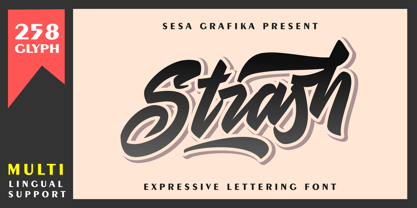 Strash is is designed with a natural expressive handwriting style. This font is perfect for Logo Branding, tshirt design, posters and so much more! Remember that the font is PUA encoded, meaning you can access all delightful glyphs and swashes effortlessly.
 - Autumn Ceria by AEN Creative Studio,
$16.00 Autumn Ceria is a simple and adaptable handlettered font. This font is PUA encoded which means you can access all glyphs and swashes with ease! Add it confidently to your favorite creations and let yourself be amazed by the outcome generated.
 - Akakios by Nantia.co,
$12.00 Akakios uppercase font is an adorable hand-made typeface with a lot of charisma. From “hand-written” quotes to product packaging, merchandise, and branding projects, this font is so versatile that it can cover them all. Greek character set included.
 - Thanks Lovely by Yoga Letter,
$15.00 "Thanks Lovely" is a modern handwritten font, featuring a decorated heart on each character. It's perfect for Valentine's Day, Christmas, Thanksgiving, weddings, invitations and more. This font is PUA coded which means you can find all glyphs and glyphs easily!
 - The Glory by FunType,
$14.00 The Glory is a sans serif font designed by Funtype in 2023. The Glory is made to fit for various reading purposes. The Glory is fit for non-industrial themes, yet it can also be used for various designed needs.
 - Unholy by Natural Ink,
$12.00 Unholy Script is a modern calligraphy design, including Regular. This font is casual and beautiful with swash. Can be used for various purposes. such as logos, product packaging, wedding invitations, branding, headlines, signage, labels, signatures, book covers, posters, quotes, and more.
 - Tramuntana Dingbats by Vanarchiv,
$12.00 Tramuntana Dingbats is a selection of different graphic elements (Box Terminals, Box Extensions and Arrows) designed to work as a complement of the main typeface Tramuntana Pro. Tramuntana Dingbats can also be used with other typefaces as a decorative graphic resource.
 - PR Swirlies 08 by PR Fonts,
$10.80 This font is a collection of simple calligraphic ornaments suitable for invitations, gift tags, and anything that can benifit from a "spoonful of sugar" visually. This font includes fewer line fillers, and more "ferns and fans" than our previous swirlies.
 - Mallorga by Top Type,
$11.00 Mallorga is a serif typeface. It has an elegant and modern character by adjusting design developments. Mallorga is made to complete your best work. You can use this font to create wedding invitations, logos, advertisements, web, covers, clothing, banners and more.
 - Halloween Festival by AEN Creative Studio,
$15.00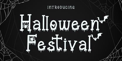 Halloween Festival is a cool-lettered and spooky display font. It is perfectly suitable for any Halloween-related project or crafty idea! Halloween Festival is PUA encoded which means you can access all of the glyphs and swashes with ease!
 - Mantilda by Letterena Studios,
$9.00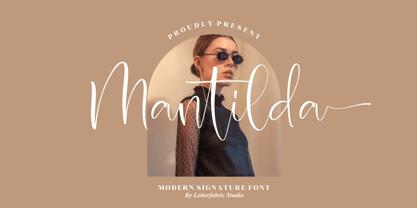 Mantilda is a stylish, refined script font that emanates sophistication and elegance. Its stylish alternates and ligatures make this font the perfect match for any project. Mantilda is PUA encoded which means you can access all glyphs and swashes with ease!
 - Silk Display by Luhop Creative,
$18.00 Silk Display is a serif retro and bold display font. This font is PUA encoded which means you can access all of the glyphs and alternates with ease! It would look great on headlines, magazines, logos, branding and so much more!
 - Paletone by Bale Type,
$15.00 Paletone is hand lettered sans in two style, Regular & Bold. With the organic and handmade feels, you can use this font for any project. This minimalist font also suitable for the project with earth tone color. Also good for quotes.
 - Rogicha by Wildan Type,
$13.00 Rogicha is A modern stackable display font. The way you can uniquely stack different parts of this font makes it super fun to work! Perfect for all purposes. You make more creation design with opentype feature. so, Enjoy this font.
 - Brogado JNL by Jeff Levine,
$29.00Make room for Brogado JNL! This bold, yet squat slab serif font takes command when set into headlines. Although not thoroughly in the Western mold, Brogado JNL can still exude enough macho appeal to make its point strongly, yet clearly. - Ratfern by Muksal Creatives,
$10.00 Raftern is a unique and modern family of Sans serif fonts. Simply Conception has 10 families Regular font, starting from the small thin to the largest Heavy. This typeface is versatile and can be used successfully in magazines, posters, branding, websites.
 - Tuesday Spirit by SSI.Scraps,
$24.00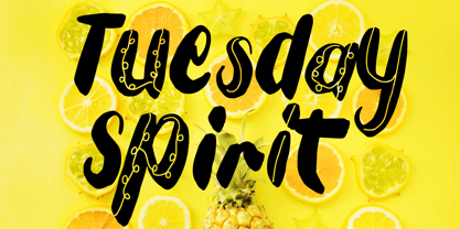 Tuesday Spirit is a unique and fun display font. It will add a charming touch to your upcoming summer crafting projects. This font is PUA encoded which means you can access all of the cute ethnic alternate glyphs with ease!
 - Ft Thyson by Fateh.Lab,
$30.00 FT Thyson is a powerful and elegant display typeface. can be used to present your ideas in sports/fitness or editorials, Its weight is superior in posters, social media, headlines, titles, large format print - and wherever you want to be noticed.
 - Arroyo by Gajana Aslanjan,
$45.00 Arroyo is based on water flow. Little creeks on the surface of the earth formed by the action of fast-flowing water, this phenomenon inspired me to create this font. The little gaps/creeks form the letters of the font.
 - Hola Delight by Jafar07,
$15.00 Hola Delight serif font was a very unique retro style-obsessed in the past, but now we are giving this font a unique touch by providing 100+ alternative characters, which can be combined at your command for your best designs.
 - Regisa by Haniefart,
$17.00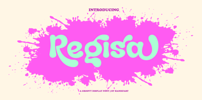 Regisa is a handcrafted typeface, inspired by water drops, coming in uppercase, lowercase, ligature and alternate. You can really make Regisa feel personalized for your client's project. Regisa is suitable for business brands, magazines, comics, T-shirts, banners and many others.
 - Cinio Text by TeGeType,
$29.00 The new Cinio Text type family is a version of Cinio that can be used on screen and for text composition. The rounded corners of the glyph design increase its legibility in small size and on supports with a low resolution.
 - Autospec by Device,
$29.00 Designed as a companion to Autofont, this dingbat set was originally developed for What Car? magazine, the UK’s leading automotive consumer title. Use in charts and reviews to indicate metallic paint, shatterproof glass, number of airbags, manual or auto sunroof, etc.
 - Skelett Antiken NF by Nick's Fonts,
$10.00 You can pack a lot of letters into a single line with this face, originally released as Clarendon XX Condensed in 1859. Both versions of this font support the Latin 1262, Central European 1250, Turkish 1254 and Baltic 1257 codepages.
 - Katydid JNL by Jeff Levine,
$29.00 Vintage sheet music for a song from the Broadway Musical “Kiss Me Kate” is the inspiration for Katydid JNL. The play’s name was written in a ball-and-line type of lettering which somewhat resembles either 'Tinker Toys' or celestial mapping.
