10,000 search results
(0.032 seconds)
- Fonseca by Nasir Udin,
$10.00 Fonseca is a modern sans serif inspired by art deco and typography poster in early 20th century. The key of this all-caps family is simple straight geometric forms and modernized letterforms. This display family is perfect for headlines, posters, logos, branding projects, magazines, and packaging. The modernized retro-look makes this family great to presents any contents related to travel, history & culture in the present/modern way.
 - Kneebls by Ingrimayne Type,
$9.95 Kneebls was inspired by Art Deco lettering. It is monoline and all caps, with most of the letters on the lower-case keys different from those on the upper-case keys. It comes in three weights: thin, regular, and bold. There is also a distorted, wavy version, KneeblsRuffled, and a shadowed version. The shadowed-inside style is designed to be used in a layer with the shadowed style.
 - Lansere by omtype,
$37.00 Lansere is an art-deco typeface inspired by lettering of Russian graphic artist, painter and sculptor Evgeniy Lansere (1875–1946). A strongly geometric lettering style of his late book covers and an elegance of early ones has been combined in a modern typeface . This all-caps font has two versions for each letter and more than 60 discretionary ligatures (both Latin and Cyrillic). The initial graphic idea by Denis Bashev.
 - Black Home by Linecreative,
$14.00 Black Home Inspiring from vintage playful style typography. This font is perfect for a design that makes it more attractive and playful. made with a very good level of aesthetics making this font suitable for book cover, poster, packging, merchandise, logotype and much more. What you get dear, you will get : Black Home- including Upper & Lowercase characters(ALL CAPS), Numbers and Punctuation Supports Multi linguage (Latin Western Europe)
 - Regan Alt by The Northern Block,
$32.00 An informal sans serif typeface carefully cut from the template of Regan and Regan Slab. Smooth curves are combined with simple angles to form a modern, legible font with a charming personality. Regan Alt is ideally suited to wide range of applications including advertising, fashion, retail and the web. Details include 10 weights with italics, 540 characters, 5 variations of numerals, small caps, stylistic alternatives, manually edited kerning and Opentype features.
 - Captura Now Core Edition by TypeThis!Studio,
$50.00 Carefully refined shapes and sensitively balanced spacing and kerning create the gentle rythm that grants Captura its warm-hearted face, perfect in form and shape. www.typethis.studio This version covers all the essentials of Captura 265 Characters 8 Styles, including Italics Western European Language Support Numbers Symbols Punctuation If you need more features like small caps, special symbols, Cyrillic or Vietnamese language support, you may review the expert version of CapturaNow.
 - PiS Koernig by PiS,
$38.00 PiS Koernig is inspired by handwritten alphabets from Max Körner's book „Das Neue Schriftenbuch“ from 1949 featuring bold and decorative display type for use in sign painting and advertising. It features clean and readable glyphs as well as quirky deco alternate letters in Max Körner's original style to add some 1950ies flavour to your projects. Be sure to use E and F caps + alternates for some labyrinth-esque patterns!
 - Boo Boo Kitty by Lauren Ashpole,
$15.00 Boo Boo Kitty is a blocky font with a halftone style gradient texture. One of the big inspirations for this font was retro comic printing so I tried to keep the background slightly messy to capture that look. It was originally released in 1997 as an all-caps font with mixed plain and textured characters but was recently updated it to include lowercase letters and full versions of both background options.
 - Molecula by Northeast Type Foundry,
$22.99 Molecula is grotesque sans serif of slightly condensed proportions and humanist-grotesk features. The family features 9 weights from Thin to Black, each of which has an italic. The character set is robust, covering extended latin. All completely equipped with opentype features, alternative glyphs, fractions, lining numbers, small caps, subscript and superscript. Molecula has been designed for advertising, branding, packaging or anywhere a clean and contemporary voice is needed.
 - Graffick by Graffiti Fonts,
$12.99 Graffick is a mechanical style created by merging a little traditional type design & typography with a little basic graffiti lettering theory. Extra ascenders and descenders have been added to many of the capital letters to add a more varied & specialized appearance. This layered type system provides for the easy creation of outline/fill effects with regular, italic, wide and outline styles as well as baseline & caps-height alignment options.
 - Logx 20 by Fontsphere,
$12.00 LOGX-20 is a geometric, all-caps display typeface. This is the brother of the LOGX-10 font. It obviously refers to the previous one, but considering the construction it is a different typeface. LOGX-20 is designed to create elements of visual identification, various creative projects and outstanding graphics. It looks great in arrangements with different text sizes, headers, sentences and longer texts. Both on websites, print or applications.
 - Firelli by Typejockeys,
$60.00 Firelli is an original family of 14 styles including 7 weights and Italics. Delighting from thin to black, Italic swash caps, ligatures, and neat alternate characters. Big headlines will love Firelli’s incorruptible details. Longer texts will benefit from a wide-ranging family with its solid posture. Go, use everything Firelli has to offer, to design your contentful magazines, powerful annual reports, or even bedtime stories and fairy tales.
 - Rowboat by Atlantic Fonts,
$26.00 Rowboat is delightful and dependable. Turn on discretionary ligatures and you will find a salty set of interlocking and double letter combinations. Access interlocking ligatures using all caps. Rowboat Pictures contains 26 original Amy Dietrich seaside illustrations from charming ocean animals to nifty nautical gear.... Go ahead and make a splash! Posters feature images from Atlantic Fonts picture fonts including Eeeek Images , Trailmap Pictures, and of course Rowboat Pictures!
 - Slob Dough by Salamahtype,
$15.00 Introducing “SLOB DOUGH” is a super bold typeface that is very suitable for use with various print and digital media, with its thickness capable of attracting attention when used as a headline or logo. SLOB DOUGH also comes with a textured version which is your choice for project design needs that are classic or vintage in style. Features: Uppercase – All caps Rounded & textured version Symbol and punctuation Multilingual support
 - Krydderi by PizzaDude.dk,
$15.00 A touch of spice is often what makes a good meal even better. In Danish, spice is called "krydderi" I chose that particular name for this font because it is the kind of brush font that most likely could spice up your next design. I've added 6 different versions of each letter, and they automatically cycle as you type, leaving the result like authentic brush written text. All Caps Fonts.
 - Phantom Gas by Hatftype,
$17.00 Is a spooky comic display font with all caps format and distinctive handwritten characters perfect for branding projects, logos, wedding designs, media posts, advertisements, product packaging, product designs, labels, photography, watermarks, invitations, stationery, and any project who need handwritten dishes. Features : Uppercase & Lowercase Multilingual support Number Symbol Punctuation Support in Mac and Windows OS -Support in design applications (photoshop, illustrator, and more) I really hope you enjoy it.
 - Quintus by JOEBOB graphics,
$22.00 This font is an adaptation of the typeface I designed for TJX Europe, which was used in their branding campaigns for the TK MAXX stores all over Europe. Most characters were given a major facelift and also a few extra ligatures were added in the process. Quintus comes with a regular and a bold version so it offers more variety in use. It also works well in all caps.
 - Summer Square by Attype Studio,
$10.00 Summer Square is vintage all caps font with 2 styles clean & rough. Summer Square is a strong font, this font is perfect for branding, logo, invitation, stationery, social media post, product packaging, merchandise, blog design, game titles, retro style design, Book/Cover Title and more. This font features Multilingual Support (Afrikaans, Albanian, Catalan, Danish, Dutch, English, Estonian, Finnish, French, German, Icelandic, Italian, Norwegian, Portugese, Spanisch, Swedish, Zulu) and includes 62 ligatures.
 - 1906 Titrage by GLC,
$38.00 We have created this family as a complement to 1906 French News since the two type families were commonly in use in the same publications, including newspapers, popular books, calendars, almanacs and posters. This font, as its name suggests, was mainly used for titlings and subtitles. Small caps, included in the single file of the TTF and OTF versions, are added as a separate file in the MacTT version.
 - Blankone by Arterfak Project,
$16.00 Blankone is a solid freestyle brush font, created with expressive brush strokes, keeping the flows to gives the energetic effect, and get an eye-catchy combination between the uppercase and small caps, also complete with swashes Blankone is perfect for many themes such as urban, thriller, sporty, horror, psychedelic, vibrant, and youth taste! Good choice to use this font for Logo, Merchandise, Brand imagery, Apparel, Packaging, Simple quotes, and many more!
 - Tinman Pro by No Bodoni,
$35.00 TinmanPro is a mildly stressed humanist sans serif type based on the University of California Oldstyle type designed by Frederick Goudy. The design captures the warmth and friendly character of Goudy�s original in a monotone sans. Broad Latin support along with small caps, fraction support and other typographic niceties are included in the ten font family. Weight range includes Regular, Medium, DemiBold, Bold and ExtraBold with matching italics for each.
 - Luckiest Guy Pro by Stiggy & Sands,
$29.00 Our Luckiest Guy Pro was inspired by hand-lettering by vintage 1950’s advertisements. The uber-bold unicase letterforms exude charm and light-heartedness, while the SmallCaps and extensive figure sets expand the range of usability and appeal. Opentype features include: - SmallCaps. - Full set of Inferiors and Superiors for limitless fractions. - Tabular, Proportional, and Oldstyle figure sets (along with SmallCaps versions of the figures). - Stylistic Alternates for Caps to SmallCaps conversion.
 - VeraCruz BT by Bitstream,
$50.99Introducing VeraCruz BT, a fanciful display typeface by Ray Cruz. A tasteful, flair serif design, VeraCruz BT is available as an OpenType font. By selecting the Contextual Alternates feature in OT savvy applications, many of the cap and lowercase characters will change automatically as you type to give the text an informal, animated look. There are also tabular and proportional figure sets, and the extended glyph set supports Central Europe. - Trigar by Maulana Creative,
$13.00 Trigar is an all caps font. With 2 style stroke, fun character. To give you an extra creative work. Trigar font support multilingual more than 100+ language. This font is good for logo design, Social media, Movie Titles, Books Titles, a short text even a long text letter and good for your secondary text font with script or handwriting. Make a stunning work with Trigar font. Cheers, Maulana Creative
 - Neue Northwest by Kaligra.co,
$19.00 Neue Northwest is a vintage sans serif family, Inspired by Vintage Wild west culture and combining with modern vintage touch. An All-Caps Sans Serif pairing with a Clean, Rounded & textured version of each. Choose between varying texture strength for your desired effect. This font is great for logo print, Restaurant Menus & Signage, Pubs, Bars, Tattoo Shops, Barber Shops, Butcher Shops, Handmade Brands, BBQ, Anything vintage styles related, etc
 - Bogen by Linecreative,
$16.00 Bogen - Bold italic font with sharp angles for dynamic effects. Use ligature characters to give you unlimited designs, this font is great for your work such as posters, logos, branding, covers, banners, t-shirts and headers, or even large-scale artwork Bogen , offers you: Bogen -italic bold font including Upper & Lowercase characters(ALL CAPS has a different form characte), Ligatures Character Supports Multi linguage (Latin Western Europe), Numbers and Punctuation
 - Laugh Together by Invasi Studio,
$19.00 Laugh Together is a dynamic display font inspired by urban streetwear culture and the vibrant world of brush paint tagging graffiti. With its bold and expressive style, Laugh Together makes a fun and bold statement in any design. This all-caps font features a complete set of A-Z alternates, allowing you to experiment and create unique combinations. Additionally, Laugh Together supports multilingual characters, making it versatile for various language requirements.
 - Cogenta Text by SRS Type,
$25.00 Cogenta Text is a geometric sans-serif typefaces. It showcases reduced contrast and a more neutral appearance compared to the lowercase joint of Cogenta. Its low cap height makes it an ideal choice for mobile and web applications. Precise kerning enhances readability, ensuring a satisfying user experience. Cogenta Text effortlessly complements diverse design applications, including logos, branding, posters, editorial design, websites, and more, consistently delivering exceptional quality results.
 - Brushine Collection by Trustha,
$17.00 Brushine Collection is a solid and complementary pair consisting of a serif all caps, with contrasting letter thickness and sharp edges making it more elegant and classy. As well as a handwritten script that look natural because they are made with marker by hand. All together your text will be beautiful, elegant and classy. Suitable for all creative projects, especially on, branding, advertising, product design, social media, and more.
 - Bowling Script by Sudtipos,
$69.00 There is plenty of lyric and literature about looking over one's shoulder in contemplation. What would you have done differently if you knew then what you know now? This is the kind of question that comes out of nowhere. When it does and whether its context is personal or professional make very little difference. It's a question that can cause emotions to rise and passions to run hot. It can trigger priority shifts and identity crises. It's never easy to answer. Three years ago, I published a font called Semilla. My aim with that was to distill the work of Bentele, a lettering artist from early 1950s Germany. Picking such an obscure figure back then was my way of pondering the meaning and efficiency of objectivity in a world where real human events and existences are inevitably filtered through decades of unavoidably subjective written, printed and oral history. And maybe to pat myself on the back for surviving surprises mild and pleasant. Having been fortunate enough to follow my professional whims for quite some time now, I took another, longer look at my idea of distilling Bentele's work again. I suppose the concepts of established history and objectivity can become quite malleable when personal experience is added to the mix. I say that because there I was, three years later, second-guessing myself and opining that Bentele's work can be distilled differently, in a manner more suited to current cultural angles. So I embarked on that mission, and Bowling Script is the result. I realize that it's difficult to reconcile this soft and happy calligraphic outcome with the introspection I've blathered about so far, but it is what is. I guess even self-created first world problems need to be resolved somehow, and the resolution can happen in mysterious ways. Bowling Script is what people who like my work would expect from me. It's yet another script loaded with all kinds of alternation, swashing and over-the-top stuff. All of that is in here. These days I think I just do all that stuff without even blinking. But there are two additional twists. The more noticeable one is ornamental: The stroke endings in the main font are of the typical sharp and curly variety found in sign painting, while the other font complements that with ball endings, sometimes with an added-on-afterwards impression rather than an extension of the actual stroke. In the philosophical terms I was mumbling earlier, this is the equivalent of alternate realities in a world of historical reduxes that by their very nature can never properly translate original fact. The second twist has to do with the disruption of angular rhythm in calligraphic alphabets. Of course, this is the kind of lettering where the very concept of rhythm can be quite flexible, but it still counts for something, and experimenting with angular white space in a project of a very dense footprint was irresistible. After playing for a bit, I decided that it would interesting to include the option of using optically back-slanted forms in the fonts. Most scripts out there, including mine, have a rhythm sonically comparable to four-to-the-floor club beats. So the weirdly angled stuff here is your chance to do the occasional drumroll. Everyone knows we need one of those sometimes. Bowling Script and Bowling Script Balls fonts comes with 1600 characters and features extended Latin-based language support. There are also a basic version of both fonts without all the alternates and extra OpenType features. Bowling family ships in cross-platform OpenType format. We also want to present “Mute”, a visual essay narated by Tomás García and Valentín Muro, about digital life created specially to introduce Bowling Script.
 - Treasury Pro by Canada Type,
$79.95 The Treasury script waited over 130 years to be digitized, and the Canada Type crew is very proud to have done the honors. And then some. After seven months of meticulous work on some of the most fascinating letter forms ever made, we can easily say that Treasury is the most ambitious, educational and enjoyable type journey we've embarked upon, and we're certain you will be quite happy with the results. Treasury goes beyond being a mere revival of a typeface. Though the original Treasury script is quite breathtaking in its own right, we decided to bring it into the computer age with much more style and functionality than just another lost script becoming digital. The Treasury System is an intuitive set of fonts that takes advantage of the most commonly used feature of today's design software: Layering. Please do help yourself to the PDF and images in the MyFonts gallery for a quick look at the some of the limitless possibilities Treasury has to offer, from simple attractive elegance expressed in the main script, all the way into mysteriously magnificent calligraphic plates. To date in digital type history, this is the most comprehensive and versatile work of its kind. Every designer loves many options to experiment. Experimentation has never been as much fun and productive as it is with Treasury. If you're "compudling" your initial ideas for a layout, or you're just an alphabet fan who loves spending time with letters, working with Treasury is very inspiring and fulfilling. Some of Treasury's features are: - No more endless searching for initial caps that fit your project. The Treasury System lets you build your own initial caps, in any combination of colors, fills, linings or dimensions you like, with a few simple clicks of the mouse. - With two base styles and nine layer fonts, the Treasury System set helps you produce endless possibilities of alternation and variation in dimension, color, and calligraphic combinations to fit your layout's exact needs, down to the very last detail. - 12 pre-combined Treasury fonts are also there to help and inspire layout artists who love shortcuts and don't want to fiddle with too many layers in their layout. Available in small packages on their own, or as part of the complete Treasury package, these 12 fonts can start you up on your way to discovering the perfect fit for your layout. - Every single letter in the Treasury System comes with at least one alternative. Some characters have even three or four alternates. Although the main character set is an authentic rendition of Ihlenburg's 1874 classic, we made sure to include a treasure trove of alternates for maximum usability. - The most gorgeous set of numerals we have seen in a long, long time. The Treasury numbers are what really turned us onto this project in the first place. - Treasury Pro, the incredibly sophisticated OpenType version, combines the complete Treasury System into a single font, programmed for compatibility with Adobe's latest CS and CS2 software programs. Over 2000 characters in one font, for thousands of possibilities. Setting the ideal elegant wordmark, logotype, intitial cap, or headline, no matter how simple or complex, is as easy as taking a minute or two to push a few buttons in Illustrator, Photoshop, or InDesign. We can go on endlessly about the beauty and functionality of this Treasury set, but we really cannot do it justice with words. So try Treasury for yourself and see the amazing possibilities of fun and creativity it has. It can be used pretty much anywhere - signs, book covers, certificates, music inserts, movie posters, greeting cards, invitations, etc. Much thanks are due to the generous and considerable help Canada Type received from the Harvard Library in Boston, Klingspor Museum in Frankfurt, and many type hobbyists and researchers in Canada, England, Germany, the Netherlands, and the United States. Without them it would was near-impossible to track down the lost history of Hermann Ihlenburg, the most prolific German/American type designer and punch cutter of the 19th century. We hope Mr. Ihlenburg is proudly smiling down on us from type designer heaven.
 - Comic Tantrum by David Engelby Foundry,
$25.00 Comic Tantrum is a versatile font – you can use it for headline posters, for infographics, for web pages or other media, when you need an expressive comic font. And you can skew it and squeeze it. It also has many special designed alternates, swash versions and ligatures. Have fun!
 - Beary by Balevgraph Studio,
$15.00 Beary is a stylish and modern sans serif font. You can use this font in a variety of projects to create a unique and distinctive look. The Beary font can be used anywhere without the need for opentype support. Beary fonts are available in regular, alternate, and oblique.
 - New Moon by Melissa Lapadula,
$14.95This font has been derived from different transformations of the moon transcending into different moods which affect the world. A full moon can cause human beings to be aggressive. While a new moon is a good time for new beginnings. This font can function as headings and subheadings. - Qilla by Herlan Nawwi,
$10.00 Qilla is a simple and elegant font for your projects. Can be used for various purposes such as headings, logos, wedding invitation, t-shirt, letterhead, signage, labels, posters, badges etc. Qilla comes with two styles, upright and slanted version can be an alternative choice to suit your needs.
 - Aryaka by Letterafandi Studio,
$14.00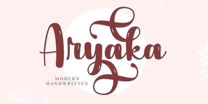 Aryaka is a modern handwritten font. It can be used for various purposes such as logos, wedding invitations, headings, t-shirts, letterhead, signage, labels, news, posters, badges and so much more. Aryaka is PUA encoded which means you can access all of the glyphs and swashes with ease!
 - Comfort by Jehansyah,
$9.00 short and bold font, cute and looks professional and a nuanced logo font that you can customize with the elegant look you want there are several alternatives that you can use and combine, and there are italics to make it easier for you to work on your design project
 - MOORA LIGHT by Top Type,
$9.00 Moora Light feels playfully nostalgic and delivers an incredible vintage aesthetic. Use this serif font to add that special retro stylish touch to any design idea you can think of! This font is PUA encoded which means you can access all of the amazing glyphs and ligatures with ease!
 - Bogitha by Letterafandi Studio,
$14.00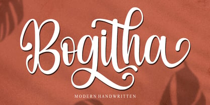 Bogitha is a modern handwritten font. It can be used for various purposes such as logos, wedding invitations, headings, t-shirts, letterhead, signage, labels, news, posters, badges and so much more. Bogitha is PUA encoded which means you can access all of the glyphs and swashes with ease!
 - Wulf Utility by Device,
$29.00 Wulf Utility is a heavily degraded font that evokes information in a utilitarian manner without any pretence to elegance, fuss or refinement. Gruff and direct, it is about as basic as a font can be. The Dirty version can be layered over the Rough version for two-tone effects.