10,000 search results
(0.048 seconds)
- Just Deine by URW Type Foundry,
$39.99 The idea was to create a fully equipped handwriting script. Thus equipped with all kinds of typographic features like for example true small caps, lots of special characters, different sets of figures, real underlining, all characters as sub- and subscripts, the cap variations, OpenType-features for controlled character string modulations ... In a nutshell: a fully equipped handwriting script.
 - Hanalei Pro by Stiggy & Sands,
$29.00 For the Polynesian Fan Inspired by the bamboo lettering of the iconic Mai Kai restaurant logo, Hanalei Pro has all the flavor of the genre without compromise. Great for titling and larger typesetting, and the added true SmallCaps & Lining/Tabular figures and limitless fractions give more range of use. The Hanalei Pro family contains 628 characters per font.
 - Gravura by ITC,
$29.99 Noted British designer Phill Grimshaw designed Gravura in 1995. Gravura is a classic copperplate script with perfect strokes and proportions. The intricacy of its initial capitals blend beautifully with the simple elegance of its lowercase, whose letters have been designed to link together in the style of true handwriting. Text set in Gravura feels very personalized.
 - Brighting Lovelyta by Letterena Studios,
$9.00 Brighting Lovelyta is a magical script font carefully created with a touch of elegance. Whether you’re looking for fonts for Instagram or calligraphy scripts for DIY projects, this font will turn any creative idea into a true piece of art! This font is PUA encoded which means you can access all of the glyphs and swashes with ease!
 - Caslon #540 by ITC,
$29.00The Englishman William Caslon punchcut many roman, italic, and non-Latin typefaces from 1720 until his death in 1766. At that time most types were being imported to England from Dutch sources, so Caslon was influenced by the characteristics of Dutch types. He did, however, achieve a level of craft that enabled his recognition as the first great English punchcutter. Caslon's roman became so popular that it was known as the script of kings, although on the other side of the political spectrum (and the ocean), the Americans used it for their Declaration of Independence in 1776. The original Caslon specimen sheets and punches have long provided a fertile source for the range of types bearing his name. Identifying characteristics of most Caslons include a cap A with a scooped-out apex; a cap C with two full serifs; and in the italic, a swashed lowercase v and w. Caslon's types have achieved legendary status among printers and typographers, and are considered safe, solid, and dependable. A few of the many interpretations from the early twentieth century were true to the source, as well as strong enough to last into the digital era. These include two from the American Type Founders Company, Caslon 540 and the slightly heavier Caslon #3. Both fonts are relatively wide, and come complete with small caps, Old style Figures, and italics. Caslon Open Face first appeared in 1915 from the Barnhart Bros & Spindler Foundry, and is not anything like the true Caslon types despite the name. It is intended exclusively for titles, headlines and initials, and looks elegant whether used with the more authentic Caslon types or by itself. - Disruptor's Script by Piñata,
$15.00 Disruptor's Script is the alter ego of our previous project Gentlemen's Script. Unlike the Gentlemen's Script, the new font is an elegant rebel and defies traditions. The font is painted with a brush pen, which is especially noticeable in the characteristic shabbiness and different thicknesses of the strokes. While the Gentlemen's Script is an embodiment of a classic costume, dress shoes and an expensive watch, Disruptor's Script is a fashionable suit, sneakers, an iWatch and a tattoo that peeks from under the shirt. The font retained the incline, speed and overall sense of dynamics inherent in Gentlemen's Script, but got a bit more chaotic and unpredictable. This is especially noticeable in the newly added shabbiness, elongated extenders, a large number of contextual alternates and different ligatures. For some high-frequency letters (10 for the Latin alphabet and 10 for the Cyrillic alphabet), we painted alternative versions that are substituted in the word instead of the standard characters when following our preceding certain groups of letters. In addition, in the Disruptor's Script you can find functional ligatures, including some of the frequently occurring two- and three-letter combinations. All these solutions dilute the monotonous line of the set, add a bit of unpredictability to the font and a touch of chaos to inscriptions. To fully enjoy usage of the font, we recommend that you always keep the features contextual alternates (calt) and standard ligatures (liga) turned on. If you do not have access to applications that support OpenType features, it does not matter—even without these features you can use and enjoy our font!
 - Bilestone by Fortunes Co,
$16.00 Bilestone inspired from vintage baseball, sign painting, and labeling, is suitable for logos, product names packages, labels, old fashioned coffee shops, bars and everything with specific characteristics of past times. Bilestone is a great combination to create something good and with a vintage feel.
 - Delabasto by Seniors Studio,
$15.00 Delabasto is contemporary brush font, with the look of a stylish face. were painted on paper and carefully made into a font. can be used for stationery, fashion, logo, merchandise, books, clothing, magazines, cover artwork etc. Delabasto includes several ligatures, alternates and international support.
 - Posterizer KG Sketch by Posterizer KG,
$30.00 Posterizer KG Sketch is basically a drawn version of Egyptian Slab Serif font Posterizer KG. Posterizer KG Sketch, is useful for some themes like music, painting, party, food, nature, kids... and many other funny and creative things. Contains all the Latin and Cyrillic glyphs.
 - Ultra Break by Lumiks Design,
$15.00 Ultra Break is a handwritten all-caps font with condensed proportions and dynamic feeling, with a lot of ligatures available. The uppercase has the main letters and the lowercase has alternate letters. It is great for display, branding, packaging, advertising, sports, titles, posters, and more!
 - Fibula by Hurufatfont,
$19.00 "Fibula" has a surprising and lively effect? The design is based on the form of a safety-pin. Fibula display font offers designers creative alternatives to create brands, packaging and titles.
 - Beware The Neighbors by Intellecta Design,
$23.90 Beware The Neighbors is based on “Personality Script”, a rough alphabet originally drawn by Ross F. George, and published in one of the Speedball series of lettering catalogs that ran from 1935 to 1948. The design is something of a minor classic, and several foundries have recreated digital fonts based on it. However, mostly of these interpretations are very “geometric”, formed using straight lines. Intellecta preferred to create a new interpretation using smoother, curved lines to create a creepy appearance. Also included are several ligatures and OpenType stylistic alternates. This version also has an extended character set for use in Central as well as and West European countries, plus Baltic, Turkish and Romanian. Check out Intellecta’s Clarvoyant for another creepy experience based on lettering from old Speedball catalogs. CLOSE THE DOORS AND WINDOWS AND BEWARE OF YOUR NEIGHBORS!
 - Le Rock by URW Type Foundry,
$39.99 Le rock is the newborn sister of my first typeface Jazmo and a relative of my music-inspired font family. Le Rock seems to wiggle and jiggle a little as if it invites you to dance. This is caused by the gaps in the individual characters. The typeface can also be seen as eroded, carved and sculpted by mother nature. But besides, the design of Le Rock can also be associated with the characteristics of stones: Solid and since ever, here, there and everywhere. To walk on, lean against, to be surrounded by, to build with and to shelter in. It cannot be denied, that there are also some comic art influences. The font is outspoken enough to be used in any form of graphic design, like poster and flyers, but at the same time it remains readable enough for longer texts.
 - Revx by OneSevenPointFive,
$5.00 • Excellent choice for Logo designing, Main body text, Headings, Titles, etc. • Rounded corners for calm yet attractive typeface.
 - Fujitora by Forberas Club,
$16.00 Fujitora is a fun and whimsical paint brushed display font. This font is perfect for abstract themed designs.
 - KG Broken Vessels Sketch by Kimberly Geswein,
$5.00 A hand-sketched sans serif sketch font. For a solid version, pair this with KG Second Chances Solid.
 - Cags Hetonal by Imoodev,
$20.00 Cags Hetonal is a rounded sans serif font with visual elegance, smooth curves, and beautiful ligatures clear, making your work look true and attractive. A very versatile font that works in both large and small sizes. This font is suitable for a wide variety of projects such as invitations, logos, branding, magazine, photography, card, product packaging, mugs, quotes, poster, labels, signatures, and more. A font that is perfect for all business sectors including personal projects, studio, corporate, creative agency, industrial, company, etc.
 - Akoher by Imoodev,
$20.00 Akoher is a vintage display font with visual elegance, smooth curves, and beautiful ligatures clear, making your work look true and attractive. A very versatile font that works in both large and small sizes. This font is suitable for a wide variety of projects such as invitations, logos, branding, magazine, photography, card, product packaging, mugs, quotes, poster, labels, signatures, and more. A font that is perfect for all business sectors including personal projects, studio, corporate, creative agency, industrial, company, etc.
 - Anes Ramuk by Imoodev,
$20.00 Anes Ramuk is modern typography fonts with visual elegance, smooth curves, and beautiful ligatures clear, making your work look true and attractive. A very versatile font that works in both large and small sizes. This font is suitable for a wide variety of projects such as invitations, logos, branding, magazine, photography, card, product packaging, mugs, quotes, poster, labels, signatures, and more. A font that is perfect for all business sectors including personal projects, studio, corporate, creative agency, industrial, company, etc.
 - Kods Hulling by Imoodev,
$20.00 Kod's hulling is rounded sans serif with visual elegance, smooth curves, and beautiful ligatures clear, making your work look true and attractive. A very versatile font that works in both large and small sizes. This font is suitable for a wide variety of projects such as invitations, logos, branding, magazine, photography, card, product packaging, mugs, quotes, poster, labels, signatures, and more. A font that is perfect for all business sectors including personal projects, studio, corporate, creative agency, industrial, company, etc.
 - Diegolk by Imoodev,
$20.00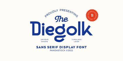 Diegolk is a sans serif fonts with visual elegance, smooth curves, and beautiful ligatures clear, making your work look true and attractive. A very versatile font that works in both large and small sizes. This font is suitable for a wide variety of projects such as invitations, logos, branding, magazine, photography, card, product packaging, mugs, quotes, poster, labels, signatures and more. A font that is perfect for all business sectors including personal projects, studio, corporate, creative agency, industrial, company, etc.
 - Cemains by Imoodev,
$20.00 Cemains is a modern sans serif typeface with visual elegance, smooth curves, and beautiful ligatures clear, making your work look true and attractive. A very versatile font that works in both large and small sizes. This font is suitable for a wide variety of projects such as invitations, logos, branding, magazine, photography, card, product packaging, mugs, quotes, poster, labels, signatures, and more. A font that is perfect for all business sectors including personal projects, studio, corporate, creative agency, industrial, company, etc.
 - Kine Lariwa by Imoodev,
$20.00 Kine Lariwa is a soft serif font with visual elegance, smooth curves, and beautiful ligatures clear, making your work look true and attractive. A versatile font that works in both large and small sizes. This font is suitable for a wide variety of projects such as invitations, logos, branding, magazine, photography, card, product packaging, mugs, quotes, poster, labels, signatures, and more. A font that is perfect for all business sectors including personal projects, studio, corporate, creative agency, industrial, company, etc.
 - Contingent Font Duo by Typehill Studio,
$10.00 Introducing Contingent Duo: An elegant serif typeface paired with a casual handwritten script. With its modern and minimal look, Harlow Font Duo brings a luxurious and clean style to websites, modern logos, branding identity, social media quotes, wedding stationery, and whatever your heart dreams up! The Serif includes two weights - regular and bold - and built in OpenType kerning features for a professional touch. Stylish modern font duo consisting of elegant and elegant script and serif fonts.
 - Badhorse by Angga Mahardika,
$15.00 I created this font in 2016 with the name “Burtons”, and now here I am turning it into “Badhorse”. If you’re looking for the perfect touch of vintage flair for a design project, Badhorse is an exceptional choice. Pairing a rustic serif with a decorative handwritten script, Badhorse offers two distinct type designs that complement one another beautifully. This font duo is effective on product packaging, particularly for wares that prefer a handcrafted, artisan approach to their finished presentation. Badhorse is ideal for strong branding, identity, and logo design, as its letter forms effortlessly express a tone of familiarity, reliability, and timelessness. Advertising spreads and menu layouts will also take advantage of this modern classic, conjuring a sense of nostalgia and comfort in the viewer. Badhorse offers stylistic alternates and ligatures through OpenType, as well as symbols, punctuation, and international characters for additional language support.
 - Letunical by Ingrimayne Type,
$9.95 Letuncial is a sans-serif typeface in which the shapes of the letters are derived from uncial, a writing style in the early medieval period. Like uncial, it has no true upper-case letters. Rather it has two sets of letters that are interchangeable. Fonts Letunical Inline Overlay-Middle and Letunical Inline Overlay Inside are designed to be layered with Letunical Inline to produce bicolored or tricolored letters and Letunical Shadow Inside is designed to layered with Letunical Shadow to produce bicolored letters.
 - SexyRexy - Unknown license

- Forest Hill by PeachCreme,
$20.00 Meet our brand new script font - Forest Hill! It is a modern casual font with a full set of easygoing letters, numerals, and punctuation. The main feature of this font is that the letters are not separated. Just look how all the letters connect one by one and form one whole piece of writing. Featuring fabulous beginning and ending lowercase swashes, Forest Hill was inspired by clean handwriting with a natural flow and works well for various designs from wedding stationery to Instagram quotes, modern logos, packaging, websites, and many more.
 - Stencil by Monotype,
$36.99Stencil™ was designed by Gerry Powell for American Type Founders in 1938. It's a faithful imitation of a stenciled alphabet, much like those used on boxes and crates, with rounded edges and thick main strokes. The font is composed of capital letters and figures; there is no lowercase. Use Stencil™ for graphic designs that call for a rough-and-ready look, a military look, or even to create real stencils for signs and marking boxes or luggage. Alexei Chekulaev made a Cyrillic version of Stencil™ in 1997. - Baisteach by Fontdation,
$15.00 Introducing Baisteach, our latest all-caps vintage serif. Inspired from early 1900's typography that often used in sign paintings, packaging labels, and advertisements. This typeface is made of sharp serifs, clean edges and strong form, give you a simple yet impactful feels. Suits best for headline, logo/logotype, and many more. If you're a fan of classic typography, make sure you add this font to your design toolbox. Last but not least, don't forget to activate its OpenType Feature to get the wider selection of letter combinations.
 - AlbertBetenbuch by Ingrimayne Type,
$14.95 The inspiration for AlbertBetenbuch came from a typeface drawn by Albert Dürer and an interpretation of that face in Arthur Baker’s Historic Calligraphic Alphabets (Dover, 1980). It is not a recreation of either. The characteristic common to AlbertBetenbuch and the faces inspiring it is the decorative zig-zag with the upper-case letters. In late 2018 the inside of the shadowed style was separated out. It looks very much like the plain face but its spacing matches the shadowed version. It can be layered with the shadowed version to easily create two-colored letters.
 - Lemoo by Locomotype,
$15.00 Lemoo is a family of fat fonts made with irregular shapes to make it more dynamic and unusual. This font will give the impression of solid, strong and prominent. Suitable for headlines, posters and messages that want to stand out. There are two styles in each variant: clean and press. You can mix and match the Lemoo font family to get different results. The ligature feature makes some pairs of letters more interesting on your headline and posters. Lemoo fonts are available in OTF and TTF format, also multilingual support.
 - Frio by Lamatas un Slazdi,
$28.00 Frio is a geometric monoline sans-serif typeface consisting of 15 styles: 5 weights and 3 widths plus italics. Clean, neutral and technical, Frio was inspired by the form of super ellipse and Eurostile by Aldo Novarese. The font contains stylistic and contextual alternates, ligatures, discretional ligatures for use in German, ornaments and other OpenType features. It supports all the European languages using Latin alphabets. The main thing that sets it apart from the other typefaces is a possibility of using simple typing combined with stylistic sets to add colored backgrounds to numerals.
 - Typist Slab Prop by VanderKeur,
$25.00 The Typist SlabSerif is part of a big family, the Typist Family. The family consists of a monospaced, a SlabSerif and a SansSerif version. The idea behind this family originated from the research into the design of typewriter typestyles, which is also the reason why the monospaced version was released first. Since it was decided from the start to make a SlabSerif and a SansSerif version of these monospaced fonts, it was also a logical consequence that the proportional variants also became available in these versions. The monospaced SansSerif fonts have been given the name 'Code' since they are designed to be used while writing code for a software program, for example. The proportional variants with each 6 weights of the Typist Slab Serif and Code (SansSerif) are now available. Although the name may seem a bit strange, it is a logical consequence from the monospaced variant. The SlabSerif variant therefore has Typist Slab Prop, written in full the Typist SlabSerif Proportional. After all, who wants to be bothered with long font names in their font menu. The entire Typist family is designed as a font for use in editorial and publishing publications. A lot of attention has been paid to the spacing and kerning of the fonts. Due to the many variants and weights, this font is versatile. Typist Font Family was designed by Nicolien van der Keur and published by vanderKeur design. Typist Slab Prop and Typist Code Prop contains each 6 styles (Thin, Light, Regular, Medium, SemiBold and Bold, each weight also designed as a true italic) and has family package options. The links to the monospaced version of The Typist are here: https://www.myfonts.com/collections/typist-slab-font-vanderkeur https://www.myfonts.com/collections/typist-code-font-vanderkeur
 - Typist Code Prop by VanderKeur,
$25.00 The Typist Code SansSerif is part of a big family, the Typist Family. The family consists of a monospaced, a Slab Serif and a SansSerif version. The idea behind this family originated from the research into the design of typewriter typestyles, which is also the reason why the monospaced version was released first. Since it was decided from the start to make a SlabSerif and a SansSerif version of these monospaced fonts, it was also a logical consequence that the proportional variants also became available in these versions. The monospaced SansSerif fonts have been given the name 'Code' since they are designed to be used while writing code for a software program, for example. The proportional variants with each 6 weights of the Typist Slab Serif and Code (SansSerif) are now available. Although the name may seem a bit strange, it is a logical consequence from the monospaced variant. The SansSerif variant therefore has Typist Code Prop, written in full the Typist Code Proportional. After all, who wants to be bothered with long font names in their font menu. The entire Typist family is designed as a font for use in editorial and publishing publications. A lot of attention has been paid to the spacing and kerning of the fonts. Due to the many variants and weights, this font is versatile. Typist Font Family was designed by Nicolien van der Keur and published by vanderKeur design. Typist Slab Prop and Typist Code Prop contains each 6 styles (Thin, Light, Regular, Medium, Semi-Bold and Bold, each weight also designed as a true italic) and has family package options. The links to the monospaced version of The Typist are here: https://www.myfonts.com/collections/typistslabfont-vanderkeur https://www.myfonts.com/collections/typist-code-font-vanderkeur
 - MVB Cafe Mimi by MVB,
$39.00Kanna Aoki was designing fabrics and dishware for several major manufacturers when she designed MVB Cafe Mimi. The design came from a few words Aoki painted as decoration for a set of cappuccino cups. Aoki created the Regular weight for MVB Fonts using a brush. The Bold was adapted after digitization. Using several double-letter ligatures, the fonts can feel as natural and spontaneous as the original hand-painted lettering. Despite its curlicues and free-flowing forms, great care was taken to keep this script balanced and legible. It skips and hops along the baseline but doesn't lose its step. - Figgins Tuscan by HiH,
$12.00 Early in the 19th century, foundries began releasing a variety of decorated ornamental letters based on the Tuscan letterform. Fancy Tuscan letters quickly became so popular, they eventually came to represent the cluttered extremes of Victorian design. Foundries competed with each other to produce most extravagantly decorated letterforms. As often happens, success turned to excess. What is often overlooked is the long history of the Tuscan style. Early examples have been traced back to ancient Rome. Indeed, the characteristic bifurcation may have represented a fishtail to the early Christians, thus sharing in the roll of symbolic identification played by the simple drawing of a fish as a whole. Later. trifurcation was developed as an alternate termination, followed by loops, full fishtails, curls, hooks and other fancy variations. Nicolete Gray provides an extensive history in her Appendix One of NINETEENTH CENTURY ORNAMENTED TYPEFACES. According to Gray, the first metal typeface based on the Tuscan form was the Ornamented of 1817 by Vincent Figgins of London. Thorowgood followed suit in 1821, Fry in 1824 and Caslon in 1830. Each was to re-visit the form many times during the Victorian era. Here we present our interpretation of what Figgins might have produced in a basic, plain Tuscan form - free of the decorative additions. We are pretty safe here because Figgins was very creative. He explored many of the terminal variations listed above and combined them with different decorative devices to produce a constant stream of new faces to meet the demands of the marketplace. Figgins Tuscan ML represents a major extension of the original release, with the following changes: 1. Added glyphs for the 1250 Central Europe, the 1252 Turkish and the 1257 Baltic Code Pages. There are also a few glyphs for Anglo-Saxon, Gaelic and Old Gaelic. Total of 355 glyphs. 2. Added OpenType GSUB layout features: aalt, ornm and liga ˜ with total 34 lookups. 3. Added 351 kerning pairs. 4. Redesigned several glyphs: the comma, quotes, brackets, braces, acute accent, and grave accent. 5. Revised vertical metrics for improved cross-platform line spacing. Please note that some older applications may only be able to access the Western Europe character set (approximately 221 glyphs). The zip package includes two versions of the font at no extra charge. There is an OTF version which is in Open PS (Post Script Type 1) format and a TTF version which is in Open TT (True Type)format. Use whichever works best for your applications.
 - Brass by HiH,
$8.00 The Brass Family has a lineage that extends into English history. About five hundred years ago a devout, but anonymous Englishman gave glory to the God he worshipped by designing the capital letters and decorations of these two fonts. Originally recorded in The History Of Mediaeval Alphabets And Devices by Henry Shaw (London 1853), they are described by Alexander Nesbitt in his Decorative Alphabets And Initials (Mineola, NY 1959) as “Initials and stop ornaments from brasses in Westminster Abbey.” I wish I could say I remember seeing them when I was there, but that was forty-two years ago and all I remember was seeing the tomb of Edward the Confessor. One definition of “stop” as a noun is a point of punctuation. I have heard people from the British Isles speak of a “full stop” when referring to a period. Some may remember a 19th century form of communication called a telegram being read aloud in an old movie, with the use of the word “stop” to indicate the end of a sentence or fragment. A full dozen of these stop ornaments are provided. They occupy positions 060, 062, 094, 123, 125, 126, 135, 137, 167, 172, 177 & 190. The Brass Family consists of two fonts: Brass and Brass Too. Both fonts have an identical upper case and ornaments, but paired with different lower cases. Although the typefaces from which the lower cases were drawn are both of modern design, both are interpretations of the textura style of blackletter in use in England when the upper case and ornaments were fashioned for the Abbey. Brass is paired with Morris Gothic, which matches the color of the upper case quite well. Brass Too is paired with Wedding Regular, which is distinctly lighter than the upper case. I find it very interesting how each connects differently. The resulting fonts are unusual and most useful for evoking an historic atmosphere.
 - Apple Pie by FontMesa,
$25.00 You might call this a Bodoni Ornate font that Bodoni never made, close examination of this old 1800s font and it's plain to see that the top half of the letters is very Bodoni in appearance. Apple Pie is a revival of and old font from the William Hagar Type Foundry, which I've been able to date back to 1850. The William Hagar type specimen book from the 1850s only shows this font as a caps only typeface plus numbers, later in 1869 MacKellar Smiths and Jordan offered this font with a lowercase. Over a two year period I was able to collect enough letters to begin production of this old decorative font, the type specimen books only showed a small line of text for this font so I would search through old documents on eBay and also shows relating to Ephemera. I could have easily developed a new font based on a very small sample of letters but I wanted to wait and find as many letters as possible, I was unable to find the Q, X, Z and ten lowercase letters so those missing letters are of my own design. New to this font is the addition of an all Caps Greek character set, accented letters for Eastern Central and Western European countries is also within this font. Fill fonts are available for the Apple Pie font, you will need an application that works in layers such as Adobe Photoshop, Adobe Illustrator or Corel Graphics in order to use the Fill fonts. Some Fill fonts may be used as stand alone fonts but the versions for Apple Pie look best when layered behind the parent or main Apple Pie fonts. Be sure to check out the left and right hands located on the Less Than and Greater Than keys.
 - Ribeye Pro by Stiggy & Sands,
$29.00 The Ribeye Pro Family is reminiscent of a cartoon tattoo style of lettering, but exhibits a playfulness that breaks traditional weight distribution across its letterforms. An edgy attitude, friendly syncopation, and highly legible letterforms makes these fonts a real pair of charmers. The SmallCaps and extensive figure sets give the Ribeye Pro Family a more diverse design voice, ranging from slightly serious to downright ludicrous. Opentype features include: - SmallCaps. - Full set of Inferiors and Superiors for limitless fractions. - Tabular, Proportional, and Oldstyle figure sets (along with SmallCaps versions of the figures). - Stylistic Alternates for Caps to SmallCaps conversion.
