10,000 search results
(0.11 seconds)
- Alice by Mirror Types,
$25.00 Alice is a formal fantasy font. It’s inspired in the fairy tales and magical lands that my mother used to tell me as a child when I went to sleep. The capitals are really nice and complex, while the minuscules are cleaner for easier reading. The style Curly uses some features of the normal uppercase letters in the lowercase ones. There are some minor, yet noticable, flaws in a number of characters that will need correction for signage/vinyl letter cuts (characters appx. 2-1/2" and larger).
 - Bapalopa by Okaycat,
$24.50 Bapalopa is inspired by classic graffiti "blockbuster" letter forms. These letters are made to look as big and as wide as possible. Bapalopa's linework is kept very loose & relaxed, mostly smooth with some distressed edges. Viewed up-close, there is lots of texture from the individual pen strokes which gives Bapalopa it's cool freehand drawn look. Use "Bapalopa" and "Bapalopa Pa" together to create eye catching designs. To make it extra fun, a handful of the largely useless alternates, (like that dumb "currency" symbol) were replaced with big blocky hearts, stars, and arrows. Check it out! Bapalopa is extended, containing the full West European diacritics & a full set of ligatures, making it suitable for multilingual environments & publications.
 - Alonquin by Studio K,
$45.00 Alonquin is a typographical tribute to Dorothy Parker and the New Yorker crowd who haunted the Alonquin hotel in its 1920s heyday, sharing scintillating one-liners over sparkling cocktails. Deco and decadent, it aims to recapture the spirit of the age (mostly gin from what I can make out!)
 - Valemon by Balpirick,
$15.00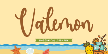 Valemon is a fancy handwritten fonts. It features gorgeous ligatures that make this script incredibly versatile. Whether you’re looking for fonts for Instagram or calligraphy scripts for DIY projects, Valemon will turn any creative idea into a true piece of art!
 - Abstract by Los Andes,
$29.00 Abstract is a contemporary and eclectic serif typeface inspired by today's life and created in times of pandemic. This family includes a true italic variant —that has its own personality— alternates, lining and old style figures, numerators and denominators & Cyrillic support.
 - Regular Bien by JASCHA&FRANZ,
$15.00 Regular Bien is a display font that is created out of two shapes - a circle and a line. It has a plain and a mutated face, depending on the usage of lowercase or capital letters. Regular Bien can be used in various fun ways and connections between lines.
 - Daub by Greater Albion Typefounders,
$8.95 Daub captures the look of old-style graffiti—it's graffiti from the days when vandals used a brush and a pot of white paint. Not an airbrush or aerosol in sight. Use Daub to give headings and posters that rough, hand brushed look. Add real grit and vigor to your work, with that old-style urban hard edge.
 - Quta by Fo Da,
$15.00 Quta is a sans serif typeface produced by FoDa foundry, that meets all the needs of professionals who search a family of clean geometric font, very well suited for headlines, newspaper and many purposes. With a basic character set in Five weights with their italics. Quta covers many features like: -Five main weights (Light, Regular, Medium, Bold and Extra Bold) -Matching italics for all weights. -language support for many Latin-based scripts -Ligatures and many other OpenType features.
 - P22 Vincent by P22 Type Foundry,
$24.95 This set is inspired by the work of Vincent van Gogh. The alphabet captures the essence of van Gogh's handwriting style, using his extensive correspondence with his brother Theo as the primary reference. This lettering style presents a bold brush-stroke appearance which bears striking similarities to the painting style of Van Gogh. A full international charcter set is featured. The extras feature selected imagery from van Gogh's drawing and paintings.
 - Silent Drama JNL by Jeff Levine,
$29.00 An ad in the April 19, 1919 edition of Motion Picture News for the (now lost) silent drama "Josselyn's Wife" featured some wonderfully stylized Art Nouveau hand lettering. Primarily a condensed character set with rounded serifs, there are a number of letters that take liberties in both width and character shape. Adding to this, [mostly vertical] parallel lines are cut through the characters to create a "striped' type of "double engraved' effect. Silent Drama JNL is available in both regular and oblique versions. **Uppercase
 - Diaconia Old Style by Hackberry Font Foundry,
$24.95Diaconia Old Style is a new rendition of my workhorse body copy font that I originally designed to use for the body copy of "Printing in a Digital World." I became increasingly upset with the lack of lowercase numbers and true small caps. Diaconia started life as a modification of one of the Dutch Bible fonts I traced. It has changed a lot since then (although I have a hard time telling how much because I have lost the original). The plain and italic work especially well when used in very large sizes as display faces. The other four variants (small caps, heavy, heavy italic, and black) are designed for use in book production. Because I format all my own books, I was able to design fonts that met my needs exactly: lowercase numbers, SMALL CAPS font, Mac Command, Option, and Control symbols, ballot box in the section slot, and several other special characters. DiaconiaPro is the OpenType family of my body copy workhorse. This is the first font family I ever created: classic, elegant, easy to read. 583 characters: small caps, oldstyle figures, numerators, denominators, lining figures, accents and a lot more. - Anger & Wrath by Omaikraf Studio,
$10.00 Introducing "Anger Style": Unleash the Power of Emotion Are you ready to harness the raw energy of emotions and bring them to life in your designs? Look no further than "Anger Style," an electrifying and dynamic font that will leave a lasting impact on your audience. Designed by our team of expert font designers, "Anger Style" is a captivating blend of intensity, power, and expressiveness. Possible Design Uses: "Anger Style" is a font that excels in making a bold statement. Its commanding presence and fiery nature make it perfect for various design applications, including: Headlines and Titles: Grab your audience's attention and make a lasting impression with powerful headlines that demand to be noticed. Logos and Branding: Infuse your brand identity with passion and intensity, creating a memorable and distinct visual presence. Posters and Flyers: Advertise events, concerts, or special promotions with eye-catching designs that embody rebelliousness and energy. Book Covers: Create striking covers that captivate readers and convey the emotional depth of your story or message. Apparel and Merchandise: Add an edgy touch to your clothing designs, making a statement that resonates with your target audience. Unique Qualities: What sets "Anger Style" apart from other fonts is its ability to evoke a wide range of emotions, not just anger. It transcends its name, allowing you to express passion, determination, and rebellion through your designs. Its versatility lies in its bold strokes and sharp edges, which convey a sense of intensity and power. By choosing "Anger Style," you gain access to a font that embodies the very essence of raw human emotion. Font Pairing: "Anger Style" pairs exceptionally well with other fonts that complement its intensity and create harmonious combinations. Consider combining it with: "Bold Sans Serifs": The clean lines and strong presence of a bold sans serif font can enhance the impact of "Anger Style," creating a balanced and eye-catching composition. "Elegant Script Fonts": To add a touch of contrast and sophistication, pairing "Anger Style" with an elegant script font can create a visually engaging and dynamic design. Functional Aspects: "Anger Style" offers a range of functional aspects designed to enhance your creative possibilities: Styles: "Anger Style" is available in bold and regular styles, allowing you to emphasize different levels of intensity within your designs. Character Sets: The font includes an extensive character set, covering uppercase and lowercase letters, numbers, punctuation marks, and special characters. This ensures versatility and legibility across various design projects. Special Features: "Anger Style" includes stylistic alternates and ligatures, providing you with additional design options and allowing you to create a truly customized and unique look.
 - Palatine by Larin Type Co,
$14.00 Palatine - this bold display typeface is a stylish and original, multipurpose font in a modern style with many alternatives, ligatures and swash that are very attractive, with their help you can make your project unique. And also use the main set to highlight exactly what you need.
 - Dancing_DL1.0 - Unknown license

- HenHouse AOE by Astigmatic,
$19.95 HenHouse is an offbeat comic sans-serif typestyle full of wonky bounce. Inspired by the 1962 Merrie Melodies cartoon titled “Mother was a Rooster”, this typeface has all of the spunk of its source. The end result, a lively tribute to its origin, easy to read and fun to look at, a perfect typeface for childrens' books, advertisements, and playful designs!
 - Bristles by Typodermic,
$11.95 Step right up folks and feast your eyes on the most authentic and pure font to ever grace the pages of your ad campaign. Bristles is the name, and it’s a font that speaks volumes of homegrown authenticity with every brushstroke. As you gaze upon this sun-bleached and weathered sans-serif, you’ll notice how the paint barely holds onto the substrate. It’s as if the letters themselves are just barely hanging on, like they were painted decades ago and left to weather the storm. But that’s what makes Bristles so special. Its wispy, textured lettering gives your message a voice of purity that simply can’t be replicated by other fonts. Each letter has its own unique character, telling a story that only a sign painter’s hand could convey. And with its letter pair ligatures, Bristles breaks up the monotony of blatantly repeating characters in OpenType-savvy apps. It’s a font that’s as versatile as it is beautiful, perfect for any project that needs a touch of old-school authenticity. So what are you waiting for? Give your message the voice it deserves with Bristles, the font that speaks volumes of homegrown authenticity. Most Latin-based European writing systems are supported, including the following languages. Afaan Oromo, Afar, Afrikaans, Albanian, Alsatian, Aromanian, Aymara, Bashkir (Latin), Basque, Belarusian (Latin), Bemba, Bikol, Bosnian, Breton, Cape Verdean, Creole, Catalan, Cebuano, Chamorro, Chavacano, Chichewa, Crimean Tatar (Latin), Croatian, Czech, Danish, Dawan, Dholuo, Dutch, English, Estonian, Faroese, Fijian, Filipino, Finnish, French, Frisian, Friulian, Gagauz (Latin), Galician, Ganda, Genoese, German, Greenlandic, Guadeloupean Creole, Haitian Creole, Hawaiian, Hiligaynon, Hungarian, Icelandic, Ilocano, Indonesian, Irish, Italian, Jamaican, Kaqchikel, Karakalpak (Latin), Kashubian, Kikongo, Kinyarwanda, Kirundi, Kurdish (Latin), Latvian, Lithuanian, Lombard, Low Saxon, Luxembourgish, Maasai, Makhuwa, Malay, Maltese, Māori, Moldovan, Montenegrin, Ndebele, Neapolitan, Norwegian, Novial, Occitan, Ossetian (Latin), Papiamento, Piedmontese, Polish, Portuguese, Quechua, Rarotongan, Romanian, Romansh, Sami, Sango, Saramaccan, Sardinian, Scottish Gaelic, Serbian (Latin), Shona, Sicilian, Silesian, Slovak, Slovenian, Somali, Sorbian, Sotho, Spanish, Swahili, Swazi, Swedish, Tagalog, Tahitian, Tetum, Tongan, Tshiluba, Tsonga, Tswana, Tumbuka, Turkish, Turkmen (Latin), Tuvaluan, Uzbek (Latin), Venetian, Vepsian, Võro, Walloon, Waray-Waray, Wayuu, Welsh, Wolof, Xhosa, Yapese, Zapotec Zulu and Zuni.
 - Blossomy by kapitza,
$99.00 Blossomy is a pictographic font consisting of 72 plant and flower illustrations, designed by kapitza. The font explores the beauty of shapes and structures in nature. The illustrations are based on photographs which have been traced by hand and are the result of a long term interest in the organic and erratic lines of naturally growing plants. The idea for Blossomy originated several years ago via a series of paintings exploring forms and structures in nature. The outlines for those paintings were traced in Illustrator and then transferred onto canvas. The outcome was so simple and beautiful that the designers decided to keep working on new illustrations and combine them in a font. Blossomy can be used as individual illustrations or to create patterns. The font covers a wide variety of flora and fauna, including pot flowers, a bonsai trees, leaves, blooms and grasses, and gives creatives a wide variety of shapes to get inspired by and use in their work.
 - Mullingar by Fontdation,
$18.00 Introducing Mullingar, our latest submission to the display typeface’s world library. Heavily inspired by the letters that are used in old/classic advertisements and signpainting culture, with a little magic touch of modern twist to keep this family relevant. Mullingar letterforms were built from bold and blocky base, unique serif combinations, clean plus smooth curves, and sharp edges. Available in six styles (Regular, Bold, Light, plus Slanted in each version), that guaranteed to give you joy in designing. Mullingar family is a reminiscent of retro sign painting, featuring a rustic architecture that makes it quite at home in a wide variety of design themes. Its blocky characters are best used in bold signage, headlines, advertising, logo designs, product packaging, merchandise, apparel, posters, album artwork, book covers, titling, etc. This typeface also provides additional versatility through OpenType feature, offering discretionary ligatures, standard ligatures, and stylistic alternates. It extends multilingual support to Basic Latin, Western European, Euro, and Pan African Latin languages for design projects intended for an international audience.
 - Ang Thong BT by Bitstream,
$29.99Bitstream developed Ang Thong for the Microsoft Windows operating system. The font is encoded with a Microsoft defined Thai character set, Thai Code Page 874. The font includes Thai glyphs and Latin glyphs from Dutch 801. Ang Thong (basin of gold) is a province in central Thailand which consists mostly of flat agricultural land used for growing rice. - Radically Rad by Prestige Artsy Studio,
$19.99 Introducing Radically Rad Display Serif, a true masterpiece of typography that combines boldness, elegance, and timeless beauty. Radically Rad is meticulously crafted to captivate and enchant with its abundance of stylistic alternates and elegant ligatures seeking a typeface that makes a bold statement, featuring a strong, thick letterforms that command attention. Radically Rad comes in with an extensive collection of stylistic alternates, offering a myriad of design possibilities.
 - Impuls Pro by RMU,
$35.00 Based on remnants of the Typoart, Dresden, version of Impuls, this is a carefully extended pro-version covering Europe's main languages written in Latein letters.
 - KG Strawberry Limeade by Kimberly Geswein,
$5.00 Doodled, whimsical, curly "capitals" (some of which are lowercase styles) are paired with unicase lowercase letters in a playful mix of capital and lowercase styles.
 - Dearest - Unknown license

- Aristotelica Pro by Zetafonts,
$39.00 Aristotelica Pro is the 2020 redesign of the rounded geometric sans designed by Cosimo Lorenzo Pancini and Andrea Tartarelli developing the original philosophy of one of the classic and best-selling Zetafonts typefaces, Arista by Francesco Canovaro. Originally conceived as an exercise in restraint and simplicity, Aristotelica is typographic eulogy to the simple beauty of circular shapes, aptly named after the greek philosopher who pioneered formal logic. It shows its strengths mostly in display uses and logo design, with a palette of moods ranging from the stark elegance of the uppercase hairline weights to the playful softness of the lowercase bold weights. True to its universalist calling, it has however been developed in a variant text version that applies slight corrections to design and metrics to allow for better legibility in long body copy. In Aristotelica Pro both the display and the text subfamilies have been complemented with a condensed version, though especially for mobile screens and other situations where space-saving is a concern. Also the original language coverage (extended latin, greek and cyrillic) has been expanded with the inclusion of arabic language glyphs, bringing the typeface to a total of over 1100 glyphs and 200 languages covered. The family is further enriched by the inclusion of Aristotelica Icons, a set of matching variable-width monoline icons that can be used to faultlessly match the typeface line width. OpenType features includes stylistic alternates, old style and lining figures and small caps.
 - Japanese Brush - Unknown license

- Anarchy Mono - Unknown license

- Love Princes by Sulthan Studio,
$10.00 Love Princes is a handwritten script font that was written using a marker on paper and then I made it into a charming and very natural font, with two very cool writing characters if paired or used in one of your works
 - Univers Next by Linotype,
$53.99 Linotype Univers is a completely reworked version of the original Univers typeface family designed by Adrian Frutiger in 1957. After a long process of painstakingly detailed revision, Frutiger and the design staff at Linotype completed this large joint project in 1997. The result: a brilliant and cohesive font family of 63 weights and styles including the 4 monospaced typewriter weights. All the existing weights were completely redrawn, with careful attention paid to making the proportions more consistent with each other and improving fine details such as curves and thick-to-thin stroke ratios. The family was expanded from 27 to 63 weights, providing a much larger framework to graphic designers for choosing just the right style. The bold and condensed weights were reworked for improved legibility and on-screen application. The stroke weights were revised for consistency within each face as well as in relationship to the other weights. By following Frutiger's original designs, the humanist character of the sans serif Univers now comes through more distinctly. T he systemized numbering system has also been updated. With its sturdy, clean forms Univers can facilitate an expression of cool elegance and rational competence. In fact, the strong familial relationships between all the styles and weights make it a serviceable choice for large graphic design projects that require versatility with consistency. Frutiger was successful in staying true to his initial aims; the new Linotype Univers does indeed work in longer texts as well as for display settings. In 2010 the typeface family was extended and renamed into a more logical naming of "Univers Next" to fit better in the Platinum Collection naming. Univers Next Variable are font files which are featuring two axis and have a preset instance from Light to Heavy and Condensed to Extended. Univers® Next font field guide including best practices, font pairings and alternatives.
 - Architype Van der Leck by The Foundry,
$50.00 Architype Konstrukt is a collection of avant-garde typefaces deriving mainly from the work of artists/designers of the inter-war years, whose ideals have helped to shape the design philosophies of the modernist movement in Europe. Due to their experimental nature character sets may be limited. Architype Van der Leck originates from the lettering that Bart Van der Leck created for ‘Flax’ magazine in 1941. The letterforms‘ restricted shapes and abstract, stencil-like forms reflect the strong geometric language of De Stijl and show influence from his abstract paintings.
 - Gradl Max by Fresh Air Fonts,
$14.00 Max J. Gradl was a German jewelry designer. A Web search today turns up several examples of his work from the turn of the 20th century. He seemed to favor green stones in silver metalwork. Gradl also did advertising work and co-authored a book on architectural design. Most important for our purposes, though, are the incredible hand lettered alphabets and monograms the man left behind. I’ve digitized one of those delightful alphabets and tried to keep it true to the original. Beyond the base character set of letters, numerals and basic punctuation, I had to extrapolate forms that, I hope, hold true to Gradl’s design. Enjoy!
 - Cristal Text by Johannes Krenner,
$5.00 »Cristal Text« has nice to read lower case letters. It contains 636 letters per font style and some Open Type features: Different stylistic alternates and different sets of numerals. It is not monospaced: Therefor it stays not true to an underlying grid like it’s bigger brother »Cristal True«. But this offers a better legibility. The basis of this font is a Union-Jack or sixteen-segment display (SISD). I have found myself in the need of a precise and well-made font, that simulates the look of such a LCD display. Also it should offer enough letters and language support for the whole European region as well as different font styles.
 - Tombola by RMU,
$30.00 Inspired by painted letters of Otto Heim, "Tombola" reflects in a charming way the feelings of the Roaring Twenties, especially in advertisement and in the creation of posters.
 - Imagine Forest by Letteralle,
$18.00 Introducing! Imagine Forest Font! a casual and charming brush font. Indigo Forest is very suitable to fill your design needs such as, branding, social media, merch, ads, book title, packaging, etc. Imagine Forest includes 2 fonts : - Imagine Forest: The main font with Uppercase, Lowercase, Number, Punctuation, and also multilingual support. - Imagine Forest Alt: Besides you can access alternative characters from the main font through the opentype feature, you can also install this alternative fonts. Indigo Forest Alt font will give you other options for a character, which of course will add a natural impression. Imagine Forest also has a some of ligatures that will enhance the natural impression. Thatís it! Please do let me know what you think, feel free to comment if there are issues or queries. Enjoy the Font, Thank You!
 - Peterhof by Favorite Fonts,
$17.00 Have you got a dream? I dream of visiting Peterhof. The palace and park ensemble with beautiful architecture, sculptures, and fountains. It is no less beautiful on the inside than on the outside. Huge halls, windows, columns, paintings. Everything is very refined, elegant, and beautiful. Looking at the photos, I enjoy and admire the views. They inspired me to create the "Peterhof" typeface. Elongated letters echo with tall columns and fountains. Serifs and playful glyph corners add grace to the font. It turned out to be refined, aristocratic, and at the same time mysterious and effective. I have created a whole family of "Peterhof" fonts from regular to bold italics for every taste and for every task. The "Peterhof" font will look great in headlines, advertising signs, posters, magazine pages, and prints. It can serve as the main focus of your compositions.
 - Balance by Victory Type,
$12.00The three typefaces that make up the Balance font set are legible, funky and stylish. Every character has been spaced and designed on a uniform geometric grid to insure true typographic "balance." There are only two shapes that make up every character: a parallelogram and a quarter circle. This design renders Balance a distinct family of fonts which are appropriate for all documents. Balance Regular is legible, funky and stylish. Every character has been spaced and designed on a uniform geometric grid to insure true typographic "balance." There are only two shapes that make up every character: a parallelogram and a quarter circle. This design renders Balance Regular a distinct font that is appropriate for all documents. Balance Light is legible, funky and stylish. Every character has been spaced and designed on a uniform geometric grid to insure true typographic "balance." There are only two shapes that make up every character: a parallelogram and a quarter circle. This design renders Balance Light a distinct font that is appropriate for all documents. Balance Unicase is legible, funky and stylish. Every character has been spaced and designed on a uniform geometric grid to insure true typographic "balance." Each letter, in this unicase version of Balance uses a single character height. There are only two shapes that make up every character: a parallelogram and a quarter circle. This design renders Balance Unicase a distinct font that is appropriate for all documents. - Montecatini Pro by Louise Fili Ltd,
$35.00 Montecatini takes its cues from the elegant Stile Liberty travel posters of Italy in the early 1900s. In its successful first release by Louise Fili Ltd in 2017, the typeface introduced distinctive ligatures typical of the time when Art Nouveau emerged as a worldwide phenomenon. Now Montecatini has been expanded into 24 alluring styles, spanning 6 weights and 4 widths. With the addition of these new styles, Montecatini has a dynamic capacity for comprehensive use and pairing. Everything looks better in Montecatini, from book jackets to monograms to packaging and logos—and the wide selection of ligatures, weights, and widths makes copyfitting a delight. Montecatini Pro’s ligatures are setup as contextual alternates. If you would like to try out Montecatini Pro’s ligatures or learn more about the font, please visit: https://www.louisefili.com/montecatini-pro
 - Playsign by Jinan Studio,
$25.00 Introducing Playsign a vibrant and dynamic sign painting display typeface that infuses creativity into every character stroke. With its meticulously crafted uppercase and lowercase letters, punctuations, numbers, symbols, and thoughtful ligatures, Playsign stands as a versatile typographic tool with boundless possibilities. Its seamless multi-language support ensures a global reach for your creative endeavors. Designed to ignite visual impact, Playsign is a perfect choice for diverse applications, elevating designs across logos, posters, product designs, print and digital advertising, branding, and beyond. Whether aiming for a bold statement or a subtle nuance, this font injects charisma into every project, embodying a harmonious blend of classic aesthetics and contemporary flair. Unleash your imagination with Playsign and watch your designs resonate with vibrancy and distinction." Features A set of uppercase and lowercase glyphs Number, symbol, and punctuation Multilingual Support Swashes and Ligature Type j_1 until j_10 to features swash, ligatures will automatically replace the standard letter pairs whenever available, when using any OpenType capable software.
 - Candy Script by Sudtipos,
$79.00 Inspired by Argentina and its culture, Alejandro Paul’s Candy Script captures the country’s spirit. It comes from the tradition of window sign painting, but its thick hand-brushed characters, with alternates for almost every upper and lowercase letter, have a personality all their own. Tons of OpenType alternates included, over 1150 characters in all.
 - Conteza by Mevstory Studio,
$10.00 Introducing Conteza Font: Redefining Modern Blackletter Elegance Unleash the power of typography with "Conteza," a remarkable font that seamlessly blends the timeless essence of blackletter style with a captivating contemporary twist. This font is a true masterpiece, meticulously designed to elevate your designs, projects, and artworks to new heights of sophistication and creativity.
 - Eurasian Stencinitials JNL by Jeff Levine,
$29.00Eurasian Stencinitials JNL are modeled from a set of crudely die-cut Old English capital letter stencils that were made in Japan in the Early 1960s. The interesting treatment of the letters (with a slight hint of Japanese calligraphy) has some added bamboo plants for balance and decoration in this digital version.


