10,000 search results
(0.078 seconds)
- SK Lisovik by Shriftovik,
$32.00 SK Leshiy is an authentic monumental font inspired by ancient Slavic legends and fairy tales. This font combines geometric and natural forms, each of its symbols creates a unique image of a fabulous creature that hides in the forest thicket. The SK Leshiy font has a basic and alternative character sets that allow you to expand the font's capabilities and its decorative functions. The font supports a multilingual set and an extended table of Cyrillic and Latin characters.
 - Keep Humble by Struggle Studio,
$16.00 Keep Humble is a retro styled font with a stunning style that can make the most of your design projects. This font gives a touch of retro style that was famous in the 60-70s. Keep Humble font has an alternative style for Uppercase and Lowercase, Ligature, which can be adapted to your design needs so you don't waste time creating extrusion effects. Keep Humble also has 25 Swash options, of course this really helps to beautify this font.
 - Shows Gracious by Jafar07,
$17.00 Shows Gracious is taken from the word luxury that underlies this font, a classic theme with a subtle touch in every node of the alphabet, although classic, this font is highly recommended for designers, because of the classic design trend but not too far from ancient when used today. has several ligatures and alternatives that can add to the uniqueness of your design, very suitable for use as logos, branding, headlines, magazines, wedding cards, and others.
 - LifeAfterCollege by Ingrimayne Type,
$13.95 The LifeAfterCollege family began as a set of four fonts based on two styles of Ranger, which are slab-serif, geometric fonts with no curves. Two of the four are outlines with hollow insides, and two have-filled insides. The two fonts that are outlined have been taken apart and made into three typeface that can be layered. This allows one color for the inside, another for the middle ring, and a third for the outside outline.
 - Xalapa by insigne,
$14.99Xalapa is a wavy and rugged script. The font comes packed with OpenType alternates and ligatures. Included are fifteen titling alternates, small caps, oldstyle figures and a full set of stylistic alternates to ensure that your designs are unique every time. Sixty-four contextual ligatures are available to extend the organic nature of the lettering and make certain that no two letters in a word are alike. Choose Xalapa when you need to evoke the spicy flavors of Mexico. - Isabella by Monotype,
$29.99Isabella was designed by Hermann Ihlenburg in 1892 for MacKellar, Smiths and Jordan, one of many type houses that were later amalgamated into American Type Founders. As testimony to its long-lived appeal, Isabella was one of the first PostScript® language typeface releases (in 1988) of Agfa Compugraphic. With its unmistakable 19th-century characteristics - swirls, loops, and surprising letter shapes - Isabella is a natural for display situations that demand high drama or, dare we say, melodrama. - Nickburg by Nathatype,
$29.00 Nickburg is a display font that exudes timeless charm. The oversized uppercase letters of this font are impossible to ignore. Each character of this font commands attention with its substantial size. What sets Nickburg apart is its sharp corners. The unique combination of vintage and sharpness creates a captivating contrast that elevates your text and makes it unforgettable. This font includes ornaments as a special bonus. Nickburg fits in headlines, logos, branding materials, and many more.
 - Red Thinker by deFharo,
$14.00 Red Thinker is a sans serif typeface that includes Small Caps, is of square proportion and fuses soft curves in the outer vertices with straight lines inside the characters, a semi-stencil design that gives it a technological aspect and future fiction. Red Thinker is the heir by right of the geometrical fonts of the early twentieth century inspired by the Bauhaus school and is specially designed for use in any size for both screen and printing.
 - M Ellan PRC by Monotype HK,
$523.99 M Ellan HK is a soft yet robust typeface that strikes an appropriate balance between vertical and horizontal strokes (豎、橫). Finials of strokes are sharp but gentle, alluding to the appeal of calligraphy. It is elegant as well as contemporary. M Ellan Light features similar thickness in vertical and horizontal strokes (豎、橫) that together make it lucid and appealing, while thickness of strokes in M Ellan Bold are accordingly adjusted to maintain its friendly and graceful character.
 - Nabana by Alifinart Studio,
$15.00 Nabana is a quotable sans serif font that offers a relaxed, comfortable and informal feel. This font is inspired by the packaging of environmentally friendly products, as well as from book covers for children. The first impression when you see this font is a sense of joy and fun. Moreover, this font package also includes a variety of floral element designs that are very harmonious when used together. Instructions: For complete details, please visit my Behance profil.
 - Timesky by Nathatype,
$29.00 Experience the timeless allure of Timesky, a serif font that effortlessly blends classic elegance with a modern sensibility. The generous spacing between characters ensures that your text breathes, This ample spacing not only enhances legibility but also lends a feeling of modernity to your design. On the other hand, the inline style brings a sense of depth and dimension to the font, creating a captivating visual. Timesky fits in headlines, branding materials, print media, and many more.
 - Hammered by Ingrimayne Type,
$14.95 In Hammered all the letters are made up of hammers and an occasional nail. It is caps only, but the characters on the lower-case keys differ from those on the upper-case keys. It has a large set of accented characters. It is not often that one needs a typeface made of hammers and nails, but if one does, there is a font for that. For related, tool-based typefaces, see Screwged, NailsNStaples, and WrenchedLetters.
 - Grilock by Nathatype,
$29.00 Prepare to embark on a typographic journey through the past with Grilock, an uppercase display font that merges vintage looks. The thickness of each letter is uneven, giving them a reminiscent of vintage handcrafted signage. The relatively sharp corners of Grilock provide visual contrast against the uneven thickness, resulting in a font that is both striking and memorable. In addition, Grilock gives ornaments as a special bonus. Grilock fits in posters, logos, branding materials, and many more.
 - Jeenull by Twinletter,
$15.00 Jeenull is a distinctively appealing typeface with a thick character that gives a distinct impression ideal for a variety of serious and casual applications. What are you waiting for? Get this font and enjoy the beauty of letter combinations in words that you may use in a variety of projects. This font is perfect for games, sporting events, branding, banners, posters, movie titles, book titles, quotes, logotypes, and more. Start using our fonts for your amazing projects.
 - JAF Herb by Just Another Foundry,
$59.00 Herb is based on 16th century cursive broken scripts and printing types. Originally designed by Tim Ahrens in the MA Typeface Design course at the University of Reading, it was further refined and extended in 2010. The idea for Herb was to develop a typeface that has the positive properties of blackletter but does not evoke the same negative connotations – a type that has the complex, humane character of fraktur without looking conservative, aggressive or intolerant.
 - Oak Ridge JNL by Jeff Levine,
$29.00Oak Ridge JNL gives a Westernized treatment to Flivver JNL; which in turn is a serif derivative of Two Reeler JNL. Although all three fonts come from the same root source—inter-title cards from an old Charlie Chaplin movie, they each take on a personality of their own. - Piano Lesson JNL by Jeff Levine,
$29.00 Piano Lesson JNL comes from the hand lettered title on a 1940s-era piece of sheet music called "The Adult Explorer at the Piano". The mix of both regular and irregular character shapes makes for an interesting font that's Art Deco influenced, yet has its own individual personality.
 - Letterpress Text by Chris Costello,
$22.75 This font is based on the popular and timeless Caslon design and was carefully digitized from the pages of an early 19th century book. I was excited to see some unique design treatments of characters such as the lower case italic 'p', the question mark, and various swash caps that I had never seen before. During the conversion process, I made sure to preserve the worn look of faded ink on old paper by maintaining a subtle level of decay and opacity with each character. For missing characters not found in the book, I created new characters that were faithful to the style of the rest of the family. Used as a text font, The Letterpress Text Family successfully reproduces the appearance of old letterpress lithography.
 - Summerlane by Rillatype,
$19.00 Introducing "Summerlane," a captivating bubble retro display font that transports you to the carefree vibes of summer. This font is a playful blend of nostalgia and modernity, reminiscent of vintage signage with a contemporary twist. Each character in Summerlane is carefully crafted to evoke the essence of retro summers, where the air is filled with joy and the sunsets are endless. The bubbly, rounded design adds a touch of friendliness to your creative projects, making it perfect for posters, logos, and any design that craves a bit of retro flair. With its versatility, Summerlane offers a delightful journey into the past while staying relevant for your present-day designs. Elevate your projects with the whimsical charm of SummerLane and let the good vibes flow.
 - Clover Font Duo by Pen Culture,
$15.00 Introducing The Clover, a stunning duo font that combines the timeless elegance of a serif typeface with the fluid grace of calligraphy. This versatile font set includes two complementary styles that work together seamlessly to add sophistication and charm to your design projects. The serif font is a classic and refined typeface that exudes elegance and professionalism. Its clean lines and sharp angles create a sense of precision and authority, making it perfect for formal documents, headlines, and branding materials. In contrast, the calligraphy font is a more decorative and ornate style that evokes a sense of fluidity and movement. Its graceful curves and flowing lines create a sense of beauty and grace, making it ideal for invitations, wedding materials, and other special occasions. When used together, the serif and calligraphy fonts complement each other perfectly to create a stunning visual contrast that captures attention and creates a lasting impression. Whether you're designing a logo, brochure, or wedding invitation, The Clover is the perfect choice for adding a touch of sophistication and style. I really hope you enjoy it – please do let me know what you think, comments & likes are always hugely welcomed and appreciated. More importantly, please don’t hesitate to drop me a message if you have any issues or queries. Thank you
 - Penitentiary Gothic by E-phemera,
$30.00Penitentiary Gothic is a digital recreation of the letters used on California state license plates, designed in order to make props for movies and television shows. The regular style is meant to be used on its own, but the other four styles are meant to be used one on top of another in different colors to create an embossed 3D effect. For best results, use the fill style in a dark color on top of a light colored background. Put the lolite style directly on top of the fill style in 10 - 30% of the background color. Put the hilite style directly on top of that in 10 - 30% of your fill color. Put the shadow style directly on top of that using your background color plus 50 - 80% black. - Cowhand by Monotype,
$9.99 Cowhand is a display typeface designed by Toshi Omagari to keep words at one specific width. Words of one letter will have one very wide character, words of two letters will have characters of half that width and so forth. At the maximum of 20-letter words, characters become very tightly compressed. The design of the Cowhand typeface is inspired by western style block printing with reverse stress that is characterised by chunky slab serifs. This Lite version of the typeface was designed as part of a font marathon over the course of 3.5 days in Monotype’s NY office. Please Note: these "Lite" fonts are offered with a limited character set. Monotype is proud to support Room to Read’s work in literacy and girls’ education through our font marathon initiative.
 - Fortezza by Eurotypo,
$22.00 Fortezza is a family of fonts inspired by the great masters who have created the Modern Roman style: Firmin Didot (1764 -1836) and Giambattista Bodoni (1740 -1813) Both typefaces can be similar, but a trained and close vision, show clear differences in the final result, like its weight and the degree of transition of the strokes. The type of Didot suggests greater warmth and elegance, they are characterized by extreme contrast in thick strokes and thin strokes, by the use of serifs very thin and by the vertical stress of the letters. while the Bodoni type conveys a greater robustness and hardness. Fortezza brings together the elegance and spirit of both types, but proposes a contemporary vision, establishing a distance with certain features typical of the baroque that was manifested at that time.
 - Fartha by Nahda Creative,
$15.00 Fartha is a lovely and delicate script font that exudes elegance and class. This font was particularly crafted for those who need a beautiful and refreshing look to their designs.
 - Autosmash by Rockboys Studio,
$15.00 Autosmash is a lovely and brushed script font that exudes elegance and class. This font was particularly crafted for those who need a beautiful and refreshing look to their designs.
 - Listingloves by Sulthan Studio,
$14.00 Listingloves - new, fresh, funny, interesting, cute calligraphy font with two cute hearts that can be connected. It is suitable for greeting cards, branding materials, business cards, quotes, posters and more!
 - Yesslyn by ARToni,
$19.00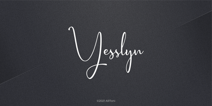 Yesslyn is a lovely and delicate script font that exudes elegance and class. This font was particularly crafted for those who need a beautiful and refreshing look to their designs
 - Auberge Script by Sudtipos,
$79.00 It took me a long time, but I think I now understand why people of my generation and older feel the need to frame current events in an historical context or precedents, while most of the young couldn't care less about what happened ten years ago, let alone centuries back. After living for a few decades, you get to a point when time seems to be moving quite fast, and it’s humbling to see that your entire existence so far can be summed up in a paragraph or two which may or may not be useful to whoever ends up reading the stuff anyhow. I suppose one way to cope with the serenity of aging is trying to convince yourself that your life and work are really an extension of millenia of a species striving to accept, adapt to, and improve the human condition through advancing the many facets of civilization -- basically making things more understandable and comfortable for ourselves and each other while we go about doing whatever it is we are trying to do. And when you do finally convince yourself of that, history becomes a source of much solace and even a little premonition, so you end up spending more time there. Going far back into the history of what I do, one can easily see that for the most part it was ruled by the quill. Western civilization’s writing was done with quill pens for more than thirteen centuries and with newer instruments for about two. By the mid-18th century, the height of the quill experience, various calligraphy techniques could be discerned and writing styles were arranged in distinct categories. There are many old books that showcase the history of it all. I recommend looking at some whenever the urge comes calling and you have to get away from backlit worlds. Multiple sources usually help me get a better perspective on the range of a specific script genre, so many books served as reference to this quill font of mine. Late 17th century French and Spanish professional calligraphy guides were great aides in understanding the ornamental scope of what the scribes were doing back then. The French books, with their showings of the Ronde, Bâtarde and Coulée alphabets, were the ones I referenced the most. So I decided to name the font Auberge, a French word for hotel or inn, because I really felt like a guest in different French locales (and times) when I going through all that stuff. Because it is multi-sourced, Auberge does not strictly fit in a distinct quill pen category. Instead, it shows strong hints of both Bâtarde and Coulée alphabets. And like most of my fonts, it is an exercise in going overboard with alternates, swashes, and ornamental devices. Having worked with it for a while, I find it most suitable for display calligraphic setting in general, but it works especially well for things like wine labels and event invitations. It also shines in the original quill pen application purpose, which of course was stationery. Also, as it just occurred to me, if you find yourself in a situation where you have to describe your entire life in 50 words or less, you may as well make it look good and swashy, so Auberge would probably be a good fit there as well. This is one quill script that no large bird had to die for. A few technical notes The Auberge Script Pro version includes 1800 glyphs, everything is included there. Also latin language support. We recommend you to use the latest design application to have full access to alternates, swashes, small caps, ornaments, etc. The images from the gallery uses this version. For better results use the fonts with “liga” feature on. Awards During 2014 the early develop of Auberge Script was chosen to be part of Tipos Latinos, the most important type exhibition in South America.
 - Graffiti Treat, designed by the prolific typeface artist Ray Larabie, is a captivating font that embodies the raw energy and expressive nature of street art. This font seamlessly blends the spontanei...
- Fave by Aerotype,
$48.00 The hand-brushed Fave™ Set has ten informal scripts and other handwritten fonts made up of two subfamilies: Fave and the even-more informal Fave Casual, each have a primary script with a bold version and three other handwritten faces for a total of ten typefaces spanning the casual spectrum. All are optimized for large type use too so they look as good up close as they do set at smaller sizes. OpenType features The Fave family has a few features that happen largely in the background. All of the fonts use the OpenType Standard Ligature feature to automatically differentiate consecutive lowercase letters and numbers (using separate glyphs) and like our previous release Turbinado, they also automatically differentiate like characters that are separated by another letter. Alternate characters The script fonts have alternate uppercase and lowercase characters including multiple t (and double t) crossbar alternates that can be selected from the OpenType glyph table. Enable Contextual Alternates feature to automatically insert a bigger crossbar as the surrounding letters allow throughout a text box or document. You can also make your own custom lowercase t and crossbar to fit any situation–all of the lowercase t ascenders and crossbars are available separately in the OpenType glyph table, and can be combined and moved around manually. Stylistic sets and other goodies Fave Script and its bold counterpart have two Stylistic Sets. When enabled, one automatically substitutes non-connecting alternate characters at the ends of words, the other substitutes even bigger t crossbars than the Standard Ligature feature does. Smart apostrophes and ligatures Other subtle but hopefully helpful features include smart apostrophes, which insert themselves between two script characters in common situations without breaking their connection, and a few ligatures that also make character connections more seamless.
 - Chalker Dust by IbraCreative,
$23.00 Chalker Dust is a delightful and whimsical handwritten chalk font that transports you to the nostalgic world of chalkboard art. With its authentic texture and playful irregularities, Chalker Dust captures the essence of doodling and scribbling on a chalkboard. Each letter has a handmade charm, as if it was lovingly written with a piece of chalk. The dusty and smudged appearance adds a sense of authenticity, making it the perfect choice for designs that aim to evoke a sense of nostalgia and carefree creativity. Whether used for menu boards, event posters, or children's projects, Chalker Dust brings a touch of fun and whimsy, infusing your designs with a playful and vibrant atmosphere.
 - Versteeg by Blank Is The New Black,
$10.00 Versteeg was originally designed as a font that would work at a singular pixel level. In the spirit of this reduction, Versteeg was designed with an x-height of 3 units with capitals at 4 units. This extreme simplification is what makes Versteeg unique. After designing the square version of the typeface, creating a series of circular versions was a natural evolution. These versions have a resemblance to braille, but don't actually have a relationship with any braille characters. The width of each face is carefully designed to make sure that the letters will align perfectly in multiple lines. Versteeg is, for the most part, a display typeface, and isn't recommended for large blocks of text.
 - Fontana ND by Neufville Digital,
$45.25 Designed for the printing of a magazine, the Fontana Sistema was based fundamentally on the Spanish language as its natural and cultural context. Due to the spanish colonization of America, the spanish language has been influenced by native american terms that enriched it and caused significant changes in both the sound and form of words. These sounds and forms had a strong influence on the identity of text, substantially modifying the nature and the characteristics of the composition. The Fontana Sistema we present is the fruit of our desire to design a font that, based on the spanish language, would endow the publication with identity and at the same time offer a framework for typographic research.
 - Broadways Beautiful by IbraCreative,
$14.10 Broadways Beautiful is an enchanting handwritten font that captures the essence of elegance and grace. With its meticulously crafted letterforms, each stroke in Broadways flows seamlessly, exuding a timeless and sophisticated beauty. The gentle curves and delicate details of this font give it a handcrafted and personalized touch, making it a perfect choice for projects that demand a sense of refinement and charm. Broadways adds a touch of allure to wedding invitations, luxury branding, and artistic displays. Its versatility is evident in its ability to seamlessly adapt to various design contexts, infusing each project with a captivating and beautiful handwritten aesthetic. With Broadways, every character is a work of art, enhancing the visual appeal of any creative endeavor.
 - Camila by Latinotype,
$39.00 Camila is a delicate and smooth Didone typeface designed by Paula Nazal. The family is inspired by concepts such as elegance, simplicity, femininity, and primarily based on Coco Chanel. A remarkable feature of this font is that it lacks teardrop terminals, characteristic of Didone typefaces. This font of thin serifs and soft finishes also includes italics, strengthening the concept of its design. A great variety of shapes makes Camila an ideal font for both display and small sizes. Camila is the perfect choice for branding and publishing projects.. This font family comes in 7 weights, ranging from Thin to Black, each with matching italics and includes a set of 426 characters that support 206 different languages.
 - Narony by Alit Design,
$22.00 Introducing "Narony" – where sophistication meets nature in a harmonious dance of elegant typography and organic inspiration. This unique font seamlessly blends the timeless allure of serif with the dynamic fluidity of script, creating a typographic masterpiece that is both refined and enchanting. Serif Elegance: Embrace the classic charm of serif letterforms that exude sophistication and readability. Narony's serif elements add a touch of timelessness to your text, making it perfect for both formal and creative contexts. Dynamic Script: The script elements in Narony bring a sense of movement and fluidity to your words. The dynamic script flows effortlessly, adding a touch of personality and modernity to your designs. Whether used for headings or accents, Narony's script component elevates your text with grace. Natural Harmony: Immerse your designs in the serenity of nature with Narony's natural concept. Adorned with elegant leaf illustrations, each character is delicately intertwined with botanical elements, creating a seamless blend of man-made artistry and the beauty of the natural world. Versatility in Design: Narony is designed for versatility, making it suitable for a wide range of applications. From branding and logo design to wedding invitations and editorial layouts, this font effortlessly adapts to various design needs. Distinctive and Memorable: Set your projects apart with a font that is both distinctive and memorable. Narony leaves a lasting impression on your audience, ensuring that your message is not just read but experienced. Ideal Usage: Branding and Logo Design Editorial Layouts Wedding Invitations Packaging Design Social Media Graphics Nature-themed Projects Elevate your designs with the perfect blend of sophistication and nature – Narony. Let your words flourish in the graceful strokes of this font, where each character is a work of art and each design tells a story of elegance and harmony. Experience the beauty of Narony and redefine your typographic expression.
 - Rig Shaded by Jamie Clarke Type,
$15.00 Rig Shaded is an award-winning 3D type family with a geometric sans serif at its heart. As its name suggests, Rig is designed as a framework to support a range of striking 3D effects. It has four versatile weights including a unique ‘zero’ weight. Each has two grades of distinctive halftone shading, Fine and Coarse, which emphasises Rig’s solid appearance. Rig developed from my quest to find ideal letter shapes for a shaded typeface while retaining their geometric principles and legibility. Each character has been designed to ensure maximum clarity and harmony when combined with 3D effects. The extrude and shaded styles have been handcrafted to produce a consistent weight and tone. Rig’s character set includes 230 glyphs, supporting 198 languages, including all Western, Central and South Eastern European languages. You can buy individual weight packs of Rig Shaded or the entire family for a discounted cost. See the full specimen for Rigs design features, additional examples and tips on using the typeface. Note: Rig’s shading styles have a high level of detail so may process more slowly in some applications.
 - Korge by Ferry Ardana Putra,
$19.00 Introducing "Korge", a captivating and versatile retro bold slab serif font that seamlessly marries vintage aesthetics with modern functionality. With its bold design, serif form, and a trio of regular, rounded, and extruded versions, Korge offers a wealth of creative possibilities for your design ventures. Korge is a font that transports your projects back to the golden eras of design. Its bold and distinct serifs evoke a sense of nostalgia, lending your creations a classic and enduring appeal. Korge provides not one, but three distinct styles to choose from. The regular version exudes a commanding presence, while the rounded variant softens the edges for a more approachable feel. The extruded version adds depth and dimension, giving your text a 3D, eye-catching quality. Korge is a font that speaks the language of design across borders. With its multi-language support and PUA encoding, it ensures your message resonates with audiences from diverse linguistic backgrounds. From logo design to branding, packaging, posters, and beyond, Korge adapts seamlessly to a wide array of design projects. Its bold slab serifs demand attention, making sure your message is delivered with both authority and style. Korge invites you to embark on a journey of creative exploration. Craft memorable headlines, iconic logos, or striking signage – this font is your canvas for pushing the boundaries of design. With Korge, the possibilities are limitless. Its vintage-inspired bold slab serif design, multi-language support, and versatile styles make it the ideal choice for designers seeking to infuse their projects with timeless charm and contemporary appeal. Get ready to bring your visions to life with Korge, where classic meets cutting-edge. ——— Korge features: A full set of Uppercase & Lowercase letters Numbers and punctuation Multilingual language support PUA Encoded Characters OpenType Features +237 Total Glyphs Rounded Style + Regular Style Extruded Style Korge Includes: Korge Regular Korge Regular Extruded Left Korge Regular Extruded Right Korge Regular Extruded Left Italic Korge Regular Extruded Right Italic Korge Rounded Korge Rounded Extruded Left Korge Rounded Extruded Right Italic Korge Rounded Extruded Left Korge Rounded Extruded Right Italic
 - Wedding by HiH,
$10.00 Wedding Regular was originally designed by Morris Fuller Benton for ATF and released as Wedding Text in 1901. It is a lighter version of his ENGRAVER'S OLD ENGLISH of the same period. Wedding Regular is based on the Textura style of blackletter that continued in popularity in England into the 16th century, long after the Dutch, French and Italians had moved to a Roman model that expressed the Renaissance humanism of the period. Wedding Headline is a still lighter version of the regular text face, suitable for setting larger sizes while still preserving the delicacy of the decorative hairlines. Textura continues in use in England and the United States for newspaper mastheads, gift shop signs, wedding invitations and programs and other applications where a feeling of tradition is desired. I recently saw an 1980ish photo of a “Tubby Isaac” sign in London using textura. I believe Benton’s design captures that feeling without being heavy-handed and still remaining quite readable for eyes accustomed to Roman lettering. Both Wedding Regular and Wedding Headline convey a comfortable familiarity. These two fonts may be purchased together at an attractive discount or they may be purchased separately. The full character set may be found in the pdf file that you can download from the gallery section. The two monks (alt-0172 and alt-0177) are from a set of sixteenth century decorative initial letters by Gering and Renbolt. Please note that there are two different eszetts, the blackletter style at alt-0126 and the antiqua style at the alt-0223.
 - As of my last update, Cubiculo Gallery by Billy Argel is a distinctive font that captures the essence of creativity, combining elegance with a touch of the experimental. While I can't provide real-ti...