10,000 search results
(0.061 seconds)
- Elegy by ITC,
$29.99In the early 1970s Ed Benguiat drew the International Typeface Corporation's logo, a flowing script that many have hoped would one day be expanded into a complete font. From 2008, Jim Wasco of Monotype Imaging - with Benguiat's blessing - took up the challenge. After two challenging years, Elegy™ was completed. I knew that developing the typeface would present many challenges, but I felt strongly that Ed Benguiat's lettering deserved to be preserved as a font that graphic designers could take creative advantage of." - Jim Wasco Elegy makes good use of modern OpenType features to really make this script shine, and introduces some of the spontaneity of Ed Benguiat's original logotype. And what did Ed Benguiat have to say about the completed typeface?"WOW! It's absolutely beautiful. Jim Wasco has done a magnificent job of turning my logo into a great typeface design."A glowing tribute for a very fine typeface. Do take a closer look at this elegant and very accomplished script." Featured in: Best Fonts for Tattoos - Risotto Script by Estudio Calderon,
$69.00 Risotto Script is a sexy font designed by Felipe Calderón, it represents the texture, sound, smell and flavor of food that come in those interesting packages with different concepts. This font makes you want to eat it because it is designed with a unique texture like a lot of vegetables, it has flourishes that suggest herbs and country roots. Calligraphy with folded pen and food packaging were two of the inspirations to develop this project that will work well wherever it is applied. Risotto Script Pro has 672 glyphs that have the purpose of covering a lot of writing options with different results, by applying OpenType programming as: - Standard ligatures - Stylistics alternatives - Contextual alternates - Discretionary ligatures - Swashes - Terminal forms - Stylistic Set 1, 2, 3 and 4 - Initials (it includes leaves in some endings) NOTE: The X height is generous, in order to design signs to 8 and low size. You`d better get the “extras” for a more complete experience. Most of the Standard ligatures include Stylistics alternatives with detailed endings Multiple language options.
 - Fried Chicken by FontMesa,
$25.00 The name of this font brings back memories of an old fried chicken restaurant in Willow Springs Illinois circa 1960’s and 1970’s, my family would all get in the car and take a long drive down to an old country road Illionis Rt 171 through a forest preserve where we’d come upon the old Willowbrook motel with a bar and restaurant next door. The restaurant was called Kegal’s, when you entered the building you had to walk through the smoky bar first to get to the restaurant, I can still see the hard wood floors with all the finish worn off from decades of foot traffic. Up until the mid 1960’s Kegal’s used to raise their own chickens behind the restaurant, back then fried chicken in the Midwest was either coated in flour or bread crumbs, Kegal’s was covered in a beautiful layer of golden bread crumbs. Before your meal arrived they’d bring a basket of dinner rolls along with crackers, bread sticks and country butter, on the side they’d serve coleslaw with a vinegar sauce, which is very common in the Midwest, the first time you try it your face puckers up like you just sucked on a lemon but you get used it over time. After waiting for what seemed like forever to a child the waitress comes out of the kitchen with a huge tray of that golden deliciousness and your mouth begins to water, in her other hand was another tray filled to overflowing with crinkle cut french fries all made by hand, I’d eat a hole handful of those french fries first then take a bite of that tender juicy farm raised chicken. Today a fine Italian restaurant occupies the old Kegal’s building and the motel is long gone, only my fond memories remain. Fast forward to 2020 and FontMesa has just made some Fried Chicken as an eight weight type font family with alternates. With the Fried Chicken slab serif font family we’ve broken some rules by removing a few of the slabs on certain letters for a unique homemade look. Fried Chicken is perfect for your next product label, t-shirt design, logo, headline or cookbook cover. Treat yourself to some good ol’ Fried Chicken today.
 - Aero Flux by Ferry Ardana Putra,
$19.00 Introducing "Aero Flux", the cyber mecha font that will take your designs to the next level. This font is designed with a perfect blend of modern and squared feel, giving it a unique and futuristic aesthetic that is perfect for a wide range of applications. The bold and sleek design of Aero Flux makes it an ideal choice for logos, headlines, and branding materials. It's all-caps design with punctuation, numerals, and foreign support allows for flexibility in creating unique and engaging visual designs. Aero Flux's squared feel makes it perfect for projects that require a strong and sturdy look, such as designing video game or movie titles, product packaging, or creating futuristic posters. This font's bold, industrial look is perfect for capturing the essence of the mecha genre, with its sharp angles and futuristic design. The squared feel of Aero Flux adds a sense of strength and solidity to your designs, making it the perfect choice for projects that require a bold, commanding look. Moreover, Aero Flux's industrial, mecha-modern design makes it the perfect font for creating digital interfaces and user interfaces (UIs), especially those that require a futuristic or high-tech feel. In summary, Aero Flux is a highly versatile font that is perfect for a wide range of applications, from logos and branding to digital interfaces and futuristic posters. With its modern, squared feel and unique design, Aero Flux is the perfect font to add a touch of futurism to your projects and captivate your audience. Aero Flux features: A full set of uppercase Numbers and punctuation Multilingual language support PUA Encoded Characters OpenType Features Cyber Mecha Style +246 Total Glyphs
 - Graphie by Dharma Type,
$24.99 Graphie is a modern geometric sans-serif family designed by Ryoichi Tsunekawa and the whole family consists of 16 style: eight weights from Thin to ExtraBold and their matching Italics. The range of styles provides flexibility for title, headline and body text. And the clear-cut-corner, vibrant straight lines and large x-heights give them legibility, readability and keenness. The basic skeleton of their letterform was designed geometrically and optically corrected. The sophisticated geometric design gives them universality, neutrality and sense of unity and make it possible to be used across a wide range of applications in all medias, all purposes. Graphie supports almost all European languages: Western, Central, South Eastern Europeans and afrikaans. And superior figures, inferior figures, denominators, numerators and fraction can be accessed by using OpenType features.
 - Nekluch by Twinletter,
$17.00 The Nekluch font is the perfect reflection of the classic elegance that designers desire. With a charming Vintage Display style, this font brings an invaluable retro feel to every project. This is the perfect solution to create a classic look and a strong, nostalgic visual branding design. What makes Nekluch truly special is its variety of features. There is a complete family that includes regular, shadow, slant, blur, outline, and shadow slant, allowing you to express your creativity with a variety of typographic styles. Also, don't miss the ligatures and alternates that add a unique feel to each letter. Multilingual support ensures that you can reach a global audience. So, if you are looking for a font that not only looks beautiful but is also easy to use, Nekluch is a wise choice.
 - Christmas Notes by PhoenixXWay,
$17.99 Each character in this font is thoughtfully crafted using delightful musical notes, creating a visually captivating representation of the Christmas season. Functional As far as we know, this font includes basically everything you would want to write sheet music. Holiday Greeting Cards: Create heartwarming and visually appealing Christmas cards that resonate with the holiday spirit, featuring messages that sing with festive joy. Decorations: Craft eye-catching decorations for your home, office, or holiday party that capture the magic of Christmas in a unique and musical way. Gift Wrapping: Design personalized gift tags and wrapping paper that showcase the beauty of music, making your presents even more special. Digital Media: Elevate your online presence with Christmas-themed social media posts, banners, and website elements that spread the holiday spirit to your virtual audience.
 - Tessie Dingies by Ingrimayne Type,
$9.95 A tessellation is a shape that can be used to completely fill the plane--simple examples are isosceles triangles, squares, and hexagons. The TessieDingie fonts contain tessellation shapes that can be used to construct tessellation patterns. The repeating unit, which may contain only one of the shapes or a several of the shapes, is on one key so making patterns is trivial with these fonts. TessieDingieAbstract contains abstract shapes that tessellate. TessieDingiePictures contains shapes that resemble real world objects, such as birds, animals, tools, and vehicles. Make sure the leading is the same as font size or the rows will not line up. Tessellation patterns are eye-catching and visually appealing, which is the reason that they have long been popular in a variety of decorative situations, such as quilting.
 - Pamors by Alit Design,
$18.00 PAMORS typeface is a bold and daring blackletter font that exudes a sense of strength and power. The mix of regular and italic styles provides versatility, making it suitable for a wide range of design applications. With 799 characters, Pamors typeface offers extensive multilingual support and includes PUA unicode for easy access to special characters. One of the standout features of this font is its use of ligatures and swashes, which add an extra touch of elegance and sophistication to any project. Whether used in headlines, logos, or body text, Pamors typeface is sure to make a bold statement that commands attention. Language Support : Latin, Basic, Western European, Central European, South European,Vietnamese. In order to use the beautiful swashes, you need a program that supports OpenType features such as Adobe Illustrator CS, Adobe Photoshop CC, Adobe Indesign and Corel Draw. but if your software doesn’t have Glyphs panel, you can install additional swashes font files.
 - Hejira by Sudtipos,
$49.00 Hejira means “rupture” and this concept was the primary principle that guided the creation of this typeface: to escape conventions and take up the challenge of designing letters with an unusual and fresh approach. Unlike traditional typefaces, each member of this somewhat atypical family has its own distinct personality and formal features. A thin, spiky font that looks like its sharp serifs could pierce through. A more experimental sibling, based on the same skeleton but taken to the extreme, that is best suited to setting big titles. An odd-one-out, sans-serif style whose shapes mimic those generated by the movement of a calligraphic pen. And a quirky fat-face with a flair for combining round curves with pointy elements. Regardless of how different they may be, all four styles feel part of the same system and can be used alongside each other seamlessly. The Hejira set includes multiple ligatures and supports a wide variety of Latin alphabet-based languages.
 - Chilead by Groteskly Yours,
$12.00 Chilead is reminiscent of the early days of magazine publishing. Its elegant curves, high contrast and all-round heartwarming feel are perfect for art projects and typography across all mediums. Chilead is a sans serif font that looks great in titles, when used in larger sizes – but is not out of the place in a text either, which makes it a perfect choice for artists and designers who pursue not only the aesthetic qualities of the font, but also its functionality. Originally designed in 2019 and fully updated and expanded in 2022, Chilead offers users a large set of ligatures (both standard and discretionary) and a number of alternative forms for letters (such as a, v, w, y, etc). Chilead comes equipped with 600+ glyphs, which covers most of Latin-based scripts. Carefully kerned, Chilead is ready to be used in any project that requires a typeface that combines unique and stylish letterforms with a modern feel.
 - Babetta by Viktor Nübel Type Design,
$- Babetta is a display typeface that comes with some decorative typographical features. Alongside a set of arrows and flower icons, it also includes an alternative ›E‹, some special diacritic marks, a wavy ›S‹ and a series of ligatures. It features 5 weights, a special ›Neon‹ version and supports a wide range of Latin languages. This typographical tool box provides a large and playful variety of options for headlines and logotypes. Babetta supports Latin and Cyrillic languages. The initial inspiration for Babetta was an illuminated vintage shop sign—that of a famous bookstore in Berlin called Karl-Marx-Buchhandlung that dates back to the days of East Germany. During the course of the design process, this slightly shabby historical original was kissed by an Italian Art Deco beauty and has blossomed into a new typeface with its own special charm. The aim was not to preserve the original lettering, but to use it as a starting point for typographical exploration.
 - TT Drugs Condensed by TypeType,
$29.00 TT Drugs useful links: Graphic presentation | Customization options TT Drugs Condensed—a modern font family which consists of 5 condensed sans serifs with a special contrast formula of lines and stems. TT Drugs Condensed is a condensed version of the TT Drugs font family. These fonts are perfect for design in the pharmaceutical industry: packaging, posters, blissery. However, those fonts can also be used in any other design, for example, in printing, logotypes and websites. Font family includes 10 most popular typefaces: thin, light, regular, bold, black and 5 appropriate italics. TT Drugs Condensed—a versatile tool for any design tasks. FOLLOW US: Instagram | Facebook | Website TT Drugs OpenType features: Case Sensitive Forms, Tabular Figures, Fractions, Numerators, Denominators, Superiors, Scientific Inferiors. TT Drugs language support: Acehnese, Afar, Albanian, Alsatian, Aragonese, Arumanian, Asu, Aymara, Banjar, Basque, Belarusian (cyr), Bemba, Bena, Betawi, Bislama, Boholano, Bosnian (cyr), Bosnian (lat), Breton, Bulgarian (cyr), Cebuano, Chamorro, Chiga, Colognian, Cornish, Corsican, Cree, Croatian, Czech, Danish, Embu, English, Erzya, Estonian, Faroese, Fijian, Filipino, Finnish, French, Friulian, Gaelic, Gagauz (lat), Galician, German, Gusii, Haitian Creole, Hawaiian, Hiri Motu, Hungarian, Icelandic, Ilocano, Indonesian, Innu-aimun, Interlingua, Irish, Italian, Javanese, Judaeo-Spanish, Judaeo-Spanish, Kalenjin, Karachay-Balkar (lat), Karaim (lat), Karakalpak (lat), Kashubian, Khasi, Khvarshi, Kinyarwanda, Kirundi, Kongo, Kumyk, Kurdish (lat), Ladin, Latvian, Laz, Leonese, Lithuanian, Luganda, Luo, Luxembourgish, Luyia, Macedonian, Machame, Makhuwa-Meetto, Makonde, Malay, Manx, Maori, Mauritian Creole, Minangkabau, Montenegrin (lat), Mordvin-moksha, Morisyen, Nahuatl, Nauruan, Ndebele, Nias, Nogai, Norwegian, Nyankole, Occitan, Oromo, Palauan, Polish, Portuguese, Quechua, Rheto-Romance, Rohingya, Romansh, Rombo, Rundi, Russian, Rusyn, Rwa, Salar, Samburu, Samoan, Sango, Sangu, Scots, Sena, Serbian (cyr), Serbian (lat), Seychellois Creole, Shambala, Shona, Slovak, Slovenian, Soga, Somali, Sorbian, Sotho, Spanish, Sundanese, Swahili, Swazi, Swedish, Swiss German, Swiss German, Tagalog, Tahitian, Taita, Tatar, Tetum, Tok Pisin, Tongan, Tsonga, Tswana, Turkish, Turkmen (lat), Ukrainian, Uyghur, Vepsian, Volapük, Võro, Vunjo, Xhosa, Zaza, Zulu.
 - DT Skiart Serif Leaf by Dragon Tongue Foundry,
$10.00 ‘Skiart Serif Leaf’ has been on a long growing path getting to where it is now. Originally inspired by the san serif font ‘Skia’ by Mathew Carter for Apple. ‘Skiart’ was designed to feel more like a serifed font, but without any serifs. It took a step between sans serif and serif fonts. Next on the path towards a serif font came Skiart Serif Mini, with tiny serifs added. This was a true serif font, although they were subtle. This font ‘Skiart Serif Leaf’ is the next in the series. After many reiterations, ‘Skiart Serif Leaf’ was built and rebuilt many times until finally, this version deserved to be presented to the world. Style and flow had been added to this font. It remained fully readable and feels as clean and normal as any of the best body copy serifs, and yet has an original modern flair to it. The font feels strong and solid while having a subtle organic flow in its form. If compared to one of the more commonly used serifs like ‘Times New Roman’, the ‘Skiart Serif Leaf’ lowercase is more open with a taller x-height, increasing its readability and friendliness. The serifs are smaller and less distracting. They are not pretending to be ligatures. This font may be organic but is not in anyway script like. Where ‘Times’ makes its p q b d forms out of a barely touching oval and stem, the ‘Serif Leaf’ forms are much more firmly attached, appearing clearly as single letters. The standard setting for the a’s and g’s are round single story, feeling warmer and more inviting in the ‘Serif Leaf’ font. Much more friendly than the stuffy double storied versions in fonts like ‘Times’ etc. ‘Skiart Serif Font’ comes with a somewhat organic italic.
 - TessieMoreBirds by Ingrimayne Type,
$13.95 A tessellation is a shape that can be used to completely fill the plane. Simple examples are isosceles triangles, squares, and hexagons. Tessellation patterns are eye-catching and visually appealing, which is the reason that they have long been popular in a variety of decorative situations. These Tessie fonts have two family members, a solid style that must have different colors when used and an outline style. They can be used separately or they can be used in layers with the outline style on top of the solid style. For rows to align properly, leading must be the same as point size. To see how patterns can be constructed, see the “Samples” file here. Shapes that tessellate and also resemble real-world objects are often called Escher-like tessellations. This typeface contains Escher-like tessellations of birds. Quite a few of them resemble swimming birds, but there are also some that resemble flying birds or birds in other positions. Most or all of these shapes were discovered/created by the font designer during the past twenty years in the process of designing maze books, coloring books, and a book about tessellations. (Earlier tessellation fonts from IngrimayneType, the TessieDingies fonts, lack a black or filled version so cannot do colored patterns. The addition of a solid style that must be colored makes these new fonts a bit more difficult to use but offers far greater possibilities in getting visually interesting results.)
 - P22 Insectile by P22 Type Foundry,
$24.95 Programmers often try to knock the "bugs" out of their computers, but P22 allows you to install them and use them to your advantage. Insectile is a set with 38 accurate insect illustrations and a font (Infestia) made up of actual scanned and rearranged insect parts.
 - Cult by ITC,
$29.99Cult is the work of designer Timothy Donaldson and its forms alone evoke a sense of mystery. The wide capitals with their unusual forms complement perfectly a condensed, angular lower case alphabet. The unique Cult is especially suited to work dealing with anything mystical or New Age. - Valentine's Letters by Greater Albion Typefounders,
$5.00 Remember party banners made out of string and letters on cutout card shapes? Well, Valentine's letters is the typeface equivalent of these joyful banners. Valentine's Letters will let you string heart shapes, each bearing an individual character across the page, making a romance filled banner. Have fun!
 - Mixbox by Sabrcreative,
$20.00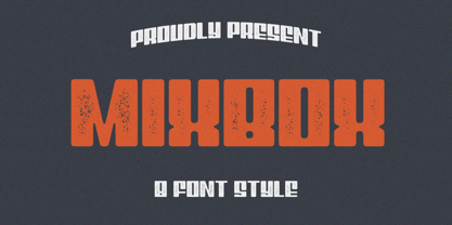 Evoke the spirit of a bygone era in your designs with the enchanting Mixbox Vintage Retro Display Font. This typeface seamlessly merges vintage charm with modern versatility, making it an ideal choice for designers seeking to infuse their projects with a touch of nostalgia and sophistication.
 - Lettering Project JNL by Jeff Levine,
$29.00 Lettering Project JNL was based on one of the many templates made by the Wood-Regan Instrument Company (also known as Wrico). Their sign making kits allowed anyone using the templates, special ink pens and alignment guides to create professional looking lettering with a minimum of experience.
 - Beauchef by Latinotype,
$26.00 Beauchef is a sans serif typeface originally created to meet the needs of Centro de Modelamiento Matemático de la Universidad de Chile (University of Chile Center for Mathematical Modeling). Beauchef is a typeface with rough strokes that features subtle optical compensation and does not strictly follow the laws of perception. This typeface might not be too cheerful, but shows a very particular idiosyncrasy of form. Beauchef is as tough as advanced mathematics; however, it is as legible and exact as numbers themselves. This is an avant-garde typeface that resembles the development of mathematics, but at the same time it is as conservative, calm and respectful as clients who require its services. Beauchef is so astonishing as mathematical formulas that mathematicians work with, but at the same time it is as humble as resulting figures.
 - Panforte Pro by Zetafonts,
$39.00Panforte Pro is the basic ingredient for any tasty visual feast: a prime-cut font family, deliciously readable online and offline, space-saving and organic, appealing to hipster consumers and seasoned gluttons. Hand drawn in easy big strokes, its a very condensed typeface that allows you to typeset easily long texts. Lovers of world cuisine will be delighted to discover that it supports over forty languages using the latin alphabet, spiced with hand-picked diacritics and comes also with a tasty side dish of greek and cyrillic characters. For all the nouvelle cuisine open type chefs, it features a set of proper small case character set and alternate oldstyle numerals, as well as a set of repeating letter ligatures to avoid that metallic taste of repeating double characters. - Ckornoments by Ingrimayne Type,
$5.00 Ckornoments is a two-font family of corner ornaments that was inspired by decorative grave ornaments. Similar ornaments can be found on old furniture and woodwork. Almost all ornaments come in sets of four for placement top right and left and bottom right and left. The two fonts, solid and outline, are designed to be used in layers but can be used separately. In addition, ornaments that include flowers have one part of the design separated out so the original and separated characters can be layered to give bi-colored images (or tri-colored with an outline). These ornaments are suitable for posters, newsletters, personal notes, and on other types of documents that benefit from framing. In addition to serving as corners, the ornaments can also be used as dividers between sections of text.
 - Megans by Sealoung,
$17.00 Imagine a slender serif font that effortlessly combines classic elegance with modern sophistication. This font features delicate, fine lines that evoke a sense of refinement and grace. Its letters are meticulously crafted, and it comes with a range of ligatures and alternate characters that add a unique touch to your design projects. These ligatures and alternates seamlessly blend together, creating a harmonious and seamless flow of text. Whether you're working on a vintage-inspired poster or a contemporary wedding invitation, this font's ligatures and alternates will allow you to infuse a touch of artistic flair into your designs, making it the perfect choice for those seeking a balance of tradition and innovation. Included : Uppercase & Lowercase Numeral & Punctuation Ligatures & Alternates Multilingual Support PUA Encode Thank you for visiting our shop and happy designing.
 - Stanzer by FaceType,
$35.00 Stanzer is an interpretation of wood type combined with the idea of modern stencils. Instead of cutting every letter, we are presenting an example of how a modern stencil typeface could look like, as we have come to the conclusion that almost every letter works without cutting it. Stanzer is a Unicase typeface, available in three OpenType weights: Black, Shadow and Block. Stanzer first started as part of our diploma 2010 (it was called Stanley at that time). The basic idea behind this typeface is that it is fully stencil usable, and, unlike other stencil fonts, does not require any bridges (except for the O and Q). Almost every letter can be sprayed without inserting planks. However, Stanzer also offers the display weight Block, which is only suitable for print or online usage.
 - ITC Django by ITC,
$29.99Australian designer and art director Wayne Thompson has loved typography “ever since I received a battered second-hand Letraset catalog at the age of 10.” He based ITC Django on the handwriting of an acquaintance -- “a fellow I know who writes and illustrates children's books and is also a commercial artist” -- who called himself Django, after the jazz guitarist Django Reinhardt. “I felt that that name Django suited the funky, lively feel of the face,” says Thompson. But he adds, “Django has a split personality: it appears loose and easy at first, but after looking at it for some time I felt an edginess come through that was slightly psychotic.” The looseness of the lowercase contrasts with the spikiness of the capitals. The “edginess” is especially apparent in words in all caps. - Signal1885 by astroluxtype,
$20.00 Signal1885 is the abbreviated name for "(Sig)nature Jour(nal)" a font that harkens back to an era, when fine handwriting filled journals with observations of science and adventure. Intimate and reflective of an individual entering his thoughts in his personal journal or a ship’s captain documenting his voyage on a daily basis. Signal1885 is penmanship that reflects hand forms from by-gone days. Its a minimal glyph set which can be used at various sizes as small as 18 points. It includes a selection of ink drips and smudges, that are the “mark” of a hand done entry. These can be placed in strategic places on the type to indicate a hand dragging through or dripping fresh ink on to the paper. Set sail- and keep a diary of your voyage.
 - FE Planking 2020 by Egor Stremousov,
$50.00 Experimental and accidental unicase grotesque. A font in which all the letters and numbers fell down and deformed under the force of gravity. Everything that was hanging fell down. Everything that was curved horizontally straightened. The form and principle of construction of each symbol in the font is dictated not by tradition, but by physics. This makes FE Planking 2020 an excellent tool for creating phrases and statements in advertising and art projects that attract attention and make your head spin. The first free version with a minimum set of Latin and Cyrillic alphabets was released in 2019, and in 2020 the font was updated and supplemented with an expanded set of characters. Dedicated to @Serge Rachok, who invented the Planking Game before it was invented by others.
 - Crispbake by Hanoded,
$15.00 A crispbake is a kind of cracker or rusk you eat for breakfast. At least, in Holland we do. They are called 'beschuit', they are round and they come in a pack of 13 (which is a baker's dozen). It turns out that this odd number of crispbakes in a pack comes from the fact that the ovens they were baked in held 13 crispbakes in a row and it was easier to pack them like that. So, should this question pop up during a game of trivial pursuit, you now know the answer! Crispbake font is a crunchy brush font. Completely handmade using a brush and Chinese ink. This fresh all caps font comes with a set of alternate glyphs and extensive language support, including Vietnamese and Greek.
 - Linotype Centennial by Linotype,
$29.99 Centennial appeared in 1986 in honor of Linotype’s 100th birthday. The roman and light cuts of the font are reminiscent of the Century typeface, particularly on that of Linn B. Benton and Morris F. Benton, designed around the turn of the 19th century for the American Type Founders. Like Century, Centennial too embodies a cool, reserved neutrality.
 - Goodfellow by Solotype,
$19.95Our font (circa 1895) of this old wood type was made by Hamilton of Two Rivers, Wisconsin, but we have been told that another identical font was made earlier by W. H. Page, Greeneville, Connecticut. Hamilton became the final home of many of the old wood type patterns as the early companies went out of business. - Stencil Mark JNL by Jeff Levine,
$29.00 The set of vintage brass alphabet stencils that inspired Stencil Mark JNL was manufactured by the Chicago Firm of Meyer and Wenthe. Pete Skoglund of Unadilla, NY was selling a set of these stencils on Ebay, and was nice enough to provide Jeff Levine some images to use as models for the design of this typeface.
 - Pencil by Ingrimayne Type,
$9.95 Imagine that you had a bunch of pencils of various sizes and you wanted to make a set of letters with them. You would probably come up with something similar to one of these three typefaces. It is caps only, but some of the characters on the lower-case keys are different from those on the upper-case keys.
 - Report School by Typodermic,
$11.95 Report School is a geometric sans-serif typeface that was inspired by student handwriting practice worksheets. But don’t worry, it’s not just a copy of those worksheets. Report School is designed to be easily readable, with legible letterforms that make it perfect for use in educational materials. You might be wondering what makes Report School different from other school-oriented geometric sans-serif typefaces. Well, for starters, it’s designed with readability in mind. While other typefaces might prioritize pure geometry, Report School puts legibility first. That means that when you use Report School, your readers will have an easier time reading your text. And speaking of easier reading, Report School has some features that are designed to make things even more legible. For example, instead of using straight quotes for inches, feet, or degrees, you can use primes. And Report School has regular primes, double primes, and triple primes, so you can choose the right one for your needs. Plus, the numerals in Report School are tabular, which means they’re vertically aligned for easier math equation alignment. But that’s not all! If you’re using OpenType savvy applications like InDesign, Illustrator, or Photoshop, you can access even more features. For example, you can use the stylistic alternates feature to access the letters “I” and “J” with no serifs, as well as a straight lowercase “q”. And if you’re looking for something a little different, you can check out Report School’s rounded version, called Report, or a version with casual strokes, called Sweater School. If you’re looking for a typeface that’s easy to read, but still has some personality, look no further than Report School. It’s the perfect choice for any educational materials that need to be both legible and stylish. Most Latin-based European writing systems are supported, including the following languages. Afaan Oromo, Afar, Afrikaans, Albanian, Alsatian, Aromanian, Aymara, Bashkir (Latin), Basque, Belarusian (Latin), Bemba, Bikol, Bosnian, Breton, Cape Verdean, Creole, Catalan, Cebuano, Chamorro, Chavacano, Chichewa, Crimean Tatar (Latin), Croatian, Czech, Danish, Dawan, Dholuo, Dutch, English, Estonian, Faroese, Fijian, Filipino, Finnish, French, Frisian, Friulian, Gagauz (Latin), Galician, Ganda, Genoese, German, Greenlandic, Guadeloupean Creole, Haitian Creole, Hawaiian, Hiligaynon, Hungarian, Icelandic, Ilocano, Indonesian, Irish, Italian, Jamaican, Kaqchikel, Karakalpak (Latin), Kashubian, Kikongo, Kinyarwanda, Kirundi, Kurdish (Latin), Latvian, Lithuanian, Lombard, Low Saxon, Luxembourgish, Maasai, Makhuwa, Malay, Maltese, Māori, Moldovan, Montenegrin, Ndebele, Neapolitan, Norwegian, Novial, Occitan, Ossetian (Latin), Papiamento, Piedmontese, Polish, Portuguese, Quechua, Rarotongan, Romanian, Romansh, Sami, Sango, Saramaccan, Sardinian, Scottish Gaelic, Serbian (Latin), Shona, Sicilian, Silesian, Slovak, Slovenian, Somali, Sorbian, Sotho, Spanish, Swahili, Swazi, Swedish, Tagalog, Tahitian, Tetum, Tongan, Tshiluba, Tsonga, Tswana, Tumbuka, Turkish, Turkmen (Latin), Tuvaluan, Uzbek (Latin), Venetian, Vepsian, Võro, Walloon, Waray-Waray, Wayuu, Welsh, Wolof, Xhosa, Yapese, Zapotec Zulu and Zuni.
 - Railyard Stencil JNL by Jeff Levine,
$29.00Railyard Stencil JNL is a stencil variant of Decal JNL that was set aside for a long time in a forgotten work folder. It's broad strokes and sharp serifs emulate the vintage look of old railway cars and other earlier forms of transportation. - Celtic Knots BA by Bannigan Artworks,
$14.95Create dynamic Celtic knot work strings with the Celtic Knotwork-BA font. Characters are sections of knots that are derived from ancient Celtic manuscripts such as the Book of Kells. Combine the characters to make an endless variety of Celtic knot configurations. - Witchy Doodle by Ake,
$12.00 Elevate your designs with Witchy Doodle, a whimsically enchanting font that seamlessly marries the charm of hand-drawn doodles with the grace of handwritten script. Perfect for invitations, branding, and creative projects, it sprinkles a dash of magic onto your design canvas.
 - Contra Flare by Wiescher Design,
$16.50 Contra Flare is the organic design of my Contra family of fonts. It has beautiful curved endings – not serifs – that make it look like it was made out of flowers leafs. But still the font has an elegant look to it. Enjoy!
 - Daily Funnies JNL by Jeff Levine,
$29.00 It is said that imitation is the sincerest form of flattery. Daily Funnies JNL (available in both regular and oblique versions) was inspired by and somewhat modeled after the hand lettering of Walt Kelly, the creator of the classic “Pogo” comic strip.
 - Mallaire by Rochart,
$20.00 Mallaire is a calligraphy font with an exclusive style and a touch of classic, inspired by the handwriting of ancient manuscripts. Carefully designed to work together in harmony that makes it very suitable for wedding media, book covers, greeting cards, logos, branding, business cards and certificates, even for any design work that requires a classic, formal or luxurious.