10,000 search results
(0.053 seconds)
- Good Reporting JNL by Jeff Levine,
$29.00 A September 29, 1920 edition of The San Diego Union ran the headline “Cicotte Confesses Baseball Fraud; Eight White Sox Players Indicted”. The White Sox baseball scandal was the first to reveal illegal gambling on the game. However, the headline itself was set in a bold slab serif type style [likely ATF Foster] which served as the model for Good Reporting JNL; which is available in both regular and oblique versions.
 - Contempora by My Creative Land,
$25.00 Contempora is a modern sophisticated font family that contains one block condensed sans serif with elegant ink traps, and a set of signature scripts in 4 different styles: Regular, 2 Rough styles (for authentic handwritten look and feel) and Bold (ideal for small text). Both Script and Sans Serif weights benefit from OpenType features. The Script fonts contain a lot of alternates, end-of-word swashes, and ligatures.
 - Sagasti by Eurotypo,
$32.00 Sagasti is a font family that contains two weights: Regular and Bold, with their corresponding Italics style. These fonts are characterized by a straight and generous serif that provides consistent stability. We have focused on controlling vertical, horizontal and oblique strokes thicknesses, as well as curved strokes. All glyphs were carefully drawn and precise kerning control has been made, providing optimal readability for texts and the beauty of the headlines.
 - La Lou by Nantia.co,
$12.00 LALOU Greek Chubby Font is a fun decorative font. The font supports Greek character set and a Latin character set. This only uppercase font is ideal for bold graphic design statements. The cute, chubby feeling of the font makes it ideal for food packaging. Also, it can be used on social media content, for branding, poster design, for “hand-written” quotes and any other kind of product packaging
 - Sunbreak by Olivetype,
$18.00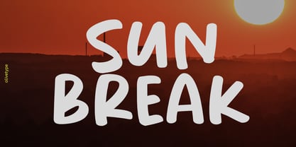 Sunbreak is a bold handwritten font, carefully handcrafted to become a true favorite. Its casual charm makes it appear wonderfully down-to-earth, readable, and ultimately, incredibly versatile. Sunbreak will look outstanding in any context, whether it’s being used on busy backgrounds or as a standalone headline! This font is supporting Multi-Languages, which includes: Afrikaans Albanian Catalan Danish Dutch English Estonian Finnish French German Italian Norwegian Portuguese Spanish Swedish Zulu.
 - Waxen by Twinletter,
$15.00 Introducing our newest gothic font called WAXEN, presenting a vintage and elegant style. With a classic Roman typeface, this font evokes confident elegance with striking details on each side of the lettering. This font can be used in a variety of projects to create a vintage and elegant style. Use it to enhance visual projects, titles, or banners, packaging with a bold classic look that exudes style, elegance, and strong personality.
 - Southern by Atom,
$16.00 Southern is a solid brush font that is made manually with brush strokes on paper. Unique in character and gives a prominent impression, it is suitable for your various design needs. With good kerning this font can also be used for paragraph writing, creating a character and bold design, this will give a huge impact to your advertising media needs. Thank you for purchasing our products, Have a great day! Letteratom
 - Buddy Slender by Hackberry Font Foundry,
$24.95 Buddy Slender is the narrower version of the companion sans for Contenu, the book font family designed for a book on book family design called Practical Font Design. It's a loose, free, easy to read sans, so when my wife suggested Buddy, it clicked. This is the 2-font Buddy Slender family of Regular & Bold. I made a new more limited feature set for these fonts due to their designed usage.
 - Annexia by Koshemare Studio,
$10.00 Annexia is a serif font with a several styles from Light to Bold. Serifs and stretched letters connect two times the past and the future, creating a perfect present. This font doesn't have a specific mood. Depending on the tasks, it can show itself in different ways. The font is perfect for both text, headlines, and branding. The font was designed by Pavel Bruev and released by Koshemare studio in 2021
 - Kiddie Stencil JNL by Jeff Levine,
$29.00 At one time, the Hampton Publishing Company of New York specialized in producing reading and activity books for children. The “Letters and Numbers Stencil Book” (probably from the late 1940s or early 1950s) was the basis for Kiddie Stencil JNL. This bold sans serif type style replicates the handmade steel rule dies used for cutting the stencil pages of the book, and is available in both regular and oblique versions.
 - Landsdowne Commercial by Greater Albion Typefounders,
$18.00 ‘Landsdowne Commercial’ is a development of one of our designer’s earlier public domain releases, ‘Landsdowne’. All glyphs have been completely redrawn and refined. An extensive range of stylistic alternates and ligatures have been added, as well as a completely new bold face and several forms of numerals. Landsdowne commercial is ideal for period-inspired design work, such as posters and book covers as well for clear elegant communications.
 - Vallenta by Letterara,
$14.00 Vallenta is a bold script font that is simple and unique looking. This customizable font will look great on a variety of design ideas such as Christmas themes, valentine's, posters, invitations, weddings, branding projects, social media posts, magazines, book covers, and more! This will add a fun and friendly touch to any of your projects! This font is PUA encoded which means you can access all glyphs and sweeps easily.
 - Tinman Pro by No Bodoni,
$35.00 TinmanPro is a mildly stressed humanist sans serif type based on the University of California Oldstyle type designed by Frederick Goudy. The design captures the warmth and friendly character of Goudy�s original in a monotone sans. Broad Latin support along with small caps, fraction support and other typographic niceties are included in the ten font family. Weight range includes Regular, Medium, DemiBold, Bold and ExtraBold with matching italics for each.
 - Angro by Linotype,
$29.99 The sans serif Angro was designed in the weights light and bold by Erwin Koch. The figures are based on the form of a rectangle which along with the high xheight and short ascenders and descenders gives the forms a static character. Lines of text in Angro are very compact and close set. Due to the reserved ascenders and descenders Angro can be set with very close line spacing.
 - Gothic Tuscan 8 by Wooden Type Fonts,
$15.00 A revival of one of the popular wooden type fonts of the 19th century, suitable for display. The bold version has rounded ball shapes at top and bottom of stems as well as at horizontal strokes. The pointed version has pointed shapes at top and bottom of stems as well as at horizontal strokes. Lowercase was not originally designed for these fonts. These new versions include caps, figures and accented caps.
 - Art Party by A New Machine,
$19.00 Art Party is a hand-drawn font suitable for headlines of all kinds when you want a handmade look. Prissy Pots owner Erin Solomon drew the playful letters, which include regular and bold versions. Each face also offers an entirely separate set of upper and lowercase letters accessible in your applications' glyphs palettes. With contextual alternates turned on, these extra letters show up automatically, yielding a more natural, random look.
 - Everglow Script by Seniors Studio,
$29.00 Everglow Script is retro signage font, bold and clean. There are so many variations on each character. Include Opentype stylistic alternates, standard ligatures and multilingual support. You are able to create so many different typographical layouts easily and quickly. Make sure you use OpenType savvy program and simply open Glyph Palette to access all of the glyphs. This font is suitable for t-shirts, signage, logos, branding, packaging etc.
 - Kuloko by Parker Creative,
$18.00 Bring a little tropical island vibe to your next project with Kuloko (Hawaiian for 'Inline')! Kuloko features offset handwritten characters with a bold marker like aesthetic, which gives the font a nice tropical tiki appearance. Kuloko's funky look is sure to capture attention in headlines on websites, social media graphics, logos, branding and so much more! Also included is a handwritten inline version of Kuloko for greater design variety!
 - Sunshine Susie JNL by Jeff Levine,
$29.00 Sheet music for the song "Today I Feel So Happy" from the 1932 motion picture "Sunshine Susie" provided both the visual model and the name for Sunshine Susie JNL, available in both regular and oblique versions. The lettering is a bold Art Deco thick-and-thin design, and comes not from the song's title, but the hand lettered name of the movie as it appeared on the cover the song folio.
 - TT Supermolot by TypeType,
$29.00 You are on the page of the old display version of the TT Supermolot font. In 2019, we released an entirely new, completely redesigned and significantly expanded version of the typeface called TT Supermolot Neue. In addition to 54 styles, TT Supermolot Neue has stylistic alternates, ligatures, old-style figures and many other useful OpenType features. Before you buy the old display version of the font, we suggest that you pay attention to the new superfamily TT Supermolot Neue and study it in more detail. - TT Supermolot Condensed is the narrow version of the TT Supermolot font family. Thanks to its open forms, TT Supermolot Condensed fits perfectly into any contemporary technological design and navigation systems. We've already seen this font family in the sports theme (as the main font for hockey teams branding), we've seen TT Supermolot as the main font inside the gameplay of a popular 3D-shooter. Information transfer in the high-tech areas is the ideal environment for this font family, also TT Supermolot Condensed fits well into army, space, and innovation themes. We've tried to create a maximum number of convenient weights (Thin, Light, Regular, Bold, Black) for you to be able to use this family anywhere, from mobile apps and web pages to big state fairs branding.
 - TT Supermolot Condensed by TypeType,
$29.00 You are on the page of the old display version of the TT Supermolot Condensed font. In 2019, we released an entirely new, completely redesigned, and significantly expanded version of the typeface called TT Supermolot Neue. In addition to 54 styles, TT Supermolot Neue has stylistic alternates, ligatures, old-style figures and many other useful OpenType features. Before you buy the old display version of the font, we suggest that you pay attention to the new superfamily TT Supermolot Neue and study it in more detail. - TT Supermolot Condensed is the narrow version of the TT Supermolot font family. Thanks to its open forms, TT Supermolot Condensed fits perfectly into any contemporary technological design and navigation systems. We've already seen this font family in the sports theme (as the main font for hockey teams branding), we've seen TT Supermolot as the main font inside the gameplay of a popular 3D-shooter. Information transfer in the high-tech areas is the ideal environment for this font family, also TT Supermolot Condensed fits well into army, space, and innovation themes. We've tried to create a maximum number of convenient weights (Thin, Light, Regular, Bold, Black) for you to be able to use this family anywhere, from mobile apps and web pages to big state fairs branding.
 - Eggad by Ingrimayne Type,
$9.00 Eggad features letters on eggs. It can be a fun font to use at Easter or for any egg-related message. Some of the eggs - those on the upper-case keys - have their large end on the bottom and others - those on the lower-case keys - have their large end on the top. The font uses the contextual alternatives feature of OpenType to alternate the big-bottom and big-top eggs. If you only want eggs with big tops or with big bottoms, turn this feature off. Eggad comes in two styles, a regular style in which the eggs are outlined and a bold style in which the eggs are solid. Both are monospaced. The two styles can be layered to color the eggs. Alternatively, background color can be added (dot accent and ring characters) or the outline color can be changed (sterling and yen characters) using layers in the regular style. If you are typing numbers and you want the start to be big-bottom number, switch on OpenType style set 1.
 - Magneton by Melvastype,
$32.00 Magneton is a brush script typeface that contains three weights and two slant angles. Three weights simulates the pressure of the brush pen; light is written with a gentle pressure and the bold one with more pressure. Two slant angles gives Magneton two natures; the more casual one and the more dynamic one. So with this script you have lots of options to choose from. You can adjust the look and feel just like when writing with a real brush pen! Magneton has lots of alternates and swash characters. It has two sets (and more) of upper case letters. The more basic one and the more flamboyant one. It also has lots and lots of lower case alternates: two styles of end swashes, underlines, a few different ascender and descer swashes and much more. Please explore the images and glyhp set to get the idea. I hope you like what you see and use Magneton in logos, lettering compositions, t-shirts etc. there are lots of opportunities with this one. Thank you and please enjoy!
 - Sapore by Fonderia Serena,
$23.90 Sapore is a script font family, mostly monoline, inspired by the elegant handmade signs in the beautiful city of Venice, Italy, where I work and live. Many of these signs were made at the beginning of the 20th century by skillful craftsmen and artists, carrying that distinct vintage Italian flavour, and this is why I named the font Sapore, which means precisely flavour (also, one of the signs is from a pastry shop that makes the most delicious things). The design takes this retro vibe into the 21st century, making it up-to-date and fresh, while keeping it authentic. It is a script font, but I added some stand alone capitals that you can use in all caps words and texts effortlessly, as the open type code is taking care of using the right set of letters at the right time, I could have made two separate fonts, but I wanted to give you the best value I could and ease of use. Make sure contextual alternates are always on! There are also swashes, alternate styles, stylistic sets, small caps, 2 figure sets and decorative elements, all accessible through open type. I think the font is particularly suited for display use, as in logos, packaging design, branding, but it is readable enough for small text blocks. You can access the non-linking caps by clicking on the discretionary ligatures button. You can access the loopy caps by clicking on the titling alternates button. The main version has straight terminals but I included a round version and a calligraphic one, called “classico”. Hope you like it!
 - RM True To Type by Ray Meadows,
$19.00 Throw away the carbon paper, ribbons and Tippex ... now you can get that typewritten look with RM True to Type. Legible at all sizes, it is available in regular and bold. That faithful old typewriter has given many years of valiant service, but now the keys are worn and blocked with ink. The Old styles replicate the wear and tear of years of use. Includes: Western European, Central European, Baltic & Turkish sets Due to the modular nature of this design there may be a slight lack of smoothness to the curves at very large point sizes (around 100 pt and above).
 - Bookvarium Roman by Letterhead Studio-VV,
$19.99 A unique display font based on the research in vintage and old fonts from the beginning of the 20th century. Perfectly work for headlines in print or can be a spice to any other design.
 - Lost Hills JNL by Jeff Levine,
$29.00Lost Hills JNL is a split-serif Western font based on Jeff Levine's Brogado JNL. Named for an actual location in California, this font has all the basic characteristics of a traditional Old West design. - Vendome by Linotype,
$40.99One of the most famous modern Old Face fonts, designer Francois Ganeua developed Vendome with the special features and extravagance typical of such forms. Strong and lively, such details give Vendome its unmistakeable, unique appearance. - Smiley by Dear Alison,
$24.00Ever think that supermarkets are becoming less personal and more clinical and cold? What will cost you less than a trip to the supermarket and put a smile on your face? Smiley was inspired by the hand-brush lettered signage at country grocery stores. There's something about the feeling you get when you visit a small town and stroll on over to the corner market. Everyone is pleasant, courteous, and they all have a smile on their face. You can have that local small town grocery store charm for yourself when you buy Smiley today. - Movie Poster - Unknown license

- Americana Dreams - Unknown license

- Groove Machine - Unknown license

- Zoloft - Unknown license

- Alien Encounters - Unknown license

- Cosmic Age - Unknown license

- Teleprinter - Unknown license

- Savu by Hiekka Graphics,
$18.00 Savu is a hand-lettering font in four styles: regular, bold, condensed and condensed bold. It is recommended for use as a display typeface.
 - Tomcat by Trim Studio,
$8.00 The Tomcat Bold is a playful display font. It comes in a regular and bold style which will give your design a fun touch.
 - P22 Vale by IHOF,
$24.95 The Vale Press was a contemporary of Willam Morris's Kelmscott Press. The types used by the Vale Press were designed by artist Charles Ricketts, who also supervised the design and printing of Vale Press books. The main type used, Vale, was based on the Jenson 15th century roman type style. The King's Fount was an experimental semi-uncial font based on the Vale type. The King's Fount was designed in 1903 for the Vale edition of the 15h century poem "The Kingis Quair". This semi-uncial font evokes old English and Anglo-Saxon lettering. P22 Vale Pro combines the two fonts P22 Vale Roman and P22 Vale King's Fount into one "Pro" font. This pro font also includes a Central European character set, old style figures, fractions, ornaments and a special faux "Middle English" feature to make "anee text appeer Olde." This feature is not known to exist in any other font.
 - Times Eighteen by Linotype,
$29.00In 1931, The Times of London commissioned a new text type design from Stanley Morison and the Monotype Corporation, after Morison had written an article criticizing The Times for being badly printed and typographically behind the times. The new design was supervised by Stanley Morison and drawn by Victor Lardent, an artist from the advertising department of The Times. Morison used an older typeface, Plantin, as the basis for his design, but made revisions for legibility and economy of space (always important concerns for newspapers). As the old type used by the newspaper had been called Times Old Roman," Morison's revision became "Times New Roman." The Times of London debuted the new typeface in October 1932, and after one year the design was released for commercial sale. The Linotype version, called simply "Times," was optimized for line-casting technology, though the differences in the basic design are subtle. The typeface was very successful for the Times of London, which used a higher grade of newsprint than most newspapers. The better, whiter paper enhanced the new typeface's high degree of contrast and sharp serifs, and created a sparkling, modern look. In 1972, Walter Tracy designed Times Europa for The Times of London. This was a sturdier version, and it was needed to hold up to the newest demands of newspaper printing: faster presses and cheaper paper. In the United States, the Times font family has enjoyed popularity as a magazine and book type since the 1940s. Times continues to be very popular around the world because of its versatility and readability. And because it is a standard font on most computers and digital printers, it has become universally familiar as the office workhorse. Times™, Times™ Europa, and Times New Roman™ are sure bets for proposals, annual reports, office correspondence, magazines, and newspapers. Linotype offers many versions of this font: Times™ is the universal version of Times, used formerly as the matrices for the Linotype hot metal line-casting machines. The basic four weights of roman, italic, bold and bold italic are standard fonts on most printers. There are also small caps, Old style Figures, phonetic characters, and Central European characters. Times™ Ten is the version specially designed for smaller text (12 point and below); its characters are wider and the hairlines are a little stronger. Times Ten has many weights for Latin typography, as well as several weights for Central European, Cyrillic, and Greek typesetting. Times™ Eighteen is the headline version, ideal for point sizes of 18 and larger. The characters are subtly condensed and the hairlines are finer. Times™ Europa is the Walter Tracy re-design of 1972, its sturdier characters and open counterspaces maintain readability in rougher printing conditions. Times New Roman™ is the historic font version first drawn by Victor Lardent and Stanley Morison for the Monotype hot metal caster."


