10,000 search results
(0.042 seconds)
- Anisette Std by Typofonderie,
$59.00 A geometric Art Déco multi-widths type family Anisette has sprouted as a way to test some ideas of designs. It has started with a simple line construction (not outlines as usual) that can be easily expanded and condensed in its width in Illustrator. Subsequently, this principle of multiple widths and extreme weights permitted to Jean François Porchez to have a better understanding with the limitations associated with the use of MultipleMaster to create intermediate font weights. Anisette is built around the idea of two widths capitals can be described as a geometric sanserif typeface influenced by the 30s and the Art Deco movement. Its design relies on multiple sources, from Banjo through Cassandre posters, but especially lettering of Paul Iribe. In France, at that time, the Art Déco spirit is mainly capitals. Gérard Blanchard has pointed to Jean François that Art Nouveau typefaces designed by Bellery-Desfontaines was featured before the Banjo with this principle of two widths capitals. A simple sentence will be as diverse in its representations, as the number of Anisette variables available to the user. With Anisette, typography becomes a game, as to design any title page as flamboyant as if it has been specially drawn for it. Two typefaces, many possibilities The complementarity between the two typefaces are these wide capitals mixed with narrow capitals for the Anisette while the Anisette Petite – in its latest version proposes capitals on a square proportions, intermediate between the two others sets. Anisette Petite proposes capitals in a square proportion, intermediate between the two other sets, all of which are interchangeable. In addition, Anisette Petite also includes a set of lowercase letters. Its style references shop signs present in our cities throughout the twentieth century. Anisette, an Art Déco typeface Anisette: Reveal your typographic expertise Club des directeurs artistiques, 46e palmarès Bukva:raz 2001 Slanted: Contemporary Typefaces #24
 - MVB Solitaire Pro by MVB,
$39.00 A typeface is a tool. Sure, there are frilly fonts that are more art than craft, showy faces that exist merely to call attention to themselves. But, in the end, any functional typeface worth its salt lives to serve one thing first: the text, the content. Everything else—the fashion of the moment, the allure of individual words and letters—is secondary. MVB Solitaire™ epitomizes this universal typographic mandate. As a tempered sans serif somewhere between a humanist and a gothic, MVB Solitaire captures a 21st-century neutrality. But practical doesn’t have to mean banal. MVB Solitaire has a soul. While some “neutral” type is dead the moment the ink hits the page, MVB Solitaire delivers text that feels lively, contemporary, relevant. Readers will not tire of this type. Behind the useful exterior is an arsenal of thoughtful technical features. It’s no surprise that this family’s creator, Mark van Bronkhorst, was first a graphic designer before becoming a type designer. Mark built all the goodies into MVB Solitaire that he would appreciate as a user: case-sensitive punctuation; alternate forms that can be invoked individually or together; oldstyle and lining figures in both tabular and proportional widths; slightly shorter lining figures that don’t stand out in running text, but also cap-height figures for all-cap settings; and the ability to speak nearly any Latin-based language. MVB Solitaire aspires to be the sort of workhorse that a designer keeps installed on their system at all times. It is a family bound to have a permanent spot in the font menu, always at the ready for projects (those most common of all) where the typography mustn’t mask the message. It has that quality that all truly useful typefaces have: the capacity to get the job done without getting in the way.
 - Classic Grotesque by Monotype,
$40.99 Classic Grotesque by Rod McDonald: a traditional font with a modern face. The growing popularity of grotesque typefaces meant that many new sans serif analogues were published in the early 20th century. Setting machines were not compatible with each other but all foundries wanted to offer up-to-date fonts, and as a result numerous different typeface families appeared that seem almost identical at first glance and yet go their separate ways with regard to details. One of the first fonts created with automatic typesetting in mind was Monotype Grotesque®. Although this typeface that was designed and published by Frank Hinman Pierpont in 1926 has since been digitalised, it has never achieved the status of other grotesque fonts of this period. But Monotype Grotesque was always one of designer Rod McDonald’s favourites, and he was overjoyed when he finally got the go-ahead from Monotype in 2008 to update this “hidden treasure”. The design process lasted four years, with regular interruptions due to the need to complete projects for other clients. In retrospect, McDonald admits that he had no idea at the beginning of just how challenging and complex a task it would be to create Classic Grotesque™. It took him considerable time before he found the right approach. In his initial drafts, he tried to develop Monotype Grotesque only to find that the result was almost identical with Arial®, a typeface that is also derived in many respects from Monotype Grotesque. It was only when he went back a stage, and incorporated elements of Bauer Font’s Venus™ and Ideal Grotesk by the Julius Klinkhardt foundry into the design process, that he found the way forward. Both these typefaces had served as the original inspiration for Monotype Grotesque. The name says it all: Classic Grotesque has all the attributes of the early grotesque fonts of the 20th century: The slightly artificial nature gives the characters a formal appearance. There are very few and only minor variations in line width. The tittles of the ‘i’ and ‘j’, the umlaut diacritic and other diacritic marks are rectangular. Interestingly, it is among the uppercase letters that certain variations from the standard pattern can be found, and it is these that enliven the typeface. Hence the horizontal bars of the “E”, “F” and “L” have bevelled terminals. The chamfered terminal of the bow of the “J” has a particular flamboyance, while the slightly curved descender of the “Q” provides for additional dynamism. The character alternatives available through the OpenType option provide the designer with a wealth of opportunities. These include a closed “a”, a double-counter “g” and an “e” in which the transverse bar deviates slightly from the horizontal. The seven different weights also extend the scope of uses of Classic Grotesque. These range from the delicate Light to the super thick Extrabold. There are genuine italic versions of each weight; these are not only slightly narrower than their counterparts, but also have variant shapes. The “a” is closed, the “f” has a semi-descender while the “e” is rounded. Its neutral appearance and excellent features mean that Classic Grotesque is suitable for use in nearly all imaginable applications. Even during the design phase, McDonald used his new font to set books and in promotional projects. However, he would be pleased to learn of possible applications that he himself has not yet considered. Classic Grotesque, which has its own individual character despite its neutral and restrained appearance, is the ideal partner for your print and web project.
 - Godzie Olstd by Olexstudio,
$19.00 GODZIE Olstd Handwritten Brush Font will look gorgeous on all your designs, poster design, book design, branding materials, logo's, and all project design other. WHAT'S INCLUDED GODZIE Olstd Handwritten Brush Font contains standard characters, All Chacacter is Uppercase, numbers, punctuation, Alternates, ligatures and international glyphs. Happy designed.! thanks, regard olexstudio
 - JAF Zalamander by Just Another Foundry,
$42.00 Blackletter, sans serif, graffiti, constructivism: all these influences are combined into a lively and dynamic – and somehow “disobedient” – typeface. Since blackletter fonts typically don’t look great when used in all-caps, Zalamander comes with a special Caps version that contains letter variants that combine nicely in uppercase. All fonts support Cyrillic.
 - Fostone by GlyphStyle,
$17.00 Fostone is a signature style font with a natural looking ballpoint pen. Luxurious and elegant font. Font family with 4 version: regular, bold, italic, bolditalic. This signature font is perfect for, watermarks, branding, business, business cards, product logos, etc. – Font feature Uppercase, Lowercase, Numerals & Punctuations, Stylistic Alt, swsh (ending swash), Ligature, Multilanguage
 - Yule Like This NF by Nick's Fonts,
$-Just in time for the Holiday Season, here's a FREE font with word art, clip art and border elements to dress up your next project. Enjoy! - Shourtcut by Arendxstudio,
$20.00 Shourtcut is a font designed for the needs of all your retro-themed projects and can be implemented to all the designs you want to make.
 - Jugenstil Kunsthand by Scriptorium,
$12.00Jugendstil Kunsthand is based on a sample of late 19th century lettering in a style often associated with artists of the Jugendstil Art Nouveau movement in Germany. The characters are done in heavy outline with a rough-hand drawn look. The style is interesting because it shows the influence of the Arts and Crafts movement on Art Nouveau with many of the characters featuring alternate versions that nest together in a manner typical of Arts & Crafts lettering. - Venio by Craft Supply Co,
$20.00 Venio – Double Line Font: Display Typography with Art Deco Flair Deco-inspired Elegance Infused with Art Deco sophistication, Venio, a double-line sans-serif font, brings timeless elegance to your designs. Distinctive Display Presence Venio ensures a bold yet refined aesthetic for logos and headlines, making your display stand out with its distinctive double-line design. Artful Symmetry Paying homage to Art Deco’s geometric precision, Venio’s symmetrical lines provide a visually pleasing experience, adding a touch of artistic flair.
 - Pata Slab by In-House International,
$10.00 Pata Slab: the ultra-heavy optimism we all need in 2020 Pata Slab is the type equivalent of a catwalk stomp down a city sidewalk, a font that’s assertive, funky and more than a little sexy. Named after a colloquialism for ‘feet’, Pata features ultra-heavy slabs and contrasting hairline centers that rise from its chunky footprint. The resulting, retro-inspired vertiginous curves add instant attitude to any design. Developed in 2020, Pata is a type of its time.Pata is all upside, as it is a typeface with no descenders — one that elevates all characters to grow upward from the baseline (because, c’mon, we could all use something uplifting right now!) All uppercase characters were built to fit precisely inside a square, so they’re all the same width and height. The lowercase alphabet, eñes, cedillas, punctuation, numbers and symbols all follow the same height restrictions. Despite all that confinement, Pata sports standard-height terminals that connect seamlessly so there’s nearly endless options for modular ligatures. The upshot of all this meticulous awesomeness is that laying out, customizing and stacking text super simple. Pata Slab was created by In-House International, designed Alexander Wright in collaboration with Rodrigo Fuenzalida. It's available for Opentype format (.otf) compatible with Mac and PC.
 - Imagine Forest by Letteralle,
$18.00 Introducing! Imagine Forest Font! a casual and charming brush font. Indigo Forest is very suitable to fill your design needs such as, branding, social media, merch, ads, book title, packaging, etc. Imagine Forest includes 2 fonts : - Imagine Forest: The main font with Uppercase, Lowercase, Number, Punctuation, and also multilingual support. - Imagine Forest Alt: Besides you can access alternative characters from the main font through the opentype feature, you can also install this alternative fonts. Indigo Forest Alt font will give you other options for a character, which of course will add a natural impression. Imagine Forest also has a some of ligatures that will enhance the natural impression. Thatís it! Please do let me know what you think, feel free to comment if there are issues or queries. Enjoy the Font, Thank You!
 - Poleno by DizajnDesign,
$39.00 Poleno is a custom typeface originally designed in 2006 for the Slovak folk dance ensemble Poleno, as a part of their corporate identity. Ever since, new weights have been added to complete six variables and two different options for accents. The typeface adds a fresh, bold and non-rational feeling to headlines and titles in books and posters in display sizes where emphasis and detail are equally important. Randomly-generated contextual alternates included in the family contribute to add a distinctive look to words with repeating characters, whenever they occur next to each other. The difference between the Poleno Set and the Poleno Alt Set is in the accented characters. In the first one, accents are merged with the characters and in Alt version, accents are separated from the characters.
 - Suited Horse PB by Pink Broccoli,
$19.00 An offbeat alternate caps typestyle inspired by the title screen of a 1968 Walt Disney film titled, The Horse in the Gray Flannel Suit. This playful and childish font comes with an extensive language set, a stylistic alternates feature that auto-alternates between capitals & lowercase (alt caps), as well as a contextual alternates feature that auto-alternates between sets only where double characters are typed like SS, TT, etc. The contextual alternate feature also enables a few titling word options like " the " " in " and " in the ". As noted in the quotes, when these word sets are typed with a space before and after them, it will trigger the swap when contextual alternates is on. Switching on Contextual Alternates enables automatic alternations between caps and alt caps like AlTeRnAtIoNs to create a more randomized look.
 - Breamcatcher by Typodermic,
$11.95 Step into the 1920s with Breamcatcher, the typeface that’ll transport you to the Art Deco era. Inspired by the smooth notes of “With Every Breath I Take” from the Bing Crosby/Kitty Carlisle classic “Here is my Heart,” Breamcatcher is the epitome of class and style. Don’t be fooled by compact sans-serif typefaces that lack personality; Breamcatcher is a slow jam that’ll have you grooving in no time. With loose spacing and lazy strokes, your message will take on a breezy, reassuring voice that oozes romance. Get ready to feel like a true Gatsby with Breamcatcher’s OpenType fractions, numeric ordinals, and a wide range of currency symbols that are included. Available in Regular, Italic, and Bold-Italic styles, this typeface is perfect for any occasion. So whether you’re advertising the latest luxury goods or simply want to add a touch of class to your designs, Breamcatcher is the perfect choice. Most Latin-based European, Vietnamese, Greek, and most Cyrillic-based writing systems are supported, including the following languages. Afaan Oromo, Afar, Afrikaans, Albanian, Alsatian, Aromanian, Aymara, Azerbaijani, Bashkir, Bashkir (Latin), Basque, Belarusian, Belarusian (Latin), Bemba, Bikol, Bosnian, Breton, Bulgarian, Buryat, Cape Verdean, Creole, Catalan, Cebuano, Chamorro, Chavacano, Chichewa, Crimean Tatar (Latin), Croatian, Czech, Danish, Dawan, Dholuo, Dungan, Dutch, English, Estonian, Faroese, Fijian, Filipino, Finnish, French, Frisian, Friulian, Gagauz (Latin), Galician, Ganda, Genoese, German, Gikuyu, Greenlandic, Guadeloupean Creole, Haitian Creole, Hawaiian, Hiligaynon, Hungarian, Icelandic, Igbo, Ilocano, Indonesian, Irish, Italian, Jamaican, Kaingang, Khalkha, Kalmyk, Kanuri, Kaqchikel, Karakalpak (Latin), Kashubian, Kazakh, Kikongo, Kinyarwanda, Kirundi, Komi-Permyak, Kurdish, Kurdish (Latin), Kyrgyz, Latvian, Lithuanian, Lombard, Low Saxon, Luxembourgish, Maasai, Macedonian, Makhuwa, Malay, Maltese, Māori, Moldovan, Montenegrin, Nahuatl, Ndebele, Neapolitan, Norwegian, Novial, Occitan, Ossetian, Ossetian (Latin), Papiamento, Piedmontese, Polish, Portuguese, Quechua, Rarotongan, Romanian, Romansh, Russian, Rusyn, Sami, Sango, Saramaccan, Sardinian, Scottish Gaelic, Serbian, Serbian (Latin), Shona, Sicilian, Silesian, Slovak, Slovenian, Somali, Sorbian, Sotho, Spanish, Swahili, Swazi, Swedish, Tagalog, Tahitian, Tajik, Tatar, Tetum, Tongan, Tshiluba, Tsonga, Tswana, Tumbuka, Turkish, Turkmen (Latin), Tuvaluan, Ukrainian, Uzbek, Uzbek (Latin), Venda, Venetian, Vepsian, Vietnamese, Võro, Walloon, Waray-Waray, Wayuu, Welsh, Wolof, Xavante, Xhosa, Yapese, Zapotec, Zarma, Zazaki, Zulu and Zuni.
 - Wubble by Typodermic,
$11.95 Welcome to Wubble Labs—where we don’t just think outside the box, we dissolve it! Our team of mad scientists has been busy experimenting with the latest in colloidal glopulation technology, and we’re thrilled to present our latest creation: Wubble, the blobbiest, squishiest, most liquid font you’ve ever seen! We know what you’re thinking, “liquid font? What the heck does that even mean?” Well, let us tell you, Wubble is more than just a font—it’s a living, breathing, dripping typographical workfish. Each letter is like a tiny blob of ooze, flowing and shifting in a mesmerizing dance of liquidy goodness. But don’t let Wubble’s gooey exterior fool you—this font is the product of years of careful research and development. Our team of scientists have spent countless hours studying the precise characteristics of colloidal glopulation, perfecting every last detail to bring you the finest liquid font ever produced. So if you’re ready to take your design game to the next level, come on down to Wubble Labs and see what all the fuss is about. We promise, once you go Wubble, you’ll never go back! Most Latin-based European writing systems are supported, including the following languages. Afaan Oromo, Afar, Afrikaans, Albanian, Alsatian, Aromanian, Aymara, Bashkir (Latin), Basque, Belarusian (Latin), Bemba, Bikol, Bosnian, Breton, Cape Verdean, Creole, Catalan, Cebuano, Chamorro, Chavacano, Chichewa, Crimean Tatar (Latin), Croatian, Czech, Danish, Dawan, Dholuo, Dutch, English, Estonian, Faroese, Fijian, Filipino, Finnish, French, Frisian, Friulian, Gagauz (Latin), Galician, Ganda, Genoese, German, Greenlandic, Guadeloupean Creole, Haitian Creole, Hawaiian, Hiligaynon, Hungarian, Icelandic, Ilocano, Indonesian, Irish, Italian, Jamaican, Kaqchikel, Karakalpak (Latin), Kashubian, Kikongo, Kinyarwanda, Kirundi, Kurdish (Latin), Latvian, Lithuanian, Lombard, Low Saxon, Luxembourgish, Maasai, Makhuwa, Malay, Maltese, Māori, Moldovan, Montenegrin, Ndebele, Neapolitan, Norwegian, Novial, Occitan, Ossetian (Latin), Papiamento, Piedmontese, Polish, Portuguese, Quechua, Rarotongan, Romanian, Romansh, Sami, Sango, Saramaccan, Sardinian, Scottish Gaelic, Serbian (Latin), Shona, Sicilian, Silesian, Slovak, Slovenian, Somali, Sorbian, Sotho, Spanish, Swahili, Swazi, Swedish, Tagalog, Tahitian, Tetum, Tongan, Tshiluba, Tsonga, Tswana, Tumbuka, Turkish, Turkmen (Latin), Tuvaluan, Uzbek (Latin), Venetian, Vepsian, Võro, Walloon, Waray-Waray, Wayuu, Welsh, Wolof, Xhosa, Yapese, Zapotec Zulu and Zuni.
 - Galderglynn 1884 by Typodermic,
$11.95 Introducing Galderglynn 1884, a font family that transports you back to the nineteenth century. With its refined expansion from the intentionally rustic Galderglynn Esquire, this typeface oozes old-world charm and sophistication. The condensed fonts are expertly squared off, paying homage to the typical condensed newspaper headline type of the era. Their weight and spacing are deliberately unrefined, just like the pre-twentieth century grotesques that inspired Galderglynn Esquire. Meanwhile, the extra-condensed “squeeze” fonts are completely flat-sided, reminiscent of the old wooden poster types and tight metal newspaper headline fonts. If you’re looking for a practical workhorse font family, Galderglynn 1884 is the perfect choice. It combines the pastoral design of Galderglynn Esquire with a polished finish that makes it easy to read and use. And if you’re after something extra special, you’ll love the three special effect fonts: all-capitals shadow, and engraved regular and condensed styles. Access tabular and lowercase (old-style) numerals with ease, thanks to the OpenType features available in this font family. Galderglynn 1884 is the perfect way to add a touch of old-fashioned charm to your designs. Try it today and transport your audience to a bygone era! Most Latin-based European, and some Cyrillic-based writing systems are supported, including the following languages. A Afaan Oromo, Afar, Afrikaans, Albanian, Alsatian, Aromanian, Aymara, Bashkir (Latin), Basque, Belarusian (Latin), Bemba, Bikol, Bosnian, Breton, Bulgarian, Cape Verdean, Creole, Catalan, Cebuano, Chamorro, Chavacano, Chichewa, Crimean Tatar (Latin), Croatian, Czech, Danish, Dawan, Dholuo, Dutch, English, Estonian, Faroese, Fijian, Filipino, Finnish, French, Frisian, Friulian, Gagauz (Latin), Galician, Ganda, Genoese, German, Greenlandic, Guadeloupean Creole, Haitian Creole, Hawaiian, Hiligaynon, Hungarian, Icelandic, Ilocano, Indonesian, Irish, Italian, Jamaican, Kaqchikel, Karakalpak (Latin), Kashubian, Kikongo, Kinyarwanda, Kirundi, Komi-Permyak, Kurdish (Latin), Latvian, Lithuanian, Lombard, Low Saxon, Luxembourgish, Maasai, Macedonian, Makhuwa, Malay, Maltese, Māori, Moldovan, Montenegrin, Ndebele, Neapolitan, Norwegian, Novial, Occitan, Ossetian, Ossetian (Latin), Papiamento, Piedmontese, Polish, Portuguese, Quechua, Rarotongan, Romanian, Romansh, Russian, Sami, Sango, Saramaccan, Sardinian, Scottish Gaelic, Serbian, Serbian (Latin), Shona, Sicilian, Silesian, Slovak, Slovenian, Somali, Sorbian, Sotho, Spanish, Swahili, Swazi, Swedish, Tagalog, Tahitian, Tetum, Tongan, Tshiluba, Tsonga, Tswana, Tumbuka, Turkish, Turkmen (Latin), Tuvaluan, Ukrainian, Uzbek (Latin), Venetian, Vepsian, Võro, Walloon, Waray-Waray, Wayuu, Welsh, Wolof, Xhosa, Yapese, Zapotec Zulu and Zuni.
 - Coco Gothic Pro by Zetafonts,
$39.00 Inspired by a biography of Coco Chanel and trying to capture the quintessential mood of classical fashion elegance, Cosimo Lorenzo Pancini designed Coco Gothic looking for the effect that the first geometric sans typefaces (like Futura, Kabel or the italian eponyms like Semplicità) had when printed on paper. The crisp modernist shapes acquired in printing charme and warmth through a slight rounding of the corners that is translated digitally in the design of Coco Gothic. This signature touch is enhanced by the inclusion of light humanist touches to the proportions of the letters, resulting in the unique mix that makes Coco Gothic one of our best sellers, with a look that is both contemporary and vintage. After six years from the original project (that has spawned in the meanwhile successful families like Cocogoose and Coco Sharp), we went back to the design to completely redraw and expand the original family, creating with a Pro version that has better on-screen readability, a wider weight range, variable type versions and more language coverage (with Coco Gothic Arabic adding a new script to the latin, greek and Cyrillic of the original). Coco Gothic Pro comes in three subfamilies, each with seven weights with matching italics and featuring an extended character set with open type support for small caps, ligatures, alternates, European languages, Greek and Cyrillic alphabets. The original, body-text optimised Coco Gothic and Coco Gothic Alternate subfamilies have been kept for compatibility with the previous version, while a new Coco Gothic Display subfamily has been developed with a complete redesign aimed at display usage, featuring tighter spacing and optimised letterforms. A distinguishing feature of Coco Gothic Pro is the inclusion of ten alternate historical sets that allow you to use the typeface as a true “typographic time machine”, selecting period letterforms that range from art deco and nouveau, to modernism and to eighties’ minimalism. Equipped with such an array of historical variants, Coco Gothic Pro becomes an encyclopedia of styles from the last century, ready to transform itself and adapt to the mood of your text.
 - Lady Rene by Sudtipos,
$59.00 Looking back on my production to date, neither so little nor so large, it does not come as a surprise to find myself now introducing Lady René. A brief review of my career would read as follows: graphic designer graduated from Buenos Aires University, a 10-year professorship in Typography in the same institution, an illustrator in the making. For almost 15 years now my work has focused on the design of editorial pieces, predominantly books and CD sleeves. Typography proper has always been central to my research projects. All my obsessions eventually embodied as much the search for a perfect, spotless text as for a daring and provoking one. In my view, "how-to-say-something" ranks highest amongst a graphic designer’s responsibilities. It was in this vein that I called in the written word to illustrate, to draw, to narrate. Why not reverse the saying and proclaim that “a word is worth a thousand images”? If so, one single word could trigger endless meanings, associations, ideas, and memories in every reader’s mind. Language, we know, has a strong power and is a living expression of a culture. In my illustrations, letters and drawings reunite in one synergy said and unsaid, the finiteness of the message and the freedom of the free reading. And this is how and when, Lady René, my first born type font sees the light of day conceived out of a love of illustration and a reverence for the written word, recalling the whimsicality of the handmade drawing and reflecting its sensitive, warmth and spontaneity. Enabled by the characteristics of Open Type and the hard, outstanding work of designer Ale Paul, Lady René succeeds in composing texts in a simple, organic way by means of its contextual and stylistic alternates, swash characters, ligatures and connecting words. A bundle of decorative miscellanea completes the set of signs, enabling the user considerable freedom to create new typographic landscapes. Lady René is then prepared, very much like a character in a short story, to come to life in the reader’s mind. I expect you will enjoy her as much as I did creating her. Laura Varsky
 - Chinese Rocks by Typodermic,
$11.95 In the bustling world of rough, grungy typography, there’s one typeface that stands out among the rest—Chinese Rocks. This iconic typeface draws inspiration from the hand-cut rubber-stamp writing found on Chinese export crates from the twentieth century. It’s a typeface that captures the raw, unpolished energy of the streets and infuses it into your messaging. What sets Chinese Rocks apart is its artisanal, handcrafted quality. Each letter is carefully carved to give your words a unique, personal touch that cannot be replicated by any other font. With Chinese Rocks, your text takes on a casual, laid-back vibe that speaks to the rawness and authenticity of modern culture. This versatile font comes in sixteen different styles, including Fat, Condensed, and Shaded. Each variation offers a different take on the classic Chinese Rocks style, allowing you to tailor your messaging to fit any occasion or application. Whether you’re looking to make a bold statement or add a touch of personality to your branding, Chinese Rocks has you covered. So why settle for a generic font that doesn’t capture your essence? Chinese Rocks is the typeface that captures your personality and turns your words into art. Try it out today and discover the power of authentic, handcrafted typography. Most Latin-based European writing systems are supported, including the following languages. Afaan Oromo, Afar, Afrikaans, Albanian, Alsatian, Aromanian, Aymara, Bashkir (Latin), Basque, Belarusian (Latin), Bemba, Bikol, Bosnian, Breton, Cape Verdean, Creole, Catalan, Cebuano, Chamorro, Chavacano, Chichewa, Crimean Tatar (Latin), Croatian, Czech, Danish, Dawan, Dholuo, Dutch, English, Estonian, Faroese, Fijian, Filipino, Finnish, French, Frisian, Friulian, Gagauz (Latin), Galician, Ganda, Genoese, German, Greenlandic, Guadeloupean Creole, Haitian Creole, Hawaiian, Hiligaynon, Hungarian, Icelandic, Ilocano, Indonesian, Irish, Italian, Jamaican, Kaqchikel, Karakalpak (Latin), Kashubian, Kikongo, Kinyarwanda, Kirundi, Kurdish (Latin), Latvian, Lithuanian, Lombard, Low Saxon, Luxembourgish, Maasai, Makhuwa, Malay, Maltese, Māori, Moldovan, Montenegrin, Ndebele, Neapolitan, Norwegian, Novial, Occitan, Ossetian (Latin), Papiamento, Piedmontese, Polish, Portuguese, Quechua, Rarotongan, Romanian, Romansh, Sami, Sango, Saramaccan, Sardinian, Scottish Gaelic, Serbian (Latin), Shona, Sicilian, Silesian, Slovak, Slovenian, Somali, Sorbian, Sotho, Spanish, Swahili, Swazi, Swedish, Tagalog, Tahitian, Tetum, Tongan, Tshiluba, Tsonga, Tswana, Tumbuka, Turkish, Turkmen (Latin), Tuvaluan, Uzbek (Latin), Venetian, Vepsian, Võro, Walloon, Waray-Waray, Wayuu, Welsh, Wolof, Xhosa, Yapese, Zapotec Zulu and Zuni.
 - Papillon by Bogusky 2,
$15.00Butterfly art - Party Invite JNL by Jeff Levine,
$29.00 Party Invite JNL is a thin, condensed Art Deco sans based on lettering from a letterpress holiday stock cut (the predecessor to clip art) from the 1940s.
 - Braaains BB by Blambot,
$20.0053 all-original, all-terrifying zombie illustrations by Nate Piekos and Lee Morin! Also included is a character map so you can pick that perfect undead dingbat! - Olho de Boi - Personal use only

- Imagine waking up on a beautiful, sunny morning, feeling refreshed and eager to conquer the world. That sensation, my friend, is what encountering the font "Greatday" by Letteratom is like. It's not ...
- The California Personal Use font by Billy Argel is an emblem of creative elegance and casual flair, embodying the laid-back, sunny vibe of its namesake state while still delivering a stroke of artist...
- Matalihim by Lurinzu Studios,
$17.35 "Matalihim" is a condensed display font that combines modernism, vintage and Art Nouveau characteristics to form a serene and decorative typeface. Matalihim is develop with the intention to be used as an elegant solution for your next magazine layout, or for any graphics that require a sleek look with an elegant and serene flair. It’s also best to use it in a an old-school, vintage and rustic themed designs to accentuate the old-school like flourishes of the characters. Using it in large medias could help maximize the font’ decorative and stylish look. *This font includes letters, numbers, alternates, standard ligatures, multi language support, and all essential marks needed.
 - Neuer Weltschmerz by Hanoded,
$15.00 About 7 years ago, I released a beautiful (imho) Art Deco inspired font called Weltschmerz. Weltschmerz was an all-caps font and I always wanted to do a lower case version as well. But as things so often go in life, I never found the time and forgot about it. Some time ago, I ‘rediscovered’ my good old Weltschmerz font and remembered that I wanted to create a lower case version. Without further ado: here is Neuer Weltschmerz (‘New Weltschmerz’). I redid the whole font, better kerning, better spacing, better looks… and with a proper lower case! I did keep the original handwritten look intact - because, well, it IS hand made!
 - Moochie by Brothergrounds Studio,
$9.99 Moochie is a Playful Display Font that will make your designs look modern, unique and fun . It’s perfect for labels, quotes, posters, DIY projects, branding, packaging, greeting cards, websites, photos, photography overlays, signs, window art, scrapbooking, tags and so much more! What's Included : + Moochie standard glyphs + Moochie alternate glyphs + Works on PC & Mac + Simple installations\ \ Accessible in the Adobe Illustrator, Adobe Photoshop, Adobe InDesign, even work on Microsoft Word. PUA Encoded Characters - Fully accessible without additional design software. Fonts include multilingual support + Image used : All photographs/pictures/vector used in the preview are not included, they are intended for illustration purpose only. Thank You
 - Historism Border 2D by 2D Typo,
$36.00 Historism Border 2D is a collection of ornaments organized into four font files. The ornaments can be divided into two groups: Friezes (borders) and Rapports (patterns). All the ornaments attribute to the period of Historicism, which prevailed in art in the middle of the 19th century. The ornaments are based on elements of architectural decorations of Lviv buildings in Ukraine. The author personally collected the material and embodied it in the font. This makes the font exclusive and unique among other digital collections of ornaments. These patterns are perfectly suited to be used in the design of invitations, diplomas, certificates or other printed materials in classic-style design.
 - Sweet Monday by Letterayu Studio,
$19.00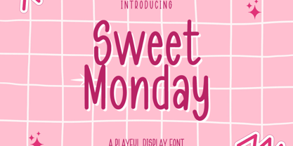 Sweet Monday is a Playful Display font that will make your designs look unique and fun. It's perfect for labels, quotes, posters, DIY projects, branding, packaging, greeting cards, websites, photos, photography overlays, signs, window art, scrapbooking, tags and so much more! What's Included : + Standard glyphs + Web Font + Multilingual Accent + Works on PC & Mac + Simple installations Accessible in the Adobe Illustrator, Adobe Photoshop, Adobe InDesign, even work on Microsoft Word. PUA Encoded Characters - Fully accessible without additional design software. Fonts include multilingual support + Image used : All photographs/pictures/vector used in the preview are not included, they are intended for illustration purpose only. Thank You
 - Sigmatone by Keristyper Studio,
$12.00 Introduce Sigmatone Inspired by old skool graffiti tagging, and street art, we created this Typeface, drawn in Procreate app, then vectorized and crafted carefully. This font is good for logo design, Social media, Movie Titles, Books Titles, short text even long text letters, and good for your secondary text font with sans or serif. Featured: Standard Uppercase & Lowercase Numeral & Punctuation Multilingual : ä ö ü Ä Ö Ü ß ¿ ¡ Alternate & Ligature PUA encoded We recommend programs that support the OpenType feature and the Glyphs panel such as Adobe applications or Corel Draw. so you can use all the variations of the glyphs. Hope you enjoy our fonts!
 - Competition by sportsfonts,
$15.00 Competition is a state of the art sports typeface. A large width range, slant angles from –12 to 12, and an adjustable inline make it extremely versatile. It’s devided into 5 subfamilies, from the sizes S, M, L & XL with decreasing inline weights to Solid without an inline at all. (By the way: S doesn’t mean it doesn’t look good in large sizes!) Choose from 105 predefined styles, or 1 variable font with axes for width, slant and inline weight (which is included in the family package). Competition embraces the Latin S character set and therefore supports 400+ Latin-based languages. Go for Gold!
 - Rivervale by Letterhend,
$19.00 Rivervale font a typeface which is inspired by vintage lettering sign and art. Very suitable for for headline, logotype, apparel, invitation, branding, packaging, advertising etc with old school / vintage as well as modern theme. It comes in uppercase, lowercase, punctuations, symbols & numerals, stylistic set alternate, ligatures, etc also support multilingual and already PUA encoded. Features : uppercase and lowercase numbers and punctuation multilingual alternates and ligatures PUA encoded We highly recommend using a program that supports OpenType features and Glyphs panels like many of Adobe apps and Corel Draw, so you can see and access all Glyph variations. How to access opentype feature : letterhend.com/tutorials/using-opentype-feature-in-any-software/
 - Peach Guava by Letterayu Studio,
$19.00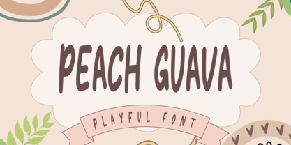 Peach Guava is a Playful Display font that will make your designs look unique and fun. It's perfect for labels, quotes, posters, DIY projects, branding, packaging, greeting cards, websites, photos, photography overlays, signs, window art, scrapbooking, tags and so much more! What's Included : + Standard glyphs + Web Font + Multilingual Accent + Works on PC & Mac + Simple installations Accessible in the Adobe Illustrator, Adobe Photoshop, Adobe InDesign, even work on Microsoft Word. PUA Encoded Characters - Fully accessible without additional design software. Fonts include multilingual support Image used : All photographs/pictures/vector used in the preview are not included, they are intended for illustration purpose only. Thank You
 - Plywood by Canada Type,
$24.95 Plywood is based on a long lost American film classic: Franklin Typefounders's Barker Flare from the early 1970s. Plywood is a surprisingly effective mix between the rigid confidence of nineteenth century wood types and the smooth feminine curves of twentieth century art nouveau ideas. With many variations on almost every letter in the alphabet, it's a versatile typeface that can make itself timelessly at home in multiple design environments, with motifs ranging from the strong and western to the crafty and artsy. Plywood's very expanded character set comes in all popular font formats, including a Pro version that takes advantage of OpenType's many character alternating features in supporting programs.
 - Nouveau Rose by Jeff Levine,
$29.00 In the July 24, 1915 issue of “Dry Goods Reporter” is a demonstration of hand lettering rendered with the use of a “speed pen”. Two suggested examples cited in the accompanying article were the Payzant pen and the then-new Speedball pen. An ornate Art Nouveau serif alphabet is displayed, with some examples having delicate floral elements entwining the letters. The initial alphabet was auto-traced, then cleaned-up and modified to recreate the core design of the basic (unadorned) letters. The numerals, punctuation and all additional characters were then made from scratch. Nouveau Rose JNL is the finished result, and is available in both regular and oblique versions.
 - Straight Bough by Letterayu Studio,
$19.00 Straight Bough is a Cute Sans Serif font that will make your designs look unique and fun. It's perfect for labels, quotes, posters, DIY projects, branding, packaging, greeting cards, websites, photos, photography overlays, signs, window art, scrapbooking, tags and so much more! What's Included : Standard glyphs Web Font Multilingual Accent Works on PC & Mac Simple installations Accessible in the Adobe Illustrator, Adobe Photoshop, Adobe InDesign, even work on Microsoft Word. PUA Encoded Characters - Fully accessible without additional design software. Fonts include multilingual support Image used : All photographs/pictures/vector used in the preview are not included, they are intended for illustration purpose only. Thank You
 - Fast Lane by Gassstype,
$22.00 Here comes a New font,Introducing Fast Lane - Dynamic Handwritten Font with a natural style and dramatic movement. Crafted manually with love and passion, This font is great for your next creative project such as logos, printed quotes, invitations, cards, product packaging, headers, Logotype, Letterhead, Poster, Label, and etc. This handmade font will make your design has a beautiful natural touch for each details. It is perfect for any design project as Invitation,logo, book cover, craft or any design purposes,photos, photography overlays, signs, window art, scrapbooking, tags and so much more! This font is PUA encoded which means you can access all of ligatures glypsh.
 - Hupp Antiqua NF by Nick's Fonts,
$10.00An enchanting design by Otto Hupp for Gebr. Klingspor in 1909 provided the pattern for this timeless classic, which gracefully and seamlessly combines medieval inspiration with Art Nouveau flair. All versions of this font contain the complete Unicode Latin A character complement, with support for the Afrikaans, Albanian, Basque, Bosnian, Breton, Catalan, Croatian, Czech, Danish, Dutch, English, Esperanto, Estonian, Faroese, Fijian, Finnish, Flemish, French, Frisian, German, Greenlandic, Hawaiian, Hungarian, Icelandic, Indonesian, Irish, Italian, Latin, Latvian, Lithuanian, Malay, Maltese, Maori, Moldavan, Norwegian, Polish, Portuguese, Provençal, Rhaeto-Romanic, Romanian, Romany, Sámi, Samoan, Scottish Gaelic, Serbian, Slovak, Slovenian, Spanish, Swahili, Swedish, Tagalog, Turkish and Welsh languages, as well as discretionary ligatures and extended fractions.
