10,000 search results
(0.018 seconds)
- Wanted Poster Caps - Unknown license

- SF Movie Poster - Unknown license

- Movie Poster Condensed - Unknown license

- SF Funk Master - Unknown license

- DS Motter Style - Unknown license

- SF Movie Poster - Unknown license

- Retro Rock Poster - Unknown license

- Mister Belvedere 3D - Unknown license

- Mister Belvedere Oblique - Unknown license

- SF Movie Poster - Unknown license

- SF Movie Poster - Unknown license

- Movie Poster Condensed - Unknown license

- Movie Poster Condensed - Unknown license

- Mister Belvedere Upper - Unknown license

- SF Funk Master - Unknown license

- Movie Poster Condensed - Unknown license

- Posterizer KG Rough by Posterizer KG,
$30.00
- Show Poster JNL by Jeff Levine,
$29.00
- Japanese Brush Master by Okaycat,
$29.95
- Mister Bones NF by Nick's Fonts,
$10.00 - Poster Casual JNL by Jeff Levine,
$29.00
- Mister Slasher Halloween by Sipanji21,
$15.00
- Robot Monster NF by Nick's Fonts,
$10.00 - Posterizer KG Rounded by Posterizer KG,
$40.00
- ITC Motter Corpus by ITC,
$40.99 - Poster Slabserif JNL by Jeff Levine,
$29.00
- Poster Plain JNL by Jeff Levine,
$29.00
- Poster Contoured JNL by Jeff Levine,
$29.00
- EB Boogie Monster by Erik Bertell,
$9.95
- Quick Poster JNL by Jeff Levine,
$29.00
- Mister Rii PB by Pink Broccoli,
$19.00
- Posterizer KG Inline by Posterizer KG,
$40.00
- Poster Inline JNL by Jeff Levine,
$29.00
- Roket Monster Graffiti by Sipanji21,
$10.00
- Lobby Poster JNL by Jeff Levine,
$29.00
- Nouveau Poster JNL by Jeff Levine,
$29.00
- NS Yorkest Poster by Novi Souldado,
$25.00
- Metropolitan Poster Black by Intellecta Design,
$13.90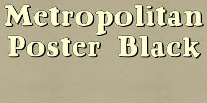
- Political Poster JNL by Jeff Levine,
$29.00
- Industrial Poster JNL by Jeff Levine,
$29.00


