10,000 search results
(0.061 seconds)
- Galber by Craft Supply Co,
$20.00 Introducing Galber - Compressed Sans Serif: A commanding typeface that captures the eye with its bold, condensed design. With its impactful lines and modern allure, Galber adds a strong touch to your projects. Elevate your designs with Galber's assertive style, making a striking statement that simply can't be ignored. This typeface is ideal for greeting card, packaging, brand identity, poster, or any purpose to make your design project look eye catching and trendy. Feel free to play with this typeface!
 - Hollestik by Maulana Creative,
$15.00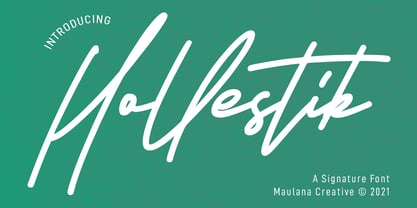 Hollestik is a casual signature font. With mono-line stroke, slanted and fun character with a bit of ligatures and lowercase alternates. To give you an extra creative work. Hollestik font support multilingual more than 100+ language. This font is good for logo design, Social media, Movie Titles, Books Titles, a short text even a long text letter and good for your secondary text font with sans or serif. Make a stunning work with Hollestik font. Cheers, MaulanaCreative
 - Baby Algutta by IM Studio,
$19.00 Baby Algutta is a modern, handwritten and modern calligraphy font. The shape is modern and unique and the writing style is very natural. The Baby Algutta features a varied baseline, smooth lines, beautiful glyphs, and amazing alternatives. Hand-drawn design elements allow you to create many beautiful typographic designs in an instant such as branding, web and editorial design, prints, crafts, quotes, It's great for logos, wedding invitations, romantic cards, labels, packaging, name spelling, and more. Thank you.
 - Lineare by Tipo,
$35.00 Lineare Serif is an attempt at solving the difficult problem of creating readable text type, seeking new ways to provide readers with some pleasure and rest as they walk along each line, creating a space where there is harmony between man and the printed form. Asymmetric serifs both in their height and width, medium contrast in the stroke, and balanced upward and downward movements make “Lineare Serif” a typeface featuring both attitude and aptitude for editorial purposes.
 - Boyflare by Maulana Creative,
$12.00 Boyflare is a cursive handwritten script font. With bold mono-line stroke, fun character with a bit of ligatures and alternates. To give you an extra creative work. Boyflare font support multilingual more than 100+ language. This font is good for logo design, Social media, Movie Titles, Books Titles, a short text even a long text letter and good for your secondary text font with sans or serif. Make a stunning work with Boyflare font. Cheers, Maulana Creative
 - Nocken by skillyas studio,
$15.00 Nocken is a sleek and modern sans-serif font that exudes elegance and simplicity. With its clean lines and minimalistic design, Its versatility allows it to be used for a wide range of projects, from branding and logo design to web and print materials. Nocken's balanced proportions and subtle details make it highly legible and visually appealing, ensuring that your message will be conveyed with clarity and style. to see more our work visit our website: skillyasstudio.com
 - Gunar by The Northern Block,
$39.00 A geometric sans serif with a square chiseled appearance. Precise curves are met with straight lines and tapered angles to produce a fresh, technical typeface. It’s large x-height and neutral width give it good legibility at small point sizes. These refined rectangular features make it ideally suited to a wide range of modern applications. Details include 550 characters with alternative lowercase a, e, g and y. 5 variations of numerals, manually edited kerning and Opentype features.
 - Ponpewd Signature by Maulana Creative,
$11.00 Ponpewd is a Signature Script Brush Font. With bold mono-line stroke, slant and fun character with a bit of ligatures. To give you an extra creative work. Ponpewd font support multilingual more than 100+ language. This font is good for logo design, Social media, Movie Titles, Books Titles, a short text even a long text letter and good for your secondary text font with sans or serif. Make a stunning work with Ponpewd font. Cheers, MaulanaCreative
 - !Disc Inferno® BASIC - Unknown license

- Lens Grotesk by Typedepot,
$39.99 Lens Grotesk is a Neo-grotesque type family of 16 fonts born as a result of a very conscious research in the field of the neutral Swiss aesthetic. There's a reason for all the prominent examples of this design like Helvetica and Univers to be used on a daily basis for more than 70 years and it's a simple one - they just work. The closed terminals, the low contrast, uniform widths and proportions makes the Neo-grotesques feel just right. Although very often branded as stiff, the neutral Neo grotesques are here to stay and Lens Grotesk is our own reading of the popular style. Lens Grotesk takes the Neo-grotesk model one step further adding a pinch of Geometric sans-serif to the mix thus creating a way more modern and contemporary looking design. Characterized with more generous oval proportions and slightly more open terminals, Lens Grotesk keeps the modulation and rhythm needed for a slightly longer texts while visibly keeping everything in order. Zooming in you'll find traces of the Geometric aesthetic - the robust almost right angled approach of the arches and tails (look t, f, j, y) and the way more circular rounded shapes. Like all our fonts, Lens Grotesk is equipped with a range of OpenType features, stylistic alternatives and of course Cyrillic support. It comes in a pack of 16 fonts with 8 styles and their matching italics or one variable font file available with all full family purchases. Live Tester | Download Demo Fonts | Subscribe
 - ALS Scripticus by Art. Lebedev Studio,
$63.00 There are many script typefaces but there is only one Scripticus. Scripticus is like a chameleon: In whatever surroundings you put it, it adapts itself and looks like it couldn't be anywhere else. Be it a sales advertisement, a music Website, a comic strip or a journal with complex chemical formula – Scripticus always solves the problem in a natural and leisurely way. And it never makes compromises concerning clarity. But where does Scripticus come from? … From the good old high school blackboard! Blackboards have become almost obsolete in teaching, but be it a black or white background – clear, strong characters placed on the board while the facts are explained are still one of the best ways to make and keep things understandable. Scripticus is dedicated to my high school chemistry teacher who was an expert in just this. While the letterforms come from different inspirations, its aim is the same as the pedagogical aim of my teacher: Combining clarity with a strong personality. Scripticus has a special trick to give it its natural look: Four alternates for each letter and each number plus rotation coding make the glyphs appear in lively melodic flow. In this way even mathematic equations look nice! Scripticus has a lot of OT-features that help it do its job. They are: capital spacing, localized forms, subscript, scientific inferiors, superscript, numerators, denominators, fractions, ordinals, tabular figures, historical forms, ligatures, stylistic alternates, stylistic set and ornaments. Finally, as is my general goal in type design – Scripticus supports close to one hundred languages from Latin extended to Cyrillic extended.
 - Polias by Esintype,
$23.00 Polias is an all-caps uniwidth typeface inspired by an ancient inscription carved on a monoblock stone in hybrid characters — between no-contrast linear sans to low-contrast flared serif. The inspiring inscription is the dedication by Alexander the Great, discovered in the Temple of Athena Polias in the ancient Ionian city of Priene. Stanley Morison mentioned this inscription in one of his lectures: “The distinctive feature of this inscription consists of a consistent thickening towards the ends of perpendiculars and horizontals.” … “We have not the right to say that the serif was invented for Alexander the Great's inscription, only that this is its first datable appearance.” The letter proportions are almost identical to the original, but the stroke features have been reinterpreted and characterized. Serif-like nodes at the end of the strokes are subtle extensions that serve to accentuate rather than break its monoline elegance. With an analogy, they are not flowers, but like blooming buds. Polias is a flared sans typeface which is closer to sans-serif forms on the spectrum between sans and serif. It’s especially light looking by design to convey rather thin and white typographic color of its original monumental look. It comes in eight weights and a variable font, scaled from Thin to Bold. It is multiplexed, so the weights do not affect text lengths. Light weights are closely based on the actual carving of the inscription. Thicker weights can be used on smaller typesettings to compensate for the weight difference of larger letters’ strokes, and to keeping the monoline appearance of the entire text block intact. This method can be used for any purpose, such as setting a hierarchy between the lines or to justify their lengths. Some of the original letterforms have been preserved and stylistic alternatives such as Ionic four-bar Sigma, dotted Theta, palm Y are provided as open type feature. Some of the other ancient forms, such as the three-bar Sigma (S), the pointed U, were also added for both the Greek and Latin scripts. Polias is preferable for big type settings such as logos and headlines as a modern representation of perennial classical forms. Its a fine fit for product branding, movie posters, book covers, packaging materials, and more, which require an epic look to attracting attention with a distinctive elegance. Polias can be considered for distinctiveness wherever Roman Capitals work. As a noun, Polias is one of the epithets of Athena / Minerva, and in this case referring to her role as the protector of the city of Priene. Polias is one of the seven typeface designs in Esintype's ancient scripts of Anatolia project, Tituli Anatolian series.
 - Irrlicht by Aarhaus,
$30.00 Irrlicht is based on C. H. Kleukens’ 1923 typeface Judith Type . Whilst Dunkle Irrlicht is a fairly faithful rendition and extension of Kleukens’ typeface, the Licht style was initially added as a stand-alone stencil version; yet, the two styles work perfectly together – for different nuances, for emphasis or simply stacked/layered. Irrlicht is equipped with upper- and lowercase ligatures, contextual and stylistic alternates, fractions, superior and inferior figures, extended language support and a few extra goodies. Additional information – How Irrlicht came to life Christian Heinrich Kleukens cut his Judith Type in 1923, at the peak of German expressionism, exclusively for publications with the Ernst-Ludwig-Press, such as a limited series of biblical prints – the first being the Book of Judith , hence the original’s name. I stumbled upon this typeface a couple of years ago in a nice little 1930 booklet of the Gutenberg-Gesellschaft and was struck by its forceful darkness on paper and its seemingly simple, crude letterforms. The lack of a long-ſ in the final version of Judith Type – quite unusual for a German typeface of that time – adds to this feel of crudeness and spontaneity*. Judith Type seemed to me like a semi-blackletter cousin of Rudolf Koch’s typeface Neuland (cast in the same year). Besides its apparent affinity with expressionism, it reflects a lot of that deeply spiritual craftsmanship of the era – much like Neuland. A few months later, when I was working on a stencil project and looking for a typeface that could be cut into thin wooden plates easily, I remembered those dark, sharp letters that seemed to be lacking any curves at all. After enlarging a few letters and tracing them by hand, the whole set was redrawn digitally, using only straight lines. As for spacing, the goal was to keep the letters tight but to avoid touching characters – without ironing out all the original’s tension and rhythm. Deliberate kerning, subtle contextual alternates and ligatures help to deal with critical glyph combinations. Two additional versions were developed: a stencil version with open counters and, in reference to a popular style of the 1920s and inspired by dry, cracked wood, an inline version. These two additional styles were later merged into one font – Lichte** Irrlicht was born. — AARHAUS * Consequently, the original typeface’s German eszett is simply a ligature of the “round s” and standard z . In some of his publications, Kleukens dispenses with using eszett altogether and sets double s instead. Irrlicht , however, does feature a more common eszett (ß); the original, among other more faithful letter forms, can be accessed via the stylistic sets feature ** licht – literally bright – being the German term for inline typefaces – not to be confused with leicht ( light )
 - Polias Varia by Esintype,
$140.00 Polias Varia is an all-caps uniwidth variable weight typeface inspired by an ancient inscription carved on a monoblock stone in hybrid characters — between no-contrast linear sans to low-contrast flared serif. The inspiring inscription is the dedication by Alexander the Great, discovered in the Temple of Athena Polias in the ancient Ionian city of Priene. Stanley Morison mentioned this inscription in one of his lectures: “The distinctive feature of this inscription consists of a consistent thickening towards the ends of perpendiculars and horizontals.” … “We have not the right to say that the serif was invented for Alexander the Great’s inscription, only that this is its first datable appearance.” In Polias Varia, the letter proportions are almost identical to the original, but the stroke features have been reinterpreted and characterized. Serif-like nodes at the end of the strokes are subtle extensions that serve to accentuate rather than break its monoline elegance. With an analogy, they are not flowers, but like blooming buds. Polias Varia is a flared sans typeface which is closer to sans-serif forms on the spectrum between sans and serif. It’s especially light looking by design to convey rather thin and white typographic color of its original monumental look. It comes in eight weights and a variable font, scaled from Thin to Bold. It is multiplexed, so the weights do not affect text lengths. Light weights are closely based on the actual carving of the inscription. Thicker weights can be used on smaller typesettings to compensate for the weight difference of larger letters’ strokes, and to keeping the monoline appearance of the entire text block intact. This method can be used for any purpose, such as setting a hierarchy between the lines or to justify their lengths. Some of the original letterforms have been preserved and stylistic alternatives such as Ionic four-bar Sigma, dotted Theta, palm Y are provided as open type feature. Some of the other ancient forms, such as the three-bar Sigma (S), the pointed U, were also added for both the Greek and Latin scripts. Polias Varia is preferable for big type settings such as logos and headlines as a modern representation of perennial classical forms. Its a fine fit for product branding, movie posters, book covers, packaging materials, and more, which require an epic look to attracting attention with a distinctive elegance. Polias Varia can be considered for distinctiveness wherever Roman Capitals work. As a noun, Polias is one of the epithets of Athena / Minerva, and in this case referring to her role as the protector of the city of Priene. Polias (family) is one of the seven typeface designs in Esintype’s ancient scripts of Anatolia project, Tituli Anatolian series.
 - Olis by Roman Polishchuk,
$34.00 Olis is a stylish, fresh new handwritten script. Olis comes with two weights, numerals, punctuations, and some variations on character including OpenType alternates, and common ligatures. It helps set your designs apart by adding a custom-lettered look. You will also find that its initial and terminal letters can enhance your designs in new and creative ways. Hand-drawn leaves, plants, flowers, as well as large and small snowflakes add original detail while complementing the font perfectly. If you like this font you might also like an aesthetic text generator by the same author.
 - RoundWhy by Ingrimayne Type,
$6.95 Font breeding is much like animal breeding, where stallion and mare, or bull and cow, or boar and sow are carefully matched in hopes of yielding a robust and useful offspring. When typefaces RoundUp with fat, rounded serifs and WyomingSpaghetti with fat, squarish serifs were chosen to be parents, it was clear that their offspring would inherit large serifs. But to discover exactly what the offspring would look like, the pairing needed to be consummated, which was done with the “Blend Fonts” commend in Fontographer. The two styles of RoundWhy are the result.
 - 1917 Stencil by GLC,
$38.00 We have created this family inspired by the old-fashioned stencil letters like those the French army used during the WWI to write on soldiers' clothes, blankets, signals, ammunition, supplies and so on. This is a Didone-style font. We offer two variants for the same font: monospaced or proportionally spaced. Our Open Type specification allows automatic substitution of letters to avoid repeating the same glyph when a letter is repeated (for example “ee” or “bb”)(Not available with accented characters and a few others like “Q” that are never repeated in common use).
 - Beaumaris by Roland Hüse Design,
$30.00 Beaumaris is a serif typeface named after a nice bay area in Australia which I would like to visit one day. A modern bold serif with an art deco touch, this font is great choice for fashion brands, jewellery and magazine headlines. It contains stylistic alternates, discretional and standard ligatures, small caps and fractions (see image gallery for details). The character set covers all Latin accented characters (including Schwa) and Russian cyrillic alphabet. For additional customization please message me at: contact@rolandhuse.com Thank you & I hope you like this font!
 - Bismuth by Setup,
$20.00 Bismuth is a simple versatile multi-purpose display typeface with nine weights. Both the upper and the lower case are capitals -- the paired letters (e.g. Aa, Bb) differ in construction but keep the same width. The width is also consistent across all weights, making the fonts easily interchangeable. The nine styles are accompanied with a free font Bismuth Symbols which contains more than one hundred various arrows, symbols and patterns for even more striking display typography. Learn more about the typeface and its OpenType features at http://www.urtd.net/fonts/bismuth.
 - Bogue Slab by Melvastype,
$29.00 Bogue is a slab serif type family of 8 weights and matching italics. Bogue Slab comes with a lots of stylistic alternates that makes it very versatile in various uses like logos, editorial design, branding, web design, package design and much more. You can use it to create short powerful phrases and headlines and also use it in longer text like lead paragraphs and body texts. So if you are looking for a versatile slab serif font you have found it! Bogue Slab is a slab serif version of Bogue
 - Tokyosign by Allouse Studio,
$16.00 Tokyosign come with Multi-Lingual Support. Enjoy the font and feel the natural impression like the handwritten style itself! We highly recommend using a program that supports OpenType features and Glyphs panels like many of Adobe apps and Corel Draw, so you can see and access all Glyph variations. Tokyosign is perfect for any tittle, logo, stationery, product packaging, branding project, megazine, social media, wedding, or just used to express words above the background. Enjoy the font, feel free to comment or feedback, send me PM or email. Thank You!
 - Twirrewyn by Hanoded,
$15.00 Twirrewyn is Frisian for ‘Whirlwind’. I have always liked the Frisian language; it’s like a crossover between English and Dutch. When I studied journalism in Zwolle (a city close to Fryslân) there were a lot of Frisian students and I did pick up a few words! Twirrewyn is a handmade font family: the fat version was made using a brush and ink; the light version was made using that same ink, but with a broken satay skewer instead of a brush. And yes, you have guessed right, we eat a lot of Satay! ;-)
 - Rastalia by Romie Creative,
$15.00 Hi everyone, I would like to introduce my newest font. Rastalia Script is a beautiful modern calligraphy typeface, I hope you will be interested in this font, if you want to use it for your work. This font can be used easily and simply because there are many features in it. contains a complete set of upper and lowercase letters, a wide variety of punctuation marks, numbers, and multilingual support. fonts also contain a lot ligatures and many others contain alternative Style Sets like the heart swash alternative.
 - Laro Soft by Larin Type Co,
$15.00 Laro Soft this is a modern sans-serif font that includes nine weights from thin to black and nine weights in Italic style. This multi-purpose font captures a huge range for the design and creation of your project. Laro will perfectly cope with a variety of tasks and he will always look stylish and modern. With it, you can create logos, labels, use in advertising, packaging, branding, book covers and magazines, cosmetics, banners, posters, headings, descriptions and much more. This font is easy to use has OpenType features.
 - Clootie by Hanoded,
$15.00 My wife was watching a baking show in which a Scottish guy attempted to cook a clootie. A what?? A clootie??? Never heard of a clootie! Apparently it is a suet dumpling, containing dried fruits (like raisins) and boiled in a piece of cloth (clootie means ‘rag’ or ‘strip of cloth’ in Scottish). Clootie font is a handmade bundle of happiness. It is rounded, soft and legible and will look particularly good on book covers. And I promise you all: one day I will cook clooties to find out what they taste like!
 - Hyggemand by Hanoded,
$16.00 Hyggemand is not a real word: it is a combination of Hygge (meaning ‘fun’ or ‘coziness’ in Danish) and Mand (which means man in Danish). Combined it means something like ‘Nice Man’. I just like the sound and look of this name, so if I offend Danish languages purists, then I apologise for this monstrosity! ;-) Hyggemand is a happy kids font that comes with extensive language support and a set of alternates for the lower case glyphs. If you want the cute Huggeman face, you will find it as a stylistic alternate for the asterisk.
 - Nefarious by Hanoded,
$15.00 A few fonts ago I mentioned the fact that I like posh English words; words you don’t really use in conversation. As I am busy expanding my ‘halloween’ font collection, I came across the beautiful word Nefarious. It means wicked or evil and when you say the word, it even sounds evil! Fantastic! Nefarious is a halloween/witches font. It looks like my Griezelig font, but it is rougher and spikier. Use Nefarious for your halloween invitations, posters and books about evil geniuses. Comes with all diacritics and a bunch of swashes as well.
 - Allegra de Amour by Typetemp Studio,
$16.00 Allegra de Amour Font is Sans-Serif Font with upper and lowercase is complemented by some of the same alternatives made with love. Access your OpenType features to access the large selection of alternate letters and ligatures, select the letters you like from the large variety to get the display font you like. Perfect for editorial projects, Logo design, Clothing Branding, product packaging, magazine headers, or simply as a stylish text overlay to any background image. Features : Uppercase and Lowercase Stylistic Alternates & Ligatures Numerals & Punctuation Multilanguange PUA Encoded
 - Molly Louie by Pelavin Fonts,
$18.00 Conceived on a cold evening to the hot Jazz of the Eri Yamamoto Trio at Arthur’s Tavern in the Village, font Molly Louie is best described by the person for whom it was named. “Very intricate, like a whole little world in each of them” and “The solid is nice too, like little cut up sandwiches.” The detailed and solid versions facilitate a variety of two-color applications. You might not use this decorative display font at smaller sizes, but you are encouraged to let your imagination guide you.
 - Laro by Larin Type Co,
$15.00 Laro this is a modern sans-serif font that includes nine weights from thin to black and nine weights in Italic style. This multi-purpose font captures a huge range for the design and creation of your project. Laro will perfectly cope with a variety of tasks and he will always look stylish and modern. With it, you can create logos, labels, use in advertising, packaging, branding, book covers and magazines, cosmetics, banners, posters, headings, descriptions and much more. This font is easy to use has OpenType features.
 - Barataria by Scriptorium,
$24.00When designing a font, I often imagine how I think it should be used or where I'd be likely to see it out in the real world. With Barataria I envisioned it on decorative, antique-looking signs hanging outside shops in the French Quarter of New Orleans - hence the name. Barataria is based on samples of 1920s period poster lettering. It's a bold, heavy roman font with strong, rounded character forms. Barataria also has some unique alternative character forms, like the super-looped 'g' shown in the sample. - LiebeMenu by LiebeFonts,
$19.90 LiebeMenu is a comprehensive set of hand-drawn restaurant and menu essentials: Restaurant signs and menu labels, dishes with vegetables, meat, fish and cheese, and of course drinks and desserts. Whether you design professional menus for a gourmet restaurant or for your friend’s dinner party, LiebeMenu instantly adds a warm personal touch. Over 110 carefully crafted drawings are included in this single font and can be used in any text or graphics application. If you like this font, you may also like our cooking ingredients font LiebeCook and our decorative restaurant phrases font LiebeMenuLettering.
 - Bismuth Stencil by Setup,
$20.00 Bismuth is a simple versatile multi-purpose stencil display typeface with nine weights. Both the upper and the lower case are capitals -- the paired letters (e.g. Aa, Bb) differ in construction but keep the same width. The width is also consistent across all weights, making the fonts easily interchangeable. The nine styles are accompanied with a free font Bismuth Stencil Symbols which contains more than one hundred various arrows, symbols and patterns for even more striking display typography. Learn more about the typeface and its OpenType features at Urtd.net.
 - Huevo by Burghal Design,
$29.00Versatile egg-shaped Huevo, like all Burghal Design fonts, includes upper and lower case letters, as well as numbers, symbols, punctuation, and accented foreign characters. Huevo is the head of the household known as Los Huevos. Tequila-guzzling, cerveza-swilling Huevo Loco is the boldest of Los Huevos and includes cocktail glass, olive, and eight ball dingbats. Huevo Loco can drink any other font under the table. Like most red-blooded American fonts, the favorite pastimes of Huevo Gordo are eating and couch warming, and boy, does it show! - The Crunch by Pen Culture,
$17.00 Introducing "The Crunch - Elegant Sans Serif Font" The Crunch is a ligature serif font that perfect for any kind design project like branding, logo design, poster, embroidery and much more. This font has elegant ligature and much of alternate, so you can mix and match to create sensational design. I really hope you enjoy it – please do let me know what you think, comments & likes are always hugely welcomed and appreciated. More importantly, please don’t hesitate to drop me a message if you have any issues or queries. Thank you
 - MFC Bindi Monogram by Monogram Fonts Co.,
$19.95 The inspiration source for Bindi Monogram is a 1915 publication by Cartier-Bresson of Paris containing classic and modern monogram patterns for embroidery. This Art Deco style monogram has been redrawn, balanced, and brought forward into the digital age for your type-setting use and enjoyment. Like so many monograms from this period, it is only a two letter monogram format, but this particular monogram comes with an accent color block character to add pop! Download and view the MFC Bindi Monogram Guidebook if you would like to learn a little more.
 - Rondell by Scrowleyfonts,
$12.00 Rondell was originally designed in 2011 as a reasonably priced variable width and weight font. There were a couple of things about it that I didn't like and so I withdrew it from sale. Since then I have found myself using it for many different projects and have realised how useful and versatile it is. Therefore I have fixed the things I didn't like about it and it is now available again. Rondell is a simple, smart, sans serif font. Rounded corners make it slightly informal and friendly.
 - Cinnabar Brush by Hanoded,
$15.00 Cinnabar Brush is a font named after a mineral - mercury sulfide to be precise. I quite like the name and the color, so naming a font after it made sense. Cinnabar Brush is a very bold, very outspoken brush font. It is all caps, but upper and lower case glyphs differ and can be mixed. It is a bit on the heavy side, so I wouldn't set a text in it. Use Cinnabar Brush for posters, book covers, T-shirts and the like. Comes with a mother lode of diacritics.
 - Blueprint by Monotype,
$29.99 Blueprint is an informal typeface designed by Monotype. A stylized handwritten letterform, Blueprint fills the need for a draughtsman-like typeface. The first letters drawn were capitals, the lowercase were added later to create a fully functional typeface. Designed to look like hand lettering but without any joining lowercase, this Blueprint font family is very legible and is well suited to any casual or informal application. Excellent for use in text, Blueprint is ideal in a wide range of setting, including: manuals, letters, faxes, presentations, instruction books and packaging.
 - Guilty Pleasure by Hanoded,
$15.00 Some time ago, my kids asked me what kind of sweets I really liked. To be honest, I don’t actually like sweets at all - never have, never will. BUT… you can wake me up for chocolate and ice cream! Those are my guilty pleasures! Guilty Pleasure is a handmade font. I used China Ink and a brush to create all the glyphs. Guilty Pleasure is a very distinct display font. I recommend you use it for your ice cream or chocolate packaging… but that, of course, is entirely up to you!
