3,920 search results
(0.035 seconds)
- Goostine by Akifatype,
$16.00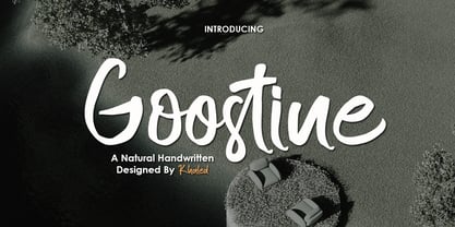 Goostine is a modern handwritten brush font, organic, dynamic and energetic sytle.Can used for various purposes. such as the title, signature, logo, correspondence, wedding invitations, letterhead, signage, labels, newsletters, posters, badges, etc.
 - Gibrella by Akifatype,
$14.00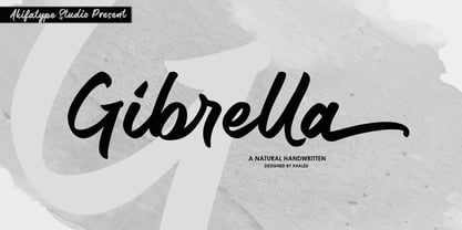 Gibrella is a modern smooth brush font, organic, dynamic and energetic sytle.Can used for various purposes. such as the title, signature, logo, correspondence, wedding invitations, letterhead, signage, labels, newsletters, posters, badges, etc.
 - Western Brushes by Soft Creative,
$14.00 Western Brushes is a modern, organic, dynamic, and energetic brush font. Can be used for various purposes. such as titles, signatures, logos, correspondence, wedding invitations, letterhead, signage, labels, bulletins, posters, badges, etc.
 - Pretty Songs by PizzaDude.dk,
$16.00 What exactly is a pretty song? To tell you the truth, I have no idea! My taste of music ranges from classical music to heavy metal, from hip hop to jazz - and even soundtracks like Flash Gordon, Merry X-mas Mr Lawrence and Tommy. But font-wise, I know what a Pretty Song is! It's this organic looking, handmade text font - suitable for many things, such as books for kids, organic products, posters ... whatever design that needs a fresh and jumpy boost! BTW, the names was inspired by another favourite artist, Nirvana!
 - Stanley Union by Ironbird Creative,
$15.00 Stanley Union is a font bundle consisting of serif, sans serif, extended sans and dingbats which is organic and hand-drawn and comes with regular and stamp styles. This typefaces is perfect for people looking for vintage aesthetic and organic feel. What Will You Get : Stanley Union Serif Regular & Stamp Stanley Union Sans Regular & Stamp Stanley Union Extended Sans Regular & Stamp Stanley Union Dingbats We hope you enjoy the font, please feel free to comment if you have any thoughts or feedback. Thanks for purchasing and have fun!
 - Pleasant Show Card JNL by Jeff Levine,
$29.00 A beautiful and stylish pen lettered alphabet appears within the pages of the 1921 publication “How to Write Show Cards” and its Art Nouveau stylings made it a perfect candidate for a digital revival. Pleasant Show Card JNL is available in both regular and oblique versions.
 - Radio Interference by Jeff Levine,
$29.00 The font Antique Slabserif JNL was run through a filter to create a design that looks like worn type at smaller settings or jaggedly distressed lettering in larger type heights. The end result is Radio Interference JNL, which is available in both regular and oblique versions.
 - Passenger Train JNL by Jeff Levine,
$29.00 A 1940s travel poster for the Florida East Coast Railway (which then carried passengers but is now a freight line) had the railroad’s name hand lettered in a bold Art Deco sans. This inspired Passenger Train JNL, which is available in both regular and oblique versions.
 - Stickball JNL by Jeff Levine,
$29.00 Using examples of antique street signs from New York City, Stickball JNL recreates the iconic lettering in a digital typeface and is available in both regular and oblique versions. For a nostalgic touch, a blank street sign is located on either the solid or broken bar keystrokes.
 - Antobe by Viaction Type.Co,
$16.00 Antobe is a serif font with a modern & elegant touch. The thin character is perfect for the design needs of a modern & elegant layout. There are 2 styles, regular and oblique. Equipped with multilingual tools to make it easier for you to use various design purposes.
 - Township JNL by Jeff Levine,
$29.00 Township JNL is based on French Antique Condensed [a classic wood design] and is available in both regular and oblique versions. Reminiscent of Old West wanted posters and circus broadsides, this ultra-condensed typeface allows for more word copy to fit into a single line’s space.
 - Meadowlark JNL by Jeff Levine,
$29.00 The cover of the 1908 sheet music for "When the Meadow-Larks Are Calling, Annie Laurie" has the title hand lettered in a semi-formal Art Nouveau Roman type design with gentle spurs. This is now available as Meadowlark JNL in both regular and oblique versions.
 - Talking Picture JNL by Jeff Levine,
$29.00 In a vintage photograph, promotional signage outside an old theater for the 1929 early sound film “The Doctor’s Secret” had lettering in a wide, bold Art Nouveau slab serif design. This was the model for Talking Picture JNL, which is available in both regular and oblique versions.
 - Nouveau Vaudeville by Jeff Levine,
$29.00 On the cover of the 1926 sheet music for “There Ain’t No Maybe in My Baby’s Eyes”, the title is rendered in Art Nouveau hand lettering; pen-drawn with rounded ends. The type design is now available as Nouveau Vaudeville JNL, in both regular and oblique versions.
 - Ruberoid by Pepper Type,
$30.00 Ruberoid is a squarish geometric sans-serif family reminiscent of Italian designs of 1950s and 1960s, but featuring considerably rounder shapes to give it a more contemporary feel. The typeface comes in 9 weights with companion oblique styles and contains support for Latin, Greek, and Cyrillic scripts.
 - Horse Thief JNL by Jeff Levine,
$29.00 The 1957 French publication “La Letra Dans La Peinture et la Publicite” (“The Letter tn the Painting and Advertising”) had an illustration of split-serif letters and numbers with a decidedly Western feel. This is now available as Horse Thief JNL in both regular and oblique versions.
 - Varsity Show JNL by Jeff Levine,
$29.00 In the last scene of the movie trailer for 1937’s “Varsity Show”, the movie’s title is hand lettered in a bold, condensed chamfer font with semi-serifs. This is now available digitally in the namesake font “Varsity Show JNL” – in both regular and oblique versions.
 - Office Staff JNL by Jeff Levine,
$29.00 Office Staff JNL is a version [with serifs added] of Popularity JNL – a condensed Art Deco design based (for the most part) on a popular typeface known in some foundry books as ‘Radiant’ with some reinterpreted characters… and is available in both regular and oblique versions.
 - Kohler by Hustle Supply Co,
$16.00 Köhler Köhler is a Condensed Headline Type Family. Köhler comes complete with 6 OTF files. Regular, Rough, Clean & Textured with Oblique counterparts. Köhler is a super condensed typeface with a vintage aesthetic but also doubles as a great modern typeface depending on the final use. Thank you!
 - Showcard Multiline JNL by Jeff Levine,
$29.00 On page 45 of Samuel Welo’s 1930 instructional book “Lettering Practical and Foreign” is a multi-line alphabet of Art Deco elegance that perfectly captures the spirit of the Streamline era. The digital version is available as Showcard Multiline JNL in both regular and oblique versions.
 - Nouveau Style JNL by Jeff Levine,
$29.00 Scribner's Magazine was an illustrated periodical published from 1887 to 1939. The 1895 holiday issue “Scribner's for Xmas” had the cover text hand lettered in an Art Nouveau style with spurred serifs. This is now available digitally as Nouveau Style JNL, in both regular and oblique versions.
 - Mevada SRF by Stella Roberts Fonts,
$25.00 Mevada SRF and its oblique partner are a remix of the Ray Larabie design Devama SRF, another exclusive from Stella Roberts Fonts. The net profits from my font sales help defer medical expenses for my siblings, who both suffer with Cystic Fibrosis and diabetes. Thank you.
 - Vintage Poster JNL by Jeff Levine,
$29.00 Modeled from an example in the book “Lettering” by Harry B. Wright (1950), the poster alphabet shown was reminiscent of the kind of style used in the early 1900s by sign painters and show card artists. Vintage Poster JNL is available in both regular and oblique versions.
 - Elite Resort JNL by Jeff Levine,
$29.00 A 1940s sheet music edition of an early 1900s song entitled "You Taught Me How to Love You, Now Teach Me to Forget" was set in a popular metal type slab serif face. It is presented digitally as Elite Resort JNL, in both regular and oblique versions.
 - Fashion Statement JNL by Jeff Levine,
$29.00 An example of hand lettering from a vintage instructional book was the basis for Fashion Statement JNL; available in both regular and oblique versions. This extra-wide "thick and thin" design is perfect for replicating the classic signage and print work of the Art Deco era.
 - Nouveau Titling JNL by Jeff Levine,
$29.00 Sheet music for 1907's "Just A Little Fond Affection" had the song title hand lettered in a simple sans serif design with influences from the then-current Art Nouveau movement. This is now available as Nouveau Titling JNL; available in both regular and oblique versions.
 - Craggy by Ingrimayne Type,
$7.95 Craggy has a narrow, spidery, irregular set of letters. Its creepy, Halloween spirit makes it ideal for scary stories and similar uses. The family has three base styles: condensed, regular, and bold. Each comes with an oblique and backslanted version yielding a complete family of nine members.
 - Reveler JNL by Jeff Levine,
$29.00 The sheet music for "Good Night Angel" from the 1937 motion picture "Radio City Revels", had the movie's title hand lettered in a free form Art Deco sans serif design. This has been recreated digitally as Reveler JNL, which is available in both regular and oblique versions.
 - Bill of Fare JNL by Jeff Levine,
$29.00 A 1942 menu cover for the restaurant at the Biltmore Hotel in Los Angeles features its name in a stylized Art Deco serif design. This is has been turned into the digital typeface Bill of Fare JNL, and is available in both regular and oblique versions.
 - Industrial Arts JNL by Jeff Levine,
$29.00 In 1935, Morris Fuller Benton designed Phenix American for American Type Founders. For 2017, the classic Art Deco design has been reinterpreted in an all-caps display version with an ever-so-slight "hand made" feel. Industrial Arts JNL is available in both regular and oblique versions.
 - Naname Kun by Julmeme,
$15.00 Naname Kun is a geometric typeface created with oblique lines as a main texture. Its unique particularity is to be filled with diagonal hatching that varies in thickness to create different styles and weights. Applicable for any type of graphic design, especially for posters and logotypes.
 - Trade Journal JNL by Jeff Levine,
$29.00Trade Journal JNL and its oblique counterpart are derived from a classic grotesk sans face from the 1800s. Despite the 'Grotesk' style name, the font design is actually quite pleasing to the eye and a nice alternative to many of the sterile sans serif faces of today. - Musical Prelude JNL by Jeff Levine,
$29.00 Musical Prelude JNL is a thin Art Deco typeface with some interesting character shapes, and was inspired by the hand lettering on the cover of the 1933 sheet music for "Blue Prelude" by Gordon Jenkins and Joe Bishop. It is available in both regular and oblique versions.
 - Oversimplified JNL by Jeff Levine,
$29.00 Oversimplified JNL is based on some examples of lettering silk screened onto plastic pieces for use on an interchangeable sign board. These thin, monoline letters are modular in nature and have the look of a ‘constructed’ alphabet. Oversimplified JNL is available in both regular and oblique versions.
 - Basic Nouveau JNL by Jeff Levine,
$29.00 The 1913 sheet music for "You’ll Be Welcome When You Get Back Home" had its title hand lettered in a simple, yet attractive Art Nouveau sans serif design which has been preserved as digital type. Basic Nouveau JNL is available in both regular and oblique versions.
 - Summertime Breeze JNL by Jeff Levine,
$29.00 The opening title sequence for the 1958 film “The Long, Hot Summer” was hand lettered in a free-form style as if painted with loose paintbrush strokes. This served as the model and inspiration for Summertime Breeze JNL, which is available in both regular and oblique versions.
 - Condensed Chamfer JNL by Jeff Levine,
$29.00 Sheet music published in the 1860s for "The Soldier’s Chorus" [from the Gounod opera "Faust"] had the title and the arranger’s name hand lettered in a bold, condensed chamfer font. This was the basis for Condensed Chamfer JNL, which is available in both regular and oblique versions.
 - Poster Moderne JNL by Jeff Levine,
$29.00 In the 1960 edition of Sam Welo’s “Studio Handbook – Letter and Design for Artists and Advertisers” is a stylized, condensed slab serif alphabet he referred to as “Poster Slab”. This has been digitally redrawn as Poster Moderne JNL, and is available in both regular and oblique versions.
 - Movie Production JNL by Jeff Levine,
$29.00 Inside the pages of the August, 1930 issue of “The New Movie Magazine” is an ad for Warner Brothers-First National Pictures – hand lettered in a bold Art Deco sans. This was the basis for Movie Production JNL, which is available in both regular and oblique versions.
 - Show Card Elite JNL by Jeff Levine,
$29.00 One example in the 1919 instructional book “One Hundred Alphabets for the Show Card Writer” was for an elegant sans serif with a subtle Art Nouveau style to the letter forms. This is now available digitally as Show Card Elite JNL in both regular and oblique versions.