10,000 search results
(0.037 seconds)
- Gastronomes by Maulana Creative,
$12.00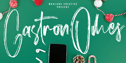 Give your designs an authentic brush handcrafted feel. "Gastronomes" is perfectly suited to signature, stationery, logo, typography quotes, magazine or book cover, website header, flyer, clothing, branding, packaging design and more.
 - Gondola SD - 100% free

- Bola - Unknown license

- As of my last update in April 2023, HEX Font may refer to a specific typeface design or could be a general reference to a font that is stylized in a way that aligns with the aesthetic or functionalit...
- Spiced Pumpkin by Hanoded,
$15.00 I don’t know about the weather on your side of the globe, but here it is mighty cold! I was trying out a new technique of font-making AND I was craving a pumpkin spice latte, so I named this font Spiced Pumpkin. Spiced Pumpkin is a rounded, thin, all caps typeface with a heart warming, ice melting attitude. It looks good on product packaging, book covers and postcards, so (in other words) give it a whirl and see what you’ll end up with!
 - Alloca Mono by Daniel Gamage,
$29.99 To break from the rigidity of a typical monospaced font, Alloca includes weights that go above and beyond. From the wire-thin to the ultra-bold, you’ll be able to do a lot with one monospaced family. With OpenType features like slashed zeros, old style numerals, and case-sensitive forms, Alloca is versatile. It's great for displaying code, showcasing data, or even flowing your body copy. It has broad language support, too, with localized forms for Vietnamese, Polish, Catalan, and Dutch, to name a few.
 - Noise Maker by Bogstav,
$15.00 Can noise be a beautiful sound? Well, I guess...because the other day when I was playing the good old Bleach album by Nirvana (which I consider lovely grunge music!) my wife yelled "Could you stop that noise?!" - and I answered "What noise?!" - ha-ha-ha! Anyway, I finished this font while listening to that particular lovely noise, and I knew that this crunchy, grungy, handmade and full of contextual alternates and multilingual font had to be named something with the word "noise" in it!
 - Nm Hello Soulmate by NM Fonts,
$9.42 is a font that converts free handwriting into digital. The uppercase and lowercase "O" are designed in a heart shape to further enhance the loveliness. This font is perfect for working with various digital devices. It is often used in apps such as Notepad, GoodNote on iPad, and can also be used as a system font on mobile. Use this font to show off your style on social media (Instagram, Pinterest, etc.)! Of course it's perfect for printing! This font will be by your side anytime, anywhere.
 - Silent Drama JNL by Jeff Levine,
$29.00 An ad in the April 19, 1919 edition of Motion Picture News for the (now lost) silent drama "Josselyn's Wife" featured some wonderfully stylized Art Nouveau hand lettering. Primarily a condensed character set with rounded serifs, there are a number of letters that take liberties in both width and character shape. Adding to this, [mostly vertical] parallel lines are cut through the characters to create a "striped' type of "double engraved' effect. Silent Drama JNL is available in both regular and oblique versions. **Uppercase
 - Makalo by Konstantine Studio,
$9.00 Pack up your bags and let's travel to somewhere far away. Dive deep into the ethical visual vibes together with MAKALO. Inspired by the traditional tribal and visual ethnic vibes. Perfectly fit for your fun and casual thematic visuals, logo, branding, products, campaigns, events, seasonal promotions, traditional concept, explore the different sides of your brand using MAKALO fonts. Came up with 3 different styles, Regular, Clean, and Inline. And also packed up with Stylistic Alternates and Ligatures to explore the deeper vibes of ethnic and tribal visuals.
 - Gladiora by Owl king project,
$37.00 Gladiora Sans serif font family with tapered accents in some of the letters gives it a modern and bold character, even being quite prominent in thin characters. This font aims to give an elegant impression and also looks so luxurious in short wording for a letter-based title and logo. With 20 types and support for multi-languages, this font provides a wider range of exploration, which can be useful also for reading sentences and giving variety to each sentence by combining it with several sizes.
 - Godfrey by Ludwig Type,
$45.00 Godfrey is a compact, straight-sided, sans serif with a solid and reliable personality. Particularly striking are the descenders on ‘f’, ‘j’ and ‘y’ – which are composed completely of straight lines – and the protracted points of the ‘i’ and ‘j’. This emphasis on straight lines and equal proportions lend Godfrey a very structured and clean appearance while also ensuring its very unique character. As a result, Godfrey is a legible typeface that is expressive without being distracting. Visit this minisite to see Godfrey in action.
 - Shmulkas by Fontsoon,
$9.00 Nu?! Vhat else vould you font?! Introduction to the first kosher vant...er...font! Yes, our Board certified rabbis made all the proper blessings so you can use this font guilt free. Just kidding, what's Jewish without a schmear of guilt. This font borrows its style from the 2nd. Avenue Deli all the way down to Guss Pickles on Essex street. If pastrami on white bread with ketchup is for you, this font is NOT. Its strictly pastrami on rye with mustard and slaw on the side.
 - Nursery Rhyme Initials by Celebrity Fontz,
$24.99High-quality ornamental initials superimposed on nursery rhyme backgrounds such as Humpty Dumpty, Ride a Cock Horse, Baa Baa Black Sheep, Tom Tom the Piper's Son, Rub-A-Dub-Dub, the Queen of Hearts, Old King Cole, and many others. Includes one set of A-Z ornamental initials conveniently assigned to both the upper and lower case alphabet characters. Ornate and accurate renderings that can be used for the beginning of paragraphs in any children's publication or texts relating to nursery rhymes and fairy tales. - Horse Drawn Carriage JNL by Jeff Levine,
$29.00 Picture if you will, a balmy autumn evening in Manhattan during the 1930s and a well-dressed couple out on the town. They hail one of the hansom cabs located near Central Park and climb in for an old-fashioned romantic ride around the green. Such are the type of images the stylized Art Deco hand-lettering comprising Horse Drawn Carriage JNL evokes. The inspiration for this font was the title card for a 1935 Bette Davis feature entitled "The Girl from 10th Avenue".
 - Stones by Fana Studio,
$20.00 STONES is a supercharged, street-wise brush font bursting with energy. With extra attention to quick strokes and sharp details, STONES is guaranteed to deliver an unapologetically loud & fast-paced message; ideal for logos, apparel, quotes, product packaging, or anything which needs a typographic turbo-boost. What you get : Numeral and Punctuation International Language Works on PC & Mac Simple installations Accessible in the Adobe Illustrator, Adobe Photoshop, Adobe InDesign, even works on Microsoft Word. Thank you for your purchase! Hope you enjoy with our font!
 - Kwersity by Ingrimayne Type,
$12.95 Kwersity is a boxy, geometric, slab-serifed typeface with strokes of uniform weight. Its circular elements are almost rectangular. The narrower style has a high x-height. Both the narrower and wider variants come in three weights, regular, semi-bold, and bold. (In its original, pre-2020 form, what is now semi-bold was bold. What is now bold is new as of 2020.) There is also a shadow version; Kwersity-semibold can be layered on top of it to color the interior of the letters.
 - Smalkis by Gatype,
$14.00 Smalkis This beautiful script is for those who need elegance and style for their designs and is perfect for wedding invitations, save the date cards and feminine branding. Smalkis includes a full set of Basic Uppercase and Lowercase Characters, Numbers and Punctuation. Also contains ligatures and many stylistic alternatives to perfectly recreate natural calligraphy (check the preview to see all of them) What will you get? Smalkis (OTF) If you have any questions about my products, feel free to write a message on the side.
 - Violant by Eurotypo,
$60.00 Violant fonts are designed as a tribute to Queen Violant, wife of Jaume 1st, king of Aragon, a woman of strong character, who supported her husband in the conquest of Valencia in 1238. Probably, Violant read texts in Gothic letters, which at that time were subjected to a stylization process in Castile and Aragon. Violant family comes with 736 glyphs, with OpenType features, swashes for all glyphs, stylistics sets, stylistics alternates, a lot of ligatures and a generous set of ornaments to play with your texts.
 - Rotis Semi Sans by Monotype,
$40.99 Rotis¿ is a comprehensive family group with Sans Serif, Semi Sans, Serif, and Semi Serif styles, for a total of 17 weights including italics. The four families have similar weights, heights and proportions; though the Sans is primarily monotone, the Semi Sans has swelling strokes, the Semi Serif has just a few serifs, and the Serif has serifs and strokes with mostly vertical axes. Designed by Otl Aicher for Agfa in 1989, Rotis has become something of a European zeitgeist. This highly rationalized yet intriguing type is seen everywhere, from book text to billboards. The blending of sans with serif was almost revolutionary when Aicher first started working on the idea. Traditionalists felt that discarding serifs from some forms and giving unusual curves and edges to others might be something new, but not something better. But Rotis was based on those principles, and has proven itself not only highly legible, but also remarkably successful on a wide scale. Rotis is easily identifiable in all its styles by the cap C and lowercase c and e: note the hooked tops, serifless bottoms, and underslung body curves. Aicher is a long-time teacher of design and has many years of practical experience as a graphic designer. He named Rotis after the small village in southern German where he lives. Rotis¿ is suitable for just about any use: book text, documentation, business reports, business correspondence, magazines, newspapers, posters, advertisements, multimedia, and corporate design.Today Rotis ia also available with pan european caracter set.
 - Rotis Semi Sans Paneuropean by Monotype,
$92.99Rotis¿ is a comprehensive family group with Sans Serif, Semi Sans, Serif, and Semi Serif styles, for a total of 17 weights including italics. The four families have similar weights, heights and proportions; though the Sans is primarily monotone, the Semi Sans has swelling strokes, the Semi Serif has just a few serifs, and the Serif has serifs and strokes with mostly vertical axes. Designed by Otl Aicher for Agfa in 1989, Rotis has become something of a European zeitgeist. This highly rationalized yet intriguing type is seen everywhere, from book text to billboards. The blending of sans with serif was almost revolutionary when Aicher first started working on the idea. Traditionalists felt that discarding serifs from some forms and giving unusual curves and edges to others might be something new, but not something better. But Rotis was based on those principles, and has proven itself not only highly legible, but also remarkably successful on a wide scale. Rotis is easily identifiable in all its styles by the cap C and lowercase c and e: note the hooked tops, serifless bottoms, and underslung body curves. Aicher is a long-time teacher of design and has many years of practical experience as a graphic designer. He named Rotis after the small village in southern German where he lives. Rotis¿ is suitable for just about any use: book text, documentation, business reports, business correspondence, magazines, newspapers, posters, advertisements, multimedia, and corporate design.Today Rotis ia also available with pan european caracter set. - Rotis Semi Serif Paneuropean by Monotype,
$92.99Rotis¿ is a comprehensive family group with Sans Serif, Semi Sans, Serif, and Semi Serif styles, for a total of 17 weights including italics. The four families have similar weights, heights and proportions; though the Sans is primarily monotone, the Semi Sans has swelling strokes, the Semi Serif has just a few serifs, and the Serif has serifs and strokes with mostly vertical axes. Designed by Otl Aicher for Agfa in 1989, Rotis has become something of a European zeitgeist. This highly rationalized yet intriguing type is seen everywhere, from book text to billboards. The blending of sans with serif was almost revolutionary when Aicher first started working on the idea. Traditionalists felt that discarding serifs from some forms and giving unusual curves and edges to others might be something new, but not something better. But Rotis was based on those principles, and has proven itself not only highly legible, but also remarkably successful on a wide scale. Rotis is easily identifiable in all its styles by the cap C and lowercase c and e: note the hooked tops, serifless bottoms, and underslung body curves. Aicher is a long-time teacher of design and has many years of practical experience as a graphic designer. He named Rotis after the small village in southern German where he lives. Rotis¿ is suitable for just about any use: book text, documentation, business reports, business correspondence, magazines, newspapers, posters, advertisements, multimedia, and corporate design. Today Rotis ia also available with paneuropean caracter set. - Rotis Semi Serif by Monotype,
$40.99 Rotis¿ is a comprehensive family group with Sans Serif, Semi Sans, Serif, and Semi Serif styles, for a total of 17 weights including italics. The four families have similar weights, heights and proportions; though the Sans is primarily monotone, the Semi Sans has swelling strokes, the Semi Serif has just a few serifs, and the Serif has serifs and strokes with mostly vertical axes. Designed by Otl Aicher for Agfa in 1989, Rotis has become something of a European zeitgeist. This highly rationalized yet intriguing type is seen everywhere, from book text to billboards. The blending of sans with serif was almost revolutionary when Aicher first started working on the idea. Traditionalists felt that discarding serifs from some forms and giving unusual curves and edges to others might be something new, but not something better. But Rotis was based on those principles, and has proven itself not only highly legible, but also remarkably successful on a wide scale. Rotis is easily identifiable in all its styles by the cap C and lowercase c and e: note the hooked tops, serifless bottoms, and underslung body curves. Aicher is a long-time teacher of design and has many years of practical experience as a graphic designer. He named Rotis after the small village in southern German where he lives. Rotis¿ is suitable for just about any use: book text, documentation, business reports, business correspondence, magazines, newspapers, posters, advertisements, multimedia, and corporate design. Today Rotis ia also available with paneuropean caracter set.
 - Big Dreams by Twinletter,
$12.00 Introducing the Big Dreams font. As the name implies, this font will give an extraordinary impression and an experience that will never be forgotten, if you use this font in your design. We designed this font with thorough attention to each letter so that it has the right portion if it is arranged in a word or title and if it is made into a sentence it will be easy to remember and pleasing to the eye. Not limited to that, the bold calligraphy font is designed to keep paying attention to the beauty of each letter, there are alternate options for the letters which are certainly easy for you to access, so you can automatically customize the letters you want to enhance the visual appearance of your design project. This charming font also offers the beauty of abstract typography harmony for a wide variety of design projects, including digital natural handwriting for designs, quote designs, for social media business designs, advertisements, trademarks, food and beverage promotion banners, text, posters, a signature, and all designs require handwriting or whatever design you want. ============================================================================================================ What’s Included : File font Web Fonts Standard glyphs Ligature Works on PC & Mac Simple installations Accessible in Adobe Illustrator, Adobe Photoshop, Adobe InDesign, even work on Microsoft Word. PUA Encoded Characters – Fully accessible without additional design software. Fonts include multilingual support for; Afrikaans, Albanian, Croatian, Czech, Danish, Dutch, English, Estonian, Finnish, French, German, Hungarian, Italian, Norwegian, Polish, Portuguese, Slovak, Slovenian, Spanish, Swedish Thank you for your purchase! Hope you enjoy our font!
 - Linotype Punkt by Linotype,
$29.99 Linotype Punkt, from US designer Mischa Leiner, is part of the TakeType Library, chosen from the entries of the Linotype-sponsored International Digital Type Design Contest 1999 for inclusion on the TakeType 3 CD. This font, from US designer Mischa Leiner is available in three weights, light, regular and bold. The basic forms are those of a robust sans serif, however the figures are composed of evenly placed dots, hence the name Punkt, the German word for dot. This distinguishing characteristic lets this font look as though it appears on a background of light. One other unique trait of this font is the nature of the three weights. The figures of each weight have exactly the same measurements, the same width, breadth, etc. The only variable measurements are those of the individual dots making up the forms, making the bold weight much darker than the light while retaining the same outer contours. Linotype Punkt should be used in larger point sizes, as when it is too small the dots blur together and rob the font of its 'light'. The font is therefore best for headlines in large and very large point sizes.
 - Zeneon by Ditatype,
$29.00 Zeneon is an extraordinary display font that combines the captivating allure of neon lights with an intriguing inline design. With its bold uppercase letterforms and electrifying neon style, this typeface creates a visually stunning and unforgettable impact. The defining feature of Zeneon lies in its mesmerizing neon-inspired design, enhanced by a distinctive inline element. Each letter is meticulously crafted to emanate the vibrant glow of neon lights, capturing the essence of urban energy. The inline detail adds an extra layer of visual interest, creating a dynamic and captivating composition. Inspired by the enchanting charm of neon signs, Zeneon infuses a sense of liveliness and modernity into each character. The font embodies the pulsating energy of neon lights, casting a radiant glow that demands attention. This neon style evokes a nostalgic urban atmosphere, adding a touch of excitement and intrigue to your designs. The uppercase letterforms of Zeneon are bold and assertive, making a powerful statement with their distinct design. The combination of the neon style and the intriguing inline element enhances the font's overall composition, creating a captivating visual impact. Zeneon is perfect for headlines, logos, signage, and any design project that seeks to command attention with a touch of neon-inspired flair. Enjoy the various features available in this font. Features: Alternates Multilingual Supports PUA Encoded Numerals and Punctuations Zeneon fits for creating posters, branding materials, digital artwork, or anything in between, this font will elevate your project to new heights. It particularly shines in applications related to nightlife, entertainment, technology, and urban-themed designs, where it adds a futuristic edge. Find out more ways to use this font by taking a look at the font preview. Thanks for purchasing our fonts. Hopefully, you have a great time using our font. Feel free to contact us anytime for further information or when you have trouble with the font. Thanks a lot and happy designing.
 - Neuzeit Office by Linotype,
$50.99 The Neuzeit Office family is designed after the model of the original sans serif family Neuzeit S™ , which was produced by D. Stempel AG and the Linotype Design Studio in 1966. Neuzeit S itself was a redesign of D. Stempel AG’s DIN Neuzeit, created by Wilhelm Pischner between 1928 and 1939. Intended to represent its own time, DIN Neuzeit must have struck a harmonious chord. DIN Neuzeit is a constructed, geometric sans serif. It was born during the 1920s, a time of design experimentation and standardization, whose ethos has been made famous by the Bauhaus and De Stijl movements in art, architecture, and design. Upon its redesign as Neuzeit S in the 1960s, other developments in sans serif letter design were taken into account. Neuzeit S looks less geometric, and more gothic, or industrial. Separating it from typefaces like Futura, it has a double-storey a, instead of a less legible, single-storey variant. Unlike more popular grotesque sans serifs like Helvetica, Neuzeit S and especially the redesigned Neuzeit Office contain more open, legible letterforms. Neuzeit Office preserves the characteristic number forms that have been associated with its design for years. After four decades, Neuzeit has been retooled once again, and it is more a child of its age than ever before. Akira Kobayashi, Linotype’s Type Director, created the revised and updated Neuzeit Office in 2006. His greatest change was to retool the design to make its performance in text far more optimal. Additionally, he created companion oblique to help emphasize text.
 - As of my last update, Hitch is not a widely recognized or standardized font within major typographical databases or among commonly listed typefaces. However, let's imagine what a font named Hitch cou...
- French Flair by PeachCreme,
$14.00 "French Flair" is our latest font pair! With a graceful decorative serif and contrasting light and crisp italic, French Flair duo can be handy in any trending design project.
 - Pantra by Nicolas Deslé,
$19.90 Pantra is a minimal and clear geometric sans. Pantra is clear, approachable, and effective in both headings and paragraphs and comes in 4 weights: light, regular, medium and bold.
 - Moderator JNL by Jeff Levine,
$29.00 Moderator JNL is a casual, light weight serif font that is perfect for headlines, short blurbs or display text. The font is available in both regular and oblique versions.
 - Sketchetik Fill by Hiekka Graphics,
$19.00 Sketchetik Fill – brother of famous Sketchetik – is a hand-drawn font in four styles: Light, Regular, Bold and Black. Sketchetik Fill is recommended for use as a display typeface.
 - Noad Sans by Groteskly Yours,
$60.00 Noad Sans is an experimental sans serif typeface with a strong character and some very unique visual features. At the core of Noad Sans is a sturdy sans serif with closed apertures and fairly simple letterforms. The defining feature of Noad Sans, however, is its visualised nodes: all control points of Bézier curves in each of the fonts in the family are intentionally visualised. The effect of this feature is largely defined by the usage: in titles and larger bodies of text, the visualised nodes stand out and create a rhythmic pattern of their own. In smaller sizes, the sans serif base of the font becomes more prominent and the nodes create a visual fuzz. Noad Sans comes in 6 styles and as a Variable Font with two axes–Optical Size and Slant. The size of each node can be changed from the smallest (Mini and Mini Italic) to the largest (Extra and Extra Italic). Variable Font technology allows you to fine tune the size of the nodes and the slant angle, so that your version of Noad Sans can be truly unique. Noad Sans has a large character set of 570+ glyphs, covering the vast majority of Latin based languages. In addition to that there are dozens of special characters, punctuation, numbers, and symbols. Noad Sans is equipped with a number of useful OpenType features, such as Case-Sensitive Punctuation, Stylistic Alternates, Ligatures, Fractions and many more. Noad Sans began as an experimental project, and during its development the spirit of experimentation was at the heart of the project. Thanks to the unique nature of the typeface, it can feel at home in a variety of settings: from web development, graphic and product design to more novel uses like 3D and NFTs. Noad Sans type family includes 6 static fonts (Mini, Mini Italic, Regular, Regular Italic, Extra and Extra Italic) and one variable font. Each style can be purchased separately. There is a free trial version of Noad Sans that can be downloaded free of charge on MyFonts. For more information on the typeface, feel free to download Noad Sans PDF Specimen.
 - Kidnap Note - Personal use only

- SHARKBOY & lavagirl - Personal use only

- Comic Relief - Personal use only

- Second Reign by Mans Greback,
$59.00 Second Reign is a decorative medieval typeface. With borders and diamonds, this magic typeface of extreme variability brings us to glorious worlds in the golden times of epic sagas. Second Reign is the typeface of a viking king or a knight order. Use it for a Middle Ages game, a fantasy headline, or as a logotype for anything of historical theme. With usage in any modern software, the letters will automatically overlap and embrace in an elegant way. To make heraldic symbols, copy these icons: 🐉 🐎 👑 🗡 🦁 🦅 🦌 + ♖ × ✝ ⚓ * ⚔ † ‡ Alternatively write %A %B %C ... etc to create the heraldry. (Download required.) Dragon, Horse, Crown, Sword, Eagle, Deer, Cross, Anchor are some of the logos. Use [ ] for side borders. Example: [Royal⚔Thrones] The Second Reign family consists of four variations: The weight styles Thin, Medium and Bold, plus the decorated Border style. The font is built with advanced OpenType functionality and has a guaranteed top-notch quality, containing stylistic and contextual alternates, ligatures and more features; all to give you full control and customizability. It has extensive lingual support, covering Greek and Cyrillic, as well as all Latin-based languages, from North Europe to South Africa, from America to South-East Asia. It contains all characters and symbols you'll ever need, including all punctuation and numbers.
 - Normandia by Canada Type,
$30.00 Designed over three years after the second World War, and published in 1949 by the Nebiolo foundry, Normandia was Alessandro Butti’s take on the fat face. As it usually was with Butti’s designs, this face effectively injected a catchy yet expertly calculated calligraphic spin into its source of inspiration — which was the essentially geometric/deco, thicker model of Bodoni’s very popular aesthetic. The metal Normandia saw some widespread use for a handful of years after its publication, not least because of the multitude of sizes in which it was available. It stepped out of the limelight by the mid-1950s, due to a combination of the popularity of cold type and Nebiolo’s refusal to retool its faces for new technologies. It was copied by a few small film typesetting outfits on both sides of the Atlantic, but never really found its way back to the mainstream. By the time computer type became the norm, Normandia was pretty much relegated to a type historian’s collection of anecdotes. This digital update of the classic series revives and refines the three original metal designs (Tonda/Regular, Corsiva/Italic, and Contornata/Outline) and expands the character set to more than 600 glyphs per font, including small caps, six types of figures, fractions and nut fractions, a full set of f-ligatures, some stylistic alternates, and other fine typography niceties.
 - Sicero by Konstantine Studio,
$12.00 Back in 1800 - 1900, the Serif fonts or known as Roman styles were very popular. Used in so many media, came from calligraphic technique and refined till it became a solid style even so many sign painters use this letter style back in that era. And today, these kinda style still got their fans who love the elegant yet clean solid style. That's what this came for. Please welcome, Sicero Duo Fonts. Its a dynamic duo fonts that came in Serif and Sans-Serif style which is perfectly fit to each other. Bring the old vibes instantly to your project with them :) Sicero Roman A Serif style font with implementations of old-era style, clean and done in click-by-click to fulfil your perfectionist personal. And it comes in Old Style Numbering too, to make the vibes stronger in the whole vintage design when using it. Sicero Sans A Sans-Serif font to make a good pair with Sicero Roman still holding those old vibes but a little bit modern touch in here to reach wider range of trends. Use it all alone is still good to go if you want something different with not pairing it with Sicero Roman as well. Available in OTF, TTF, and Webfonts. Enjoy it more. Have some fun with it, Oldsport :) Cheers, Konstantine Studio
 - FM Bolyar Pro by The Fontmaker,
$29.00 Bolyar Pro type family is the ancestor of our successful font Bolyar . We decided to develop it to a new higher level - making it more sophisticated, detailed and useful at the same time. The new improved Bolyar is able to satisfy every typographic taste and meet the ever growing design requirements for high quality typefaces. If you are addicted to classic vintage style, then you could easily use Bolyar Pro for almost anything - from letterhead, logos and catchy headlines to elegant packaging, book covers and wine labels. Alternates, Swashes and Ligatures will help you customize almost every single letter and fit perfectly to your artwork. Bolyar Pro type family is showing an abundance of many new useful features and options like: - Five weights each sold as separate font - Over 1200 glyphs per weight - Full multilingual support of all European languages as well Greek and Cyrillic - Brand new Alternates and Swashes fully supported in all languages (even with accented characters) - Many useful ligatures - Full Open Type and True Type support for Mac and Win Platforms - New Bolyar Ornaments - a new complimentary font exclusively designed to fit the new Bolyar Pro, containig decorative shields, frames, ornaments and borders. Bolyar Pro font family is great for any kind of labels - in this link you could see some amazing examples how to use it alone or in combination with our Bolyar Ornate Pro font family.


