10,000 search results
(0.036 seconds)
- Willo the Wisp - Unknown license

- Dunley by Eko Bimantara,
$18.00 Dunley is soft script that fit for various design purposes. Good for display sizes, branding, titles, logo and more.
 - Robusta by Wiescher Design,
$39.50 Robusta is somehow more elegant than Courier and sturdier than Bodoni. Yours in an in-between mood, Gert Wiescher.
 - DB Foliage by Illustration Ink,
$3.00DB Foliage is more than just ground cover. This DoodleBat offers great borders or adornments for your creative projects. - Venfro by ffeeaarr,
$11.00 venfro is dynamic including tech display fonts, is a bold with futuristic character. it's work for games, logo & more
 - Reklamefraktur by RMU,
$25.00 Reklamefraktur is a stout, eye-catching blackletter font for labels, product branding, posters, ads, the internet and much more.
 - Perpetuity by Zang-O-Fonts,
$25.00Strict, strong and narrow, Perpetuity is clean and perfectly designed to be used as a more formal display face. - Printers Decorations JNL by Jeff Levine,
$29.00 More vintage cartoons, decorations, embellishments and various letterpress dingbats have been re-drawn and collected in Printers Decorations JNL.
 - Stereoflows by Maulana Creative,
$16.00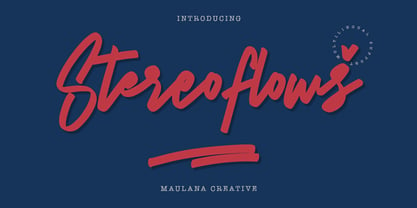 Give your designs an authentic handcrafted feel. � Stereoflows� is perfectly suited to stationery, logos and much more. Many Thanks!
 - Lockup JNL by Jeff Levine,
$29.00Lockup JNL is a more condensed version of Jeff Levine's Hoosegow JNL - based on a classic wood type design. - Wakerobin by Monotype,
$50.99 Wakerobin takes its charming swagger from the hand-painted billboard, poster and signage lettering of the mid-19th century. These showy styles did everything they could to stand out from the background cacophony of advertising, with signwriters using sharp and high contrast serif letters, squared block shapes, or art nouveau forms to grab the attention of passersby. Wakerobin embraces the spirit of these letterforms, bringing these various styles together in one typeface - as if users had their own sign painter on hand. Just as lettering artists had to adapt to a variety of sizes - from wide streetcar lettering to compressed forms that squeezed into narrow Victorian windows - the variable version of Wakerobin scales up and down in width to fit whatever environment the user’s working in. The static fonts come in three widths and five weights. As well as its adaptability, Wakerobin is bursting with vintage flavour, making it hard to ignore. Its distinctive, spiky serifs would be right at home on food and drinks packaging, as well as shop windows, adverts, and any other place that calls for some typographic showmanship. It performs particularly well in busy environments, or anywhere with a lot of visual noise - just as its historic predecessors did. And while Wakerobin is first and foremost a display typeface, it’s surprisingly elegant when used at text size, or in the lighter end of the weight spectrum.
 - Rotis Sans Serif Paneuropean by Monotype,
$98.99Rotis is a comprehensive family group with Sans Serif, Semi Sans, Serif, and Semi Serif styles. The four families have similar weights, heights and proportions; though the Sans is primarily monotone, the Semi Sans has swelling strokes, the Semi Serif has just a few serifs, and the Serif has serifs and strokes with mostly vertical axes. Designed by Otl Aicher for Agfa in 1989, Rotis has become something of a European zeitgeist. This highly rationalized yet intriguing type is seen everywhere, from book text to billboards. The blending of sans with serif was almost revolutionary when Aicher first started working on the idea. Traditionalists felt that discarding serifs from some forms and giving unusual curves and edges to others might be something new, but not something better. But Rotis was based on those principles, and has proven itself not only highly legible, but also remarkably successful on a wide scale. Rotis is easily identifiable in all its styles by the cap C and lowercase c and e: note the hooked tops, serifless bottoms, and underslung body curves. Aicher was a long-time teacher of design with many years of practical experience as a graphic designer. He named Rotis after the small village in southern Germany where he lived. Rotis is suitable for just about any use: book text, documentation, business reports, business correspondence, magazines, newspapers, posters, advertisements, multimedia, and corporate design. - Ongunkan Phoenician by Runic World Tamgacı,
$50.00 Phoenician/Canaanite The Phoenician alphabet developed from the Proto-Canaanite alphabet, during the 15th century BC. Before then the Phoenicians wrote with a cuneiform script. The earliest known inscriptions in the Phoenician alphabet come from Byblos and date back to 1000 BC. The Phoenician alphabet was perhaps the first alphabetic script to be widely-used - the Phoenicians traded around the Mediterraean and beyond, and set up cities and colonies in parts of southern Europe and North Africa - and the origins of most alphabetic writing systems can be traced back to the Phoenician alphabet, including Greek, Etruscan, Latin, Arabic and Hebrew, as well as the scripts of India and East Asia. Notable features Type of writing system: abjad / consonant alphabet with no vowel indication Writing direction: right to left in hortizontal lines. Sometimes boustrophedon. Script family: Proto-Sinaitic, Phoenician Number of letters: 22 - there was considerable variation in their forms in different regions and at different times. The names of the letters are acrophonic, and their names and shapes can be ultimately traced back to Egyptian Hieroglyphs. For example, the name of the first letter, 'aleph, means ox and developed from a picture of an ox's head. Some of the letter names were changed by the Phoenicians, including gimel, which meant camel in Phoenician, but was originally a picture of a throwing stick (giml).
 - Wakerobin Variable by Monotype,
$209.99Wakerobin takes its charming swagger from the hand-painted billboard, poster and signage lettering of the mid-19th century. These showy styles did everything they could to stand out from the background cacophony of advertising, with signwriters using sharp and high contrast serif letters, squared block shapes, or art nouveau forms to grab the attention of passersby. Wakerobin embraces the spirit of these letterforms, bringing these various styles together in one typeface - as if users had their own sign painter on hand. Just as lettering artists had to adapt to a variety of sizes - from wide streetcar lettering to compressed forms that squeezed into narrow Victorian windows - the variable version of Wakerobin scales up and down in width to fit whatever environment the user’s working in. The static fonts come in three widths and five weights. As well as its adaptability, Wakerobin is bursting with vintage flavour, making it hard to ignore. Its distinctive, spiky serifs would be right at home on food and drinks packaging, as well as shop windows, adverts, and any other place that calls for some typographic showmanship. It performs particularly well in busy environments, or anywhere with a lot of visual noise - just as its historic predecessors did. And while Wakerobin is first and foremost a display typeface, it’s surprisingly elegant when used at text size, or in the lighter end of the weight spectrum. - Mercedes - Unknown license

- Tiny Butler by Pink Broccoli,
$14.00 A light hearted unicase typeface inspired by the titling of the 1977 Pink Panther cartoon, Therapeutic Pink.
 - Lightspeed by Zang-O-Fonts,
$25.00Very light and italicized, this font was created as a somewhat futuristic interpretation of a modern font. - Butt Smuggler by Buttfaces,
$18.00Buttsmuggler is a light-hearted puffy font, good for a cartoon-like or casual hand-drawn look. - Gionni by Cultivated Mind,
$15.00 Gionni was designed by Cindy Kinash. This is a hand drawn, tall, light, thin retro inspired font.
 - Status by FaceType,
$18.00 Status is a hybrid of a super fat alphabet and ultra light figures and other special glyphs.
 - Brutal by bb-bureau,
$65.00 Brutal is a not stencil calligraphic typeface designed in light, regular and bold. language: all latin glyphs
 - Khakoy by Twinletter,
$13.00 Introducing “Khakoy Font” – Unleash Playful Creativity! Dive into a world of limitless imagination with Khakoy Font, your ultimate tool for injecting a playful spirit into your designs. Khakoy Font is the embodiment of joy and whimsy in typography. Crafted to spark delight, it’s your go-to choice for projects that demand a dash of fun and a pinch of mischief. With its lively and distinct characters, Khakoy Font invites you to explore the playful side of design. It’s a font that ensures your message is conveyed with a contagious sense of playfulness, captivating your audience instantly. Designed to ignite creativity, Khakoy Font adds a touch of amusement to your projects. From cheerful posters to charming children’s books, this font is your partner in crafting designs that leave a lasting, joyful impression. Let your designs break free from the ordinary and embrace the vibrant spirit of Khakoy Font. Elevate your creative game, infuse humor and light-heartedness into your work, and watch your designs come alive with this delightful typeface. Discover the magic of Khakoy Font today! – PUA Encoded Characters – Fully accessible without additional design software.
 - Colville by Canada Type,
$29.95 The Colville fonts began their existence in 2015 as a project-specific typeface, made to be used on a custom-made headstone commemorating Canadian artist Alex Colville (1920-2013) and his wife Rhoda Wright. For that purpose, some initial shapes were modelled after letters Colville himself had used on a Governor General gold medal he designed in the mid-1970s. From there started a year-long project that culminated in a set of four comprehensive fonts ranging in weight from Light to Bold, each containing over 750 glyphs to cover Pan European language support, stylistic alternates, five sets of figures, automatic fractions, and some ornaments rooted in Alex Colville’s art. These fonts exhibit a strong art deco aesthetic that has always been a favourite of architects, metal casters, and sign makers. This is a very humanist geometry alternating from the precisely calculated to the curvy and lithe, subtle contrast, flat stroke stops, and airy proportions that make for a counterspace built for accommodation and comfort. The breadth and timeless humanism of the Colville set makes fit in a variety of applications, from straightforward headlines, titles, and emphasis captions, to branding and packaging.
 - Karim by Linotype,
$187.99Karim is a traditional-style Arabic text face, designed in response to a demand for a traditional text face adapted to setting Quranic commentaries. Within the constraints of the standard character set and typesetting program, Karim’s design aims to recall the style and fluency of manuscript Naskh without, however, reproducing the idiosyncrasies of any particular calligrapher. The line weight chosen is heavier than usual for a traditional light face in order to benefit the reproduction of small size Tafsir text. A tall kaf, deep descenders and slightly inclined alifs and lams all help to suggest the cursiveness of manuscript. The type-style that emerges is characterized by restraint and clarity; qualities suited to Karim’s original purpose, and ones that recommend it for wider use. Karim ships includes Latin glyphs from Janson Text Roman, allowing the single font to set text in both most Western European and Arabic languages. Karim’s code pages incorporate Basic Latin and the Arabic character set, which supports Arabic, Persian, and Urdu. The font includes tabular and proportional Arabic, Persian, and Urdu numerals, as well as a set of tabular European (Latin) numerals. - Jemgonza by Pootis Type Corp.,
$24.99 Jemgonza is a Sans-serif font started on January 26, 2022. This font with hyper-extended character sets allow for usage for billboard signs, logos, and even professional documents and essays. It contains localized forms for certain languages that write them differently. For example: Л and л shaped like upside-down V's, д shaped like a lowercase g, и shaped like a lowercase u, and more for Bulgarian; б shaped like the Greek lowercase letter delta for Macedonian and Serbian. There are two non-standard variation sequences for the light and dark shades for when they are used vertically. If it bothers you, you can add Variation Selector-14 after each one of those This font also contains 256 braille patterns for the blind people. Note that each pattern is not tied to any specific letter since multiple scripts have a braille system
 - Ocean View by Mans Greback,
$59.00 Ocean View is a beautiful handwriting lettering. This script typeface is cute and feminine, optimized for a modern signature logotype with a genuine craft style. Its monolined strokes and hand drawn letterforms emits optimism and lightheartedness. Use underscore _ to make a swash. Example: Cle_arly Use multiple underscores to make different swashes. Example: Super__________star (Download required.) The Ocean View family consists of five high-quality cursive fonts: Thin, Light, Regular, Bold and Black The font is built with advanced OpenType functionality and has a guaranteed top-notch quality, containing stylistic and contextual alternates, ligatures and more features; all to give you full control and customizability. It has extensive lingual support, covering all Latin-based languages, from Northern Europe to South Africa, from America to South-East Asia. It contains all characters and symbols you'll ever need, including all punctuation and numbers.
 - Linotype Belle by Linotype,
$29.99Linotype Belle is a casual script face. Created in 1999 by the Swiss designer Isabelle Stutz, the letters in this design have a light, informal nature, and appear as if they were written out quickly, using a writing instrument similar to a ballpoint pen. Linotype Belle has two fonts to offer: Linotype Belle Plain and Linotype Belle Bonus. Linotype Belle Bonus contains more extravagant, swash-like capitals than Linotype Belle Plain's characters; when used together, these two fonts can create a varied, lively impression. Linotype Belle was a prizewinner in Linotype's Third International Type Design Contest. Additionally, the design is part of the innovative Take Type Library, and can be purchased as part of the Take Type 3.1 CD collection. The typeface works excellently when used to set magazine or newsletter headlines, and as text for greeting cards." - Whatchamacallit by Comicraft,
$19.00 We popped the Doohickey into the Framistat and out popped this Whatchamacallit! Is it fat? is it thin? Is it tall? Is it short? Is it light? Is it heavy? Is it condensed?! is it expanded?! Yes, yes, yes and yes -- It’s all of the above and more! Our resident mad scientist John “Mr. Fontastic” Roshell has developed a single contraption that can handle any design emergency, from crimelords to supervillain team-ups to alien invasions. Whatchamacallit is a friendly and readable sans-serif, inspired by some of our all-time favorites -- Gill Sans, Futura, Venus and Antique Olive. But, like its machinery-contraption namesakes Doohickey and Framistat, Whatchamacallit has a lively personality -- the strokes are a little wavy, the ends a bit bulbous, and the circles are like little loaves of bread, rising in the Whatchamacallit's oven... delicious!
 - Al Murberry by Aluyeah Studio,
$90.00 Bonjour! Murberry a fashion chic display font. This font was carefully crafted and inspired by one of leading fashion brand in the world. In general, it creates a luxurious and elegant look in design. Coming to you with 50+ luxury ligature and 30+ alternate in 4 weight – light, normal, medium and bold – to create a perfectly beautiful, classy, chic, elegant, and luxurious design. Use this font for your fashion brand, resort, cosmetics, invitations, wedding, branding, packaging, magazines, boutique, social media, restaurant, spa, greeting cards, headers, headline and many more. Features: OpenType support Multilingual support (15 languages) PUA Encoded Super Easy to Use alternates – It’s OpenType support but you can easily call alternates character using special combination like a.2 c.2 e.3 etc so you don't need special software. To get results like the preview just type Mu.2RBe.5RRY
 - Ducatus by Scriptorium,
$12.00We wanted to make an ultra-thin, tall font with a rough, hand-drawn look and ended up with more than we bargained for. To get the font we wanted we started by developing a source font for the basic letter shapes and we ended up with a whole bunch of variations of the basic style. Thus was born the new Ducatus family of fonts, starting with Ducatus Light which developed into the Medium and Heavy versions, and the Medium weight was ultimately used as the basis for the Ducatus Rough font, which was the goal of the project in the first place. Ducatus Rough was created by modifying Ducatus Medium in Photoshop using Gallery Effects and several other filter packages, and then redoing the outlines from scratch in Fontographer. A lot of work, but the result is just what we wanted. - Geogrotesque by Emtype Foundry,
$69.00 Geogrotesque is a semi modular with a subtle rounded finish typeface. All the characters are based in the same formal principle with its corresponding optical adjustments in order to adapt the system to an alphabet for texts. Although the type family has a geometric or “technological” construction, the rounded finish provides it a warm appearance, making the typefaces nicer and nearby. Geogrotesque has been conceived to be used as a display typeface in publications or intermediate length texts, most of all the Thin and Ultralight weights which were meant to be used in big sizes. The type family consists of 14 styles, 7 weights (Thin, UltraLight, Light, Regular, Medium, SemiBold and Bold) plus italics and it’s available in Open Type format. For more details see the PDF. Related: Geogrotesque Stencil, Geogrotesque Condensed, Geogrotesque Expanded, Geogrotesque Slab and Geogrotesque Sharp.
 - Genre by Storm Type Foundry,
$26.00The official terseness and grey of Neo-Classical type faces will stand out when we narrow them. The consistently vertical shading of the letters suppresses one's desire for eccentricity, just like tea with bromine. It would, however, be wrong to consider Bodoni as the originator of this - vertically shaded - trend in type face production. In his Manual we can also find type faces with a slanted axis of shade, picturesque italics and a number of normal, more human type faces. It remains a mystery why his name is connected only with one of his many works. Genre's basic design is fairly light in colour, which is why it looks good in illustrated magazines and short texts and directly calls for graphically striking, contrasting headings. It shows off beautifully next to photographs, on diplomas and on printed materials connected with a person's death. - Orca Pro by (v) design,
$49.00 Orca Pro is a modern sans-serif font family. Its lowercase letters are inspired by the well known OCR-A font, however every single glyph has been more or less revised. Capitals, numerals and all other characters and punctuation marks are entirely new. Feel free to download the PDF Specimen for detailed info and examples. The Orca Pro family consists of 10 fonts – light, regular, medium, bold and heavy weights including real italics. It supports many OpenType features like automatic fractions, ordinals, proportional/tabular figures, numerators, denominators, superiors, inferiors or case sensitive forms and offers great multilingual support for most of Latin-based languages (including CE). Orca Pro contains a number of standard and discretionary ligatures, numerals as well as 62 bullets, symbols and arrows. Orca reveals its soft, rounded character in bigger sizes while it remains distinct and legible in small sizes.
 - Karmina Sans by TypeTogether,
$49.00 Karmina Sans follows the steps of its successful award winner cousin, Karmina Serif. It shares the same technical excellence and it achieves similar stylistic features, but the new sans serif version proposes a much more versatile tool for editorial designers. Karmina Sans has six different weights with their matching italics, from light to heavy and from continuous text to headlines to small text. The heavy weight delivers one of the darkest and most powerful impressions out there while the text weights are perfect companions for Karmina Serif. The OpenType Pro package of Karmina Sans includes nearly 900 characters per weight, including small caps, fractions, old style and lining numbers, scientific superior/inferior figures, complete ordinal and inferior alphabet, and a set of symbols and arrows. It supports over 40 languages that use the Latin extended alphabet.
 - Column Sans by Campotype,
$25.00 Column Sans, talking about space efficiency. The character set that condensed can maximize the use of limited space without losing good legibility aspects. The typeface is very appropriate to be used as a text in a small column widths, display text, caption, title, author credit on the film, etc. Column Sans is available in OpenType format in the three weights Light, Regular, and Bold, whereby there are corresponding italics for all variants. In the same narrow italic versions, the "a" has a closed form while the "f" has a descender. Besides of standard ligature, this typeface is also equipped with some additional ligature and deligature like "fr", "tt", "cb", "ch", "ck" and so on as well as three "stylistic ligature": "the", "Mr" and "Mrs". Please find more information about the OpenType Manual of this typeface on the gallery page (pdf) if possible.
 - Mauritz Sans by Mans Greback,
$49.00 Mauritz Sans is a brush script typeface. A cartoony brush handwriting, Mauritz was drawn and created by Mans Greback in 2021 to be the ultimate set of wild-style scripts for logotypes and branding. This calligraphy family consists of nine high-quality fonts in a variety of weights and styles: Mauritz Sans Light, Regular and Bold, plus each style is provided in the additional styles Upright and Italic. The font is built with advanced OpenType functionality and has a guaranteed top-notch quality, containing stylistic and contextual alternates, ligatures and more features; all to give you full control and customizability. It has extensive lingual support, covering all Latin-based languages, from North Europe to South Africa, from America to South-East Asia. It contains all characters and symbols you'll ever need, including all punctuation and numbers.
 - Holiday Thin Line by alphArt,
$25.00 “Holiday Thin Line” is a mesmerizing typeface with elegant and minimalist thin lines. It is specifically designed to add a touch of beauty and lightness to your designs. With its gentle and simplistic nature, this font is perfect for projects that require a modern touch, such as wedding invitations, logo designs, greeting cards, and more. Available in various character variations and symbols, it allows you to express limitless creativity. Get “Holiday Thin Line” now and enjoy the enchanting beauty of typography. Unlock a world of creative possibilities with an extensive collection of 369 meticulously crafted glyphs, offering limitless expression for your designs. Our font proudly supports an impressive range of 92 languages, ensuring seamless communication across cultures and borders. May it inspire you to create remarkable designs that leave a lasting impression. Thank you for joining us on this typographic journey!
 - Korsen by Asenbayu,
$12.00 Korsen font is a unique multipurpose font that consists of 5 styles. Korsen font has an attractive appearance which is a combination of serif, slab and decorative fonts. Each letter is carefully crafted with rounded edges. You can use this font for retro, vintage and modern designs. Korsen font can help you complete various projects such as brand logos, headlines, products, social media posts, web and much more. Korsen fonts feature opentype, kerning, ligature and alternate packed in 5 styles: Light, Regular, Medium, SemiBold and Bold. Korsen fonts include uppercase letters, lowercase letters, numeral, punctuation and multilingual support. Thank you! FYI: To use the alternate and ligature features, please look in the Glyph Panel / Character Map in your software to be able to access all the glyphs in this font. There are standard and discretionary ligatures.
 - Boston Angel by Great Studio,
$18.00 Boston Angel Serif is a modern vintage serif font packaged in a modern and classy style, complete with access to your OpenType features to access a large selection of alternates letters and ligatures, the choice of letters you like from variations of uppercase and lowercase letters to get a display luxurious and elegant. Unique, playful and versatile serif family with 35 ligatures and 114 alternatives to beautify the design you like. This font is perfect for branding projects, Logo design, Clothing Branding, packaging, magazine headings, advertising, T-shirts, postcards and much more. What is included: Boston Angel Thin Boston Angel Light Boston Angel Regular Boston Angel Medium Boston Angel Bold Features • All Uppercase and Lowercase • Number & Symbol • Supported Languages • Alternates and Ligatures • PUA Encoded If you have any questions, don't hesitate to contact me. Thank you, Great Studio
 - Walls by Piñata,
$8.00 What do you use to write a price tag at a store or to design a wall menu in a cafe? What to choose – a marker or chalk? Now it makes no more sense to be torn apart by the choice – use both techniques for your design. Walls fontfamily allows to perfectly combine an eco-friendly style with contemporary motives. Walls fontfamily supports over 70 languages and consists of 10 typefaces in 5 popular weights (Thin, Light, Regular, Bold, Black). Initially we wanted to create a font that would imitate an inscription made by a square tip marker which is usually used to write price tags at supermarkets, shops and cafes. During the working process we've decided to extend the conceptual boundaries of the Walls fontfamily and added 5 rough typefaces that imitate the style of ecologic chalk writing

