10,000 search results
(0.041 seconds)
- Design District JNL by Jeff Levine,
$29.00Decorative elements with a decidedly Art Deco flair make up the twenty-six images found in Design District JNL by Jeff Levine. Use these images as embellishments to your next design project. - Design We Like by studiocharlie,
$24.00 Design We Like is a collection of objects: the objects that made history! All the objects are drawn very accurately.
 - GUI Design Icons by upirTYPO,
$17.00 GUI Design Icons is pack of about 200 icons for every possible user interface (GUI). What makes this font special is combinations. There are background and foreground objects which you can combine any way you like. Imagine you have an icon of shopping cart. By just adding another symbol, you can make an icon for adding that item to shopping cart, removing the item, showing favorites or any other possible combination. See image example for some fresh ideas!
 - KG One More Night - Personal use only

- Just One More Picture - Unknown license

- KR Be Mine More - Unknown license

- More Deco Lettering JNL by Jeff Levine,
$29.00 Occasionally font projects are started, but then set aside for other designs and are subsequently forgotten for a while. Such is the case of More Deco Lettering JNL; a bold thick-and-thin sans modeled from vintage source material.
 - More Office Stamps JNL by Jeff Levine,
$29.00More Office Stamps JNL is the companion font to Office Stamps JNL, and collects another twenty-six designs based on vintage 'stock' rubber stamps used in hundreds of offices for decades. - More Antique Stencils JNL by Jeff Levine,
$29.00 More Antique Stencils JNL is another collection of wonderful decorative stencil designs from antique sources. Included in this font are floral, bird and nautical motifs in both singular and border designs as well as an ornate embellishment. This font is a companion to Antique Stencils JNL.
 - More Printing Helpers JNL by Jeff Levine,
$29.00More Printing Helpers JNL gathers another assortment of vintage printing embellishments and ornaments from the late 1800s. Within the standard twenty-six alphabet keys are pointing hands, corner pieces, border elements and decorative center and end pieces. On the lower case, certain elements have been flipped or inverted for matching effects. Some additional positions are available on the 1 through 9 keys and on the colon and semicolon. A bonus to this font: three expandable panels. the first (with decorative end caps) is attained by typing the left parenthesis for the left side, the hyphen for the center lines and the right parenthesis for the right side. The second one features ribbon ends, and the combination of the less than-equal-greater than keys creates this panel. The third design can be made by typing the left brace/vertical bar/right brace keys. - KG One More Night by Kimberly Geswein,
$5.00 Tall, skinny handwritten letters in both a wide and a narrow version. The uppercase slots hold all of the wide versions, while the lowercase slots hold all of the narrow versions.
 - Ready for More BB by Blambot,
$10.00 The long-awaited sentence-case version of Blambot's Ready for Anything comic book dialogue font has arrived! Are you...Ready for More? This typeface includes double-letter autoligatures, contextual alternate barred-I correction, and tons of diacritical glyphs.
 - Eat More Fruit JNL by Jeff Levine,
$29.00 Eat More Fruit JNL is an odd name for a typeface, but then again the lettering style of the font is just as unusual. Named for a 1940s-era poster espousing "Put more pep in your step... eat more fruit", the lettering (although Art Deco in nature) also evokes images of 1960s and 1970s hippie-era concert posters.
 - Demine by Craft Supply Co,
$20.00 Introducing Demine – Condensed Bold Sans Serif Font The Perfect Typeface for Large Displays Demine – Condensed Bold Sans Serif Font is an ideal choice for meeting your large display typography needs. With its distinct features, this font stands out in the world of design. Bold Impact for Attention Demine’s bold design unquestionably captures attention. Whether it’s billboards, posters, or signage, this font excels in conveying a powerful message that can’t be ignored. Furthermore, it ensures that your content immediately seizes the viewer’s gaze. Optimal Readability Even at Scale Despite its condensed form, Demine prioritizes readability. Each character is thoughtfully crafted to remain clear and legible, ensuring your message is effectively communicated, even at larger sizes. Consequently, it guarantees that your audience can easily comprehend the content. Versatile Design Applications Demine’s versatility shines through in various design applications. It’s not limited to headlines; it also excels in branding, packaging, and any project where making a bold statement is essential. As a result, it can adapt to a wide range of creative endeavors. In Conclusion Demine – Condensed Bold Sans Serif Font epitomizes typography that marries boldness with clarity. When you need your message to shine large and clear, Demine is your go-to choice. Elevate your designs with Demine’s impactful presence, and witness your message soar to new heights, leaving an indelible impression on your audience.
 - Devin by Linotype,
$29.99Devin is designed mainly for the benefit of the advertising industry, and it surely is a nice typeface for headings, isn't it? And you should see what a nice body type it makes! I had no other typeface in mind when working with it, but I can now find several typefaces it is related to. It reminds of the egyptienne group, but I did't really plan that. The name Devin is taken from my birth region. There is a castle with that name on the northern Adriatic coast (known even from Rilke's Duino elegies - Duino is another name of the same castle). A castle ruin called Devin, too, can be found on a height above the Danube in Slovakia, not far away from its capital Bratislava. Devin was released in 1994. - Square Line Icons Design by Howcolour,
$17.00 The square icons focus on maximizing the meaning by minimizing the symbols. Let your viewers understand your data without disorientation. Use a metaphorical icon library, designed for fast, intuitive human recognition.
 - Printing Press Designs JNL by Jeff Levine,
$29.00 Printing Press Designs JNL accumulates various vintage embellishments, ornaments, border elements and miscellaneous designs into one handy collection.
 - Soul Material Design Dingbatz by Otto Maurer,
$9.00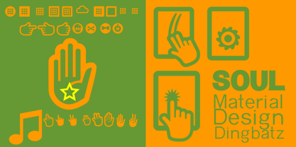
- Art And Design JNL by Jeff Levine,
$29.00 A 1930s-era WPA (Works Progress Administration) poster advertising a Federal Art Project exhibit entitled "Index of American Design" was the basis for Art and Design JNL.
 - KR Morning Must! - Unknown license

- KR Moving Day - Unknown license

- This Boring Party - Unknown license

- KR Morning Must - Unknown license

- AT Move Altera by André Toet Design,
$39.95 ALTERA a typeface based on a logotype André Toet made for a dutch broadcast company. This typeface is in fact carries a transformation in itself: it’s composed of three different weights and shapes. In our humble opinion the possibilities are endless ! So be a sport and use this typeface for logo’s and headings. Kick the can ! Concept/Art Direction/Design: André Toet © 2017
 - AT Move Wyggle by André Toet Design,
$39.95 WYGGLE is a dynamic (capital) font taken from my Alphatool project. It’s an interesting typeface which can be used for interior and/or exterior (3D projects). Concept/Art Direction/Design: André Toet © 2017
 - Core Gothic E by S-Core,
$72.00 Core Gothic E is a simple and modern sans-serif Korean font consists of 9 weights (Thin, ExtraLight, Light, Regular, Medium, Bold, ExtraBold, Heavy & Black). Character set is consist of Korean 11,172 characters, Hirakana & Katakana, Latin and Korean symbols. It is well balenced between Korean and Latin characters. Latin typeface (Core Sans E) was adjusted to be matched with korean typeface. Spaces between individual letter forms are adjusted in detail so that it makes perfect typesetting. Supported codepages are MS Windows 1252 Latin1 and MS Windows 949 Korean. We recommend to use for books, web, screen displays and so on.
 - Moving Message JNL by Jeff Levine,
$29.00 A vintage printer's cut for the masthead of the "Fed-O-Gram" (a monthly publication of the Farm Bureau Federation, Inc.) had its title set in letters that emulated a moving message board. This design formed the basis for what is Moving Message JNL.
 - AT Move Powerplay by André Toet Design,
$39.95 POWERPLAY a monospace lowercase alphabet with a 3D twist. Designed by André Toet in 1976 (during his study at Central School of Art & Design, London, UK) and he redesigned this in 2011. The name Powerplay is based on the Battersea Power Station, London. The remarkable architecture of the building is also used as a decor for films and for one of the covers by Pink Floyd (Animals, the flying pig). Concept/Art Direction/ Design: André Toet © 2017
 - AT Move Nath! by André Toet Design,
$75.00 NATH !* Is a peculiar typeface. It’s design came by the fascination of Optical Illusions and 3D on a flat surface, like with Holborn and Powerplay. The typeface is named after a girlfriend of André Toet. *Made in the UK, 1974, London (Central School of Art & Design). (Redesigned 2013 by André Toet / Jasper Terra). Concept/Art Direction/Design: André Toet © 2017
 - Morning Flower Serif by Letterfreshstudio,
$15.00 Morning Flower is a luxury font Duo. which comes with a combination of modern and elegant fonts, namely serif and signature style. You can combine it to make beautiful typography. This hand display style makes it perfect for use in all your design projects be it logos, labels, packaging designs, blog titles, posters, wedding designs, social media posts, Instagram designs, card invitations, art quotes, home decor, book / cover titles , etc. Already matched up and ready to be used together for your next design! Here’s what’s included : Morning Flower Script Regular / Serif • Thin and realistic signature fonts lowercase letters, uppercase letters, all punctuation & numbers. Language Support • Morning Flower supports the following languages; English, French, Italian, Spanish, Portuguese, German, Swedish, Norwegian, Danish, Dutch, Finnish, Indonesian, Malay, Hungarian, Polish, Croatian, Turkish, Romanian, Czech, Latvian, Lithuanian, Slovak, Slovenian. I hope you enjoy this font. If you have questions, don't hesitate to give me a message :) Thank you for your purchase!
 - Core Sans B by S-Core,
$20.00 The Core Sans B Family is a part of the Core Sans Series, such as N, NR, N SC, M, E, A, D, G, R and BR. The family has very small x-heights and large ascenders(descenders) which give an elegant feeling in body text. It is a sans-serif family but it’s structure is similar to serif fonts, so you can make paragraphs beautiful with this font family. It is very legible and readable even in small size because of its open counters and distinctive shapes. This font family consists of 7 weights (Thin, Light, Regular, Medium, Bold, Heavy, Black) and Italics for each format. Core Sans B supports complete Basic Latin, Cyrillic, Central European, Turkish, Baltic character sets. Each font includes proportional figures, tabular figures, oldstyle figures, numerators, denominators, superscript, scientific inferiors, subscript, fractions and case features. We highly recommend it for use in books, web pages, screen displays, and so on.
 - Core Sans A by S-Core,
$19.00 Core Sans A Family from S-Core is a modern sans-serif typeface that is clean, simple and highly readable. It is a part of the Core Sans Series (Core Sans N SC, Core Sans N, Core Sans NR, Core Sans M and Core Sans G). Letters in this type family are designed with genuine neo-grotesque and neutral shapes without any decorative distractions. The spaces between individual letter forms are precisely adjusted to create the perfect typesetting. Core Sans A family consists of 8 weights (Thin, Extra Light, Light, Regular, Medium, Bold, Extra Bold, Heavy) with their corresponding italics. Core Sans A contains complete Basic Latin, Cyrillic, Central European, Turkish, Baltic character sets. Each font includes proportional figures, tabular figures, numerators, denominators, superscript, scientific inferiors, subscript, fractions and case features. We highly recommend it for use in books, web pages, screen displays, and so on.
 - AT Move Decoupe by André Toet Design,
$39.95 Découpé Based on a French children’s play from 1906. In a car boot sale André Toet found a funny looking box containing a lot of cut out cardboard figures, in fact it looked a bit like a geometric puzzle! He played around a bit and succeeded to create a workable typeface with it ! The interesting thing about this particular font is, that in fact it’s organized chaos. The 26 letters of the alphabet are a mix between caps and lowercases, so within one word caps and lowercases will be used next to each other. It’s a very useful font for different projects. Concept/Art Direction/Design: André Toet © 2017
 - Core Sans N by S-Core,
$15.00 The Core Sans N Family is a part of the Core Sans Series (Core Sans N SC, Core Sans N Rounded, Core Sans M, and Core Sans G). Letters in the Core Sans N Family are designed with genuine neo-grotesque and neutral shapes without any decorative distractions. The spaces between individual letter forms are precisely adjusted to create the perfect typesetting. The Core Sans N Family consists of 3 widths (Condensed, Normal, Extended), 9 weights (Thin, ExtraLight, Light, Regular, Medium, Bold, ExtraBold, Heavy, Black), and Italics for each format. It also supports WGL4, which provides a wide range of character sets (CE, Greek, Cyrillic and Eastern European characters). Each font includes support for Tabular numbers, Arrows, Box drawings, Geometric shapes, Block elements, Mathematical operators, Miscellaneous symbols and Opentype Features such as Proportional Figures, Numerators, Denominators, Superscript, Scientific Inferiors, Subscript, Fractions and Standard Ligatures. The Core Sans N Family provides both OpenType (.OTF) and TrueType (.TTF) versions in the same package. We highly recommend it for use in books, web pages, screen displays, and so on.
 - AT Move Specx by André Toet Design,
$39.95 SPECX This is my #11/12 Font a slabserif typeface. In fact it’s a very, very basic and extreme strong typeface! We gave this new Font a special touch by adding an extra family-member: a stencil-version of the SPECX. My inspiration for the SPECX is based on the cover of a 1955 French School-Notebook. Concept/Art Direction/Design: André Toet © 2017
 - Core Magic Rough by S-Core,
$20.00 Core Magic Rough is a textured version of Core Magic which is a layered type family consisting of seven 3D effect layers, eight 2D effect layers and one shadow effect layer. Uppercase and lowercase letters are separated by such features that counters are opened or closed. Core Magic provides other closed counter styles such as numbers with opentype feature (Stylistic Alternatives). Using Core Magic Rough with Core Circus Rough could make your works more charming and special with endless combinations (at least 262,551 kinds). This family is really nice for book titles, headlines, logotypes and any artworks.
 - Core Serif N by S-Core,
$20.00 Core Serif N is a modern serif family with neutral design elements. Letters in the Core Serif N has designed with large x-heights and simple serifs for legibility at small sizes. The spaces between individual letter forms are precisely adjusted to create the perfect typesetting. Core Serif N Family consists of 7 weights (Thin, Light, Regular, Medium, Bold, Heavy, Black), and Italics for each format. Core Serif N Thin is designed such as a frame of Core Serif N Family, so its serif shapes are slightly different with other weights. But all weights of Core Serif N work in harmony because they are sharing same structure. It supports complete Basic Latin, Cyrillic, Central European, Turkish, Baltic character sets. Each font includes support for proportional figures, tabular figures, oldstyle figures, numerators, denominators, superscript, scientific inferiors, subscript, fractions and case features. We highly recommend it for use in books, magazines, editorial and publishing as well as logo, branding, and so on.
 - Morning Rain Dot by ToBeThea,
$12.00 Morning Rain Dot is handmade font with cute little dots. It’s great for big and short titles. You can costumize it and make it look even cuter :)
 - Boys on mopeds by PizzaDude.dk,
$20.00 Sometimes you just want to have fun, and "Boys on mopeds" will take you there! Boys on mopeds are a simple-minded serif font with a fun and loose twist. I've added several versions of each lowercase letter: you have 4 different versions to choose from. Enough to make your invitations, diary, posters, postcards, novels, stickers ... ahhh ... the list is long - and the use of Boys on mopeds is almost endless! Comes with a bunch of international letters, so fun is available in many languages! :)
 - Core Gothic M by S-Core,
$72.00 Core Gothic M is a simple and modern sans-serif Korean font consists of 7 weights (Light, Regular, Medium, Bold, ExtraBold, Heavy & Black). Character set is consist of Korean 11,172 characters, Hirakana & Katakana, Latin and Korean symbols. It is well balenced between Korean and Latin characters. Latin typeface (Core Sans M) was adjusted to be matched with korean typeface. Spaces between individual letter forms are adjusted in detail so that it makes perfect typesetting. Supported codepages are MS Windows 1252 Latin1 and MS Windows 949 Korean. We recommend to use for books, web, screen displays and so on.


