10,000 search results
(0.256 seconds)
- Susan Sans by ParaType,
$30.00 An original text and display type family was designed for ParaType in 2008 by Manvel Shmavonyan to be used together with Susan and Susan Classic, earlier released type families by the same author. This is a low-contrast sans serif font with open letterforms. Its shape is distinguished by rounded upper parts of lower case. Susan, Susan Classic and Susan Sans forms a super family coordinated on weight, style and proportions. Susan Sans is well suited for short and middle range text composing as well as for use in advertising and display typography.
 - Decize by Eurotypo,
$36.00 Decize font is a classic “Didona”, characterized by extreme contrast in thick strokes and thin strokes, by the use of very short serifs, and by the vertical stress of the letters. This version, designed by Carine de Wandeleer, is slightly condensed and is also enriched by a full set of OpenType features of tails, ligatures, alternates and swashes. Decize Italica is a true "italic" This font was designed and carefully drawn to combine with Decize Regular, it has 652 glyphs and the same OpenType features than the regular version.
 - Presto Script by Fontop,
$16.00 Follow your design needs with Presto Script font. It’s a script typeface which has contextual alternates for additional authenticity as open type feature. If you want to manually change letters in your headline or short text, stylistic alternates are available through glyph panel (you need to disable contextual alternates option). Really very easy to use! The font is perfect for quotes, wedding branding, headings, social media texts, blogs and much more. The font has Latin multilingual support as well as uppercase letters, lowercase letters, numbers and basic punctuations.
 - Gazeta by Vanarchiv,
$21.00 This typeface was designed for editorial purposes (text sizes), where the letterforms contain short serifs (more economical). This font family contains different weights (from Extra Light until to Extra Bold) to create an simple and sequential typographic hierarchy scale. There are two different weights and options designed specifically for text sizes (Regular and Text). The design is classical but contain some contemporary details, which are not distractive for reading, it's simple and clean at small sizes. This font family include italics, small caps, ligatures, old style and tabular figures.
 - Eddieth Brush by Keristyper Studio,
$12.00 Eddieth Handbrush is a best-handwritten brush that is written casually and quickly. This font is good for logo design, Social media, Movie Titles, Books Titles, short text even long text letters, and good for your secondary text font with sans or serif. Featured: Standard Uppercase & Lowercase Numeral & Punctuation Multilingual : ä ö ü Ä Ö Ü ß ¿ ¡ Alternate & Ligature PUA encoded We recommend programs that support the OpenType feature and the Glyphs panel such as Adobe applications or Corel Draw. so you can use all the variations of the glyphs. Hope you enjoy our fonts!
 - Chemistry by MJB Letters,
$15.00 Chemistry is a stylish monoline script with a natural flow and beautiful and elegant characters, you can use this font to design wedding invitations, labels, logos, branding, craft project, quotes, and more. In order to use the beautiful swashes, you need a program that supports OpenType features such as Adobe Illustrator CS, Adobe Photoshop CC, Adobe Indesign, and Corel Draw. but if your software doesn't have Glyphs panel, you can install additional swash font files: if you have questions about the latest fonts, please provide a short message to us Thank You! MJB Letters
 - Niks by dooType,
$20.00 Niks is the first sans serif created by dooType. It has 4 weights with corresponding italics. The character set supports more than 30 languages and some Opentype Features.
 - Times New Roman PS Cyrillic by Monotype,
$67.99In 1931, The Times of London commissioned a new text type design from Stanley Morison and the Monotype Corporation, after Morison had written an article criticizing The Times for being badly printed and typographically behind the times. The new design was supervised by Stanley Morison and drawn by Victor Lardent, an artist from the advertising department of The Times. Morison used an older typeface, Plantin, as the basis for his design, but made revisions for legibility and economy of space (always important concerns for newspapers). As the old type used by the newspaper had been called Times Old Roman," Morison's revision became "Times New Roman." The Times of London debuted the new typeface in October 1932, and after one year the design was released for commercial sale. The Linotype version, called simply "Times," was optimized for line-casting technology, though the differences in the basic design are subtle. The typeface was very successful for the Times of London, which used a higher grade of newsprint than most newspapers. The better, whiter paper enhanced the new typeface's high degree of contrast and sharp serifs, and created a sparkling, modern look. In 1972, Walter Tracy designed Times Europa for The Times of London. This was a sturdier version, and it was needed to hold up to the newest demands of newspaper printing: faster presses and cheaper paper. In the United States, the Times font family has enjoyed popularity as a magazine and book type since the 1940s. Times continues to be very popular around the world because of its versatility and readability. And because it is a standard font on most computers and digital printers, it has become universally familiar as the office workhorse. Times?, Times? Europa, and Times New Roman? are sure bets for proposals, annual reports, office correspondence, magazines, and newspapers. Linotype offers many versions of this font: Times? is the universal version of Times, used formerly as the matrices for the Linotype hot metal line-casting machines. The basic four weights of roman, italic, bold and bold italic are standard fonts on most printers. There are also small caps, Old style Figures, phonetic characters, and Central European characters. Times? Ten is the version specially designed for smaller text (12 point and below); its characters are wider and the hairlines are a little stronger. Times Ten has many weights for Latin typography, as well as several weights for Central European, Cyrillic, and Greek typesetting. Times? Eighteen is the headline version, ideal for point sizes of 18 and larger. The characters are subtly condensed and the hairlines are finer." - Times New Roman Seven by Monotype,
$67.99In 1931, The Times of London commissioned a new text type design from Stanley Morison and the Monotype Corporation, after Morison had written an article criticizing The Times for being badly printed and typographically behind the times. The new design was supervised by Stanley Morison and drawn by Victor Lardent, an artist from the advertising department of The Times. Morison used an older typeface, Plantin, as the basis for his design, but made revisions for legibility and economy of space (always important concerns for newspapers). As the old type used by the newspaper had been called Times Old Roman," Morison's revision became "Times New Roman." The Times of London debuted the new typeface in October 1932, and after one year the design was released for commercial sale. The Linotype version, called simply "Times," was optimized for line-casting technology, though the differences in the basic design are subtle. The typeface was very successful for the Times of London, which used a higher grade of newsprint than most newspapers. The better, whiter paper enhanced the new typeface's high degree of contrast and sharp serifs, and created a sparkling, modern look. In 1972, Walter Tracy designed Times Europa for The Times of London. This was a sturdier version, and it was needed to hold up to the newest demands of newspaper printing: faster presses and cheaper paper. In the United States, the Times font family has enjoyed popularity as a magazine and book type since the 1940s. Times continues to be very popular around the world because of its versatility and readability. And because it is a standard font on most computers and digital printers, it has become universally familiar as the office workhorse. Times?, Times? Europa, and Times New Roman? are sure bets for proposals, annual reports, office correspondence, magazines, and newspapers. Linotype offers many versions of this font: Times? is the universal version of Times, used formerly as the matrices for the Linotype hot metal line-casting machines. The basic four weights of roman, italic, bold and bold italic are standard fonts on most printers. There are also small caps, Old style Figures, phonetic characters, and Central European characters. Times? Ten is the version specially designed for smaller text (12 point and below); its characters are wider and the hairlines are a little stronger. Times Ten has many weights for Latin typography, as well as several weights for Central European, Cyrillic, and Greek typesetting. Times? Eighteen is the headline version, ideal for point sizes of 18 and larger. The characters are subtly condensed and the hairlines are finer." - Times New Roman WGL by Monotype,
$67.99 In 1931, The Times of London commissioned a new text type design from Stanley Morison and the Monotype Corporation, after Morison had written an article criticizing The Times for being badly printed and typographically behind the times. The new design was supervised by Stanley Morison and drawn by Victor Lardent, an artist from the advertising department of The Times. Morison used an older typeface, Plantin, as the basis for his design, but made revisions for legibility and economy of space (always important concerns for newspapers). As the old type used by the newspaper had been called Times Old Roman," Morison's revision became "Times New Roman." The Times of London debuted the new typeface in October 1932, and after one year the design was released for commercial sale. The Linotype version, called simply "Times," was optimized for line-casting technology, though the differences in the basic design are subtle. The typeface was very successful for the Times of London, which used a higher grade of newsprint than most newspapers. The better, whiter paper enhanced the new typeface's high degree of contrast and sharp serifs, and created a sparkling, modern look. In 1972, Walter Tracy designed Times Europa for The Times of London. This was a sturdier version, and it was needed to hold up to the newest demands of newspaper printing: faster presses and cheaper paper. In the United States, the Times font family has enjoyed popularity as a magazine and book type since the 1940s. Times continues to be very popular around the world because of its versatility and readability. And because it is a standard font on most computers and digital printers, it has become universally familiar as the office workhorse. Times?, Times? Europa, and Times New Roman? are sure bets for proposals, annual reports, office correspondence, magazines, and newspapers. Linotype offers many versions of this font: Times? is the universal version of Times, used formerly as the matrices for the Linotype hot metal line-casting machines. The basic four weights of roman, italic, bold and bold italic are standard fonts on most printers. There are also small caps, Old style Figures, phonetic characters, and Central European characters. Times? Ten is the version specially designed for smaller text (12 point and below); its characters are wider and the hairlines are a little stronger. Times Ten has many weights for Latin typography, as well as several weights for Central European, Cyrillic, and Greek typesetting. Times? Eighteen is the headline version, ideal for point sizes of 18 and larger. The characters are subtly condensed and the hairlines are finer."
 - Times New Roman by Monotype,
$67.99 In 1931, The Times of London commissioned a new text type design from Stanley Morison and the Monotype Corporation, after Morison had written an article criticizing The Times for being badly printed and typographically behind the times. The new design was supervised by Stanley Morison and drawn by Victor Lardent, an artist from the advertising department of The Times. Morison used an older typeface, Plantin, as the basis for his design, but made revisions for legibility and economy of space (always important concerns for newspapers). As the old type used by the newspaper had been called Times Old Roman," Morison's revision became "Times New Roman." The Times of London debuted the new typeface in October 1932, and after one year the design was released for commercial sale. The Linotype version, called simply "Times," was optimized for line-casting technology, though the differences in the basic design are subtle. The typeface was very successful for the Times of London, which used a higher grade of newsprint than most newspapers. The better, whiter paper enhanced the new typeface's high degree of contrast and sharp serifs, and created a sparkling, modern look. In 1972, Walter Tracy designed Times Europa for The Times of London. This was a sturdier version, and it was needed to hold up to the newest demands of newspaper printing: faster presses and cheaper paper. In the United States, the Times font family has enjoyed popularity as a magazine and book type since the 1940s. Times continues to be very popular around the world because of its versatility and readability. And because it is a standard font on most computers and digital printers, it has become universally familiar as the office workhorse. Times?, Times? Europa, and Times New Roman? are sure bets for proposals, annual reports, office correspondence, magazines, and newspapers. Linotype offers many versions of this font: Times? is the universal version of Times, used formerly as the matrices for the Linotype hot metal line-casting machines. The basic four weights of roman, italic, bold and bold italic are standard fonts on most printers. There are also small caps, Old style Figures, phonetic characters, and Central European characters. Times? Ten is the version specially designed for smaller text (12 point and below); its characters are wider and the hairlines are a little stronger. Times Ten has many weights for Latin typography, as well as several weights for Central European, Cyrillic, and Greek typesetting. Times? Eighteen is the headline version, ideal for point sizes of 18 and larger. The characters are subtly condensed and the hairlines are finer."
 - Times New Roman Small Text by Monotype,
$67.99In 1931, The Times of London commissioned a new text type design from Stanley Morison and the Monotype Corporation, after Morison had written an article criticizing The Times for being badly printed and typographically behind the times. The new design was supervised by Stanley Morison and drawn by Victor Lardent, an artist from the advertising department of The Times. Morison used an older typeface, Plantin, as the basis for his design, but made revisions for legibility and economy of space (always important concerns for newspapers). As the old type used by the newspaper had been called Times Old Roman," Morison's revision became "Times New Roman." The Times of London debuted the new typeface in October 1932, and after one year the design was released for commercial sale. The Linotype version, called simply "Times," was optimized for line-casting technology, though the differences in the basic design are subtle. The typeface was very successful for the Times of London, which used a higher grade of newsprint than most newspapers. The better, whiter paper enhanced the new typeface's high degree of contrast and sharp serifs, and created a sparkling, modern look. In 1972, Walter Tracy designed Times Europa for The Times of London. This was a sturdier version, and it was needed to hold up to the newest demands of newspaper printing: faster presses and cheaper paper. In the United States, the Times font family has enjoyed popularity as a magazine and book type since the 1940s. Times continues to be very popular around the world because of its versatility and readability. And because it is a standard font on most computers and digital printers, it has become universally familiar as the office workhorse. Times?, Times? Europa, and Times New Roman? are sure bets for proposals, annual reports, office correspondence, magazines, and newspapers. Linotype offers many versions of this font: Times? is the universal version of Times, used formerly as the matrices for the Linotype hot metal line-casting machines. The basic four weights of roman, italic, bold and bold italic are standard fonts on most printers. There are also small caps, Old style Figures, phonetic characters, and Central European characters. Times? Ten is the version specially designed for smaller text (12 point and below); its characters are wider and the hairlines are a little stronger. Times Ten has many weights for Latin typography, as well as several weights for Central European, Cyrillic, and Greek typesetting. Times? Eighteen is the headline version, ideal for point sizes of 18 and larger. The characters are subtly condensed and the hairlines are finer." - Times New Roman PS Greek by Monotype,
$67.99In 1931, The Times of London commissioned a new text type design from Stanley Morison and the Monotype Corporation, after Morison had written an article criticizing The Times for being badly printed and typographically behind the times. The new design was supervised by Stanley Morison and drawn by Victor Lardent, an artist from the advertising department of The Times. Morison used an older typeface, Plantin, as the basis for his design, but made revisions for legibility and economy of space (always important concerns for newspapers). As the old type used by the newspaper had been called Times Old Roman," Morison's revision became "Times New Roman." The Times of London debuted the new typeface in October 1932, and after one year the design was released for commercial sale. The Linotype version, called simply "Times," was optimized for line-casting technology, though the differences in the basic design are subtle. The typeface was very successful for the Times of London, which used a higher grade of newsprint than most newspapers. The better, whiter paper enhanced the new typeface's high degree of contrast and sharp serifs, and created a sparkling, modern look. In 1972, Walter Tracy designed Times Europa for The Times of London. This was a sturdier version, and it was needed to hold up to the newest demands of newspaper printing: faster presses and cheaper paper. In the United States, the Times font family has enjoyed popularity as a magazine and book type since the 1940s. Times continues to be very popular around the world because of its versatility and readability. And because it is a standard font on most computers and digital printers, it has become universally familiar as the office workhorse. Times?, Times? Europa, and Times New Roman? are sure bets for proposals, annual reports, office correspondence, magazines, and newspapers. Linotype offers many versions of this font: Times? is the universal version of Times, used formerly as the matrices for the Linotype hot metal line-casting machines. The basic four weights of roman, italic, bold and bold italic are standard fonts on most printers. There are also small caps, Old style Figures, phonetic characters, and Central European characters. Times? Ten is the version specially designed for smaller text (12 point and below); its characters are wider and the hairlines are a little stronger. Times Ten has many weights for Latin typography, as well as several weights for Central European, Cyrillic, and Greek typesetting. Times? Eighteen is the headline version, ideal for point sizes of 18 and larger. The characters are subtly condensed and the hairlines are finer." - Times New Roman PS by Monotype,
$67.99In 1931, The Times of London commissioned a new text type design from Stanley Morison and the Monotype Corporation, after Morison had written an article criticizing The Times for being badly printed and typographically behind the times. The new design was supervised by Stanley Morison and drawn by Victor Lardent, an artist from the advertising department of The Times. Morison used an older typeface, Plantin, as the basis for his design, but made revisions for legibility and economy of space (always important concerns for newspapers). As the old type used by the newspaper had been called Times Old Roman," Morison's revision became "Times New Roman." The Times of London debuted the new typeface in October 1932, and after one year the design was released for commercial sale. The Linotype version, called simply "Times," was optimized for line-casting technology, though the differences in the basic design are subtle. The typeface was very successful for the Times of London, which used a higher grade of newsprint than most newspapers. The better, whiter paper enhanced the new typeface's high degree of contrast and sharp serifs, and created a sparkling, modern look. In 1972, Walter Tracy designed Times Europa for The Times of London. This was a sturdier version, and it was needed to hold up to the newest demands of newspaper printing: faster presses and cheaper paper. In the United States, the Times font family has enjoyed popularity as a magazine and book type since the 1940s. Times continues to be very popular around the world because of its versatility and readability. And because it is a standard font on most computers and digital printers, it has become universally familiar as the office workhorse. Times?, Times? Europa, and Times New Roman? are sure bets for proposals, annual reports, office correspondence, magazines, and newspapers. Linotype offers many versions of this font: Times? is the universal version of Times, used formerly as the matrices for the Linotype hot metal line-casting machines. The basic four weights of roman, italic, bold and bold italic are standard fonts on most printers. There are also small caps, Old style Figures, phonetic characters, and Central European characters. Times? Ten is the version specially designed for smaller text (12 point and below); its characters are wider and the hairlines are a little stronger. Times Ten has many weights for Latin typography, as well as several weights for Central European, Cyrillic, and Greek typesetting. Times? Eighteen is the headline version, ideal for point sizes of 18 and larger. The characters are subtly condensed and the hairlines are finer." - Mon Nicolette by Sudtipos,
$49.00 This is a digital revival by Cristóbal Henestrosa based on an experimental typeface named Charter, designed – yet never fully accomplished – by the prominent William Addison Dwiggins. It is an upright italic, unconnected script typeface, whose main features are a pronounced contrast, condensed forms and exaggerated ascenders. While Dwiggins worked on this project from 1937 to 1955, he only completed the lowercase and a few other characters. However, it was used to set a specimen in 1942 and a short novel in 1946. The sources that Cristóbal used for Mon Nicolette were the original sketches by WAD as well as printing trails kept at the Boston Public Library, and a copy of the 1946 edition of The Song-Story of Aucassin and Nicolette. This gorgeous typeface can be used successfully in headlines, subheads and short passages of text from 12 points onwards, in applications such as fashion magazines, soft news, advertising, poetry, albums, and book covers. This project started ten years ago, while Cristóbal was studying the Type@Cooper Extended Program at New York City. A previous version was selected to be part of the Biennial Tipos Latinos 2018, and now Mon Nicolette is finally ready for commercial distribution with Sudtipos… and we are very proud of it! Festina lente.
 - Ongunkan Younger Futhark by Runic World Tamgacı,
$45.00 The Younger Futhark, also called Scandinavian runes, is a runic alphabet and a reduced form of the Elder Futhark, with only 16 characters, in use from about the 9th century, after a "transitional period" during the 7th and 8th centuries. The reduction, somewhat paradoxically, happened at the same time as phonetic changes that led to a greater number of different phonemes in the spoken language, when Proto-Norse evolved into Old Norse. Also, the writing custom avoided carving the same rune consecutively for the same sound, so the spoken distinction between long and short vowels was lost in writing. Thus, the language included distinct sounds and minimal pairs that were written the same. The Younger Futhark is divided into long-branch (Danish) and short-twig (Swedish and Norwegian) runes; in the 10th century, it was further expanded by the "Hälsinge Runes" or staveless runes. The lifetime of the Younger Futhark corresponds roughly to the Viking Age. Their use declined after the Christianization of Scandinavia; most writing in Scandinavia from the 12th century was in the Latin alphabet, but the runic scripts survived in marginal use in the form of the medieval runes (in use ca. 1100–1500) and the Latinised Dalecarlian runes (ca. 1500–1910)
 - Fiasco by ChibaChiba,
$24.95 Extremely influenced by the new rave trend, Fiasco is a reflex of it's excesses. Way too many elements, bright neon colors, and that not-knowing-when-to-stop sort of behavior. Acid House aesthetic remixed by the nu school DJs. Neon Flamboyant.
 - Medici Script by Linotype,
$29.99 Medici Script is an elegant calligraphic script. The Medici Script font is ideal for use on invitations, greetings cards and business cards. Medici Script™ is a trademark of Linotype GmbH and may be registered in certain jurisdictions.
 - Moklan by Jadatype,
$12.00 Moklan is an all caps bold display font that has a funky and playful style. suitable for logotype, branding, social media, posters, advertisements, and so on. contains standard English letters, numbers, punctuation, and several accents that support multilingualism.
 - Excelsior by Linotype,
$29.99Before designing this font, C.H. Griffith consulted the results of a survey of optometrists regarding optimal legibility. Excelsior font was then presented by Mergenthaler Linotype in 1931 and remains one of the most legible and popular fonts worldwide. - Cashews by ErlosDesign,
$12.00 Cashews is a handwritten, happy and fun handwritten monoline script. It features an incredibly classic style, while still keeping a friendly feel. Perfect for titles, headings and logotypes for blog, products and lifestyle imagery like quotes and stuff.
 - Kolyada by Tkachev,
$29.00 Kolyada is a modernist semi-serif with a friendly nature. This type is well-suited for use in retail, magazines, logotypes, books, etc. It comes with 4 styles, from Ultra Light to Medium, each with its Upright Italics.
 - Meliya by Yumna Type,
$16.00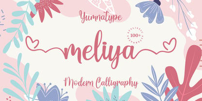 Meliya is a beautiful and modern script that is best used for weddings, branding, logotype, and quotes. Features : Beautiful Ligatures Beautiful Alternates + Swashes PUA Encoded Multi-lingual Support Numerals and Punctuation Beginning Swash and Ending Swashes (a-z)
 - Silverstone by Arendxstudio,
$12.00 Introducing Silverstone, Luxury script font, using hand made style with brush. Beautiful for wedding card design, logotype, website header, fashion design and any more. Features : • Character Set A-Z • Numerals & Punctuations (OpenType Standard) • Accents (Multilingual characters) • Swash • Ligature
 - Andarillo by Franklin Veiga,
$10.00 Andarillo is a display typeface inspired by vintage travel posters and magazines. The complete glyph set contains uppercase, small caps, numerals, punctuation, ligatures and multilingual support. Andarillo is perfect for logotypes, magazines, titles, posters, advertising and branding communication.
 - Ecentric by Redy Studio,
$21.00 Ecentric is a bold font inspired by the vintage style of letters on posters, bagde, packaging, labels from antiquity. The classic feel is really perfect you who needs a vintage typeface for logotype, apparel, branding, packaging, quote etc.
 - Melyana by Yumna Type,
$16.00 Melyana is a beautiful and modern script that is best used for weddings, branding, logotype, and quotes. Features : Beautiful Ligatures Beautiful Alternates + Swashes PUA Encoded Multi-lingual Support Numerals and Punctuation Beginning Swash and Ending Swashes (a-z)
 - Alibabe by Almarkha Type,
$25.00 Introducing Alibabe Authentic Display Font, Inspired by Food Logo style and combination with Cute Craft style. that will fulfill your design needs for quotes,sporty theme, logotype, wordmark, etc. This has many opentype features and support multi language.
 - Carlista by Yumna Type,
$16.00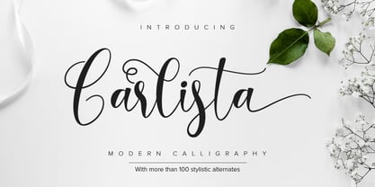 Carlista is a beautiful and modern typeface that is best used for weddings, branding, logotype, and quotes. Features : Beautiful Ligatures Beautiful Alternates + Swashes PUA Encoded Multi-lingual Support Numerals and Punctuation Beginning Swash and Ending Swashes (a-z)
 - Hauntress by Jadatype,
$15.00 Hauntess is a Serif Font that comes with a scary sharp-display's style. suitable for posters, logotype, branding, social media, book, movie and so on. contains standard English letters, numbers, punctuation, alternates, and several accents that support multilingualism.
 - Kathiya by Yumna Type,
$16.00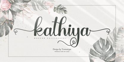 Kathiya is a beautiful and modern script that is best used for weddings, branding, logotype, and quotes. Features : Beautiful Ligatures Beautiful Alternates + Swashes PUA Encoded Multi-lingual Support Numerals and Punctuation Beginning Swash and Ending Swashes (a-z)
 - Sagha by YonTypeStudio Co,
$15.00 Sagha is a retro styled, thick lettered handwritten font, crafted to give your headlines and logotype projects a stylish touch. This font reads as strong, confident, and dynamic and can add tons of nostalgic character to your designs
 - Summer Joy by AEN Creative Studio,
$15.00 Summer Joy is a cute groovy font that will help you enjoy and have fun with your designs. You can design it to match Summer’s holiday theme. Perfect for creating a wide variety of new designs to match products such as T-shirts, pillows, banner, mugs, cards, stationery, social media posts, and more!
 - Muscle Cars by Vozzy,
$10.00 Introducing vintage label font duo named Muscle Cars. These two fonts has an additional characters and multilungual support (check out all available characters on previews). Bold and Script fonts has two styles: Clean and Aged. This font will look good on any vintage styled designs like a poster, T-shirt, label, logo, etc.
 - Lalonde by The Thrill of Design,
$29.00 Lalonde Font Family has great readability and can be used for: logos, call outs and headlines for advertising, wedding invitations, t-shirts, signage, scrapbooking, posters, badges, etc. Lalonde is a modern hand-drawn script font and is available with two formats OTF and TTF and with (Latin-1 Supplement) ÀÁÂÃÄÅÆÇÈÉÊËÌÍÎÏÝ ÑÒÓÔÕÖØŒÙÚÛÜ àáâãäåæçèéêëìíîïñòóôõöðøœùúûüýÿ.
 - Abrupt by Akifatype,
$21.00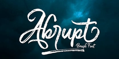 Abrupt is a textured brush font, a contemporary approach to design, naturally handmade and with underscores. It also has alternatives and ligatures that make your design more attractive.Suitable for use in title design such as clothing, invitations, tittle books, stationery designs, quotes, branding, logos, greeting cards, t-shirts, packaging designs, posters and more.
 - Mesquin by MuSan,
$15.00 Mesquin is an all uppercase sans serif font with geometric shapes of characters. It is inspired by lettering from the industrial and good old past, but it still has a strong modern appearance. Its allows versatile design options and works perfectly for headlines, logos, posters, packaging, T-shirts, postcards and much more.
 - FM Bebel by FontMeister,
$29.95 Bebel is a straight forward font. A modern geometric typeface influenced by architectural reproduction drawings such as blueprints and dyelines. It's medium weight makes it very legible, even in small sizes. You can use this font to create posters, greeting cards, scrapbooks, CD labels, T-shirts, coffee mugs, digital videos websites and banners.
 - Fox Single by Fox7,
$12.00 Fox Single is a strong and incredibly cool Sans Serif Fonts. For publications, logos, business cards, or printed on t-shirts, this font will look outstanding on everything, no matter the topic. This font will be an incredible asset to your fonts’ library, as it has the potential to elevate any creation.
 - Steel Leg by Gatype,
$9.00 Steel leg is a font that was scratched with a brush pen, to get a natural texture, this font will show the characteristics of the hand.This font is perfect for various places such as clothing, posters, title books, stationery designs, quotes, branding, logos, invitations, greeting cards, t-shirts, packaging designs and more.