4,797 search results
(0.038 seconds)
- Times New Roman Small Text by Monotype,
$67.99In 1931, The Times of London commissioned a new text type design from Stanley Morison and the Monotype Corporation, after Morison had written an article criticizing The Times for being badly printed and typographically behind the times. The new design was supervised by Stanley Morison and drawn by Victor Lardent, an artist from the advertising department of The Times. Morison used an older typeface, Plantin, as the basis for his design, but made revisions for legibility and economy of space (always important concerns for newspapers). As the old type used by the newspaper had been called Times Old Roman," Morison's revision became "Times New Roman." The Times of London debuted the new typeface in October 1932, and after one year the design was released for commercial sale. The Linotype version, called simply "Times," was optimized for line-casting technology, though the differences in the basic design are subtle. The typeface was very successful for the Times of London, which used a higher grade of newsprint than most newspapers. The better, whiter paper enhanced the new typeface's high degree of contrast and sharp serifs, and created a sparkling, modern look. In 1972, Walter Tracy designed Times Europa for The Times of London. This was a sturdier version, and it was needed to hold up to the newest demands of newspaper printing: faster presses and cheaper paper. In the United States, the Times font family has enjoyed popularity as a magazine and book type since the 1940s. Times continues to be very popular around the world because of its versatility and readability. And because it is a standard font on most computers and digital printers, it has become universally familiar as the office workhorse. Times?, Times? Europa, and Times New Roman? are sure bets for proposals, annual reports, office correspondence, magazines, and newspapers. Linotype offers many versions of this font: Times? is the universal version of Times, used formerly as the matrices for the Linotype hot metal line-casting machines. The basic four weights of roman, italic, bold and bold italic are standard fonts on most printers. There are also small caps, Old style Figures, phonetic characters, and Central European characters. Times? Ten is the version specially designed for smaller text (12 point and below); its characters are wider and the hairlines are a little stronger. Times Ten has many weights for Latin typography, as well as several weights for Central European, Cyrillic, and Greek typesetting. Times? Eighteen is the headline version, ideal for point sizes of 18 and larger. The characters are subtly condensed and the hairlines are finer." - Times New Roman PS Greek by Monotype,
$67.99In 1931, The Times of London commissioned a new text type design from Stanley Morison and the Monotype Corporation, after Morison had written an article criticizing The Times for being badly printed and typographically behind the times. The new design was supervised by Stanley Morison and drawn by Victor Lardent, an artist from the advertising department of The Times. Morison used an older typeface, Plantin, as the basis for his design, but made revisions for legibility and economy of space (always important concerns for newspapers). As the old type used by the newspaper had been called Times Old Roman," Morison's revision became "Times New Roman." The Times of London debuted the new typeface in October 1932, and after one year the design was released for commercial sale. The Linotype version, called simply "Times," was optimized for line-casting technology, though the differences in the basic design are subtle. The typeface was very successful for the Times of London, which used a higher grade of newsprint than most newspapers. The better, whiter paper enhanced the new typeface's high degree of contrast and sharp serifs, and created a sparkling, modern look. In 1972, Walter Tracy designed Times Europa for The Times of London. This was a sturdier version, and it was needed to hold up to the newest demands of newspaper printing: faster presses and cheaper paper. In the United States, the Times font family has enjoyed popularity as a magazine and book type since the 1940s. Times continues to be very popular around the world because of its versatility and readability. And because it is a standard font on most computers and digital printers, it has become universally familiar as the office workhorse. Times?, Times? Europa, and Times New Roman? are sure bets for proposals, annual reports, office correspondence, magazines, and newspapers. Linotype offers many versions of this font: Times? is the universal version of Times, used formerly as the matrices for the Linotype hot metal line-casting machines. The basic four weights of roman, italic, bold and bold italic are standard fonts on most printers. There are also small caps, Old style Figures, phonetic characters, and Central European characters. Times? Ten is the version specially designed for smaller text (12 point and below); its characters are wider and the hairlines are a little stronger. Times Ten has many weights for Latin typography, as well as several weights for Central European, Cyrillic, and Greek typesetting. Times? Eighteen is the headline version, ideal for point sizes of 18 and larger. The characters are subtly condensed and the hairlines are finer." - Times New Roman PS by Monotype,
$67.99In 1931, The Times of London commissioned a new text type design from Stanley Morison and the Monotype Corporation, after Morison had written an article criticizing The Times for being badly printed and typographically behind the times. The new design was supervised by Stanley Morison and drawn by Victor Lardent, an artist from the advertising department of The Times. Morison used an older typeface, Plantin, as the basis for his design, but made revisions for legibility and economy of space (always important concerns for newspapers). As the old type used by the newspaper had been called Times Old Roman," Morison's revision became "Times New Roman." The Times of London debuted the new typeface in October 1932, and after one year the design was released for commercial sale. The Linotype version, called simply "Times," was optimized for line-casting technology, though the differences in the basic design are subtle. The typeface was very successful for the Times of London, which used a higher grade of newsprint than most newspapers. The better, whiter paper enhanced the new typeface's high degree of contrast and sharp serifs, and created a sparkling, modern look. In 1972, Walter Tracy designed Times Europa for The Times of London. This was a sturdier version, and it was needed to hold up to the newest demands of newspaper printing: faster presses and cheaper paper. In the United States, the Times font family has enjoyed popularity as a magazine and book type since the 1940s. Times continues to be very popular around the world because of its versatility and readability. And because it is a standard font on most computers and digital printers, it has become universally familiar as the office workhorse. Times?, Times? Europa, and Times New Roman? are sure bets for proposals, annual reports, office correspondence, magazines, and newspapers. Linotype offers many versions of this font: Times? is the universal version of Times, used formerly as the matrices for the Linotype hot metal line-casting machines. The basic four weights of roman, italic, bold and bold italic are standard fonts on most printers. There are also small caps, Old style Figures, phonetic characters, and Central European characters. Times? Ten is the version specially designed for smaller text (12 point and below); its characters are wider and the hairlines are a little stronger. Times Ten has many weights for Latin typography, as well as several weights for Central European, Cyrillic, and Greek typesetting. Times? Eighteen is the headline version, ideal for point sizes of 18 and larger. The characters are subtly condensed and the hairlines are finer." - Ingenious by Heyfonts,
$18.00 Ingenious Groovy font is a type of display font that emerged in the 1960s and 1970s during the psychedelic era. It features bold, curvy lettering with an exaggerated cursive style, incorporating elements such as swirls, loops, and curves. The Groovy font is designed to give off a sense of retro vibrancy, and it is often used in advertising, music covers, and other whimsical design projects. The font is available in a variety of colors, including bright yellow, orange, and pink, adding to its playfulness and funkiness.
 - Douglass Pen by Three Islands Press,
$39.00 Douglass Pen was inspired by the handwriting of Frederick Douglass, who was born an American slave but died a distinguished 19th century statesman, orator, and abolitionist leader. He also had fine penmanship. Douglass Pen is modeled chiefly after Douglass's handwritten account of John Brown's famous 1859 raid on Harpers Ferry, Virginia. It simulates his somewhat condensed cursive, dashed off in a swift, bold style. The OpenType release has more than 800 glyphs, including scores of ligatures, alternative upper cases, inkblots, crossouts, and Eastern European characters.
 - Itoya by The Northern Block,
$39.00 Itoya is a contemporary sans serif font influenced by Western and Japanese ideologies. A fusion of modern machine-like functions with a warmer, emotional and more spiritual ethic. The marriage of a western precision and eastern expression forms a sharp functional font with a modern edge ideally suited to graphic novels, fashion and product design. Details include seven carefully chosen weight with true cursive italics, over 600 characters, alternative lowercase a, e, g and y. Five variations of numerals, ligatures, manually edited kerning and Opentype features.
 - The Seasons by My Creative Land,
$25.00 The Seasons is an elegant classic serif font family consisting of a high contrast serif fonts with a vintage chic look, with corresponding calligraphic cursive italics that are based on a number of humanist italic scripts and written with a Pilot Parallel Pen. Both upright and italic fonts (6 in total) share same style soft terminals with a sharp cut and are enhanced by OpenType features such as ligatures and stylistic alternates. The Seasons can be used in high-end branding, logo designs, magazines, product packaging & invitations.
 - Byker by The Northern Block,
$49.50 Byker is a geometric sans serif font that blends technology with handcrafted skill. The letterforms are constructed digitally from a technical grid and overlaid with handmade curves. The combination of this process creates a strong, organic font that is precise with subtle movement and personality without being too clinical. Details include seven carefully chosen weights with true cursive italics, over 800 characters, alternative lowercase a, e, g and y. Seven variations of numerals, true small caps with accents, ligatures, manually edited kerning and Opentype features.
 - Miramonte by Ascender,
$29.99 Miramonte Pro was designed by Steve Matteson in 2006 as a friendly sans serif design suitable for user-interface design, corporate branding and publishing. The name means 'behold the mountains' in Spanish, suggesting the rustic, unrefined type design. Miramonte is based on Stanislav Marso's humanist sans serif released by Grafotechna in 1960. This revival includes a cursive style italic rather than a sloped roman. Miramonte Pro includes an extensive character set for publishing Central and Eastern European languages. Its OpenType features include proportional figures, and tabular figures.
 - Mielle CF by Connary Fagen,
$25.00 Flowing like warm honey, Mielle® CF is a playful cursive script perfect for logos, signage, and posters. Automatic ligatures and contextual letters flow across Mielle's six weights. Mielle® CF pairs well with simple, elegant typefaces that won’t compete for visual attention, such as Artifex CF and Artifex Hand CF. Please note that some contextual glyphs may not appear in the generated previews, but will work correctly in the full typeface. All typefaces from Connary Fagen include free updates, including new features, and free technical support.
 - Calligri by SummitType,
$25.00 Someday, as computers become the new medium for writing, the art of cursive handwriting will slowly become a lost art. Calligri seeks to preserve this endangered style with tastefully drawn letters that connect with each other in classical artistry. Calligri includes a full character set (UPPER and lower case), all punctuation, all special characters, Euro symbol, and all Latin Extended-A characters, making this font a perfect match for any project including personal messages or notes, holiday cards and newsletters, and wedding invitations and announcements.
 - Medici Script by Linotype,
$29.99 Medici Script is an elegant calligraphic script. The Medici Script font is ideal for use on invitations, greetings cards and business cards. Medici Script™ is a trademark of Linotype GmbH and may be registered in certain jurisdictions.
 - Moklan by Jadatype,
$12.00 Moklan is an all caps bold display font that has a funky and playful style. suitable for logotype, branding, social media, posters, advertisements, and so on. contains standard English letters, numbers, punctuation, and several accents that support multilingualism.
 - Excelsior by Linotype,
$29.99Before designing this font, C.H. Griffith consulted the results of a survey of optometrists regarding optimal legibility. Excelsior font was then presented by Mergenthaler Linotype in 1931 and remains one of the most legible and popular fonts worldwide. - Cashews by ErlosDesign,
$12.00 Cashews is a handwritten, happy and fun handwritten monoline script. It features an incredibly classic style, while still keeping a friendly feel. Perfect for titles, headings and logotypes for blog, products and lifestyle imagery like quotes and stuff.
 - Kolyada by Tkachev,
$29.00 Kolyada is a modernist semi-serif with a friendly nature. This type is well-suited for use in retail, magazines, logotypes, books, etc. It comes with 4 styles, from Ultra Light to Medium, each with its Upright Italics.
 - Meliya by Yumna Type,
$16.00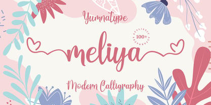 Meliya is a beautiful and modern script that is best used for weddings, branding, logotype, and quotes. Features : Beautiful Ligatures Beautiful Alternates + Swashes PUA Encoded Multi-lingual Support Numerals and Punctuation Beginning Swash and Ending Swashes (a-z)
 - Silverstone by Arendxstudio,
$12.00 Introducing Silverstone, Luxury script font, using hand made style with brush. Beautiful for wedding card design, logotype, website header, fashion design and any more. Features : • Character Set A-Z • Numerals & Punctuations (OpenType Standard) • Accents (Multilingual characters) • Swash • Ligature
 - Andarillo by Franklin Veiga,
$10.00 Andarillo is a display typeface inspired by vintage travel posters and magazines. The complete glyph set contains uppercase, small caps, numerals, punctuation, ligatures and multilingual support. Andarillo is perfect for logotypes, magazines, titles, posters, advertising and branding communication.
 - Ecentric by Redy Studio,
$21.00 Ecentric is a bold font inspired by the vintage style of letters on posters, bagde, packaging, labels from antiquity. The classic feel is really perfect you who needs a vintage typeface for logotype, apparel, branding, packaging, quote etc.
 - Melyana by Yumna Type,
$16.00 Melyana is a beautiful and modern script that is best used for weddings, branding, logotype, and quotes. Features : Beautiful Ligatures Beautiful Alternates + Swashes PUA Encoded Multi-lingual Support Numerals and Punctuation Beginning Swash and Ending Swashes (a-z)
 - Alibabe by Almarkha Type,
$25.00 Introducing Alibabe Authentic Display Font, Inspired by Food Logo style and combination with Cute Craft style. that will fulfill your design needs for quotes,sporty theme, logotype, wordmark, etc. This has many opentype features and support multi language.
 - Carlista by Yumna Type,
$16.00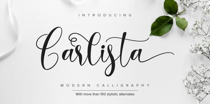 Carlista is a beautiful and modern typeface that is best used for weddings, branding, logotype, and quotes. Features : Beautiful Ligatures Beautiful Alternates + Swashes PUA Encoded Multi-lingual Support Numerals and Punctuation Beginning Swash and Ending Swashes (a-z)
 - Hauntress by Jadatype,
$15.00 Hauntess is a Serif Font that comes with a scary sharp-display's style. suitable for posters, logotype, branding, social media, book, movie and so on. contains standard English letters, numbers, punctuation, alternates, and several accents that support multilingualism.
 - Kathiya by Yumna Type,
$16.00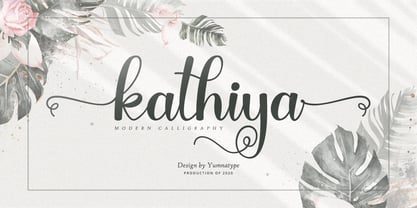 Kathiya is a beautiful and modern script that is best used for weddings, branding, logotype, and quotes. Features : Beautiful Ligatures Beautiful Alternates + Swashes PUA Encoded Multi-lingual Support Numerals and Punctuation Beginning Swash and Ending Swashes (a-z)
 - Radley by Variatype,
$12.00 Radley is an urban all-caps font designed for sports branding and logotype. Including 4 fonts to make your project awesome, get it now! FONT FEATURES Additional Accents 66 Languages Kerning Alternates SOFTWARE RECOMMENDATION Adobe Photoshop Adobe Illustrator
 - Sagha by YonTypeStudio Co,
$15.00 Sagha is a retro styled, thick lettered handwritten font, crafted to give your headlines and logotype projects a stylish touch. This font reads as strong, confident, and dynamic and can add tons of nostalgic character to your designs
 - Cloister Open Face LT by Linotype,
$29.99Cloister Open Face was designed in 1929 by Morris Fuller Benton as one weight of the Cloister Old Style family. Cloister itself appeared from 1897 with American Type Founders, and later for the typesetting machines of the Linotype, Intertype and Monotype companies. At that time, it was the truest modern industrial revival of the Jensonian Roman. Benton stayed close to the style of his model in both design and spacing. Cloister Open Face has an old-world elegance, and it works well for titling in books and magazines. In 1458, Charles VII sent the Frenchman Nicolas Jenson to learn the craft of movable type in Mainz, the city where Gutenberg was working. Jenson was supposed to return to France with his newly learned skills, but instead he traveled to Italy, as did other itinerant printers of the time. From 1468 on, he was in Venice, where he flourished as a punchcutter, printer and publisher. He was probably the first non-German printer of movable type, and he produced about 150 editions. Though his punches have vanished, his books have not, and those produced from about 1470 until his death in 1480 have served as a source of inspiration for type designers over centuries. His Roman type is often called the first true Roman." Notable in almost all Jensonian Romans is the angled crossbar on the lowercase e, which is known as the "Venetian Oldstyle e."" - Small Baguette by RA Studio,
$12.00 A great variable font with fun ligatures. Symbols are stretched vertically like a baguette. It is perfect for eye-catching signs, posters, headers, product packaging, book cover, logotype, apparel design and etc. Display font Extended latin & Cyrillic 599 Glyphs
 - Play Ground by Wacaksara co,
$12.00 Play Ground is a fancy hand-lettering script font with cute styles this font is great for your next creative project such as logos, printed quotes, invitations, cards, product packaging, headers, Logotype, Letterhead, Poster, Apparel Design, Label, and etc.
 - Hello August by Good Java Studio,
$20.00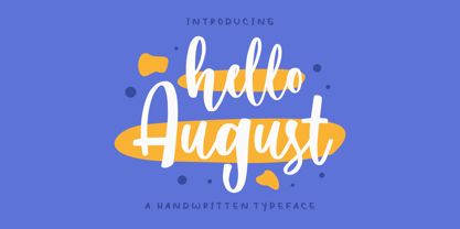 Introducing Hello August Hello August a playfully script font make from handlettering ideas in typeface. This font includes full of Alphabetical glyphs, Numerals, and punctuation. This is so perfect for invitations, monograms, wedding, fashion, branding, label, handlettering or logotype.
 - Renedetta by Bale Type,
$15.00 Renedetta is a lovely script font with modern touch. This font will suitable for you who want to use for various purposes, such as headline, wedding invitation, logotype, apparel, invitation, letterhead, branding, packaging, advertising, label, news, posters, and more.
 - Gojacky Bold Script Font by IbeyDesign,
$17.00 Gojacky Bold Script Font is a gorgeous and bold handwritten font, crafted to give your headlines and logotype projects a stylish touch. This font reads strong, confident, and dynamic and can add tons of nostalgic character to your designs.
 - Blacklite by Letterhend,
$14.00 Blacklite is a bold script that will stands out from the crowd! Perfect to be used as logotype, badge and label! This has many OpenType features like ligatures, stylistic alternates, contextual alternates, swash, and more, and support multiple languages.
 - Display Dots Three Sans by Gerald Gallo,
$20.00 Display Dots Three Sans and Serif are display fonts not intended for text use. They were designed specifically for display, headline, logotype, branding, and similar applications. Display Dots Three Sans and Serif include an uppercase alphabet, numbers, and punctuation.
 - Agustaf Bold Script Font by IbeyDesign,
$17.00 Agustaf Bold Script Font is a gorgeous and bold handwritten font, crafted to give your headlines and logotype projects a stylish touch. This font reads strong, confident, and dynamic and can add tons of nostalgic character to your designs.
 - MB GEOMETRIXA by Ben Burford Fonts,
$25.00 Inspired from geometric curves and circles, an audacious lower case display face with some alternate characters in Upper and Lower case glyphs. Great for Logos and Logotypes, headlines and larger text. Works well with smaller strap lines as well.
 - Display Dots Three Serif by Gerald Gallo,
$20.00 Display Dots Three Sans and Serif are display fonts not intended for text use. They were designed specifically for display, headline, logotype, branding, and similar applications. Display Dots Three Sans and Serif include an uppercase alphabet, numbers, and punctuation.
 - Being Strong by Subectype,
$15.00 Being Strong is a layered script and is inspired by bold, hand-lettered, vintage scripts. It includes OpenType features and additional accented characters, and is great for logotype, posters, badges, book covers, t-shirt designs, packaging and any more.
 - Display Dots Four Sans by Gerald Gallo,
$20.00 Display Dots Four Sans and Serif are display fonts not intended for text use. They were designed specifically for display, headline, logotype, branding, and similar applications. Display Dots Four Sans and Serif include an uppercase alphabet, numbers, and punctuation.