10,000 search results
(0.112 seconds)
- RTCO Fransworth by Roams Type Co,
$12.00 RTCO Fransworth Inspired by Vintage Horror Novel & Movies Poster Typograhphy This font is suitable for graphic designs such as logotypes, merchandise, printed stickers, and other branding needs.
 - Bros Rover by Blankids,
$27.00 Introducing a new font is Bros Rover Classic Sans Serif. Bros Rover good for logotype, poster, badge, wedding invitation, book cover, tshirt design, packaging and any more.
 - Metropolitan by Alias Collection,
$60.00 Originally developed as a logotype proposal for the Metropolitan Hotel in Park Lane, London. Available in upper case only, Metropolitan is a pure, streamlined, contemporary display typeface.
 - Ginko - Unknown license

- M Hei3 HK by Monotype HK,
$523.99 Monotype Hei3 HK is a modulated and transitional Chinese design with structure, diǎn, piē and nà carry Song style, while horizontal & vertical strokes are relatively simple. This mix of ancient and modern elements with low contrast is something that you can find in wood carving: rigid while balanced with softness.
 - M Hei3 PRC by Monotype HK,
$523.99 Monotype Hei3 PRC is a modulated and transitional Chinese design with structure, diǎn, piē and nà carry Song style, while horizontal & vertical strokes are relatively simple. This mix of ancient and modern elements with low contrast is something that you can find in wood carving: rigid while balanced with softness
 - Chedros by Surotype,
$15.00 Chedros is a display typeface with playful taste. It comes in two different weight, regular and bold so you can use them to your heart's content. Chedros very suitable to use for headlines, wordmark, prints, logotype, young and playful design or anything else.
 - Hello Wishes by Good Java Studio,
$22.00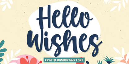 Produly Present Hello Wishes a Crafty Font Hello Wishes a Crafty Font make from handlettering ideas in typeface. This font includes full of Alphabetical glyphs, Numerals, and punctuation. This is so perfect for invitations, monograms, wedding, fashion, branding, label, handlettering or logotype.
 - Hello Mono One by Good Java Studio,
$18.00 Introducing Hello Mono with Layered Inline Hello Mono is a playfully display font make from handdrawn ideas in typeface. This font includes full of Alphabetical glyphs, Numerals, and punctuation. This is so perfect for invitations, monograms, wedding, fashion, branding, label, handdrawn or logotype.
 - Aldin by Open Window,
$- Aldin is a stylish and modern typeface based on geometric forms. It is best suited for headlines and subheads but can also work in short paragraphs. Its character makes it a good choice for magazines, advertisements, packaging or logotypes for the fashion or tech industries—particularly the thinner weights. Thicker weights also allow the option for more contrast among elements.
 - AM Siola by URW Type Foundry,
$39.99 AM Siola is designed as a pure display font. The starting point for this type design was a customized logotype. Logotypes usually just need the design of some characters to form a harmonious, individual lettering. Obviously, it is much more difficult to create a complete font on the basis of just a few characters. The semi-serifs partly running in the opposite direction form the basic idea for this font. AM Siola can well be used for packaging design, logo design and individual headlines for anything from advertising to posters.
 - Spacia by Designova,
$15.00 Spacia is a unique & modern Sans-Serif typeface specially designed for headlines, big text, branding, logotypes & display usage. The typeface could be the perfect choice for logo/logotype design, branding, marketing graphics, banners, posters, signage, corporate identities as well as for editorial design that can bring freshness and professionalism. Please see the examples shown above to get an idea of the capability of this typeface. Handcrafted and designed with powerful OpenType features in mind, each weight includes extended language support including Western European & Central European sets.
 - Display Carlos by Gerald Gallo,
$20.00 Display Carlos is a display font not intended for text use. It was designed specifically for display, headline, logotype, branding, and similar applications. There are numbers and punctuation located under their respective keys.
 - Xerochasy by Ali Hamidi,
$15.00 Xerochasy is a bold script with classic touch and very readable at glance. Really perfect for you who needs a typeface for especially logotype, apparel, invitation, branding, sticker, social media, packaging, advertising etc.
 - Willynta by Patria Ari,
$15.00 Introducing, Willynta, a beauty handwritten script with a twist of fun! The natural hand writing script is suitable for you who needs a typeface for headline, logotype, apparel, invitation, branding, packaging, advertising etc.
 - Display Plump by Gerald Gallo,
$20.00 Display Plump is a display font not intended for text use. It was designed specifically for display, headline, logotype, branding, and similar applications. There are numbers and punctuation located under their respective keys.
 - Display Gothic by Gerald Gallo,
$20.00 Display Gothic is a display font not intended for text use. It was designed specifically for display, headline, logotype, branding, and similar applications. Display Gothic has upper and lowercase alphabets, numbers, and punctuation.
 - Helixa by Designova,
$15.00 Helixa is a neo-grotesque typeface with a clean & modern design and an enduring appearance. This is a perfect choice for creating logotypes, branding, headlines, corporate identities, and marketing materials for web, digital & print alike. The typeface will be a great option for branding, logo/logotype design projects, marketing graphics, banners, posters, signage, corporate identities and editorial design. Adding extra letter spacing will make this font the perfect choice for minimal headlines and logotypes, as shown in the promo designs attached. Handcrafted and designed with powerful OpenType features in mind, each weight includes extended language support with Western European, Central European and South Eastern European sets. A total of 300 glyphs are available. Helixa typeface includes 12 fonts in total, with seven upright weights (Thin / Light / Book / Regular / Bold / Heavy) and Italic equivalents of all six weights.
 - Designer RD by Kostic,
$40.00 Designer RD was created in 1999, at the same time as Just Square and Why Square typefaces, and envisioned to be their rounded alternative. Zoran based the font on the logotype his son Nikola made and its primary purpose is to be used in logotypes, headlines, fliers, websites, etc. that are going for a hard geometric look. Designer RD’s character set supports Western European languages, as well as the Cyrillic script.
 - Plantin Infant by Monotype,
$29.99Plantin is a family of text typefaces created by Monotype in 1913. Their namesake, Christophe Plantin (Christoffel Plantijn in Dutch), was born in France during the year 1520. In 1549, he moved to Antwerp, located in present-day Belgium. There he began printing in 1555. For a brief time, he also worked at the University of Leiden, in the Netherlands. Typefaces used in Christophe Plantin's books inspired future typographic developments. In 1913, the English Monotype Corporation's manager Frank Hinman Pierpont directed the Plantin revival. Based on 16th century specimens from the Plantin-Moretus Museum in Antwerp, specifically a type cut by Robert Granjon and a separate cursive Italic, the Plantin" typeface was conceived. Plantin was drawn for use in mechanical typesetting on the international publishing markets. Plantin, and the historical models that inspired it, are old-style typefaces in the French manner, but with x-height that are larger than those found in Claude Garamond's work. Plantin would go on to influence another Monotype design, Times New Roman. Stanley Morison and Victor Larent used Plantin as a reference during that typeface's cutting. Like Garamond, Plantin is exceptionally legible and makes a classic, elegant impression. Plantin is indeed a remarkably accommodating type face. The firm modelling of the strokes and the serifs in the letters make the mass appearance stronger than usual; the absence of thin elements ensures a good result on coated papers; and the compact structure of the letters, without loss of size makes Plantin one of the economical faces in use. In short, it is essentially an all-purpose face, excellent for periodical or jobbing work, and very effective in many sorts of book and magazine publishing. Plantin's Bold weight was especially optimized to provide ample contrast: bulkiness was avoided by introducing a slight sharpening to the serifs' forms." - Plantin Headline by Monotype,
$29.00Plantin is a family of text typefaces created by Monotype in 1913. Their namesake, Christophe Plantin (Christoffel Plantijn in Dutch), was born in France during the year 1520. In 1549, he moved to Antwerp, located in present-day Belgium. There he began printing in 1555. For a brief time, he also worked at the University of Leiden, in the Netherlands. Typefaces used in Christophe Plantin's books inspired future typographic developments. In 1913, the English Monotype Corporation's manager Frank Hinman Pierpont directed the Plantin revival. Based on 16th century specimens from the Plantin-Moretus Museum in Antwerp, specifically a type cut by Robert Granjon and a separate cursive Italic, the Plantin" typeface was conceived. Plantin was drawn for use in mechanical typesetting on the international publishing markets. Plantin, and the historical models that inspired it, are old-style typefaces in the French manner, but with x-height that are larger than those found in Claude Garamond's work. Plantin would go on to influence another Monotype design, Times New Roman. Stanley Morison and Victor Larent used Plantin as a reference during that typeface's cutting. Like Garamond, Plantin is exceptionally legible and makes a classic, elegant impression. Plantin is indeed a remarkably accommodating type face. The firm modelling of the strokes and the serifs in the letters make the mass appearance stronger than usual; the absence of thin elements ensures a good result on coated papers; and the compact structure of the letters, without loss of size makes Plantin one of the economical faces in use. In short, it is essentially an all-purpose face, excellent for periodical or jobbing work, and very effective in many sorts of book and magazine publishing. Plantin's Bold weight was especially optimized to provide ample contrast: bulkiness was avoided by introducing a slight sharpening to the serifs' forms." - Hochland by Zealab Fonts Division,
$18.00 Hochland is a modern, condensed font, inspired by street urban style posters. It works well for headlines, logotypes, signs, posters, greeting card, letterhead, t-shirts, watermarks and more.
 - Robuck by Martype co,
$15.00 ROBUCK is a family Sans Serif font designed with carefully handcrafted. Also suitable for branding, T-shirt, Wedding Invitation, Classic Design, Logotype, and any project. All caps fonnts.
 - Univers by Linotype,
$42.99 The font family Univers? is one of the greatest typographic achievements of the second half of the 20th century. The family has the advantage of having a variety of weights and styles, which, even when combined, give an impression of steadiness and homogeneity. The clear, objective forms of Univers make this a legible font suitable for almost any typographic need. In 1954 the French type foundry Deberny & Peignot wanted to add a linear sans serif type in several weights to the range of the Lumitype fonts. Adrian Frutiger, the foundry's art director, suggested refraining from adapting an existing alphabet. He wanted to instead make a new font that would, above all, be suitable for the typesetting of longer texts - quite an exciting challenge for a sans-serif font at that time. Starting with his old sketches from his student days at the School for the Applied Arts in Zurich, he created the Univers type family. In 1957, the family was released by Deberny & Piegnot, and afterwards, it was produced by Linotype. The Deberny & Peignot type library was acquired in 1972 by Haas, and the Haas'sche Schriftgiesserei (Haas Type Foundry) was folded into the D. Stempel AG/Linotype collection in 1985/1989. Adrian Frutiger continues to do design work with Linotype right up to the present day. In 1997, Frutiger and the design staff at Linotype completed a large joint project of completely re-designing and updating the Univers family. The result: Univers Next - available with 59 weights and 4 Linotype Univers Typewriter weights. With its sturdy, clean forms Univers can facilitate an expression of cool elegance and rational competence. Univers has the uncanny ability to combine well with fonts of many different styles and origins: Old style fonts such as: Janson Text, Meridien, Sabon, Wilke. Modern-stressed fonts such as: Linotype Centennial, Walbaum. Slab serif fonts such as Egyptienne F, Serifa. Script and brush fonts such as: Brush Script, Mistral, Ruling Script. Blackletter fonts such as: Duc De Berry, Grace, San Marco. Even fun fonts such as F2F OCRAlexczyk, Linotype Red Babe, Linotype Seven."
 - Brainoise by Ronny Studio,
$19.00 Punk-looking fonts usually embody the rebellious and edgy spirit of the punk subculture. It is characterized by its bold, jagged, and distorted letterforms, which often feature exaggerated or irregular shapes. This font is perfect for your design needs such as: for posters, magazines, covers, brands, logotypes, band logos, etc
 - Nicko by Zealab Fonts Division,
$14.00 Nicko is a bold and friendly typeface. Nicko has a unique style with stylistic, alternates, ligatures and supports multilingual languages. Create unique & beautiful logotype, use it as an elegant solution for your next magazine layout, or choose Nicko for any graphics that require a sleek look with a elegant flair.
 - Neima by Zealab Fonts Division,
$12.00 Neima is high contrast serif font features a mixed modern-classic design. Neima support multilingual languages, numbers, punctuation and alternative-ligatures. Create unique & beautiful logotype, use it as an elegant solution for your next magazine layout, or choose Neima for any graphics that require a sleek look with a elegant flair.
 - Meave Multipurpose Display Typeface by Eotype,
$12.00 Meave is high contrast serif font features a mixed modern-classic design. Meave support multilingual languages, numbers, punctuation and alternative-ligatures. Create unique & beautiful logotype, use it as an elegant solution for your next magazine layout, or choose Meave for any graphics that require a sleek look with a elegant flair.
 - Thrillington by Rochart,
$15.00 Thrillington is font duo with modern vintage look design styles, available on script and Display Sans serif typeface. These two lovely fonts would be perfect to combine in your design. Brand new stylish textured fonts and Make it easy for made logotype hand lettering Style. It will be great for Logotypes, Posters, Digital Lettering Arts, Clean Design, Branding Design, Sign, Merchandise and Social Media Posts. This font contain of Uppercase, Lowercase, Number, Symbol, Punctuation, also support multilingual and already PUA encoded.
 - Labours by Akufadhl,
$15.00 Labours is a bold strong handcrafted typeface, inspired by an old and rustic signs on the street. Designed for any vintage purpose. suitable for Posters, Logotype, T-Shirt design, and many other vintageous design!
 - Display Dots Five by Gerald Gallo,
$20.00 Display Dots Five is a display font not intended for text use. It was designed specifically for display, headline, logotype, branding, and similar applications. Display Dots Five has an uppercase alphabet, numbers, and punctuation.
 - Alamanda by ErlosDesign,
$19.00 Allamanda is a handwritten monoline script. It features an incredibly classic style, while still keeping a friendly feel. Perfect for titles, headings and logotypes for blog, products and lifestyle imagery like quotes and stuff.
 - Salut by Monotype,
$29.99 Designed by Heinrich Johannes Machler and released in 1931, the Salut font is a bold, upright connecting script for headline use. Salut is a good face for logotypes where a modern style is desired.
 - Display Dots Six by Gerald Gallo,
$20.00 Display Dots Six is a display font not intended for text use. It was designed specifically for display, headline, logotype, branding, and similar applications. Display Dots Six has an uppercase alphabet, numbers, and punctuation.
 - Display Crisp by Gerald Gallo,
$20.00 Display Crisp is a display font not intended for text use. It was designed specifically for display, headline, logotype, branding, and similar applications. Display Crisp has tall and short cap alphabets, numbers, and punctuation.
 - Monticello by Linotype,
$40.99 Linotype Monticello was designed by C.H. Griffith in 1946. Its design is based on James Ronaldsons Roman No.1 and Oxford Typefaces from American Type Founders and was revised by Matthew Carter while he was working at Linotype between 1965 -1981.
 - Matura by Monotype,
$29.99 Matura font was designed by the Hungarian wood engraver and type designer Imre Reiner in 1938 and released by the Monotype Corporation. Matura font is a bold upright script that looks as if it were written with a broad-edged pen. A set of vibrant near-flourished capitals, called scriptorial capitals, broadens the usual range of script faces. Matura's distinctive lines make it appropriate for advertising uses as well as text headings, and for informal work like cards, invitations, and announcements.
 - Goudy 38 by Red Rooster Collection,
$45.00 Designed by Les Usherwood. Digitally engineered by Steve Jackaman. Originally designed by Frederick Goudy for the original Life magazine, circa 1908. Because of delays in production, the face was never used by the magazine. However, Gimbel Brothers, the famous New York department store, opened in 1910, around the time of the release of the typeface, which was used almost exclusively for its advertising and was often known as Goudy Gimbel, but the typeface was better known by the Monotype series number Goudy 38.
 - Classic Grotesque by Monotype,
$40.99 Classic Grotesque by Rod McDonald: a traditional font with a modern face. The growing popularity of grotesque typefaces meant that many new sans serif analogues were published in the early 20th century. Setting machines were not compatible with each other but all foundries wanted to offer up-to-date fonts, and as a result numerous different typeface families appeared that seem almost identical at first glance and yet go their separate ways with regard to details. One of the first fonts created with automatic typesetting in mind was Monotype Grotesque®. Although this typeface that was designed and published by Frank Hinman Pierpont in 1926 has since been digitalised, it has never achieved the status of other grotesque fonts of this period. But Monotype Grotesque was always one of designer Rod McDonald’s favourites, and he was overjoyed when he finally got the go-ahead from Monotype in 2008 to update this “hidden treasure”. The design process lasted four years, with regular interruptions due to the need to complete projects for other clients. In retrospect, McDonald admits that he had no idea at the beginning of just how challenging and complex a task it would be to create Classic Grotesque™. It took him considerable time before he found the right approach. In his initial drafts, he tried to develop Monotype Grotesque only to find that the result was almost identical with Arial®, a typeface that is also derived in many respects from Monotype Grotesque. It was only when he went back a stage, and incorporated elements of Bauer Font’s Venus™ and Ideal Grotesk by the Julius Klinkhardt foundry into the design process, that he found the way forward. Both these typefaces had served as the original inspiration for Monotype Grotesque. The name says it all: Classic Grotesque has all the attributes of the early grotesque fonts of the 20th century: The slightly artificial nature gives the characters a formal appearance. There are very few and only minor variations in line width. The tittles of the ‘i’ and ‘j’, the umlaut diacritic and other diacritic marks are rectangular. Interestingly, it is among the uppercase letters that certain variations from the standard pattern can be found, and it is these that enliven the typeface. Hence the horizontal bars of the “E”, “F” and “L” have bevelled terminals. The chamfered terminal of the bow of the “J” has a particular flamboyance, while the slightly curved descender of the “Q” provides for additional dynamism. The character alternatives available through the OpenType option provide the designer with a wealth of opportunities. These include a closed “a”, a double-counter “g” and an “e” in which the transverse bar deviates slightly from the horizontal. The seven different weights also extend the scope of uses of Classic Grotesque. These range from the delicate Light to the super thick Extrabold. There are genuine italic versions of each weight; these are not only slightly narrower than their counterparts, but also have variant shapes. The “a” is closed, the “f” has a semi-descender while the “e” is rounded. Its neutral appearance and excellent features mean that Classic Grotesque is suitable for use in nearly all imaginable applications. Even during the design phase, McDonald used his new font to set books and in promotional projects. However, he would be pleased to learn of possible applications that he himself has not yet considered. Classic Grotesque, which has its own individual character despite its neutral and restrained appearance, is the ideal partner for your print and web project.
 - Just Be by Roland Hüse Design,
$12.00 JUST BE is a playful brush script. Perfect for titles, headings and logotypes for blogs, ads, quote prints, home decor, book title, invitation, birthday, custom product, lifestyle imagery (like quotes and stuff). Character set contains Eastern and Western European Latin accented letters. For additional customisations (for logotypes for example) please email me at contact@rolandhuse.com You MAY NOT sell this font or claim them as your own. You MAY NOT edit or rename this font. You MAY NOT redistribute this font. Thank you I hope you like this font & good luck with your project! Roland Instagram: @rolandhusedesign Background images of "Just Be" main poster by Annie Spratt from unsplash https://unsplash.com/@anniespratt "Your best moments in life are ahead" by Helena Hertz https://unsplash.com/@imperiumnordique paper bag mock up by Graphic Burger https://graphicburger.com"
