10,000 search results
(0.038 seconds)
- Coptek by ITC,
$29.00 Coptek is the work of David Quay and gets its name from the high tech look imposed on the design of copperplate script. The capitals are initials which fit well with a lower case alphabet whose letters join in the style of true handwriting.
 - Ballian Phil by Arttype7,
$15.00 Introducing Ballian Phil, a scripted font with perfect fonts. equipped with an elegant strap, adding to the natural impression and neatness of your writing. Handwritten with the perfect slant like a beautiful signature, the Ballian Phil is perfect for invitations, branding and editorial design, logos.
 - Adelyna by Letterena Studios,
$9.00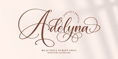 Adelyna is a ravishing and delicate script font that exudes elegance and class. This font was particularly crafted for those who need a beautiful and refreshing look to their designs. Adelyna is PUA encoded which means you can access all glyphs and swashes with ease!
 - Real One Specific by Sulthan Studio,
$8.00 Real one specific! This font duo comes with a script typeface as well as a sans serif typeface. The two typefaces complement each other really well with beautiful, eye-catching handwritten nuances. This font is very light and can also make your job stand out.
 - Minimalistic by Fikryal,
$18.00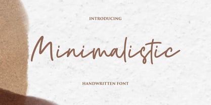 Minimalistic is a beautiful script font perfect for crafting, branding, invitation, stationery, wedding designs, social media posts, advertisements, product packaging, product designs, label, photography, watermark, special events, or anything. Minimalistic with a full set of uppercase and lowercase letters, ligatures, multilingual symbols, numerals, and punctuation.
 - Katfish by ITC,
$29.00Katfish is the work of Michael Gills, a unique and inventive script font. Initial capitals are complemented by a lively lowercase and a number of alternative characters, ligatures and swash elements. Katfish has a fun, irregular style and includes charming cat, fish and dolphin illustrations. - Rallia by Jafar07,
$20.00 Rallia A modern classic serif style font with unique curves that combine straight, rounded, and sharp lines. Inspired by elegant and temporary characters. This font is suitable for use in many forms of design and pairs beautifully with sans-serif or light script fonts.
 - Melathy by Awan Senja,
$14.00 Melathy is a script calligraphy font. It looks stunning on wedding invitations, thank you cards, quotes, greeting cards, logos, business cards and every other design which needs a handwritten touch. Add it to your most creative ideas and notice how it makes them come alive!
 - Abellaice by Letterhanna Studio,
$13.00 Abellaice is a graceful script font. Fall for its ravishing style and use it to create gorgeous wedding invitations, beautiful stationary art, eye-catching social media posts, and much more! Abellaice is PUA encoded which means you can access all glyphs and swashes with ease!
 - Calmsie by Timurtype,
$14.00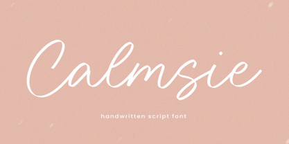 Calmsie A Handwritten Script Font Calmsie is perfect for product packaging, branding project, magazine, social media, weddings, or just used to express words above the background. This Calmsie font includes: Calmsie multilingual support. Embellish your designs with our original fonts. Enjoy the font, Thank you!
 - Culington by Nurf Designs,
$16.00 Culington is a bold script font. This font will look great in any creative project such as logos, printed quotes, invitations, cards, product packaging, headers, and more! This font is PUA encoded which means you can access all of the glyphs and swashes with ease!
 - Blue Sapphire by Skinny Type,
$14.00 Blue Sapphire is a modern handwritten script font - perfect for crafter project! This font is perfect for farmhouse decor, svg designs, shirts, crafts, websites, branding, blogs, logos, invitations and more! This purchase includes TTF & OTF font files. Most accent characters are included. Thank you!
 - CA Play by Cape Arcona Type Foundry,
$29.00 This font invites you to play with it. The Real version has longer tails, while the Roman version cuts them up to make the font more suitable for text. The Script version connects the letters, while the Dynamic version is just an italic style.
 - Stola by Jujumisur’s Ficus,
$15.00 Stola is able to be used with all European languages including ancient and reconstructed languages like Old Church Slavonic (it can be written by Cyrillic or Glagolitic script), Proto Slavic, Ancient Greek etc. Also it includes IPA, so it can be used in education.
 - Silver Dagger by Scholtz Fonts,
$19.00Silver Dagger is a contemporary script-inspired font that combines the elegance of graceful handwriting with clean, modern, incisive calligraphy. It will enhance the appearance of advertisements, invitations, headlines and posters. It contains a full character set and is professionally letter-spaced and kerned. - Beauty Switzerland Duo by Lettersiro,
$18.00 Beauty Switzerland is an elegant, delicate and distinct script font. It will add a luxury spark to any design project that you wish to create! This font is PUA encoded which means you can access all of the amazing glyphs and ligatures with ease!
 - Simple Games by Timurtype,
$14.00 Introducing by Timur type Proudly Present, Simple Games Simple Games A Handwritten Script Font Simple Games is perfect for product packaging, branding project, megazine, social media, wedding, or just used to express words above the background. Aesthetica also multilingual support. Enjoy the font.Thank you!
 - Sodaster by WNGSTD,
$15.00 Sodaster is a lovely and delicate script font that exudes elegance and class. This font was particularly crafted for those who need a beautiful and refreshing look to their designs. Sodaster is PUA encoded which means you can access all glyphs and swashes with ease!
 - Beblock by Garisman Studio,
$20.00 Introducing Beblock - Display Typeface Beblock combines attractive curves with a fresh urban edge and build with all caps letters; delivering a stylish script which is guaranteed to add an eye-catching appeal to your logo designs, brand imagery, quotes, product packaging, merchandise & social media posts
 - BrushtipTravis by JOEBOB graphics,
$19.00 Slightly slanted brush tip handwriting script that looks both elegant and streetwise, very suitable for all your poetry, lyrics and memoires. The font comes with a couple of swashes to use as you please and includes all eastern European, Baltic, Scandinavian and Turkish characters.
 - Manttulcuy Signature by Juncreative,
$15.00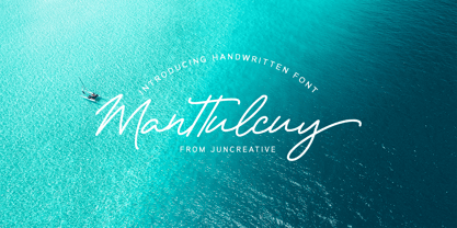 Manttulcuy Signature is a handwritten signature script with a natural & stylish flow, elegant and smooth. Manttulcuy is perfect for branding projects, logos, wedding designs, social media posts, advertisements, product packaging, product designs, labels, photography, watermark, invitations, stationery and any projects that needs a handwriting touch.
 - Corrida by ParaType,
$25.00Designed for ParaType (ParaGraph) in 1989 by Elvira Slysh. Based on Slogan of Ludwig & Mayer type foundry, 1959, by Helmut Matheis. An informal flowing script simulating pointed brush calligraphy. A style of medium weight and coherent lowercase. For use in advertising and display typography. - Bank Sans EF by Elsner+Flake,
$35.00 With its extended complement, this comprehensive redesign of Bank Gothic by Elsner+Flake offers a wide spectrum for usage. After 80 years, the typeface Bank Gothic, designed by Morris Fuller Benton in 1930, is still as desirable for all areas of graphic design as it has ever been. Its usage spans the design of headlines to exterior design. Game manufacturers adopt this spry typeface, so reminiscent of the Bauhaus and its geometric forms, as often as do architects and web designers. The creative path of the Bank Gothic from hot metal type via phototypesetting to digital variations created by desktop designers has by now taken on great breadth. The number of cuts has increased. The original Roman weight has been augmented by Oblique and Italic variants. The original versions came with just a complement of Small Caps. Now, they are, however, enlarged by often quite individualized lower case letters. In order to do justice to the form changes and in order to differentiate between the various versions, the Bank Gothic, since 2007 a US trademark of the Grosse Pointe Group (Trademark FontHaus, USA), is nowadays available under a variety of different names. Some of these variations remain close to the original concept, others strive for greater individualism in their designs. The typeface family which was cut by the American typefoundry ATF (American Type Founders) in the early 1930’s consisted of a normal and a narrow type family, each one in the weights Light, Medium and Bold. In addition to its basic ornamental structure which has its origin in square or rectangular geometric forms, there is another unique feature of the Bank Gothic: the normally round upper case letters such as B, C, G, O, P, Q, R and U are also rectangular. The one exception is the upper case letter D, which remains round, most likely for legibility reasons (there is the danger of mistaking it for the letter O.) Because of the huge success of this type design, which follows the design principles of the more square and the more contemporary adaption of the already existing Copperplate, it was soon adopted by all of the major type and typesetting manufacturers. Thus, the Bank Gothic appeared at Linotype; as Commerce Gothic it was brought out by Ludlow; and as Deluxe Gothic on Intertype typesetters. Among others, it was also available from Monotype and sold under the name Stationer’s Gothic. In 1936, Linotype introduced 6pt and 12pt weights of the condensed version as Card Gothic. Lateron, Linotype came out with Bank Gothic Medium Condensed in larger sizes and a more narrow set width and named it Poster Gothic. With the advent of photoypesetters and CRT technologies, the Bank Gothic experienced an even wider acceptance. The first digital versions, designed according to present computing technologies, was created by Bitstream whose PostScript fonts in Regular and Medium weights have been available through FontShop since 1991. These were followed by digital redesigns by FontHaus, USA, and, in 1996, by Elsner+Flake who were also the first company to add cursive cuts. In 2009, they extended the family to 16 weights in both Roman and Oblique designs. In addition, they created the long-awaited Cyrillic complement. In 2010, Elsner+Flake completed the set with lowercase letters and small caps. Since its redesign the type family has been available from Elsner+Flake under the name Bank Sans®. The character set of the Bank Sans® Caps and the Bank Sans® covers almost all latin-based languages (Europe Plus) as well as the Cyrillic character set MAC OS Cyrillic and MS Windows 1251. Both families are available in Normal, Condensed and Compressed weights in 4 stroke widths each (Light, Regular, Medium and Bold). The basic stroke widths of the different weights have been kept even which allows the mixing of, for instance, normal upper case letters and the more narrow small caps. This gives the family an even wider and more interactive range of use. There are, furthermore, extensive sets of numerals which can be accessed via OpenType-Features. The Bank Sans® type family, as opposed to the Bank Sans® Caps family, contains, instead of the optically reduced upper case letters, newly designed lower case letters and the matching small caps. Bank Sans® fonts are available in the formats OpenType and TrueType.
 - Liza Pro by Underware,
$50.00 Lettres d’amour! Flirting, fashionable, provocative, emotional, casual, moderate, extremely sensible & beautiful - Liza Pro covers it all. Liza Pro, Underware’s dear creation, is a live-script typeface. Thanks to its extremely intelligent OpenType architecture, she approaches human hand lettering as closely as technically possible. Liza Pro deeply analyzes the text. Out of a stock of 4000 hand crafted characters, Liza creates the most optimal combination. All of this works automatically. All you need to do is start typing your lettres d’amour, and Liza makes the text always look different. She gives your creative piece the impression par excellence. Erotique mais intelligent. She is as clever as we could imagine. She kept all folks at Underware busy for a couple of years. It all started one rainy night back in May 2004 but quickly changed into a fatal affair exceptionnelle. But now, 5 years later we are quite sure: this is something serious. Yes, we are talking about real love. L’amour pour la vie. Liza Pro has Underware’s world-dominating Latin Plus character set, supporting a total of 219 languages (Latin 1 + 2 and beyond). Liza Pro is a package of 4 fonts which work together. Liza Display Pro rocks the script lettering to the max. The build-in Out-of-ink feature, LetterSwapper and Protoshaper makes this font a realtime-digital-calligrapher. She’ll swash up your text drastically, giving long strokes, loops and swashes to letters if their context allows. Liza Text Pro has a more silent, moderate character - she’s well behaving sister of Liza Display Pro, designed to walk long pieces of text in a lively script style. Liza Caps Pro adds more possibilities and functionality to these two script fonts. It bridges the gap in case running script lettering doesn’t do the job, but it also works perfectly on its own. Every capital letter appears in various shapes to obtain the manual lettering feeling. Liza Ornaments Pro is for extra delicatesse et est plus charme. Four heart winning fonts, pour la langue l’amour!
 - Syntax Next by Linotype,
$50.99 Syntax was designed by Swiss typographer Hans Eduard Meier, and issued in 1968 by the D. Stempel AG type foundry as their last hot metal type family. Meier used an unusual rationale in the design of this sans serif typeface; it has the shapes of humanist letters or oldstyle types (such as Sabon), but with a modified monoline treatment. The original drawings were done in 1954; first by writing the letters with a brush, then redrawing their essential linear forms, and finally adding balanced amounts of weight to the skeletons to produce optically monoline letterforms. Meier wanted to subtly express the rhythmical dynamism of written letters and at the same time produce a legible sans serif typeface. This theme was supported by using a very slight slope in the roman, tall ascenders, terminals at right angles to stroke direction, caps with classical proportions, and the humanist style a and g. The original foundry metal type was digitized in 1989 to make this family of four romans and one italic. Meier completely reworked Syntax in 2000, completing an expanded and improved font family that is available exclusively from Linotype GmbH as Linotype Syntax. In 2009 the typeface family was renamed into a more logical naming of "Syntax Next" to fit better in the Platinum Collection naming." Syntax® Next font field guide including best practices, font pairings and alternatives.
 - Metro Office by Linotype,
$50.99The Metro Office family is designed after the model of the original sans serif family – Metro No.1 – produced by W.A. Dwiggins and Mergenthaler Linotype’s design studio during the late 1920s and 1930s. A distinctly new interpretation of the sans serif idea, Metro was a thoroughly “American” sans serif when it was released. However, over the ensuing decades, it became a favorite the world over. Moreover, it is one of the first “humanist” sans serif typefaces designed. While redesigning Metro in 2006, Linotype’s Type Director Akira Kobayashi drew from his own knowledge of humanistic letterforms. The result is a redefined Metro; a typeface that is finally ready for heavy text setting. The original Linotype Metro No.1 never had italic variants. Kobayashi has created oblique variants, extending its use in document setting. A double-storey a and g, as well as a wider w were features of Dwiggins’ original Metro design that were filtered out by Mergenthaler Linotype in the 1930s. Kobayashi remedied this historical slight, retooling Dwiggins’ original forms and optimizing their legibility. Kobayashi has additionally retooled some of Metro’s more troublesome letters, which has black elements that became too dense. By opening up the troublesome joins (like that on the Q), Kobayashi has given his new Metro a more even color in text, improving its legibility while retaining its original spirit. - Frutiger by Linotype,
$42.99 In 1968, Adrian Frutiger was commissioned to develop a sign and directional system for the new Charles de Gaulle Airport in Paris. Though everyone thought he would want to use his successful Univers font family, Frutiger decided instead to make a new sans serif typeface that would be suitable for the specific legibility requirements of airport signage: easy recognition from the distances and angles of driving and walking. The resulting font was in accord with the modern architecture of the airport. In 1976, he expanded and completed the family for D. Stempel AG in conjunction with Linotype, and it was named Frutiger. The Frutiger™ family is neither strictly geometric nor humanistic in construction; its forms are designed so that each individual character is quickly and easily recognized. Such distinctness makes it good for signage and display work. Although it was originally intended for the large scale of an airport, the full family has a warmth and subtlety that have, in recent years, made it popular for the smaller scale of body text in magazines and booklets. The family has 14 weights and 14 companion fonts with Central European characters and accents. Another 14 Cyrillic companion fonts are available as well. See also the new revised version Frutiger Next from the Linotype Platinum Collection. Featured in: Best Fonts for Logos
 - Brewery No 2 Paneuropean by Linotype,
$103.99An entry in the Second Linotype Design Contest, Linotype Brewery, designed by Gustavs Andrejs Grinbergs, became part of the TakeType Collection in 1997. Brewery No 2 represents a significantly improved version of its precursor, and the typeface has been both extended and enhanced. When asked about prototypes, Grinbergs cites German typefaces of the early 20th century. It is thus not surprising that the characters of Brewery™ No 2 are based on geometrical forms. However, this is no mere synthetic Grotesque-derived typeface. It has significant contrasts in line thickness and triangular line terminals that are not unlike serifs, placing it in the middle ground somewhere between a Grotesque and serif font. The contrast between the features of a synthetic Grotesque and an Antiqua gives the characters of Brewery No 2 their distinctive charm and is the distinguishing attribute of this contemporary typeface. Additional vibrancy is provided by bevelled line endings (as in the case of the 'E' and the 'F'), the circular punctuation marks and the slight curve of the descending bar of the 'k'. Thanks to a generous x-height and its open counters, Brewery No 2 is also highly legible in small point sizes. Only in its bolder versions is another aspect of Brewery No 2 apparent; Grinbergs has here made the linking elements more rectangular and has emphasized the counters, so that the Bold variants of Brewery No 2 exhibit elements typical of a broken typeface. Brewery No 2 is available in seven finely graduated weights, ranging from Light to Black. Every variant has a corresponding, slightly narrower Italic version. In addition, the lowercase 'a' is given a closed form, the 'e' is more rounded and the 'f' has a descender. The character sets of Brewery No 2 leave nothing to be desired. In addition to small caps and ligatures, there are various numeral sets with old style and lining figures for setting proportional text and table columns. In its most extensive form (the Pan-European variant), Brewery No 2 can be used to set texts in many languages that employ the Latin alphabet and also texts in international languages that use Cyrillic or monotonic Greek orthography. Although some of the features of Brewery No 2, such as the tiny serifs, are only evident in the larger point sizes, this typeface is not just at home when used to set headlines. Brewery No 2 also cuts a good figure in short or medium length texts. This contemporary typeface with its formally elegant quality looks good, for example, on posters, in newspapers and promotional material. It can also be used for websites as it is also available as a web font. - Brewery No 2 by Linotype,
$40.99 An entry in the Second Linotype Design Contest, Linotype Brewery, designed by Gustavs Andrejs Grinbergs, became part of the TakeType Collection in 1997. Brewery No 2 represents a significantly improved version of its precursor, and the typeface has been both extended and enhanced. When asked about prototypes, Grinbergs cites German typefaces of the early 20th century. It is thus not surprising that the characters of Brewery™ No 2 are based on geometrical forms. However, this is no mere synthetic Grotesque-derived typeface. It has significant contrasts in line thickness and triangular line terminals that are not unlike serifs, placing it in the middle ground somewhere between a Grotesque and serif font. The contrast between the features of a synthetic Grotesque and an Antiqua gives the characters of Brewery No 2 their distinctive charm and is the distinguishing attribute of this contemporary typeface. Additional vibrancy is provided by bevelled line endings (as in the case of the 'E' and the 'F'), the circular punctuation marks and the slight curve of the descending bar of the 'k'. Thanks to a generous x-height and its open counters, Brewery No 2 is also highly legible in small point sizes. Only in its bolder versions is another aspect of Brewery No 2 apparent; Grinbergs has here made the linking elements more rectangular and has emphasized the counters, so that the Bold variants of Brewery No 2 exhibit elements typical of a broken typeface. Brewery No 2 is available in seven finely graduated weights, ranging from Light to Black. Every variant has a corresponding, slightly narrower Italic version. In addition, the lowercase 'a' is given a closed form, the 'e' is more rounded and the 'f' has a descender. The character sets of Brewery No 2 leave nothing to be desired. In addition to small caps and ligatures, there are various numeral sets with old style and lining figures for setting proportional text and table columns. In its most extensive form (the Pan-European variant), Brewery No 2 can be used to set texts in many languages that employ the Latin alphabet and also texts in international languages that use Cyrillic or monotonic Greek orthography. Although some of the features of Brewery No 2, such as the tiny serifs, are only evident in the larger point sizes, this typeface is not just at home when used to set headlines. Brewery No 2 also cuts a good figure in short or medium length texts. This contemporary typeface with its formally elegant quality looks good, for example, on posters, in newspapers and promotional material. It can also be used for websites as it is also available as a web font.
 - Sungarden by Juraj Chrastina,
$39.00 Welcome to my hand-drawn garden! Enjoy the sunshine, surrounded by my line illustrations of flowers, leaves, birds, hearts, arrows, snowflakes and various ornaments. Sungarden is a bouquet of about 400 handmade pics and floral ornaments, created to get along well with my collection of 12 playful sans serifs and a cute script. Sungarden Script is packed with ligatures and automatic initial and terminal forms accessed through contextual altrenates. All the fonts have an extended character set to support Western and Central European languages. The Sungarden family is well-suited for nature cosmetics, organic food, handmade-style products, wedding and greeting cards, invitations, labels, packaging, menus, books or apparel. You can download the instruction PDF here.
 - Corinth by Albatross,
$19.00 Do you need that perfectly-imperfect yet highly legible font to pair with a script or supplement a logo? Corinth is a hand drawn geo sans with 4 styles plus ornaments that pairs well with scripts, is readable at small sizes and still achieves the retro, or hand made feel. The classic geometric letterforms in combination with the imperfections of being hand drawn give Corinth a unique personality without sacrificing legibility. Corinth is a small caps family with comprehensive language support, uppercase and lowercase alternates, double-letter ligatures for added realism, and over 100 ornaments and symbols. Corinth's legibility and classic style makes it very handy for any designer's arsenal and comes in useful for almost any subject matter.
 - Polthena by Keristyper Studio,
$14.00 Polthena is a brush script typeface created by skilled hands which makes it look very refined. Its subtle shapes make this font suitable for all your projects. Polthena Brush Script is perfect for branding projects, logos, wedding designs, social media posts, advertisements, product packaging, product designs, label, photography, watermark, invitation, stationery and any projects that need handwriting taste. Polthena Font multilingual support: Afrikaans, Albanian, Catalan, Danish, Dutch, English, Estonian, French, Finnish, German, Icelandic, Indonesian, Italian, Malay, Norwegian, Portuguese, Spanish, Swedish, Zulu, and many more. What’s Included : Standard & Multilingual glyphs Ligature Works on PC & Mac Simple installations Accessible in Adobe Illustrator, Adobe Photoshop, Adobe InDesign, and even work on Microsoft Word. Hope you enjoy our font!
 - Sunstone by Supfonts,
$17.00 Sunstone Cyrillic & Latin font Sunstone it is a chic script font with exquisite accents and full Cyrillic support. It is perfect for branding, wedding invitations and invitation cards and many more It includes a full set of gorgeous uppercase and lowercase letters, numbers, a large selection of punctuation marks, and ligatures. Sunstone - это милый шрифт с изысканными акцентами и полной поддержкой кириллицы. Он идеально подходит для брендинга, свадебных приглашений и пригласительных билетов и многого другого Test it out below to see how it could look for your next project! Includes: Regular Script Latin languages support Cyrillic languages support Uppercase and lowercase Numbers and punctuation Ligatures Check out my blog: https://www.instagram.com/zloillev pinterest.com/dmitriychirkov7 Enjoy
 - Goodwater by Fenotype,
$19.00 Goodwater is an original collection of a Brush, three weights of a monoline Script and four weights of condensed Sans typeface. Goodwater also has a “Print” version with rugged outline and worn-out texture of each font. Goodwater is a great pack for any display use from online to logo and from headline to packaging. All the styles are designed using the same proportions and soft corners so that they’ll place nice together. All Print versions have the same texture style and size too so that they’ll fit smooth together. Goodwater Script and Brush fonts are equipped with automatic Standard Ligatures and Contextual Alternates to keep the flow smooth and it’s best to keep those features on.
 - Little Cecily by Olga Umpeleva,
$25.00 Little Cecily was designed on the base of a Russian calligraphy sample book for primary schools “Propisi pryamogo pis’ma” (Moscow, 1914). Such kind of scripts were implemented in school programs at the end of 19th-beginning of 20th century. There was an opinion that the straight writing is easier for learning and better for children from a medical point of view. The letterforms of the typeface are characterized by simplified constructions and upright design which distinguishes it from the list of typical school scripts and convey to it a naive charm and originality. The character set covers standard Western and Cyrillic code pages and it includes alternative letters and contextual forms for connected writing.
 - Brigattin by Muhammad Alkaf,
$14.00 Brigattin is a calligraphy script font that comes with beautiful alternative characters. a mixture of copper calligraphy with handleting style. Designed to bring style elegance. Brigattin Script attracts such a subtle, clean, feminine, sensual, glamorous, simple and very readable typeface. The classic style is perfect to apply in various formal forms such as invitations, labels, menus, Logos, fashion, make up, stationery, letterpress, romantic novels, magazines, books, greeting / wedding cards, packaging, labels. Brigattin has 494 glyphs. including multiple language support. With OpenType features with stylish alternatives, ligatures and characters, allowing you to mix and match pairs of letters to fit your design, as well as a touch of ornament to make this font look elegant.
 - Brightness by Black Studio,
$15.00 Brightness Script - new, fresh, cute, catchy, funny calligraphy font with relatable heart. Perfect for greeting cards, branding materials, business cards, quotes, posters and more! Brightness Script - includes many alternative characters. Coded with Unicode PUA, which allows full access to all additional characters without having any special design software. Mac users can use Font Book. Windows users can use the Character Map to view and copy any of the additional characters to paste into your favorite text editor. For people who have opentype-capable software: Alternatives can be accessed by turning on the "Alternative" and "Ligature" buttons on Photoshop's Character panel, or via any software with a glyph panel, eg. Adobe Illustrator, Photoshop CC, Inkscape. Thank you for purchasing!
 - Disco Rendezvous by Wing's Art Studio,
$20.00 Disco Rendezvous: An Adaptive Font Pair Inspired by Neon Soaked Club Culture Combining an elegant script and a tall sans serif font, Disco Rendezvous is a perfectly contrasted design that evokes the golden-age of disco, inspired by neon soaked night clubs and epic dance floor hits. The superstar of this show is the highly customisable script that takes full advantage of OpenType features to offer countless creative options via alternative characters and automatic ligatures, giving your headers and title designs an authentically hand-made look. It features a complete set of uppercase and lowercase characters, along with numerals, punctuation and language support, and used with the included Sans Serif font pair you have a perfectly matched type treatment.
 - Slapjack by Stephen Rapp,
$49.00 Slapjack is a unique rendition of a broad-edged calligraphic script ideal for packaging, signage, and titling. Its presence is strikingly bold and rhythmic, yet stylishly elegant. With a glyph count well over 700, Slapjack is a fully-featured pro font. Both regular and light weights have contextual and stylistic alternates, stylistic sets, swashes, ligatures, fractions, and Central European language support. Using Adobe InDesign which supports Stylistic Sets allows you to instantly convert your text to a version without baseline connectors for a more streamlined look. These can also be selected via the glyph palette. As a bonus feature, unlike most script fonts, Slapjack is designed to also set well in all caps adding to its versatility.
 - Stealing Hearts by Nathatype,
$29.00 Looking for a beautiful font to captivate your audience, clients, or party guests? If you need to create invitations, have a t-shirt branding company, or whatever it is - then this is the perfect font for you. Stealing Hearts-A Handwritten Script Font Stealing Hearts is a elegant script typeface. Designed primarily as a captivating handcrafted with style. Every swash, stroke, and curve was created to entice happiness and elegance. Ideal to create amazing headings, invitations, logos, and social media graphics. Our font always includes Multilingual Support to make your branding reach a global audience. Features: Ligatures Stylistic Sets PUA Encoded Numerals and Punctuation Thank you for downloading premium fonts from Nathatype