10,000 search results
(0.033 seconds)
- Monotype Corsiva by Monotype,
$89.00 Monotype Corsiva is an italic typeface made in the style of the early Italian cursives as exemplified by the work of the writing master, Ludovico degli Arrighi, in the sixteenth century. The capitals of the Monotype Corsiva font are of swash design, with characteristic flourishes, designed primarily for use as initial letters. Monotype Corsiva can be used for short text passages in advertising but is best used to add sparkle to invitations, greetings cards and menus and to give a sense of occasion to certificates and awards.
 - Spylord Bold Italic - Unknown license

- Grotesque Bold Italic by Wooden Type Fonts,
$15.00 Based on a revival of one of the popular type fonts of the 19th century, suitable for display, or text.
 - Linotype Zootype by Linotype,
$29.99Zootype –the first original single font– was designed in 1997 by Victor Garcia of Argentina and as a winner of Linotype's Second International Type Design Contest is included in the TakeType Library. The three additional family styles –Zootype Air, Zootype Land, Zootype Water– were added in 1999. In the words of the designer, the design concept is meant to display the funny, happy joy of animal nature.’ Animal heads peek into the block forms of the letters, giving the font a unique whimsical character. - Monotype Old Style by Monotype,
$29.99 Monotype Old Style is a nineteenth century update of Caslon Old Face with characteristics of the moderns built in. Monotype Old Style was recut by Monotype in 1901 from a Stephenson Blake & Company version. The design originated at the Miller and Richard foundry in 1860. In some respects it can be seen as transitional between old style and modern, but the spirit of the old styles predominates. By the turn of the century it had become a successful rival to the moderns. The Monotype Old Style font family is an attractive design which gives a light, airy feel to text.
 - Prescript Cn Bold Italic - Unknown license

- Year 3000 Bold Italic - Unknown license

- Spylord Bold Expanded Italic - Unknown license

- D3 Euronism Bold italic - Unknown license

- Bolded by We Make Font,
$16.00 Bolded is a new complete type family, designed and developed by creative professionals. Contains geometric and rounded features, optimized for both long texts and small screens and texts. The complete family offers seven weights divided between the basic, italic, condensed and condensed italic family. Created in 2022, Bolded has a modern and functional look, designed for the most diverse uses and projects. Bolded is a geometric rounded family that can meet the needs of the most varied professionals looking for a clean and elegant font family with a wide set of Latin characters.
 - Bolde by Figuree Studio,
$18.00 Bolde is a powerful sans serif font family with modern touches. A balance of hard lines and smooth curves makes them able to stand on their own dynamically Features: five all caps font, Numbers & Punctuation / Extensive Language Support Bolde works great in any branding, logos, magazines, film. The different styles give you the full range to explore a whole host of applications. Thanks for having a peek at Bolde. As always, if you have any questions just send me a message!
 - Monotype Century Old Style by Monotype,
$29.99The Century Old Style family was modeled on Century Expanded, which had been cut in 1900. Similar weights and proportions were maintained, but the letter shapes were made more elegant by the introduction of a number of old style characteristics. The Century Old Style family is a useful text design that offers good legibility and economy. - Monotype Old English Text by Monotype,
$40.99Old English is a digital font that was produced by Monotype's design staff, circa 1990. But its roots go much further back: the face's design is based on that of Caslon Black, a Blackletter type cast by the venerable William Caslon foundry in England, circa 1760. This design has been popular throughout England for centuries. Its style of lettering, conveniently also called Old English, can be found all over the UK. Old English-style typefaces belong to the Blackletter category. They nicely combine the design attributes of both the medieval and Victorian eras. This is mostly because their Textura forms, which were born during the Middle Ages, became quite fashionable again in the late 1800s! This Old English font is very legible for a Blackletter face. Perhaps that is why it is more familiar to readers in the UK and North American than German Blackletter varieties, like Fraktur. A favorite once again today, Old English is ideal for certificates, diplomas, or any application which calls for the look of stateliness and authority. It's a sturdy and sure bet for newspaper banners, holiday greeting cards, and wedding announcements. - Monotype Italian Old Style by Monotype,
$41.99Italian Old Style™ was designed by Frederic W. Goudy for the Lanston Monotype Company in the USA. Goudy was asked by Monotype to copy Cloister Oldstyle, a successful font that belonged to a competing foundry (it was designed by Morris Fuller Benton, see Cloister Open Face). Goudy refused on grounds of ethics, and instead talked Monotype into producing a new face. This he based freely on fifteenth century Venetian types, which were the same historical models used by Benton for Cloister and later by Bruce Rogers for Centaur. Goudy's result was Italian Old Style, released by Monotype in 1924, and considered by many to be one of Goudy's best fonts for book typography." - Monotype Engravers Old English by Monotype,
$29.99 The rather wide, caps-only Monotype Engravers family imitates scripts that evolved from copperplate and steel plate engravers hands of the nineteenth century, which were a quite expressive medium! Monotype Engravers' letters show a strong contrast between thick and thin strokes and have sharply cut serifs. In 1899, Robert Wiebking (who worked for a number of foundries in his time) designed an all-caps typeface named Engravers Roman."" Shortly thereafter, American Type Founders, Inc. (ATF) released another successful ancestor of this design in 1902, ""Engravers Bold,"" designed by Morris Fuller Benton. Engravers Bold was also released by the Barnhart Brothes & Spinder foundry. Also made available by Lanston Monotype at the beginning of the twentieth century, the Engravers faces soon became a popular choice for letter heads, advertising and stationery.
 - Mototype by T-26,
$19.00 - Cortin - Unknown license

- Cordite by Device,
$29.00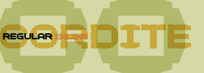
- Corsica by AVP,
$19.00 Corsica is an all-purpose geometric sans-serif typeface of visually uniform stroke thickness. The design seeks to be reminiscent of classic 20th Century grotesques with a crisp modern appearance and opentype features that are now expected. Coverage includes most Roman languages, Greek and basic Cyrillic. Each font contains a standard set of features including fractions, small capitals etc. The family contains six weights, two widths and three lowercase size options, together with an italic variant for each. The are three standard 4-font families for each size variant and a further three corresponding families for Condensed versions. The versatility provided by this extensive family has many useful applications. In particular, the choice of small, medium and large lowercase letter sizes (SX, MX, LX) allows designers to select an appropriate style for suitable impact and legibility in different situations such as headlines, captions, signage, web menus etc. Although each of the three size options will work equally well in most situations, the middle size (Corsica MX) would generally be the preferred choice for lengthy texts.
 - Cordin by Typotheticals,
$8.00Cordin is a rough handdrawn face useful for scrapbooking and other craft-based ideas. There is a free version available. - Corpsy by Mofr24,
$11.00 Introducing Corpsy, the horror display font with a trash style and a unique droplet touch. Its spooky design perfectly captures the essence of Halloween, nightmares, and horror. Ideal for posters, t-shirts, art crafts, unique headlines, logotypes, and many more. What makes Corpsy unique is its distinct droplet effect, adding an extra layer of fear to any design. This font also pairs well with other horror-themed families such as Ghoulish and Gruesome. Corpsy comes in various styles, including regular and bold, and boasts an extensive character set, making it versatile for any project. Its special features include ligatures, stylistic alternates, and swashes. The design concept for Corpsy was to create a font that could embody the essence of all things horror, yet still retain a unique and identifiable style. We wanted to create a font that could stand out amongst the other horror display fonts available. We created Corpsy for designers who wanted to create horror-themed designs that were more than just clichés. This font is perfect for those looking to push the boundaries of horror design and create something new and unique. Corpsy is not a revival or based on any historical design. It was created from scratch, with the goal of becoming a staple font in the horror design world. Try Corpsy today, and take your horror designs to the next level.
 - Carnival by House Industries,
$33.00 Unlike the modest fonts in your menu content with discreetly imparting information, Carnival is conspicuous by design. Deliberately engineered to attract eyeballs, the typeface’s unmistakable silhouette produces a dramatic visual texture that stands out in print, on screen, or in any environment where your message demands to be noticed. The steady yet vibrant rhythm created by its letterforms also makes Carnival ideal for fashioning alphabet patterns and graphic devices. Flaunting a lean slender body anchored by stout stroke endings, Carnival turns conventional typographic thinking on its head by inverting the relative thickness of its stems and serifs. This reverse-contrast approach stretches all the way back to the roots of modern advertising, when similar types became the favorite for posters, packaging, and loads of consumer products during the 1800s. The striking style prevailed well into the next century, as Harold Horman, co-founder of New York City-based Photo-Lettering. Inc., modernized a version for the company’s popular film-typesetting service in the early 1940s. Digitized and expanded by Dan Reynolds in 2013, Carnival had previously been used exclusively for House Industries projects. Now you can get in on the action, and use this stunning slice of type history anytime you want your work to turn heads. SUGGESTED USES Carnival’s unique character commands attention, making it the perfect voice for promotional pieces, editorial design, labels, packaging, posters, and any other application that needs to strike the right tone. Like all good subversives, House Industries hides in plain sight while amplifying the look, feel and style of the world’s most interesting brands, products and people. Based in Delaware, visually influencing the world.
 - Norsics by Maulana Creative,
$12.00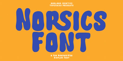 Norsics is a casual modern handwritten display font. With wavy bold stroke, fun character. To give you an extra creative work. Norsics font support multilingual more than 100+ language. This font is good for logo design, Social media, Movie Titles, Books Titles, a short text even a long text letter and good for your secondary text font with sans or serif. Make a stunning work with Norsics font. Cheers, Maulana Creative
 - Corpid by LucasFonts,
$49.00 The name Corpid derives from “Corporate Identity” — which is what this family of low-contrast sans-serifs was made for. Corpid was originally commissioned by Studio Dumbar in the Netherlands as a corporate typeface for the Dutch Ministry of Agriculture, Nature Management and Fishing. The font was designed to replace the existing standard typeface (a well-known business-like sans-serif) to provide the organization with a unique and strong identity. Although it was designed to fit strict technical requirements, Corpid has a personality all of its own. This was in part a result of what Luc(as) calls “creating tension” between the inner and outer curves of each character. “I tend to put a little more diagonal contrast into fonts than is the case in most neutral sans serif fonts. This brings a certain humanistic touch to the typeface. Much more subtle here than in Thesis – but although it is almost invisible, it is still palpable.” Corpid was gradually expanded into a five-weight, three-width family. The new Corpid SemiCondensed has double functionality. It is a no-frills, compact headline font that offers optimum legibility in sizes from small to huge. It is also a great space-saving text typeface for magazines, newsletters or annual reports: economic, versatile, and provided with several different numeral sets. In this OpenType type version, all weights come with Small Caps. With its wealth of numeral styles and complete character sets (including Central European) the Corpid family is now well equipped to tackle the most complex of typographic tasks.
 - Florentine Cursive by Red Rooster Collection,
$45.00R.H. Middleton for Ludlow, circa 1956. Digitally engineered by Steve Jackaman. - Cursive Script by Scrowleyfonts,
$12.00 Cursive Script is a digital handwriting font. It is slightly different from many other handwriting fonts as it is designed to be regular and highly legible. As such it is clearly a digital font, inspired and informed by natural handwriting rather than attempting to emulate it. It contains 697 glyphs, mostly lower case alternates to ensure natural, flowing script. It also has stylistic alternates for many lower case letters, particularly those with ascenders and descenders.
 - Stitch Cursive by Okaycat,
$26.50 Stitch Cursive is a cute cursive font, with the added distinction of looking hand sewn! The applications of this full-out cursive font are many. It is designed to be creative & free flowing, but I also wanted it to be at least somewhat proper. The stitch is the central element to this unique design. Use Stitch Cursive any time you want fancy, legible, and luxurious text. Works great for logo design and beautiful for titles. Go ahead and have fun with it. Stitch Cursive is extended, containing the full West European diacritics & a full set of ligatures, making it suitable for multilingual environments & publications.
 - LOLO Cursive by Okaycat,
$32.50LOLO Cursive is sweet & funky lettering written with distinct character. Create a memorable look with this flowering, freehand script. In this font I envisioned a style with a grassroots flavor, yet a fashionista's edginess. Small, distressed detailing contrasts beautifully with the rolling curves of this feminine hand-style. The strokes are punky yet refined - for widest appeal. LOLO Cursive is extended, containing West European diacritics & ligatures, making it suitable for multilingual environments & publications. Go ahead and have fun with it! - Regina Cursiv by HiH,
$10.00 Regina-Cursiv is a warm, bold, casual typeface. Its friendly, rounded curves remind me of the line from a gospel song by the Canton Spirituals, about "smoothin' up the roughway." Jointly released by the Bauer and Berthold foundries of Germany during the fin-de-siecle period, this typeface has some cultural flexibility. There are alternate versions of the uppercase ‘H’ and ‘I’ that can be chosen to reflect a humanist or blackletter tradition, whichever you prefer. Other alternates offer various stylistic choices. Regina Cursiv is a friendly, comfortable font. You will enjoy using it. Alternative letters: D, E, G, I, K, S, T, d, h, k, m, n and z. The numerals are old-style figures.
 - Milk Cursive by Okaycat,
$29.50 Milk Cursive is the healthy choice. Fortify your designs & fulfill your daily textual needs with these flowing, bubbly letters. Enjoy the refreshingly natural look of an every-man's calligraphy with a fat & wide style. Milk Cursive is extended, containing West European diacritics & ligatures, making it suitable for multilingual environments & publications. It also contains some icons as extra characters, such as a star, a heart, an arrow, flowers, a butterfly, and manicules (pointing hands). Go ahead and have fun with it!
 - Dainty Cursive by Supfonts,
$15.00 Dainty Cursive it is cute handwritten marker font This font is perfect for branding, cricut projects, wedding invitations, logos, vinyl, svg files, stickers, cards, signs and more!
 - Hand Cursive by Okaycat,
$25.50 Hand Cursive design is a cute cursive font, written by hand—careful writing with a steady pen! The applications of this full-out cursive font are many. It is designed to be creative & free-flowing, but I also wanted it to be at least somewhat proper. Use Hand Cursive any time you want fancy, legible, and luxurious text. Works great for logo design and beautiful for titles. Go ahead and have fun with it. Hand Cursive is extended, containing the full West European diacritics & a full set of ligatures, making it suitable for multilingual environments & publications.
 - Ribbon Cursive by Okaycat,
$29.50 Ribbon Cursive was developed largely from Mercator's Italic Hand, which originated from Italy, during the Renaissance. Ribbon Cursive is fancy, legible, and luxurious text. Works great if you are designing a logo, or use it to create some beautiful titling. Use it for advertisement copy, or even for short to medium-length bodies of text. It should be noted that, due to the heavy embellishment of all the capital letters, this font will not work well if your text is set in all capitals! Ribbon Cursive is contains the full West European diacritics and a full set of ligatures, making it suitable for multilingual environments and publications.
 - Scrawl Cursive by Scrowleyfonts,
$45.00 Scrawl Cursive pushes the boundaries of OpenType contextual alternates to present a font which emulates natural, modern, casual handwriting. It includes 2006 glyphs, many of these lower case alternates so that there are minimal compromises when it comes to forming and joining letters naturally. Another unusual feature is that many capital letters also join when preceding lower case letters, which creates a much more realistic flow than is normally achieved. Please view with the contextual alternates option turned on.
 - Lydian Cursive by Bitstream,
$29.99Lydian is Warren Chappell’s almost calligraphic sanserif, designed for ATF in 1938. Lydian Cursive, done by Chappell in 1940, is much freer and more calligraphic. Life is a journey. - Azola Cursive by Okaycat,
$29.95 Azola Cursive is an elegant connected letter cursive script arriving with a family of detailed & artistic styles. Azola Cursive features diagonal hatched texture, outline & solid variations. Azola Cursive is extended, containing West European diacritics & ligatures, making it suitable for multilingual environments & publications. This new font family pairs well with the existing Azola (noncursive) family.
 - Candy Cursive by Okaycat,
$29.50 Candy Cursive is a sweet & lovely connected script. Use this flowing cursive wherever eloquence or delicacy is required. Candy Cursive is extended, containing West European diacritics & ligatures, making it suitable for multilingual environments & publications.
 - LD Cursive by Illustration Ink,
$3.00Your grade school teacher would be proud of this smooth flowing handwriting font. Perfect for any formal invitation, newsletter, scrapbook layout, etc. - Forest Cursive by Okaycat,
$29.95 Okaycat presents "Forest Cursive". Forest Cursive is an beautiful connected letter cursive script arriving with ornate & simplified styles. Forest Cursive features lovely detail & artistic nature. Forest Cursive is extended, containing West European diacritics & ligatures, making it suitable for multilingual environments & publications.
 - Pompeian Cursive by Wordshape,
$30.00 Pompeian Cursive is a calligraphically-inspired display typeface featuring a limited number of alternate characters and a handful of graceful ligatures. A lively set of non-lining numerals accompanies, as well as a few calligraphically-inspired flourishes for ornament. The history of this typeface: Oswald Cooper’s relationship with the Barnhart Brothers & Spindler foundry was one instigated under the auspices of creating new styles of type in lieu of following stylistic trends. In 1927, BB&S requested that Cooper create a script-like cursive typeface design in step with Lucien Bernhard’s Schoenschrift and ATF’s similarly-styled Liberty typeface. In response to BB&S’s desire to emulate instead of innovate, Cooper wrote to Mcarthur, “I am desolated to see Barnhart’s hoist the black flag. Your own efforts through the years to boost the foundry into a place in the sun as an originator seem wasted.” Still, Cooper took up the task at hand, creating a delicate, sophisticated type design which he named Pompeian Cursive. The typeface featured a limited number of alternate characters and a handful of graceful ligatures. A lively set of non-lining numerals accompanied, as well as a few calligraphically-inspired flourishes for ornamenting the end of lines of type accompanied the typeface, as well. By reviewing the few remaining original drawings for the type, as well as copious samples of Pompeian Cursive from both Cooper & BB&S' proofing process and period-specific type specimens, Wordshape presents the first digital version of this classic hybrid script/sans typeface, complete with all original alternate characters and ornaments. Pompeian Cursive has been intensively spaced and kerned for the finest setting for weddings, announcements, and general display work. - What was the inspiration for designing the font? While researching a biographic essay for Japan’s IDEA Magazine, I came across the original proofs and drawings for Pompeian Cursive. While a number of foundries have released interpretations of Cooper’s assorted typefaces, they stray from the original rather dramatically in parts. Cooper is without a doubt my favorite type and lettering designer, and to bring a refined return to his original intentions is an immense gift. - What are its main characteristics and features? Pompeian Cursive is a typeface which functions as both a display face and a limited text face. It features classy, thoughtful, and delicate swash capitals and rugged lowercase characters with a low x-height and gracefully long ascenders and descenders. - Usage recommendations: Display type or text-setting. Perfect for newspaper work, editorial design, materials intended to invoke an "old-timey" flavor, or just about anything in need of personality.


Page 1 of 250Next page