7,436 search results
(0.033 seconds)
- Nawin Arabic by Letterjuice,
$43.00 Nawin is an informal Arabic typeface inspired by handwriting. The idea behind this design is to create a type family attractive and ownable for children but at the same time a design that keeps excellent letter recognition for reading. Handwriting has been a great source of inspiration in this particular typeface. By emulating the movements of the pen, we have obtained letter shapes that express spontaneity. A bright group of letters create a lively and beautiful paragraph of text. To get closer to handwriting and the variety of letter shapes that we draw while writing, this typeface offers a large number of alternative characters, which differ slightly from the default ones. Because we have programed the «Contextual Alternate» feature in the fonts, these alternate characters appear automatically as you set a text on your computer. The proportions and letter shapes are flexible, escaping from tradition to increase expressivity and personality in the design. For instance, variability on vertical proportions between letters Alef and initial Lam, create movement in text and avoid the cold mechanical feel of repetition. Nawin is quirky and elegant at the same time. Letter recognition is relevant when reading continuous text. For this reason, we have added another contextual alternate feature with alternate characters that help to avoid confusion when letters with similar or the same shape repeat inside one word. For instance, this is the case of medial «beh and Yeh» repeated three times continuously in the same word. The alternate characters change in shape and length, facilitating distinction to the reader. Since this typeface is inspired by handwriting and the free movement of the hand while writing, we considered ligatures a good asset for this design. The typeface has a wide range of ligatures that enhance movement and fluidity in text making look text alive.
 - Spaghetti Joint JNL by Jeff Levine,
$29.00 An image from the Library of Congress showing a New York City Italian Kitchen storefront window and its various neon signs inspired Spaghetti Joint JNL, which is available in both regular and oblique versions. The term “Spaghetti Joint” is old-fashioned slang for any restaurant serving Italian cuisine, especially those featuring spaghetti or other pasta dishes.
 - Trochera by Sardiez,
$20.00 The agressive moves, the lateral spurs and the heavy leaf endings of Trochera resemble the silvan plants behavior giving it a very expressive and festive personality. Its features make Trochera very useful for flamboyant and colorful purposes, but it is also attractive in black and white, the saturation of the ornaments will give an appealing texture to headings.
 - Klorofeel by Invasi Studio,
$19.00 Featuring a classy elegant handwritten display typeface, Klorofeel font is inspired by Plants and Poems. This font was created to help you tell your story. This font comes with so many ligatures, that you can use that for more fun on your projects. Klorofeel font is perfect for quotes, headlines, branding projects, or any project requiring an elegant feel.
 - Cover Art JNL by Jeff Levine,
$29.00 Cover Art JNL was inspired by the hand-lettered sans serif title of an Art Deco era Portuguese magazine called Ilustraçáo. The mix of conventional and non-conventional letter forms made it a perfect candidate to turn into a digital font.
 - AZ Grampa by Artist of Design,
$25.00 AZ Grampa font was inspired from old content type on vintage tins. This font utilizes an "old look" to the line work which is designed to have a "worn feel" to it. Ideal for use as content text in you design.
 - TT Trailers by TypeType,
$39.00 Meet the new TT Trailers! The first version of TT Trailers was conceived as a font suitable for the film industry. The font harmoniously looks in posters, it is ideally suited for setting titles. However, the font has gained wide popularity among designers, and now you can find TT Trailers on the covers of magazines, on restaurant signs and on the main pages of websites. TT Trailers useful links: Specimen | Graphic presentation | Customization options Since 2019 when we released the first version, the TypeType studio team has released dozens of fonts, constantly improving our skills. In 2022, we decided to look at TT Trailers again, improving and expanding the font. In the new TT Trailers, we expanded the character set, corrected the contours, and improved the technical content. We have added extended Latin and Cyrillic characters, new symbols, and additional sets of numbers. The number of glyphs in one style has increased from 1081 to 1242. The inclined styles were long-awaited. The italics in TT Trailers are as eccentric as the upright fonts. The 15-degree tilt looks absolutely harmonious, complementing the character of the font family. We added italics to the variable font, so the new font changes along two axes at once, weight and slant. From the technical point of view, TT Trailers has become more modern and correct, and the number of OpenType features has increased from 29 to 42. We have added new alternative versions of glyphs and created a large number of localized features. The font retained all the qualities thanks to which designers fell in love with it, but became even more convenient. TT Trailers in the new version is suitable for titles and posters, for websites and printed materials. The font will embellish in restaurant and cafe signs and look beautiful in posters. There are 19 styles in TT Trailers: 9 upright, 9 italic and 1 variable font.
 - Figaro by Monotype,
$29.99Figaro is a very condensed slab serif design of the kind associated with nineteenth century advertising. The Figaro font has considerable weight contrast in the strokes, with a marked weight emphasis on the horizontal elements, including the serifs. Use the Figaro font for display and advertising and for 'Wild West' style posters. - Subtitle by Type.write.type,
$8.00 Subtitle is a handdrawn slab serif that contains condensed and wide width capital letters in one font. With slightly wobbly lines, Subtitle is designed to be legible at a variety of sizes to give that quirky, fun feel to any informal occasion or brand. Central, Eastern and Western European language support included.
 - Varial Two by Paavola Type Studio,
$21.00 Varial Two typefaces are new and updated versions of Varial family created 2014: Extra-condensed Opentype™ sans-serifs with small caps, extended character set (european languages support) and extra features (fractions, ligatures and alternatives). Varial Two is versatile in all design applications, for example all headlines, display use, infographics and more!
 - Stage Production JNL by Jeff Levine,
$29.00 A 1935 piece of sheet music entitled “(There’s A) Little Picture Playhouse in My Heart” had its movie-themed title hand lettered in a condensed Art Deco style with a few interesting character variations. The resulting digital type design is Stage Production JNL, which is available in both regular and oblique versions.
 - Soft Rock by Studio K,
$45.00 Soft Rock is a bold condensed sans serif with rounded contours that contrives to be gentle and dynamic at the same time: rather like the soft rock bands (Chicago, Air Supply, Fleetwood Mac etc) after which it is named. It's a warm, friendly font ideal for branding everything from soup to soft furnishings.
 - Lichtspielhaus by Typocalypse,
$19.00 Lichtspielhaus is an ultra condensed Lichtspiele spin-Off with 8 weights. It still transports you back to a time where neon lights and marquee letters decorated cinema facades. There are 8 styles: Hairline, Thin, Light, Regular, Medium, Bold, Black and Heavy. "Lichtspielhaus" is the first part of a new Type Noir Quadrilogy.
 - Fictionalism by Haiku Monkey,
$10.00 Fictionalism is carefully handcrafted slab serif, slightly condensed to fit lots of beautiful text wherever you need. It's handwritten, but neat as a pin; it's tidy, but has a lively character that grabs attention in a friendly way. Use it for branding, posters, text, or a million and one other design applications.
 - Office Space JNL by Jeff Levine,
$29.00 Office Space JNL is based on “Condensed Edina” from the 1921 Miller & Richard type specimen book and is available in both regular and oblique versions. This spurred serif Art Nouveau monoline font is a milestone – marking the 1900th font design released by Jeff Levine Fonts since its inception in January of 2006.
 - Highpoint Gothic NF by Nick's Fonts,
$10.00Morris Fuller Benton's 1935 offering from ATF, entitled Raleigh Gothic Condensed, inspired this ultracompact masterpiece. Benton's alternate characters are included in several lowercase positions, to add a little Art Deco sparkle to this versatile workhorse. Both versions of this font include the complete Latin 1252, Central European 1250 and Turkish 1254 character sets. - Airbuzz by Spinefonts,
$14.00 Airbuzz is a typeface created by Spinefonts in Warsaw, Poland. The idea was to create something between grotesk and 'lcd' typefaces; something which is strong and condensed. Airbuzz looks best in large sizes (30+ pts). You may find it useful for posters, titling, infographics, signage and corporate identity. Airbuzz features only uppercase characters.
 - Harpsichord by Jonahfonts,
$35.00 Harpsichord (as I have named it) is from the late 1940s and was designed at Lucian Bernhard Studios in New York for Bernhard's Magnetype Collection. It was originally published as 'Community Low' along with 'Community Condensed'. Many of his Magnetype Fonts have been dormant which I hope to revive in the near future.
 - Encorpada Classic Compressed by dooType,
$20.00 Encorpada Classic, designed by Eduilson Coan, brings the best features of the Didone genre, but with a 21st century look and feel. With smooth details Encorpada Classic is an elegant choice for your type library. The family has three widths – compressed, condensed & normal, support for more than 40 languages and opentype features.
 - Prosa GT by Gartype Studio,
$20.00 Introducing Prosa GT is a condensed sans serif which has styles from thin to black to make your design more variative and unique. Good for bold branding, titling and headline who has come to be seriously and fun. This typeface can be so serious, fun, and bold it depends on for what purpose.
 - Rambla by TipoType,
$31.90 Rambla is a humanist sans for medium-long texts. It’s slightly condensed, with a generous x-height and short ascender/descenders. Its proportions have as objective to gain space in height and width. It’s elegant at large sizes and legible at the same time, with a lot of rhythm in small sizes.
 - Newspaper Publisher JNL by Jeff Levine,
$29.00 The Logansport, Indiana Pharos-Observer dated June 12, 1917 had the following headline running across its front page: “American Steamer Sunk by German U Boat”. The condensed slab serif typeface used to set that headline has been recreated digitally as Newspaper Publisher JNL, and is available in both regular and oblique versions.
 - PAG Bravos by Prop-a-ganda,
$19.99Prop-a-ganda offers retro-flavored fonts inspired by lettering on retro propaganda posters, retro advertising posters, retro packages all the world over. This is perfect font for your retrospective project. PAG Bravos is a condensed geometric font with a retro touch. It is a great performer in posters, logo and covers. - Livery Stable by FontMesa,
$25.00Livery Stable is a revival of an old classic font from the 1800s. Much research was done to recreate the original versions of Livery Stable which include regular, black, condensed and shadow lined versions of this font. Also look for the Horse Head symbol placed on the Less-Than and Greater-Than keys. - SLICKY BOHEM by Jolicia Type,
$25.00 SLICKY BOHEM is a bold condensed typeface that is strong geometric. with a variety of discretionary ligatures to give you all you need for great typography. make your creative work stand out with lots of unique ligatures. highly recommended and those who are planning a poster design, logo, headline, t-shirt, etc.
 - Counter Service JNL by Jeff Levine,
$29.00 The hand lettered name “Chickland” from a 1958 restaurant menu cover was actually a throwback to the Art Deco style with its condensed thick and thin sans serif design. With just a few available letters to work with, it has been turned into Counter Service JNL; available in both regular and oblique versions.
 - Turista Flaca NF by Nick's Fonts,
$10.00This Art Deco-inspired face is based on the Baltimore Type Foundry’s Tourist Extra Condensed. Graceful and elegant, this typeface’s compact design also packs a lot of information into very little space. This font contains the complete Latin language character set (Unicode 1252) plus support for Central European (Unicode 1250) languages as well. - Calling Cards by Ana's Fonts,
$12.00 Calling Cards is simple and clear, slightly condensed sans serif font family in 3 styles: Regular, Italic and Bold. Each font includes ligatures and stylistic alternates. Calling Cards looks great in quotes, logos, print, and social media, and is perfect for both short and long texts, at small and large font sizes.
 - Lonsome Town by Balpirick,
$15.00 Lonesome Town is a Condensed Handwritten Font. This font is very suitable for writing quotes and notes. Apart from that, it can be used for logos, book covers, magazines, t-shirts, and others. This font only has uppercase letters - also multilingual support Enjoy the font! Feel free to comment or feedback! Thank you!
 - Rigide by Gerald Gallo,
$20.00 Rigide is a clean, contemporary, geometric, condensed font family. There are 6 fonts in the Rigide family, Rigide Light, Rigide Light Oblique, Rigide Medium, Rigide Medium Oblique, Rigide Bold and Rigid Bold Oblique. The Rigide fonts are ideal for headlines, titles, branding, small blocks of text or wherever a fresh font is desirable.
 - Koloss CT by CastleType,
$39.00 A well-designed bold art deco font. Very chunky. Uppercase, lowercase, numerals and punctuation. CastleType additions to the Koloss family include Koloss Bold Condensed and Koloss Bold Wave. The latter was used beautifully in the wonderful children's book The Leaf Men (and the Brave Good Bugs) written and illustrated by William Joyce.
 - Concordia by RMU,
$30.00 In 1915 the Leipzig based foundry Heinrich Hoffmeister released the bold condensed version of its Sensation font family which is the most outstanding. The letters f, l and the long s have stylistic alternatives. To get access to all ligatures it is recommended to activate both OT features Standard and Discretionary Ligatures.
 - Compressed Wood JNL by Jeff Levine,
$29.00 Two word examples (“nice” and “bud”) from the J.G. Cooley & Co.’s Specimens of Wood Type catalog for the typeface ‘Roman Triple Extra Condensed Fifty Line’ offered only seven letters to work with. Despite this lack of characters, it inspired Compressed Wood JNL, which is available in both regular and oblique versions.
 - LC Body is a contemporary typeface, meticulously designed to meet the needs of extensive text settings while maintaining an elegant and approachable character. Its design philosophy embodies a balanc...
- GEOspeed - Personal use only

- Wayville by Keristyper Studio,
$14.00 Wayville is a casual script font, with clean high contrast stroke, slanted and fun character. This font is good for logo design, Social media, Movie Titles, Books Titles, short text even a long text letter, and good for your secondary text font with sans or serif. Featured: Standard Uppercase &Lowercase Numeral & Punctuation Multilingual : ä ö ü Ä Ö Ü ß ¿ ¡ Alternate &Ligature PUA encoded We recommend programs that support the OpenType feature and the Glyphs panel such as Adobe applications or Corel Draw. so you can use all the variations of the glyphs. Hope you enjoy our fonts!
 - Rever by ParaType,
$30.00 Rever is an experimental typeface by a young designer Sasha Smirnov. It clearly alludes to 19th century typefaces with reverse contrast, but still the character shapes are as simple and geometric as possible. Rever answers the question “What can a reverse-contrast typeface look like today?” Its set of styles is non-traditional: in addition to a regular one, there are also an oblique (slanted to the left, not to the right!) and a stencil styles. The typeface can work for typographic experiments of any kind -- web, print or motion design. The font was released by Paratype in 2019.
 - Silvano Western by Letterhend,
$17.00 Silvano Western is a display typeface suitable for design needs with a touch of classic western, especially in logo, and the other various formal forms such as invitations, labels, logos, magazines, books, greeting / wedding cards, packaging, fashion, make up, stationery, novels, labels or any type of advertising purpose. Features : regular and slant version numbers and punctuation multilingual PUA encoded We highly recommend using a program that supports OpenType features and Glyphs panels like many of Adobe apps and Corel Draw, so you can see and access all Glyph variations. Email us to letterhend@gmail.com if you need something! Happy Designing!
 - Banco by Linotype,
$40.99 Designed for Linotype Library GMBH and the International Typeface Corporation in 1997 by Phil Grimshaw. Based on bold script Banco designed by French graphic and poster designer Roger Excoffon and released in 1952 by the Fonderie Olive. Originally Banco was an all-caps bold typeface, and the lower case and the corresponding light weight were created for ITC. The tapering slightly slanted strokes of Banco made by sharp-edged flat brush. The face has the effect of being quickly sketched by a powerful hand. For use in advertising and display typography. Cyrillic version developed for ParaType in 2000 by Tagir Safayev.
 - Love The Journey by Letterhend,
$14.00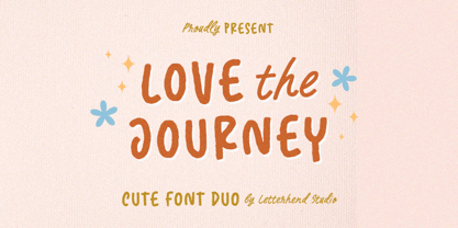 Love The Journey is a cute handwritten font. It comes with 2 looks, regular and slant version. This font perfectly made to be applied especially in logo, and the other various formal forms such as invitations, labels, logos, magazines, books, greeting / wedding cards, packaging, fashion, make up, stationery, novels, labels or any type of advertising purpose. Features : Uppercase & lowercase Numbers and punctuation Alternates & Ligatures Multilingual PUA encoded We highly recommend using a program that supports OpenType features and Glyphs panels like many of Adobe apps and Corel Draw, so you can see and access all Glyph variations.
