7,431 search results
(0.031 seconds)
- Intellecta Crafts by Intellecta Design,
$9.00an Arts and Crafts Movement lettering style font - Narrow Way by Ingrimayne Type,
$9.00 NarrowWay is a family of 18 condensed and ultra-condensed sans-serif typefaces. The family started with the ultra-condensed widths, then the condensed and regular widths (the regular is still quite condensed) were added. All widths have three weights and each weight has an italics style. These 18 styles lack a true lowercase but rather have a set of alternative characters, some based on lower-case forms, on the lower-case keys. Some alternative letters can be reached with the OpenType feature of stylistic sets. The character spacing in most of the styles is quite loose and it can be tightened with an application's character spacing if needed. These typefaces are display faces that can be useful for squeezing tall lettering into tight spaces. They are not readable at small point sizes.
 - Meuga by Ferry Ardana Putra,
$19.00 Introducing our sleek and modern condensed sans-serif font - Meuga. Meuga is condensed sans-serif font offers a minimalist design with its narrow width and clean lines, perfect for any branding or design project. This condensed sans-serif font is perfect for anyone looking for a clean and modern look, with its narrow width and elegant lines. Add a contemporary touch to your designs with our condensed sans-serif font, perfect for headlines and titles in digital and print design. This font is perfect for Headlines and titles, digital advertisements, brochures and flyers, infographics and data visualizations, navigation menus and labels, web designs, logotypes, t-shirts, and many more. Meuga features: A full set of uppercase Numbers and punctuation Multilingual language support PUA Encoded Characters OpenType Features Condensed Style +235 Total Glyphs
 - Nova Caere by Eurotypo,
$39.00 Nova Caere is a typical urban calligraphy, gestural with its fast lines, with short and slightly noticeable ascender and descender traits. Condensed lower case and rounded capital letters are quite similar in height. Nova Caere has been studied for alternating upper and lower case inside the words of the text, so as to reinforce their expressive content. Stylistic variations that combine particular couples of letters have been developed, as well as some descender traits have been highlighted that can be employed to characterize words and phrases.
 - Novita by Autographis,
$39.50 Novita is a new something. This font is a new very elegant – extremely slanted – joining script with long ascenders and descenders. It is the fiancée of Novido which is the more elaborate male part of this font pair.
 - Rit Graph by Stawix,
$25.00 Rit Graph has been revived from old style font template often used by architects or engineers. The design of Rit Graph is casual yet sophisticate with a slanted proportion and little details of rough edges from writing tools.
 - HU Mois KR by Heummdesign,
$25.00 HU Mois KR is a calligraphy typeface with a sense of speed and a naturally slanted feel as if writing. It also gave a sense of free rhythm of handwriting. Includes Korean from the existing 'HU Mois' font.
 - Echountter by Maulana Creative,
$14.00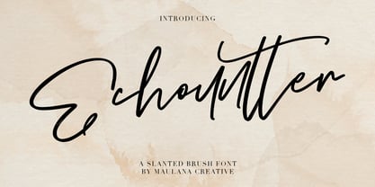 Give your designs an authentic handcrafted feel. "Echountter Slanted Brush Font" is perfectly suited to signature, stationery, logo, typography quotes, magazine or book cover, website header, clothing, branding, packaging design and more. Thanks for use this font ~ Maulana
 - Junker by Gassstype,
$27.00 Introducing our latest display typeface called Junker - Normal And Italic Paint Brush Font with a natural style and dramatic movement can make your logotype become more interesting. Best Vintage font and multilingual support. inspired by the decorative arts and architecture movement
 - Cribin by wearecolt,
$18.00 Introducing Cribin: Playful condensed serif inspired by 90s grunge & vintage aesthetics. Its condensed form, strong serifs & high contrast add attitude to logos, headlines, & more. Perfect for web, print, and branding. Embrace nostalgia, and elevate your design. Unleash Cribin's creativity!
 - Lyu Lin by Stefan Stoychev,
$25.88 LyuLin is a modern sans-serif font and contains 24 styles. Available in 6 weights and its italics and condensed forms. LyuLin Heavy Italic weight and LyuLin Light Condensed are free, so you can use them for your projects.
 - November Notes by Ratzlaff Type,
$10.00 A condensed handwritten for your notes and poems.
 - Roemisch by Linotype,
$29.99The Roemisch type family is a historic hot metal face with left slanted weights that is used for the german cartographic map production. There are also special typefaces required like the Venus type family and Topografische Zahlentafel type family." - Delgos by Typebae,
$10.00 Delgos is a display font family. It is very suitable for logos, headlines, posters and various other designs that require an assertive touch. What's Included? 20 Font, 9 Weight Slanted & Outline All Caps, Numbers & Punctuation Multilingual Support PUA Encoded
 - Vectis by Greater Albion Typefounders,
$14.95 Vectis, named in honor of the Roman settlement of Britain's south coast on the Isle of Wight, brings a fresh approach to the classic simple elegance of ancient Roman faces. Vectis is offered as a small caps face designed to add a fresh hint of character to this style of classical design. Vectis can lend a note of formal dignity to any design project or poster and is ideal for clear headings and titles with a traditional feel. Two basic weights are offered, regular and bold, as well as a range of alternate letterforms and ligatures. This popular family has now been expanded with the incised 'Monumental' display face, and well as 'miniscule' lower case forms and condensed widths. Vectis and our Anavio families compliment each other perfectly, and can also be purchased together in a value pack.
 - Katz Pajamas JNL by Jeff Levine,
$29.00 According to Wiktionary, "the cat's pajamas" was a slang phrase coined by Thomas A. Dorgan, the well-known journalist, cartoonist and sportswriter of that era. The phrase became popular in the U.S. in the 1920s, as the word "cat" was used as a term to describe the unconventional flappers from the jazz era. This was combined with the word pyjamas (a relatively new women's fashion during that time) to form a phrase used to describe something that is the best at what it does, thus making it highly sought and desirable. Wikipedia adds that Dorgan was the first to use the terms "twenty-three, skidoo", and "yes, we have no bananas", "apple sauce" and "solid ivory", which also became part of the slang of the "Roaring Twenties". Katz Pajamas JNL is a condensed slab serif typeface based on the title lettering for the 1944 sheet music "Pretty Kitty Blue Eyes", hence the pun-laden font name paying homage to this bit of verbal Americana as well as making the pajamas a pair owned by Mr. Katz instead of the fashionable feline. Available in both regular and oblique versions.
 - Ondine by Linotype,
$29.99 Ondine is one of the early typefaces of Adrian Frutiger. It looks as though it were written with a broad tipped pen, however, Frutiger actually cut the forms out of a piece of paper with scissors. The forms of Ondine are reminiscent of the humanist period, the high point of the Italian Renaissance text typefaces of the 15th century. This movement was centered in Florence, the base of the Humanist movement overall, and the home of a famous type school of the time. The main goal of the educated writers was to faithfully recreate the writing of the admired literary works, whose aesthetic was as important as their content. Ondine displays a regular and open character. Texts set in this typeface give the impression of being hundreds of years old. Ondine should be used in point sizes of 12 and larger and is best for short texts and headlines.
 - Gliker by Studio Sun,
$8.00 Gliker was designer in the early 2019 and published in June 2020. Gliker is inspired by the characteristics of Hobo Typefaces. All corners of this typeface is founded, giving a more dynamic and vintage feel. Gliker is available in 4 Weights (Regular, Semi Bold, Bold, Black) and 7 Widths (Extra Condensed, Condensed, Semi Condensed, Normal, Semi Expanded, Expanded, Extra Expanded) with a total 28 Styles. Also includes support for 75+ Latin (Extended) Languages.
 - Contane Text Cnd by Hoftype,
$49.00 Contane Text Condensed is the text optimized version of Contane Condensed. More solid, more robust, it embodies the power addition to the more delicate members of the Contane Condensed family. Stronger hairlines and stronger serifs also make it appropriate for smaller text size applications. Contane Text Condensed supports up to 80 languages and it’s OpenType format allows a wide range of typographic applications. 20 styles offer fine graduation of the weights. All weights contain small caps, ligatures, superior characters, proportional lining figures, tabular lining figures, proportional old style figures, lining old style figures, matching currency symbols, fraction- and scientific numerals, matching arrows and alternate characters.
 - Koo Koo Puff by astroluxtype,
$20.00 Does the world really need one more vernacular pop culture typeface? We here, at astroluxtype shout a resounding yes! Sure, at myfonts.com, you can find the apex of fine font design that will have your mind and eyes burst with joy at the level of sophistication and craftsmanship they exhibit- Koo Koo Puff Light Condensed and Regular Condensed are not one of those fonts. But if kooky goofy is your thing, we're selling it at the astroluxtype booth. Koo Koo Puff Regular Condensed is the companion font to Koo Koo Puff Light Condensed. Both fonts includes an upper and lowercase glyph set. Regular Condensed has a different upper and lowercase “O” from the original Koo Koo Puff Light Condensed. Spacing metrics are looser, as well. The font is not a match for Light Condensed, it is a separate font. Both are headline display faces, for optimum usage it is recommended to be set at 48 points or larger in size. Look to astroluxtype’s Sugarbang ! as the first in a series of fonts inspired by vintage product packaging, Koo Koo Puff is the second release in the Cerealboxx series. The third font is in the fridge getting cool now, watch for it in the future. Rave on you design genius.
 - Liquida by Resistenza,
$49.00 Liquida is a decorative script font with slanted inclination. All characters were designed with brush and walnut ink on paper using real ink drops to generate a trickling effect. A display typeface perfect to set a refreshing liquified lettering in seconds!
 - Rafigen by Surotype,
$20.00 Rafigen is a thick and playful typeface . It comes in two different styles, plain and slant. Really great font to make it easier for you creative work such as — branding, film titles, packaging, advertising, posters, and web or app. Enjoy:)
 - Quick Rest by wearecolt,
$19.00 Quickrest is a tall & quirky type with slight irregularities, Quickrest does not do conformity - each character is entirely individual. A fun looking family with its heart set in the handmade / crafty scene. The Quickrest family features five weights and slanted versions.
 - Almost Broken by Rillatype,
$17.00 Almost Broken is a modern display font with bold and strong personality but charmful. this font comes with two version, regular and slanted. Almost Broken is perfect for headlines, logotypes, magazine, advertising, etc. this font also comes with multilingual support.
 - Wasabi by Positype,
$20.00 Remastered in 2019. Wasabi is the re-imagining of my very first release, Iru. Like Iru, Wasabi was heavily influenced by the monument lettering style, Vermarco. The simple, geometric forms allowed for small lettering sizes to be sandblasted cleanly and has been a monument lettering workhorse for decades… the only issue centered around the lack of a lowercase or any other letters beyond the 26 uppercase glyphs and the numerals. Wasabi solves this with the same simple, efficient line reminiscent of the old Vermarco while bringing it into the 21st century. Visual and optical incongruities of the original uppercase were replaced with new interpretations for the capital letters, a new lowercase and small caps were produced and the original single weight alphabet was replaced with six new weights. Wasabi has several ‘lighter’ weights primarily because the thin lines and simple transitions produce very elegant relationships… and I wanted to make sure those relationships could be explored regardless of the scale of letter. Stylistic Alternates show up through the upper, lowercase and small cap glyphs that attempt to simplify these shapes even more when the opportunity arises. Wasabi is as much a utilitarian typeface as it is a headline face. This realization led to the decision to produce a companion Condensed version shortly after the initial regular weights were developed and tested; so, try them all!
 - Pocky Block by Arterfak Project,
$16.00 Introducing Pocky Block, a font that's bold and blocky with elegant and modern design. This font exudes a sporty, assertive, and daring vibe, making it a perfect fit for designs with sports, adventure, or futuristic themes. It's great for stickers, movie posters, flyers, displays, logos, motion graphics, advertising, and more. Pocky Block comes in two styles: Regular and Slanted. The Slanted style highlights a spirit of enthusiasm, speed, and confidence. This thick font also boasts over 100+ ligatures, allowing you to create dynamic and sophisticated letter combinations. What you'll get : All capital characters Numbers, punctuation & symbols Stylistic alternates Stylistic set 100+ Ligatures Multilingual support Help file. Thank you for your appreciation!
 - Juniper and Sage by Nicky Laatz,
$23.00 Let Juniper and Sage Script whisk you away for a romantic rendezvous with your love of handwritten scripts. A little bit chic, a little bit classy, Juniper and Sage is a must-have for any handwritten font collection. It includes 55 natural looking Opentype Ligatures - to make the font look more natural as you type. Juniper and Sage has 3 subtle variants - each adds a different feel due to their different slants. Upright being slightly more upbeat and casual and slanted being more elegant. Perfect for: elegant branding, wedding stationery, romantic book cover designs, classy packaging, album covers, handwritten quotes, greeting cards, unique social media posts, and so much more.
 - Competition by sportsfonts,
$15.00 Competition is a state of the art sports typeface. A large width range, slant angles from –12 to 12, and an adjustable inline make it extremely versatile. It’s devided into 5 subfamilies, from the sizes S, M, L & XL with decreasing inline weights to Solid without an inline at all. (By the way: S doesn’t mean it doesn’t look good in large sizes!) Choose from 105 predefined styles, or 1 variable font with axes for width, slant and inline weight (which is included in the family package). Competition embraces the Latin S character set and therefore supports 400+ Latin-based languages. Go for Gold!
 - Julie Molly by Letterhend,
$11.00 Julie Molly is a typeface with fun and playful looks. Available in 4 styles - regular, slanted, semi bold & semi bold slanted. This type of font perfectly made to be applied especially in storybook children or child theme which is need a standout font, and the other various formal forms such as invitations, labels, logos, magazines, books, greeting / wedding cards, packaging, fashion, make up, stationery, novels, labels or any type of advertising purpose. Features : numbers and punctuation multilingual ligatures PUA encoded We highly recommend using a program that supports OpenType features and Glyphs panels like many of Adobe apps and Corel Draw, so you can see and access all Glyph variations.
 - Alburgone by Letterhend,
$15.00 Alburgone is a hand lettering typeface with nostalgic look and feel! This font perfectly made to be applied especially in logo, and the other various formal forms such as invitations, labels, magazines, books, greeting / wedding cards, packaging, fashion, make up, stationery, novels, labels or any type of advertising purpose. Features: 4 styles (Regular, Slanted, Outline Regular, Outline Slanted) numbers and punctuation multi-lingual support PUA encoded We highly recommend using a program that supports OpenType features and Glyphs panels like many of Adobe apps and Corel Draw, so you can see and access all Glyph variations. Email us to letterhend@gmail.com if you need something! Happy Designing!
 - Ravenstonedale by Hanoded,
$15.00 Ravenstonedale is a village in Cumbria, England. There’s not much to see in this quaint village, but the landscape surrounding it is beautiful. This font was sort of based on a number of handwritten letters by English author D.H. Lawrence. It is not a true reflection of the man’s handwriting, though, as I had to design a lot of missing glyphs myself; it was merely an inspiration. Ravenstonedale comes in a slightly slanted ‘regular’ version and a more slanted ‘Italic’ version. In order to stay true to the handwritten nature of this script, I have added a lot of ligatures, plus all the diacritics you could hope for.
 - Entendre Rough by Wordshape,
$30.00 Entendre Rough defies the conventions of most distressed typefaces, as it is an actual text typeface family. Sure, you can use it for your big display type, but you can also use it for body text. Entendre Rough is a stately, commanding and handsome distressed sans serif typeface family that pulls reference from Trajan capitals, the history of English calligraphy, and a variety of other sources to summon a sense of warmth, consideration, trust and authority. Entendre Rough spans 22 weights and styles including Regular and Condensed versions. The large x-height and refined characteristics of the family lend the family a sober and sophisticated appearance that is suitable for both print design and on-screen use. Entendre Rough includes Central and Eastern European language support as well as Western European language support, including Greek and Cyrillic. Entendre Rough’s generous x-height and medium-length ascenders and descenders offer pronounced readability, making the family useful for text typesetting both in print and on screen. Within, humanist elements are tempered with monumental construction, making the heavier weights go-tos for display design work. All of the Entendre Rough family of typefaces feature Western, Eastern and Central European language support alongside nuanced Greek and Cyrillic. Entendre Rough pairs well with our non-distressed Entendre family and our rounded sans serif family Elpy, sharing similar proportions and spacing.
 - Six Feet Over by Brad Mead,
$10.00 Six Feet Over is tall, cool and near impossible to read - what's not to love? This super condensed and trippy typeface was designed to be elusive and is perfect for those that love condensed, compressed - or any other word for squished - fonts.
 - Neon by Monotype,
$29.99Neon Extra Condensed was designed by Giulio da Milano and released in 1935. This all-capital typeface is similar to designs released in the early 1990s. The Neon Extra Condensed font is good as a headline face for magazines and book covers. - Herokid by W Type Foundry,
$29.00 Herokid is a grotesque style font, inspired by classic fonts like Helvetica, Impact and Univers, with a dynamic, versatile and flexible personality. It ranges from Thin to Heavy, and from UltraCompressed to UltraExpanded. It’s a huge family, with 96 variants adaptable to kinds of design projects providing flexibility for their creation. Consider Herokid your new workhorse, you will be able to generate high-impact headlines, subtitles and/or text; all with the same font family. The mixture of wide and condensed sets allows for versatile combinations and can give great movement to a design, while the regular weights can be used for text bodies. The heavier weights also stand out, with its very full shapes with small counterforms, ideal for big headlines.
 - Crewekerne by Greater Albion Typefounders,
$13.95 Crewekerne is a typeface family which speaks of the villages that are at the heart of English life. It is inspired by the arts and crafts movement of the early twentieth century, and is complimented by two other families, Crewekerne Magna and Crewekerne Magister. Three widths - condensed, regular and expanded and three weights - regular bold and heavy are offered. Crewekerne is especially good when combined with its two complimentary families and when used in poster and design work that needs a rustic hand crafted flair but still needs to be easily legible. Crewekene is a fun family and a serious set of faces all in one. Crewekerne, Crewekerne Magna and Crewekerne Magister can also be purchased together in the Crewekerne Value Pack.
 - ITC Portago by ITC,
$29.99 ITC Portago was designed by Luis Siquot, who admits to a tendency toward unusual typefaces that can be read in text yet also work well in display settings. ITC Portago is a robust alphabet of caps and slightly smaller caps. It is a stencil face, based on the lettering on crates and luggage. Siquot says that his intention drawing Portago was to obtain a neutral, classical, very condensed grotesque stencil shape that is readable in text sizes, showing at the same time the 'movement' produced by the nicked edges. And of course the more obvious rough effect in headline sizes." At small sizes, Portago is best set with slightly looser letterspacing, as capital combinations usually do. Portago includes numerals in both full and small caps proportions.
 - Crewekerne Magister by Greater Albion Typefounders,
$13.95 Crewekerne is a typeface family which speaks of the villages that are at the heart of English life. It is inspired by the arts and crafts movement of the early twentieth century, and is complimented by two other families, Crewekerne Magna and Crewekerne Magister. Three widths - condensed, regular and expanded and three weights - regular bold and heavy are offered. Crewekerne is especially good when combined with its two complimentary families and when used in poster and design work that needs a rustic hand crafted flair but still needs to be easily legible. Crewekene is a fun family and a serious set of faces all in one. Crewekerne, Crewekerne Magna and Crewekerne Magister can also be purchased together in the Crewekerne Value Pack.
 - Crewekerne Magna by Greater Albion Typefounders,
$13.95 Crewekerne is a typeface family which speaks of the villages that are at the heart of English life. It is inspired by the arts and crafts movement of the early twentieth century, and is complimented by two other families, Crewekerne Magna and Crewekerne Magister. Three widths - condensed, regular and expanded and three weights - regular bold and heavy are offered. Crewekerne is especially good when combined with its two complimentary families and when used in poster and design work that needs a rustic hand crafted flair but still needs to be easily legible. Crewekene is a fun family and a serious set of faces all in one. Crewekerne, Crewekerne Magna and Crewekerne Magister can also be purchased together in the Crewekerne Value Pack.
 - Hercílio by Sea Types,
$25.00 Hercílio is a typographic family without condensed serif, modern and geometric inspired by the architectural forms of the Hercílio Luz Bridge in Florianopolis | Brazi Comprising eleven (11), weights of which ten (10) business are: Five weights Romans: Light, Normal, Regular, Medium and Bold Five Italics weights: Light, Normal, Regular, Medium and Bold And a weight (FREE) Hercílio Decorative Comprising 430 glyphs in each source, brings support for 56 languages (Latin and West, Central and East European) still has features Open Type, ligatures and tabular figures. http://www.cort9.com/wp-content/uploads/2016/05/Specimen_Hercilio.pdf