10,000 search results
(0.055 seconds)
- Ongunkan South Picene by Runic World Tamgacı,
$50.00 South Picene (also known as Paleo-Sabellic, Mid-Adriatic or Eastern Italic) is an extinct Italic language belonging to the Sabellic subfamily. It is apparently unrelated to the North Picene language, which is not understood and therefore unclassified. South Picene texts were at first relatively inscrutable even though some words were clearly Indo-European. The discovery in 1983 that two of the apparently redundant punctuation marks were in reality simplified letters led to an incremental improvement in their understanding and a first translation in 1985. Difficulties remain. It may represent a third branch of Sabellic, along with Oscan and Umbrian (and their dialects), or the whole Sabellic linguistic area may be best regarded as a linguistic continuum. The paucity of evidence from most of the 'minor dialects' contributes to these difficulties. The corpus of South Picene inscriptions consists of 23 inscriptions on stone or bronze dating from as early as the 6th century BC to as late as the 4th century BC. The dating is estimated according to the features of the letters and in some cases the archaeological context. As the known history of the Picentes does not begin until their subjugation by Rome in the 3rd century, the inscriptions open an earlier window onto their culture as far back as the late Roman Kingdom. Most are stelai or cippi of sandstone or limestone in whole or fragmentary condition sculpted for funerary contexts, but some are monumental statues.
 - Mymra by TipografiaRamis,
$35.00 Mymra fonts – an upgraded version of Mymra Forte and Mymra Mono (2009), with a careful re-dress of glyph shapes, and the extension of glyph amounts – which enables support of more Latin languages. One more weight – Black – has been added to the original three of Mymra Forte fonts. Fonts are intended for use in a vast variety of publications.
 - Breakfast Burrito by Hanoded,
$15.00 Recently I have been watching some re-runs of Dexter. In season 1, Debra has a rough morning and complains she cannot make it through the day without eating a breakfast burrito. The name stuck, a font was born and the result is Breakfast Burrito font. It is a tall, all caps typeface with a little twist.
 - Clearface Gothic by Linotype,
$29.99 Clearface Gothic first appeared in 1910, designed by Morris Fuller Benton, the world-famously prolific typeface artist. In addition to Clearface Gothic, Benton also designed classics like Franklin Gothic, Century Expanded, and many other types. Clearface Gothic is a sans serif face with light forms displaying the Zeitgeist of the turn of the 20th century. Distinguishing characteristics are the open forms of the a" and "c," the arched "k," and the upward-tilting horizontal stroke of the "e." The relatively narrow typeface, with its open inner white spaces, is extremely legible even in small point sizes. There is no accompanying italic. This digital version of Clearface Gothic was made in 1984 by the Linotype Design Studio."
 - Ala Kazam by Scholtz Fonts,
$22.00 Ala Kazam is a new take on Calligraphic fonts. It has all the drama and pen-like quality of the calligraphy genre, but presents as a casual, quirky, magical font. Ala Kazam evokes many moods - it's fun, it's sophisticated, it's fashionable, it's contemporary romance. It's perfect for a host of uses - branding, packaging, kids stuff, fashion, wedding stationery, greeting cards. Vigorous and readable, Ala Kazam has all the features usually included in a fully professional font. Language support includes all European character sets, Greek symbols and all punctuation. Ala Kazam makes use of OpenType features to avoid the mechanical look caused by two identical characters side by side.
 - Fighting Words by Comicraft,
$19.00 Hulk mad. Hulk so mad, Hulk broke font. Puny Comicraft no like mashed up font! Hulk no care. Hulk like to talk like Hulk has mouth full of marbles. Hulk smash! Get FightingWords and Hulk promise not punch your lights out.
 - Dexterous by Gerald Gallo,
$20.00 Dexterous is my interpretation of an antique typeface. The font includes upper and lowercase alphabets with alternate "E F L M S T" characters and alternate "c e m s" characters, numbers, punctuation, accented characters, symbols, and miscellaneous characters.
 - Felbridge by Monotype,
$29.00 The impetus behind Felbridge was both ambitious and highly practical: to develop an ideal online" typeface for use in web pages and electronic media. Robin Nicholas, the family's designer, explains, "I wanted a straightforward sans serif with strong, clear letterforms which would not degrade when viewed in low resolution environments." Not surprisingly, the design also performs exceptionally well in traditional print applications. In 2001, to achieve his goal, Nicholas adjusted the interior strokes of complex characters like the M and W to prevent on-screen pixel build-up and improve legibility. Characters with round strokes were drawn with squared proportions to take full advantage of screen real estate. In addition, small serifs were added to characters like the I, j and l to improve both legibility and readability. "The result," according to Nicholas, "is a typeface with a slightly humanist feel, economical in use and outstanding legibility - even at relatively small point sizes. Most sans serif typefaces have italics based on the simple "sloped Roman" principle, but italic forms for Felbridge have been drawn in the tradition of being visually lighter than their related Roman fonts, providing a strong contrast when the italic is used for emphasis in Roman text. The italic letter shapes also have a slightly calligraphic flavor and distinctive "hooked" strokes that improve fluency. Felbridge is available in four weights of Roman - Light, Regular, Bold and Extra Bold - with complementary italics for the Regular and Bold designs. The result is a remarkably versatile typeface family, equally comfortable in magazine text copy or in display work for advertising and product branding. As a branding typeface, Felbridge works in all environments from traditional hardcopy materials to web design, and is even suitable for general office use. As part of a corporate identity, this no-nonsense typeface family will be a distinctive and effective communications tool." Felbridge™ font field guide including best practices, font pairings and alternatives.
 - Crop by Thinkdust,
$10.00 Crop is the guy who works till 3am, striving for greatness. Crop is the one in the gym at six in the morning, pushing harder every time. Taking no for an answer, just isn't part of the deal. Crop is the one with fire in his heart and eye intense enough to achieve the unthinkable. If you've never stopped pushing boundaries, if you think second place isn't worth getting out of bed for, if you can stand on the top of the world and ask, 'What's next?' - Crop might just be the one for you!
 - Marathon by Linotype,
$29.99Marathon was originally designed by Rudolf Koch in 1931 for Schriftgiesserei Klingspor. It is a roman with short ascenders and descenders. The serifs are small, but longer at the ends of the arms of E, F and L, M is rather splayed and is without top serifs, like M in other typefeaces designed by Rudolf Koch. The lowercase g has no link and an open tail, again like the g in other Koch types. U has the lower-case design. In the W the middle strokes cross, the lower case w has no middle serif. The figures are short-ranging. Ute Harder from the Fachhochschule Hamburg had redesigned Marathon with the help and supervision of Professor Jovica Veljovic. She has added a book weight to offer more flexibility with this beautiful typeface. - Parochus by Kaer,
$24.00 Hello! Inspiration for this beautiful script font I found in “A Source of Solace in Illness” (Trost Bronn der Kranchhen) book, published in the middle of 17th century. There was an entire on the back of the top cover: Joannes Auanger Parochus Sinchingae 1808”. That's why I named my font family Parochus. In the Catholic Church, a parish is a community of the faithful within a particular church, whose pastoral care has been entrusted to a parish priest (Latin: parochus). There are original and regular style fonts. Also, I’ve added some modern symbols. With this set, you can precisely imitate medieval style text. I designed a full uppercase and lowercase set with Multilingual support and ligatures. You'll found ß, &, Š, ę and many other beautiful glyphs. Best, Roman.
 - Getty Dubay by Handwriting Success,
$9.00 The Getty-Dubay® family of fonts has been 500 years in the making — so that you can make your handwriting worksheets in seconds. These fonts are modern descendants of the chancery handwriting style (now called “Italic”) from the Italian Renaissance, when master scribes designed a fluid and graceful hand, inspired by the proportions of the golden rectangle and Roman capitals. The Italic style has been in constant use since then. In modern times, it has been celebrated by Alfred Fairbank, Lloyd Reynolds and many others including authors Barbara Getty and Inga Dubay in their Getty-Dubay® Italic method. The Getty-Dubay® monoline handwriting fonts provide a replete resource to effectively model the highly-legible and beautiful Italic handwriting style. These are the official fonts of Getty-Dubay® Italic. Download the Getty-Dubay® Font Guide for everything you need to know about the Getty-Dubay® fonts. The Getty-Dubay® Joined fonts produce a clean cursive handwriting with join-as-you-type ease. Four join options are included: Standard, Pointed (altered joins into m, n and r), e k (utilizing the two-stroke e and one-stroke k), and Beginning (easiest joins only). The Getty-Dubay® Basic fonts provide sans-sarif clarity suitable for young writers. The Getty-Dubay® Precursive fonts add serifs to the lowercase letters, while retaining the pure Roman capitals of Basic Italic. The Getty-Dubay® Smallcaps fonts make mixed capitals easy to use. All Getty-Dubay® fonts come with scaffolds such as dashed contours, ruled lines, directional arrow and starting dots (for Basic and Smallcaps). They support multiple Latin-based languages from around the world. Getty-Dubay® is a registered trademark in the United States.
 - Poynter Old Style by Font Bureau,
$40.00 In the 1670s, Christopher Plantin was the largest publisher of his day. Hendrik van den Keere cut for him an astounding series of romans. As Stanley Morison once observed, such types adopted features of Flemish blackletter to strengthen elegant French romans. Large on the body, strong in color, economical in fit, widely (if anonymously) distributed, they established effective standards for all that followed; FB 1997–2000
 - Newstyle by Matteson Typographics,
$19.95 Goudy’s Newstyle typeface was desiged in 1921 began as an experiment in creating a phoentic alphabet with different shapes for letters depending on their unique sound. The design is strongly influenced by the Venetian Romans of Aldus which Goudy believed to be the most readable letterforms. Steve Matteson digitized the roman faithfully to Goudy’s original and designed the companion italic in the spirit of Goudy’s style.
 - Kegina by Attract Studio,
$19.00 Kegina is a sans serif font family with sharp curves that look clean in a minimalist look. Kegina is equipped with a variety of attractive font alternatives and natural ligature bonds, each version of the Roman style equipped with an Italic style version to produce your extraordinary design needs. Include: 18 Weights (Roman & Italic) 1 Variable Font Replacement & Binding OpenType support Multilingual PUA Encoded.
 - P22 Amelia Jayne by IHOF,
$39.95Amelia Jayne is Ted Staunton's updated revision and expansion of his own Amelia decorative cap font. Amelia Jayne started as a Roman font to accompany the Amelia initials but has taken on a new life as a Pro Roman font with small caps and several variations of new matching initial companion fonts. (The initials are not included in the pro font but come bundled with the set.) - Hacky Sack NF by Nick's Fonts,
$10.00Ross George in his numerous Speedball chapbooks called the pattern for this typeface Stunt Roman. A studious observer may discern that many of the wackier letterforms were tamed to produce the popular font University Roman; however, this version remains unapoligetically true to the original. All versions of this font include the Unicode 1250 Central European character set in addition to the standard Unicode 1252 Latin set. - Multi by Type-Ø-Tones,
$60.00 Multi is an extensive sans serif typeface family that consists of two subfamilies: Multi Text that comprises three weights (roman & italic) and Multi Display (seven weights, roman & italic). Vitality bursts forth from Multi. It has a distinctive ‘phrasing’ (in the musical sense), neither humanist nor glyphic, somewhere in between, exploring uncharted territory. Its design is pragmatic, yet not rigid, slightly tinged with tiny incised touches. This is clearly noticeable in Multi Display: the roman lowercase’s asymmetric stems are very softly tapered, with bevelled, sharp upstrokes. Furthermore, all weights consistently share these idiosyncrasies from Thin to Poster. With its lower contrast, wider proportions, shorter ascenders and descenders, Multi Text was purposely adjusted to meet all the requirements of a legible typeface for newspapers in paper and screen, as they were manually hinted. It also has a few new features, such as the outstrokes of the roman ‘l’ and the italic ‘a’, which bring a subtle calligraphic feel to the text flow.
 - Vertrina by Greater Albion Typefounders,
$8.95 Vertrina marries four virtues: elegance, simplicity, character and usefulness. It started as an idea to combine two things: the elegance of classical Roman typefaces and of classical Roman architecture. The result is that rarest of all things - a truly new face that is elegant yet characterful but not so obtrusive as to be restricted to display work. All the faces' uprights mirror the elegant taper of Roman columns, as used in the most simple and elegant form of Roman architecture. The serifs are a subtle shape that mirrors the pediments and corbels of that same order of architecture. Vertrina is a family of eight faces, four upper and lower case faces, suitable for the elegant setting out of text, and four small capitals faces ideal for headings and titles. You'll find regular and bold weights and normal and condensed width, as well as a range of Opentype ligatures. All faces are offered individually and in family groups. Bring some simple elegance to your work.
 - Span by Jamie Clarke Type,
$25.00 Span is a modern chiseled style family that flaunts its engraved heritage with sweeping serifs and sculptural forms. Bridging the contemporary and traditional, Span appears exuberant yet dignified. Designed primarily for luxurious headlines and titles, Span’s strong vertical stress is softened by elegant organic curves while its compact height accentuates the deep serifs. The family offers five weights, each with three widths and italics. The condensed styles provide an invaluable advantage when designing within narrow spaces. Span’s italics strike a balance between true italics and oblique letterforms to create a change in rhythm while preserving its chiselled style. A variety of additional features enhance Span's typographic capabilities including restrained swashes and flourishes are available in both roman and italic styles. Span also introduces an additional set of capitals for exceptional typographic control over uppercase settings. ‘Mid Caps’ sit midway between full-height capitals and lowercase letters and extend Span's title setting options to All Capitals, Capitals with Mid Caps and Capitals with Small Caps. Choose Span and take full control over your title settings and produce classic typography with statuesque poise. Overview: 30 styles comprised of 5 weights, 3 widths and accompanying italics Additional features include alternate characters, swashes, Small Caps and Mid Caps 987 glyphs per style See the Specimen Supported Languages: Albanian, Asturian, Basque, Breton, Bosnian, Catalan, Croatian, Czech, Danish, Dutch, English, Estonian, Faroese, Finnish, Filipino, French, Galician, German, Hungarian, Icelandic, Indonesian, Irish, Italian, Kurdish, Latin, Latvian, Lithuanian, Malay, Maltese, Moldavian, Norwegian, Occitan, Polish, Portuguese, Romanian, Samoan, Serbian (Latin), Slovak, Slovenian, Spanish, Swahili, Swedish, Tagalog, Turkish, Walloon, Welsh, Wolof, Zulu
 - Balloon by Bitstream,
$29.99Another informal script designed in 1939 by M.K. Kaufmann for ATF. - Marc Anthony by Zang-O-Fonts,
$25.00An imperfect mix between a Roman and a Modern font, Marc Anthony can be used easily for display or body text. - Sommet Rounded by insigne,
$24.99 The Sommet series has been updated with a rounded variant. Sommet rounded retains its predecessor's high-tech web 2.0 character but features blunted terminators, making for a much warmer and friendlier impression. Sommet Rounded features a tall x-height, and its letterforms are compressed, perfect for when layout space is at a premium Sommet Rounded can be easily mixed and matched with its non-rounded relative. Sommet Rounded includes four weights and italics for plenty of design options and is suitable for body copy and display text.
 - Strata by Just My Type,
$25.00 Big, expansive and flat on top; that’s a land formation called a mesa. “Mesa” was the first name for Strata Bold Rounded Serif, but it turns out it’s someone else’s registered trademark; in any case, if you need a bold, extended mono-height font that’s great for logotype, you could, as we used to say in the Mid-West, do a whole lot worse. SBRS is the final generation of an evolution that started with Mesa begating Mesa Bold which begat Mesa Bold Rounded which culminated in this evolutionary superior product. Use it!
 - Kanvas by Mans Greback,
$29.00 Kanvas is a flowing calligraphy script. The typeface was drawn and created by Måns Grebäck between 2017 and 2020. Its flowing shapes are inherited from mid-century advertising, being soft and friendly while retaining a sturdy forward movement. Kanvas is a typeface family consisting of five weights: Thin, Light, Regular, Bold and Black. Use it for an invitation card, in a celebratory context or as a logotype. The font contains all characters you'll ever need, including all punctuation and numbers. It has an extensive lingual support, covering all European Latin-based scripts.
 - Deco Eccentrique JNL by Jeff Levine,
$29.00 The inspiration for Deco Eccentrique JNL was initially hand drawn contoured lettering from a mid-1920s piece of sheet music; the style of the letters showing influences of the upcoming Art Deco movement. This was made into a digital font entitled Poster Contoured JNL. Once all of the excess parts of the previous design were stripped away to only the inner letters, the pre-Art Deco influences remained along with characters of varying stroke widths and shapes. This non-conformist type face is available in both regular and oblique versions.
 - Nimali by Letrizmo,
$21.00Complement your collection of animal-shaped fonts with an illustration series that brings the different moods and moments of wildlife right to your desktop. Formed by shadows of animals in a variety of real life poses, it's perfect for design situations that require animals with a non whimsical look and a more correct morphology. 87 silhouettes and 9 pairs of tracks that range from the enigmatic energy of dodgy rats and rabbits, to the mysterious serenity of amphibians and much more. A simple and useful picture of nature. - Jolie by Scholtz Fonts,
$22.00 Jolie personifies romance. With its dramatic swashes, generously curved lines, and full, richly fashioned upper case characters, it evokes floral perfumes, roses, violin music and romantic evenings. The richly complex uppercase characters provide a backdrop and a contrast for the simple elegant and readable lowercase characters. The font is perfect for wedding stationery, clothing branding, packaging, music posters and all other romantic possibilities Jolie introduces a simple method for applying the elegantly beautiful end-of-word or end-of-sentence swashes. Simply type in a three-character code and [hey presto] the swash suddenly appears. Clear and readable, Jolie has all the features usually included in a fully professional font. Language support includes all European character sets, Greek symbols and all punctuation. Jolie makes use of OpenType features to avoid the mechanical look caused by two identical characters that are placed side by side.
 - Mystical - Personal use only

- MerryCouple Demo San Serif - Personal use only

- Haunting Attraction - Unknown license

- JLR Simple Hearts - Unknown license

- Chanse Fresh by ArtGarbage,
$10.00 Graffiti is all repetition. Style, like brand logos, makes the repetition more recognizable, but style should never keep you from reading the word. Chanse Fresh was a project to make a handstyle font that wasn't self-concious and overworked - the font is clearly readable and fresh AF. Round is the base font with a thin version to create hierarchy or for longer pieces of text. Both round and thin have a "wet" drippy mop tag version best for key text. The font is all caps with alternates, so you can sub in capitals as needed with repetitive letters to change things up. There's a full latin alphabet so you can type all the words with accent marks natively and a ton of discretionary ligatures and accessory glyphs like arrows, stars, and crowns to make your lettering extra fresh.
 - Area51 by Comicraft,
$29.00 The characters in this font are the key players in a global conspiracy reaching down into the lives of every man, woman and child on the planet. The Information Agency known as "Active Images" has been shut down. The availability of this font is now restricted to comicbookfonts.com operatives only. Information Agents have been instructed to deny the existence of any UFO* activity in the pages of CABLE, GEAR STATION or LEGION LOST. Trust no one. *Unauthorized Font Operation
 - Central Park JNL by Jeff Levine,
$29.00 The beautiful Art Deco monoline pen lettering on the cover of a 1940s piece of sheet music inspired Central Park JNL. The 1940s was an era when couples took romantic walks along the pathways of Manhattan's Central Park or rode around it in hansom cabs. Big bands played at the major clubs and ballrooms and "uptown" meant the well-to-do. Men dressed in their tuxedos and top hats and the ladies were in their jewels and evening gowns.
 - Anna Creams by Maulana Creative,
$16.00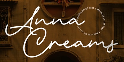 Anna Creams is a Unique romantic modern script font. With regular mono-line stroke, fun character with some of ligatures. To give you an extra creative work. Anna Creams font support multilingual more than 100+ language. This font is good for logo design, Social media, Movie Titles, Books Titles, a short text even a long text letter and good for your secondary text font with sans or serif. Make a stunning work with Anna Creams font. Cheers, MaulanaCreative
 - Fabrizio by ARTypes,
$60.00 The new Fabrizio™ types, designed by Ari Rafaeli, have made their first appearance in Saggi di Letteratura Italiana: Da Dante per Pirandello a Orazio Costa, by Lucilla Bonavita, printed at Pisa in March 2016 by Fabrizio Serra Editore for whom the type was specially designed. The types are now offered for general sale. Each style (roman, small capitals, italic, semi-bold, bold) contains Cyrillic and ‘polytonic’ Greek letters and letters for many European languages (Czech, Hungarian, Icelandic, Lettish, Polish, Romanian, Serbian, Ukrainian, Welsh etc.), non-kerning fs, long ſ, ligatures and fractions. Alternative forms are supplied in ‘B’ versions of each style. A set of swash letters and sets of superiors, inferiors, fractions and phonetic letters are also offered. Two ‘Special’ fonts (roman and italic) containing special accents, letters for transliteration, Vietnamese letters, mathematics signs and symbols, arrows, commercial signs, pictograms, figures in circles, scansion marks, braces & benzene rings and the Rafaeli-Meruba Hebrew letters, as well as Latin, Cyrillic and Greek letters, are included in the Fabrizio family.
 - Lotter by Kaer,
$19.00 Lotter blackletter with Drop caps One fine day I found a vintage book, it called “A treatise by the Dominican friar-writer Marcus von Weida on the Brotherhood of the Holy Rosary”. It was printed in 1515 by Melchior Lotter in Leipzig. The text was illustrated by hand-colored engravings on religious and liturgical themes and beautiful initials I like. Lotter was the last name of a family of German printers, intimately connected with the Reformation. An innovation by the elder Lotter was his use of Roman types for Latin, reserving the Gothic types for German. I'm happy to present to you my new font family. Lotter font family has Drop cap and Regular styles. It's all you need to precisely imitate medieval style text. Use Drop cap style as a decorative element at the beginning of a paragraph or section, other part of the paragraph should be in Regular style. You’ll get: * Drop cap & Regular styles * Uppercase and lowercase * Multilingual support * Numbers * Symbols * Punctuation * Ligatures Please feel free to request any help you need: kaer.pro@gmail.com Best, Roman.
 - Volatile Serif by Mans Greback,
$59.00 Volatile Serif, designed by Mans Greback, is a luxurious and romantic typeface that exudes an air of softness and delicate beauty. Its flowing, liquified forms, and delicate swirls evoke feelings of empathy, creating a sense of connection and warmth. This font is perfect for high-end projects that demand a touch of fine elegance. Inspired by the gentle movements of water, the designer sought to capture the essence of fluidity in Volatile Serif. The result is a typeface that feels alive, as if its character is organically creating the word, making it a perfect choice for luxury brands, romantic designs, and storytelling. The font is built with advanced OpenType functionality and has a guaranteed top-notch quality, containing stylistic and contextual alternates, ligatures, and more features; all to give you full control and customizability. It has extensive lingual support, covering all Latin-based languages, from Northern Europe to South Africa, from America to South-East Asia. It contains all characters and symbols you'll ever need, including all punctuation and numbers. Mans Greback is a Swedish typeface designer with a passion for creating unique and versatile fonts. With an extensive background in design and typography, Mans has built a reputation for his meticulous attention to detail and prolific craftsmanship. His many fonts are widely used by designers around the world, making his work synonymous with creativity and innovation.
 - Sublime by Coniglio Type,
$19.95 Sublime45-Regular Sublime Revised for 2021. One font in Opentype format as Sublime45. Families and all TT Truetype versions eliminated in this wonderful stand alone. The Spring 1997 original release of Sublime —borne an organic creature of black water soluble ink & digitized by Coniglio Type. Sublime is a fun font to use in commercial layouts. It is soft and fluid as ink. Like the wrinkles of time, it is imperfect. That in itself makes it incredibly attractive, warm and “human factor”. Sublime offers legibility so sorely missed in the current recreational font market. Sublime was inspired by World War II US fighter pilot Donald Alling. He flew missions over Nazi Germany. His squadron also dropped food, medicine and relief supplies over the Netherlands. Known as “the Colonel” to his friends. Don as a civic engineer ruled literally miles of ink letter callout’s with a template device called a LeRoy in peacetime on vellum and mylar across his career as a technical illustrator. You didn't want to screw up inking into a template with wet black permanent ink. You really had to have a steady hand and it was all done by hand. You can say Don worked “unplugged”. And that is cool! He was part of the broad stroke of postwar industrial expansion that helped keep America strong, rendering exploded views on top secret projects. Many of us were not even born yet when all this was going on. Today at over 80 years young Don is like a national treasure, savvy and bright—and the ladies love him! The Colonel remains a dedicated master airbrush man, stand–up man, caricature artist and letterman all without use of a computer! He was lucky enough to retire before a desktop cathode tube was put in his face. Today the Colonel enjoys restoring VW’s, flying and freelance consulting when not being called to supper by his lovely wife Rea.


