10,000 search results
(0.335 seconds)
- Lapendos Stripes by Axara Creative,
$10.00 Introducing a new Lapendos Stripes. It comes with OpenType features such contextual alternates, stylistic alternates, stylistic sets, good for logotype, poster, badge, book cover, tshirt design, packaging and any more. This font is suitable for t-shirts, signage, logos, headlines, branding, packaging, etc. Accessible in the Adobe Illustrator, Adobe Photoshop, Adobe InDesign, even work on Microsoft Word. PUA Encoded Characters – Fully accessible without additional design software.
 - Koch Schrift by Ingo,
$42.00 A heavy blackletter; Rudolf Koch’s first type from 1909. On an old page full of type specimen from the 1930s, the type is described as ”Schwabacher (used by the Deutsche Reichsbahn [German Imperial Railway]).“ As a matter of fact, it is the first print of the Offenbach script master Rudolf Koch, who came out with this typeface in 1909. At that time, it was given the name ”Neudeutsch“ (New German). Later, it became very popular under the name Koch-Schrift, and was at times the official typeface of the Deutsche Reichsbahn (German Imperial Railway).
 - Choob Stripes by Aah Yes,
$2.95Choob Stripes is reminiscent of pipes and tubes, and other mechanical works. Upper Case has the small circle, lower case doesn't. - Stripes Pattern by Crumphand,
$20.00 Hello, here's the new fonts Stripes Pattern. Inspired by children book. The font is cute, good for your comic, brand, youtube, movie production etc. What's Included Inside The Fonts ? Uppercase Lowercase Symbols Numerals European Multilingual Thank you, Regards!
 - Stripy Matey by Gleb Guralnyk,
$14.00 Hello! Introducing a geometric style font — Stripy Matey. It's a vintage look smooth typeface built of dashed flowing lines. Stripy Matey font has multilingual support (check out a screenshot with available letters and signs). Thank you and wish you a peaceful sky!
 - Scritta Nuova by Anatoletype,
$16.00 Scritta Nuova was born to transpose my personal handwriting and evolved today into a smart typeface that maintains the original feel with improved legibility and visual balance. The steady rhythm and roundness of Scritta Nuova give the impression of a smooth, girlish and gentle writing. It also evokes retro calligraphic styles taught in Italian schools around the 1950s, which might have influenced in one way or another my original handwriting. Note that the capital letters can be nicely set next to each other without overlapping, unlike script typefaces with swashy capitals created as initials.
 - Scripio C by AType,
$24.95This font from the same family as Scripio A and Scripio B. The truth it more likely their cousin, very much it is not similar to them. Though looks not so bad. - Antiquarian Scribe by Three Islands Press,
$39.00 Henri Abraham Chatelain was a cartographer and publisher of the famous Atlas Historique, ou Nouvelle Introduction a L'Histoire, a world atlas released between 1705 and 1732 in Amsterdam. A few years ago, at an antique book shop in London, I bought a page from Chatelain's atlas—a page covering the Near East, India, the Indian Ocean—that had a particularly alluring, oblique handlettering style. The text is in French, which gave me plenty of samples of diacritics and accented characters. The overall effect is neat and legible, with a distinctly historical flair.
 - Scripio A by AType,
$24.95Scripio A was the first font which I submitted to MyFonts.com. It is a decorative font. Little bit technical. I wanted to make a font which would be interesting to all. To some extent it has justified my hopes. - Deutsche Schrift by Alter Littera,
$25.00 A comprehensive and faithful rendition of Rudolf Koch’s first release, usually referred to as “Fette Deutsche Schrift” or "Koch-Schrift". In addition to the regular character set, the font includes a large number of alternates and ligatures, plus two sets of ornamental initials (Initialen mit Zierstrichen und Punkten zur Koch-Schrift, and Initialen zur halbfetten deutschen Schrift von Rudolf Koch). The main sources used during the font design process were a sample page from Hendlmeier, W. (1994), Kunstwerke der Schrift, Hannover: Bund für Deutsche Schrift und Sprache (p. 164), and several specimen sheets from the Gebrüder Klingspor Type Foundry for Koch’s “Deutsche Schrift” type family. Specimen, detailed character map, OpenType features, and font samples available at Alter Littera’s The Oldtype “Deutsche Schrift” Font Page.
 - Behrens Schrift by URW Type Foundry,
$39.99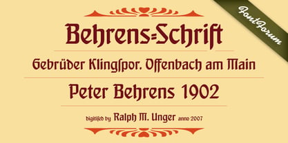
- Geometry Soft Pro Bold N - 100% free

- Kis Antiqua Now TB Pro by Elsner+Flake,
$99.00 In the course of the re-vitalization of its Typoart typeface inventory, Elsner+Flake decided in 2006 to offer the “Kis Antiqua” by Hildegard Korger, in a re-worked form and with an extended sortiment, as an OpenType Pro-version. After consultation with Hildegard Korger, Elsner+Flake tasked the Leipzig type designer Erhard Kaiser with the execution of the re-design and expansion of the sortiment. Detlef Schäfer writes in “Fotosatzschriften Type-Design+Schrifthersteller”, VEB Fachbuchverlag Leipzig, 1989: No other printing type has ever generated as far-reaching a controversy as this typeface which Jan Tschichold called the most beautiful of all the old Antiqua types. For a long time, it was thought to have been designed by Anton Janson. In 1720 a large number of the original types were displayed in the catalog of the „Ehrhardische Gycery“ (Ehrhardt Typefoundry) in Leipzig. Recently, thanks to the research performed by Beatrice Warde and especially György Haimann, it has been proven unambiguously that the originator of this typeface was Miklós (Nicholas) Tótfalusi Kis (pronounced „Kisch“) who was born in 1650 in the Hungarian town of Tótfal. His calvinistic church had sent him to the Netherlands to oversee the printing of a Hungarian language bible. He studied printing and punch cutting and earned special recognition for his Armenian and Hebrew types. Upon his return to Hungary, an emergency situation forced him to sell several of his matrice sets to the Ehrhardt Typefoundry in Leipzig. In Hungary he printed from his own typefaces, but religious tensions arose between him and one of his church elders. He died at an early age in 1702. The significant characteristics of the “Dutch Antiqua” by Kis are the larger body size, relatively small lower case letters and strong upper case letters, which show clearly defined contrasts in the stroke widths. The “Kis Antiqua” is less elegant than the Garamond, rather somewhat austere in a calvinistic way, but its expression is unique and full of tension. The upper and lower case serifs are only slightly concave, and the upper case O as well as the lower case o have, for the first time, a vertical axis. In the replica, sensitively and respectfully (responsibly) drawn by Hildegard Korger, these characteristics of this pleasantly readable and beautiful face have been well met. For Typoart it was clear that this typeface has to appear under its only true name “Kis Antiqua.” It will be used primarily in book design. Elsner+Flake added two headline weights, which are available as a separate font family Kis Antiqua Now TH Pro Designer: Miklós (Nicholas) Tótfalusi Kis, 1686 Hildegard Korger, 1986-1988 Erhard Kaiser, 2008
 - Out of Line Pro BB by Blambot,
$10.00 Out of Line Pro BB is a comic book dialogue typeface with Greek and Cyrillic support, as well as a hefty compliment of European diacritical glyphs. It's the improved remix of Blambot's popular Out of Line BB set. Designed after Blambot letterer, Nate Piekos's hand lettering, it features opentype autoligatures, contextual alternates, and fractions.
 - Kate Slab Pro Ultra Expanded by Monday Type,
$19.00 Kate Slab Pro Ultra Expanded is a sophisticated and robust modern Slab Serif Typeface that works in a variety of design scenarios. It is designed to work in big attention grabbing headlines as well as in smaller text and even body text. The recognition value of Kate Slab Pro Ultra Expanded is its biggest asset in world of uniformity. Ranging from “100 Thin” all the way to “900 Black” makes Kate Slab Pro Ultra Expanded such an amazing and versatile font family that stands out. Kate Slab Pro Ultra Expanded doesn’t only work great in lifestyle and fashion related contexts but will also look amazing for restaurants, coffee shops or and other use cases that ask for character and identity. To fill all the gaps of a designer’s needs, Kate Slab Pro Ultra Expanded comes with an italic style with every weight. Those italics are equipped with unique and real italic characters and will make you love it. Being a Slab Serif Kate Slab Pro Ultra Expanded manages to remind you of a classic Font Family with a modern and timeless approach that will make you happy for decades. Monday Type can’t wait to see the beautiful designs you are going to create with our Kate Slab Pro Ultra Expanded.
 - Iwata UD Maru Gothic Pro by IWATA,
$199.00 ???????????UD????????????????? ??????????????????????????????????????????
 - Birth Of A Hero Pro by CheapProFonts,
$10.00 A grunged-up variant of a classic font – with ultra-tight spacing (uppercase letters are mostly overlapping). Perfect for that worn but stylish look, now with hugely extended language support. ALL fonts from CheapProFonts have very extensive language support: They contain some unusual diacritic letters (some of which are contained in the Latin Extended-B Unicode block) supporting: Cornish, Filipino (Tagalog), Guarani, Luxembourgian, Malagasy, Romanian, Ulithian and Welsh. They also contain all glyphs in the Latin Extended-A Unicode block (which among others cover the Central European and Baltic areas) supporting: Afrikaans, Belarusian (Lacinka), Bosnian, Catalan, Chichewa, Croatian, Czech, Dutch, Esperanto, Greenlandic, Hungarian, Kashubian, Kurdish (Kurmanji), Latvian, Lithuanian, Maltese, Maori, Polish, Saami (Inari), Saami (North), Serbian (latin), Slovak(ian), Slovene, Sorbian (Lower), Sorbian (Upper), Turkish and Turkmen. And they of course contain all the usual “western” glyphs supporting: Albanian, Basque, Breton, Chamorro, Danish, Estonian, Faroese, Finnish, French, Frisian, Galican, German, Icelandic, Indonesian, Irish (Gaelic), Italian, Northern Sotho, Norwegian, Occitan, Portuguese, Rhaeto-Romance, Sami (Lule), Sami (South), Scots (Gaelic), Spanish, Swedish, Tswana, Walloon and Yapese.
 - Iwata News Mincho NK Pro by IWATA,
$309.00 数多くの新聞社で使われてきた伝統ある「岩田新聞明朝体」を再現した「イワタ新聞明朝体」と、かなを現代風にアレンジした「イワタ新聞明朝体新がな」があります。
 - Shanks Antique 5 AOE Pro by Astigmatic,
$24.95 Shanks Antique 5 Pro is an iconic antique English typestyle rooted in tradition. It is the historical revival and elaboration of the “Antique No. 5” typeface created by Stevens, Shanks & Sons in 1865. What began as a basic character set of Capitals, lowercase, numerals, and a small handful of punctuation characters has been expanded to a full character set including unlimited fractionals, superiors & inferiors, ordinals, tabular & proportional figures, and an expanded language glyph set, all with a smallcaps and Caps to Smallcap set to match. Reviving history looks and feels good. Perfect for wedding invitations, historical ephemera recreations, and classically elegant text settings.
 - Iwata News Gothic NK Pro by IWATA,
$309.00 数多くの新聞社で使われてきた伝統ある「岩田新聞呉竹体」を再現した「イワタ新聞ゴシック体」と、かなを現代風にアレンジした「イワタ新聞ゴシック体新がな」があります。
 - Kis Antiqua Now TH Pro by Elsner+Flake,
$99.00 In the course of the re-vitalization of its Typoart typeface inventory, Elsner+Flake decided in 2006 to offer the “Kis Antiqua” by Hildegard Korger, in a re-worked form and with an extended sortiment, as an OpenType Pro-version. After consultation with Hildegard Korger, Elsner+Flake tasked the Leipzig type designer Erhard Kaiser with the execution of the re-design and expansion of the sortiment. Detlef Schäfer writes in “Fotosatzschriften Type-Design+Schrifthersteller”, VEB Fachbuchverlag Leipzig, 1989: No other printing type has ever generated as far-reaching a controversy as this typeface which Jan Tschichold called the most beautiful of all the old Antiqua types. For a long time, it was thought to have been designed by Anton Janson. In 1720 a large number of the original types were displayed in the catalog of the „Ehrhardische Gycery“ (Ehrhardt Typefoundry) in Leipzig. Recently, thanks to the research performed by Beatrice Warde and especially György Haimann, it has been proven unambiguously that the originator of this typeface was Miklós (Nicholas) Tótfalusi Kis (pronounced Kisch) who was born in 1650 in the Hungarian town of Tótfal. His calvinistic church had sent him to the Netherlands to oversee the printing of a Hungarian language bible. He studied printing and punch cutting and earned special recognition for his Armenian and Hebrew types. Upon his return to Hungary, an emergency situation forced him to sell several of his matrice sets to the Ehrhardt Typefoundry in Leipzig. In Hungary he printed from his own typefaces, but religious tensions arose between him and one of his church elders. He died at an early age in 1702. The significant characteristics of the “Dutch Antiqua” by Kis are the larger body size, relatively small lower case letters and strong upper case letters, which show clearly defined contrasts in the stroke widths. The “Kis Antiqua” is less elegant than the Garamond, rather somewhat austere in a calvinistic way, but its expression is unique and full of tension. The upper and lower case serifs are only slightly concave, and the upper case O as well as the lower case o have, for the first time, a vertical axis. In the replica, sensitively and respectfully (responsibly) drawn by Hildegard Korger, these characteristics of this pleasantly readable and beautiful face have been well met. For Typoart it was clear that this typeface has to appear under its only true name “Kis Antiqua.” It will be used primarily in book design. Elsner+Flake added these two headline weights, which are available besides a separate font family Kis Antiqua Now TB Pro. Designer: Miklós (Nicholas) Tótfalusi Kis, 1686 Hildegard Korger, 1986-1988 Erhard Kaiser, 2008
 - Data Error Vert AOE Pro by Astigmatic,
$24.00 The Data Error Vert AOE Pro family is another spinoff of my Data Error AOE Pro family. Quite simply, it takes on a slightly different feel than the original pin matrix grid by stroking across all vertical glyph lines. The vertical lines break up the readability somewhat of the original grid and lend a more tech vibe to the family. Check out the range of posters created to see the various Capitals, Lowercase, smallcaps and varying styles that the family has to offer and how it both differs from and compliments the original Data Error AOE Pro family.
 - It Aint Rocket Science Pro by CheapProFonts,
$10.00 This font was reworked by request. It is another lovely handwritten font made by Kimberly Geswein - with its long e and c it gets a semi-connected look. Perfect for text with a personal touch. ALL fonts from CheapProFonts have very extensive language support: They contain some unusual diacritic letters (some of which are contained in the Latin Extended-B Unicode block) supporting: Cornish, Filipino (Tagalog), Guarani, Luxembourgian, Malagasy, Romanian, Ulithian and Welsh. They also contain all glyphs in the Latin Extended-A Unicode block (which among others cover the Central European and Baltic areas) supporting: Afrikaans, Belarusian (Lacinka), Bosnian, Catalan, Chichewa, Croatian, Czech, Dutch, Esperanto, Greenlandic, Hungarian, Kashubian, Kurdish (Kurmanji), Latvian, Lithuanian, Maltese, Maori, Polish, Saami (Inari), Saami (North), Serbian (latin), Slovak(ian), Slovene, Sorbian (Lower), Sorbian (Upper), Turkish and Turkmen. And they of course contain all the usual "western" glyphs supporting: Albanian, Basque, Breton, Chamorro, Danish, Estonian, Faroese, Finnish, French, Frisian, Galican, German, Icelandic, Indonesian, Irish (Gaelic), Italian, Northern Sotho, Norwegian, Occitan, Portuguese, Rhaeto-Romance, Sami (Lule), Sami (South), Scots (Gaelic), Spanish, Swedish, Tswana, Walloon and Yapese.
 - Might Makes Right Pro BB by Blambot,
$9.00 Might Makes Right Pro BB is an all-purpose comic book dialogue font inspired by Bronze Age comics. It’s designed to compliment a wide variety of art styles. The opentype version has autoligatures to swap out adjacent, identical letter pairs for a more organic look, and a wide variety of European characters are included. This Blambot classic comic book dialogue family has been updated with even more European characters, improved spacing and kerning, contextual alternate correction of errant serif-I, and a fourth weight, plain Bold.
 - Data Error Horiz AOE Pro by Astigmatic,
$24.00 The Data Error Horiz AOE Pro family is a spinoff of my Data Error AOE Pro family. Quite simply, it takes on a slightly different feel than the original pin matrix grid by stroking across all horizontal glyph lines. The horizontal lines add more readability to the original grid and lend a more sci-fi vibe to the family. Check out the range of posters created to see the various Capitals, Lowercase, smallcaps and varying styles that the family has to offer and how it both differs from and compliments the original Data Error AOE Pro family. Be sure to note that the "family" price is the same as the "individual" price, so buy the family for the price of a single font!
 - PF Square Sans Condensed Pro by Parachute,
$79.00 Square Sans Pro is one of Parachute’s most popular typefaces. It has been used by the likes of companies such as Samsung and organizations like the European Commission. Now a new version has been released. Square Sans Condensed Pro is a square-shouldered, modern and self-assured text typeface which lends style to a variety of projects. With its generous x-height, full-bodied counters and uniform stroke weight, it provides high legibility and uniform typographic color at all sizes. This is an exceptionally warm and comprehensive type family -with slightly rounded edges and softened curves- which possesses a robust and friendly appearance. The family consists of 12 fonts -from extrablack to thin- including true italics. It supports opentype features like small caps, fractions, ordinals, etc. and offers multilingual support for all European languages including Latin, Greek and Cyrillic. Download its complehensive PDF Specimen Manual for further details.
 - M XiangHe Hei SC Pro by Monotype,
$187.99The M XiangHe Hei Simplified Chinese typeface merges traditional brush strokes with modern letterforms to carefully balance traditional calligraphy with humanist design. Named for the smooth movements of a flying crane, the M XiangHe Hei typeface is designed to glide across the page, and features strokes that are partly derived from the Kaishu calligraphic style – an everyday script which dates back hundreds of years. Seol Sans features Neue Frutiger for its Latin glyphs, and works harmoniously with Neue Frutiger World and Monotype’s CJK typefaces Tazugane Info (Japanese) and Seol Sans (Korean). M XiangHe Hei is a great choice for global brands using sans serif Latin typefaces looking to maintain their visual identity, and communicate with a consistent tone of voice with Simplified Chinese. - P22 Civilite by P22 Type Foundry,
$24.95 P22 Civilite is a historic font revival. The font is a non-connecting upright handwriting script based on 16th century sources with a lineage going back to Robert Granjon in France and from early Dutch type specimens from the Enschede and Sons Foundry. The P22 Civilite suite of fonts includes the 6 basic Dutch versions of Civilite in both "historical" and "modern" styles in basic OpenType format and Pro versions that combine the historical, modern & sorts into one OpenType font with alternates, expanded language coverage and pro features.
 - Sonora by profonts,
$51.99 Sonora is a brandnew profonts script typeface family supplied in the new OpenType Pro font format. Sonora contains six styles as light, medium, bold and the corresponding italics. The character set covers about 1.500 glyphs for the complete Latin character set (West, East, Baltic, Turkish, Romanian), and a huge number of handmade ligatures and alternates to make it a perfect OpenType Pro connecting script. Sonora is a very distinguished, elegant and versatile, intentionally non-slanted script font.
 - Santa Fe by profonts,
$51.99 Santa Fe is a profonts script typeface family supplied in the new OpenType Pro font format. Santa Fe contains six styles as light, medium, bold and the corresponding italics. The character set covers about 500 glyphs for the complete Latin character set (West, East, Baltic, Turkish, Romanian), and a large number of handmade ligatures and alternates to make it a perfect OpenType Pro connecting script. Santa Fe is a very distinguished, elegant and versatile, intentionally non-slanted script font.
 - Myteri Script PERSONAL USE ONLY - Personal use only

- VA Script No. 1 SB by Scangraphic Digital Type Collection,
$26.00 Since the release of these fonts most typefaces in the Scangraphic Type Collection appear in two versions. One is designed specifically for headline typesetting (SH: Scangraphic Headline Types) and one specifically for text typesetting (SB Scangraphic Bodytypes). The most obvious differentiation can be found in the spacing. That of the Bodytypes is adjusted for readability. That of the Headline Types is decidedly more narrow in order to do justice to the requirements of headline typesetting. The kerning tables, as well, have been individualized for each of these type varieties. In addition to the adjustment of spacing, there are also adjustments in the design. For the Bodytypes, fine spaces were created which prevented the smear effect on acute angles in small typesizes. For a number of Bodytypes, hairlines and serifs were thickened or the whole typeface was adjusted to meet the optical requirements for setting type in small sizes. For the German lower-case diacritical marks, all Headline Types complements contain alternative integrated accents which allow the compact setting of lower-case headlines.
 - Pollet Signature Script Sans Font by Maulana Creative,
$14.00 Pollet is a fancy signature script and sans serif font duo. With light contrast stroke, fun character with a bit of ligatures. To give you an extra creative work. Pollet font support multilingual more than 100+ language. This font is good for logo design, Social media, Movie Titles, Books Titles, a short text even a long text letter and good for your secondary text font with sans or serif. Make a stunning work with Pollet font. Cheers, MaulanaCreative
 - Hello Cartel Story Script Duo by Attract Studio,
$13.00 Hello Cartel Story Script FONT DUO is a new modern script font with irregular base lines. Trendy and feminine style. Hello Cartel Story Script looks beautiful in wedding invitations, thank-you cards, quotes, greeting cards, logos, business cards, and more. Perfect for use in ink or watercolors. Includes initial letters and terminals, alternatives and support for many languages. Include file: Hello Cartel Story Script.OTF Hello Cartel Story Sans.OTF To activate the OpenType Stylistic alternative, you need a program that supports OpenType features such as Adobe Illustrator CS, Adobe Design & CorelDraw X6-X7, Microsoft Word 2010 or newer versions. There are additional ways to access alternatives / swash, using Character Map (Windows), Nexus Fonts (Windows), Font Books (Mac) or software programs such as PopChar (for Windows and Mac). How to access all alternative characters, using Windows Character Map with Photoshop: https://www.youtube.com/watch?v=Go9vacoYmBw How to access all alternative characters using Adobe Illustrator: http://youtu.be/iptSFA7feQ0 How to use a stylish font set in Microsoft Word 2010 or later versions: https://youtu.be/x1A_ilsBsGs Need help or have questions, let me know. I am happy to help :) Thank you & Congratulations on the Design!
 - Blood Script Italic Personal Us - Personal use only

- Gauze Strips - Unknown license

- Linotype Scrap by Linotype,
$29.00Linotype Scrap is part of the Take Type Library, chosen from the entries of the Linotype-sponsored International Digital Type Design Contests of 1994 and 1997. The font is available in two weights and was designed by German artist Ingo Preuss. It is as though the forms of the basic weight were cut with scissors out of pieces of paper. There are no inner contours, only the outer silhouettes. The capital letters which make up Scrap Bonus are set on black rectangular backgrounds and are white and framed with a white contour. This weight includes a number of different pictograms which were also not spared the scissors. The decorative Linotype Scrap embodies the comic style of the 1990s and is meant exclusively for headlines of points sizes 18 and larger. - Scrap Twiggy by Illustration Ink,
$3.00Squiggly and branchy describes this artfully jumbled font. You'll find it useful for all of your cute kids stuff. - Olde Crilt by Graffiti Fonts,
$19.99With 2 full alphabets & a full array of symbols & decorations this style can look elegant or insane. New English is easy to customize for infinite unique looks. - Scrap Caps by Illustration Ink,
$3.00Cap off your project with this all capital letter font. Bold and stylish with hand lettered appeal. Great for any paragraph or headline that demands attention.


