763 search results
(0.014 seconds)
- Tenika by Eaver Studio,
$12.00
- Sangkuriang - Unknown license

- Western Railway JNL by Jeff Levine,
$29.00 - Decor by Haniefart,
$17.00
- Dustismo Roman - 100% free

- Dustismo - Unknown license

- Manzello by Tour De Force,
$35.00
- Delusion - Unknown license

- EG Dragon Caps - 100% free

- Throrian Formal - 100% free

- Throrian Commonface - 100% free

- BoomBox - Unknown license

- Ork Glyphs - Unknown license

- Dwarven Runes - Unknown license

- Eldar Runes - Unknown license

- Crown Title - Unknown license

- Hattan Antique by Solotype,
$19.95 - Movie Star - Unknown license

- Stencilvania JNL by Jeff Levine,
$29.00 - Coldera by Haniefart,
$12.00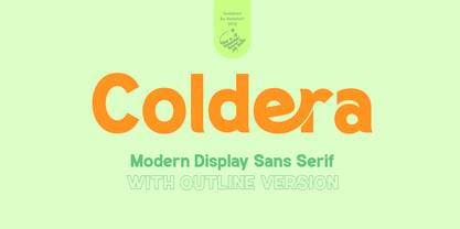
- IMA ISO GPS No Frame by Iain Macleod Associates Ltd,
$27.00
- Cellophane Tape JNL by Jeff Levine,
$29.00
- Town Meeting JNL by Jeff Levine,
$29.00
- PerfectPixel - Unknown license

- Ridicule - Unknown license

- Gretchen by Solotype,
$19.95 - Clarendon Semi by Wooden Type Fonts,
$15.00
- VAG-HandWritten - 100% free

- Cift by Graptail,
$15.00
- Ailey Display by Graptail,
$15.00
- DXKometa by DXTypefoundry,
$45.00
- JP Hand - 100% free

- PR Swirlies 02 by PR Fonts,
$10.20
- Killecthrone by Ilhamtaro,
$19.00
- Faux Hebrew by Page Studio Graphics,
$24.00
- Acadami by Hackberry Font Foundry,
$24.95
- Show Poster JNL by Jeff Levine,
$29.00
- Ornamental Heritage by Haniefart,
$15.00
- Mister Rii PB by Pink Broccoli,
$19.00
- Hexide JNL by Jeff Levine,
$29.00


