10,000 search results
(0.039 seconds)
- Amstoven by DYSA Studio,
$19.00 Amstoven is a New Modern Serif Typeface. This another collection of Serif is perfect for your next branding project, excellent for your business. Amstoven have a smooth edges, so this font gives an authentic handcrafted feel style.
 - Gans Titania by Intellecta Design,
$19.95See also other font families inspired by Gans' original typefaces: Gans Tipo Adorno , Gans Lath Modern , Gans Titular Adornada , Gans Ibarra , Gans Antigua , Gans Antigua Manuscrito , Gans Fulgor , Gans Radio Lumina , Gans Carmem Adornada , and Gans Italiana . - Melasthi by Yoga Letter,
$16.00 "Melasthi" is a modern sans serif font. This font is very elegant and beautiful. Equipped with uppercase letters, lowercase letters, numbers, punctuations, and also multilingual support. Very suitable for brochures, invitations, posters, banners, stickers, branding, and more.
 - Bebop by Présence Typo,
$36.00 Here is a sans-serif built up on an old-style design framework especially perceptible in the italic. It is the conjunction of contradictories feelings: pointed / soft, classical / modern. The smaller the typesetting, the better it works.
 - Maxos by Mysterylab,
$17.00 Maxos is a modern hyper-stylized font that is simultaneously sleek & futuristic, yet retro & whimsical. This font package contains two variations: Extra Bold and Extra Bold Oblique. Excellent for posters, album graphics, motorsports, sports, high-tech, etc.
 - Panther Fighter by Yoga Letter,
$17.00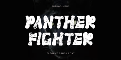 "Panther Fighter" is a modern and elegant brush font. This font is equipped with uppercase, lowercase, numerals, punctuations and multilingual support. It is suitable for logos, movie titles, Halloween, Christmas, business branding, ornaments, mock ups and others.
 - Linotype Cineplex by Linotype,
$29.99A typeface that shows its root in stencil lettering. Dario Muhafara created a modern sans serif type family which is ideally suited for cool, technical themes. A small caps font offer a widely usage in book production. - Gans Titular Adornada by Intellecta Design,
$14.95See also other font families inspired by Gans' original typefaces: Gans Tipo Adorno , Gans Lath Modern , Gans Titular Adornada , Gans Ibarra , Gans Antigua , Gans Antigua Manuscrito , Gans Fulgor , Gans Radio Lumina , Gans Carmem Adornada , and Gans Italiana . - Adelyne by Good Java Studio,
$20.00 Adelyne is a modern hand-lettering font make from handwriting ideas in font design. This font includes full Alphabetical glyphs, Numerals, and punctuation. Adelyne is perfect for invitations, monograms, wedding, fashion, branding, labels, hand-lettering or logotype.
 - Tiposka by ATK Studio,
$15.00 A new monospaced font with tech and experimental style by Atk Studio. Created for electronic displays found in modern techie world. This type features a Latin Standard character set, covering multiple languages written with the Latin script.
 - Harpers Grotesque by Cloud9 Type Dept,
$45.00 Harpers Grotesque is a classic multiusable grotesk font with a modern twist. Harper Grotesque has an extended character set to support Central and Eastern European as well as Western European languages plus OpenType features, fractions and alternates.
 - Satellite by Dingbatcave,
$15.00Cool doodads from the cold war...spaceships, moderne coffee pots, boomerangs, cocktail glasses, etc. A must for decorating your cyber-bachelor pad; a requirement for the retro lounge crowd. Don't be a square, daddio, get Satellite today! - Franca by René Bieder,
$29.00 Franca is a neo-grotesk family in nine weights plus matching italics. The inspiration for the design came through the constant interest in new interpretations of the classic grotesk model and a study of "neutral“ typefaces like Helvetica, Univers or Normal Grotesk. During the studies, additional attention was given to the American representatives of the genre, resulting in the initial impetus for a reinterpretation, combining both paths into one contemporary design. This is reflected in the name, blending together the names of the most popular typefaces of each genres, (Fran)klin and Helveti(ca). Due to its large x-height and plain design, the family is perfectly suited for all kinds of text. Its mid-weights are optimized for usage in long paragraphs, while the bolder weights, due to a short descender and ascender, create a compact and confident look in headlines or short copy. In order to create strong and dynamic italics, the oblique glyph shapes come with a faint calligraphic hint, defined by a higher stroke contrast and a steeper connection between stems and arcs in, for example, h n m and u. This is followed by different standard shapes for a and y, supporting the dynamic movement of the lowercase in general. A wide range of OpenType features such as ligatures, old style figures, fractions, case-sensitive shapes and many more, are available for professional and contemporary typesetting. This is completed with eleven alternative glyph sets, enabling a quick customization of the typeface. The family supports up to 92 languages and comes with 500+ glyphs per font.
 - Solpera by Storm Type Foundry,
$32.00This type face fills one of the gaps between the world of Roman alphabets and that of linear alphabets. The first to be designed was the set of upper-case letters. The expression of these characters cannot conceal that they were originally intended only for the sculptor's use, as a type face for three-dimensional inscriptions. Their width proportions reflect a dialogue between the contemporary feeling and the legacy of classical Roman inscriptions. The type face was later complemented with a set of lower-case letters and elaborated into further designs. Its clear, concise letter forms end with small serifs which not only make the type face more refined, but above all anchor the individual letter signs visually to the horizontal of the text line. The austere construction of the majority of the letters is balanced by the more exuberant, humanizing forms of the most frequently used letters "a"; "e". (The three variants of the lower-case "e" enable to create rhythmically differentiated texts.) The letters in which a straight stroke is connected with an arch are designed in two ways. That means that the letters "n", "h","m" and the group of letters "b","d","p","q" are conceived in a different way. Thus an interesting tension is created in the structure of the text, which, however, does not endanger legibility. The economizing, slightly narrowed design of this type face predetermines its use for the setting of usual texts. In larger sizes, however, it produces a rather serious, even solemn, impression. - Mono Spec by Halbfett,
$30.00 Mono-Spec is a monospaced family of sans-serif type. At least in default settings, all characters across the typeface share a common width. That fixed setting is condensed, and the aesthetic style of Mono-Spec’s letterforms is very industrial. A sister family, called Mono-Spec Stencil, is also available. Its design strays away from the mechanical nature of Mono-Spec, and it channels the spirit of resistance and street culture. Mono-Spec ships in two different formats. Depending on your preference, you can install the typeface as a single Variable Font or use the family’s five static OpenType font files instead. Those weights run from Light through Bold. While the static-format fonts offer a good intermediary-step selection, users who install the Variable Font have vastly greater control over their text’s stroke width. The Mono-Spec Variable Font’s weight axis allows users to differentiate between almost 1,000 possible font weights. That enables you to fine-tune your text’s exact appearance on-screen or in print. Whatever format you choose, the Mono-Spec fonts are equipped with several OpenType features. The most striking of these can be activated via a Stylistic Set. That will replace several letters – like “B”, “E”, “F”, “H”, and “I” with double-width alternates. Those alternates take up as much space as two characters placed next to each other otherwise word. The effect of Mono-Spec’s double-width alternates is striking, and their use strikes a strong chord in any display typography applying them.
 - Lonely Moon VP by VP Creative Shop,
$20.00 Introducing Lonely Moon - Handmade typeface - 3 fonts Lonely Moon is handwritten and retro slab serif typeface loaded with 3 fonts, alternate, ligature glyphs and multilingual support to enchant your next project. Very versatile fonts that works great in large and small sizes. Lonely Moon is perfect for branding projects, home-ware designs, product packaging, magazine headers - or simply as a stylish text overlay to any background image. Language Support Afrikaans, Albanian, Asu, Basque, Bemba, Bena, Breton, Chiga, Colognian, Cornish, Czech, Danish, Dutch, Embu, English, Estonian, Faroese, Filipino, Finnish, Frenc,h Friulian, Galician, Ganda, German, Gusii, Hungarian, Indonesian, Irish, Italian, Jola-Fonyi, Kabuverdianu, Kalenjin, Kamba, Kikuyu, Kinyarwanda, Latvian, Lithuanian, Lower Sorbian, Luo, Luxembourgish, Luyia, Machame, Makhuwa-Meetto, Makonde, Malagasy, Maltese, Manx, Mer,u Morisyen, North Ndebele, Norwegian, Bokmål, Norwegian, Nynorsk, Nyankole, Oromo, Polish, Portuguese, Quechua, Romanian, Romansh, Rombo, Rundi, Rwa, Samburu, Sango, Sangu, Scottish, Gaelic, Sena, Shambala, Shona, Slovak, Soga, Somali, Spanish, Swahili, Swedish, Swiss German, Taita, Teso, Turkish, Upper Sorbian, Uzbek (Latin), Volapük, Vunjo, Walser, Welsh, Western Frisian, Zulu FEATURES 3 styles Uppercase, lowercase, numeral, punctuation & Symbol Multilingual support - 87 languages alternate glyphs ligature glyphs How to access alternate glyphs? To access alternate glyphs in Adobe InDesign or Illustrator, choose Window Type & Tables Glyphs In Photoshop, choose Window Glyphs. In the panel that opens, click the Show menu and choose Alternates for Selection. Double-click an alternate's thumbnail to swap them out. Feel free to contact me if you have any questions! Mock ups and backgrounds used are not included. Thank you! Enjoy!
 - Verve by Altered Ego,
$65.00Called by some the "Archetype of the millennium", Verve is a seven-weight typeface family. It features a complete Adobe character set with kerning and fit to match. The alternate characters offer some variations on s,f,h,j,k,S,T,Y and others, plus this font has the Euro symbol. Verve is the fourth in an on-going series of condensed typefaces that I’ve been designing since 1989. My concept was to create an elegant condensed typeface that would be a "typeface for the millennium," in style and functionality. At the very core of all my designs is a typographic problem I wanted to solve, or a market niche that I think needs filled. Verve addresses both of those concerns, without copying or borrowing from its predecessors. There’s the challenge of creating a rich and interesting typeface with an austerity of line and elegance of form. I’m a minimalist by nature – but I wanted Verve to have a sensuous feel in certain respects – yet have that sensuality balanced by the uniformity of the uniform character widths. Gottfried Pott always stresses "theme and variation," and "point and counterpoint," and that’s what I’m doing in Verve. What one finds in musical composition is evident in Verve. Perfect for book covers, CD packaging, club flyers, retail packaging (especially bottles!), identity design and multimedia. The adventurous can try it in text, but it will give you a headache. The beauty of Verve is in thesize and weight variations which create a rich typographic texture in this font. - AE Prosperity by Altered Ego,
$50.00 Well suited for headlines, packaging and display applications, AE Prosperity will be a robust and versatile addition to your script library. It’s purposefully designed to infer the visual connections of letters for a hand-lettered feel. Some characters will connect, and others will guide your eye to the next letter from, making it highly legible. In 1779, the schooner Prosperity sailed the high seas. Commissioned by a young continental congress, with 6 guns & at twenty tons, she sailed under a Letter of Marque for patriotism and profit. Look lively, because with contextual and alternate glyph sets (contextual glyphs, alternate lower case glyphs and an extended set of alternate capitals), this robust typeface is as inspiring as her namesake and adapts to whatever winds may blow. Prosperity is designed as a free-flowing script, for a spontaneous and historic aesthetic. Contextual glyphs include variations on tt (short and longbar), t longbar, ll, cc and other characters. Contextual features change ascender heights and descender styles. Alternate glyphs (set 1) include variations on b,d,f,g,h,l,o,p,r,s,t,y. Alternate capitals (set 2) include a complete set of alternate upper case letters. Most useful with Adobe® InDesign®, multiple variations of letter combinations can be achieved by selecting Contextual glyphs, and/or set 1 and set 2 from the Character Palette: OpenType: Stylistic Sets menu. Alternate glyphs and contextual characters will be available based on the OpenType support of your application. AE Prosperity™ is available exclusively in OpenType format.
 - Burford by Kimmy Design,
$10.00 Burford is a font family that I sketched while traveling through Europe. I was mesmerized by all the unique typography that was showcased throughout the five countries I visited. Inspired by all that I had seen, I found myself spending 4-5 hours per day in Amsterdam’s Vondel Park drawing characters. Once back in the states I digitalized Burford, deciding it would make for a beautiful layer-based font. Burford Pro package comes with all 18 layering fonts including 5 base layers, 3 top layers, 5 bottom layers and 2 sets of graphic elements. They are strategically made to build on top of each other, creating a cohesive and easy to use layer-based family. Each font also comes with a set of Stylistic Alternatives for letters A C E F G H P Q R. Burford Basic package is created for users who don’t have access to premiere design programs (such as Illustrator, InDesign, Photoshop, etc) and are unable to use the layering effect. Burford can still be a powerful tool as each font can also be used on its own. It includes every font file not needed for the layering effect. (Include 13 fonts - Burford Basic, Dots, DropShadow, Extras Set A, Extras Set B, Extrude B, Extrude C, Inline, Line, Marquee, Outline, Stripes A and Stripes B). The Burford Extras set uses all basic keyboard characters - around 100 total elements per set. They are designed to go specifically with Burford and complement its varying styles perfectly. The set includes: banners, borders, corners, arrows, line breaks, catchwords, anchors and many more!
 - Bodoni Highlight by Image Club,
$29.99Giambattista Bodoni (1740-1813) was called the King of Printers; he was a prolific type designer, a masterful engraver of punches and the most widely admired printer of his time. His books and typefaces were created during the 45 years he was the director of the fine press and publishing house of the Duke of Parma in Italy. He produced the best of what are known as modern" style types, basing them on the finest writing of his time. Modern types represented the ultimate typographic development of the late eighteenth and early nineteenth centuries. They have characteristics quite different from the types that preceded them; such as extreme vertical stress, fine hairlines contrasted by bold main strokes, and very subtle, almost non-existent bracketing of sharply defined hairline serifs. Bodoni saw this style as beautiful and harmonious-the natural result of writing done with a well-cut pen, and the look was fashionable and admired. Other punchcutters, such as the Didot family (1689-1853) in France, and J. E. Walbaum (1768-1839) in Germany made their own versions of the modern faces. Even though some nineteenth century critics turned up their noses and called such types shattering and chilly, today the Bodoni moderns are seen in much the same light as they were in his own time. When used with care, the Bodoni types are both romantic and elegant, with a presence that adds tasteful sparkle to headlines and advertising. This version of Bodoni was done by Morris Fuller Benton for American Typefounders between 1907 and 1911. Although some of the finer details of the original Bodoni types are missing, this family has the high contrast and vertical stress typical of modern types. It works well for headlines, logos, advertising, and text." - Charles Wright by K-Type,
$20.00 Charles Wright is a full typeface in the style used for British vehicle license plates. The standard Bold weight is based on the condensed bold ‘2001’ style with an uppercase which conforms to UK registration plate specifications for character heights of 79mm and widths of 50mm. The 9 font family also includes previously unavailable Medium and Regular weights, Obliques , and a newly designed lowercase. For platemakers, the wider '1935' and lighter 'Motorcycle' fonts are also included.
 - [D]ONLINE by Don Citarella,
$20.00 [D]ONLINE is the first font family designed by Don Citarella for his blog, [D]ONLINE, and was created to provide a signature feel for its namesake. It combines a strong, medium stroke with arching end caps to embue the typeface with a futuristic curvilinear feel. This display font is best used for headlines, identities, wordmarks and other instances involving minimal copy and maximal whitespace The typeface includes 300 characters, including 45 accented glyphs and 30 ligatures.
 - Tex Writer by Designova,
$15.00 Tex Writer is a custom handmade / handwritten Serif typeface with a simple and casual personality making it perfect for text typography, logotypes, marketing graphics, branding, package and advertisement design and anything in between. Extended Character Sets Along with the basic Latin character set, we have added Western European, Central European, South Eastern European character sets for your convenience. What You Get This typeface comes with 14 fonts having 7 weights + 7 italics (Light / Regular / Medium / SemiBold / Bold / ExtraBold / Heavy).
 - Enzia by insigne,
$21.99 Enzia is a friendly and flowing sans serif. Enzia exists somewhere between a slab serif and a semi-sans, and features flared vertical stems and rounded terminals. Its bulbous terminals and open counters inject a flavor of ease and excitement. Enzia provides plenty of impact and is best used with short to medium length texts. Six different weights provide plenty of versatility and contrast for poster designs, logotypes and headlines, while still retaining excellent legibility for extended copy.
 - Quta by Fo Da,
$15.00 Quta is a sans serif typeface produced by FoDa foundry, that meets all the needs of professionals who search a family of clean geometric font, very well suited for headlines, newspaper and many purposes. With a basic character set in Five weights with their italics. Quta covers many features like: -Five main weights (Light, Regular, Medium, Bold and Extra Bold) -Matching italics for all weights. -language support for many Latin-based scripts -Ligatures and many other OpenType features.
 - Sonora by profonts,
$51.99 Sonora is a brandnew profonts script typeface family supplied in the new OpenType Pro font format. Sonora contains six styles as light, medium, bold and the corresponding italics. The character set covers about 1.500 glyphs for the complete Latin character set (West, East, Baltic, Turkish, Romanian), and a huge number of handmade ligatures and alternates to make it a perfect OpenType Pro connecting script. Sonora is a very distinguished, elegant and versatile, intentionally non-slanted script font.
 - Bruna by Antonio Lechuga,
$35.00 Its open counters and large x height give it excellent performance in small sizes. On the other hand, its curved diagonals, generous width and soft shapes give it a friendly but functional personality for a wide range of messages and voices. We recommend the four most extreme weights (Thin, ExtraLight, Black, and Heavy) for large sizes starting at 18 points, and the five intermediate weights (Light, Book, Regular, Medium, and Bold) for small sizes starting at 7 points.
 - St Ryde by Stereotypes,
$- St Ryde is a humanistic sans-serif with a slight touch of a script typeface. The most significant aspect of the typeface is the combined sharp and round treatment of the stroke endings. The complete Ryde Family contains five weights including real matching italics, so you can choose from thin, light, regular, medium and bold. St Ryde has a wide range of characters, including small caps, lining proportional and tabular figures plus small caps figures, too.
 - Portland Grotesk by QUADRAAT,
$35.00 Portland Grotesk is a grotesque sans serif typeface with chubby proportions in 5 weights Light - Regular - Medium - SemiBold - Bold and supports all latin languages. Easy to use and easy to read. The character set contains 1109 glyphs with a wide range of alternates characters and includes: - Small Capitals - Fractions - Superiors, denominators - Open type features such as case sensitive, standard ligatures and several stylistics sets Portland Grotesk fits perfectly for all types of communication (Books, magazines, posters)
 - Gratique by Lemon Studio Type,
$7.50 Gratique is a semi-rounded sans-serif typeface. The curvature of the corners fits perfectly and makes it look so cool. Gratique comes with 3 different font variants, namely medium, bold, and black. Gratique is perfect for headings, typography, branding, mockups, or any other design you need especially for a sans-casual style, it will work really well. FEATURES: - STANDARD CHARACTER SET -Case Sensitive Forms -Denominators -Fractions -Historical Forms -Standard Ligatures -Scientific Inferiors -Subscripts -Superscripts -Multilingual Support, etc.
 - Neonoir by phospho,
$25.00 Neonoir is an homage to neon lettering craftsmanship of the mid 20th century. The beautiful futuristic grace of wall-sized bent-glass hand-writing is distilled into a three-weight connected script that’s on the button for headlines, logotype and branding designs. Its Slim and Bold weights are formal monoline scripts, while the medium weight mimics the rough edges of ink on paper. Neonoir is available as an Open Type font that features alternate endings and lots of ligatures.
 - Santa Fe by profonts,
$51.99 Santa Fe is a profonts script typeface family supplied in the new OpenType Pro font format. Santa Fe contains six styles as light, medium, bold and the corresponding italics. The character set covers about 500 glyphs for the complete Latin character set (West, East, Baltic, Turkish, Romanian), and a large number of handmade ligatures and alternates to make it a perfect OpenType Pro connecting script. Santa Fe is a very distinguished, elegant and versatile, intentionally non-slanted script font.
 - Conseration by Letterhend,
$17.00 Conseration is a condensed font family. This family has 5 styles: Light, Regular, Medium, Semi Bold, and Bold. You can use it according to your needs. Luxury, classy yet still looks fun and playful in the same time. This font is perfectly made to be applied especially in logos and the other various formal forms such as invitations, labels, magazines, books, greeting / wedding cards, packaging, fashion, make up, stationery, novels or any type of advertising purpose.
 - Oilvare by Adam Ladd,
$25.00 Oilvare is a hand-drawn, layered typeface inspired by vintage painted signs and oil cans. While sturdy, it also has a softer side—wide proportions, oval-inspired forms, curled angle strokes, and a medium contrast all help give it a little bit of distinction from the typical sans serif. Mix, match, and layer the styles to your liking. Carefully drawn, when you enlarge the typefaces, the subtle irregularities become more apparent and harken to hand lettering of the past.
 - Code Saver by Dharma Type,
$9.99 Code Saver — Next-generation monospaced font — 1. Code Saver is a monospaced font family for coding and tabular layout. 2. Code Saver is a clean, natural and simple monospaced font family. 3. Code Saver consists of 6 style, Regular, Medium, Bold and their 11° Italic. 4. Code Saver has 93.33% condensed width for more usable space. 5. Code Saver has good distinguishability and legibility especially numerals. 6. Code Saver brings a fresh sensitivity to boring old existing monospaced fonts.
 - Professor by Three Islands Press,
$39.00 My father is retired from teaching after a distinguished career as a professor at the University of Texas (and other colleges). He's also retired from writing in longhand, ever since I digitized his script several years ago. Professor is a slightly modified version of my ol' dad's cursive hand -- a good, strong, helpful, friendly, personable hand, much like the man. Use Professor for all your casual handwriting needs: my father doesn't mind. Comes in a single, medium-weight style.
 - WT Volkolak by Wraith Types,
$50.00 Volkolak is the ultimate serif-sans-grotesque tribrid, its numerous cuts will give you many options represent a typesetter's dream! Designed as one, it offers a serif, a contrasted sans serif and a grotesque style. The numerous typesetting options offered this way gives it a ton of usability and functionality in many different mediums, editorial design, books, magazines, posters, visual identity, web design... You won't find a project in which you can't use this true workhorse superfamily!
 - Mores by Graphicfresh,
$19.00 Mores - Minimal Sans Introducing a minimalist style font. Fonts that are suitable for branding, packaging, logos and others. This font comes in regular and medium formats. Including italics in it. If you like this font, don't forget to collect it and share it with your loved ones. If there are things you want to ask or problems you face with this font. Don't hesitate to ask us. Because we are very happy to help you. Thanks Graphicfresh
 - Lineare by Tipo,
$35.00 Lineare Serif is an attempt at solving the difficult problem of creating readable text type, seeking new ways to provide readers with some pleasure and rest as they walk along each line, creating a space where there is harmony between man and the printed form. Asymmetric serifs both in their height and width, medium contrast in the stroke, and balanced upward and downward movements make “Lineare Serif” a typeface featuring both attitude and aptitude for editorial purposes.
 - As of my last update in April 2023, the described font name "(afGiHmtV)" is not recognized as part of standard font collections or widely known typefaces. This name seems unconventional and doesn't f...