10,000 search results
(0.116 seconds)
- Nokio by TypeUnion,
$25.00 Nokio is a clean, minimalist Sans Serif typeface designed in 2013 by TypeUnion. Nokio uses clean lines and curves matched with smooth, rounded terminals to produce a structured typeface with a subtle playfulness. Nokio is made up of 5 weights, and is built for multiple uses, from digital applications such as Apps and Websites to logotypes and print applications.
 - Gancio by Funk King,
$39.00 Gancio is my first fully realized hand-drawn font and has a robust character set. Its simple lines and sophisticated curves are contemporary, but recall vintage and retro cool. The font is very adaptable and flexible and can be used effectively in a number of themes. Also included are the dingbats used in the poster art.
 - Keynote Speaker NF by Nick's Fonts,
$10.00This curious little gem is patterned after a typeface named "Bloomsbury", released by P. M. Shanks & Sons, Ltd. of London in the 1920s. Its gentle curves and somewhat quirky construction combine to create a warm and friendly, if slightly offbeat, antique charm. Both versions of the font include 1252 Latin, 1250 CE (with localization for Romanian and Moldovan). - Bill Poster by Smartfont,
$18.00 A powerful, energetic and exciting condensed typeface. It brings charming curves and satisfying patterns to traditional condensed fonts. It's designed for impact, without sacrificing style or legibility. It looks especially stunning in large scale, although it still carries a punch at smaller point sizes. It's born to be! Ideal for magazine, posters, headlines and pull quotes.
 - Hostania by Attract Studio,
$17.00 Hostania is a beautiful and nostalgic serif typeface that looks amazing in both large and small settings as both display and body text. Best used as a showcase for titles and logos, sharp curves and a decorative alternative that give any project an extra touch of class. Includes: Alternative Styles Multiple Languages Supported PUA Encoded Characters.
 - Argentina NF by Nick's Fonts,
$10.00This elegant titling face is based on an American Type Founders release from the 1920s named Sterling. Hairline serifs and graceful curves give this typeface a certain grace and charm that will brighten up any project. All versions of this font include the Unicode 1250 Central European character set in addition to the standard Unicode 1252 Latin set. - Chopsee Softee by TypeUnion,
$35.00 Chopsee Softee is the marshmallowy version of our 2017 release Chopsee. It's fun and curvaceous and comes in 8 weights with matching italics. Just like Chopsee the soft version maintains the fluidity and movement with the accentuated curves and terminals, but with added fun and freedom. Chopsee Softee is perfect font for packaging to branding and everything in between.
 - Apparata by Xavier Lanau,
$50.00 Apparata is a versatile display and text typeface suitable for identities or magazines. With a rounded finish, some characters have a combination of diagonal and curve strokes. Currently includes 4 styles: Light, Light Italic, Bold and Bold Italic. With more than 700 glyphs in each font, smallcaps, tabular and old style figures, fractions, ligatures, punctuation and symbols.
 - Kornasoft by OJR Design,
$20.00 Kornasoft is a typeface with hard corners, straight lines and smooth curves. The typeface is influenced by dance, movement and music culture. Kornasoft is a combination of a simple looking font, yet with personality and edge to it. Kornasoft is mainly designed to be a display font, but it can also be used as quantity text.
 - Aventra by Graphite,
$18.00 Aventra is a handmade organic sans serif typeface family. With curved edges and slightly uneven lines, it has a warm and friendly appeal. Its clean and minimal design makes it legibility and readable even in smaller point sizes. With a distinct and informal human touch, it is ideal for packaging, branding, display, posters, logos, advertising, signage and editorial design.
 - Bleecker Street NF by Nick's Fonts,
$10.00This late Victorian typeface flirts with Art Nouveau sensibilities, as evidenced by the graceful curves and the decorative crossmembers in several of the uppercase letters. The result is a font that combines simple, understated elegance with a no-nonsense, workmanlike stance. Both versions of the font include 1252 Latin, 1250 CE (with localization for Romanian and Moldovan). - Organic Space by Melissa Lapadula,
$19.95Organic Space is about preserving what natural goodness there is left in the world, with its use of curves and space usage. It represents the selection of consumers, which choose organic products instead of the alternative genetically modified version. This typeface aims to be organic and unique. This font can function as headings, subheadings and body text. - Amy by AVP,
$19.00 Developed from the simplest possible curves, Amy is a wide hand lettered style with tall straight ascenders and generously looped descenders. The capitals are centred horizontally with the lower case. A handful of ligatures helps copy to flow for easy reading and optional proportionally spaced numerals make the font suitable for quite lengthy chunks of copy.
 - Brumers by Trustha,
$17.00 Brumers is a fun sans serif font. Inspired by the curves of a bear. The basic concept is actually hand-drawn. Then, I developed and improved it in the next process. It comes in six styles, which makes it easy to choose according to the project you are working on. Brumers is perfect for headlines, branding, and many more.
 - Kopi Senja by Orenari,
$10.00 Kopi means coffee, and Senja means sunset. The inspiration of Kopi Senja Font Duo is indie music fans. Every curves of the character is originaly drawn by my hand with heart. Kopi Senja has sans and script version, mix and match it with your own imagination. Be creative and make your project stand out with Kopi Senja.
 - Teletex by The Northern Block,
$16.70 A typewriter style slab serif typeface. The design is influenced by the font Rockwell and uses a combination of precise geometry with subtle elliptical curves. The harmony of these elements creates a distinctive and functional typeface suitable for a variety of graphic design applications. Details include 4 weights, a complete character set, manually edited kerning and Euro symbol.
 - RM Hangle by Ray Meadows,
$19.00 This strong angular cousin of RM Hunky offers a bold display face. The distinctive nature of this design will be a welcome addition to any designers collection of useful fonts. Due to the nature of this design there may be a very slight lack of smoothness to the curves at extremely large point sizes (around 200 pt and above).
 - HU Specialmovie by Heummdesign,
$15.00 HU Specialmovie is a retro, wide square typeface, characterized by streamlined, narrow stroke ends. The first consonants are designed to be large with full modules to improve readability. The grapheme 'O', which is the face of the font, is in the form of a square in harmony with straight lines and curves, expressing a solid and simple feeling overall.
 - Dietal by Tour De Force,
$25.00 Dietal is condensed slab serif family that comes in 5 weights. Dietal coquettes with different type categories from sans and slab to calligraphy, western and display elements. It is available in two versions: with curved and sharp joining. Contains Stylistic Alternates, Ordinals and Tabular Figures as Open Type Features in Extended Latin and Cyrillic character set.
 - Doll by FaceType,
$30.00 Who needs counters? Although this typeface is bold as hell, it is still absolutely legible. If You are looking for fat curves, this is may be Your choice! There are also extra letters (A, V, v) to let You make better logos and headlines. Please take also a look at Dollbats for suitable Arrows, Symbols and Numbers.
 - Bastony Signature by Multype Studio,
$18.00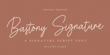 Bastony Signature is is a simple and classy font with unique curves and an elegant inky flow. Features : uppercase, lowercase, symbol, number, ligature, and also support multi language. Bastony Signature is perfect for photography, watermark, social media posts, advertisements, logos & branding, invitation, product designs, label, stationery, wedding designs, product packaging, special events or anything that need handwriting taste.
 - Reboot by Typelove Fontworks,
$7.00 Born in the lab as a research experiment, Reboot is great for that certain 70’s sci-fi need. It’s filled with the angular curves of the technology of yore, with full diacriticals for Eastern European Cold War era galactic display copy. It’s the first font of a series of research experiments, varying from rectilinear to ovoid.
 - Turismo CF by Connary Fagen,
$25.00 Inspired by midcentury motorsports, technology, and business, Turismo CF is designed for stunning logotypes and gripping headlines. Constructed from strong rectangles with sloping, elongated curves and a confident, affable stance. Turismo CF is a display typeface pairs well with mellow, text-friendly serifs that won't compete visually, like Artifex CF, or humanist typefaces like Artifex Hand CF.
 - Elaya Script by Mans Greback,
$59.00 Elaya Script is a formal and flowing script typeface. Silky and smooth curves, but with a straight and rigid backbone. Perfect for logotypes and titles of a project to emit friendly earnestness. The font contains OpenType functions such as alternates and ligatures. It supports all European Latin-based languages and has all necessary punctuation and symbols.
 - Medyson by Reyrey Blue Std,
$19.00 Medyson is an elegant and bold serif font. It is defined by smooth curves. It is perfect for branding projects, Logo design, Clothing Branding, packaging, magazine headings, advertising, T-shirts, postcards and much more. Add it confidently to your projects, and you won’t be disappointed. ? Features · All Uppercase and Lowercase · Number & Symbol · Supported Languages · Alternates and Ligatures · PUA Encoded
 - Trivette by Greater Albion Typefounders,
$12.00 Trivette is an ‘All Capitals’ calligraphic display face, where all upright strokes are rendered as curves and where everything approaching the vertical are rendered in threes. That’s probably as clear as mud, but the results combine charm and legibility with a decorative period air. Recommended for poster work where a sense of dignified fun is important.
 - Auster Variable by Resistenza,
$89.00 Auster Variable for Adobe's softwares. Auster packs sensational personality in its fine-tuned forms. Confident and quirky, yet comfortable to read, this distinctive san serif family stands out from the crowd. The curves cinch and strokes flair in unconventional places making Auster an unashamed rebel sure to turn heads. More About Opentype Features: https://bit.ly/opentype-rsz
 - Divenire by CAST,
$45.00 Divenire is derived from a custom typeface designed for the Partito Democratico (Italian Democratic Party), it is used in their political communication. It has variation of tension in its design, alternating curved and almost straight elements. The glyphlist includes many alternatives like a set of odd punctuation marks: the famous "interrobang" and others, starting from Hervé Bazin's work.
 - Mushin by Satori TF,
$16.99 Mushin is a typeface, that comes with 14 fonts, roman and the matching italics, which draws inspiration from the grotesques of the beginning of the 20th century. However, its humanistic details and endings, remove the coldness so characteristic of this style, making Mushin a typeface of lively and dynamic curves, which can be used for various purposes.
 - Krone by Lebbad Design,
$27.95 Krone is a clean, bold contemporary semi-serif font characterized by its flared semi-serifs and graceful curves. Well-suited for all graphic design challenges such as dynamic display headlines, logos, posters, cover/titles and much more. Its optimized kerning enables it to work well in a variety of text uses for both web and desktop.
 - Baket Fashion by Nirmana Visual,
$22.00 Introducing our exquisite elegant style font, designed to bring sophistication and grace to your designs. With its refined letterforms, delicate curves, and timeless beauty, this font is perfect for projects that require a touch of elegance and class. Inspired by the elegance of classic typography and the beauty of Serif, this font exudes a sense of refined aesthetics.
 - Malvie by Eko Bimantara,
$17.00 Malvie is casual, groovy and friendly font. Made for titling and products, branding, packaging, display, signage and other fit-for-bold medium. Each glyphs shown dynamic curves, especially with the stems which is personalized by heavy swinging stroke. Its contain 270 glyphs with latin standard character set and two opentype features; Stylistic Alternates and standard Ligatures also extra swashes.
 - JTT Uyugeopum by Ziwoosoft,
$300.00 It's a font designed to remind you of milk bubbles. Curved strokes were used to add a bouncy feeling, and jasos were designed in various sizes to make them look rich when making. Numbers and English, which contain a bouncy feeling like Hangeul, can feel a more lively atmosphere when used together through rhythmically designed writing lines.
 - Glamure Serif by Fauzistudio,
$15.00 Glamure Serif is inspired by the Myriad font which has often been used by technology companies and governments since the 1990s. Glamure Serif is a clean, sleek and versatile font, using geomatrices to make this font more modern and elegant. Glamure Serif can function as a title, logo, body copy, subtitle, headline and others.
 - Glamure by Fauzistudio,
$10.00 Glamure was inspired by the Myriad font which has been frequently used by technology companies and governments since the 1990s. Glamure is a clean, sleek and versatile font, by applying geomattric shapes to create a fantastic, modern and humanistic font. Glamure can function as a title, logo, body copy, subtitle, headline and so on.
 - Zt Nezto Variable by Khaiuns,
$18.00 ZT Nezto is a new work that focuses on curved areas, bringing out an elegant and refined style. The emergence of this idea was due to the constraints when designing with W&V letters which were very difficult to combine with other letters, and also the desire to present new elements in the world of typography, thus making each design more unified between letters. ZT Nezto design with this charming curved shape and still maintains the identity of each weight so it is very beautiful to apply to web design, packaging, or branding. ZT Nezto is a very useful typeface for you and it also comes in eight weights with matching italics and comes with a variety of open type features. I hope you have fun using ZT Nezto Thanks for using this font ~ Khaiuns X zelowtype
 - Zt Nezto by Khaiuns,
$14.00 ZT Nezto is a new work that focuses on curved areas, bringing out an elegant and refined style. The emergence of this idea was due to the constraints when designing with W&V letters which were very difficult to combine with other letters, and also the desire to present new elements in the world of typography, thus making each design more unified between letters. ZT Nezto design with this charming curved shape and still maintains the identity of each weight so it is very beautiful to apply to web design, packaging, or branding. ZT Nezto is a very useful typeface for you and it also comes in eight weights with matching italics and comes with a variety of open type features. I hope you have fun using ZT Nezto Thanks for using this font ~ Khaiuns X zelowtype
 - ITC Motter Sparta by ITC,
$29.99ITC Motter Sparta is the work of Austrian designer Othmar Motter and for its inspiration, he turned to car design. As we all know, trends in car design affect many other fields of design in a way that shapes tastes." At the end of the 1990s, Motter saw the trend moving away from soft lines and toward a tighter, tenser look: "In this latest trend, sharp clearly-defined edges meet broadly-drawn, dynamic curves and cut them off sharply." And so too is ITC Motter Sparta, with each character form distinct, which also creates a typeface instantly recognizable from a single character. "The sharp straight strokes, cut off almost at right angles, and the strong cross-stroke curves, ending in points, form a charged contrast to the vertical and horizontal straight strokes that give Motter sparta its taut framework."" - FS Sophie by Fontsmith,
$50.00 Slinky Chic, svelte and slinky, FS Sophie was inspired by and designed in partnership with ATTIK UK. With clean lines, simple, elegant curves and dynamic forms, it brings a feminine sophistication to text and headlines in publishing and advertising. Kinky FS Sophie’s engaging simplicity arises from its construction, using a modular set of core, rounded shapes and straight strokes, drawn and then repeated to create letterforms. An extra technical detail of occasional, short 45-degree diagonals adds a distinctive little kink to Sophie’s cool exterior. Alchemy By some kind of typographic alchemy, the combination of simple curves and lines with unexpected twists to the shapes of characters creates an unusually spirited and lively design in all three weights and their italic sets. Born for the spotlight, FS Sophie is a natural for big headlines, pull quotes and other high-profile text elements.
 - Vertical by Alias,
$60.00 Alias Vertical is a sans serif typeface with a vertical cut-off point for letter endings. The vertical cut-offs bend round characters (b, c, o, etc) into a squarish, high-shouldered shape, suggesting Roger Excoffon’s Antique Olive. In mid-weights, the typeface mixes Antique Olive with typefaces such as Gill or Johnston, for example the shape of the t, the l borrowing Johnston’s flick. Vertical has the same minimal difference in weight between verticals and horizontals as Gill and Johnston, and the same sharp connection point where curves meet straight lines. Like Antique Olive, Vertical has a narrow connection point here, adding contrast and definition. The overall effect feels austere at lighter weights and strident and graphic at bolder weights, and sharp and incised throughout. In the Bold and Black weights, the squarish and top heavy shape of Antique Olive is most noticeable. For example the wide uppercase, with the B having almost-even width between top and bottom curves, and the almost-overhang of the top curve of the G. But Vertical does not have as extreme an aesthetic or square shape as Antique Olive. As well as its wide design, the upper case is given extra authority by being a slightly heavier weight than the lower case. This is a device borrowed from Gill, and other ‘old’ typefaces, where the upper case is presented as a titling design. Modern sensibilities are more focussed on an even colour between upper and lower case. Vertical was originally intended as a sister typeface to Ano, like AnoAngular or AnoStencil. Vertical developed into a similar but separate design. Ano was designed for use in Another Man — in its modular, circle-base design, and the way there aren’t the amendments usually made in bolder weights to ensure letter clarity. This is for layouts where different weights are used together in different sizes so that the overall letter weight is the same, a feature of the magazine. Where Ano is simple and graphic, Vertical has nuance and texture. It is a pragmatic, utility design. In the balance between graphic and typographic, its focus is the latter.