10,000 search results
(0.05 seconds)
- Canapé by FDI,
$25.00 Canapé is based on the idea of letters with a subtly curved and slightly modulated line. Through this, the typeface has a warm and friendly, almost haptical appearance which brings some kind of cosiness to your communication with type. Designed and crafted with great attention to detail, the type family is usable for copy texts as well as corporate design or display purposes. Canapé (Serif) with its 4 fonts and more than 4,200 characters contains a large amount of features like small capitals, swashes, 10 different figure sets, automated fractions, ordinals, standard and discretionary ligatures, language support for Central and Western Europe and a small sofa building kit. All features are conveniently accessible through OpenType features. Check out the type specimen PDF for more details and a closer look.
 - Vilane by Din Studio,
$25.00 Hi, Everyone! Want to make your branding bold? Looking for a font that exudes fabulous, style, and adventure? Then, we got the solution for you. Introducing Vilane - A Sans Serif Font Family A package that will delight you. With this family, you will get many options to captivate, engage, and inspire your audience and clients. These fonts can be used for a host of different content needs and projects. Perfect for social media branding projects, fashion designs, printed quotes, packaging, or even as a stylish text overlay to any background image. Our font always includes Multilingual Support to make your branding reach a global audience. Inspire your audience, clients, or guests with this beautiful, statement font. Features: Multilingual Support PUA Encoded Numerals and Punctuation Thank you for downloading premium fonts from Din Studio
 - ITC Cyberkugel by ITC,
$29.99ITC Cyberkugel is the work of British designer Timothy Donaldson, who occasionally likes to write with an extra-fine ballpoint pen. I like the spindly scrawny forms that it gives me when I follow all the usual 'italic' writing conventions", he says. And there lie the origins of ITC Cyberkugel, although the creative process was moved from pen and paper to software and a Wacom tablet. "I like the fact that people will be buying it to give them a 'human', 'organic', 'non-digital' look, and yet no ink has soiled paper. Although the movements of the hand are still the essence, the whole thing was created in cyberspace." The name comes from combining cyberspace and Kugelschreiber, the German word for ballpoint pen. ITC Cyberkugel is a fresh interpretation of traditional calligraphy." - Quiroh by Hashtag Type,
$32.00 Quiroh is a functional typeface that expresses both artistic life and emotion. Taking its inspiration from the industrial revolution of the 19th Century where romance and science coincided. With a cushioned finish and designed according to traditional conventions, the sentiment is equally as important as the reason, resulting in a very pleasurable read. Quiroh includes both heavy display weights and lighter weights for small copy, it's a perfect tool for communicating to the masses. Tall ascenders and descenders give the typeface a distinctive look with an elegant feel, and while these expressive forms invite the reader to observe its visible shape and appearance, its rhythm and function invites the reader to peruse at their leisure. Full details include 7 weights from thin to heavy with over 470 characters, manually edited kerning and OpenType features.
 - Buddy by Hackberry Font Foundry,
$24.95 Buddy is the new companion sans for Contenu, the book font family designed for my book on font design design. Originally, I called it Compagnon, but that seemed to pompous. Then I called it Aide, but that was too formal and dry. It's a loose, free, easy to read sans, so when my wife suggested Buddy, it clicked. This is the 4-font Buddy family of Regular, Italic, Bold, & Bold Italic. I made a new, more limited feature set for these fonts due to their designed usage, but there are still small caps, small cap figures, oldstyle figures, numerators, and denominators. The bold is closer to a black, and the italics are only slightly slanted obliques. If you need a strong black in caps, use the small caps of the bold.
 - Janeiro by IKIIKOWRK,
$19.00 Proudly present Janeiro - Vintage Bold Font, created by ikiiko. Janeiro a bold font that personifies masculinity and retro vibes! This font dances in a contemporary setting with a fluidity that evokes the energy of the past. In a world where conformity sometimes takes center stage, Janeiro boldly challenges convention and invites everyone to join in a colorful and energetic parade. It's more than just a font; it's a typographic carnival that welcomes you to experience the joy of expression and the flow of creativity. This font is very suitable for making a poster, vintage or retro stuff, fashion brand, magazine layout, food & beverages packaging, quotes, or simply as a stylish text overlay to any background image. What's Included? Uppercase & Lowercase Numbers & Punctuation Multilingual Support Works on PC & Mac
 - DF Pigtail by Dutchfonts,
$33.00 DF Pigtail is the result of a curious marriage of the 'free'-form of writing with the fixed (mono) space for each character of the typewriter typeface. In the early sixties of the last century, typewriter typography became popular as a Fluxus vocabulary. The Fluxus art movement (in fact a Dada like follow up) which encouraged a do it yourself aesthetic, and valued simplicity over complexity and anti commercialism over the conventional market-driven approach. I was educated in the mid seventies when this form of typography was still very popular and was even applied in corporate design. This particular letter has been used by my teacher Jan Begeer to compose his design assignments. Recently I rediscovered this type and was struck by its pigtail similarity and drew it my way.
 - Parca by Vasava Fonts,
$30.00 Parca is a straightforward new take on the classic tradition of Grotesk sans, setting a new standard in the category. The letterforms are crafted with a gentle and careful drawing process that features small details like subtle tappering on the stems and optical corrections avoiding excessive geometry artefacts. Parca is indicated for design projects and branding when you are in the need of a neutral yet warm feeling allowing the content to be the focus and letting the forms to support it. A careful kerning and spacing features have been develop for the font, allowing it to be used either for small text or huge headlines. Parca is presented in a robust family of five weights plus matching italics and it supports most of the latin-based European languages.
 - Xmas Wishes by Resistenza,
$29.00 Xmas Wishes Font - A collection of 55 calligraphic Christmas greetings and 10 Christmas dingbats. All handwritten with different tools like broad nib pen, pointed pen and brush pen which allowed us to create diverse styles. The letterings are written in different languages; English, French, Spanish and Italian. Add the beauty of calligraphy to your layout and create unique gadgets for this Holiday Season like posters, greeting cards, wrapping paper, tags, and much more! You can also use the designs as photo overlays for your blog or social media content. Open the images to see all the details AWESOME FEATURES 'Font in .otf .ttf' '55 Handlettering Xmas words' '10 Hand-drawn Xmas dingbats' 'Languages in use English, French, Spanish and Italian' 'We highly recommend Turquoise Font to combine with the letterings.'
 - Shopping Guide by Jeff Levine,
$29.00 While watching the 1947 holiday classic “Miracle on 34th Street”, one scene in particular presented a chance to develop a retro type design. ‘Kris Kringle’ suggests to a mother visiting with her child in the Macy’s toy department to try Gimbel’s for a toy she couldn’t find at the store. The news of this behavior reaches Mr. Macy himself, who embraces the practice as a brilliant marketing strategy. A number of departments are then presented with reference books containing competitor ads, and the visual of the cover stating “R.H. Macy & Co. Shopping Guide for the Convenience of Our Customers” shows on screen. The thin, Art Deco sans serif monoline with a few serif-like hooks added onto some characters became the basis for Shopping Guide JNL, which is available in both regular and oblique versions.
 - Outright Horror by Wing's Art Studio,
$10.00 This new addition to my Video Store font series takes a scratched lettering style and pairs it with a wildly spontaneous brush font with horrific effect! Given life by an unknowable hand, this font clawed into the misty midnight inspired by retro horror movies, ghost stories and unsettling fireside tales. A boiling pot of misspent youth reading Edgar Allen Poe, M.R. James and H.P. Lovecraft. Outright Horror comes with an all-caps scratched style font with a subtly controlled Art Deco feel and a contrasting brush font that ramps up the fear! Consider it’s Regular style the skeleton that holds the Bold creeping flesh, ready for some horrific Halloween designs! It also comes with numerals, punctuation, language support, custom underlines and automatic ligatures. Contents: Outright Horror Regular Outright Horror Bold Underlines
 - Symbojet by SIAS,
$56.00 Symbojet is the first professionally designed font equally covering alphabetic and pictographic characters on a large-scale scheme. It’s typographically based on Andreas Stötzner’s recent “Lapidaria” design and uses brandnew standard Unicode-6.0 codepoints for about 340 symbol characters. Use Symbojet for combined text/signage composing to design wayfinding, tourism and leisure, sports and transport matters, for media and communication, for birthday invitations or bistro menu cards … With Symbojet the combined usage of text and signage becomes as easy and elegant as it has never been before. Symbojet is available in a Regular and a Bold version. Both fonts contain about 340 alphabetic (full Latin and Greek) and 400 pictographic characters; in total they count about 1000 glyphs each. The pictographic content is the same in both fonts.
 - As of my last update in April 2023, "Paul6" does not appear to be a widely recognized or documented font within the typographic community or among the standard collections from major type foundries. ...
- Faber Sans Pro by Ingo,
$42.00 A classic-modern sans serif appearing in two forms — ”standard“ and a ”stylistic alternate“ with uncial script-orientated characters which give the font a completely different ”look.“ Faber Sans is a sans serif in the classic-modern style of type creations of the early 20th century — godfathered by Futura from Paul Renner and Gill Sans from Eric Gill. Unlike classic sans serifs, Faber Sans includes a ”true“ italic. Faber Sans Pro will perfectly pair with the accompnying Roman Faber Serif Pro.
 - Arcandias Downtown by BlackLotus,
$20.00 Arcandias Downtown is a serif with high contrast combined with alternates so that it can match projects created using this font with trends in modern times.This font is made with precision for each character so as to create a quality font that is beautiful to look at. Arcandias Downtown can be used in various projects, both Magazine Titles, Posters, Newspapers, and others. This font has a variety of alternatives, so that any project that uses this font will look striking, beautiful, and modern.
 - Orange Garden by Balpirick,
$15.00 Orange Garden is a Modern handwritten typeface that's perfect for adding a touch to your design projects! With its natural, organic feel and unique character. Crafted with care and attention to detail, this font is incredibly versatile and can be used for a range of design projects, including logos, branding, invitations, and more. Its modern, handwritten style gives it a unique character that's sure to make an impact. - also multilingual support - Ligatures Enjoy the font! Feel free to comment or feedback! Thank you!
 - Blantic by Zamjump,
$17.00 BLANTIC is a modern and dynamic sans font that contains all caps and alternative fonts. The combination of futuristic and geometric elements creates a modern design. very suitable for use in various logo designs, posters, book covers, films, sports and several other formal designs, very easy to read, try some alternative letters to get the impression of dynamism and harmony between letters. WHAT IS INCLUDED This font contains standard characters, uppercase letters, numbers, punctuation marks. Includes: Uppercase Numbers Punctuation Symbols multilingual support Alternate
 - Icarus by Artisticandunique,
$20.00 Icarus - Serif Font Family - Multilingual - 4 Style With its modern vintage look, Icarus font offers a wide variety of styles to help you discover the best mood for your projects, from body text to large titles, classic styles to modern and bold styles. It is very suitable for books and magazines, editorials, titles, websites, logos, branding, advertising and more. With this font you can create your unique designs. If you have a question, please contact me. Have a good time.
 - United White by Balpirick,
$15.00 United White is a modern handwritten typeface that's perfect for adding a personal touch to your design projects! With its natural, organic feel and unique character. Crafted with care and attention to detail, this font is incredibly versatile and can be used for a range of design projects, including logos, branding, invitations, and more. Its modern, handwritten style gives it a unique character that's sure to make an impact. - also multilingual support Enjoy the font! Feel free to comment or feedback! Thank you!
 - Rainquote by Balpirick,
$15.00 Rainquote is a Modern Calligraphy Font that's perfect for adding a personal touch to your design projects! With its natural, organic feel and unique character. Crafted with care and attention to detail, this font is incredibly versatile and can be used for a range of design projects, including logos, branding, invitations, and more. Its modern, handwritten style gives it a unique character that's sure to make an impact. - also multilingual support Enjoy the font! Feel free to comment or feedback!
 - Moura by Flawlessandco,
$9.00 Moura is a handcrafted script, this style gives a feel of girly and Modern font type. An Original typeface that suitable for any graphic designs such as branding materials, t-shirt, print, business cards, logo, poster, t-shirt, photography, quotes .etc This font support for some multilingual. Modern script that contains uppercase A-Z and lowercase a-z, alternate character, numbers 0-9, and some punctuation. If you need help, just write me! Thanks so much for checking out my shop!
 - Kartun by Gassstype,
$22.00 Hello Everyone, Introduce our new collection Kartun - A Cute Cartoon Font - Bold Display , Inspired from Modern logos of brands that have very strong characteristics, very suitable for posters,card to kids cute,and guaranteed to add a sweet touch to your next design,packaging, branding, logotype and more. Kartun is font with strong and challenging nuances. very suitable for the title, typography, Poster, magazines, brochures, packaging,Websites and much more for your design needs, making your designs more modern and professional.
 - Wendys by Jafar07,
$17.00 Wendys | Modern and Chic Sans Serif a modern and stylish style that has unique stroke characters, which is very easy to combine with other fonts, this will be very useful for designers making logo and layout designs. What are you get? Numbers & Punctuation Multilingual Support Works on PC & Mac Simple Installations Enjoy using the Wendys Sans Serif font and it will make a perfect addition to your font collection. If you have some questions, don't hesitate to drop a message!
 - Magea by Flawlessandco,
$9.00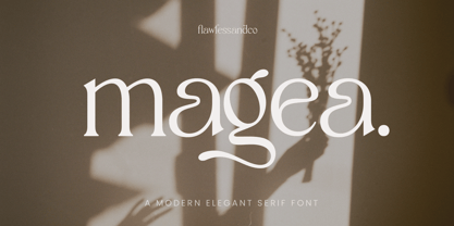 Magea is a Modern Serif Typeface with Elegant vibes in each character with some alternate. An Original typeface that suitable for any graphic designs such as branding materials, t-shirt, print, business cards, logo, poster, t-shirt, photography, quotes .etc This font support for some multilingual. Modern Sweet Retro that contains uppercase A-Z and lowercase a-z, alternate character, numbers 0-9, and some punctuation. If you need help, just write me! Thanks so much for checking out my shop!
 - Belgiany by Sealoung,
$25.00 Belgian is a beautifully stylish modern serif font. A new beautiful serif that we created specifically for your logo and branding needs, with an extra unique shape that will add value to your brand. It's great to take advantage of designers or product owners who need a solution to make their designs look more beautiful and modern. And especially for Belgian fonts, We prepare any alternative characters to help you create unlimited variations for your creative needs especially for logo types or wordmarks.
 - Breathine by MJB Letters,
$19.00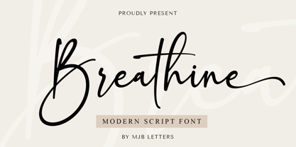 Breathine is a modern script font, with stylish looks that will add a chic elegance to design, perfect for websites, wedding stationery, modern logos, personal branding, social media quotes, and more. Files Included: Works on PC & Mac Simple installations Accessible in Adobe Illustrator, Adobe Photoshop, Adobe InDesign, and even work on Microsoft Word. PUA Encoded Characters – Fully accessible without additional design software. Thank you so much for checking out my shop, and please get in touch if you have any questions!
 - Giriton by Hazztype,
$18.00 Giritron is a modern geometric sans-serif typeface that effortlessly blends elegance with a contemporary aesthetic. With its precise, angular forms and minimalist design, Giritron offers a perfect balance between readability and visual impact. Giritron is the perfect choice for contemporary branding, editorial layouts, websites, and any design project where a sophisticated, modern look is desired. Its geometric sans-serif nature ensures a timeless quality, while its attention to detail sets it apart as a distinctive and visually pleasing typeface.
 - TDL Ruha Crown by Tipos Das Letras,
$15.00 TDL Ruha Crown is a decorative, modern and mechanical display typeface and it results from the development of the stencil RUHA. Being the first typeface of the family, sets the basic concepts to be developed further, on each version to come. There is an rigid geometrical connection with the Roman du Roi design approach, since the letterforms are imposed by the constraints of the RUHA ruler. The main typographic proportions are connected with the modern typefaces, like Didot or Bodoni.
 - Meira by Sohel Studio,
$16.00 Meira is a Modern serif typeface Unique alternate , multilingual support with perfect kerning. This typeface is perfect for an elegant & luxury logo , classy editorial design, women's magazine, fashion brand , cosmetic brand, fashion promotion , modern advertising design, invitation card, art quote, home decoration , book/cover titles, special events, and much more. Meira Features: · Uppercase & Lowercase · Alternates & Ligatures · Numerals & Punctuation · Accented characters · Multilingual Support · Unicode PUA Encoded If you want the SVG version please contact me. Thanks and have a wonderful day .
 - Inovasi by XdCreative,
$29.00 Inovasi Sans "Inovasi Sans is the youngest brother of Clinto Geometric sans font family by Faldykudo, released a few months ago. Inovasi is constructed based on geometric principles, emphasizing simplicity and modernity. The font comes with comprehensive multilingual support, offering more than 300 languages. Notably, Inovasi Sans features a distinctive characteristic in its lowercase 'a', offering 8 alternate characters. Additionally, each lowercase letter from 'a' to 'z' has stylistic alternates, providing a unique look and feel for a modern and futuristic impression."
 - Rikoma by Flawlessandco,
$9.00 Rikoma is a Modern Retro with Fun and Elegant Style in each character with some alternate. An Original typeface that suitable for any graphic designs such as branding materials, t-shirt, print, business cards, logo, poster, t-shirt, photography, quotes .etc This font support for some multilingual. Modern Retro Font that contains uppercase A-Z and lowercase a-z, alternate character, numbers 0-9, and some punctuation. If you need help, just write me! Thanks so much for checking out my shop!
 - Dramatic Florals by Balpirick,
$15.00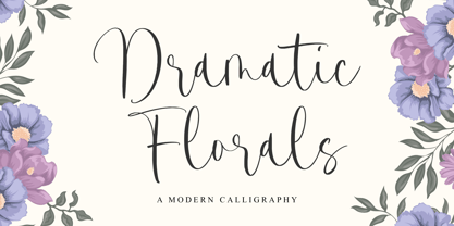 Dramatic Florals is a Modern Calligraphy that's perfect for adding a touch to your design projects! With its natural, organic feel and unique character. Crafted with care and attention to detail, this font is incredibly versatile and can be used for a range of design projects, including logos, branding, invitations, and more. Its modern, handwritten style gives it a unique character that's sure to make an impact. - also multilingual support - Ligatures Enjoy the font! Feel free to comment or feedback! Thank you!
 - Honey Blossom by Balpirick,
$15.00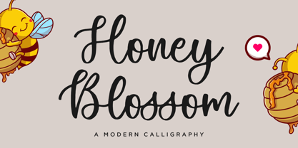 Honey Blossom is a Modern Calligraphy Font that's perfect for adding a personal touch to your design projects! With its natural, organic feel and unique character. Crafted with care and attention to detail, this font is incredibly versatile and can be used for a range of design projects, including logos, branding, invitations, and more. Its modern, handwritten style gives it a unique character that's sure to make an impact. - also multilingual support Enjoy the font! Feel free to comment or feedback! Thank you!
 - Segule by Sensatype Studio,
$15.00 A new San Serif Font that we created special for Headline, Title and more stand out typography needs. It's so perfect to add your style and headline overview. And specially for Headline font, we crafted for unique style and modern feels so enjoy to create any project that will show your main idea out. Segule Modern Humanist Sans Serif Font ready with: Preview as a inspirations that you can do with Segule font Ready with All characters Wish you enjoy our font. :)
 - Paulo by Ron Nevers,
$20.00 Paulo is a versatile display font with a modern take on the classic split bifurcated design. The clean, sleek look lends itself to logos and headlines. Created to feel familiar and new simultaneously, Paulo has a versatility that can invigorate your traditional designs with a fresh spin, giving them a timeless and modern feel. Its vertical nature and clean, swooshy serifs, create a rhythm that helps draw the eye. Paulo suits various design styles, from urban to an upscale look and feel.
 - Graj by Fontsphere,
$16.00 GRAJ is a minimalist, bitmap font with a unique pixel style. It features a sophisticated and original form, making it quite experimental. Despite this, it is widely applicable, and can be used for a variety of large text projects, headers, and custom projects. Its unique geometric elements are perfect for creating custom designs, logos, and other projects requiring a unique and modern aesthetic. With its ingenuity and versatility, GRAJ is a perfect choice for any project requiring a modern bitmap typeface.
 - Neulis by Adam Ladd,
$25.00 Neulis is a geometric sans and modern script hybrid offering a unique blend of characters inspired by script letterforms (like the l, k, r, s) along with script-style exit strokes (like the a, n, u) that blend into the geometric skeleton. Neulis Alt adds more of a restrained option by keeping with more classic sans letterforms. With a monoline appearance, the type looks clean and modern. Neulis provides a distinct, creative, and expressive message for branding, advertising, packaging, and more.
 - Ropan by Larin Type Co,
$16.00 Ropan this is a modern geometric sans-serif font that includes nine weights from thin to black. This multi-purpose font captures a huge range for the design and creation of your project. Ropan will perfectly cope with a variety of tasks and he will always look stylish and modern. With it, you can create logos, labels, use in advertising, packaging, branding, book covers and magazines, cosmetics, banners, posters, headings, descriptions and much more. This font is easy to use has OpenType features.
 - Pemusiran by Wildan Type,
$15.00 Looking for a modern and experimental font to make your designs stand out? Look no further than Pemusiran font family! Comes with 3 styles including regular, oblique and handwritten. Pemusiran also include some alternate to make great for your design. Pemusiran is perfect for creating designs that are modern and confident. With consistent letter width and a high contrast between thick and thin strokes, Pemusiran is sure to grab your audience's attention. Don't settle for an ordinary font, upgrade to Pemusiran today!
 - Canastra by Ivan Rosenberg,
$16.00 Canastra Typeface is a stylish vintage font inspired by 70’s groovy vibe with a touch of modernity. It looks amazing at display sizes and is easily readable in text size. Canastra Typeface comes with access to your OpenType features, selection of 383 alternate glyphs and ligatures. Canastra Typeface is a serif font made mainly for headlines, titles, and other short texts and is well-suited for advertising, vintage mood board, branding, logotypes, packaging, titles, editorial design and modern and vintage design.