10,000 search results
(0.05 seconds)
- Glaukous - Aublikus - Unknown license

- AmyBats3 - Unknown license

- Xeron - 100% free

- BlockBit - 100% free

- ryp_fiesta2 - Unknown license

- Urban - 100% free

- Sci Fied 2002 - Unknown license

- Quares - Unknown license

- Pixeldust Expanded - 100% free

- Powderfinger - Unknown license

- Mecha - 100% free

- Space Up Yer Life - Unknown license

- fatty fatty - Unknown license

- PF Tempesta Seven - Unknown license

- Phutura - 100% free

- Futurex Dropshaft - Unknown license

- Fearless - Unknown license

- Merchantry by Bushwick Happy Hour,
$20.00
- Nighthawk JNL by Jeff Levine,
$29.00 - FF Spoken Trial - Personal use only

- FF PQR Trial - Personal use only

- FR Warrior Plain - Personal use only

- LT Sculpture - 100% free

- College Block - Personal use only

- Lemonstyle Sweet - Personal use only

- FF Comma Trial - Personal use only

- Yoon Gothic 700 by Yoon Design,
$400.00
- Athena by Solotype,
$19.95 - Water Stone by WAP Type,
$20.00
- Slankie by Forberas Club,
$16.00
- Lesham by Saxofont,
$18.00
- Sarten by Patria Ari,
$15.00
- JH Hikmat by JH Fonts,
$95.00
- Widia Hand Brush by BBA Key,
$10.00
- Fantasik by Letterena Studios,
$17.00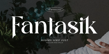
- Bordershine by CBRTEXT Studio,
$15.00
- Dimor by Nine Font,
$20.00
- Space 51 by Mightyfire,
$10.00
- Agnia by Phoenix Group,
$9.00
- Celeb MF by Masterfont,
$59.00


