10,000 search results
(0.069 seconds)
- Asimilates by UICreative,
$23.00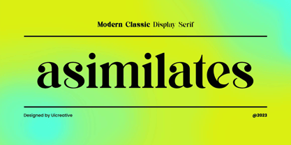 Introducing our new product the name Asimilates Modern Classic Serif Display Font Family comes with 9 different weights. Modern Serif font that beautiful classy, elegant, and modern. This font is perfectly suited for a wide variety of projects, such as signature, stationery, logo, wedding, typography quotes, magazine or book covers, website headers, clothing, branding, packaging design, and more. Also for fashion-related branding or editorial design and displays both masculine and feminine qualities.
 - Somnium Amor by Salsabiyl Studios,
$15.00 Introducing Somnium Amor Modern Serif Font Somnium Amor is a modern and elegant serif font. This serif font is perfect for your next branding project. This serif font has plenty Characters and has Multilingual Support. Somnium Amor is perfect choice for people looking for clean, modern, minimalist, elegant, beauty design styles. Suitable for almost any graphic designs such as logo, branding materials, business cards, gift cards, t-shirt, cover, thumbnail, print, poster, photography, quotes .etc.
 - Somes Slab by Ie Fonts,
$10.00 Somes Slab Small Caps Extra-Light Display IMPROVED VERSION 2.0 + SWASH Somes Slab is a slab serif small caps designed by Ivan Yelizarow in 2019, inspired and named after The Matiu/Somes Island in Wellington, New Zealand. Its distinctive feature is a combination of wavy curves with slab serifs that makes it ideal for titling, headlines, subheads, spotlighting a short few-paragraph text that needs detachment. Best at Display sizes. Complete classification: Wavy Squircle Slab-Serif Small Caps Extra-Light Display.
 - Diablo by Solotype,
$19.95Diablo Light was originally called Fabric and was issued by the Farmer, Little & Co. foundry in New York. We liked everything about this font except for the lowercase 'g'. So we changed the offending letter, but for purity kept the orginal as an alternate. We created a bold version of Diablo Light, with minor changes to accomodate the bolder stroke weight. Although the original design is over a century old, the style seems to have an up-to-date look. - Only One by Letterara,
$10.00 Only One is a stylish, unique, handwritten family that is easy to remember. It’s great for unique branding, photo overlays, watermarks, business cards, invitations, wedding, photography, fashion, etc. This font is available in 10 styles: Thin, Light, Regular, Semi Bold, Bold, Thin Italic, Light Italic, Italic, Semi Bold Italic, Bold Italic. And most importantly: Only one is perfect for you. Thanks for checking out my store, and feel free to get in touch if you have any questions! thomasaradea@gmail.com
 - Fonstery by Miracledsign,
$9.00 Fonstery is a font that is inspired by modern life with all the sophistication and excellence in the field of technology that makes fontstery very elegant and modern with style and full of future accents. Fonstery is formed and made by combining the contours and anatomy of a strong and sharp letter by highlighting the modern side so that it has extraordinary value when used in a template, game font, or your selling product which of course will be very interesting for those who see it and will certainly make the product. you look more elegant, modern and will add value to your product and add value to your product.
 - Fd Parfume by Fortunes Co,
$19.00 Modern serif fonts are a contemporary twist on traditional serif typefaces, striking a perfect balance between classic elegance and modern aesthetics. Combining clean lines with refined serifs, they exude a sophisticated and professional vibe, making them a popular choice for digital and print media alike. Their versatility enables them to work well in both body text and headlines, ensuring readability and visual appeal across various platforms. Modern serifs often showcase a higher contrast between thick and thin strokes, elevating legibility while preserving their distinctive character. Embraced by designers for their timeless charm with a contemporary edge, modern serif fonts continue to shape the visual language of our digital era.
 - Wavespired by Invasi Studio,
$19.00 Wavespired is a unique font that combines the playful and jazzy lettering of the 1950s cartoon modern style with a modern and sleek design. This font is perfect for creating eye-catching logos and headings that will stand out in any design project. The font is influenced by the retro vibes of the fifties, but with a fresh and modern twist that makes it ideal for today's design needs. The font is legible and easy to read, making it perfect for headlines, titles, and other design elements that need to be easily understood. The font is perfect for any project that requires a fun, retro-inspired design with a modern twist.
 - Galdien by Craft Supply Co,
$20.00 Introducing Galdien – Modern Sans Serif Font A Contemporary Typeface Galdien – Modern Sans Serif Font is, without a doubt, a testament to contemporary design simplicity and elegance. It seamlessly blends modernity with readability. Clean and Versatile Furthermore, Galdien’s clean lines and uncluttered appearance make it an extraordinarily versatile choice for a wide range of design applications. Its simplicity ensures it doesn’t overpower your message, making it a font suitable for various projects. Readability at its Core At its core, Galdien prioritizes readability. Each character is thoughtfully crafted to ensure clarity in both print and digital formats. This font’s legibility is especially essential for conveying your message effectively and effortlessly. Ideal for Modern Branding Additionally, Galdien is perfectly suited for modern branding initiatives. Its clean and sleek aesthetic aligns seamlessly with contemporary brand identities, offering a cohesive and professional look that resonates with today’s audience. In Conclusion Galdien – Modern Sans Serif Font is your unwavering companion for modern design endeavors. Its simplicity, versatility, and readability, combined with its adaptability to various media, make it an excellent choice for diverse projects. With Galdien, your message is not only communicated with clarity and style but also imbued with a contemporary touch that captivates your audience and leaves a lasting impression.
 - Gondola SD - 100% free

- Bola - Unknown license

- Linotype Punkt by Linotype,
$29.99 Linotype Punkt, from US designer Mischa Leiner, is part of the TakeType Library, chosen from the entries of the Linotype-sponsored International Digital Type Design Contest 1999 for inclusion on the TakeType 3 CD. This font, from US designer Mischa Leiner is available in three weights, light, regular and bold. The basic forms are those of a robust sans serif, however the figures are composed of evenly placed dots, hence the name Punkt, the German word for dot. This distinguishing characteristic lets this font look as though it appears on a background of light. One other unique trait of this font is the nature of the three weights. The figures of each weight have exactly the same measurements, the same width, breadth, etc. The only variable measurements are those of the individual dots making up the forms, making the bold weight much darker than the light while retaining the same outer contours. Linotype Punkt should be used in larger point sizes, as when it is too small the dots blur together and rob the font of its 'light'. The font is therefore best for headlines in large and very large point sizes.
 - Check Mate by Funk King,
$5.00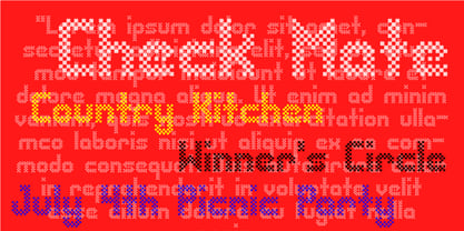 Check Mate is a modern, playful checkerboard-style font.
 - Cairus by Ixipcalli,
$18.00 Modern typeface for projects for videogames, furutis, space, action,...
 - Japanese by Volcano Type,
$29.00A different view of Japanese - fresh, modern and traditional! - Linotype Syntax Lapidar Serif Text by Linotype,
$29.99Modeled on the writings chiseled in stone in the second century B.C., Syntax™ Lapidar is an energetic, spirited typeface designed by Hans Eduard Meier in 2000. Linotype Syntax Lapidar Text and Linotype Syntax Lapidar Serif Text have five weights each, with both cap and lowercase letterforms. Lapidar Display and Lapidar Serif Display also have five weights each, with mostly all cap letterforms and many alternates. It's a terrifically fun and inventive family, and if you look closely, you can see the resemblance to the more modern and restrained Syntax™ relatives. Great for menus, artist books, travelogues, or advertising - and if used very sparingly, it could add just the right element of lapidary significance to corporate documents. - Molsaq Latin by Abjad,
$40.00 A multilingual type family that features a modern Arabic Naskh with very short descenders and ascenders, which matches with a full-caps Latin counterpart. Molsaq is perfect for setting applications that require tight leading, such as posters, hence the name, which means poster in Arabic. With 1050 glyphs, Molsaq Pro supports Arabic, Farsi, Urdu, and Kurdish, it also supports more than 60 languages that use the Latin script. Molsaq Pro comes with many Opentype features such as, stylistic alternates, ligatures, swashes, and small caps. Molsaq Latin includes all the Opentype features and the full languages support, except for the Arabic script. While Molsaq Arabic doesn't include Opentype features, and only support the Arabic script.
 - Linotype Syntax Lapidar Serif Display by Linotype,
$29.99Modeled on the writings chiseled in stone in the second century B.C., Syntax™ Lapidar is an energetic, spirited typeface designed by Hans Eduard Meier in 2000. Linotype Syntax Lapidar Text and Linotype Syntax Lapidar Serif Text have five weights each, with both cap and lowercase letterforms. Lapidar Display and Lapidar Serif Display also have five weights each, with mostly all cap letterforms and many alternates. It's a terrifically fun and inventive family, and if you look closely, you can see the resemblance to the more modern and restrained Syntax™ relatives. Great for menus, artist books, travelogues, or advertising - and if used very sparingly, it could add just the right element of lapidary significance to corporate documents. - Linotype Syntax Lapidar Display by Linotype,
$29.99Modeled on the writings chiseled in stone in the second century B.C., Syntax™ Lapidar is an energetic, spirited typeface designed by Hans Eduard Meier in 2000. Linotype Syntax Lapidar Text and Linotype Syntax Lapidar Serif Text have five weights each, with both cap and lowercase letterforms. Lapidar Display and Lapidar Serif Display also have five weights each, with mostly all cap letterforms and many alternates. It's a terrifically fun and inventive family, and if you look closely, you can see the resemblance to the more modern and restrained Syntax™ relatives. Great for menus, artist books, travelogues, or advertising - and if used very sparingly, it could add just the right element of lapidary significance to corporate documents. - Valienta Script by Colllab Studio,
$19.00 "Hi there, thank you for passing by. Colllab Studio is here. We crafted best collection of typefaces in a variety of styles to keep you covered for any project that comes your way! Fonts never fit your designs ? They’re just not flexible enough, not modern enough or too old-fashioned? And you’re too busy to keep looking for a font that fits the bill, right? The market is flooded with all kinds of fonts, but none of them is simple and elegant. Valienta Script is what you’re looking for. It’s an elegant typeface created to make your designs stand out from the crowd, and to add a touch of luxury. A Million Thanks www.colllabstudio.com
 - Heliopride by Keristyper Studio,
$14.00 Heliopride A Monoline Script Font was fully thought out to easily meld inside your designs. An excellent choice to add the right amount of elegance. This custom-made font was specifically designed to fit whatever you need. Perfect for social media posts and ads, printed quotes, t-shirt designs, packaging, or even as a modern text overlay to any background image. Heliopride Handwriting Font multilingual support: Afrikaans, Albanian, Catalan, Danish, Dutch, English, Estonian, French, Finnish, German, Icelandic, Indonesian, Italian, Malay, Norwegian, Portuguese, Spanish, Swedish, Zulu, and many more. What’s Included : Standard & Multilingual glyphs Ligature Works on PC & Mac Simple installations Accessible in Adobe Illustrator, Adobe Photoshop, Adobe InDesign, and even work on Microsoft Word. Hope you enjoy our font!
 - Molsaq Pro by Abjad,
$100.00 A multilingual type family that features a modern Arabic Naskh with very short descenders and ascenders, which matches with a full-caps Latin counterpart. Molsaq is perfect for setting applications that require tight leading, such as posters, hence the name, which means poster in Arabic. With 1050 glyphs, Molsaq Pro supports Arabic, Farsi, Urdu, and Kurdish, it also supports more than 60 languages that use the Latin script. Molsaq Pro comes with many Opentype features such as, stylistic alternates, ligatures, swashes, and small caps. Molsaq Latin includes all the Opentype features and the full languages support, except for the Arabic script. While Molsaq Arabic doesn't include Opentype features, and only support the Arabic script.
 - Sana Sans by Latinotype,
$29.00 Sana Sans is a humanist functional typeface with a modern feel. It is intended to be a face well-suited for multiple purposes, especially in publishing. Sana Sans looks perfectly legible and clean in long texts, and neat and simple in headlines. Thanks to its versatility, this font is also ideal for both screen and print usage. Sana Sans consists of 32 styles and 8 weights—ranging from Thin to Heavy—italics, small caps and an alternative family. The alternative family offers slight variants in many glyphs, some of which include the lowercase a, e, l, q, y and uppercase G, L, and Q. Sana Sans was designed by Felipe Sanzana, under the supervision of Latinotype Team.
 - Linotype Syntax Lapidar Text by Linotype,
$29.99Modeled on the writings chiseled in stone in the second century B.C., Syntax™ Lapidar is an energetic, spirited typeface designed by Hans Eduard Meier in 2000. Linotype Syntax Lapidar Text and Linotype Syntax Lapidar Serif Text have five weights each, with both cap and lowercase letterforms. Lapidar Display and Lapidar Serif Display also have five weights each, with mostly all cap letterforms and many alternates. It's a terrifically fun and inventive family, and if you look closely, you can see the resemblance to the more modern and restrained Syntax™ relatives. Great for menus, artist books, travelogues, or advertising - and if used very sparingly, it could add just the right element of lapidary significance to corporate documents. - Loew by The Northern Block,
$39.00 Loew is a geometric sans serif font influenced by the methods of the early industrial designers. Pure mechanical shapes are carefully adjusted to give the characters the right form, function and usability. These subtle human touches combined with the technical detail provide great readability at both large and small point sizes. Loew is a versatile sans serif font with simple and honest geometry aimed at a wide range of modern applications. Details include over 800 characters with alternative lowercase a, e and g. Seven variations of numerals, true small caps with accents, manually edited kerning and Opentype features. For additional non-latin language support in Cyrillic, Greek and Arabic, visit Loew Next and Loew Next Arabic.
 - Areon Flux by DePlictis Types,
$33.00 The future is right here, today, and Areon Flux comes to point that out. It’s a font family consisting in three weights that makes it a notable choice for designers that have to do with techy, futuristic layouts or printing materials. The lettering design appeal as sharp, powerful, distinctive and kind of modular, remembering the upcoming space exploration opportunities that are ready to enlarge our horizons in the next years. Areon Flux family is designed and published in late ‘20/ early ’21 and has an established discount for more that 30% for all the weights buyed together that makes it a versatile fresh and modern display not to be missed by edgy designers.
 - Molsaq Arabic by Abjad,
$50.00 A multilingual type family that features a modern Arabic Naskh with very short descenders and ascenders, which matches with a full-caps Latin counterpart. Molsaq is perfect for setting applications that require tight leading, such as posters, hence the name, which means poster in Arabic. With 1050 glyphs, Molsaq Pro supports Arabic, Farsi, Urdu, and Kurdish, it also supports more than 60 languages that use the Latin script. Molsaq Pro comes with many Opentype features such as, stylistic alternates, ligatures, swashes, and small caps. Molsaq Latin includes all the Opentype features and the full languages support, except for the Arabic script. While Molsaq Arabic doesn't include Opentype features, and only support the Arabic script.
 - Neospace Circuit Exp - Personal use only

- RQND Pro V.2 by Tondi Republk,
$25.00 Introducing RQND Pro 2 - The Futuristic and Industrial Sans Serif Font Welcome to the world of RQND Pro 2, a cutting-edge sans serif font designed to elevate your designs to new heights. With its industrial aesthetic and futuristic appeal, this font is the perfect choice for projects seeking a bold and contemporary look. Key Features: 1,201 Glyphs: RQND Pro 2 boasts an extensive character set, offering you a vast array of design possibilities. Supports 123 Languages: No matter where your audience is, this font ensures that your message is conveyed clearly and effectively. 20 Font Styles: With 5 font weights and 5 font widths, RQND Pro 2 offers 20 unique styles to suit every creative vision. Expanded to Extra Condensed: Whether you need a spacious layout or a compact design, this font delivers unmatched versatility. 18 OpenType Features: Unlock the full potential of RQND Pro 2 with various OpenType features, including small caps, alternate characters, standard numerals, circled numerals, fractions, and more. All Caps Font: Embrace the power of uppercase letters with this font, enhancing the impact of your message. Full Character Set: From standard numerals to punctuation marks, mathematical symbols to special characters, RQND Pro 2 has everything you need for seamless communication. Latin and Cyrillic Support: Perfect for international projects, this font provides complete support for both Latin and Cyrillic languages. RQND Pro 2 empowers designers, creatives, and typographers to explore new design territories. Its sleek and modern appearance makes it ideal for tech branding, UI design, editorial projects, advertisements, web design, and more. Discover a font that combines sophistication with contemporary flair. Elevate your designs with RQND Pro 2 and leave a lasting impression on your audience. Explore the full range of styles and unleash your creativity today.
 - Gambler by Fenotype,
$25.00 Gambler is a characteristic display type collection of 7 font styles with both clean and textured -making it total 14 fonts designed to play together. Gambler strikes with witty and elegant appeal combining vintage and modern elements. Gambler is an effective set for creating identities for branding, posters, book covers, headlines, logotypes, prints on garments, restaurant menus, beer labels and so on, both offline and online. Gambler Script is a smooth contrasted script that comes in two weights and it is packed with plenty of OpenType features: Standard Ligatures and Contextual Alternates are automatically on and they help to keep the flow and connections smooth. From Stylistic Alternates you’ll find characters with pointed endings and some other small variations. For extra flair try Swash or Titling Alternates. Gambler Script is PUA encoded so you can access the extra characters in most graphic design softwares. Gambler Brush is a soft brush script with low contrast and large x-height. Gambler Brush comes with following OpenType features: Standard Ligatures and Contextual Alternates that are automatically on and that keep the connections smooth. For less uneven word picture try Stylistic or Swash Alternates. Gambler Brush is PUA encoded so you can access the extra characters in most graphic design softwares. Gambler Flare is a flared serif with sharp edges and wide characters Gambler Flare comes in two weights. Gambler Gothic is a rigid condensed sans serif that comes in two styles: Regular and Shadow. Gambler Gothic Shadow has a narrow lining giving a three dimensional expression to the font. Gambler fonts are designed to play together, in pairs, or all together but they also work great as themselves or combined with other Fenotype Fonts.
 - The "Bright Lights" font by onezero is a vivid, captivating typeface that practically vibrates with energy and charisma. It's a font that doesn't just sit quietly on the page or screen; it demands at...
- Sabron by Fontron,
$35.00Sabron Light is a very round font with the thickness at the corners rather than the side as in most typefaces. Serifs are swollen ends coming to a point. - French Flair by PeachCreme,
$14.00 "French Flair" is our latest font pair! With a graceful decorative serif and contrasting light and crisp italic, French Flair duo can be handy in any trending design project.
 - Pantra by Nicolas Deslé,
$19.90 Pantra is a minimal and clear geometric sans. Pantra is clear, approachable, and effective in both headings and paragraphs and comes in 4 weights: light, regular, medium and bold.
 - Moderator JNL by Jeff Levine,
$29.00 Moderator JNL is a casual, light weight serif font that is perfect for headlines, short blurbs or display text. The font is available in both regular and oblique versions.
 - Sketchetik Fill by Hiekka Graphics,
$19.00 Sketchetik Fill – brother of famous Sketchetik – is a hand-drawn font in four styles: Light, Regular, Bold and Black. Sketchetik Fill is recommended for use as a display typeface.
 - Kidnap Note - Personal use only

- SHARKBOY & lavagirl - Personal use only

- Comic Relief - Personal use only

- Spund, as it sounds, might evoke the idea of a font that is playful and perhaps rounded, suggesting a certain whimsy and casualness in its design. As there isn't a widely recognized typeface by this ...


