10,000 search results
(0.02 seconds)
- Bullaina by Balevgraph Studio,
$14.00 Bullaina is a dainty and flowing handwritten font. Sweet and joyful, this font will be ideal for writing wedding invitations, cards or any other design that may need a romantic, personalised touch! What's Included : - Uppercase, Lowercase, Numerals & Punctuations - Ligature & Alternate - Works on PC & Mac - Simple installations - Multilingual support - PUA Encoded
 - Bridgera by Akrtype Studio,
$15.00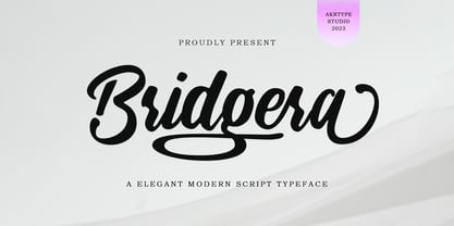 Bridgera script font is a magical script font carefully created with a touch of elegance. This is a beautiful combination of timeless elegance and authentic calligraphy. It features an incredibly classic style, while still keeping a friendly feel. Bridgera script font is the perfect font for making original and outstanding designs.
 - Brvsheed by Mofr24,
$10.00 Introducing Brvsheed, a modern handwritten font that exudes uniqueness with its brushed texture. With both Regular and Italic styles, it's a versatile choice for posters, marketing, T-shirt design, and more. Its multilingual support enhances its usability, while its distinctive look adds flair to titles, YouTube thumbnails, and gaming graphics.
 - Shaheen pro Arabic by Zaza type,
$99.00 Shaheen pro is a version of Shaheen typeface, Shaheen pro is an Arabic and Latin typeface that embodies power and a tendency towards uniformity. While preserving the neat, minimalist look which is associated with it. The name, too, hints at the strong character of the typeface. Shaheen comes in 5 wights
 - Valentine Soul by Sakha Design,
$14.00 Valentine Soul is a romantic and delicate handwritten font. Dainty and joyful, this font will be ideal for writing wedding invitations, cards or any other design that may need a dreamy, personalized touch! This font is PUA encoded which means you can access all of the glyphs and swashes with ease!
 - Modern Appliances JNL by Jeff Levine,
$29.00 If there s a back-story about the design inspiration for Modern Appliances JNL, it's lost to time. An unfinished design for quite a while, this clean sans with an Art Deco flair was recently completed, and the design quality should speak more for its appeal than any promotional blurb.
 - Holista by GlyphStyle,
$16.00 Holista is a casual calligraphy writing style, in a consistent bold-thin cursive. Beautiful and pretty font. This calligraphy font can be use for weddings, cosmetic product, photography logo, magazine, business cards, watermarks, etc. – Font feature Uppercase, Lowercase, Numerals & Punctuations, Stylistic alternate(ending), Ss01(ending), Ss02(beginning) Ligature, Swashes, Multilanguage
 - Youth Line by Sakha Design,
$14.00 Youth Line is a sweet and delicate handwritten font. Dainty and joyful, this font will be ideal for writing wedding invitations, cards, or any other design that may need a romantic, personalized touch! This font is PUA encoded which means you can access all of the glyphs and swashes with ease!
 - Le Major by Calamar,
$18.00 Le Major is my new elegant serif font that will bring in your projects a touch of luxury and style. It's perfect match for logotypes, branding, wedding monograms and invitations, blog headlines and much more. Flip through all the previews and get inspired like I was while creating this font.
 - Begiko 17 by Begiko,
$10.00 Begiko17 is a monoline typeface family which was designed to be a font of ease lecture with features in the rhythm and proportions of school writing. In addition to the standard characters, Begiko17 includes several useful mathematical characters. Its strength relies in the clarity, simplicity and harmony of its traces.
 - Arunika by Skinny Type,
$14.00 Arunika is an elegant and flowing handwritten font. It is PUA encoded which means you can access all of the glyphs and swashes with ease! It maintains its classy calligraphic influences while feeling contemporary and fresh. Fall in love with this font and bring your projects to the highest levels!
 - Andrew Dawkins by Violatype,
$14.00 Introducing the "Andrew Dawkins" font, a handwritten style font created directly by hand, resulting in beautiful, natural, and unique writing. Andrew Dawkins font is very suitable for branding, logotypes, magazines, quotes, wedding invitations, crafts, printed designs, and others. Andrew Dawkins font supports many languages around 90 languages, amazing isn't it?
 - Athalia Script by Letterhend,
$16.00 Introducing, Athalia, a lovely modern script that bring luxury feel. The natural hand writing script is suitable for you who needs a typeface for headline, logotype, apparel, invitation, branding, packaging, advertising etc. This typeface is comes in uppercase, lowercase, punctuation, symbols & numerals, stylistic set alternate, ligatures, etc also support multilingual.
 - Personal Invitation JNL by Jeff Levine,
$29.00 One of the lettering examples in the 1913 book “Instructions on Modern Show Writing” is a delightful calligraphic alphabet that’s perfect for everything from show cards to invitational notes to names on certificates. It has been digitally redrawn as Personal Invitation JNL, and is available in both regular and oblique versions.
 - Guildhall by Device,
$39.00 Class, with a punch. It's rare to find fonts that are refined without being too delicate, stylish while still being bold and impactful. Guildhall is a heavy rectangular flared serif in face widths with matching italics. Suitable for film posters, rock concerts and band logos, beer labels, packaging and magazine headlines.
 - Designator by TEKNIKE,
$39.00 Designator is a display modular monospace font. The typeface has a distinct technical geometry using sharp angled corners. "Designator" name is derived from Latin "designare" and means to mark, point out or to indicate. Designator is great for team sports, display work, invitations, writing, architecture, fashion, posters, logos and headings.
 - Nathallia by Portograph Studio,
$20.00 Nathallia is a bold serif while elegance still maintained. It will boost your design stand out! Nathallia is the perfect typeface for any kind of your project, such as advertisements, branding, graphic design, quotes, wedding design, logo for online or offline business, photography, and others. Make your business more elegant beautiful!
 - Bradbury Five by Device,
$39.00 A stylish cartoon sans reminiscent of lettering by Harvey Kurtzman on early issues of Mad, or other casual mid-century types. The three widths give full versatility for expressive, customised headlines and layouts, while the lighter weights can be used for text. Conveys an approachable, light touch with style and finesse.
 - Caliber by Loaded Fonts,
$15.00A highly decorative slab-serif that is combat ready. The steady contrast and sharp angles make it great for titles and posters. Mechanical and aggressive but can easily be used for static background text and shapes. May keep Bodoni and Niagara Solid company if not for just a short while. - Gendos by Febri Creative,
$14.00 Gendos is a sans serif condensed font family that is designed with a simple but unique shape. This font family has 10 styles consisting of 5 normal shapes and 5 italics. Gendos font can be used for logos, book or magazine cover titles, product brands, or just for writing articles.
 - Through Brush by Realtype,
$16.00 Through Brush consists of sophisticated handwriting, elegant, classy and modern. With a little bit of dirty curves it is made from the new trend typefaces now to look as close as possible to the natural brush writing, Through Brush is perfect for adding a modern and classy touch to your project.
 - Black Delights by Mokatype Studio,
$19.00 Hello Introducing, Black Delights - Elegant Ligatures Connected Serif is an elegant and unique font that uses ligatures to smoothly link letters. Perfect for adding a unique twist to word-mark logos Black Delights has 16 ligatures as well making it super fantastic.Ligature can be turned off if required standard writing needs.
 - Poetically Dark by Pitt's Hand,
$10.00 Poetically Dark is a font created to recall a certain type of dark and romantic writing from another century. Well-groomed letters, but written instinctively, as if in the throes of a creative frenzy. In a clash between the refined taste of the past and the ever-present speed of communication.
 - Wheaton by Typodermic,
$11.95 Introducing Wheaton, the bold and striking headline typeface that brings together the best of retro and techno aesthetics. With its softened letterforms and classic electronic vibe, Wheaton will transport your message into the future while invoking a sense of nostalgia for the past. At first glance, Wheaton’s design may seem like a throwback to the 1980s, with its clean lines and futuristic curves. But upon closer inspection, you’ll notice the subtle details that give it a contemporary edge. Its softened edges and fluid curves evoke a sense of modernity and sophistication, while its retro digital gloss adds a touch of nostalgia to your message. But Wheaton isn’t just about looks. Its scientific elegance and industrial wonder make it the perfect typeface for conveying a sense of technological progress and innovation. Whether you’re designing a website, creating an advertisement, or crafting a presentation, Wheaton is the perfect choice for making a bold statement. In the world of graphic design, standing out is key. With Wheaton, you can be sure that your message will be noticed and remembered. Its unique blend of retro and techno aesthetics gives it a distinct personality that will set your work apart from the rest. So why settle for a boring, generic typeface when you can have Wheaton? Let its futuristic assurance and industrial wonder take your message to the next level, and discover a new world of creative possibilities. Most Latin-based European writing systems are supported, including the following languages. Afaan Oromo, Afar, Afrikaans, Albanian, Alsatian, Aromanian, Aymara, Bashkir (Latin), Basque, Belarusian (Latin), Bemba, Bikol, Bosnian, Breton, Cape Verdean, Creole, Catalan, Cebuano, Chamorro, Chavacano, Chichewa, Crimean Tatar (Latin), Croatian, Czech, Danish, Dawan, Dholuo, Dutch, English, Estonian, Faroese, Fijian, Filipino, Finnish, French, Frisian, Friulian, Gagauz (Latin), Galician, Ganda, Genoese, German, Greenlandic, Guadeloupean Creole, Haitian Creole, Hawaiian, Hiligaynon, Hungarian, Icelandic, Ilocano, Indonesian, Irish, Italian, Jamaican, Kaqchikel, Karakalpak (Latin), Kashubian, Kikongo, Kinyarwanda, Kirundi, Kurdish (Latin), Latvian, Lithuanian, Lombard, Low Saxon, Luxembourgish, Maasai, Makhuwa, Malay, Maltese, Māori, Moldovan, Montenegrin, Ndebele, Neapolitan, Norwegian, Novial, Occitan, Ossetian (Latin), Papiamento, Piedmontese, Polish, Portuguese, Quechua, Rarotongan, Romanian, Romansh, Sami, Sango, Saramaccan, Sardinian, Scottish Gaelic, Serbian (Latin), Shona, Sicilian, Silesian, Slovak, Slovenian, Somali, Sorbian, Sotho, Spanish, Swahili, Swazi, Swedish, Tagalog, Tahitian, Tetum, Tongan, Tshiluba, Tsonga, Tswana, Tumbuka, Turkish, Turkmen (Latin), Tuvaluan, Uzbek (Latin), Venetian, Vepsian, Võro, Walloon, Waray-Waray, Wayuu, Welsh, Wolof, Xhosa, Yapese, Zapotec Zulu and Zuni.
 - Octin College by Typodermic,
$11.95 Octin College is a typeface that commands attention with its bold and robust appearance, making it an excellent choice for any project that requires a strong and authoritative voice. Designed with the collegiate aesthetic in mind, Octin College is a versatile font family that boasts seven weights ranging from light to black. Each weight of Octin College features a distinct personality, allowing designers to experiment with various typographical compositions to create unique and engaging designs. The lighter weights are perfect for creating elegant headlines, while the heavier weights pack a powerful punch that demands attention. But don’t be fooled by its name, Octin College is not limited to academic applications. Its bold and blocky appearance makes it an ideal choice for various themes, including sports, construction, police, and military themes. This typeface exudes a sense of strength and confidence, making it an excellent choice for any project that requires a bold and impactful design. Octin College is a tough and tenacious typeface that is sure to impress. Its versatility and robustness make it an excellent choice for designers looking to add a touch of collegiate design to their work, while its distinctive personality ensures that it stands out in any application. So whether you’re designing for a university or a prison, Octin College is the perfect choice to make your design stand out. Check out the rest of the Octin families: Octin Sports, Octin Prison, Octin Stencil, Octin Vintage & Octin Spraypaint. Most Latin-based European writing systems are supported, including the following languages. Afaan Oromo, Afar, Afrikaans, Albanian, Alsatian, Aromanian, Aymara, Bashkir (Latin), Basque, Belarusian (Latin), Bemba, Bikol, Bosnian, Breton, Cape Verdean, Creole, Catalan, Cebuano, Chamorro, Chavacano, Chichewa, Crimean Tatar (Latin), Croatian, Czech, Danish, Dawan, Dholuo, Dutch, English, Estonian, Faroese, Fijian, Filipino, Finnish, French, Frisian, Friulian, Gagauz (Latin), Galician, Ganda, Genoese, German, Greenlandic, Guadeloupean Creole, Haitian Creole, Hawaiian, Hiligaynon, Hungarian, Icelandic, Ilocano, Indonesian, Irish, Italian, Jamaican, Kaqchikel, Karakalpak (Latin), Kashubian, Kikongo, Kinyarwanda, Kirundi, Kurdish (Latin), Latvian, Lithuanian, Lombard, Low Saxon, Luxembourgish, Maasai, Makhuwa, Malay, Maltese, Māori, Moldovan, Montenegrin, Ndebele, Neapolitan, Norwegian, Novial, Occitan, Ossetian (Latin), Papiamento, Piedmontese, Polish, Portuguese, Quechua, Rarotongan, Romanian, Romansh, Sami, Sango, Saramaccan, Sardinian, Scottish Gaelic, Serbian (Latin), Shona, Sicilian, Silesian, Slovak, Slovenian, Somali, Sorbian, Sotho, Spanish, Swahili, Swazi, Swedish, Tagalog, Tahitian, Tetum, Tongan, Tshiluba, Tsonga, Tswana, Tumbuka, Turkish, Turkmen (Latin), Tuvaluan, Uzbek (Latin), Venetian, Vepsian, Võro, Walloon, Waray-Waray, Wayuu, Welsh, Wolof, Xhosa, Yapese, Zapotec Zulu and Zuni.
 - Vasarely by B2302,
$33.00 VASARELY has famous roots, its name is related to optical arts own Victor Vasarely. Dropping the field of Op-Art, you already know where we have been aiming at. The REGULAR and LIGHT cuts of VASARELY are quite ordinary, rectangular, but legible typefaces, but with the BOLD and EXTRABOLD versions you will be able to build diverse illusive type illustrations and layouts. Being build on a strict grid with same dimensions, the eye-affecting black-and-white contrast should trigger different optical effects. As an extra we build an EXTRUDED version as well. Have fun!
 - Marketing Strategy JNL by Jeff Levine,
$29.00 Marketing Strategy JNL was inspired by some display signage used in an episode of the classic "Alfred Hitchcock Hour". Evoking the early-60s feel of kitchy advertising, this display font has a limited character set and is specifically designed for creating retro ad banners and point-of-sale attention getters as well as period piece signage. For those preferring a blank hexagon for spaces between words, one is located on the equal key. Marketing Strategy JNL is available in both regular (outline) and solid (white letters on black) versions.
 - Spekulatus by Bogstav,
$18.00 Spekulatus is a made up name, and that was what I needed for a font like this. I am not sure which category it fits in: grunge, square, handmade, rough or maybe even graffiti? Well, let's just say that it fits in all 5 - or perhaps even more? All letters are handdrawn, and messed up a bit with a thin fine white liner, leaving a gentle grungy and worn effect. I've added 5 different versions of each letter, which is quite nice - not having the same letters repeating all the time!
 - Odin by ITC,
$29.00The extravagant Odin was designed by Bob Newman in 1972. Its figures display constructed basic forms and when set into words, the typeface builds closely set lines. The strong serifs catch the reader's eye and draws it horizontally across the page. The forms of the capital letters are particularly distinctive. In the upper third, the stroke beginnings seem to form a roof over the body of the letter, fragmented by a fine white line that lends them independence and dominance. Odin is best used for headlines in display point sizes. - Playmax by OhType!,
$16.00 It is difficult to classify a typography that is made from different line fragments but precisely that is what makes it stand out from the rest, a construction that took months and multiple corrections that now make up a set of glyphs with is own identity based on the game between blacks and whites, standing out especially in large formats, posters, headlines, logos and titles. Playmax is a typeface with which you can find endless forms of customization, from its basic structure to the number of effects it supports.
 - Banner by ITC,
$29.99The calligraphy font Banner was designed by Martin Wait in 1986 and mixes the character of the 1940s with that of the 1980s in its forms. The round and somewhat reserved lower case letters make a balanced basis for the generous capitals. Black outer contours surround a white inner area and are heavier on the right side of the figures, making the characters look as though they have shadows. Banner should be used in point sizes of 18 and larger and is meant for lighthearted short texts or headlines. - Snippity Snap by Hanoded,
$15.00 Snippity Snap is a font made up of glyphs I cut out from black paper with some household scissors, then pasted onto white paper. When I was cutting out the shapes, my children asked me what I was doing, and when I told them, they thought it was pretty cool and started cutting out shapes from paper themselves. The result is a house filled with paper cuttings, which I keep finding everywhere - even in my bed. Snippity Snap is a very nice font for ads, book covers, packaging and children's books. Enjoy!
 - Moraz - Unknown license

- Hope Sans by Monotype,
$50.99 Hope Sans™ takes the jaunty style of 1950s and 60s lettering and melds it with the jubilant 1970s swashes of Bookman. The result is a sans serif family that is lively, inviting and deeply customizable. Its basic sans serif forms create engaging text, while a roaring collection of swash designs, alternate characters and ligatures make it a natural for attention-grabbing display typography. Hope Sans has been selected by the judges of the 22nd Annual TDC Typeface Design Competition to receive the Certificate of Typographic Excellence. The middle weights of the family are easy on the eyes and shine at smaller sizes and in blocks of text copy. Their friendly vibe also translates well to web and interactive design projects. Spacing is open, counters are large and Hope Sans’ range of six weights can provide just the right design for virtually any need. Headlines, subheads, banners and navigational links are naturals for its lightest and boldest weights – either with, or without, the swash letters. “Hope Sans is a paint box,” says its designer, Charles Nix. “In its basic form, it’s a sturdy grotesque, capable of setting text in a cool and relaxed way. But a bit of accenting with the alternate forms easily creates an entirely different mood and meaning. And for those that are willing to really mix with it, the variety of alternate characters can build truly unique typographic statements.”
 - Burgues Script by Sudtipos,
$99.00 Burgues Script is an ode to the late 19th century American calligrapher Louis Madarasz, whose legendary pen has inspired schools of penmanship for over 100 years. His talent has caused some people to call him “the most skillful penman the world has ever known.” I use the word ‘ode’ in a colloquially ambitious manner. If I was an actual poet, my words would be about things I desire but cannot attain, objects of utter beauty that make me wallow in humility, or people of enormous talent who look down at me from the clouds of genius. But I don’t write poems. My work consists of letters drawn to fit together, that become an element of someone’s visual poetry. I am the poet’s assistant, so to speak. Once in a while, the assistant persists on what the subject of the poem will be. And occasionally, the poet gives in to the persistence. I hope you, visual poet, find my persistence justified in this case. The two main sources for Burgues were the calligraphy examples shown in Zaner Bloser’s The Secret of the Skill of Madarasz: His Philosophy and Penmanship Masterpieces, and C. W. Jones’s Lessons in Advanced Engraver’s Script Penmanship by L. Madarasz. These two references were the cornerstone for the concept I was trying to work with. I did have to change many of the letters in order to be able to produce digital calligraphy that can flow flexibly and offered the user a variety of options, while maintaining its attractive appearance. To this end, many ligatures and swashes were made, as well as full flourished sets of letters for use at the beginnings or endings of words and sentences. All of this has been tied together with OpenType and tested thoroughly within today’s standard design and desktop publishing software. After working with digital scripts for so long, at one point I thought that Burgues Script would become a bit of a chore to complete. I also thought that, like with most other scripts, the process would regularize itself after a while and be reduced to a mechanical habit. Surprisingly, and fortunately for me, this did not happen. The past holds as many surprises as the future. Madarasz’s method of penmanship was fascinating and challenging to translate into the strict, mathematically oriented language of the computer. It seems that the extremely high contrast of the forms, coupled with the required flow and connectivity of such lettering, will always be hard work for any visual artist to produce, even with the aide of a powerful machine. I can only imagine what steady nerves and discipline Madarasz must have had to be able to produce fully flourished and sublimely connected words and sentences on a whim. When I think of Madarasz producing a flourished calligraphic logotype in a few seconds, and try to reconcile that with the timelines of my or my colleagues’ work in identity and packaging design, the mind reels. Such blinding talent from over a hundred years ago. Burgues is the Spanish word for Bourgeois. In the end, I hope Burgues Script will serve you well when a flourished word or sentence is required for a design project. One of the wonders of the computer age is the ability to visually conjure up the past, serving both the present and the future. With Burgues, you have a piece of “the most skillful penman the world has ever known,” at your service. Burgues received important awards such as a Certificate of Excellence TDC2 2008 and a Certificate of Excellence at the Bienal Tipos Latinos 2008.
 - Festive by TypeSETit,
$49.95 It's Festive! But don't let the name fool you... It's a fun script font (plus a Roman) accompanied by an assortment of exciting ornamental dingbats. In fact, it's the ornamentals that make this font so much fun! At first glance, Festive appears to be suited only for the Christmas holiday season. But wait… you can use the ornamental dingbats for any occasion where festivities abound— New Years, Valentines, St. Patty's Day, Back to School, Graduation, Baby & Wedding Showers, Halloween, Thanksgiving, and much more— even Sports. The base font works well with bodies of copy, while the alternate fonts can be used to swap out individual characters to give a custom, hand written look. Be sure to scroll thru to see all 14 fonts in this package—especially the fun ornamental dingbats. Festive Regular is included with all the alternate fonts (Festive One thru Ten) which are sold as two font sets. The PRO version contains all the glyphs of the family plus OpenType programming to easily access alternates. The Festive family of fonts are PUA encoded, so you can access them easily. So, get in the mood and have FESTIVE fun!
 - Blorp by Missy Meyer,
$12.00 I had a totally different name assigned to this font at first. Then, while drifting off to sleep one night during the creation process, my sleepy brain said, "You know, BLORP would be a great name to go with these letter shapes." Normally when I have those half-asleep ideas and look at them in the morning, they make no sense. But I decided to make a sample image for BLORP, and it turns out I really like it! So ... BLORP it is! This font is extensively edited for super-smooth lines and curves, so it'll cut like butter in your Cricut or Silhouette machine. Though it's also super cute for print projects, logos, branding, or anything else you want to use it for! It has a funky mix of letter sizes and heights, and two sets of uppercase letters, so you can mix everything together JuSt LikE tHIs, and it'll still look great! BLORP includes over 300 extended Latin characters for language support, including, but not limited to: Catalan, Czech, Danish, Esperanto, Estonian, Finnish, French, Gaelic, German, Icelandic, Irish, Italian, Latvian, Lithuanian, Norwegian, Polish, Portuguese, Romanian, Serbian (Latin), Slovak, Slovenian, Spanish, Swedish, Turkish, Welsh, and more!
 - Sassoon Handwriting Starter by Sassoon-Williams,
$45.99 Sassoon fonts package for handwriting starters The three upright "infant" fonts developed to meet the demand for letters to produce pupil material for handwriting as well as for reading. Letters have extended ascenders and descenders ideal on screen and print. They facilitate word recognition. The exit strokes link words together visually, also crucially, they space the letters for improved legibility. The "joined" font puts the skills gained into practice producing joined-up handwriting. Together these typefaces provide a valuable resource for Teachers to create consistent material across the curriculum. Sassoon Infant Tracker B font: This font with its direction arrows helps pupils to start in the correct place. Motor movements can be refined by keeping inside the line. When starting and direction is no problem, the arrow font can be dropped and the Dotted font used. Sassoon Infant Dotted B font: Writing over the dots of this font refines motor skills. The aim here is to give confidence by reinforcing starting points, exits and to now encourage fluidity. Sassoon Infant font: With some words in this font and a baseline beneath to copy onto, pupils can use their learned starting points and exit strokes to write freely along the baseline - still unjoined. Once learned, this leads to spontaneous joins along the baseline leading logically to a joined-up hand. Sassoon Joined font: Having learned to write letters with correct starts and exits, this is when the joined font for teaching handwriting can be used. With some words in this font and a baseline beneath to copy onto, pupils can use their learned starting points and simply extend their exit strokes to make joined-up writing. The default joins the font provides are recommended, however there are alternative letterforms that are so important for some Teachers which can be accessed. Create ‘pen lifts’ anytime too! NOTE: Fonts display unjoined by default on this website and are delivered that way - joining is controlled by your text editing application such as Word or TextEdit, read more for instructions… Free to download PDF resources: Stylistic Sets and how to access the alternative letters feature in these OpenType fonts. Using the separate letter fonts Using the joined font Teachers copybooks using these fonts: How to teach pre-cursive Copybook How to teach cursive handwriting Copybook
 - Soulfinger PB by Pink Broccoli,
$16.00 Soulfinger PB is a another frisky offbeat typeface from Pink Broccoli, this time inspired by a vintage paperback cover of Patricia Highsmith's "A Pleno Sol". Soulfinger is a flare serif with just enough visual dance to it without going off the rails. It's simply a celebration of the original vintage paperback titling, letting it's freak flag fly, so to speak.
 - HU Retroround by Heummdesign,
$50.00 'HU Retroround' is a font that captures the feel of the retro typefaces used on signboards during Korea's modernization era. This font has a variable function, allowing users to fine-tune the thickness they want. (Available only in Adobe programs.) Six basic weights are provided so that they can be used even in programs that do not apply the variable function.
