10,000 search results
(0.017 seconds)
- M Hei HK by Monotype HK,
$523.99HK series fonts are in Unicode encoding and consists of BIG 5 character set and HKSCS characters. The character glyphs are based on the regular Traditional Chinese writing form and style. It is generally used in Taiwan ROC, Hong Kong and Macau. - De Gozaru by Bejeletter,
$14.00 De Gozaru, is a classic calligraphy font with a beautiful arch. This font is available in several modern swirls that can make your work look elegant, sweet and perfect. This font also has several alternatives that can allow you to improvise your writing.
 - PreCursive by Graffiti Fonts,
$9.99 This set of two fonts is intended for use by kindergarden & 1st grade teachers or anyone else teaching young children how to write. 2 Fonts are included, PreCursive Lined has the upper, lower & dotted mid line & the the Regular has only the letters.
 - Barila by Irina Vascovet,
$16.00 Barila is a fun hand written font that is perfect for projects like games, apps, books, holiday cards, and nursery art projects. It is very readable while keeping it's fun and whimsical personality. Multilingual characters are included for international customers as well.
 - Staly Home by IbeyDesign,
$17.00 Staly Home Handwritten Script Font is an exquisite handwritten font, masterfully designed to become a true favorite. It maintains its classy calligraphic influences while feeling contemporary and fresh. Fall in love with Stay Home and bring your projects to the highest levels.
 - Mineral by bb-bureau,
$60.00 Glittering writing, fractured into multiple tetragonal splinters, rectangular modules slightly spaced, like quartz and pixels. A Kapla style construction, with stencil properties (except Border and Outline version ) designed by Benoît Bodhuin . Mineral Solid has 4 stylistic titling alternatives (Border, Outline, Blunt and Smooth).
 - Breakfast Renegade by Crumphand,
$22.00 Hello, here's the new Handwriting font Breakfast Renegade. Breakfast Renegade is a family fonts. The style inspired by child writing. Easy to read, good kerning, easy to access multilingual What's Included Inside The Fonts ? Uppercase Lowercase Symbols Numbers European Multilingual Thank You, Regads
 - MSung HK by Monotype HK,
$523.99HK series fonts are in Unicode encoding and consists of BIG 5 character set and HKSCS characters. The character glyphs are based on the regular Traditional Chinese writing form and style. It is generally used in Taiwan ROC, Hong Kong and Macau. - Hirondelle by JBFoundry,
$18.00 With over 900 characters and with the contextual alternates, Hirondelle offers you a perfectly connected writing. By activating swashes, your texts will take a more remarkable expression. With its four weights, you will have a wide choice for your invitations, advertisements, packaging …
 - MHeiSung HK by Monotype HK,
$523.99HK series fonts are in Unicode encoding and consists of BIG 5 character set and HKSCS characters. The character glyphs are based on the regular Traditional Chinese writing form and style. It is generally used in Taiwan ROC, Hong Kong and Macau. - Greatest All of Time by Struggle Studio,
$16.00 Greatest All the Time - is a Duo Handwritten with Extras and petite (handwritten and modern look) Font Duo, featuring a sweet and gentle look. This original look will appeal to a variety of crafty ideas, from letterhead and titles to writing implements.
 - Big Trees by A New Machine,
$19.00 Inspired by a trip to Sequoia National Park, this bold, all cap font is reminiscent of the great west and wide open spaces. Upper case letters are solid while lower case letters feature shadow lines. Great for titles, branding and logo work.
 - M Windy HK by Monotype HK,
$523.99HK series fonts are in Unicode encoding and consists of BIG 5 character set and HKSCS characters. The character glyphs are based on the regular Traditional Chinese writing form and style. It is generally used in Taiwan ROC, Hong Kong and Macau. - Andina by Nissa Nana,
$23.00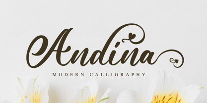 Andina is an exquisite handwritten font, masterfully designed to become a true favorite. It maintains its classy calligraphic influences while feeling contemporary and fresh. This font is PUA encoded which means you can access all of the glyphs and swashes with ease!
 - Babaloo by Lisa Holtzman,
$9.00 Originally executed using a stick and sumi ink, Babaloo is Lisa's first digital font. While great in larger point sizes, Babaloo is surprisingly legible in small point sizes as well. Its quirky, spontaneous nature makes it ideal as a casual, fun, display font.
 - Andalusia Signature by Letterena Studios,
$9.00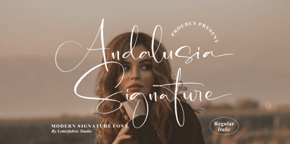 Andalusia Signature is an exquisite handwritten font, masterfully designed to become a true favorite. It maintains its classy calligraphic influences while feeling contemporary and fresh. This font is PUA encoded which means you can access all of the glyphs and swashes with ease!
 - M HG Reithic T HK by Monotype HK,
$523.99HK series fonts are in Unicode encoding and consists of BIG 5 character set and HKSCS characters. The character glyphs are based on the regular Traditional Chinese writing form and style. It is generally used in Taiwan ROC, Hong Kong and Macau. - Shaheen Arabic by Zaza type,
$29.00 Shaheen Arabic is an Arabic typeface that embodies power and a tendency towards uniformity. While preserving the neat, minimalist look which is associated with it. The name, too, hints at the strong character of the typeface. Shaheen Arabic comes in 5 wights
 - Sheree by Typadelic,
$14.95 Inspired by mid-century greeting card hand-lettering, Sheree is a unique serif font with some really fun qualities. While some characters are distinctly calligraphic and conformist in nature, Sheree bounces all over the baseline, displaying an unconventional attitude all her own.
 - Wedusa by Sign Studio,
$15.00 Wedusa with an antique typeface offers the impression of a classic and elegant design. Inspired by classic and modern calligraphic styles. Can support about 35 languages. Will be a versatile font because writing text using this font is also easy to read.
 - Triplett by Monotype,
$40.99The capitals of the Triplett font bare a strong resemblance to Roman inscriptions, while the lowercase alphabet has been drawn with a rounded hand, inspired by the cursive uncial handwriting. Serifs are very small, giving a clean modern look to texts and headings. - Foda Naskh by Fo Da,
$50.00 Foda Naskh is a modern naskh typeface that Combines the originality and modernity, which shows the letters beauty and the ease of reading. Foda Naskh is typical for books, the writing of newspapers, headlines, magazines, poetry, long and short text paragraphs and more..
 - Naroid Initials JNL by Jeff Levine,
$29.00Naroid Initials JNL is one of the most ultra-compressed sets of initials available in digital type. These twenty-six initials are so narrow that a test print with all of the letters at 2-1/2 inches in height took up no more than about 5 inches in width! - British Stencil JNL by Jeff Levine,
$29.00 British Stencil JNL was sketched from images of a vintage stencil set made by Reese and Sons of England that was being sold on ebay. In truth, this is a semi-stencil, as some of the characters are solid; lacking the breaks in the letter shapes so typical of stencil alphabets.
 - Tertius by Scholtz Fonts,
$21.00 Tertius, with its high ascenders and clubbed serifs, is a modern interpretation of the classic Carolingian style (7th - 9th centuries AD). There was no capital form in the Carolinian hand and Roman square capitals were originally used with it. The Carolingian hand began, after a while, to develop more cursive tendencies as people looked for a way to speed up the writing process. I have “capitalized” on this trend and have devised an appropriate and dramatic set of flowing capitals for this family. With its elegant swashes and bold letter shapes, Tertius embodies the romance of medieval life, of knights, castles, and chivalry. Tertius comes in four styles:- -- Regular: with elegant, smoothly penned characters; -- Crenellated: written with a scratchy pen over rough parchment -- many drops of ink and blotches have been left on the parchment (“Crenellated” means battlements -- the rough protrusions on the top of castle walls); and -- Romantic: the capitals have been loosely overwritten generating a contemporary version of illuminated capitals. -- Illuminated: richly decorated illuminated capitals for use with Tertius Regular (28 characters) All fonts have been carefully crafted, letterspaced and kerned and contain full character sets of 237 characters.
 - Document by Aah Yes,
$11.00Document is an easy-to-read sans serif with large lower-case letters, but with one difference - it is slightly slanted to the right, but a lot less than a conventional italic angle. This is intended to give it a more informal and modern look than a perfectly upright font would be, and which also contributes extra dynamism while reading. It's a sort of in-between font, for situations where a boring old upright typeface is too formal and staid but where the italic version is too slanted and obvious. There are six weights, giving adequate representation for most jobs, from large bodies of text to headlines. The zip package contains both OTF and TTF versions - install either OTF or TTF, not both versions of a font on the same machine. - Ingrian Euroika by Ingrimayne Type,
$6.95 In the 1990s Adobe’s MultipleMaster technology introduced interpolation into font editing programs. Though the obvious use of interpolation was to create an unlimited number of weights for a font, interpolation could also be used to crossbreed two completely different typefaces. IngrianEuroikaH is a hybrid resulting from such crossbreeding of two very different parents. Euroika is a decorative font with high contrast and thin, square serifs while Ingriana is a relaxed, informal typeface. IngrianEuroikaH was constructed in 1995-6; updates in 2012 and 2020 cleaned up many of the remaining oddities that resulted when parts of the parent fonts clashed. The family retains some peculiarities from the method of its construction but is highly readable as text. The IngrianEuroikaH family has six styles: regular, semibold, bold, italic, semibold italic and bold italic.
 - Itacolomi by Eller Type,
$35.00 Itacolomi is a font family conceived for editorial purposes. Based on historical models, it is well placed in the present time, turning classic proportions into contemporary letter shapes. It is robust and clean in small sizes, keeping the consistency in both print and digital environments. Itacolomi is a result of an extensive investigation into Scottish style types produced in Brazil around 1820. A possible connection between Brazil and Scotland. In short, it preserves the qualities of the famous 19th-century Scotch Roman types while adding a personal approach with unique features from the early Brazilian models. It has six weights, romans plus respective italics, which makes twelve fonts with an extensive character set that supports over two hundred languages and includes small caps, ligatures, old-style and tabular numerals.
 - Alonzo by Fenotype,
$25.00 Alonzo is a modern cosmopolitan who speaks several languages fluently. Alonzo comes in six weights and two widths, as well as corresponding italics, making a total 24 styles. Alonzo is an elegant, simplistic, high-contrast sans that is at home in high-end fashion and cultural environments, as well as in the world of restaurants and nightclubs. While Alonzo Condensed is more illustrative and works best in display use, headlines, logotypes, labels and all that, Alonzo Regular works in a wider range of contexts, from body text to editorial and catalogs and more. Alonzo is equipped with several OpenType features such as oldstyle figures, small caps, Standard Ligatures, Superior and Inferior Figures. In addition Alonzo has Stylistic Alternate lowercase "a" with round Bowl. Me llamo Alonzo. Mucho gusto, piacere di conoscerti, nice to meet you!
 - Ekorre by Mans Greback,
$49.00 Ekorre is a professional serif typeface. Drawn and created by Mans Greback in 2021, this creative font family has a vivid retro style and a strong personality, and is constructed with soft corners and flowing shapes. The letterforms express empathy, while retaining seriousness. It is provided in six complementing high-quality styles: Ekorre Regular, Ekorre Bold, Ekorre Black and each one as Italic. Ekorre is built with advanced OpenType functionality and has a guaranteed top-notch quality, containing stylistic alternates, ligatures and more features; all to give you full control and customizability. It has extensive lingual support, covering all Latin-based languages, from North Europa to South Africa, from America to South-East Asia. It contains all characters and symbols you'll ever need, including all punctuation and numbers.
 - Eloise by Wiescher Design,
$39.50 Ever since I first designed Ellida in 2005, that elaborate script in the tradition of the 18th-century English calligrapher George Bickham and the 19th-century American calligrapher Platt Rogers Spencer, I wanted to add a very high contrast cut to the family. I finally did so. But the result looks so much different to Ellida that I had to give it another name, hence "Eloise". Eloise should actually be written with a 'i' that has double dots, but that would be difficult for international use. Eloise is a beautiful first name not only for French girls. Pronounce: Ay-low-eese. If I would have had a daughter, I would have called her "Eloise" (with double dots!). But instead I have two phantastic sons, so I never got the chance to use it. Actually one of my sons discovered it on his little boys sand shovel, it was called Eloise. Your decorative designer with a heart for sand shovels Gert Wiescher
 - David Hadash Sans by Monotype,
$50.99Monotype Imaging is pleased to present David Hadash (New" David), the full family of typefaces by Ismar David, in its intended authentic form. The Estate of Ismar David has sought to revive this jewel of Twentieth-Century design by granting an exclusive license to Monotype Imaging to implement it in industry-standard format. Never before has the typeface in its full set of sub-styles been made available to the design community. David Hadash consists of three style families, Formal, Script, and Sans. Each of these appears in three weigths: regular, medium, and bold. Originally devised as a companion to the upright Formal style, the Script style has a beauty and grace all its own that allows it to be used for full-page settings also. While it is forward-leaning and dynamic, it does not match any of the existing cursive styles of Hebrew script. Ismar David created an eminently readable hybrid style which is like no other by inclining the forms of the upright while blending in some features of Rashi style softened with gentle curves. One can say that the Script style is the first truly italic, not just oblique, typeface for Hebrew script. Although the proportions of the Sans style are very similar to those of the Formal style, its visual impression is stunningly different. If the Formal style is believably written with a broad-point pen, the Sans is chiseled in stone. Rounded angles turn angular and stark. The end result is an informal style that evokes both ancient and contemporary impressions. David Hadash (Modern) supports the writing conventions of Modern Hebrew (including fully vocalized text) in addition to Yiddish and Ladino. David Hadash Biblical is a version of the Formal style that supports all the complexities of Biblical Hebrew, including vocalization and cantillation marks. " - Quirky by Scholtz Fonts,
$19.95 The idea for Quirky was born while I was looking at a book of etchings by British artist Graham Clarke. His signature, crawling spider-like across the page, fascinated me with its casual, almost messy, inky dark and light drama. I started scribbling the alphabet as I imagined he would write it, based on his signature, then continued, adding curls, making the characters more angular, and refining the dramatic play between dark and light. Finally, Quirky appeared. Apparently casual, Quirky is, in fact, a true connected script. Quirky is characteristic of contemporary handwriting: It appears loose, angular, unstructured, and free, while maintaining good form and legibility. Its baseline is varied, creating an impression of impatient handwriting, without losing legibility. Quirky comes in five styles: condensed -- the most dramatic form, with great drama between thick and thin condensed black -- as with condensed but allows the user to provide exceptional emphasis wide -- increased readability wide black -- increased readability and emphasis splat -- messy and ink-blotted -- a hint of grunge Use Quirky for advertising, for humorous greeting cards, for a funky fashion look or tongue-in-cheek spooky media. Quirky is a fully professional font with extensive use of OpenType Ligatures. For example: most common double letter combinations such as "ee" are rendered as two, slightly different shaped "e"s. This variation in letter shapes removes the cues by which the reader identifies that he is viewing a FONT and thus conveys a strong sense of hand-lettered text. Language support includes all European character sets and has been designed to be used with the following languages: Afrikaans, Albanian, Basque, Bemba, Cornish, Danish, Dutch, English, Estonian, Faroese, Filipino, Finnish, French, Galician, Ganda, German, Icelandic, Indonesian, Irish, Italian, Kinyarwanda, Luo, Malagasy, Malay, Manx, Morisyen, North Ndebele, Norwegian Bokmål, Norwegian Nynorsk, Nyankole, Oromo, Portuguese, Romansh, Sango, Shona, Somali, Spanish, Swahili, Swedish, Swiss German and Zulu.
 - David Hadash Script by Monotype,
$50.99Monotype Imaging is pleased to present David Hadash (New" David), the full family of typefaces by Ismar David, in its intended authentic form. The Estate of Ismar David has sought to revive this jewel of Twentieth-Century design by granting an exclusive license to Monotype Imaging to implement it in industry-standard format. Never before has the typeface in its full set of sub-styles been made available to the design community. David Hadash consists of three style families, Formal, Script, and Sans. Each of these appears in three weigths: regular, medium, and bold. Originally devised as a companion to the upright Formal style, the Script style has a beauty and grace all its own that allows it to be used for full-page settings also. While it is forward-leaning and dynamic, it does not match any of the existing cursive styles of Hebrew script. Ismar David created an eminently readable hybrid style which is like no other by inclining the forms of the upright while blending in some features of Rashi style softened with gentle curves. One can say that the Script style is the first truly italic, not just oblique, typeface for Hebrew script. Although the proportions of the Sans style are very similar to those of the Formal style, its visual impression is stunningly different. If the Formal style is believably written with a broad-point pen, the Sans is chiseled in stone. Rounded angles turn angular and stark. The end result is an informal style that evokes both ancient and contemporary impressions. David Hadash (Modern) supports the writing conventions of Modern Hebrew (including fully vocalized text) in addition to Yiddish and Ladino. David Hadash Biblical is a version of the Formal style that supports all the complexities of Biblical Hebrew, including vocalization and cantillation marks. " - David Hadash Biblical by Monotype,
$50.99Monotype Imaging is pleased to present David Hadash (New" David), the full family of typefaces by Ismar David, in its intended authentic form. The Estate of Ismar David has sought to revive this jewel of Twentieth-Century design by granting an exclusive license to Monotype Imaging to implement it in industry-standard format. Never before has the typeface in its full set of sub-styles been made available to the design community. David Hadash consists of three style families, Formal, Script, and Sans. Each of these appears in three weigths: regular, medium, and bold. Originally devised as a companion to the upright Formal style, the Script style has a beauty and grace all its own that allows it to be used for full-page settings also. While it is forward-leaning and dynamic, it does not match any of the existing cursive styles of Hebrew script. Ismar David created an eminently readable hybrid style which is like no other by inclining the forms of the upright while blending in some features of Rashi style softened with gentle curves. One can say that the Script style is the first truly italic, not just oblique, typeface for Hebrew script. Although the proportions of the Sans style are very similar to those of the Formal style, its visual impression is stunningly different. If the Formal style is believably written with a broad-point pen, the Sans is chiseled in stone. Rounded angles turn angular and stark. The end result is an informal style that evokes both ancient and contemporary impressions. David Hadash (Modern) supports the writing conventions of Modern Hebrew (including fully vocalized text) in addition to Yiddish and Ladino. David Hadash Biblical is a version of the Formal style that supports all the complexities of Biblical Hebrew, including vocalization and cantillation marks. " - David Hadash Formal by Monotype,
$50.99Monotype Imaging is pleased to present David Hadash (New" David), the full family of typefaces by Ismar David, in its intended authentic form. The Estate of Ismar David has sought to revive this jewel of Twentieth-Century design by granting an exclusive license to Monotype Imaging to implement it in industry-standard format. Never before has the typeface in its full set of sub-styles been made available to the design community. David Hadash consists of three style families, Formal, Script, and Sans. Each of these appears in three weigths: regular, medium, and bold. Originally devised as a companion to the upright Formal style, the Script style has a beauty and grace all its own that allows it to be used for full-page settings also. While it is forward-leaning and dynamic, it does not match any of the existing cursive styles of Hebrew script. Ismar David created an eminently readable hybrid style which is like no other by inclining the forms of the upright while blending in some features of Rashi style softened with gentle curves. One can say that the Script style is the first truly italic, not just oblique, typeface for Hebrew script. Although the proportions of the Sans style are very similar to those of the Formal style, its visual impression is stunningly different. If the Formal style is believably written with a broad-point pen, the Sans is chiseled in stone. Rounded angles turn angular and stark. The end result is an informal style that evokes both ancient and contemporary impressions. David Hadash (Modern) supports the writing conventions of Modern Hebrew (including fully vocalized text) in addition to Yiddish and Ladino. David Hadash Biblical is a version of the Formal style that supports all the complexities of Biblical Hebrew, including vocalization and cantillation marks. " - Lovelace by Zetafonts,
$39.00 Designed by Cosimo Lorenzo Pancini and Andrea Tartarelli with Maria Chiara Fantini, Lovelace is Zetafonts homage to the tradition of nineteenth century “Old Style” typography - a revival of Renaissance hand-lettered shapes driven by the desire to create a less formal and more friendly alternative to Bodonian serifs. While taking inspiration from the letter shapes created by Pheimester or Alexander Kay - with their calligraphic curves and heavy angled serifs that influenced Benguiat and Goudy’s typefaces in the 70s - we also tried to add elegance and contrast by following another 19th century revival style: the Elzevir. This digital homage to victorian typography, aptly named after the algorist daughter of lord Byron, is developed in two optical sizes, both in a six weights range from extralight to extrabold. The text variant offers maximum readability thanks to the generous x-height and screen-friendly design, while the display variant excels in the sharp contrast and thin details needed for editorial and large-size titling use. The italics, strongly influenced by calligraphy, have been complemented with a display script family, including luscious swashes and connected lowercase letters, lovingly designed by Zetafont in-house calligrapher. All the thirty weights of Lovelace cover over 200 languages that use latin, cyrillic and greek alphabets, and include advanced Open Type features as Stylistic Alternates, Standard and Discretionary Ligatures, Positional Numerals, Small Caps and Case Sensitive Forms.
 - FF Attribute Text by FontFont,
$72.99 FF Attribute™ Text is a proportional design with a faux monospace appearance. It has an industrial strength, minimalist vibe, making it perfect for attention getting, theme-based headlines, posters, banners and navigational links. And, because it is such a robust family, FF Attribute can also be used for branding of blogs, games, web sites and tech products. FF Attribute comes in two families; Mono and Text. The Mono is a fixed width (monospace) design, while the Text is a proportional design. FF Attribute was, in fact, initially designed for the use in code editor software. Its seven roman and italic monospaced weights and extended character set supporting a many languages, also make it a powerful communications tool. But this is only the tip of the iceberg. In addition to the monospaced version, where all characters share a fixed width, there is also a proportional, “faux monospaced” version: FF Attribute Text. The Text family keeps the visual character of a monospaced typeface, but wide letters are given more space while narrow characters have been drawn with correct proportions and spacing. FF Attribute Text looks monospaced – but it’s not. Drawn by Viktor Nübel, FF Attribute Text’s 14 designs, huge character set, including box-drawing characters and user interface-icons, make it the Swiss Army Knife® of monospaced fonts.
 - Bruney by Sensatype Studio,
$15.00 Bruney is a Classy and Unique font for brand and logo design. Based on our experience as a graphic designer who works for a lot of companies, we often are requested to design a logo in a unique style but with an elegant shape. So, we try to brainstorming and create this font to make the idea is going out. This is perfect for BRANDING and LOGO DESIGN. You will get classy, elegant, and certainly unique logos with this font. To make it look more classy and unique, here we prepared some ligatures: KA KI KU KE KO LA LI LU LE LO RA RI RU RE RO EB EH EP ER EK HB HP HK HR TB TD TE TF TP TR TT UB UD UF UK UM UN UP UR VA WA AB AD AR AV AW CK OO OC CA CY EA EB ED ES GB GH GK GB GR HB HP HR HK KB KD KS EY FY LS ME MU MB MD MF MH MK MP MR NN SO RS SB SD SE SF SP SY SR ST SS LL UN CS Bruney is also included full set of: uppercase letters multilingual symbols numerals punctuation Wish you enjoy our font. :)
 - Bigticy by Présence Typo,
$36.00Bigticy is a typeface with a "new-retro" feeling. Its square outline is tempered by rounded angles. This makes it suitable for a large range of applications in the domains of magazine headlines and posters. The Narrow version has been drawn from a title found in an example (dated from the 50's) of the French newspaper "Le Dauphiné Libéré". For the Maxi style, I have tried to reduce to their minimum the inner white spaces. I had in mind those amazing stone walls that one can see in the antique Inca cities in Peru. The stones are so tightly joined that it is impossible to slip a sheet of paper between them. The Plain version is an interpolation of the two other ones. It is a very useful style since I keeps the main quality of each parent: the weight of the Maxi and the narrowness of the Narrow.