10,000 search results
(0.022 seconds)
- Rossela by Letterena Studios,
$17.00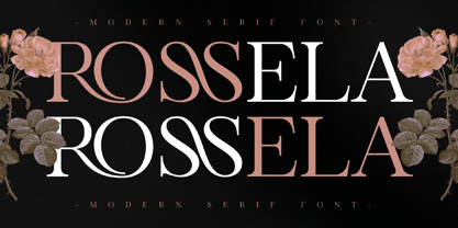 Rossela is an elegant, distinct and stylish serif font. This typeface is perfect for an elegant & luxury logo, book or movie title design, fashion brand, magazine, clothes, lettering, quotes, and so much more. It is also PUA encoded which means you can access all of the glyphs and swashes with ease.
 - Metavoria by Invasi Studio,
$17.00 Introducing Metavoria Font, a playful and quirky display typeface with a hand-drawn style. This font comes with so many ligatures and alternates, that you can use that for more fun on your projects. Metavoria font is ideal for branding projects or packaging that need a quirky and playful feel.
 - Beldon by Aqeela Studio,
$12.00 Introducing a new beautiful calligraphy font, Beldon! It is perfect for elegant logos, upscale packaging, wedding stationery, websites, and any other projects requiring a handwritten and luxurious touch. A wide range of ligature alternates are included so that you can give your logo or name a custom, hand-calligraphy look.
 - Bankai Street by Sipanji21,
$14.00 Bankai Street - Realistic Monoline Handwritten Graffiti Font This font designed so that users can use it more easily and make graffiti designs easier. Bankai Street is very suitable for use in various media such as; packaging, logos, labels, posters, shirt designs, bulletins, typography, and many other media, especially with graffiti look.
 - Yoda by MysticalType,
$10.00 Yoda is a super-compressed font family with some suitable special characters. Perfect for posters, display copies, headlines, magazine header copies. It comes in 10 weights ranging from extra light to black so it is versatile. The extra lightness can give you great height because of how narrow it is.
 - Udon Soup by Hanoded,
$15.00 Udon Soupis my all time favourite Japanese food! I like it so much that I decided to name a font after it. Udon Soup font is a handmade script font, kind of messy, kind of weird, but very legible and useful. Comes with oodles of diacritics and double letter ligatures.
 - Moon Earth by Orenari,
$17.00 Please welcome, Moon Earth. A simple cozy handwritting and it's perfect for quotes. Moon Earth also fit for any range of your design projects. This font is naturally written by my self, so the flow of each characters became unique. Take your design project to the next level with Moon Earth.
 - Hello Lovely by Fargun Studio,
$12.00 Hello Lovely! A new fresh ans modern hand lettered font with decorative characters and a dancing baseline. So beautiful on invitation like handicraft, greeting cards, branding materials, business cards, quotes, posters, and more design concepts. Features : Stylistic sets Basic Latin A-Z and a-z Numbers International Symbols included Punctuation
 - Better Chocolatte by Violatype,
$14.00 Introducing, “Better Chocolatte font” is a font with unique and natural handwriting, has a natural curve, so that it makes your design better. “Better Chocolatte font” is perfect for branding logos, invitations, magazines, quotes, crafts, and more, there are standard ligatures in it, which will make your designs even better.
 - Precious Memories by Epiclinez,
$18.00 Precious Memories is a cool-looking display font. Bold and a little bit quirky, this font is the perfect fit for all of your logos, branding, social media, and crafty DIY projects. So what's included : Basic Latin A-Z & a-z Numbers, symbols, and punctuations Accented Characters : ÀÁÂÃÄÅÆÇÈÉÊËÌÍÎÏÑÒÓÔÕÖØŒŠÙÚÛÜŸÝŽàáâãäåæçèéêëìíîïñòóôõöøœšùúûüýÿžß Thank you
 - Double Tracker by Hanzel Space,
$25.00 Double Tracker is an inspiration for a font with paint strokes so that it has a texture that seems natural, done with an original ink stroke process.. The strong and sturdy design makes it ideal for eye-catching headlines, branding, packaging, magazines, sports, logos, and more. Happy Creating! Hanzel Studio
 - Morfeta Gealmord by Letterena Studios,
$17.00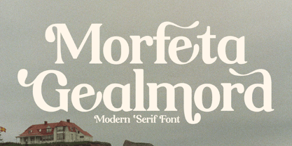 Morfeta Gealmord is a classy and modern looking serif font. This typeface is perfect for an elegant & luxury logo, book or movie title design, fashion brand, magazine, clothes, lettering, quotes, and so much more. This font is PUA encoded which means you can access all glyphs and swashes with ease!
 - Bitline by Grontype,
$15.00 Bitline is bold swirly font. comes with more alternate style each glyphs and ligature. The font is unique and modern vintage look. This is an adaptable font. Suitable for any project types, from magazine header, wedding invitation, branding design, poster or flyer header design, until logo tagline and so much more.
 - Storyboard by Atlantic Fonts,
$26.00 Storyboard is expressive, rough, partly connected and full of painterly, brushed energy like the sketches of a storyboard. It's bold and kind of edgy, but can be friendly too. There are tons of ligatures you can turn on or off depending on the look you're after. So what's your story?
 - Black Sigra by Sign Studio,
$12.00 Black Sigra comes in 3 styles (regular, blur, and shadow) so it can be more versatile. Adapting to a simpler fracture calligraphy style. Has sufficient thickness to dominate a design page. Supports multiple languages and each character has a PUA code which means everything can be accessed on most common software.
 - Bombardies by Figuree Studio,
$18.00 Hello, this is Bormbardies modern Graffiti Font! This font was designed so that users can use it more easily and make graffiti designs easier. Bombardies is very suitable for use in various media such as; packaging, logos, labels, posters, shirt designs, bulletins, typography, and many other media, especially with graffiti look.
 - Roselyn by Calamar,
$20.00 Roselyn Script is an elegant calligraphic font that will look awesome on wedding and event stationery, logos and branding materials, cards and so on. Roselyn Script includes Uppercase and Lowercase Latin Basic Characters, Numbers and Punctuation. Also the font contains ligatures and stylistic alternates to perfectly re-create natural calligraphy.
 - Three Candy by Mazkicibe,
$11.00 Three Candy Font is Sans Serif and modern font combined with a sweet touch and beautifully curved each letter. using a touch of soft curves so that it is pleasing to the eye. Three Candy Font Spirit is great for: Wedding invitations, fashion magazines, logos, signatures, and suitable for watermark photography.
 - Medieval Gunslinger by Ingrimayne Type,
$14.95 What would happen if one took a rather crude, squared-serifed typeface of the type popular in the 19th century and added medieval and calligraphic ornamentation? Maybe the result would be Medieval Gunslinger. The MedievalGunslingerShadOverlay font is spaced so that it can be layered with MedievalGunslingerShadow to produce bicolored lettering.
 - Lisa by Doffdog,
$14.00 Lisa is an all caps display font perfect for Branding, Logo Design, Greeting Cards, Stationery Design, Invitations, T-shirts, Apparel, Packaging designs, Posters, Typographic Design, and so much more. Multilingual support for various languages including: French, German, Spanish, Portuguese, Italian, Dutch, Finnish, Swedish, and more. Happy creating with Lisa font!
 - Evil Laughter by Hanoded,
$10.00 I am working on my Halloween font collection and realised I did not have a ‘blood drip font’. So, I bought a second hand typewriter and typed all the glyphs. Then I made the blood drips using syrup, paper and gravity! The result is a halloween font with a twist!
 - Serwus by Agnieszka Ewa Olszewska,
$20.00 It's font created for posters, ads, websites. I created it when I designed a poster, then later realized that I very often need such a letters so decided to complete all of the characters. It's distinctive, spacious, hand made with narrow kern. Have more then 400 characters, smallcaps and text figures.
 - Vtc-NueTattooScript - Personal use only

- Tempora LGC Uni - 100% free

- Quirky Quill by Mix Fonts,
$13.00 MIX QUIRKY QUILL is not your average font. Inspired by the old archival books and documents from the days of yore, MIX QUIRKY QUILL brings a touch of history and tradition to your designs. With its clean, slightly italicized letters, this font is the perfect choice for projects that aim to evoke a sense of timelessness. Think of the old record books in church archives, the documents from Ellis Island, and pre-technology paperwork. MIX QUIRKY QUILL is reminiscent of these timeless pieces, making it ideal for art events, classic artwork, theatre posters, and anything that demands an air of tradition and classic sophistication. But don’t let its historical roots fool you. MIX QUIRKY QUILL is a perfectly imperfect digitized handwriting font, with a playful and fun flair that makes it stand out. Its clean lines and slightly italicized letterforms provide a touch of sophistication, while its charming imperfections add a touch of personality. This font is perfect for use in earthy, classic palettes such as browns, creams, and ink greens. Whether you’re looking to create a vintage-inspired design or a modern, quirky take on tradition, MIX QUIRKY QUILL is the font for you. Add Quirky Quill to your design arsenal today and see what story you can tell! MIX QUIRKY QUILL comes with the following glyphs: ABCDEFGHIJKLMNOPQRSTUVWXYZ abcdefghijklmnopqrstuvwxyz 0123456789 !@#$%^&*()`~♥✿•· ÷×+−±≈=≠≥≤[]<>:;'”,.\|/ {}“”‘’-–—_…‚„©®™‹›«»°¹²³¡¿₱¢€£¥¶§№† ÁÀÂÄȦÃÅĂĀĄÆĆĈČĊÇÐĐÉÈÊËĖĒĘḞǴĜǦḠĠĤȞḦḢIÍÌÎÏĪĮĴḰǨŁḾṀŃÑŇ ÓÒÔÖÕŌŐØŒṔṖŔŘṘŚŜŠŞȘŤṪȚÚÙÛÜŨŮŬŪŰŲẂẀŴẄẆÝŶŸŹẐŽŻƵ áàâäȧãåăāąæćĉčċçðđéèêëėēęḟǵĝǧḡġĥȟḧḣıíìîïīįĵḱǩłḿṁńñň óòôöõōőøœṕṗŕřṙśŝšşșťṫțúùûüũůŭūűųẃẁŵẅẇýŷÿźẑžżƶ Alternates/Ligatures: & j gg kk ll lt mm nn oo th tt
 - Neutraface Condensed by House Industries,
$33.00 Richard J. Neutra became an icon of Modern architecture as an artistic visionary, social commentator and outspoken defender of the environment. He refined his unique approach to design, for which he coined the term biorealism, over half a century ago. Regarding humankind and its surroundings as two inseparable halves to a greater whole, Neutra created habitats with the welfare of man and nature as his utmost concern. His ideas of evolutionary growth and adaptability compelled House Industries to develop Neutraface Condensed, built upon the original typeface and driven by the enduring spirit of the revolutionary who inspired it. “I have tried to be a feeling observer of life in all its manifestations, not a cold rationalist.” House Industries adopted this precept of Neutra as the guiding principle when the foundry commissioned Christian Schwartz to draw Neutraface Condensed. Instead of being exactingly compressed, the new companion fonts were composed around a complementary structural framework in order to better reflect the sensibilities of their predecessor. The result is an individualistic design with a restrained exuberance that shuns stylistically ersatz imitation. This compact yet lively presence allows Neutraface Condensed to lend flexibility and economy to headlines without sacrificing the simplicity and charm of the original. Like all good subversives, House Industries hides in plain sight while amplifying the look, feel and style of the world’s most interesting brands, products and people. Based in Delaware, visually influencing the world.
 - Aqueo by R9 Type+Design,
$38.00 Aqueo™ is a versatile display font family inspired by the cylindrical wireframe of a water glass. The one-sided round corner details added a contemporary feel to this unique typeface. It comes in 6 weights and 12 styles. To ensure the accuracy of the letterforms, we painstakingly drew a master set for each weight. And with over 1,350 glyphs each, Aqueo™ fonts support most Latin-based languages and feature an extensive set of stylistic alternates; The standard uppercase set takes more traditional forms, while the alternate uppercase set sports unorthodox lowercase forms. The standards exude confidence and dependability yet are friendly and approachable, and the alternates elicit more fun, quirky and whimsical. The More Opentype Features, the More Zing for Your Design Projects. Aqueo™ Display Sans Serif comes loaded with Opentype features such as case-sensitive marks, punctuations and mathematic symbols. It also has an extensive set of discretionary ligatures, stylistic alternates, and over 80 essential UX/UI icons, each in three design options. These various Opentype features help improve your user experience, streamline your workflow, and unlock a broader range of typography details you can choose for your design. If you’re looking for a unique contemporary typeface, try Aqueo™ on your packaging design, logo design, infographic, print design, store signages, and UX/UI projects today! To find out more about Aqueo™ Opentype features and type specimens, please visit https://r9typedesign.com/aqueo-font-features-specimen
 - Esfand by Naghi Naghachian,
$98.00 Esfand is a modern Sans Serif font family in three weights, Light, Medium and Bold.The Esfand innovation is a contribution to the modernisation of Arabic typography; gives the Arabic font letters real typographic arrangement and provides for more typographic flexibility. Esfand supports Arabic, Persian, and Urdu and includes proportional and tabular numerals for the supported languages. The Esfand Font family is available in Three weights; Light, Medium and Bold. Its intuitive design arrangement fulfills the following needs: - It is precisely crafted for use in electronic and print media. Esfand is not based on any pre-digital typefaces and it is not a revival. Rather, its forms were created with today’s ever-changing technology in mind. - Esfand is suitable for multiple applications, and gives the widest potential for acceptability. - It is extremely legible not only in its small sizes, but also when the type is filtered or skewed, e.g., in Photoshop or Illustrator. Esfand's simplified forms may be artificially oblique with InDesign or Illustrator, without any degradation of its quality for the effected text. - Esfand is an eye-catching and classy typographic image that was developed for multiple languages use and writing conventions. - Esfand uses the very highest degree of geometric clarity along with the necessary amount of calligraphic references. The Esfand typeface is of a high vibration that is finely balance between calligraphic tradition and the contemporary sans serif aesthetic commonly seen in Latin typography.
 - Miranda Wright by Din Studio,
$29.00 Miranda Wright is a captivating serif font designed in an exquisite and elegant style. Each letter is meticulously crafted with fine details, evoking a sense of sophistication and grace. What sets Miranda Wright apart are the last few letters, which feature graceful circular swings that add a touch of charm and uniqueness to the font.. The circular swings at the end of certain letters infuse this serif with a delightful flair. These subtle and graceful details add an air of playfulness and individuality to the font, setting it apart from conventional serif typefaces. The circular swings give the font a distinctive personality, making it ideal for creative projects that seek to stand out. Its legible and elegant letterforms make it suitable for both body text and headings, while the circular swings add a touch of character that enhances the overall visual appeal. Enjoy the available features here. Features: Stylistic Sets Ligatures Multilingual Supports PUA Encoded Numerals and Punctuations Miranda Wright fits in headlines, logos, posters, flyers, invitations, greeting cards, branding materials, print media, editorial layouts, website headers, and many more. Find out more ways to use this font by taking a look at the font preview. Thanks for purchasing our fonts. Hopefully, you have a great time using our font. Feel free to contact us anytime for further information or when you have trouble with the font. Thanks a lot and happy designing.
 - Averta Standard by Intelligent Design,
$10.00 Averta Standard is the basic version of Averta. Bringing together features from early European grotesques and American gothics, Kostas Bartokas’ (Greek: ‘αβέρτα’ – to act or speak openly, bluntly or without moderation, without hiding) Averta is a geometric sans serif family with a simple, yet appealing, personality. The purely geometric rounds, open apertures, and its low contrast strokes manage to express an unmoderated, straightforward tone resulting in a modernist, neutral and friendly typeface. Averta Standard is intended for use in a variety of media. The central styles (Light through Bold) are drawn to perform at text sizes, while the extremes are spaced tighter to form more coherent headlines. The dynamism of the true italics adds a complementary touch to the whole family and provides extra versatility, making Averta Standard an excellent tool for a range of uses, from signage to branding and editorial design. Averta Standard comes with alternate glyphs, case sensitive forms and contextual alternates, in eight weights with matching italics and supports over two hundred languages with an extended Latin, Cyrillic (Russian, Bulgarian, and Serbian/Macedonian alternates), Greek and Vietnamese character set. It ships in three different packages offering different script coverage according to your needs: Averta Standard PE (Pan-European: Latin, Cyrillic, Greek), Averta Standard CY (Latin and Cyrillic), and Averta Standard (Latin and Greek). Averta's Cyrillic have received the 3rd Prize in the 2017 Granshan Awards in the Cyrillic Category.
 - Termit by Ditatype,
$29.00 Termit is a striking display font designed with a game theme, featuring large letters with a fairly thick weight and a rectangular shape with sharp corners. This font shows large letters that demand attention and create a bold statement. The rectangular shape with sharp corners in Termit adds a sense of structure and stability to the font. The clean lines and defined angles create a visually bold and impactful appearance. This unique feature evokes a sense of strength and resilience, reflecting the competitive and strategic nature of the gaming world. Each character shares the same height and width, creating a cohesive and pleasing visual experience. With its low-contrast design, it offers a subtle and understated look. The minimal variation in stroke width adds a sense of uniformity and simplicity to the font, allowing the overall design to take center stage. This feature ensures that the focus remains on the content while still maintaining a strong visual impact. Enjoy the available features here. Features: Stylistic Sets Multilingual Supports PUA Encoded Numerals and Punctuations Termit fits in headlines, logos, posters, titles, branding materials, print media, editorial layouts, website headers, and any other game-themed projects. Find out more ways to use this font by taking a look at the font preview. Thanks for purchasing our fonts. Hopefully, you have a great time using our font. Feel free to contact us anytime for further information or when you have trouble with the font. Thanks a lot and happy designing.
 - Neufile Grotesk by Halbfett,
$30.00 Neufile Grotesk has its roots in some of the earliest commercially available sans-serif typefaces. This highly legible sans-serif design is well-suited for many display and text-based typographic uses. Users can apply the fonts effortlessly to a large number of messages and media, from advertising to book design. The typeface family ships in two different formats. Depending on your preference, you can install the typeface as a single Variable Font or use the family’s eight static OpenType font files instead. Those weights run from Extralight through Black. While the static-format fonts offer a good intermediary-step selection, users who install the Variable Font have vastly greater control over their text’s stroke width. The Neufile Grotesk Variable Font’s weight axis allows users to differentiate between almost 1,000 possible font weights. That enables you to fine-tune your text’s exact appearance on-screen or in print. But even the eight static fonts satisfy the need for flexibility, creating harmonious variations of texture and emphasis. Whichever format you choose, the Neufile Grotesk fonts include several sophisticated OpenType features. In addition to standard ligatures, there are a few discretionary ligatures and a stylistic set replacing “a”, “g”, and “R” with geometric-sans-style forms. Other features include numeral variants – there are proportional and tabular versions of lining figures and oldstyle figures – as well as fractions and numbers in circles. The fonts have arrows and a feature for setting case-sensitive forms, too.
 - Josef K Patterns by Juliasys,
$9.60 Franz Kafka’s manuscripts have always been a source of inspiration for designer Julia Sysmäläinen. At first she was just interested in literary aspects but later she noticed that content and visual form can not be separated in the work of this ingenious writer. Analyzing Kafka’s handwriting at the Berlin National Library, Julia was inspired to design the typeface FF Mister – by now a well known classic. Over the years, FF Mister K became a handsome typeface family and even produced offspring: the Josef K Patterns. Some of Kafka’s most expressive letterforms were the starting point for these decorative ornaments. How do the Patterns work? Outlines and fillings correspond to the uppercase and the lowercase letters on your keyboard. You can use them separately or layer them on top of each other. If you write a line of “pattern-text” in lowercase and repeat it underneath in uppercase you get a row of fillings followed by a row of outlines. Now you can color them and then set line space = 0 to get a single line of layered colored ornaments. Alternatively, activating OpenType / stylistic set / stylistic alternates will also unite the two lines to a single layered line. Further magic can be done with OpenType / contextual alternates turned on. On the gallery page of this font family is a downloadable Josef K Patterns.pdf with an alphabetical overview of forms. Hundreds of patterns are possible … we’d love to see some of yours and present them here on the website!
 - First March by Nathatype,
$29.00 First March is a captivating display serif font designed with elegance and a touch of modernity. This typeface combines classic serif elements with a contemporary twist, offering a unique and refined look to your creative projects. The elegant letterforms with clean lines and balanced proportions adding a sense of sophistication and grace to your typography. The serif details provide a timeless appeal, while the modern twist brings a fresh and current vibe to the font. This combination creates a harmonious balance between tradition and innovation. What sets First March apart are its swinging endings in select letters. These graceful and subtle flourishes add a touch of dynamism and playfulness to the font, creating an engaging visual experience. The swinging endings bring a sense of movement and fluidity to the letterforms, enhancing the overall elegance of the typeface. Because of its legibility you can use this font in a variation of text sizes. Enjoy the available features here. Features: Ligatures Stylistic Sets Multilingual Supports PUA Encoded Numerals and Punctuations First March fits in headlines, logos, posters, titles, invitations, branding materials, print media, editorial layouts, website headers, and many more. Find out more ways to use this font by taking a look at the font preview. Thanks for purchasing our fonts. Hopefully, you have a great time using our font. Feel free to contact us anytime for further information or when you have trouble with the font. Thanks a lot and happy designing.
 - Kolbano by Jehoo Creative,
$19.00 Kolbano is a visually captivating typeface that is renowned for its distinctive and expressive letterforms. Designed with meticulous attention to detail, each character in Kolbano Font possesses a unique shape, making it an exceptional choice for creative and artistic projects. The font's design philosophy centers around providing a harmonious balance between elegance and personality. The letters in Kolbano are meticulously crafted with fluid curves, sharp angles, resulting in an eye-catching and memorable visual experience. Every character stands out on its own, showcasing its own individuality and artistic flair. Whether used in headlines, logos, or other design applications, Kolbano is sure to make a lasting impression. In addition to its regular upright variant, Kolbano also offers a captivating italic style. The italics add a dynamic touch to the typeface, imbuing the text with a sense of movement and energy. The slanted letterforms maintain the unique shape of each character, preserving the font's distinctiveness while introducing a sense of flow and elegance. The italics are perfect for emphasizing words, creating emphasis, or adding a touch of sophistication to any design. Kolbano s versatile and adaptable, suitable for a wide range of creative projects. Its aesthetic appeal makes it ideal for editorial design, branding, packaging, posters, and any application where typography plays a central role. The font's versatility allows it to effortlessly adapt to various design themes and concepts, whether it be modern and sleek or vintage and nostalgic.
 - Iranica by Naghi Naghachian,
$64.00 Iranica is a new creation of Naghi Naghashian. It is extremely legible even in very small size. "Iranica" is reminiscence to my birthplace and my cultural root. Iranica is a modern Sans Serif font family. This innovation is a contribution to modernisation of Arabic typography, gives the font design of Arabic letters real typographic arrangement und provides more typographic flexibility. Iranica supports Arabic, Persian and Urdu. The highest degree of calligraphic grace and the clarity of geometric typography. This typeface offers a fine balance between calligraphic tradition and the Roman aesthetic common in Latin typography. It also includes proportional and tabular numerals for the supported languages. Iranica design fulfills the following needs: A. Explicitly crafted for use in electronic media fulfills the demands of electronic communication. B. Suitability for multiple applications. Gives the widest potential acceptability. C. Extreme legibility not only in small sizes, but also when the type is filtered or skewed, e.g., in Photoshop or Illustrator. Iranica's simplified forms may be artificial obliqued in InDesign or Illustrator, without any loss in quality for the effected text. D. An attractive typographic image. Iranica was developed for multiple languages and writing conventions. Iranica supports Arabic, Persian and Urdu. It also includes proportional and tabular numerals for the supported languages. E. The highest degree of calligraphic grace and the clarity of geometric typography. This typeface offers a fine balance between calligraphic tradition and the Roman aesthetic common in Latin typography.
 - Garrigue by Nootype,
$45.00 Garrigue is a sans-serif typeface, it's inspired by the typography of German rationalism of mid XXth century, the base version is combining this rationalism with more organic elements, while Garrigue Sharp is simpler, ideal for technical applications. The OpenType functions allows near 700 different combinations of ligatures in Capital letters, which gives to text interesting patterns and a lot of dynamism in 100 different languages, including cyrillic. The family contains different stylistic alternates which gives more flexibility to the typeface. The Garrigue family includes 14 weights, seven styles from Thin to Black in Normal and “Sharp” version. Each font includes OpenType Features such as Discretional Ligatures, Proportional Figures, Tabular Figures, Numerators, Superscripts, Denominators, Scientific Inferiors, Subscript, Ordinals, Standard Ligatures, Stylistic Alternates and Fractions. Larsseit family supports Latin and Cyrillic, all these languages are covered: Latin language support: Afrikaans, Albanian, Asturian, Azeri, Basque, Bosnian, Breton, Bulgarian, Catalan, Cornish, Corsican, Croatian, Czech, Danish, Dutch, English, Esperanto, Estonian, Faroese, Filipino, Finnish, Flemish, French, Frisian, Friulian, Gaelic, Galician, German, Greenlandic, Hungarian, Icelandic, Indonesian, Irish, Italian, Kurdish, Latin, Latvian, Lithuanian, Luxembourgish, Malagasy, Malay, Maltese, Maori, Moldavian, Norwegian, Occitan, Polish, Portuguese, Provençal, Romanian, Romansch, Saami, Samoan, Scots, Scottish, Serbian, Slovak, Slovenian, Spanish, Swahili, Swedish, Tagalog, Turkish, Walloon, Welsh, Wolof Cyrillic language support: Adyghe, Avar, Belarusian, Bulgarian, Buryat, Chechen, Erzya, Ingush, Kabardian, Kalmyk, Karachay-Balkar, Karakalpak, Kazakh, Komi, Kyrgyz, Lak, Macedonian, Moldovan, Mongol, Permyak, Russian, Rusyn, Serbian, Tatar, Tofa, Tuvan, Ukrainian, Uzbek
 - Jasna by Naghi Naghachian,
$95.00 Jasna is designed by Naghi Naghashian. This Font is developed on the basis of specific research and analysis on Arabic characters and definition of their structure. This innovation is a contribution to modernisation of Arabic typography, gives the font design of Arabic letters real typographic arrangement and provides more typographic flexibility. This step was necessary after more than two hundred years of relative stagnation in Arabic font design. Jasna supports Arabic, Persian, and Urdu. It also includes proportional and tabular numerals for the supported languages. Jasna Font is available in two weights, Jasna Regular and Jasna Bold. Jasna design fulfills the following needs: A Explicitly crafted for use in electronic media fulfills the demands of electronic communication. Jasna is not based on any pre-digital typefaces. It is not a revival. Rather, its forms were created with today's technology in mind. B Suitability for multiple applications. Gives the widest potential acceptability. C Extreme legibility not only in small sizes, but also when the type is filtered or skewed, e.g., in Photoshop or Illustrator. Jasna's simplified forms may be artificial obliqued in InDesign or Illustrator, without any loss in quality for the effected text. D An attractive typographic image. Jasna was developed for multiple languages and writing conventions. E The highest degree of geometric clarity and the necessary amount of calligraphic references. This typeface offers a fine balance between calligraphic tradition and the contemporary sans serif aesthetic now common in Latin typography.
 - Lydia Sans by Craceltype,
$35.00 Lydia Sans™ is an elegant geometric sans serif with a charming profile and organic flow. Inspired by the clean typography of the 1920s, it's character and legibility make it suitable for any kind of text applications, from brand design to extensive text layouts. Lydia Sans™ has 22 styles, variable font technology and its weight range spreads from hairline to ultra bold forms. Flexible and adaptable, it covers 230+ languages, including extended Latin, Cyrillic and Greek writing systems. With over 1300 glyphs per style, its Opentype features include alternative shapes, small caps, standard and discretionary ligatures, localised forms in Latin and Cyrillic, case sensitive forms, numerators and denominators, proportional and tabular figures, slashed zero, fractions and more. As a workhorse type system, Lydia Sans™ is a sans serif for everyday use and a great choice for a wide range of applications. • Suggested uses: perfect for brand design, editorial design, web design and packaging design; • 22 styles: 11 weights + 11 italics. • 2 variable fonts; • 1315 glyphs in each weight; • OpenType features: Access All Alternates, Small Capitals From Capitals, Contextual Alternates, Case-Sensitive forms, Glyph Composition, Discretionary Ligatures, Denominators, Fractions, Standard Ligatures, Lining Figures, Localised forms, Numerators, Oldstyle Figures, Scientific Inferiors, Small Capitals, Stylistic Alternates, Stylistic Set 1, Stylistic Set 2, Stylistic Set 3, Stylistic Set 4, Stylistic Set 5, Stylistic Set 6, Stylistic Set 7, Stylistic Set 8, Subscript, Superscript, Tabular Figures, Slashed Zero; • 220 languages supported (extended Latin, Cyrillic, Greek alphabets).
 - Funky Sign by Putracetol,
$26.00 Funky Sign - Groovy Hipster Font is an eye-catching display font that exudes retro charm and groovy vibes. With its pop, fancy, and colorful styles, this font offers a fun and playful typographic solution. It comes in two versions: clean and textured/rough, providing versatility and creative options for various design projects. Funky Sign is the perfect choice for creating captivating posters, logos, landing pages, titles, headlines, stickers, branding materials, cards, and any project with a music or funky theme. The Funky Sign font stands out with its funky and hipster-inspired style, bringing a sense of nostalgia and vibrancy to your designs. The clean version offers a polished and sleek look, while the textured/rough version adds a touch of authenticity and edginess. Whether you're designing a poster for a music event, creating a logo for a trendy brand, or crafting a funky landing page, this font will infuse your designs with a unique and dynamic flair. With Funky Sign - Groovy Hipster Font, you have a versatile and lively typographic tool at your disposal. Its retro and groovy styles, along with the clean and textured versions, offer endless possibilities for designing captivating visuals. Whether you're working on a music-themed project, creating funky branding materials, or designing eye-catching posters, this font will bring a unique and vibrant touch to your designs, setting them apart with its distinctive and playful appeal.

