10,000 search results
(0.035 seconds)
- Christmas Glow by Pedro Teixeira,
$14.00 When I started designing this font, I had the purpose of giving a retro warming christmas feeling. So I added ornaments to add more value to your designs. Ornament glyphs can be arranged in numerous different designs.
 - Cypheral by Volcano Type,
$19.00 A type between letter and number. Cypherals' fresh typeface is a mix-up of number parts and lines that reveal to be letters. So who is to say that numbers and letters don't have much in common?
 - Marithin by DYSA Studio,
$19.00 Marithin is a New Modern Display Typeface. This another collection of Serif is perfect for your next branding project, excellent for your business. Marithin have a smooth edges, so this font gives an authentic handcrafted feel style.
 - Salute Riches by FHFont,
$17.00 Salute Riches is a handwritten script font with a hand lettering pen style, so many opentype features are included in the font. Suitable for element design, wedding, events, t-shirt, logo, badges, sticker, and other awesome work.
 - Wotham by Aqeela Studio,
$20.00 Wotham is a beautiful signature font featuring a modern and attractive typeface created for branding any professional project. This is best applied to logos, branding, cards, packaging, book covers, wedding invitations, printed quotes, merchandise, and so on.
 - Rhamela by DYSA Studio,
$19.00 Rhamela is a new handwritten scrip font. This another collection of handwritten is perfect for your next branding project, excellent for your business. Rhamela have a natural edges, so this font gives an authentic handcrafted feel style.
 - Auntekhno Script by FHFont,
$17.00 Auntekhno Script is Vintage Script Brush Font with Hand-lettering Brush Style, and so many OpenType feature include in the font. Suitable for design, element design, weddings, events, t-shirts, logos, badges, stickers, and awesome work, etc...
 - Font Thography by Alcode,
$23.00 Thography font is a new decorative typeface. This font has a very beautiful and elegant opentype feature, so that it can make users happy and can increase creativity or productivity, you can use this font very easily.
 - Payback by Subectype,
$16.00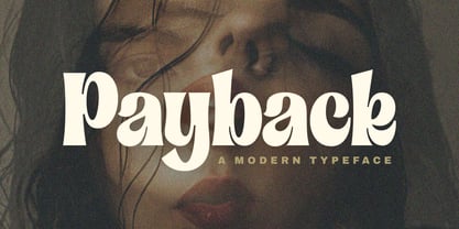 Introducing "Payback" Modern Serif font, that has own unique style & casual look. This font is perfect for an elegant & luxury logo, branding, title project, fashion brand, magazine, clothes, lettering, quotes, and so much more. Thank You. Subectype
 - Digital-LED by B1 Industries,
$6.00 I wanted to create a custom LED font, so I did, making sure to check for errors... It is useful for many things. (Electronically and in Real Life) (e.g. Documents, coding, signage, games, LED signs, calculators, etc.)
 - Richard Samuels by Letterena Studios,
$17.00 A serif modern and classic typeface that his own unique style & modern look. This typeface is perfect for an elegant & luxury logo, book or movie title design, fashion brand, magazine, clothes, lettering, quotes, and so much more.
 - Quirky by PizzaDude.dk,
$20.00 Quirky is so unpredictable and full of weirdness that you don't know what’s coming at you! The font has more than 250 different ligatures, that should be enough to boost your text into something funky and wild!
 - Floralissimo by Wiescher Design,
$39.50 Floralissimo are flowery embellishments that I found in several old publishing books dating back over a hundred years. I thought they might be useful for some of you, so I digitized them. Your digitizing typedesigner, Gert Wiescher
 - Big Limbo BT by Bitstream,
$50.99This freeform exercise in typographic design echoes the looseness of early 1960's advertising. Brian breaks almost every typographic rule we can think of — but so what? The bold letterforms of Big Limbo are anything but stuck! - Atomed by Jadatype,
$12.00 Atomed is a display font with Futuristic Feel. suitable for events, logotypes, Sci-fi stuff, modern & futuristic vibe, social media, products, and so on. Contains standard English letters, numbers, punctuation, ligature, and several accents that support multilingualism.
 - Precious Way by Seemly Fonts,
$12.00 Precious Way is a thin and simple lettered handwritten font. It can easily be matched to an incredibly large set of projects, so add it to your creative ideas and notice how it makes them stand out!
 - Big Wish by Seemly Fonts,
$12.00 Big Wish is a cool, casual, and fun display font. It can easily be matched to an incredibly large set of projects, so add it to your creative ideas and notice how it makes them stand out!
 - Nirwana by Arendxstudio,
$14.00 Introducing Nirwana, a Brush font script that is very suitable and captivating, with a very detailed hand touch so that the characters are the same and that Nirwana will be very suitable for your project design needs.
 - Movest Outline by Jadatype,
$12.00 Movest is a display font that has a bubble style with fun graffiti's vibe. suitable for poster, branding, social media, products, advertisements, and so on. contains standard English letters, numbers, punctuation, and several accents that support multilingualism.
 - Scenders by Juliane Bone,
$9.99 Scenders was inked first then digitized for the masses to use. Strong ascenders and descenders embellish the font, so the lowercase characters are quite compelling. Scenders is versatile, but it works very well in all caps headlines.
 - Laser Dots by Etewut,
$17.00 Laser dots display font is based on sans serif. Use it in your design be it cards, outside commercial, web or product adds and laser cuts. It has foreign characters so you may use your mother language.
 - Ludwig by Supfonts,
$15.00 Meet my new signature script Ludwig! Ludwig includes 158 ligatures, full set of uppercase and lowercase letters, multilingual symbols, numerals and punctuation. This is so perfect for invitations, monograms etc. It includes Multilingual support and 158 Ligatures.
 - Amstoven by DYSA Studio,
$19.00 Amstoven is a New Modern Serif Typeface. This another collection of Serif is perfect for your next branding project, excellent for your business. Amstoven have a smooth edges, so this font gives an authentic handcrafted feel style.
 - Break Stones by FHFont,
$17.00 Break Stones is Script Brush Font with Vintage Style, include 1218 Glyphs and so much opentype feature include of the font. Suitable for design, element design, wedding, event, t-shirt, logo, badges, sticker, and awesome work, etc...
 - Aaarp by Drawwwn,
$15.00 Aaarp's an arty farty cut paper display font - inspired by Jean Arp & Henri Matisse’s amazing work. Get creative with extra glyphs and shapes... Aaarp also has alternative letters so you can make all your designs look unique.
 - Superior Mind by Seemly Fonts,
$14.00 Superior Mind is an incomparable and simple lettered handwritten font. It can easily be matched to an incredibly large set of projects, so add it to your creative ideas and notice how it makes them stand out!
 - Enduring Promise by Seemly Fonts,
$14.00 Enduring Promise is an incomparable and simple-lettered handwritten font. It can easily be matched to an incredibly large set of projects, so add it to your creative ideas and notice how it makes them stand out!
 - Mural by Solotype,
$19.95Another caps-only font for which we have designed a lowercase. It was originally brought out in smaller sizes for card work, but proved to be so popular that sizes up to 48 point were soon added. - Emberglow Script by BeckMcCormick,
$16.00Introducing Emberglow Script, a monoline handlettered font with a varied baseline. Emberglow is packed full of discretionary ligature and a variety of alternate characters so that you can customize your text to make it look truly handwritten. - Kill Me by Octopi,
$13.00 I have terrible and messy handwriting so I thought it would be a good idea to make a twisted version into an horrific font. In that respect I think it is quite successful, plus, Hallowe'en is nigh.
 - Renattosa by DYSA Studio,
$19.00 Renattosa is a new Handwritten Script Font. This another collection of handwritten is perfect for your next branding project, excellent for your business. Renattosa have a natural edges, so this font gives an authentic handcrafted feel style.
 - Gagnersy by Rvandtype,
$9.00 Gagnersy is a handwritten font. It has an elegant and playful look that can be used for logos, branding, invitations, stationery, wedding designs, social media posts, and so much more. FEATURES: Numbering Punctuations Multilingual Support Thank You
 - Prosaic Std by Typofonderie,
$59.00 A Postmodern vernacular sanserif in 8 fonts Prosaic designed by Aurélien Vret is a Postmodern typographic tribute to the french vernacular signs created by local producers in order to directly market their products visible along the roads. These signs drawn with a brush on artisanal billboards do not respect any typographic rules. The construction of these letterforms is hybrid and does not respect any ductus. Nevertheless the use of certain tools provokes a certain mechanism in the development of letter shapes. It’s after many experiments with a flat brush, that’s these letterforms have been reconstructed and perfected by Aurélien Vret. This is the starting point for the development of an easily reproducible sanserif with different contemporary writing tools. From non-typographical references of Prosaic towards readability innovation The influence of the tool is revealed in the letterforms: angular counterforms contrasting to the smoothed external shapes. This formal contrast gives to Prosaic a good legibility in small sizes. These internal angles indirectly influenced by the tool, open the counterforms. In the past, to deal with phototype limitations in typeface production, some foundries modified the final design by adding ink traps. In our high resolution digital world, these ink traps — now fashionable among some designers — have little or no effect when literally added to any design. Should one see in it a tribute to the previous limitations? Difficult to say. Meanwhile, there are typeface designers such as Ladislas Mandel, Roger Excoffon, and Gerard Unger who have long tried to push the limits of readability by opening the counters of their typefaces. Whatever the technology, such design research for a large counters have a positive impact on visual perception of typefaces in a small body text. The innovative design of counter-forms of the Prosaic appears in this second approach. Itself reinforced by an exaggerated x-height as if attempting to go beyond the formal limits of the Latin typography. It is interesting to note how the analysis of a non-typographical letters process has led to the development of a new typographic concept by improving legibility in small sizes. Disconnected to typical typographic roots in its elaboration, Prosaic is somewhat unclassifiable. The formal result could easily be described as a sturdy Postmodern humanistic sanserif! Humanistic sanserif because of its open endings. Sturdy because of its monumental x-height, featuring a “finish” mixing structured endings details. The visual interplay of angles and roundness produces a design without concessions. Finally, Prosaic is Postmodern in the sense it is a skeptical interpretation of vernacular sign paintings. Starting from a reconstruction of them in order to re-structure new forms with the objective of designing a new typeface. Referring to typographic analogy, the Prosaic Black is comparable to the Antique Olive Nord, while the thinner versions can refer to Frutiger or some versions of the Ladislas Mandel typefaces intended for telephone directories. Prosaic, a Postmodern vernacular sanserif Prosaic is radical, because it comes from a long artistic reflection of its designer, Aurélien Vret, as well a multidisciplinary artist. The Prosaic is also a dual tone typeface because it helps to serve the readability in very small sizes and brings a sturdy typographic power to large sizes. Prosaic, a Postmodern vernacular sanserif
 - Mantika Sans Paneuropean by Linotype,
$67.99With its well-defined characters that are readily legible even in the small font sizes, Mantika Sans by Jürgen Weltin is ideal for typesetting. The elaborately designed and highly individual set of italics enhances the attractiveness of the font.Jürgen Weltin developed the Mantika™ Sans sans serif font using older designs for an serif font as his inspiration. Nothing more than the merest suggestion of the original serifs has survived. Bevelled line endings and the slight variation in thickness of verticals, in particular, provide Mantika Sans with a very dynamic character that evokes manuscript. Short ascenders and descenders give the font a compact appearance that is also underscored by its condensed proportions. Weltin has achieved his aim of producing a typeface with excellent legibility even in small sizes not just by means of the x-height, which is tall in comparison with the capital letters, but also by using clearly defined and well differentiated designs for critical letters, such as i", "I" and "l". Lower case "i", for example, has a serif while the "l" has a curved base.In addition to uppercase numerals, Mantika Sans also has lowercase or old style numerals that have been designed so that they can be used in both tabular and proportional settings. The uppercase numerals are slightly shorter than the uppercase letters, ensuring that the latter can be sympathetically incorporated within continuous text.The Mantika Sans italics are very unusual. They are inclined at only 4.5° (the usual angle for italics is 10 - 12°) and so appear to be almost upright. In addition, they also have quite distinctive forms. The overall effect calls attention to their curvilinear, manuscript character, enhances contrasts and further emphasizes the terminals. Weltin explains: "Within the variety of forms of the italics there are many contrasting terminal elements that create dynamism. The result is a diversity of interaction between the rounded and angular forms". Mantika Sans Italic thus has all the features of a display typeface, but can also be happily used on its own to set longer text passages. Mantika Sans is available in two weights; Regular and Bold, both of which have corresponding italics sets. Mantika Sans has been designed so that the widths of the four related cuts are identical, meaning that a change of font within a single layout will have no effect on justification. In addition, the members of the Mantika Informal font family, designed by Jürgen Weltin in 2010, also have the same thickness. Other font families having weights with equal thickness can be found in the "Linotype Office Alliance series".The Mantika Sans character sets are paneuropean. There are characters for setting texts in Eastern European languages, Greek and Cyrillic. There is also a range of special symbols, including right-angled brackets, subscript and superscript lower case letters, together with numerals, arrows and many different bullet points.As a vibrant and highly legible text font, Mantika Sans has a broad spectrum of potential applications. Its unusual italics are not just perfect for use in display text. The fact that it has only four cuts means that Mantika Sans is particularly suitable for office use or for the setting of business reports. Its excellent legibility even in the small font sizes also makes it ideal as a text for electronic reading devices; this also applies to Mantika Informal.At the 3rd International Eastern Type Design Competition Granshan 2010, Mantika Sans was awarded in the category Greek text typefaces." - Mantika Sans by Linotype,
$50.99 With its well-defined characters that are readily legible even in the small font sizes, Mantika Sans by Jürgen Weltin is ideal for typesetting. The elaborately designed and highly individual set of italics enhances the attractiveness of the font.Jürgen Weltin developed the Mantika™ Sans sans serif font using older designs for an serif font as his inspiration. Nothing more than the merest suggestion of the original serifs has survived. Bevelled line endings and the slight variation in thickness of verticals, in particular, provide Mantika Sans with a very dynamic character that evokes manuscript. Short ascenders and descenders give the font a compact appearance that is also underscored by its condensed proportions. Weltin has achieved his aim of producing a typeface with excellent legibility even in small sizes not just by means of the x-height, which is tall in comparison with the capital letters, but also by using clearly defined and well differentiated designs for critical letters, such as i", "I" and "l". Lower case "i", for example, has a serif while the "l" has a curved base.In addition to uppercase numerals, Mantika Sans also has lowercase or old style numerals that have been designed so that they can be used in both tabular and proportional settings. The uppercase numerals are slightly shorter than the uppercase letters, ensuring that the latter can be sympathetically incorporated within continuous text.The Mantika Sans italics are very unusual. They are inclined at only 4.5° (the usual angle for italics is 10 - 12°) and so appear to be almost upright. In addition, they also have quite distinctive forms. The overall effect calls attention to their curvilinear, manuscript character, enhances contrasts and further emphasizes the terminals. Weltin explains: "Within the variety of forms of the italics there are many contrasting terminal elements that create dynamism. The result is a diversity of interaction between the rounded and angular forms". Mantika Sans Italic thus has all the features of a display typeface, but can also be happily used on its own to set longer text passages. Mantika Sans is available in two weights; Regular and Bold, both of which have corresponding italics sets. Mantika Sans has been designed so that the widths of the four related cuts are identical, meaning that a change of font within a single layout will have no effect on justification. In addition, the members of the Mantika Informal font family, designed by Jürgen Weltin in 2010, also have the same thickness. Other font families having weights with equal thickness can be found in the "Linotype Office Alliance series".The Mantika Sans character sets are paneuropean. There are characters for setting texts in Eastern European languages, Greek and Cyrillic. There is also a range of special symbols, including right-angled brackets, subscript and superscript lower case letters, together with numerals, arrows and many different bullet points.As a vibrant and highly legible text font, Mantika Sans has a broad spectrum of potential applications. Its unusual italics are not just perfect for use in display text. The fact that it has only four cuts means that Mantika Sans is particularly suitable for office use or for the setting of business reports. Its excellent legibility even in the small font sizes also makes it ideal as a text for electronic reading devices; this also applies to Mantika Informal.At the 3rd International Eastern Type Design Competition Granshan 2010, Mantika Sans was awarded in the category Greek text typefaces."
 - Midnight Diner by Roland Hüse Design,
$30.00 Did your client just say ‘can you make it pop’? Then you already know you got it on lock. Introducing: Midnight Diner! A multi-layered dimensional script font family featuring thin, bold, outline and shadow capabilities, with a left-leaning slant to boot. You can experiment with various layer combinations and colour! How fun is that? Being effortlessly casual, retro and elegant all in one, you can play it up or down to your liking – perfect for display graphics, logos, signages, packaging, lifestyle imagery, invitations and more. It features a diverse range of stylistic alternates, contextual alternates, and standard ligatures, ensuring that you’ve countless options to choose from for your design work. This font family is delicately crafted and well thought out with every little detail in mind, to ensure its ease and versatility when used! Midnight Diner is a collaboration between lettering artist and calligrapher, Leah Chong (www.leahdesign.sg) and typeface designer, Roland Huse (www.rolandhuse.com). Product Content: Midnight Diner Layered Font - Thin (TTF) Midnight Diner Layered Font - Bold (TTF) Midnight Diner Layered Font - Outline (TTF) Midnight Diner Layered Font - Shadow (TTF) Font Guide PDF https://drive.google.com/file/d/1KPSf-gGrhX3wyaImEAmlJICERNbxu2IN/view?usp=sharing Font Guide Youtube Video https://youtu.be/GtZ8E7Y7wnQ 6 Bonus SVGs (TTF): Midnight Diner SVG - Red Yellow Midnight Diner SVG - Black Pink Midnight Diner SVG - Blue Green Midnight Diner SVG - Orange Yellow Midnight Diner SVG - Purple Pink Midnight Diner SVG - Black White Font Features: Latin character set: Uppercase & Lowercase A - Z Stylistic Alternates Contextual Alternates Standard Ligatures Numerals, Currency Symbols & Punctuation Accented Characters To access all features of Midnight Diner such as stylistic alternates etc., it's highly recommended to use professional design software such as Adobe Illustrator, Adobe Photoshop, Adobe InDesign or Procreate (via the ‘add text' feature).
 - Monotype Goudy by Monotype,
$40.99Over the course of 50 years, the charismatic and enterprising Frederic W. Goudy designed more than 100 typefaces; he was the American master of type design in the first half of the twentieth century. Goudy Old Style, designed for American Type Founders in 1915-1916, is the best known of his designs, and forms the basis for a large family of variants. Goudy said he was initially inspired by the cap lettering on a Renaissance painting, but most of the flavor of this design reflects Goudy's own individualistic style. Recognizable Goudy-isms include the upward pointing ear of the g, the diamond-shaped dots over the i and j, and the roundish upward swelling of the horizontal strokes at the base of the E and L. The italic was completed by Goudy in 1918, and is notable for its minimal slope. Goudy Bold (1916-1919) and Goudy Extra Bold (1927) were drawn not by Goudy, but by Morris Fuller Benton, who was ATF's skillful in-house designer. Goudy Catalogue was drawn by Benton in 1919-1921 and was meant to be a medium weight of Goudy Old Style. Goudy Heavyface was designed by Goudy for Monotype in 1925, and was intended to be a rival to the successful Cooper Black. Goudy Modern was designed by Goudy in 1918; its small x-height, tall ascenders and shorter caps impart a spacious and elegant feeling. Benton designed Goudy Handtooled, the shaded version that has just a hairline of white through its bold strokes. The Goudy faces, especially the bolder weights, have long been popular for display and advertising design. They continue to pop up all over the world, and still look reassuring to our modern eyes." - Goudy Ornate MT by Monotype,
$29.99Over the course of 50 years, the charismatic and enterprising Frederic W. Goudy designed more than 100 typefaces; he was the American master of type design in the first half of the twentieth century. Goudy Old Style, designed for American Type Founders in 1915-1916, is the best known of his designs, and forms the basis for a large family of variants. Goudy said he was initially inspired by the cap lettering on a Renaissance painting, but most of the flavor of this design reflects Goudy's own individualistic style. Recognizable Goudy-isms include the upward pointing ear of the g, the diamond-shaped dots over the i and j, and the roundish upward swelling of the horizontal strokes at the base of the E and L. The italic was completed by Goudy in 1918, and is notable for its minimal slope. Goudy Bold (1916-1919) and Goudy Extra Bold (1927) were drawn not by Goudy, but by Morris Fuller Benton, who was ATF's skillful in-house designer. Goudy Catalogue was drawn by Benton in 1919-1921 and was meant to be a medium weight of Goudy Old Style. Goudy Heavyface was designed by Goudy for Monotype in 1925, and was intended to be a rival to the successful Cooper Black. Goudy Modern was designed by Goudy in 1918; its small x-height, tall ascenders and shorter caps impart a spacious and elegant feeling. Benton designed Goudy Handtooled, the shaded version that has just a hairline of white through its bold strokes. The Goudy faces, especially the bolder weights, have long been popular for display and advertising design. They continue to pop up all over the world, and still look reassuring to our modern eyes." - Leroy by Andinistas,
$39.95 Leroy is a font family of 5 members designed from geometrizing Roman and Gothic skeletons. Its purpose is to provide optimal reading of titles and paragraphs with strong mechanical flavor. Because of this, its variables are designed to sort information in media such as labels, signs and industrial atmosphere packaging related with the Soviet Union’s fonts in 1920. This idea matured white horizontal lines superimposed on alphabets drawn with an ancient architectural team known as “Leroy K & E Controlled Lettering System”. Then that evolved into a family concept unifying its proportion to the same X height for its members, resulting in a versatile type system. Therefore, Regular and Bold variables have low contrast between thick and thin strokes. Its upstream and downstream are extremely short, generating a suitable interline that clogs the vertical area. Its overall width equal to its X height, supports its tight spacing that compacts the horizontal area. Therefore, the variant with black caliber has plenty of contrast between thick and thin strokes. The light variable has a “blind” effect radiating light halos, ideal to propose hierarchies and combinations with orthogonal projection. In that sense, Leroy’s modular character reminds constructivist ideology merged with typographical variants suitable for graphic design with geometric look. To achieve this, I studied the softening of forms and counter blocks into a typographical system specially designed for composing useful information to attract attention. In that sense, the dingbats were obtained through a careful process of research and testings done with drawings that provided full and empty visual strategies that with the passage of time helped to forge the major decisions of a metamorphosis from industrial tools, birds and humans from pictogram mixing various genres.
 - Goudy Handtooled by Monotype,
$40.99Over the course of 50 years, the charismatic and enterprising Frederic W. Goudy designed more than 100 typefaces; he was the American master of type design in the first half of the twentieth century. Goudy Old Style, designed for American Type Founders in 1915-1916, is the best known of his designs, and forms the basis for a large family of variants. Goudy said he was initially inspired by the cap lettering on a Renaissance painting, but most of the flavor of this design reflects Goudy's own individualistic style. Recognizable Goudy-isms include the upward pointing ear of the g, the diamond-shaped dots over the i and j, and the roundish upward swelling of the horizontal strokes at the base of the E and L. The italic was completed by Goudy in 1918, and is notable for its minimal slope. Goudy Bold (1916-1919) and Goudy Extra Bold (1927) were drawn not by Goudy, but by Morris Fuller Benton, who was ATF's skillful in-house designer. Goudy Catalogue was drawn by Benton in 1919-1921 and was meant to be a medium weight of Goudy Old Style. Goudy Heavyface was designed by Goudy for Monotype in 1925, and was intended to be a rival to the successful Cooper Black. Goudy Modern was designed by Goudy in 1918; its small x-height, tall ascenders and shorter caps impart a spacious and elegant feeling. Benton designed Goudy Handtooled, the shaded version that has just a hairline of white through its bold strokes. The Goudy faces, especially the bolder weights, have long been popular for display and advertising design. They continue to pop up all over the world, and still look reassuring to our modern eyes."