243 search results
(0.014 seconds)
- MLB Tuscan - Unknown license

- Tuscan by Baseline Fonts,
$24.00Tuscan is a classic western-style typeface. The distressed versions include extended character sets and offer rustic character. - Tuscany by Classic Font Company,
$14.95Tuscany is a decorated Lombardic font with a complimentary rotunda style lowercase. - MLE by Martin Wait Type,
$26.00This is a close spaced tagging style that needs to be auto kerned. - MLB Red Sox - Unknown license

- Tuscan MF - Unknown license

- Tuscan Gothic by Solotype,
$19.95This is a Vanderburgh and Wells wood type cap font from 1877. We don't know if the originators made a lowercase for it, but we did. Most effective in larger sizes. - Fargo Tuscan by Greater Albion Typefounders,
$20.00 Fargo Tuscan is the first of seven typefaces exploring the decorative possibilities of the Tuscan letter form, all of which are releasing in 2017. It’s the most European of the seven- it’s a Mid-Victorian inspired display face which would have been (and is) at home on either side of the Atlantic, unlike some of the others in this batch of Tuscan faces which are distinctly ‘trans-Atlantic’ (we know, that depends on your point of view but we are Greater ALBION Typefounders after all) in flavour. Fargo Tuscan is replete with decorative features, including Swash Capitals, alternate numeric forms and stylistic alternates ideal for the beginning and ending of words. Have some mid-Victorian mid-Atlantic fun with your next design project!
 - Cowboya Tuscan by deFharo,
$15.00 Cowboya is a typography with concave Tuscan serif very contrasted and modernist inspiration with letters in small caps, includes 4 versions of the font that can be used by superimposed layers which results in multicolored typographic titles. For the design of this typeface I was inspired by the credit titles used in the black film directed by Frizt Lang in 1950 called "The House of the River", to the drawing of the original forms of the letters i added decorative elements to give the fonts a festive character, traditionally this type of decorative fonts that emerged in Italy in the nineteenth century were used in large headlines and posters that were closely related to circus shows, carnival or environments of the Far West American. I have also rounded the sharper joints of the antlers and counterforms to create a contrast with the sharp Tuscan serifs which brings a modern background of retro inspiration and soft shapes.
 - Antique Tuscan by Wooden Type Fonts,
$20.00 A revival of one of the popular wooden type fonts of the 19th century, condensed, bold, curved serifs, a very useful design for display, upper and lower case.
 - Concave Tuscan by Intellecta Design,
$15.90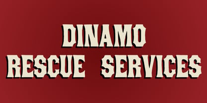
- Turquoise Tuscan by Resistenza,
$59.00 A new Version of Turquoise Roman Capitals. With specials Tuscan Serifs to add more engraving feel. Turquoise Tuscan is full of ligatures and awesome alternates. Perfect for big headlines, logos, branding and wine labels.
 - Tuscan Egyptian by Wooden Type Fonts,
$15.00 A revival of one of the popular wooden type fonts of the 19th century. Suitable for posters and display applications.
 - Gothic Tuscan by Wooden Type Fonts,
$15.00 A revival of one of the popular wooden type fonts of the 19th century; a very useful design for display.
 - Gringo Tuscan by Volcano Type,
$29.00Gringo is a type family that contains 27 different varieties. It is divided into three groups: Sans, Slab, and Tuscan = Europe - Texas. Due to its consistant structure, the single groups can be mixed as you wish. Furthermore every variety comes in Light, Medium, and Bold. There are three widths, from Narrow to Wide. Additionally, there is also a Dingbats font. The concept of Gringo is a fusion and a merging of type cultures to cross borders and create something new. Gringo won 3rd place in the "tdc2 2006 award" by the Type Directors Club New York. - Figgins Tuscan by HiH,
$12.00 Early in the 19th century, foundries began releasing a variety of decorated ornamental letters based on the Tuscan letterform. Fancy Tuscan letters quickly became so popular, they eventually came to represent the cluttered extremes of Victorian design. Foundries competed with each other to produce most extravagantly decorated letterforms. As often happens, success turned to excess. What is often overlooked is the long history of the Tuscan style. Early examples have been traced back to ancient Rome. Indeed, the characteristic bifurcation may have represented a fishtail to the early Christians, thus sharing in the roll of symbolic identification played by the simple drawing of a fish as a whole. Later. trifurcation was developed as an alternate termination, followed by loops, full fishtails, curls, hooks and other fancy variations. Nicolete Gray provides an extensive history in her Appendix One of NINETEENTH CENTURY ORNAMENTED TYPEFACES. According to Gray, the first metal typeface based on the Tuscan form was the Ornamented of 1817 by Vincent Figgins of London. Thorowgood followed suit in 1821, Fry in 1824 and Caslon in 1830. Each was to re-visit the form many times during the Victorian era. Here we present our interpretation of what Figgins might have produced in a basic, plain Tuscan form - free of the decorative additions. We are pretty safe here because Figgins was very creative. He explored many of the terminal variations listed above and combined them with different decorative devices to produce a constant stream of new faces to meet the demands of the marketplace. Figgins Tuscan ML represents a major extension of the original release, with the following changes: 1. Added glyphs for the 1250 Central Europe, the 1252 Turkish and the 1257 Baltic Code Pages. There are also a few glyphs for Anglo-Saxon, Gaelic and Old Gaelic. Total of 355 glyphs. 2. Added OpenType GSUB layout features: aalt, ornm and liga ˜ with total 34 lookups. 3. Added 351 kerning pairs. 4. Redesigned several glyphs: the comma, quotes, brackets, braces, acute accent, and grave accent. 5. Revised vertical metrics for improved cross-platform line spacing. Please note that some older applications may only be able to access the Western Europe character set (approximately 221 glyphs). The zip package includes two versions of the font at no extra charge. There is an OTF version which is in Open PS (Post Script Type 1) format and a TTF version which is in Open TT (True Type)format. Use whichever works best for your applications.
 - Elb-Tunnel - 100% free

- Mob Concrete - Unknown license

- MVB Embarcadero by MVB,
$79.00 MVB Embarcadero lies in a space between grotesque sans serifs and the vernacular signage lettering drawn by engineers. It’s a style that happens to convey credibility and forthrightness without pretense—it’s anti-style, actually. All of this makes for the most versatile of typefaces, capable of delivering any kind of message while staying out of the way. As is often the case with a type design that develops over several years, Embarcadero isn’t the realization of a specific concept. In the ’90s Mark van Bronkhorst began digitizing a blocky slab serif from the Victorian era, which was then set aside for many years. He later revisited the design, paring it down to its bare essentials, and as more time passed, it evolved from a grid-based outline to curves that echoed the rigid skeleton of the original. Eventually it became a complete family with all the readability requirements of a text sans serif, yet maintaining the subtle eccentricities of its inspiration. Functionally, the Embarcadero family is as adaptable as its design. The OpenType Pro set of 20 fonts contains two widths and five weights, each with italics, small caps, a full set of figures, bullets and arrows, and support for most Latin-based languages. In all, Embarcadero is suitable for headlines or text. And—thanks to its simple, square form—it’s ideal for type on screen too.
 - MVB Greymantle by MVB,
$39.00Kanna Aoki had fairy tales in mind when she designed MVB Greymantle. She drew dots with a felt pen to build up the forms, giving them their particular rough character. The “Extras” font contains a set of whimsical illustrations, including a portrait of Greymantle—her 18-pound cat, a set of curly initial caps, and border parts. MVB Greymantle has been spotted on numerous children's books, in magazines, in salad dressing advertisements, and on food packaging. - MVB Magnesium by MVB,
$39.00Mark van Bronkhorst's MVB Magnesium is based on his impressions of a style of lettering often seen on early 20th century hand-painted signage. With its thick-thin strokes and angled terminals, MVB Magnesium is a warmer, less common alternative whenever one might use a sans serif in all-caps. It is available in two widths. - Hip-Mob by IC Fonts,
$30.00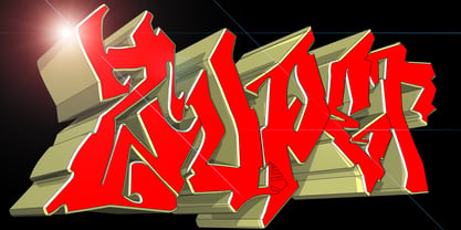
- Albe Sans by Hackberry Font Foundry,
$24.95Albe Sans is a font family that began life when I was struck by a full-color back page ad in a 1935 copy of Better Homes & Gardens. I loved the readability and general cleanliness of the design. This font is drawn from memory after that experience. It is loosely based on Palton for proportion, but heaviily modified (not to mention, Palton is serif): Lower case numbers, Euro, ballot box in the section slot. - MVB Dovetail by MVB,
$79.00 MVB Dovetail is an editorially focused text serif designed by David Sudweeks. The working idea for the typeface came from a design school letter-making exercise: Take a pair of scissors and a few large sheets of paper, and start cutting. The resulting letters and the action itself of cutting them out of paper informed the type design process, producing strong, simple shapes and an open, inviting texture. Dovetail’s tone is crisp and straightforward. Its classic letterforms, set off with a touch of playfulness, give the design both a practical and spontaneous personality. The text weights capably set copy at a variety of sizes for print and render crisply on screen. Its lightest and heaviest weights perform best at display sizes. Care has been taken to save the typographer’s time with OpenType features including contextual punctuation and symbols to fit mixed-case, small-caps, and all-caps settings, as well as figure sets tuned to each use.
 - Merry Mob by Typephases,
$5.99 A gestual drawing of little people that will produce an instant crowd, gang or any combination of folks you need.
 - Mob Pro by NONBook,
$69.95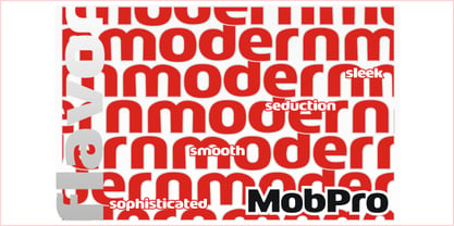
- MVB Peccadillo by MVB,
$39.00MVB Peccadillo is an interpreted revival of a metal typeface popular in the 19th Century, then known as Skeleton Antique. Highly condensed with extra short descenders, the face makes a big impact in a narrow space. Holly Goldsmith worked from letterpress-printed specimens of 96-point, antique metal type, deliberately retaining subtle distortions due to type wear and letterpress impression. Alan Dague-Greene, referring to printed samples of Skeleton Antique, adapted the design to create two additional optical sizes: “Eight” for smaller text and “Twenty-four” for subheads. - MVB Fantabular by MVB,
$39.00MVB Fantabular proves that monospaced faces needn’t be formal or bland. Inspired by the letterforms of older typewriters, Akemi Aoki designed a playful family of three weights with italics. With every character the same width MVB Fantabular works wherever a monospaced font is needed, but the face is so loose and carefree it hides its fixed pitch construction well, allowing it to be used in other settings too. A sans serif version—MVB Fantabular Sans—is also available. - MVB Gryphius by MVB,
$39.00MVB Gryphius is a digitization of uncommon type from an era normally associated with the work of Nicolas Jenson. Produced by Otto Trace, the fonts come from types used by Sebastian Gryphius in Lyon in the early 16th century. The italic appears in a book from 1524 and the roman and small caps appear with the same italic in another book printed by Gryphius in 1541. Retaining the rough contours and uneven texture of its source, MVB Gryphius is best used at text sizes from 12- to 15-point, but its old world character can work in display settings too. - Natalia MLG by LGF Fonts,
$15.00 Natalia font, is an original type by Manuel Lage, inspired by the Doric column bases. Its heavy appearance is lightened by the erosion of the serif pieces. It is a typeface with a rigid and compact stroke.
 - MVB Grenadine by MVB,
$39.00Reminiscent of the hand-lettering found in mid-century children’s books, Akemi Aoki’s MVB Grenadine is a quirky sans, broken free of its geometric roots. Letterforms bounce along the baseline in a jolly dance, yet remain clear and legible, whatever the reader’s age. MVB Grenadine is available in a broad range of six weights, each with italics. - MVB Pedestria by MVB,
$39.00 Lettering on a vintage bottle cap served as inspiration for MVB Pedestria. Akemi Aoki’s design is simple and legible, yet full of life, thanks to its loose, casual forms. Two sets of irreverent Pict fonts take characters from ubiquitous public restroom door symbology to a new level, providing playful pictograms for invitations, advertising, and infographics.
 - MVB Calliope by MVB,
$39.00Gayle Sato, longtime friend of MVB Fonts, has amazing handwriting. It’s a natural, simple hand, with perfect rhythm. Devoid of flourishes, it doesn’t try to be beautiful. It’s just genuine, quick, and clean — the handwriting we all wish we had. The digitization by Mark van Bronkhorst captures these qualities. Retaining the roughness of a felt pen, MVB Calliope is a handwriting typeface that feels much more authentic than most, highly legible but still raw. The Regular was released in 2005, with the other weights shortly thereafter. - MVB Diazo by MVB,
$59.00 Mundane information—the sort you might ignore—often appears in the form of very simple, utilitarian lettering, devoid of personality, the sort of industrial lettering you find on old blueprints, park restrooms, and electrical boxes. MVB Diazo is such a thing. It looks like lettering done earnestly with a plastic template. The monoline caps—constructed from straight lines and simple curves—have rounded details as if rendered by a blunt pen on a topographical survey or by a router on a rustic campground sign. The MVB Diazo fonts are compact, available in two widths: Condensed and Extra Condensed. Each width offers four weights from Light to Black. The fonts are perfect for wherever plain and boring letterforms are required. All widths and weights are also available in two distressed textures (#1 and #2) that accentuate the industrial character of the design. Rough #1 is gritty, with finer texture for use at larger sizes. Rough #2 exhibits more damage, the roughness apparent when used at smaller sizes. The Rough fonts include alternates of a number of glyphs so that variation of texture is possible when letters repeat in a word.
 - MVB Sirenne by MVB,
$39.00A rare natural history book from the early 18th century served as inspiration for the MVB Sirenne typefaces. The artisan who engraved the book—likely a map engraver—had a distinctive style of lettering that was used on the descriptive captions for the many tropical fishes depicted in the book. The plates used to print the illustrations would have been copper, the letterforms hand-engraved. The designers at MVB Fonts found the distinctive quirks of the roman letterforms and the eccentric stress of the italic interesting enough to embark on developing digital fonts based on the engraved samples. As the captions were hand-lettered, there was a great degree of variation, making a direct “revival” impossible, so Alan Dague-Greene interpreted the characteristics of the letterforms into a workable typeface design. The challenge was to retain a rustic quirkiness to the forms, yet have a typeface that was useful for more than display. The solution was to make optical sizes. The “Six” faces are full of character, but strong and open for clarity at small sizes. The design of the “Text” faces is more subtle, so that they can be used for passages of text, but retain the feel of their model. MVB Sirenne “Eighteen” and “Seventy Two” are intended for display use. - MVB Bovine by MVB,
$39.00A hand-rendered advertisement for a leather tanner, appearing in a French book from the ’40s, served as inspiration for MVB Bovine. Using its comic sway and slightly exaggerated forms, the typeface delivers bold headlines with a wink and a smile. MVB Bovine is all-caps with a set of discretionary ligatures. It's available in versions with sharp or rounded corners. - MVB Emmascript by MVB,
$39.00Kanna Aoki drew the letters for MVB Emmascript while on a picnic near the Conservatory of Flowers in San Francisco’s Golden Gate Park. Mark van Bronkhorst adapted the writing as a font that maintains a very natural scrawl. Later a bold weight was added. MVB Emmascript has been used to add a lighthearted, human touch to everything from fiction paperbacks to potato chip packaging. The typeface is named for Aoki's 1968 Volkswagen, Emma. - FF Mab - Personal use only

- Primitive Tuscan JNL by Jeff Levine,
$29.00 Re-drawn from examples of vintage wood type, Primitive Tuscan JNL captures the essence of early letterpress printing of the 1800s; the styles of which were most closely associated with the Old West.
 - Antique Tuscan Condensed by Wooden Type Fonts,
$20.00A revival of one of the popular wooden type fonts of the 19th century, condensed, bold, curved serifs, a very useful design for display.


Page 1 of 7Next page