10,000 search results
(0.065 seconds)
- 1538 Schwabacher by GLC,
$38.00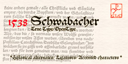 This 1538 Schwabacher was based on a font used by Georg Rhau in Wittemberg (Germany) to print Des Babsts Hercules [...], a German pamphlet against roman catholicism written by Johannes Kymeus. The original font has a relatively complete set of characters including “long s”, but also the special german types like k, fl or ‰, ˆ, ¸.... A few omissions were remedied, and accented letters were added. A render sheet, enclosed with font files, help to identify them on keyboard. It can be used as web-site titles, posters and fliers, editing ancient texts, menus or greeting cards as a very decorative font... Although this font remains clear and easy to read from 8 or 9 points on screen, it is clearly designed for print works.
 - Strogino by maganet,
$5.00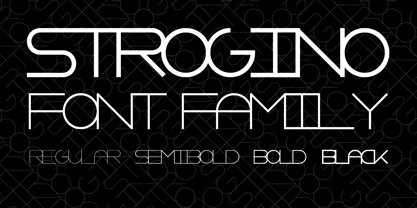 Strogino is a modern display pseudo-monospaced sans serif font. Due to the special design and some variants, all letters are easily identifiable though stuck together. It is as geometric as possible, being made with the simplest forms, capital letter sizes are exactly square. This allows to even create seamless patterns for backgrounds and watermarks. Diacritic can be added to any letter or even symbol and number, giving in total more than 1500 combinations! Strogino is perfect for logos, headings, titles, inscriptions, overlay text, backgrounds, and many more! Short paragraphs or quotes also look great with it. The font is named after Strogino (Russian: Строгино), a district in northwest Moscow, where the designer Roman Maganet came from. You can read more about making this font here.
 - Leonardian by Cubo Fonts,
$25.00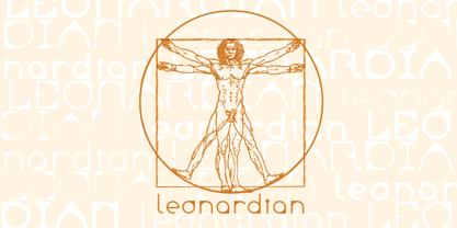 The Vitruvian Man is a world-renowned drawing created by Leonardo da Vinci circa 1487. The drawing depicts a male figure in two superimposed positions with his arms and legs apart and simultaneously inscribed in a circle and square. The drawing and text are sometimes called the Canon of Proportions or, less often, Proportions of Man.The drawing is based on the correlations of ideal human proportions with geometry described by the ancient Roman architect Vitruvius in Book III of his treatise De Architectura. Vitruvius described the human figure as being the principal source of proportion among the Classical orders of architecture. That's how "Leonardian" was buid as well: a quest for ideal proportions, a harmonious design springing up from a geometric "collision", circle and square's intersections.
 - After 5 by Our House Graphics,
$17.00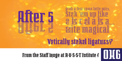 From the basement labs and after hours lounge of R?U?S?S?T Institute, we present After 5. With a somewhat formal (ha ha) yet warm, friendly feel, its normally calm, even tempered and sensible rhythm takes on the syncopated, jazzy beat that goes along with too many martinis when discretionary ligatures are turned on. A friend once asked, was I trying to design a font that looked sort of �Korean?� I said no, I was trying to mess up the Latin alphabet. So, here it is: After 5, a bold, upright condensed slab-serif display typeface with a mixed-up attitude. Complete with bold roman and matching italics. This attention getting font is ideal for Posters, headlines, Packaging and logos.
 - Calton by LetterMaker,
$22.00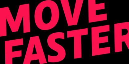 Calton is a utilitarian workhorse sans serif family. It’s designed to work in as many environments as possible, from small text to big headlines. The roman and italic styles work well for any typographical situation while the stencil really packs a punch and shines as a display family. The design has a hint of familiarity from classical humanist sans serifs, but the proportions are much more economical and the detailing is distinctly modern. All styles come in eight weights, from Thin to Black and the family is well suited for film and TV, advertising, editorial design, packaging, branding, logo, sports, web and screen design. The family is available in multiple bundle options so check out the different choices. The family package is available with a bargain price.
 - Chaparral by Adobe,
$35.00Chaparral is the work of type designer Carol Twombly and combines the legibility of slab serif designs popularized in the 19th century with the grace of 16th century roman book lettering. The result is a versatile, hybrid slab-serif design. Unlike ""geometric"" slab serif designs, Chaparral has varying letter proportions that give it an accessible and friendly appearance in all weights from light to bold. And because it is a multiple master typeface with an optical axis (ranging from 7 to 72 points), Chaparral is clear and legible in smaller text settings while remaining subtle and lively at display sizes. Chaparral�s highly functional design is surprisingly beautiful, the perfect choice for correspondence, as well as book, poster and newsletter design. - Decora One by Naghi Naghachian,
$82.00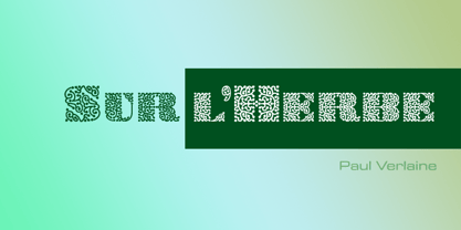 Decora one is a typographic innovation. It is the first of a series of typeface that gives the typographer and other graphic artists the possibility to use modern initials. It enables, moreover, the use of this typeface for decorative headlines and is suitable for manipulations in both vector-based and pixel-based graphic programs. Typographies in countries worldwide, whose alphabets derive from the Roman one, are dependent on such innovations in order to meet the increasing demands of modern communication. This typeface implies at the same time an enrichment of the possibilities for typographical design, which in turn increases the delight in such design. It gives me great pleasure to present this series of new typefaces to my creative colleagues worldwide.
 - Mastro Sans by Ndiscover,
$39.00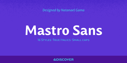 Mastro™ Sans is a contemporary humanist sans serif and the sans version of Mastro. The lowercase shapes are simple yet distinct, its organic design (specially the italic) are based on different stroke modulation ideas combined into a coherent whole. The uppercase is inspired in roman capital proportions yet keeping the lowercase stroke modulation. Mastro™ Sans has a total of 16 styles and it covers a large set of languages. It also has many Opentype features, such as small caps, superscript numbers and letters, old style and lining figures, tabular figures, case sensitive forms, fractions and more. It is a design with a lot of personality while being versatile. You can use it in branding, editorial, web and video.
 - Arquitecta by Latinotype,
$26.00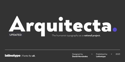 Arquitecta. The humanist typography as a rational project. Since the experimentation from the Bauhaus through modern sans history we looked for a new mix to construct a rational geometric typeface with humanist proportions suitable for text layout and continuous reading. Inspired by American & European hand lettering from the first half of the past century, Arquitecta finds his own space as a great alternative for paragraphs in front of classics like Futura, Kabel or Avant Garde. The family contains 8 upright romans and 8 italics with the following features: - European accents, Old Style Numbers, Numerators & Fractions. - Ink traps to avoid press impressing spots & hinting optimized. - Small X-height with accentuated ascenders y descenders. Upgrade Mar 2023: Contours were corrected and the set was extended to the current Latinotype.
 - Curled Corner by Kaer,
$14.00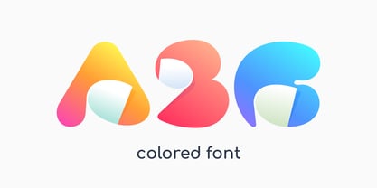 I’m here for you with my new colored font Curled Corner! Alphabet made of letters with curled corner. It’s looks like negative space style icons. Colorful gradient note paper. Modern clean vector origami font for your stickers, crypto app, nft identity, and tags. All the letters in this font are colored brightly and vividly with corner overlay. --- *You can use color fonts in PS since CC 2017, AI since CC 2018, ID since CC 2019, QuarkXPress since 2018, Pixelmator, Sketch, Affinity Designer Since macOS 10.14 Mojave, Paint.NET Windows only.* *Please note that the Canva doesn't support color fonts!* --- What's included? * Colored and B&W styles * A-Z & Numbers * BONUS icon (ligature) set If you have any questions or issues, please contact me: kaer.pro@gmail.com Best, Roman.
 - Ganache by Laura Worthington,
$35.00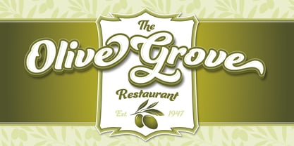 Ganache is a smart, intricate, fun, and deceptively simple font. This distinctive hybrid is a unique blend of script, Roman, and italic. My fascination with letter-fitting makes this an intriguing exercise in negative space. The uppercase letters are boldly stylish, and here some of the counters display unexpected shapes. Between some letters, the negative space is transformed into a type of swash itself. Customize your design with Ganache’s 185 swashes and alternates and 10 ornaments. *NOTE* Basic versions DO NOT include swashes, alternates or ornaments See what’s included! http://bit.ly/2bUfPmt These fonts have been specially coded for access of all the swashes, alternates and ornaments without the need for professional design software! Info and instructions here: http://lauraworthingtontype.com/faqs/
 - Gaudeamus by Znakomesto,
$35.00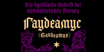 Gaudeamus is a Cyrillic face of medieval Gothic textura inspired of incunabulum artworks. Recommended for a historical and cultural context, but it goes well beyond. Suitable for music, books, fashion, catering, packaging and more. Works for long paragraphs and short sentences. Features: — 7 Stylistic sets; two of which are text preformats to the commons of the Middle Ages and Early Modern historical periods. — Sets of Ordinal and Superscript characters for French, Portuguese, Spanish typesetting. — Localized letterforms for Bulgarian and Serbian. — Localized diacritics for Polish and Romanian. — Support typesetting in Russian pre-reform orthography. — Support typesetting in Middle English orthography. — Case sensitive characters for greater consistency with uppercase letters. — Set of Roman Numerals. — Standard and Discretional ligatures. — 530 glyphs; 40 languages support.
 - President by Linotype,
$29.99In 1952, Charles Peignot made a bold and fortuitous move: he invited a young Swiss designer to Paris to be the art director of the Deberny & Peignot type foundry. This started the professional type design career of Adrian Frutiger; and since then he has designed an astonishing range of masterful typefaces. One of the earliest for Deberny & Peignot was Président, a sharp-seriffed Latin titling face. Latin" is a typographic designation for roman typefaces with wedge or triangular-shaped serifs, a stylistic form that Frutiger would return to later with his beautiful typeface Méridien. Président™ has wide, solid shapes; very little contrast between thick and thin strokes; and an air of assurance. Use this titling font for business cards, announcements, or artistic signage." - Linotype Syntax Letter by Linotype,
$29.00Linotype Syntax™ Letter is reminiscent of the style of the Roman Rustic capitals and is an earthy, almost snappy companion to the other Linotype Syntax™ typefaces. Instead of subtly expressing the rhythmic dynamism of handwritten letters, this face is more overt about its connections to writing movements, such as the lead-in and exiting terminals, and the organic branching of round strokes from main stems. Linotype Syntax Letter was designed especially for office communications, and it does add a warmer, more personal touch to such documents — while still combining nicely with the more formal Syntax relatives. With six weights, their matching italics, as well as small caps and old style figures, this typeface family has a total of 24 weights. - Narcissus SG by Spiece Graphics,
$39.00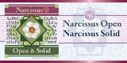 Narcissus Open is a heavy typeface designed by Walter Tiemann in 1921 for the Klingspor Foundry in Germany. It is a shaded wide roman using a very modest amount of white highlighting. Serifs are extremely delicate, almost ornamental. This elegant old typeface gives a feeling of importance and authority and is highly effective when used in large display sizes. Narcissus Solid lacks all highlighting and becomes more useful in smaller sizes. Narcissus Open and Solid are also available in the OpenType Std format. Some new characters have been added to this OpenType version. Advanced features currently work in Adobe Creative Suite InDesign, Creative Suite Illustrator, and Quark XPress 7. Check for OpenType advanced feature support in other applications as it gradually becomes available with upgrades.
 - 1431 Humane Niccoli by GLC,
$38.00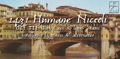 Niccolo Niccoli (1364-1437) was a wealthy bibliophile and an acclaimed scribe, in Florence (Italy). He was one of the most important Italian calligrapher in this early time of rediscovering Roman script. Of rare accomplishment was his adaptation of the so called Italian humanistic minuscule script. We were inspired from his late work to create this present Font. We have added a lot of accented and other characters (U/V, I/J...) who was not existing in the original and replacing "long s" by a small "s" for a modern use. The OTF encoding was used for intelligent alternates, permitting to use different forms of the same lower case or capital in a single word, reproducing easily the charming variety of a real manual scripture.
 - Parliament by Hoefler & Co.,
$49.99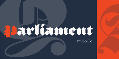 The Parliament typeface was designed by Jonathan Hoefler beginning in 1995. A burlesque typeface in the Regency Blackletter style, Parliament was inspired by the ‘Four-line Pica Black No. 1’ typeface of William Caslon Jr (1821), whose enigmatic design for the letters E, G, I, N, V and Y hinted at a broader ambition to modernize the arcane shapes of the gothic alphabet’s capital letters. Parliament completes this project for the first time by including two sets of alphabets, one archaic and one modern, along with a third set of ‘small caps’ that restores to the blackletter the versatility of Roman type. Parliament was first used for the 1998 ATypI Conference in Lyon, and was published by Hoefler&Co in 2022.
 - Henriette by Typejockeys,
$-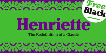 The redefinition of a classic In the 1920s the Viennese government decided to standardize the street signs across the city. A typeface was especially constructed for the purpose. It was available in a Heavy and a Bold Condensed version, to support short street names as well as longer ones. As the years went by, the typeface was adopted and redrawn by several enamel factories. These adaptations lead to variations on the design, and to the fact that there isn’t a Viennese street sign font but 16 – in part severely – different versions. Henriette is not a digitization of any of those versions; rather, it is influenced by all of them. The italic versions are completely original and designed to accompany the Roman.
 - Arquitecta Standard by Latinotype,
$16.00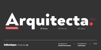 Arquitecta Standard. The humanist typography as a rational project. Since the experimentation from the Bauhaus through modern sans history we looked for a new mix to construct a rational geometric typeface with humanist proportions suitable for text layout and continuous reading. Inspired by American & European hand lettering from the first half of the past century, Arquitecta finds his own space as a great alternative for paragraphs in front of classics like Futura, Kabel or Avant Garde. The family contains 8 upright romans and 8 italics with the following features: - European accents. - Ink traps to avoid press impressing spots & hinting optimized. - Small X-height with accentuated ascenders and descenders. Arquitecta Standar update: Improvements of proportions and drawing. The set was extended to the current one of Latinotype.
 - Cartesius by T4 Foundry,
$21.00Veteran designer Bo Berndal has created Cartesius, an oldstyle serif typeface with roots in the 16th and 17th centuries, France and Venice. Bo Berndal: "Rene Decartes, the great French philosopher, was invited to Sweden in the 17th century, when the country was at the height of its power. In the university city of Uppsala he used the Latin name form Cartesius. The typeface that carries his name is inspired by letterforms from the 1600s, but upper case letters are of pure Roman type". Cartesius holds up well even under less than perfect circumstances, and is suitable for magazine and book design. It comes with a full range of styles, including small caps. Swedish type foundry T4 premiere new fonts every month. Cartesius is our fifth introduction. - Axion by Type Innovations,
$39.00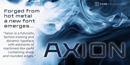 Axion is an original design by Alex Kaczun. It is a display font not intended for text use. It was designed specifically for display headlines, logotype, branding and similar applications. The entire font has an original look which is strong, dynamic, machine generated and can be widely used in publications and advertising. Axion is a futuristic, techno-looking and dynamic typeface with elements of machined-like parts containing sharp and rounded edges. This attractive display comes in roman with lower case and lining figures. The font is also available with true-drawn slant italics. Other design style variations include small capitals with old style figures. The large Pro font character set supports most Central European and many Eastern European languages.
 - Rare Bird Specimen IV by Rare Bird Font Foundry,
$50.00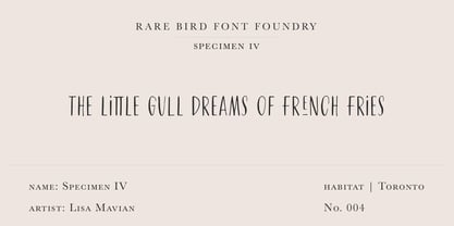 This unassuming sans serif, lettered by Toronto based artist Lisa Mavian of Post Calligraphy, is loaded with robust and charming features and illustrations. OBSERVATIONS Specimen IV is a clean, hand-lettered sans with a quirky personality that does not take itself too seriously. These humble and winsome characters are sure to be a winning addition to your flock of fonts! DEFINING CHARACTERISTICS OpenType programming, formal title & preposition word art, Roman numerals, old-style numerals, realistic double-letter ligatures, complete set of swashed uppercase alternates, select swashed lowercase alternates, complete set of swashed numerals, select swooping descender alternates, 7 complete sets of alternate uppercase letters, 52 graphic iconography alternates. POTENTIAL SIGHTINGS Wedding menus, signage, logo design, chocolate packaging, children's literature, mobile apps.
 - Borest by Flavortype,
$20.00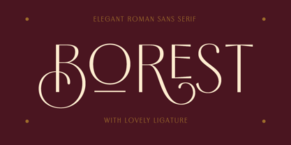 Borest, a new carefully crafted roman sans serif display font. The ideas for this font has a wide range of reference, from vintage, classic, art deco, until the modern era. So the looks of this font must be in the wide range of the reference above. Borest has a versatile and luxury feel as you can see in our creations on the display, such as Branding, Header, Logotype, Poster, Magazine, Packaging, Wedding Invitation with art deco style, and more. It shows that Borest can accommodate various design style. Borest comes with OpenType Features. such as Stylistic Alternates as an Ascender swash and Descender Swash and Ligatures. Every glyphs for alternates are curated for the best and without eliminating the characteristics of this font.
 - Honesty Sans by Océane Moutot,
$32.90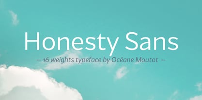 Honesty was the first font published by the Studio in 2020. It was a typeface with flared stems. 2 years later, we are now publishing Honesty Sans. It is inspired by the original design but is revisited as a sans serif this time. Honesty Sans keeps the inspiration from the incise genre and font such as Albertus or the Trajan but with softness, thanks to its low contrast and smooth curves. Honesty Sans is highly lisible, which offers a variety for use, from titles, edition of texts, branding, magazines and so on. Its large variety of glyphs, including accents, old-style numbers and ligatures will give uniqueness to your designs. Honesty Sans is available in 16 styles, from thin to heavy in roman and italic.
 - Jenthill by Katsia Jazwinska,
$15.00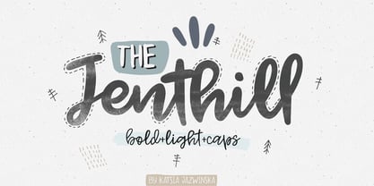 Introducing Jenthill - a lovely font family which includes 4 font styles: - a wonderful script typeface Jenthill - Jenthill Light - a delicate version of Jenthill - 2 uppercase fonts Jetnthill Caps and Jenthill Light Caps which are perfect for headings. Each font consists of about 380 glyphs and includes basic punctuation, numbers, roman typeface and international characters, so the font can be used with most of the European languages. Each font in this family is amazing in itself and perfectly combined with each other. So, if you are looking for a font that simulates the soft-edged handwriting, the Jenthill is just for you! Every letter of this font has been carefully crafted to look wonderful and helps you to add a little fancy to your work.
 - Agilo Handwriting Pro by SoftMaker,
$15.99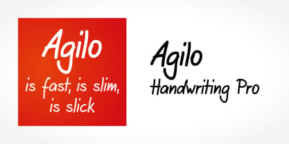 Digitized handwriting fonts are a perfect way to give documents the “very special touch”. Invitations look simply better when handwritten than when printed in bland Arial or Times New Roman. Short handwritten notes look authentic and appealing. There are numerous occasions where handwritten text makes a better impression. Agilo Handwriting Pro is an upright, medium weight handwriting font with a simplified, slightly sloped print (non-connecting) style that mimics true handwriting closely. Use Agilo Handwriting Pro to create stunningly beautiful designs easily. This typeface comes with many pre-made ligatures and alternative characters for sophisticated typography – all easily accessible as OpenType features. A “random” feature even allows for automated random switching between variations of the same character, resulting in type that looks authentically handwritten.
 - Bonsai by Three Islands Press,
$29.00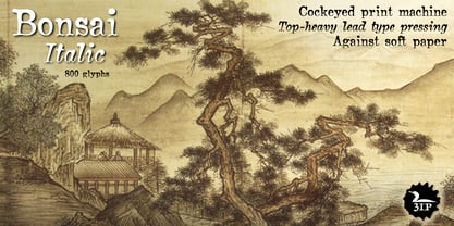 Years ago, I developed an interest in the Japanese art of dwarfed potted trees, bonsai. I bought some books on the subject from Brooklyn Botanic Garden. In one -- Handbook on Bonsai: Special Techniques (seventh printing, February 1976) -- the type was bad. Old worn lead type, I suspect, spread wide in the tops of characters and disappearing on the bottoms. Two decades later, I came across my Brooklyn Botanic Garden collection and was struck again by this interesting type. Inspired, I made a typeface. Didn't take me long to decide on a name for it, either: a name with a double-meaning, based both on its look and its inspiration. Bonsai, the typeface, has two styles, a roman and a true italic.
 - Figgins Brute by Intellecta Design,
$14.90"A capital titling face with numerals, erroneously labelled in Figgins specimen book of 1817 as an 'antique' or roman. With a very bold, nearly monoline construction and squared serifs as thick as the main stroke, this type surpassed even the fat face style in blackness, it was popularised by the advent of handbills and early advertising posters, which needed bold type styles to project commercial messages from a distance. A sign-writer friend of mine theorises that the Egyptian style originated with the North African campaigns (hence Egyptian) of Napoleon Bonaparte, and the type historian Ruari McLean also suggests that the Egyptian style originated with signwriters 'block' letters, just like the prototypical (and contemporary) sans serif of Caslon IV." (Ben Archer) - Garnet Euro Typewriter by Coniglio Type,
$19.95Garnet is a rare TT typewriter face, made digital from analog samples gathered with great care by Coniglio Type. A time and place; type and life. Garnet Euro Typewriter is the first new release by designer Joseph V Coniglio in over 5 years. It is contemporary designer type, made from the struck steel hammers of an art deco san serif face transferred from a mechanical 1926 Royal Portable typewriter. It has an obsessively complete commercial roman character set ––for the pre-opentype environment of the late 1990's. Yes, it has that great “Monopoly Game” question mark -- and all on a period-piece typewriter! You should have no trouble grafting that sorely needed Euro symbol.” –And he very well did! - Libertatus Duas - Personal use only

- Marishka Roseville by Kulokale,
$23.00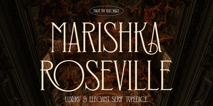 Marishka Roseville is a luxury and elegant display serif font. Marishka Roseville is well-suited for advertising, branding, logotypes, packaging, titles, headlines and editorial design. This font comes in two styles, Regular and Oblique Version. This font is encoded with Unicode PUA, which allows full access to all additional characters without having special design software. Mac users can use Font Book, and Windows users can use Character Map to view and copy one of the extra characters to paste into your favorite text editor / application. We highly recommend using a program that supports OpenType features and Glyphs panels such as Adobe Illustrator, Adobe Photoshop CC, Adobe InDesign, or CorelDraw, so you can see and access all Glyph variations. We hope you enjoy the font. Thanks for purchasing and have fun!
 - Love Girl by Zane Studio,
$12.00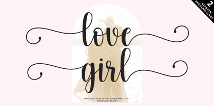 girl love Script is a sweet calligraphy writing while maintaining its elegance. This will increase your design stand out! girl love is the perfect typeface for all your types of projects, such as advertising, branding, graphic design, quotes, wedding designs, logos for online or offline businesses, photography, and more. Make your business more beautiful! girl in love has 2 VERSIONS of the regular script with slanted tails. Feature: - Uppercase and lowercase letters (including PUA coded extra glyphs) - Numbers and Punctuation - Most Multilingual Accent - Can be used in any software, such as Adobe Photoshop, Illustrator, Silhouette Studio, even Microsoft Word, PowerPoint and others. HOW TO ACCESS SWASH: PC: Using the character map. Easier to use Character Map UWP (Free Download from Microsoft store) Feel free to chat with us if you have any questions. Thank you :)
 - Kaghe Slab by Kulokale,
$19.00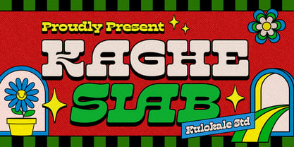 Kaghe is a retro display slab font. Kaghe is well-suited for advertising, branding, logotypes, packaging, titles, headlines, and editorial design. This font comes in 4 styles, Regular, Oblique, Outline, and Oblique Outline version. We highly recommend using a program that supports OpenType features and Glyphs panels such as Adobe Illustrator, Adobe Photoshop CC, Adobe InDesign, or CorelDraw, so you can see and access all Glyph variations. This font is encoded with Unicode PUA, which allows full access to all additional characters without having special design software. Mac users can use Font Book, and Windows users can use Character Map to view and copy one of the extra characters to paste into your favorite text editor/application. We hope you enjoy the font and have fun! Thank You.
 - WBP Emperio by Studio Jasper Nijssen,
$20.00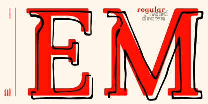 A classic serif font with a twist. WBP Emperio has an interesting shape. She has rounded corners and a slightly 'curvy' look. The little indent makes her stand out above the rest. A sensation in the making. Emperio has two styles. The Regular: Great for designing friendly corporate identities. And there's the Hand Drawn style: Great for design posters of prints with a handmade feel. Combine the two and you can go infinite. WBP Emperio was a sketch I designed when I started my company. So you can say it's been five years in the making XD. When I was invited to add two pages to the Typodarium 2022, I speeded up the process and added the hand-drawn style. The end result is awesome. A classic serif font, with a crazy extra style.
 - Jupiter Mission by Wing's Art Studio,
$10.00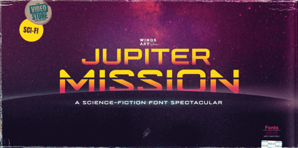 Jupiter Mission: A Science-Fiction Font Spectacular by Wingsart Studio Jupiter Mission is a futuristic font family inspired by science-fiction movies and TV shows. It promotes the spirit of adventure and space exploration with a design aimed at recapturing the excitement of childhood movie nights and VHS video covers. It is at once cool and serious, retro and modern. It’s clean look is suitable for large headlines and small infographics and works great for sci-fi movie titles, production design elements, technology articles, video games and much more. Regular and Italic styles are included with additional Sliced versions when you need an extra futuristic flourish. It features unique uppercase and lowercase characters, along with numerals, punctuations and language support. For more great fonts check out our website at Wingsart Studio.
 - P22 FLW Exhibition by P22 Type Foundry,
$29.95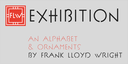 This font set is the second in a series from P22 Type Foundry based on the lettering styles of Frank Lloyd Wright. Created in 1931, the Exhibition lettering was intended primarily to accompany Frank Lloyd Wright's exhibition drawings and models. Many of the 72 Extras were designed to form continuous linking borders. Combinations of these geometric forms can provide endless variations of decorative elements in the style of Frank Lloyd Wright. Many of these images were based on Mr Wright's "Saguaro Forms and Cactus Flowers" illustration for an unused Liberty magazine cover of 1926. Other imagery in this set was derived from assorted geometric designs by Wright. Exhibition Regular, Light, and Bold have been remastered and now contain almost 400 characters including support for Western and Central European languages.
 - Artico by cretype,
$20.00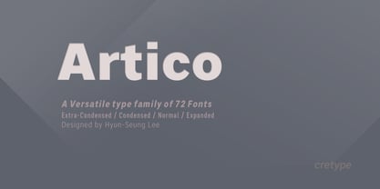 Artico Family is a modern sans-serif typeface that is clean, simple and highly readable. Letters in this type family are designed with genuine neo-grotesque and neutral shapes without any decorative distractions. The spaces between individual letter forms are precisely adjusted to create the perfect typesetting. Artico is versatile type family of 72 fonts. Artico family consists of 9 weights (Thin, ExtraLight, Light, Regular, Medium, Bold, ExtraBold, Heavy & Black) and 4 widths (Extra Condensed, Condensed, Normal & Expanded) with their corresponding italics. The Open Type fonts contain complete Latin 1252, Cyrillic, Central European 1250, Turkish 1254 character sets. Each font includes proportional figures, tabular figures, numerators, denominators, superscript, scientific inferiors, subscript, fractions and case features. We highly recommend it for use in books, web pages, screen displays, and so on.
 - Logika Nova by Designova,
$35.00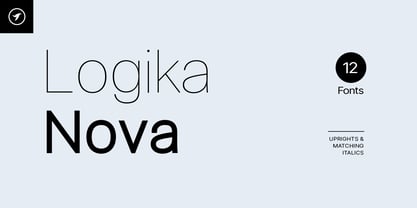 Logika Nova is a simple, clean typeface with a modern design and remarkable appearance. This is a perfect choice for creating logotypes, branding, headlines, corporate identities, and marketing materials for web, digital & print alike. The typeface will be a great option for branding, logo/logotype design projects, marketing graphics, banners, posters, signage, corporate identities, and editorial design. Adding extra letter spacing will make this font the perfect choice for minimal headlines and logotypes, as shown in the promo designs attached. Handcrafted and designed with powerful OpenType features in mind, each weight includes extended language support with Western European, Central European, and South Eastern European sets. A total of 280 glyphs are available. Logika Nova typeface includes 12 fonts, with six upright weights (Thin / Light / Book / Regular / Bold / Heavy) and Italic equivalents of all six weights.
 - Karina by Flawlessandco,
$9.00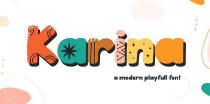 Introducing "Karina" is a modern playful font. Step into a world of contemporary charm with "Karina," a font designed to infuse your projects with a perfect blend of modern aesthetics and playful whimsy. Karina doesn't just bring letters to life; it introduces a dynamic trio of styles — regular, extrude, and fun — adorned with patterns in fun styles that add an extra layer of delight to your designs. There's some connected letters and some alternates that suitable for any graphic designs such as branding materials, t-shirt, print, business cards, logo, poster, t-shirt, photography, quotes .etc This font support for some multilingual. Also contains uppercase A-Z and lowercase a-z, alternate character, numbers 0-9, and some punctuation. If you need help, just write me! Thanks so much for checking out my shop!
 - Teenage Rockstar by Teenage Foundry,
$19.00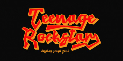 TF Teenage Rockstar Display Script Font - a stylized design that is sure to bring a touch of elegance and sophistication to your projects. Our font features swooping tails on select lowercase letters, adding an extra level of flourish and personality that is sure to capture attention. There are 2 styles available (Regular & Extrude). Both font versions are meticulously crafted with attention to detail, ensuring that each letterform maintains its structural integrity while still conveying its unique style. With our display script font, you can create designs that are both elegant and impactful, giving you the freedom to express your creativity with confidence. Features: Uppercase, Lowercase, Numeral, Opentype Features, Punctuation & Multilingual. Note: To access tails, just type underscore + underscore + numeral. The alternates feature must be active. Example __3 For any questions please contact me 🙂 Thanks!
