10,000 search results
(0.034 seconds)
- Eurocine by Monotype,
$31.99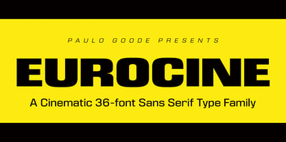 Eurocine is an expansive display typeface – a square sans serif that’s perfect for titling, headlines, logotype and branding. This 36-font family is packed with features to make it supremely versatile. This typeface attempts to capture the mood of movie credits from European Cinema in the 1970s, with a focus on Giallo films in particular. In terms of style, Eurocine sits somewhere between Walter Baum and Konrad Friedrich Bauer’s Folio, and Aldo Novarese’s Eurostile. With Eurocine you get a more versatile typeface by way of its small caps and additional stylistic sets giving you extended caps, extended small caps, and petite caps, as well as upper and lowercase unicase. Creating typographic masterpieces of your own will be so much easier! Key features: • 6 Weights in Roman and Oblique • 3 Widths – Narrow, Regular, Wide • Extended Caps • Small Caps • Extended Small Caps • Petite Caps • Unicase • Old Style Figures • European Language Support (Latin) • 1,200 glyphs per font.
 - Destra by Isaco Type,
$26.00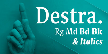 Destra is a contemporary, narrow serif family, suitable to save space and legible at small sizes. Its shapes are the result of a mix of styles. "Destra" is the Portuguese word for "right hand". The font has several OT features - fractions, old style-, lining-, tabular numbers, superiors/inferiors, alternative glyphs, dozens of ligatures (standard + discretionary) and an exclusive feature to convert Arabic to Roman numerals up to 1000 (download the “OT Features Guide” pdf). Moreover, Destra has an impeccable technical finish, with a systematic review of nodes, curves, spacing and internal data, eliminating the possibility of errors when using it. The family consists of 8 styles, 4 weights - Regular, Medium, Bold and Black, plus their respective italic versions. The fonts are available in OpenType PS/TT and have extended character set to support CE, Baltic, Turkish as well as Western European languages. You can test Destra downloading the free trial font in Medium version (TT only). This trial file supports only Western languages.
 - Preto Sans OT Std by DizajnDesign,
$50.00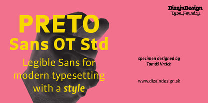 Preto is an extensive type family, which explores the function of serifs on readability and legibility. Preto consist of three subfamilies: Sans, Semi and Serif. Preto is designed for multilingual typesetting. All of the subfamilies have equal gray value but different texture which can be use to differentiate languages. Preto subfamilies have two text weights and two bold styles (Regular --> Bold, Medium --> Black). Every weight has a companion Italic style as well. Preto Sans OT Std The Sans version of Preto forms the basic skeleton of the family, it is decidedly simpler than the other styles (Semi and Serif). Although you can find many distinctive and unique elements in the details. The most visible elements are the tapered upper part of the letters. The capital letters have uniform widths achieving very different texture than traditional roman proportions. There are two different options for ligatures and alternative characters (J, Q, g, &) gives more variability for different languages.
 - Preto Sans by DizajnDesign,
$24.00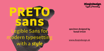 Preto is an extensive type family, which explores the function of serifs on readability and legibility. Preto consist of three subfamilies: Sans, Semi and Serif. Preto is designed for multilingual typesetting. All of the subfamilies have equal gray value but different texture which can be use to differentiate languages. Preto subfamilies have two text weights and two bold styles (Regular --> Bold, Medium --> Black). Every weight has a companion Italic style as well. Preto Sans The Sans version of Preto forms the basic skeleton of the family, it is decidedly simpler than the other styles (Semi and Serif). Although you can find many distinctive and unique elements in the details. The most visible elements are the tapered upper part of the letters. The capital letters have uniform widths achieving very different texture than traditional roman proportions. There are two different options for ligatures and alternative characters (J, Q, g, &) gives more variability for different languages.
 - Di Barros by Di Barros,
$5.00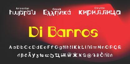 I'm Roberto Teixeira, a Brazilian graphic designer. After looking for a form quite different from the existing types, created in 2019, Di Barros Fonts Family is composed by Di Barros Regular...for while. This,form covers the following, according to the Windows character map: Basic Latin, Latin Supplement 1, Extended Latin A, Extended Latin B, Additional Latin, Cyrillic, Greek, Greek Extended, Armenian and several other special types, such as currency symbols, numbers, fractions, Roman numerals, arrows, symbol of electricity, hearts and vector images, of own authorship and more. Di Barros, with a good length, serves several languages. I think Di Barros applies to fine environments, such as jewelry stores, fashion stores, cultural events and others, where a beautiful and non-aggressive look is required. But there is no better application than the one chosen for its inspiration and creativity. Di Barros Fonts Family was made for you. Thank you for using it.
 - Garota Sans - Personal use only

- Garota Serif - Personal use only

- Woodford Bourne PRO by Monotype,
$25.99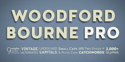 Woodford Bourne PRO is the evolution of my original Woodford Bourne typeface that was inspired by the iconic stone cast letters on the façades of the 19th century Woodford, Bourne & Co. buildings in Cork City, Ireland. Woodford Bourne PRO has matured with numerous improvements to make it an even more versatile font family. The fonts have been completely redrawn and spaced, there are now an additional 500 glyphs for you to use across 9 stylistic sets. The additions include underlined caps, small caps, petite caps, catchwords, discretionary ligatures and more. Please view the specification sheet before you purchase to see all the glyphs and features. Key features: • Woodford Bourne PRO is a vintage geometric sans, optically adjusted for improved aesthetics and legibility 2 FONTS IN 1 – Use the default contemporary character set, or switch to vintage style with stylistic sets 9 Weights in Roman and Italic Thin | ExtraLight | Light | Regular | Medium | SemiBold | Bold | Black | Ultra Underlined Caps, Small Caps, Petite Caps, Catchwords, Discretionary Ligatures Full European character set 1000+ glyphs per font UPDATED JULY 2021 (v.3) Woodford Bourne PRO v.3 update includes numerous improvements including rebalanced /S/s/ glyphs to make them less ‘top heavy’. Italics have been redrawn to smoothe out irregularities. Improvements have been made to diacritics and glyph coverage now supports all Latin European languages.
 - Cannon by W Type Foundry,
$20.00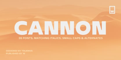 The Cannon family is the result of combining the clean aesthetics from a classic sans neo-grotesque with a touch of a geometric design. The result is a simple but dynamic typeface with retro and technological airs. Cannon is ideal for robust advertising, bold brand identities and packaging, also suitable for high impact headlines and short texts. This type family consists of 36 variants and 9 weights (thin, extra light, light, regular, book, medium, bold, extra bold, black), matching italics for all weights and widths, matching small caps for all weights and widths, alternate characters and extended language support. We are proud to introduce: Cannon.
 - Monday Vacation by Din Studio,
$25.00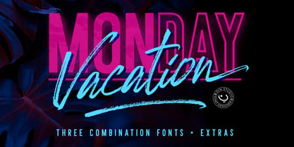 Introducing Monday Vacation Font. Monday Vacation is a brush font and combines with a sans font (Solid +outline). Made with a natural brush. The texture from the brush font will make your design more beautiful and powerful. This font is suitable for any design like branding, quotes, t-shirt printing and etc. Included: Monday Vacation Regular Monday Vacation Italic Monday Vacation Sans Solid Monday Vacation Sans Outline Monday Vacation Extra Features: Accents (Multilingual characters) 39 Alternates 52 Extra Swashes PUA encoded Numerals and Punctuations (OpenType Standard) Customer support I hope you enjoy it !! Thanks for visiting and purchasing my font! Best Regards Donis M
 - Lazy Boutique by Bogstav,
$17.00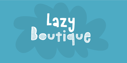 Lazy Boutique is and exciting and beautiful piece of work. It's 100% handmade and slightly irregular in an organic way. I've added X different versions: Regular, Line, Fill and Curl - mix and match to find your favourite kind of look . Use Lazy Boutique for your products that needs a handmade, organic and exciting look!
 - Sinister Undertones JNL by Jeff Levine,
$29.00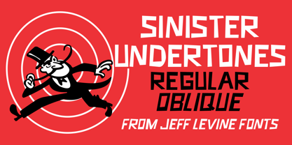 Hand lettering from the 1958 movie poster for “Vertigo” (designed by Saul Bass) was the inspiration for the digital font Sinister Undertones JNL, which is available in both regular and oblique versions. The quirkiness of this irregular, squared-edge sans – despite its simplicity – perfectly captured the mood and drama of Alfred Hitchcock’s film production.
 - P22 Sniplash by IHOF,
$24.95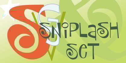 Sniplash is a lively font inspired by cartoons and comics of the 1960s and '70s. Casual and organic, this font features curly lines and irregular weights in Regular, Light and Bold styles. This design defies serious analysis and offers a fun attitude for lighthearted design. Excellent for parties, retro packaging or any number of uses.
 - Travel Plans JNL by Jeff Levine,
$29.00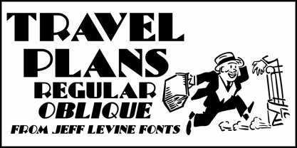 A 1930s travel poster from American Airlines had the airline’s name in a classic thick-and-thin Art Deco design of hand lettering. With the addition of angular spurs, some of the characters become semi-serif in nature. This type style is now available as Travel Plans JNL, in both regular and oblique versions.
 - Heket by Eurotypo,
$48.00 Heket was a goddess of childbirth and fertility in Ancient Egypt. She was depicted as a frog, or a woman with the head of a frog. Frogs symbolized fruitfulness and new life. Heket font is an expressive handwritten font, it is available in four versions: Regular and slanted. They have many advantages of the OpenType futures to choose from: stylistic alternates, swashes, contextual alternates, and a full set of standard and discretionary ligatures. Heket supports all diacritics for CE languages; they come also with a huge variety of ornaments, underlines, beginnings and word endings that will allow you to work in a creative way. They've been specially thought to use in packaging design, children books, advertising, logotypes, greeting cards, web sites and much more.
 - Bartholeme by Galapagos,
$39.00The four weight semi-condensed Bartholemé family came into existence as a family expansion based on the designer's earlier concept, Bartholemé Open. This hybrid family was inspired by and loosely based on a number of contemporary mid-twentieth century type concepts having Old Face or Modern influence. Those inspirational type designs were primarily designed for various proprietary photolettering technologies of the time. The award-winning* Bartholemé Open and its companion design Bartholemé small capital open were inspired by various Shaded, Inline and Handtooled type models from the nineteenth and twentieth centuries. Most of those inspirational type designs were designed as titling fonts with all capital sets only. To set it apart from the earlier models, Bartholemé Open is semi-condensed intentionally designed with a lowercase. Design qualities include a large x- height, tightly curved ample counters, crisp serifs and tight bracketing. The overall plan of the family was originally intended for display usage in titling and short passages of text. At higher output resolutions all fonts read well at smaller point sizes. The Bartholemé family works well on its own, but also is compatible with type styles possessing qualities that complement or enhance its own. The Bartholemé family consists of a Regular weight complementing a Bold weight, along with Medium complementing an Extra Bold weight. The companion true-drawn italics are based on the Bartholemé roman design. * Award for Design Excellence bukva: raz! Type Design Competition of the Association Typographique Internationale, 2001 - Patricia Rustine by Letterena Studios,
$9.00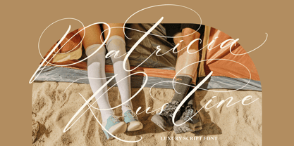 Patricia Rustine is a romantic and sweet calligraphy typeface with characters that dance along the baseline. It will add a luxury spark to any design project that you wish to create!
 - July Girl by Attract Studio,
$12.00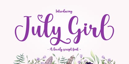 INTRODUCING July Girl is a new variant of beautiful script type with linkable hearts that is here to complete your script font collection. July Girl is perfect for branding, wedding invitations, business cards, posters, quotes and other romantic projects. July Girl features OpenType stylistic alternates, ligatures and International support for most Western Languages is included. To enable the OpenType Stylistic alternates, you need a program that supports OpenType features such as Adobe Illustrator CS, Adobe Indesign & CorelDraw X6-X7, Microsoft Word 2010 or later versions. July Girl is coded with PUA Unicode, which allows full access to all the extra characters without having special designing software. Mac users can use Font Book , and Windows users can use Character Map to view and copy any of the extra characters to paste into your favourite text editor/app. If you need help or have any questions, please let me know. I'm happy to help. Thank you. Attract Studio
 - Bedfore Script by Lettersams,
$14.00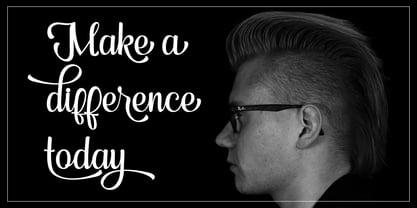 Bedfore Script is a romantic typeface. vintage script font that is thick, elegant & fun. very suitable for various purposes and wants. Like logo, label, wedding invitation, brand, t-shirt, letterhead, nameplate, news, book covers, magazine, oster, badge, etc. Bedfore Script features OpenType stylistic alternates, ligatures and International support for most Western Languages is included. To enable the OpenType Stylistic alternates, you need a program that supports OpenType features such as Adobe Illustrator CS, Adobe Indesign & CorelDraw X6-X7, Microsoft Word 2010 or later versions. Bedfore Script is coded with PUA Unicode, which allows full access to all the extra characters without having special designing software. Mac users can use Font Book , and Windows users can use Character Map to view and copy any of the extra characters to paste into your favourite text editor/app. If you need help or have any questions, please let me know or via email "lettersams@gmail.com" I'm happy to help :) Thanks & Happy Designing!
 - Meccanica by Monotype,
$25.00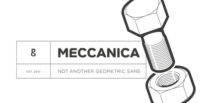 Meccanica is pretty unique and difficult to describe, suffice to say that it’s a geometric sans typeface with some hexagonal DNA. Meccanica’s defining features include soft, chamfered edges, angular bowls and shoulders, angled/hexagonal terminals, and semi-hexagonal ink traps (in a nutshell). View the microsite for full info: http://meccanica.info Meccanica was inspired by the mechanics of engineering – the humble nut and bolt in particular – it is a versatile typeface that will give your own typography a distinctive voice. Initially designed as a display typeface (for headlines, logotype, branding and short runs of text), Meccanica also reads well as body copy – particularly at smaller point sizes. Key features: • 9 weights in Roman and Oblique • Small Caps and Alternates • Full European character set (Latin) • 640+ glyphs per font.
 - Optima Cyrillic by Linotype,
$65.00Many typefaces are distinctive or attractive at the expense of legibility and versatility. Not so the Optima® family. Simultaneously standing out and fitting in, there are few projects or imaging environments outside of its range. Although Optima is almost always grouped with sans serif typefaces, it should be considered a serifless roman. True to its Roman heritage, Optima has wide, full-bodied characters – especially in the capitals. Only the E, F and L deviate with narrow forms. Consistent with other Zapf designs, the cap S in Optima appears slightly top-heavy with a slight tilt to the right. The M is splayed, and the N, like a serif design, has light vertical strokes. The lowercase a and g in Optima are high-legibility two-storied designs. Optima can be set within a wide choice of line spacing values – from very tight to very open. In fact, there are few limits to the amount of white space that can be added between lines of text. Optima also benefits from a wide range of letter spacing capability. It can be set quite tight, or even slightly open – especially the capitals. If there are any guidelines, Optima should be set more open than tight. It’s not that readability is affected that much when Optima is set on the snug side; it’s just that the unhurried elegance and light gray typographic color created by the face are disrupted when letters are set too tight. Optima is also about as gregarious as a typeface can be. It mixes well with virtually any serif design and a surprisingly large number of sans serif faces. The Optima family is available in six weights, from roman to extra black, each with an italic counterpart. In addition, the family is available as a suite of OpenType® Pro fonts, providing for the automatic insertion of small caps, ligatures and alternate characters, in addition to offering an extended character set supporting most Central European and many Eastern European languages. When you’re ready to find its perfect pairing, browse these fantastic matches: Monotype Century Old Style™, Dante®, Frutiger® Serif, Joanna® Nova, Malabar™, and Soho®. - Optima by Linotype,
$45.99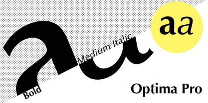 Many typefaces are distinctive or attractive at the expense of legibility and versatility. Not so the Optima® family. Simultaneously standing out and fitting in, there are few projects or imaging environments outside of its range. Although Optima is almost always grouped with sans serif typefaces, it should be considered a serifless roman. True to its Roman heritage, Optima has wide, full-bodied characters – especially in the capitals. Only the E, F and L deviate with narrow forms. Consistent with other Zapf designs, the cap S in Optima appears slightly top-heavy with a slight tilt to the right. The M is splayed, and the N, like a serif design, has light vertical strokes. The lowercase a and g in Optima are high-legibility two-storied designs. Optima can be set within a wide choice of line spacing values – from very tight to very open. In fact, there are few limits to the amount of white space that can be added between lines of text. Optima also benefits from a wide range of letter spacing capability. It can be set quite tight, or even slightly open – especially the capitals. If there are any guidelines, Optima should be set more open than tight. It’s not that readability is affected that much when Optima is set on the snug side; it’s just that the unhurried elegance and light gray typographic color created by the face are disrupted when letters are set too tight. Optima is also about as gregarious as a typeface can be. It mixes well with virtually any serif design and a surprisingly large number of sans serif faces. The Optima family is available in six weights, from roman to extra black, each with an italic counterpart. In addition, the family is available as a suite of OpenType® Pro fonts, providing for the automatic insertion of small caps, ligatures and alternate characters, in addition to offering an extended character set supporting most Central European and many Eastern European languages. When you’re ready to find its perfect pairing, browse these fantastic matches: Monotype Century Old Style™, Dante®, Frutiger® Serif, Joanna® Nova, Malabar™ and Soho®.
 - Burdigala X Serif by Asgeir Pedersen,
$24.99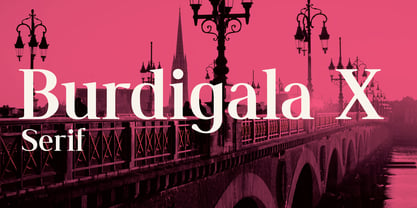 Burdigala X Serif is an open and spacious typeface inspired by the classic Didones. The X Serif is ideal for larger amounts of (printed) texts in brochures, magazines and books. Being wider than usual, it works especially well in media intended for on-screen reading, such as in Pdf-documents and e-books etc. Burdigala is the ancient Roman name of the city of Bordeaux France.
 - Life by URW Type Foundry,
$35.99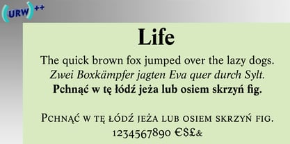 Life is an elegant roman face, designed by W. Bilz and developed by Francesco Simoncini at Ludwig & Mayer in 1964. It is a contemporary design based on the Transitional designs of the eighteenth century. The Life font can be used for almost any kind of copy. Life is especially suitable for newspapers, both in editorial and advertising due to its high degree of legibility.
 - Justine Handwriting by SoftMaker,
$15.99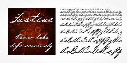 Digitized handwriting fonts are a perfect way to give documents the “very special touch”. Invitations look simply better when handwritten than when printed in bland Arial or Times New Roman. Short handwritten notes look authentic and appealing. There are numerous occasions where handwritten text makes a better impression. “Justine Handwriting” is a beautiful typeface that mimics true handwriting closely. UseJustine Handwriting to create stunningly beautiful designs easily.
 - Bvenaztre by Ilhamtaro,
$23.00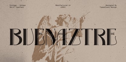 BVENAZTRE is a basic serif font, which was modified into an art deco font that looks vintage and classic. With the art deco style, it is very suitable for art-style designs or it could be with Greek and Roman styles. To enable the OpenType Stylistic alternates, you need a program that supports OpenType features such as Adobe Illustrator CS, Adobe Indesign & CorelDraw X6-X7. Cheers!
 - Blue (Not) Mono by Volcano Type,
$35.00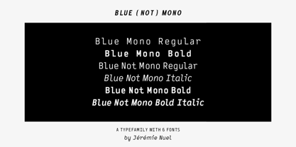 As a binary system, at the junction to two antagonist drawings, the Blue (Not) Mono typeface is a hybrid between the monospace and the humanistic sans-serif families. Declined to several variants and weights: a true monospace and a proportional one, a roman and italic style, bold and the main purpose is obviously to maintain in the same time a calligraphic identity, and a computing legacy.
 - Emona by Linotype,
$29.99I began my work on Emona while still struggling with Birka. I took the superellyptic form as the basic shape, and that gives the typeface some of its characteristics. It is strictly vertical. It is easy to classify it in the same section as Bodoni & Company. Emona is what Ljubljana, the capital of Slovenia, was called in the Roman days. Emona was released in 1992. - Arethusa by AVP,
$14.99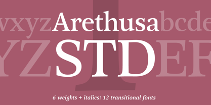 Arethusa is a versatile font after the 'transitional' style – a style that has been evolving for 250 years. The balanced design of familiar letter forms blends form with function to create highly readable text. Twelve fonts organised in three sub-families provide a range of weights and styles. The standard character set covers many roman-based languages. For extended language support, see Arethusa Pro.
 - Bague by Eurotypo,
$22.00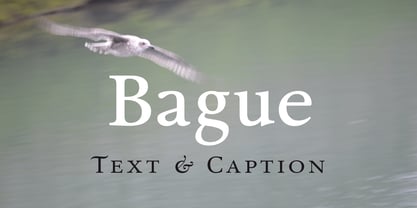 Bague is a classical roman typeface, which was inspired in Old Dutch style, especially in the work of Jan Van Krimpen. Bague family comes with two different lengths of stem (ascenders-descenders), with three weights in each style: Text and Caption OpenType features: Discretional and standard ligatures; Swash, Contextual and stylistic alternates; Case sensitive forms, tabular figures, numerals, denominator, numerator, Small-Caps and Old Style figures.
 - Furius by Typogama,
$29.00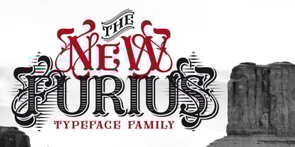 Furius is a display typeface inspired by the split serif style of woodcut or chiseled letters found in roman inscriptions and later popularized by the western genre in the United States. Created as a display typeface, Furius combines a host of Opentype features and equally incoporates a full extended latin and cyrillic character set to provide a versatile and complete design solution for titles or display settings.
 - ITC Benguiat by ITC,
$40.99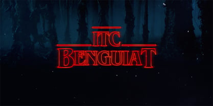 A roman face designed in the early 1980s by Ed Benguiat for ITC, ITC Benguiat shows a strong Art Nouveau influence. As with ITC Korinna, the stress of the ITC Benguiat font family occurs in the upper half of each capital. This distinctive typeface is particularly useful for display and advertising work. ITC Benguiat® font field guide including best practices, font pairings and alternatives.
 - Musical Score JNL by Jeff Levine,
$29.00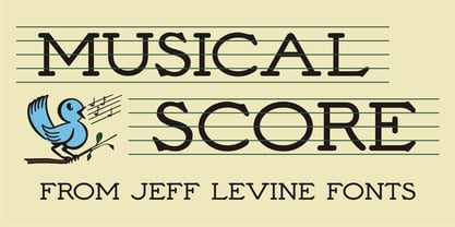 A number of pieces of antique sheet music utilizing the same Roman typeface were the inspirational basis for Musical Score JNL. This antique design closely resembles pen lettering and its hand-made charm due to the rounded stroke ends and varying character widths. Informal, yet attractive - the character design evokes the feeling of the turn of the previous century and simplicity of life at that time.
 - Zenon by CAST,
$50.00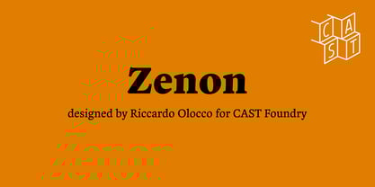 Zenon is a compact text font in four weights. Zenon is a sum of different styles, from Francesco Griffo to Granjon, from modern typefaces to the first sketches of Times New Roman. Zenon is an apparently Renaissance revival with modernish proportions. A closer look reveals that it is a typographic potpourri. Zenon was design as part of the MATD program at the University of Reading.
 - P22 Larkin by IHOF,
$24.95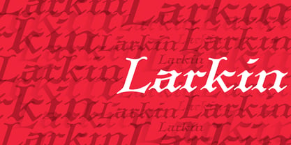 This lettering style is unusual in that combines aspects of several lettering styles. It is essentially a Germanic Blackletter but with many romanized capital letters and also features an italic slant along with some italic lower case traits. It is evocative of “old world” craftsmanship and early 20th century romanticism. The font was developed based on the logo of the Lakin Company of Buffalo, NY circa 1900.
 - Flavium by Flanker,
$11.00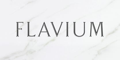 Flavium is the reconstruction of the typographic character used in the engravings of the marble street name sign of Rome from about 1970 until the end of the eighties. It is an uniquely uppercase Roman font whose letters are confined within the space between the baseline and the caps line. Its style is severe but elegant, very useful for expressing authority and officialdom with simplicity.
 - Missale Solis by astype,
$41.00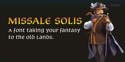 Missale Solis is an overhaul of my previous font Missale Lunea from 2004. After some usecases and requestes for customized versions I decided to make a redesign that is better suited for screen. The font is useful for headlines and small amounts of text with a distinctive medieval impression. It includes Roman figures, dynamic fractions, zodiacs and an alternate design for T and ampersand (&).
 - P22 Posies by IHOF,
$24.95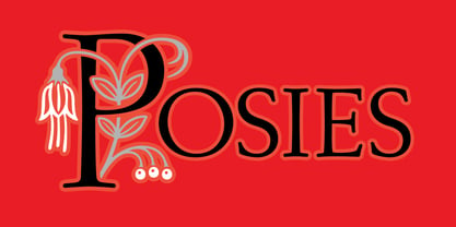 P22 Posies is a six-font system for creating multi-colored initial caps in the spirit of illuminated manuscripts. Four layer fonts can be built upon each other to create any chromatic effect you desire. The Posies Initial font combines all four layers to allow easy one-color drop-caps, while the Solid font features the unadorned roman capitals for setting companion titling text.
 - Ambergate by Greater Albion Typefounders,
$19.00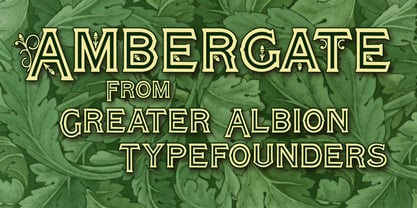 Ambergate is a new typeface family redolent of the late 19th and early 20th centuries. It’s a display family of four small capitals roman faces, incised and elaborated with filigree scrollwork. The four typefaces which comprise the family recapture the elegance of traditional flourished sign writing and make and provide ideal lettering for period inspired design work such as posters, signage and book covers.
 - Trajan by Adobe,
$35.00While designing Trajan, Carol Twombly was influenced by the style of carved letters produced by the Romans during the first century AD. Twombly completed the design, adding numerals and punctuation, as well as a bolder version to allow for text emphasis. Most importantly, her interpretation of the ancient style resulted in a font family whose clarity and beauty come across in modern printed materials.

