5,656 search results
(0.026 seconds)
- SF Nizar by Sultan Fonts,
$19.99 In July 2014, using my light pen, I completed the work in designing the font - Nizar, which was named in honor of the great poet Nizar Qabbani who inspired millions through poetry and prose. The font depends mainly on the characteristics of the traditional Ruq'ah handwriting, but the spirit of the letters tend to embrace the distinguished style that we knew of the poet in his hand-written poetry books. Due to the fact that I could not find all the alphabets in the great poet's handwriting, I adopted the method of measurement and prediction for structure of the missing letters, Which resulted in a new style of the Ruq'ah Typeface; a closer look at the font highlights the common characteristics of all the usual Ruq'ah writings, which are the height of the character "Alef" and spaces and formation on the line, the contextual replacement and convergence of when a letter meets another, closed and open letters, letters coming down from the baseline, and the forms of dots. That been said, hidden touches in the details of Nizar Typeface can be observed, the characters are all dependent on one pen stroke thickness, and are attracted to the baseline as much as possible when vertically and horizontally formed, and the distance between words and lines grows leading to creating both an aesthetic and typographical touch distinguishing this font from the conventional Ruq'ah – which can be found in some of my previous Ruq'ah projects. It is important to mention that after the completion of the Arabic characters and punctuation, I began drawing the Latin alphabets, punctuation and necessary symbols. I cannot fail to also note that the Arabic characters include the Persian, and the Urdu characters. This Typeface is fit to be used in lengthy texts, especially in literary works, artistic print, and diverse visual display, giving the design striking features, modernity and distinction. Sultan Mohammed Saeed
 - Blank Manuscript by Aah Yes,
$14.95Blank Manuscript allows you to produce sophisticated musical scoresheets even on basic Word Processors - anything from simple plain staves to complex full-page orchestral scores of your own design, to write in the notation yourself. The basic stuff is really easy and straightforward, but there's some quite advanced things you can do as well. So Copy and Save these Instructions. • The main stuff is simple and tends to follow the initial letter. Treble, Bass and Alto clefs are on upper case T B A (there are more clefs, below). The 5 Lines for the clefs are on L or l. • A small v will give a small vertical line (like a bar line) and a Big U will give a Big Upright - these can start or end a line or piece. • Time Signatures - type the following letters: Think of W for Waltz and it's easy to remember that 3/4 time is on W. Then from that they go up or down together like this: V=2/4 W=3/4 X=4/4 Y=5/4 Z=6/4 Compound Times are on H I J K like this: H=3/8 I=6/8 J=9/8 K=12/8 Common Time and Cut Common symbols can be found on semi-colon and colon respectively (all begin with Co- ). 2/2 3/2 are on lower case a and b, 7/4 and 7/8 are on lower case c and d, 5/8 is on small k (think POL-k-A) • Flat signs are on the numbers. Flat signs on LINES 1 to 5 are on numbers 1 to 5. Flat signs on SPACES 1 to 5 are on numbers 6 to 0 (space 1 being above line 1, space 5 being above the top line of the stave). Sharp signs are on the letters BELOW the long-row numbers. Which is q w e r t for the sharp signs on Lines 1 to 5, and y u i o p for sharp signs on spaces 1 to 5. Doing it this way means it works the same for all clefs, whether Treble, Bass, Alto, Tenor or any other. Sharp and Flat Signs always go in this order, depending on how many sharps or flats your key signature requires: Treble Clef Sharps t i p r u o e Flats 3 9 7 4 2 8 6 Bass Clef Sharps r u o e t i w Flats 2 8 6 3 1 7 = Alto Clef Sharps o e t i w r u Flats 7 4 2 8 6 3 1 • Guitar Chord Boxes are on G and g (G for Guitar) Upper Case G has a thick line across the top Lower case g has an open top, for chords up the fretboard TAB symbols are available: Six-string Tablature is on s & S for Six. Four-string Tablature is on f & F for Four. (Lower case has the "TAB" symbol on it, Upper Case has just the lines to continue.) Five-string tablature, is on lower case "j" (as in BAN-j-O) and of course L or l will continue the 5 lines. •RARE CLEF SIGNS including Tenor Clef, are on various punctuation marks, i.e. dollar, percent, circumflex, ampersand & asterisk, above the numbers 4 to 8. NOTE: The important symbols were kept on the letter and number keys, which are fairly standard all over, but some of the less important symbols are on various punctuation keys, which in different countries are not the same as on my keyboard. If it comes out wrong on your system, all I can say is it's right on the systems we've tried, and they'll be in here somewhere, probably on a different key. CLOSING THE ENDS OF THE LINES and BAR-LINES is done with the 3 varieties of brackets - brackets, brace and parentheses - Left/Right for the Left/Right end of the line. Parentheses L/R () which are above 9, 0 give a clef with a small vertical upright (the same as a bar line). Brace L/R and Brackets L/R (both on the 2 keys to the right of P on my keyboard) will close off a staff line with tall upright bars. Brace gives a double upright - one thick, one thin. Brackets give a single tall upright. A Big Upright is on Big U, (Big U for Big Upright) and a small vertical line is on small v (small v for small vertical). The Big Upright is the maximum height, and the small vertical is exactly the same height as a stave. And there's a tall upright Bar, on Bar (which is to the left of z on my keyboard, with Shift,) which is the same height as the bar on upper case U but twice as broad. • There's a staff intended for writing melodies, which is a little bit higher up than an ordinary treble clef giving a space underneath to put lyrics in - on m and M for Melody line. Lower case has the Treble Clef on, Upper case M has just the higher-up staff lines with no clef. (Use mMMMMMMM etc.) However this clef will be in the wrong place to put in sharp and flat signs, key signatures and so on, so if you use this clef you'll have to write the sharps, flats and key signature yourself. There's also a clef that's smaller (less tall) than the ordinary clef, but with the same horizontal spacing so it will align with other standard-sized clefs - on slash (a plain clef) and backslash (with a Treble Clef). • There are some large brackets for enclosing groups of staves, such as you'd use on large orchestral scores, on Upper Case N O P Q R, which can aid clarity. N and O on the left, Q and R on the right. P is a Perpendicular line to be used on both sides to increase the height of the enclosure, in this way but with the staff lines in between: N Q P P P P P P O R OTHERS —————————————— • Repeat marks are on comma (left) and period/full stop (right). • Hyphen is left as a sort of hyphen - it's a thin line like a single staff line, with the same horizontal spacing as ordinary staff lines - in case you want to draw a line across for a Percussion Instrument, or a Title or Lyric Line. • Space is a Space, but with HALF the width or horizontal spacing as ordinary staff lines, so 2 space symbols will be the same width as a clef symbol or line. • Grave (to the left of 1 on the long row, or hold down Alt and type 0096 then let go) gives a staff line that is one eighth the width of an ordinary staff line. • If you want manuscript in a clef and key which requires a flat or sharp sign in the space underneath the 5 lines, they’re on = equals and + plus . SYMBOLS • Many of these symbols will only be useful if you have worked out in advance which bars will need them, but they are here in case you've done that and wish to include them. • Symbols for p and f (piano and forte) are on 'less than' and 'greater than' < > (above comma and full stop) and m for mezzo is on Question, next to them. They can be combined to make mp, mf, ff, pp, etc. These signs -- and other signs and symbols like Pedal Sign, Coda Sign and so on -- can be found on various punctuation mark keys, including above 1, 2, 3 in the long row, and others around the keyboard. There's a sort of logic to their layout, but in different countries the keys are likely to give different results to what is stated here, so it's probably best to just try the punctuation and see if there's any you might want to use. (But on my keyboard a Coda sign is on circumflex - because of the visual similarity. Pedal sign is on underscore. A "Sign" symbol is on exclamation mark.) They were only included in case you really need them to be printed rather than handwritten. • However, a Copyright symbol is deemed necessary, and also included are a "Registered" symbol and a TradeMark symbol. They are found in the conventional places, and can be accessed by holding down ALT and typing 0169, 0174 or 0153 respectively in the numberpad section and letting go. • Staff lines with arco and pizz. above are on capital C and D respectively ---C for ar-C-o. • An empty circle above a staff line (to indicate sections by writing letters A, B, C or 1,2,3 inside for rehearsal marks) is on n. The actual signs for an A, B, C and D in a circle above the staff line can be produced by holding down ALT and typing 0188, 0189, 0190 and 0191 respectively and letting go. • The word "Page", for indicating page numbers, is on the numbersign key. • The two quotes keys, (quote single and quote double) have symbols representing "Tempo is", and "play as triplets", respectively. • INSTRUMENT NAMES There's a whole lot of Instrument Names built in (over a hundred) which can be printed out above the clef, and you do it like this. Hold down Alt and type in the given number in the numberpad section, then let go. For Piccolo it's 0130, for Flute it's 0131, Cornet is on 0154, Violin is on 0193, and the numbers go up to over 0250, it's a fairly complete set. There's also a blank which is used to align un-named clefs on 0096. Put them at the very beginning of the line for the best results. Here they are: WOODWIND Piccolo 0130 Flute 0131 Oboe 0132 Clarinet 0133 Eng Horn 0134 Bassoon 0135 Soprano Sax 0137 Alto Sax 0138 Tenor Sax 0139 Baritone Sax 0140 Saxophone 0142 Contrabassoon 0145 Recorder 0146 Alto Flute 0147 Bass Flute 0148 Oboe d'Amore 0149 Cor anglais 0152 Pipes 0241 Whistle 0242 BRASS Cornet 0154 Trumpet 0155 Flugelhorn 0156 Trombone 0158 Euphonium 0159 Tuba 0161 French Horn 0162 Horn 0163 Tenor Trombone 0164 Bass Trombone 0165 Alto Trombone 0166 Piccolo Cornet 0167 Piccolo Trumpet 0168 Bass Trumpet 0170 Bass Tuba 0171 Brass 0172 VOICES Vocal 0175 Melody 0176 Solo 0177 Harmony 0178 Soprano 0179 Alto 0180 Tenor 0181 Baritone 0182 Treble 0183 Bass 0197 (see also PLUCKED STRINGS) Descant 0184 Mezzo Soprano 0185 Contralto 0186 Counter Tenor 0187 Lead 0206 BOWED STRINGS Strings 0192 Violin 0193 Viola 0194 Cello 0195 Contrabass 0196 Bass 0197 Double Bass 0198 Violoncello 0199 Violin 1 0200 Violin 2 0201 Fiddle 0252 PLUCKED STRINGS Harp 0202 Guitar 0203 Ac. Gtr 0204 El. Gtr 0205 Lead 0206 Bass 0197 Ac. Bass 0207 El. Bass 0208 Slide Gtr 0209 Mandolin 0210 Banjo 0211 Ukelele 0212 Zither 0213 Sitar 0214 Lute 0215 Pedal Steel 0216 Nylon Gtr. 0238 Koto 0239 Fretless 0244 KEYBOARDS + ORGAN Piano 0217 El. Piano 0218 Organ 0219 El. Organ 0220 Harpsichord 0221 Celesta 0222 Accordion 0223 Clavinet 0224 Harmonium 0225 Synth 0226 Synth Bass 0227 Keyboards 0228 Sampler 0249 PERCUSSION and TUNED PERCUSSION Percussion 0229 Drums 0230 Vibes 0231 Marimba 0232 Glockenspiel 0233 Xylophone 0234 Bass marimba 0235 Tubular Bells 0236 Steel Drums 0237 Kalimba 0240 OTHERS Harmonica 0246 Mouth Organ 0247 FX 0251 Intro 0243 Verse 0245 Refrain 0248 Chorus 0250 un-named 0096 (this is a small spacer stave for aligning clefs without a name) ALSO copyright 0169 registered 0174 TradeMark 0153 Rehearsal marks 0188-0191 (giving A, B, C, D in a circle, an empty circle is on n ) Clef signs for Treble Bass Alto without any staff lines 0253-0255 An Alphabetic List of all signs: a 2/2 time b 3/2 time c 7/4 time d 7/8 time e sharp sign, centre line f Tab sign for 4-string tab g Guitar Chord Box, no nut h half-width stave I sharp sign, third space up j Tab sign for 5-string tab k 5/8 time l Lines - 5 horizontal lines for a stave m Melody Clef - a standard clef but placed higher up, with Treble sign n Stave with an empty circle above o sharp sign, fourth space up p sharp sign, space above stave q sharp sign, bottom line r sharp sign, fourth line up s Tab sign for 6-string tab t sharp sign, top line (fifth line up) u sharp sign, second space up v vertical line (bar-line) w sharp sign, second line up x Fretboard, four strings y sharp sign, first space up z Fretboard, five strings A Alto Clef B Bass Clef C “arco” above stave D “pizz.” above stave E Double Vertical Lines F Four Horizontal lines (for 4-string tab) G Guitar Chord Box with nut H 3/8 time I 6/8 time J 9/8 time K 12/8 time L Lines - 5 horizontal lines for a stave M Melody Clef - a standard clef but placed higher up, plain N Bounding Line for grouping clefs - top left O Bounding Line for grouping clefs - bottom left P Bounding Line for grouping clefs - Perpendicular Q Bounding Line for grouping clefs - top right R Bounding Line for grouping clefs - bottom right S Six Horizontal lines (for 6-string tab) T Treble Clef U tall, thin Upright line V 2/4 time W 3 / 4 time X 4/4 time Y 5/4 time Z 6/4 time 1 flat sign, first line up (the lowest line) 2 flat sign, second line up 3 flat sign, third line up 4 flat sign, fourth line up 5 flat sign, fifth line up (the top line) 6 flat sign, first space up (the lowest space) 7 flat sign, second space up 8 flat sign, third space up 9 flat sign, fourth space up 0 flat sign, space above stave - TT Geekette by TypeTrends,
$27.00 TT Geekette is an experimental variable* serif with friendly and flexible character of shapes. In this project, we wanted to get away from simplifications and dry geometry and to experiment with the smoothness, softness and plasticity of forms. And in order to make the project a little more stylish and serious, we decided to make the font monospaced. When creating TT Geekette, we did not rely on traditional writing techniques or on the influence of pen movement on the font pattern. Despite the fact that judging by certain characters TT Geekette is a serif, the font is specifically “built” and “drawn”. There are several systemic techniques in font design, such as “loops” which set the plastic rhythm for the entire typeface. Variability in TT Geekette is influenced by contrast buildup in the font—moving the slider to adjust the variability axis, you gradually move from a completely non-contrast monolinear serif font to a font with a pronounced reverse contrast. In addition, with the help of the variability slider, you can remove serifs from the monolinear essence of the font. The TT Geekette family consists of 3 styles: the TT Geekette Bones—monolinear font, the TT Geekette Muscles—reverse contrast serif, and the TT Geekette Variable font. Each style contains over 450 glyphs. And yes, technically the typeface can be used in programming, at least you are guaranteed to get your share of bright emotions. *An important clarification regarding variable fonts. At the moment, not all graphic editors, programs and browsers support variable fonts. You can check the status of support for the variability of your software here: v-fonts.com/support/
 - Caslon #540 by ITC,
$29.00The Englishman William Caslon punchcut many roman, italic, and non-Latin typefaces from 1720 until his death in 1766. At that time most types were being imported to England from Dutch sources, so Caslon was influenced by the characteristics of Dutch types. He did, however, achieve a level of craft that enabled his recognition as the first great English punchcutter. Caslon's roman became so popular that it was known as the script of kings, although on the other side of the political spectrum (and the ocean), the Americans used it for their Declaration of Independence in 1776. The original Caslon specimen sheets and punches have long provided a fertile source for the range of types bearing his name. Identifying characteristics of most Caslons include a cap A with a scooped-out apex; a cap C with two full serifs; and in the italic, a swashed lowercase v and w. Caslon's types have achieved legendary status among printers and typographers, and are considered safe, solid, and dependable. A few of the many interpretations from the early twentieth century were true to the source, as well as strong enough to last into the digital era. These include two from the American Type Founders Company, Caslon 540 and the slightly heavier Caslon #3. Both fonts are relatively wide, and come complete with small caps, Old style Figures, and italics. Caslon Open Face first appeared in 1915 from the Barnhart Bros & Spindler Foundry, and is not anything like the true Caslon types despite the name. It is intended exclusively for titles, headlines and initials, and looks elegant whether used with the more authentic Caslon types or by itself. - Brandogram Monogram Typeface by Design A Lot,
$45.00 After months of testing and development, we have managed to put together the Brandogram Typeface, an ultimate tool for monogram design. With the help of this typeface you can easily create a monogram in less than a minute. Thanks to the way we have created and optimised Brandogram, the uppercase letters effortlessly fit together with the small caps that are activated by the lowercase letters. Using the Brandogram typeface you can create unlimited monogram combos with 2, 3 or even 4 letters in some cases. And these are all possible thanks to features like: Multiple letter widths, from condensed to wide; Both sans serif and slab serif letter designs; Up to 24 different designs per letter; All letter variations are available as alternates so you can easily choose your favorite; Accents are available for each letter alternate; Uppercase and lowercase activated letters are constructed to perfectly center and middle align; There are 5 solid ready-made weights; There are another 2 stencil weights that can bring a new touch to your designs. The 7 weights of Brandogram Monogram Typeface: Thin Light Regular Medium Bold Stencil One Stencil Two Each of these weights are thought to express different levels of heaviness. The thicker the weight of the font gets, the less white space will be left between the letters when they are combined, therefore your design gets heavier. The role of the stencil weights is to create depth in the monogram designs. With those you can easily delete the extra overlapping shapes of the letters and create passages between the letters and give an interlocking impression. This typeface combined with your creativity can have no limits!
 - The font named "SHARKBOY & lavagirl" crafted by SpideRaY is a captivating typeface that embodies the adventurous spirit and fantastical essence of the popular film "The Adventures of Sharkboy and Lav...
- Lougra by Creativemedialab,
$22.00 Monograms or connected letters are very popular; apart from looking elegant, the monogram will also present an impression that sticks in the eyes of the audience. Lougra has more than 100 monograms or ligatures, making designing an initial or logo easier. Lougra is elegant and minimal modern sans serif. It has three contrast options which are display, regular and text.
 - Lumine Vellas by Lone Army,
$12.00Embrace the aqua-infused elegance of our modern serif font. With fluid, graceful strokes, it captivates with its contemporary charm and timeless sophistication. Let the cascading aqua serifs dance across your designs, creating a harmonious symphony of visual delight. Elevate your typography and unleash its captivating power. Experience the fluidity and immerse your audience in its mesmerizing beauty, leaving a lasting impression. - Merilland by Prioritype,
$15.00 Hello everyone, here is a font that comes with a beautiful impression and is equipped with alternative characters that can be processed at will. You can apply this font in various print and digital media such as logos, wedding invitations, craft products, promotions on social media and many more. Lots. For reference, see preview. Features: -Uppercase -Lowercase -Numeral -Punctuation -Multilingual -Alternate -Ligature -Swash
 - Necosmic by limitype,
$21.00 Elevate your design to the next level with Necosmic – a display font that radiates futuristic and modern style. Specifically designed to seamlessly integrate into technology, futuristic, and outer space themes, each character reflects innovation, creating an extraordinary impression in every design. Perfect your visual presentation with the sophistication of Necosmic – where progress meets inspiring typography. Necosmic comes complete with : - Multilingual - Allcaps Font & - Symbols
 - Darling Town by Epiclinez,
$18.00 Introducing Darling Town, a cut-out font that can make your headlines, product packaging, logos, and children's books come alive! Imagine the possibilities as this quirky yet charming typeface adds a touch of playfulness to your designs. With its unique and eye-catching shapes, Darling Town will instantly capture attention and leave a lasting impression on your audience. Thank You
 - Amateur Printer JNL by Jeff Levine,
$29.00 Amateur Printer JNL is comprised of letters and numbers from one of the rubber stamp sign printing sets that were popular with children up until about the 1960s. The letters were printed out on paper, then scanned and converted into a font... leaving all of the rough edges and defects intact to give the look of authentic rubber stamp impressions.
 - Chicken Feet by BA Graphics,
$45.00An irresistible design by my (11 year old) Granddaughter; it brings that child innocence to font design. When she first showed it to me I was so impressed I could not resist I had to make it into her very own font. Alexandra is also the designer of the font flag and says she is working on new font ideas. - Jarekuh by Differentialtype,
$10.00 Jarekuh is a neat decorative serif font. This font will look amazing in any context, whether it's used on a busy background or as a standalone title! Jarekuh has many alternative glyphs that can be combined to get an attractive and prominent impression. Of course this font is PUA encoded, which means you can access all of the glyphs and swashes with ease!
 - Promag Fonts Duo by XdCreative,
$29.00 Promag sans duo is inspired by climora serif by faldykudo, while maintaining a feminine and elegant impression, combined with a beautiful Promag Scripts which is a perfect combination to your various design needs. Promag would look great for logos & branding, invitations, stationery, wedding designs, social media, advertisements, printed quotes, product packaging, labels, photography, watermarks, special events, or even magazine layouts. Thank you.
 - Riveruta by Andfonts,
$14.00 Working as a graphic designer for a long time, I realized importance of alternates. Riveruta is a modern typeface designed especially for those who like to experiment with letters. Lots of alternative letters help in creating logos or names. Create your own unique combination using different options. Suitable for any business, this font is gender neutral and should appeal to most people.
 - Duly Noted NF by Nick's Fonts,
$10.00This upscale offering, with its understated elegance, is based on a release from the 1912 American Type Founders specimen catalog named, quite simply, "Freehand". Use it for any occasion which otherwise might require the services of a skilled Osmiroid wrangler. Guaranteed to please and to impress. Both versions of the font include 1252 Latin, 1250 CE (with localization for Romanian and Moldovan). - Groovy Soumaya by Letterhanna Studio,
$19.00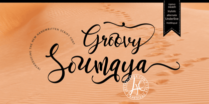 Groovy Soumaya Font is a beautiful and flowing handwritten font. Use it for wall displays, wedding invitations, social media post logos, advertisements, product packaging, product designs, labels, photography, watermarks, invitations, stationery, and any project that requires impressive typography. To achieve that authentic handwritten feel, Groovy Soumaya Font comes with a full set of lowercase alternates as well as 34 ligatures.
 - MF Sadu by MhrfType,
$40.00 Sado is a traditional, modern typeface that create a truly captivating visual experience. with a family of 6 weights, it supports languages that use the Arabic script, such as Persian and Urdu, as well as the Latin alphabet. Sado opens up a world of creative possibilities, inviting designers to explore new horizons and create designs that leave a lasting impression.
 - Actrocious by Ardyanatypes,
$20.00 Atrocious - Display Typeface exudes a Gothic aura that's both eerie and distinctive. Its captivating design adds an unparalleled artistic charm, evoking a strong air of mystery. This font is perfect for creating impressive visuals, with OpenType features and multilingual support for limitless self-expression. Ideal for captivating book titles, enhancing cinematic experiences, or infusing graphic designs with a unique touch.
 - Nickvic by Niamullah aqil,
$20.00 Nickvic is a font that you can instantly download. You can use this font in Photoshop, Illustrator, or any other program that will allow you to import fonts. This font is for personal and commercial use. Please note that this is a digital download, you will not be sent anything physical. All sales are final. Refunds or exchanges are not accepted.
 - Moony by Brave Lion Fonts,
$9.99 Moony combines edgyness with softness and was made to look elegantly strong. The typeface is great for big headlines and impressive titles. Yet a reduced sans serif font, Moony brings it own character with it. With eight styles in different weights you can easily combine it with other typefaces, like scripts. Use Moony to bring a statement in neutral designs.
 - Brightlast by FallenGraphic,
$17.00 Introducing Brightlast Brightlast font under inspiration of vintage bar signage, hotel signage, barbershop signage ect. Brightlast has a classic impression but still elegant suitable for modern and classic designs project. Brightlast are perfect for badge, label, tshirt design, branding, logotype, poster, book cover, packaging and more. FEATURES : Character Set A-Z Numberal Accents (Multilingual characters) PUA encode Alternates Ligature MULTiLINGUAL ACCENT žŠŒšŸÀÁÂÃÄÅÆÇÈÉÊËÌÍÎÏÐÑÒÓÔÕÖØÙÚÛÜÝßàáâãäåæçèéêëìíîïðñòóôõöøùúûüýÿ
 - Little Moment by Letteralle,
$19.00 I'd like to introduce you Little Moment. This font has the same thickness every stroke. The spacing of each letter is slightly wide, making this font look clean. Little Moment has a friendly taste with a warm and charming impression. This font is perfect for making quotes, T-shirts, mugs, or just annotating photos, and many other things. Enjoy The Font, Thanks.
 - Swoley by Luxfont,
$40.00 Introducing the Swoley family of cool 3D color fonts - where the letters are like a liquid flowing into glyphs, creating an amazing fluid visual effect. This unique type family combines realism and modernity, adding amazing details to your projects. Pairs perfectly with Volufont. Features: - Real Plastic effect - Kerning IMPORTANT: - Check the glyphs in the font before buying! - SVG fonts contain raster letters.
 - LTC Goudy Ornate by Lanston Type Co.,
$24.95 Goudy Ornate (also known as Ornate Title) was designed in 1931 by Frederic Goudy. He states "It is a simple, decorative face that has been used by some good presses for use on title-pages where size is more important than blackness of line." The new Lanston version includes a lower case and full character set designed in the style of Frederic Goudy.
 - Beiko Heavy by Minor Praxis,
$20.00 A heavy font made by Minor Praxis. Inspired by blocks toy design. Ideal use for headlines, medium and large prints format, displays, and posters. Built by a quite heavy structure and dense kern which can make a hefty and solid impression. It can be matched with basic sans serif fonts as a body copy. Available in 4 styles with multi languages support.
 - Adellia by Yoga Letter,
$12.00 This font is named Adellia. Adellia is a font that is very elegant, beautiful and has a romantic impression. It is suitable for beautifying all types of your work. This font is very unique and has high quality. It is suitable for wedding designs, branding, invitations, signatures, labels, logos, promotion of your business, creating social media status, quotes and more.
 - Paku by Kah Khiong Design,
$13.00 Paku, a typeface that grow on the inspiration of fiddlehead (fern), taking Fibonacci curve as the base, with influence of Art Nouveau & Art Deco, it evolves into a simple yet magical typeface. The spiral’s characteristic in the typeface give the stylish impression of grace, rhythmic, classical & poetry. It’s unique & distinctive looks suitable for any surface printing, publishing, branding, packaging, advertising & digital content.
 - ALS Heino by Art. Lebedev Studio,
$63.00 Heino is a decorative face with two font styles that was inspired by an old magazine lettering. Its original features include heavy serifs and tight spacing, particularly if you take the Black version. The bouncing letters create a cheerful impression, and would look nice in children’s books and magazines, on candy and food packages, holiday and circus posters and flyers.
 - Belhampton by Greater Albion Typefounders,
$18.00 Belhampton is a lively display family, full of the spirit of the Edwardian era. Six typefaces are offered: regular, bold, light, oblique, embossed and outline. All include an extensive range of stylistic alternates and discretionary ligatures, as well as lining and old-style numerals. Belhampton is ideal for poster and display work, or just the thing for any piece of Belle Epoque design.
 - Yel Yeah by Allouse Studio,
$16.00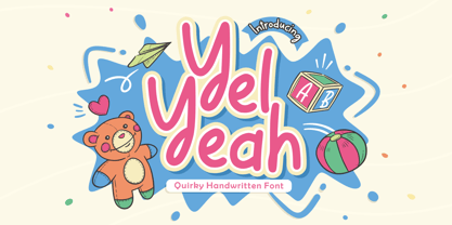 Yel Yeah a Quirky Handwritten Font tha will bring an fun and playful impression. Yel Yeah is perfect for any tittles, logo, product packaging, branding project, megazine, social media, wedding, or just used to express words above the background. Yel Yeah also come with Multi-Lingual support. Enjoy the font, feel free to comment or feedback, send me PM or email. Thank You!
 - Quegos by ZetDesign,
$15.00 Quegos is a display font with a sleek yet bold look. make a strong impression. comes in the iconic bubble style with strong outlines and fat strokes. very suitable to create a big, bold logo for your business, work on a poster for an event, or whatever your project, and Perfect to create amazing headings, logos, menus, social media graphics, and many more.
 - Vtg Stencil Marsh by astype,
$36.00 The Vtg Stencil fonts from astype are based on real world stencils from several countries. The Vtg Stencil Marsh design was derived from 1 inch stencils, cut by a Marsh R machine. Marsh produced stencil machines since 1922 and was one of the most important manufacturers for such marking machines. The design is part of the American industrial heritage. PDF Specimen
 - The Florest by BlackLotus,
$10.00 The Florest is a display type font inspired by the beauty of nature on florest island, Indonesia. The Florest has a characteristic impression of nature that will beautifully translate into a wide variety of design ideas. Include : The Florest Reguler (with Alternate) The Florest Outline (with Alternate) The Florest Deco (with Alternate) The Florest Deco Outline (with Alternate) The Florest Dingbats Swash
 - Oblygasi by Wildan Type,
$14.00 Oblygasi is a modern serif font with a unique ligature and aletrnate style. A simple serif with a touch of curves on the top and bottom of the stemp gives a special impression. Combaine with high contrast and slat style perfect for feminine logo signs, fashion heads & editorial designs, branding projects, Clothing Branding, packaging, magazine headings, advertising, T-shirts, postcards and much more.
 - Index by Linotype,
$29.99Index is a sans serif font which gives an impression of both movement and harmony. The soft, round forms of this font give it an almost ornamental feel. The influence of American advertisement and poster typefaces of the turn of the 20th century is apparent. Index can be used as a headline or text font in small or larger point sizes. - Elefantasia NF by Nick's Fonts,
$10.00The inspiration for this typeface—originally called Elefanta—enjoyed popularity stateside in the late nineteenth century, an import from the Karl Brendler & Söhne foundry of Vienna. Its graceful yet playful elegance makes it suited for a wide range of projects where projecting warmth is desirable. Both versions contain the complete Latin 1252, Central European 1250 and Turkish 1254 character sets. - Bevalonia by Prioritype,
$15.00 Hello everyone, this is a handwritten font that comes with a beautiful, elegant and very beautiful impression, especially with some very charming ligatures. You can apply this font in various print and digital media such as logos, wedding invitations, craft products, promotions on social media, business cards and much more. For reference, see preview. Features: -Uppercase -Lowercase -Numeral -Punctuation -Multilingual -Ligature
 - Friem by Holis.Mjd,
$10.00 Friem is a hand drawn font inspired by fonts that are usually used for children’s book titles that have a bold, messy and funny impression. Available in two clean and textured styles, this font is suitable for use for logos, book titles, movie posters, YouTube content, quotes, and more. There are ligatures that add features to this font, only in uppercase characters.