10,000 search results
(0.033 seconds)
- Modern Love by Resistenza,
$39.00 Breaking from our catalog of typefaces to create a new handwritten font family, Modern Love was born out of our desire to see what would happen if we took a step back from the norm. We weren’t looking for the perfection of the many calligraphy techniques, but more of a natural way of writing with the same tools. Our escapist experiment into casual lettering culminated into 4 fonts: Modern Love Regular, Grunge, Rough and Caps. Modern Love Regular is a hand-painted script, each glyph individually designed with a pointed brush and walnut ink. The aim was to create an effortless hand-drawn feel while keeping the contrast high density. Playful, yet polished, this font works very well when accentuated with the family’s two distinctive styles: Modern Love Grunge, simulating a washed-out effect, perfect to add a vintage look to your projects; and Modern Love Rough, with its crunchy borders, makes letters visibly rough-around-the edges and gives large letters an unmistakeable pop. All three fonts include a hand-painted set of ornaments, swashes and alternates to limitlessly customize and decorate your texts, accessible through Opentype features. Modern Love Caps is the fourth font, a handwritten Sans Serif that ties the family together with its simplicity and readability. Designed with a pointed nib and Indian ink, this font boasts a different style that perfectly complements Modern Love Regular, Grunge and Rough. The result is a fresh font family perfect to create headlines, posters, DIY hand-lettered artwork, books, holiday cards, wrapping paper, invitations, T-shirts, labels, packaging for cosmetics, fashion supplies, food products, artisanal goods, and an endless array of options for your projects. Modern Love…when brush meets passion. Check out also ‘Modern Love Slanted’ Turquoise Nautica
 - Optima Nova by Linotype,
$57.99 With the clear, simple elegance of its sans serif forms and the warmly human touches of its tapering stems, the Optima family has proved popular around the world. In 2002, when it was finally possible to produce digital alphabets without technical limitations and compromises, and more than fifty years after the first sketches, an expansion and redesign of the Optima family was completed and released as Optima nova. Hermann Zapf and Japanese type designer, Akira Kobayashi, collaborated on the project, which included re-working of the existing weights and the addition of several new weights: small caps, old style figures, light, heavy, and condensed. The original Optima was never manufactured with a real italic, only an oblique version of the roman. Optima nova has a complete range of beautifully designed real italics; the new italic forms, of the e, f and g are especially notable. The titling face includes capital letters with special and unusual letter combinations and ligatures, making it an excellent choice for headlines, logos and advertising purposes. Optima continues to be an all-purpose typeface; and Optima nova works for just about anything from book text to signage. Optima Nova® font field guide including best practices, font pairings and alternatives.
 - Moho by John Moore Type Foundry,
$40.00 Moho is a broad family of types inspired by the burgeoning modernism of the early twentieth century. Moho introduces an unconventional style in the form of his glyphs which aims to impregnate the text compounds thus a distinctive aesthetic sobriety and elegance while creating a flow of practical reading. The Moho family consists of a wide range of various weights. Thought for innovative text composition, Moho covers all shades of Medium, Regular, Light, ExtraLight to delicate Thin. Moho has a square shape letter style, provided with a competent OpenType programming for Moho OT family and basic functions for Moho Std family. Among the family characteristics OT has features such as small caps for letters and numbers, stylistics alternates, swash letters where "t" is extend over others, giving the typeface that particular style ideal for headlines, ligatures for pairs and triplets of letters, fractions and ordinals. In addition, each comes with its weight set italics. Moho has a character set to compose texts in European languages of east and west with over 600 glyphs. Moho is a letter in resonance for general topics like sports, art. technology trends, fashion, tourism and transport. There exist two groups of Moho Family OT = Full OpenType Features and full set of glyphs Std= Basic OpenType Features and less glyphs
 - Euroscript by profonts,
$41.99 Euroscript Pro is the handwriting of Ralph M. Unger, a very talented and hard-working German type designer. Unger has redesigned a large number of beautiful ancient typefaces during the last few years. Peter Rosenfeld of profonts persuaded him to try and produce his own very beautiful handwriting. Kind of hesitant at the beginning of the design process, Unger's joy and excitement about the project was continuously growing during the design process. He designed not only the standard character complement West, but added all of the Eastern European Latin glyphs and, on top of that, even the complete Cyrillic characters. Born and grown up in Th�ringen, former East Germany, Unger has a fair knowledge of Polish and also Russian (Cyrillic). Euroscript Pro is a very beautiful, casual, informal and modern handwriting of a contemporary type designer. Even though a digitized handwriting, it keeps a very natural and pleasant look, at the same time being generous and well-readable. The individual characters combine quite easily and perfectly with no need for extra variants.Euroscript Pro is well-suited for plenty of applications, e.g. personal correspondence, invitations, greeting cards, headlines etc.Euroscript Pro is supplied in the complete Latin character set (West + East) plus Cyrillic.
 - Mon Nicolette by Sudtipos,
$49.00 This is a digital revival by Cristóbal Henestrosa based on an experimental typeface named Charter, designed – yet never fully accomplished – by the prominent William Addison Dwiggins. It is an upright italic, unconnected script typeface, whose main features are a pronounced contrast, condensed forms and exaggerated ascenders. While Dwiggins worked on this project from 1937 to 1955, he only completed the lowercase and a few other characters. However, it was used to set a specimen in 1942 and a short novel in 1946. The sources that Cristóbal used for Mon Nicolette were the original sketches by WAD as well as printing trails kept at the Boston Public Library, and a copy of the 1946 edition of The Song-Story of Aucassin and Nicolette. This gorgeous typeface can be used successfully in headlines, subheads and short passages of text from 12 points onwards, in applications such as fashion magazines, soft news, advertising, poetry, albums, and book covers. This project started ten years ago, while Cristóbal was studying the Type@Cooper Extended Program at New York City. A previous version was selected to be part of the Biennial Tipos Latinos 2018, and now Mon Nicolette is finally ready for commercial distribution with Sudtipos… and we are very proud of it! Festina lente.
 - Ongunkan Cypriot Linear C Sylla by Runic World Tamgacı,
$100.00 This font is an adaptation of the cyprus syllabic script to a Latin-based font. I tried to assign as many correct letters as possible, but there were too many characters so I had to fit them. Please review the alphabet table of Cypriot syllabic to use the Font. To see all the characters, you can see all the characters and add them to the text by selecting this font from the add character section on the word page. Cypriot syllabary The Cypriot syllabary was used in Cyprus from about 1500 and 300 BC and is thought to have developed from the Linear A. The earliest known inscriptions from between 1500 and 1200 BC are in an unknown language called 'Eteo-Cypriot', or 'True Cypriot', and the script in which they are written is called Cypro-Minoan. From around 1200 BC Cyprus began to be colonised by Mycenaean, Minoan and possibly Cretan Greek settlers, and they probably adapted the existing script to write their own language - the oldest known inscription in Greek dates from the 11th century BC. Cypriot Greek had much in common with Greek dialects of Arcadia and Pamphylia, which corresponds to the province of Antalya in Turkey.
 - Kometa by Kiril Zlatkov Type Foundry,
$40.00 Kometa Sans is a contemporary grotesk with a certain personality. She has a steady geometric skeleton, but its appearance is rather humanistic. The precise details of the artwork, the carefully drawn true italics, the six types of numerals, the variety of alternates, the broad range of open-type features and the extensive glyph set can meet most of the contemporary typographer’s demands for a neutral, but not boring type family for both long text and display use. Among the distinctive qualities of Kometa are also the forms of ligatures (both default and discretionary). They follow the natural constructive transitions between oval parts and stems, which is an advantage to mark, at least for designers who respect the beauty of clean forms. Note the specially designed Kometa Unicase sub-family, substantially enough to exist as a separate typeface. Its elegant and expressive letterforms are boosting further the power to create outstanding design work. Kometa Unicase has original and playful, yet reasonable approach to letterforms variety. Kometa has a very broad usability range – from logotypes and poster designs to corporate identities and complex editorial projects. The contemporary Cyrillics of Kometa allows easily completion of graphically consistent multilingual corporate and artistic design projects. Designed by Kiril Zlatkov and Vassil Kateliev.
 - Denedo by Andinistas,
$19.95Just like the M.C. Escher impossible figures and optical illusions, "Denedo" is a font that is impossible to construct in three dimensions because it only exists as a drawing. This font is based on the "0, 1, 2, 3, 4, 5, 6, 7, 8, 9" characters of one of the alphabets published by Nedo Mion Ferrario in the "Letromaquia" exhibition that was shown in Caracas, Venezuela in the 70's. The reason why I chose to restore and complete this font is that unique and exceptional personality that each word acquires when it is written with this alphabet. Denedo is a typographic family in three styles: Denedo 1A, 1B and 1C. When mixing them in big sizes you will emphasize the balance and incongruity of its shapes, providing originality and a unique identity to every word. All of the 3 variations include a complete character set with the lower and upper case letters, numbers, accents, diacritic signs, punctuation and monetary signs. All the fonts included in this family are available in Open Type format and are perfectly compatible with Mac and PC. I want to express my sincere gratitude to all my friends at Typophile who supported and motivated me during the final stages in the development of this font. - ITC Outpost by ITC,
$29.99Hal Taylor's ITC Outpost was not the result of a detailed design brief, nor was there a methodical development of key concepts or characters. Outpost just seemed to emerge all at once during a brief sketching session," says Taylor. "I guess what I was thinking of was an antiquated Western perception of some sort of Middle Eastern hand lettering - a 'mysterious East' sort of thing." ITC Outpost's sense of the exotic has an almost Art Nouveau quality, with its sensuous curves and sweeping strokes. The open bowls and opposing weight bias in many of the characters add to the design's striking personality. A suite of alternate and swash letters enables the setting of distinctive display copy. ITC Outpost's family of roman, italic, and swash characters is compact but versatile. The caps have the grace and authority of a titling face. Add in the lowercase and swash letters and copy is transformed into something lighthearted and full of verve. ITC Outpost creates dramatic headlines and adds a flourish to invitations, menus, logos and packaging An accomplished designer, Taylor has spent most of his career in the lettering and typographic arts. He began as a photo-lettering typographer, setting headlines and creating custom lettering, and now works in the publishing industry. " - MMC Grafik by MMC-TypEngine,
$37.00 Modular Matrix «Calligraffiti» Robotic Letterform Typeface! New Edition. Redesigned with Obliques and OT Features! This Typeface was inspired by Graffiti Calligraphic Broad Markers and Underground Lettering Technic and Style, grid based by squares perpendiculars and Diagonals… Is Part of a juxtaposed “Type-Game” based on inversions and rotations… Type cool legible digital manuscript Aesthetics body text, scripts, lyrics, articles; Plus, Create Fancy Display’s Branding designs, Packaging, Publishing, Advertisement, Posters, Art Support, Motion, Games, tastes good to text on everything! Experiment Automatic and Responsive OpenType Features, like Fractions, Ordinals, Nominators, Denominators, Scientific Inferiors, Numerators, Localized forms and Kerning. Previous Released by MMC-Typo* 2020. Post Released by MMC-TypEngine 2022. Tip 1: Combine styles into infinite possibilities of Digital Monochromatic or Color Typesetting, by ‘central pasting’ or you may dislocate layers for improvisations! TIP 2: *BLIND BLOCKS ‘FREE-STYLES’ Use Block «Free Styles» 1 & 2 also to add 3D, change 3D directions by switching Block 1 to Block 2, that way you can Zig-Zag words and lines. *Also shift the block layer up to bottom limit, it makes the 3D direction turn upside down. *All Styles have 917 Glyphs. Follow the Groove!! & Power to The Pixel!! Greetings !! André, MMC-TypEngine.
 - Karmina by TypeTogether,
$49.00 Karmina is a text typeface developed mainly for pocket books and budget editions. It was built to withstand the worst printing conditions: low quality papers, high printing speed with web presses and variations in the ink level of the printing press. Some of Karmina's most representative features are the rather large serifs, intended to work perfectly in small reproduction sizes, the sharpness of the shapes, including some calligraphic reminiscences, and the large and yet graceful ink traps in the acute connections. Structurally, Karmina combines a significantly large x-height with relatively compressed letterforms. The result of these features grants Karmina outstanding legibility and economy. Karmina features four weights and 800 characters per weight, including small caps, discretionary ligatures, fractions and a complete range of numerals for every use. It also supports over 40 languages that use the latin extended alphabet. Karmina was selected in the text typography category at the Letras Latinas exhibition 2006 and won a merit in the European-wide ED-Awards competition 2007. Karmina Basic is a reduced version of Karmina. It is still an OT-font but without any particular features except of a set of ligatures, class-kerning and language support including CE and Baltic.
 - Baka Expert by Positype,
$25.00 Why Baka Expert? There’s actually a simple answer. The original Baka was done as an experiment of sorts. I wanted to quickly capture a rough, frenetic handwriting style that broke normal conventions. Commercially, it was successful, received some accolades ... but I wasn’t completely satisfied, so I went back to the master art and the lettering explorations and produced Baka Too. This addressed some of the line items I wanted to refine in Baka. I liked it. Each font has been out for a few years now, and I have seen them in use. I’m very critical of my work, and I could still see things—modulations of strokes, angle of the nib, ink swell, and so on—that I wanted to change, refine, and reorder. For me, it is typographic indulgence, but I wanted to take this handwriting ‘font’ and turn it into a robust ‘typeface.’ So I did just that and a bit more by adding back more of my initial flourish concepts; attaining tighter, consistent control of the modulation; optimizing points; adding titling options; and expanding the character language set. Baka and Baka Too had to exist to produce this entirely new re-envisioning of an old friend ... and they all play well together :)
 - Nurnberg Schwabacher by Intellecta Design,
$29.95"I digitized and to revitalize NurnbergSchwabacher by the extinct Haas'sche Schriftgiesserei, a German/Swiss foundry established in 1790 and based in Basel/Münchenstein. Many of its shares were acquired by D. Stempel in 1927. On the Luc Devroye site this foundry is listed on the Extinct Foundries of the 18th century page. This design is very similar to another Intellecta best seller: Hostetler Fette Ultfraktur Ornamental, both drawn from the classical type specimen book from Hostetler. The ornamental frame that completes the font is a fantastic baroque ornament that I found in another old book, unfortunately lost now. Luc Devroye, whose book is the source for all of my fonts, writes this about Rudolf Hostettler: He was a Swiss type designer, author of “The Printer’s Terms” designed by Jan Tschichold, of "Technical Terms of the Printing Industry" (5th edition was printed in 1995), and of "Type: eine Auswahl guter Drucktypen; 80 Alphabete klassischer und moderner Schriften" (Teufen, Ausser-Rhoden: Niggli, 1958). He also wrote "Type: A Selection of Types" (1949, fgm books, R. Hostettler, E. Kopley, H. Strehler Publ., St. Gallen and London) in which he highlights type made by European houses such as Haas, Enschedé, Deberny and Nebiolo. Jost Hochuli wrote his biography. - Neue Plak by Monotype,
$57.99 Originally designed in 1928, Plak is something of a lost gem in the type world. Despite being drawn by Futura creator Paul Renner, it never achieved the same popularity and spent decades lacking a much-needed digital revival. Monotype designers Linda Hintz and Toshi Omagari have taken its existing three weights and, after extensive research into the original wood type, extended them into the vast Neue Plak family. The typeface is available in 60 weights that stay true to Renner’s intentions, and offer the same blend of “quirky” details and “German stiffness” – as Hintz describes it. The design is an unusual mixture, bringing together a defiant outer appearance that’s counteracted by more playful details found in the lowercase r, and the large dots of the lowercase i. Other distinctive details include open or strikethrough counters, and a set of hairline widths that reduce Renner’s original design to its bare bones. Neue Plak’s display weights are crying out to be used in editorial, on packaging or in logos, while its text weight works well in both print and digital environments. Neue Plak Text Variables are font files which are featuring one axis and have a preset instance from Thin to Black
 - Fontoddler by CozyFonts,
$20.00 Fontoddler Font Family, This font was created with the personality, in mind, of my two-and-a-half-year-old granddaughter Chloe Bella. I believe strongly that fonts have personalities that’s why we refer to their members as ‘characters’ or to be more accurate, ‘glyphs’. This font is playful, bold, colorful in form and design, a bit irregular, a bit informal, a bit irreverent, a bit humorous, a bit sassy, and a bit independent just like my little one. When used in color Fontoddler sings. She’ll be writing and creating visual words in just the nick of time. At 2 she started recognizing many colors and identifying people, places, animals, and objects and now she’s recognizing letters. I can’t wait for her to understand that this font was designed and named after her. Fontoddler currently exists in 3 styles, Medium, Heavy, and Heavy Outline. Naturally Heavy and Heavy Outline are congruous, ie. They are fitting together. I hope you enjoy and use this 24th font family from Cozyfonts Foundry. It will fit well with greeting cards, signage, birthday parties, holiday occasions, invites, stationary, headlines, logos, posters, cartoons, animation titles, movie titles and even sports events and sports logos. Have fun with this one. Tom Nikosey
 - Quendel by URW Type Foundry,
$39.99 Quendel has been expanded to become Quendel Happy Family. Apart from the new Bold weight for easy distinction and emphasis, there are now four other very exciting variants, rendering different writing tools and writing materials. The basic form of Quendel was written with a Japanese bamboo tip and therefore embodies a form letter of natural flow. The new versions show other features that provide the feel of written scripts. While the styles Wood and Crayon include some alternate characters, Q Marking Pen and Q Fingertip, due to their apparently more complex enacted forms, do not need additional alternates without looking stiff or boring. The wood relief of Quendel Wood was created by a freehand wood relief drawn with oiled chalk. Quendel Marking Pen seems to be written with a felt-tip pen soon depleted. At the same time it is also reminiscent of the blooming effect, which we know from photography. The name of Quendel Fingertip suggests what can be seen - someone seems to have written with the finger in a grainy material. One would like to try it himself. The effect of broken lines which can be gained by writing with chalk as reflected in Quendel Crayon. Almost like parched sandy soil, the writing material seems to crumble.
 - Pepper Sans by VIDI Visual Design Studio,
$17.99 The core design of Pepper family, designed by VIDI Visual Design Studio, is the fingertip handwriting style inspired by children’s writings on windows. This distinctive low-contrast typeface combines characteristics from neo-grotesque and organic models. Warmer than most Helvetica inspired typefaces, Pepper has organic shapes, playful strokes, rounded endings, and a generous x-height which makes Pepper easy to read. This family could be used well for food packagings, content aimed for children, book covers, branding, high-impact titles and small body texts, advertising, editorial design and more. What makes Pepper Sans Vol.1 competent and more spicy then some other fonts is that it contains a set of more than 900 characters for each of 5 weights that support many Latin-based languages, Greek and Cyrillic. As the weight decreases, the typeface gains impact with becoming elegant, giving titles in (Hair, Thin or Light) a breath of fresh air. We derived a typeface family consisting of Hair, Thin, Light, Regular, Semi Bold in this Vol.1 edition. Typeface features: • 5 weights: Hair, Thin, Light, Regular, Semi Bold • Latin, Greek & Cyrillic multilingual support • More than 900 characters for each of 5 weights Font Specs: • Created: August 2020 • Files type: .ttf
 - Kingthings Petrock Pro by CheapProFonts,
$10.00 For these fonts I have reworked the spacing a bit, and completely redesigned the "N" as they were calligraphically very wrong. Kevin King says: "Petrock is based on letterforms found in a small city Church in Exeter - from a display case about bell ringing. A lovely simple labeling hand, I think I've done it justice... Petrock Light is a lighter form of Petrock - makes both of them more usable." ALL fonts from CheapProFonts have very extensive language support: They contain some unusual diacritic letters (some of which are contained in the Latin Extended-B Unicode block) supporting: Cornish, Filipino (Tagalog), Guarani, Luxembourgian, Malagasy, Romanian, Ulithian and Welsh. They also contain all glyphs in the Latin Extended-A Unicode block (which among others cover the Central European and Baltic areas) supporting: Afrikaans, Belarusian (Lacinka), Bosnian, Catalan, Chichewa, Croatian, Czech, Dutch, Esperanto, Greenlandic, Hungarian, Kashubian, Kurdish (Kurmanji), Latvian, Lithuanian, Maltese, Maori, Polish, Saami (Inari), Saami (North), Serbian (latin), Slovak(ian), Slovene, Sorbian (Lower), Sorbian (Upper), Turkish and Turkmen. And they of course contain all the usual "western" glyphs supporting: Albanian, Basque, Breton, Chamorro, Danish, Estonian, Faroese, Finnish, French, Frisian, Galican, German, Icelandic, Indonesian, Irish (Gaelic), Italian, Northern Sotho, Norwegian, Occitan, Portuguese, Rhaeto-Romance, Sami (Lule), Sami (South), Scots (Gaelic), Spanish, Swedish, Tswana, Walloon and Yapese.
 - Teddyber V1.1 by GemFonts, created by Graham Meade, is a distinctive and playful font that stands out for its unique character and charm. Designed to bring a sense of warmth and whimsy to any project...
- As of my last update in April 2023, I must note that there might be limited direct information widely available about a specific font called "DENIAL" by Patrick Dehen, making a comprehensive descript...
- LiebeLotte Swell by LiebeFonts,
$29.90 Have you heard? It’s in the stars: next July we collide with Mars! But until then, there are plenty of good reasons to treat yourself to this swell typeface. LiebeLotte Swell is a great investment for letter lovers who design beautiful things for their friends and family and also for designers who love their clients: Your next birthday invitation? Check. That photo album you’re making for your mom? Check. The business cards you’re designing for your friend who runs a deli? Check. There are so many nice things that want to be designed, and LiebeLotte Swell wants to be your assistant in the old-fashioned way: polite and friendly. Just like her monolinear siblings in the LiebeLotte family, charming LiebeLotte Swell knows how to impress with her perfectly drawn curves and her perfectly connected loopy letterforms. Of course LiebeLotte Swell comes with a state-of-the-art character set. She also sports a variety of ligatures and alternative forms, available through OpenType features. (Please make sure your software supports ligatures for the letter connections and OpenType if you wish to use the advanced features.) Advanced designers, check out the complete LiebeLotte family with six weights of monolinear loopiness. You may also want to take a look at our best-sellers LiebeErika and LiebeKlara, they get along great with LiebeLotte Swell.
 - Gemini Type Fontpack by Chank,
$49.00 INTRODUCING THE GEMINI TYPE FONTPACK, an industrial-strength OpenType font bundle inspired by and optimized for dimensional type. Chank Co is proud to introduce the new “Gemini Type Fontpack,” a collection of ten fonts available for use on your desktop computer or web pages, but also optimized for use as exterior cast-metal signage in bronze or aluminum in collaboration with Gemini, a family-owned industry leader in the wholesale manufacture of dimensional letters, logo and plaques based in Cannon Falls, MN. Gemini collaborated with Chank Co to assemble a line of fonts that would work well as dimensional, cast-letter signage for use on the sides of buildings, in stores, and other public spaces. The fonts included in the “Gemini Type Fontpack” are reinterpretations of previous Chank Fonts, now optimized for dimensional signage display, but then also repackaged and presented for your use as an OpenType desktop computer font collection: GT-Adrianna DemiBold GT-Adrianna Bold GT-Adrianna ExtraBold GT-Fairbanks GT-Forward Thinking GT-Hydropower ExtraCondensed GT-Kegger GT-Shopaganda GT-Shopaganda Condensed GT-Timeless Geometric. This is a multi-purpose collection of heavy-lifting fonts to convey your message strong and clearly, full of legibility and clarity, but also displaying personality and distinction. You can purchase and download these fonts in OpenType format for your desktop computer right now via MyFonts. Get it today and you'll also get a great introductory special sale price. These exclusive typefaces are also available as dimensional letters, manufactured by Gemini in bronze or aluminum, from 6" tall up to 18" tall, with a variety of finish options, for use in public signage and wayfinding systems. Gemini manufacture their products in 20 plants through out the US, Canada and Mexico, and all their products are backed by a lifetime guarantee. Chank Co is excited to offer these ten strong, industrial font designs in durable cast metal format via Gemini. ----- More about the fonts in the Gemini Type Fontpack: GT-Adrianna DemiBold, Bold, and Adrianna ExtraBold Clear, invisible, no-nonsense, multi-purpose. A versatile sans-serif heavy-lifting font family. GT-Fairbanks Vintage, silent film, speedball, old-timey, old-fashioned, retro. Based upon the lettering in the 1914 silent film, “The Good Bad Man.” GT-Forward Thinking Futuristic, semi-serif, clean, distinctive, contemporary, idiosyncratic. A font for tomorrow and the future. GT-Hydropower ExtraCondensed Extra-condensed, compressed, strong, rigid and concise. GT-Kegger Strong, sporty, collegiate, athletic. Nothing says “GO TEAM” quite like a big, bold slab-serif font. GT-Shopaganda and GT-Shopaganda Condensed Industrial, geometric, constructivist, propaganda, oh there’s so much to love about the strength and clarity of these two fonts. Based on Chank’s Liquorstore and Nicotine fonts, which have been married and unified here, with a few new twists and turns to their letterforms. GT-Timeless Geometric Bauhaus, anyone? The geometric and minimalist alphabet here is about as clean and straight-forward as a semi-condensed sans can get. ----- All of the fonts in this package are available individually, or save money when you purchase all ten of them as a collection. Download this digital font package from MyFonts today and you'll receive both OpenType and TrueType formats in your download for your desktop computer. Webfont format is also available. (If you'd like to use these fonts as cast-metal letters for exterior, architectural purposes, visit the Gemini website to learn more about how you can find a signage retailer near you.)
 - Alrighty, imagine you're diving into a world where comic books aren't just stories; they're experiences that leap off the page. That's where ShockTherapy BB by Blambot Fonts punches its way in, decki...
- As of my last update in April 2023, there isn't a font officially recognized or broadly distributed under the name "! Jamiroquai !" that is associated with the popular British jazz-funk band Jamiroqu...
- Powlina Theater by Attype Studio,
$16.00 Powlina Theater is a Modern Calligraphy Font. Perfect font for your wedding ceremony. Combine Powlina Theater stylistic set to create amazing script font for wedding! Fall in love with its incredibly versatile style and use it to create spectacular designs! Powlina Theater is perfect for branding, logo, invitation, quotes, wedding invitation, cricut font, silhouette font, product packaging, merchandise, game titles, cute style design, Book/Cover Title and more. What's Included : - Ligatures - Multilingual Support Hope you enjoy with our font! Attype Studio
 - Quick Sketching by Gassstype,
$25.00 Hello Everyone, introduce our new product Quick Sketching is a Freehand Written Font with a Authentic Style and classy style, this font is great for your creative projects such as watermark on photography, and perfect for logos & branding, photography, invitation, watermark,advertisements,product designs, stationery, wedding designs,label ,product packaging, special events or anything that need handwritting taste. That is why Quick Sketching has authentic and strong characteristic more natural look. You can activate Ligature OpenType panel and alternate glypsh.
 - Tallove by Attype Studio,
$16.00 Tallove is lovely script font with swash on beginning & ending word. This font perfect for valentine & wedding theme design. Combine it with Tallove beginning, ending swash & ligatures to make perfect design for yor projects. Tallove perfect for valentine promotion, wedding invitation, branding, logo, invitation, stationery, social media post, product packaging, merchandise, blog design, game titles, cute style design, Book/Cover Title and more. What's Included : - Tallove Font - Beginning Swash - Ending Swash - Ligature - Multilingual Support --- Hope you enjoy with our font! Attype Studio
 - Willona by Nk Studio,
$19.00 Willona is a subtle and elegant font. This font has a lovely touch of character, perfect for a variety of designs. The Willona features varied baselines, unique smooth lines, and stunning alternatives. Add to your most creative ideas and see how to make art! Alternative Glyph Styles (including Uppercase, Lowercase, Numbers & Punctuation) Works on PC & Mac Simple installation. Accessible in Adobe Illustrator, Adobe Photoshop, Adobe InDesign, even works in Microsoft Word. Multilingual Support Thank you ! Hope you enjoy our fonts!
 - Mount Loneli by Letterday Studio,
$20.00 Mount Loneli is a subtle and lovely font. This font has a lovely touch of character, perfect for a variety of designs. Mount Loneli features varied baselines, unique smooth lines, and stunning alternatives. Add to your most creative ideas and see how to make art! fastener, Alternative Glyph style (including Uppercase, Lowercase, Numbers & Punctuation) Works on PC & Mac Simple installation. Accessible in Adobe Illustrator, Adobe Photoshop, Adobe InDesign, even works in Microsoft Word. Multilingual Support Thank you ! Hope you enjoy our fonts!
 - Slowly by PaulaType,
$10.00 Slowly - A Classy Handwritten font perfect for high impact headlines Every single letter has been creative carefully and Perfectly Playful new font pair. This font is a perfect script designed for making your set of invitations, Brand, blog posts, and more completely beautiful multilingual support for the following languages: Cornish, Danish, Dutch, English, Estonian, Faroese, Filipino, Finnish, French, Galician, German, Icelandic, Indonesian, Irish, Italian, Norwegian Bokmål, Norwegian Nynorsk, Portuguese, Spanish, Swahili, Swedish, Swiss German. Thank you for purchasing our product again Paula Type :)
 - Rectory by Kavoon,
$15.00 Introducing our new typeface, Rectory - a contemporary, Art Deco-inspired display typeface full of character, quirky ligatures, and glyphs to keep your designs fresh. This is a display font that we recommend using in the following types of work; magazines (titles and layouts), logos and branding, invitations, quotes, blog headers, posters, and advertising. Language Support: Afrikaans, Albanian, Catalan, Danish, Dutch, English, French, German, Italian Norwegian, Portuguese, Spanish, Swedish and Zulu. What's included: Uppercase and lowercase glyphs Punctuation Numbers Multilingual support Unique ligatures glyphs
 - Resistance Is by Comicraft,
$19.00 You will not move. You will not breathe. You will not think. You WILL buy this font. You are our prisoner. There is no escape... RESISTANCE IS FUTILE! Also Useless. RESISTANCE IS… was created for the voice of the evil robot Sentinels in X-MEN: AGE OF APOCALYPSE, and later used for the friendly robot in BATTLE CHASERS and robot police in ELEPHANTMEN. A font for all your robot needs! See the families related to Resistance Is Futile and Useless: Resistance is Lowered
 - Lokeya by Reyrey Blue Std,
$16.00 Introducing Lokeya the new san serif typeface. It is clean, cute, modern and playful san serif . Lokeya contain several stylistic alternates that can make it unique and different. You can mix & match it to create the perfect combination of your design. Lokeya is perfect for branding projects, Logo design, Clothing Branding, product packaging, magazine headers, or any kind of advertising purpose. Features : · All Uppercase and Lowercase · Number & Symbol · Supported Languages · Alternates and Ligatures · PUA Encoded Hope you enjoy with our font!
 - Nortika by Luhop Creative,
$18.00 Nortika is a classy and distinct serif font. Add it confidently to your favorite creations and let yourself be amazed by the outcome generated. This font is PUA encoded which means you can access all glyphs and swashes with ease! Nortika is also included full set of: Uppercase and lowercase letters Multilingual symbols Numerals Punctuation Standard ligatures Discretionary Ligatures Alternates Wish you enjoy our font and if you have a question, don't hesitate to drop message & I'm happy to help :)
 - Amorista by HansCo,
$15.00 Amorista is a luxury and elegant font. Many alternate and ligature characters are also available in here. This font is perfect for creating logos, print templates like posters, branding, wedding invitations, quotes, or anything else. Very recommended to use in Adobe Illustrator, Adobe Photoshop, Adobe InDesign, CorelDraw. Don't forget to check out our font collection for more great and artistic fonts. Pick your most favorite font and create something awesome today. Tutorial how to Install & use Alternate / Special Character : https://hanscostudio.com/tutorial/ Enjoy!
 - Bogem Style by Sensatype Studio,
$15.00 Bogem is a Historical Vintage Serif. A New Vintage font that we created special for Unique branding needs, with extra ligature in unique style that ready to add value of your brand. It's so nice to leverage designer or product owner that need solutions to make their design look more unique and vintage. Lowercase and Uppercase characters Numbers and Punctuations Preview as a inspirations that you can do with Bogem font Available for PC and Mac Wish you enjoy our font.
 - Vlanity by Sensatype Studio,
$15.00 A Modern Stylish Fancy Luxury font that we created special for elegant branding needs, with unique shape will be ready to add value of your brand. It so nice to leverage designer or product owner that need solutions to make their design look more stylish and modern. Vlanity Modern Stylish Fancy Luxury Font ready with: Unique Classy Characters Preview as a inspirations that you can do with Vlanity font Ready with Lowercase and Uppercase characters Wish you enjoy our font. :)
 - Invocation AOE by Astigmatic,
$19.95 Made from a simple font incantation, the Invocation typeface was born. Inspired by an old Atari game called Necromancer where trees uprooted and came after the wizard, or something like that. The end result, a thematic typeface spawning roots. On darkened night, the moon eclipsed, a cryptic verse does pass my lips, from ancient parchment, edges worn, this Invoctation font is born... Sometimes we need an evil look for our designs, so why not summon this typeface into your hands today!
 - Candra Winata by Straight.Co,
$20.00 candra winata is a subtle and lovely font. This font has a lovely touch of character, perfect for a variety of designs. candra winata features varied baselines, unique smooth lines, and stunning alternatives. Add to your most creative ideas and see how to make art! fastener, Alternative Glyph style (including Uppercase, Lowercase, Numbers & Punctuation) Works on PC & Mac Simple installation. Accessible in Adobe Illustrator, Adobe Photoshop, Adobe InDesign, even works in Microsoft Word. Multilingual Support Thank you ! Hope you enjoy our fonts!
 - Amoura Rosbele by Multype Studio,
$16.00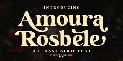 Amoura Rosbele is a modern and classy serif font. Amoura Rosbele is perfect for branding, logos, social media, advertisements, product packaging, watermark, invitation, stationery, tshirt, prints, posters and more. What’s Included : Uppercase & Lowercase Stylistic Alternate Ligature Numbers & Symbols Works on PC / Mac Simple installations Accessible in the Adobe Illustrator, Adobe Photoshop, Adobe InDesign, even work on Microsoft Word PUA Encoded Characters, Fully accessible without additional design software. Multilingual support Thank you for your purchase! Hope you enjoy with our font!