10,000 search results
(0.058 seconds)
- Auto Signature Script by WEP,
$22.00 Introducing the Auto Signature Script Typeface. Your Personal Feel of Luxury. This methodically crafted typeface easily merges the timeless elegance of hand- lettered scripts with the modern flexibility of a digital font. Its elegant curves and moving strokes capture the essence of fluid script, bringing a personal feel to every design. Whether you're crafting wedding invitations, logos, packaging, or social media graphics, this font will add a feel of class that speaks with your audience.
 - Marchens by Ironbird Creative,
$20.00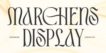 Introducing Marchens, a stylish and modern display serif, making it a versatile and elegant typeface. With a touch of vintage vibes, it will make your presentation looks amazing and sophisticated! You can use this typeface for logo, poster, event, or your social media post. Also support Multi Language and already PUA Encoded! Features: Uppercase & Lowercase Number & Symbol Multi language Ligatures Alternates PUA Encoded Thanks for purchasing and happy creating! Regards, Ironbird Creative
 - Disco Jaw by PizzaDude.dk,
$20.00 The beat is on, the piano plays the funky tunes and the rhythm guitars do their best to get the party started! The party starts with your design - use the Disco Jaw font if you are working with a theme that involves comic, kids, commercial, arts and crafts, posters ... anything that needs a fresh kick! Included are jumpy alternative letters, which makes your text look alive and kicking - and or course, there is multilingual support!
 - Good Friend by Senekaligrafika,
$12.00 “Good Friend” has hard strokes and signature style that speak to instant unique sensation. Take your creative projects to the highest level with this font. “Good Friend” will help you to create special and touching typographical design for your projects, for every day or the happiest day in life, greeting card, headings, flyer, product packaging, book cover, printed quotes, logos, and many more. It is really universal and modern font. The owner of endless possibilities!
 - Qafidut by Twinletter,
$18.00 Qafidut Groovy is a psychedelic-inspired retro typeface with a bold and playful character. It’s ideal for branding, product packaging, or even just to add a little flair to your editorial work. This elegant typography has a simple and contemporary look but with a touch of beautiful simplicity to give a modern feel to every curve of the letter. what are you waiting for start using this font to create your own special project now!
 - Tenky by Twinletter,
$13.00 Introducing “Tenky Font” – Embrace the Essence of Summer. Tenky Font embodies the spirit of summer in every stroke. With its refreshing summer theme, this font brings the warmth and vibrancy of the season into your creative projects. Whether you’re designing beach party flyers, tropical-themed banners, or anything under the sun, Tenky Font effortlessly captures attention and infuses your designs with the joyful essence of summer. Crafted with meticulous detail, Tenky Font radiates the energy and sunshine of the season, creating an immediate connection with your audience. Its versatility knows no bounds, making it a perfect fit for a wide range of applications, from vacation postcards to festival posters. Tenky Font elevates your text with its playful and breezy characters, giving your designs a carefree and inviting look. Plus, it supports various languages, ensuring it resonates with a global audience. Capture the essence of summer in your creative projects with Tenky Font. Explore this delightful typeface today and let your designs shine with the warmth and spirit of the season. – PUA Encoded Characters – Fully accessible without additional design software.
 - Hoojuy by Twinletter,
$17.00 Hoojuy is a classic serif typeface ideal for projects involving classic or retro modernism. This font’s stylish and refined attributes will add a distinctive touch to your designs. Hoojuy’s distinctive characteristics, like ligatures and alternatives, give it versatility and generate unexpected changes in the appearance of your text. You may quickly change the look and feel of your creative work. Furthermore, Hoojuy supports multilingualism, therefore it may be used for a variety of languages worldwide. This allows you to reach a global audience and increase the visual impact of your designs. By using Hoojuy as the primary typeface for your project, you’ll add an appealing modern twist to your classic style. Use Hoojuy right away to add the elegance of typography to your outstanding design. What’s Included : - File font - All glyphs Iso Latin 1 - Alternate, Ligature - Simple installations - We highly recommend using a program that supports OpenType features and Glyphs panels like many Adobe apps and Corel Draw so that you can see and access all Glyph variations. - PUA Encoded Characters – Fully accessible without additional design software. - Fonts include Multilingual support
 - Othuf by Twinletter,
$13.00 Introducing “Othuf Font” – Where Handwriting Meets Elegance. Othuf Font is the epitome of handwritten elegance. With its captivating handwriting theme, this font is your key to adding a touch of sophistication and authenticity to your creative projects. Whether you’re designing invitations, posters, or branding materials, Othuf Font effortlessly grabs attention and infuses your designs with the charm of true handwriting. Crafted with meticulous detail, Othuf Font exudes the timeless beauty and grace of handwritten script, forging an immediate connection with your audience. Its versatility knows no bounds, making it a perfect fit for various applications, from wedding stationery to logo design. Othuf Font enhances readability and style with its graceful strokes and flowing lines, providing a natural and appealing look to your text. It also offers support for multiple languages, ensuring that it resonates with a global audience. Elevate your creative projects with the classic elegance of Othuf Font. Explore this exceptional typeface today and let your designs exude the beauty of authentic handwriting. – PUA Encoded Characters – Fully accessible without additional design software.
 - Zalderdash by Typodermic,
$11.95 Introducing Zalderdash! The wackiest, most uproarious font on the farm. This isn’t your average typeface—oh no, this is a zany slab-serif, and it’s so thick you could milk it. Our font farmers have been hard at work breeding this baby to make sure it’s as silly as can be. Zalderdash isn’t just any old font, it’s a campy Clarendon that’s sure to make all your graphic design dreams come true! With its automatic character substitution, your text will jump off the page like a herd of wild cows! You’ll be mooooved by the boisterous and bouncy impression it makes! And don’t worry about perfect alignment because Zalderdash loves to get cockeyed! It’ll take your design from boring to barn-raising in no time. So, whether you’re designing a farm-fresh logo or a hilarious invitation to your next hoedown, Zalderdash is the font for you. It’s fun, it’s goofy, and it’s the freshest thing to hit the typography scene since sliced hay! Most Latin-based European writing systems are supported, including the following languages. Afaan Oromo, Afar, Afrikaans, Albanian, Alsatian, Aromanian, Aymara, Bashkir (Latin), Basque, Belarusian (Latin), Bemba, Bikol, Bosnian, Breton, Cape Verdean, Creole, Catalan, Cebuano, Chamorro, Chavacano, Chichewa, Crimean Tatar (Latin), Croatian, Czech, Danish, Dawan, Dholuo, Dutch, English, Estonian, Faroese, Fijian, Filipino, Finnish, French, Frisian, Friulian, Gagauz (Latin), Galician, Ganda, Genoese, German, Greenlandic, Guadeloupean Creole, Haitian Creole, Hawaiian, Hiligaynon, Hungarian, Icelandic, Ilocano, Indonesian, Irish, Italian, Jamaican, Kaqchikel, Karakalpak (Latin), Kashubian, Kikongo, Kinyarwanda, Kirundi, Kurdish (Latin), Latvian, Lithuanian, Lombard, Low Saxon, Luxembourgish, Maasai, Makhuwa, Malay, Maltese, Māori, Moldovan, Montenegrin, Ndebele, Neapolitan, Norwegian, Novial, Occitan, Ossetian (Latin), Papiamento, Piedmontese, Polish, Portuguese, Quechua, Rarotongan, Romanian, Romansh, Sami, Sango, Saramaccan, Sardinian, Scottish Gaelic, Serbian (Latin), Shona, Sicilian, Silesian, Slovak, Slovenian, Somali, Sorbian, Sotho, Spanish, Swahili, Swazi, Swedish, Tagalog, Tahitian, Tetum, Tongan, Tshiluba, Tsonga, Tswana, Tumbuka, Turkish, Turkmen (Latin), Tuvaluan, Uzbek (Latin), Venetian, Vepsian, Võro, Walloon, Waray-Waray, Wayuu, Welsh, Wolof, Xhosa, Yapese, Zapotec Zulu and Zuni.
 - Crafter Pieces by Putracetol,
$28.00 Crafter Pieces - Multi-Style Font is a truly unique font that offers multiple styles within a single typeface. With a total of 8 different styles accessible through alternate characters, this font provides versatility and creative options for various design applications. From super bold and stencil to thin, slab, serif, sans-serif, sport, and postage stamp styles, Crafter Pieces is a font that can be applied to any design and suit any theme or style. Each style can stand on its own or be combined with others, making it a perfect choice for branding, logos, posters, quotes, books, magazines, headlines, and more. The versatility of Crafter Pieces is truly exceptional, as it allows you to experiment with different styles within a single font. The availability of 8 distinct styles in one typeface opens up a world of possibilities for your creative projects. Whether you need a super bold look for a striking poster, a stencil style for an edgy branding design, or a thin font for an elegant quote, Crafter Pieces has it all. With Crafter Pieces - Multi-Style Font, your design possibilities are endless. Whether you're working on a modern or vintage theme, an edgy or elegant concept, this font will be your go-to choice, offering a wide range of styles to suit every project and creative vision.
 - Copperplate New by Caron twice,
$39.00 Imagine America in the 1930s. A gangster flick with Al Capone, a crime novel featuring Philip Marlowe. Our hero in a fedora sits in a classy bar, orders a double bourbon, lights a cigar and eyes the evening paper. He turns the pages, reading about a bank heist over on Third Avenue, a scandal involving a baseball player, a small ad for a general practitioner and a large spread about a famous law firm. What do the bottle of booze and the majestic facade of the bank have in common? The elegant baseball uniform and trustworthy attorneys? - Copperplate Gothic - When Frederick William Goudy created his legendary typeface in 1901, it went on to literally become the symbol of early 20th century America. Tiny serifs, characteristically broad letterforms, and particularly bold titles decorated calling cards at 6-point size, enormous bronze-cast logos, newspaper headlines, restaurant menus and more. This was the golden age of Copperplate, lasting up until the arrival of die neue Typografie and monospaced grotesques in the 1960s. Then the typeface almost completely disappeared. It made a partial comeback with the advent of the personal computer; digitizations of varying quality appeared, and one version even became a standard font in Adobe programs. This may have played a role in Copperplate later being used in DIY projects and amateur designs, which harmed its reputation. Copperplate New has been created to revive the faded glory of the original design. Formally, the new typeface expands the existing weight and proportional extremes. The slight serifs are reduced even further, making the typeface sans-like at smaller point sizes and improving readability. In contrast, at large point sizes it retains all of its original character. Decorative inline & shadow styles have been added and both have been created in all five proportions, making it easy to adapt the typesetting to the format you need. Despite these changes and innovations, Copperplate New remains true to Goudy’s original design and represents a snazzy way to evoke a golden era in American culture. Specimen: http://carontwice.com/files/specimen_Copperplate_New.pdf
 - FS Industrie Variable by Fontsmith,
$279.99Changing nature of work FS Industrie is an extraordinarily versatile new type system, with 70 variants built around five different widths and seven different weights. Type in the future will be increasingly variable, and FS Industrie is specifically designed to address the changing needs of brands. As more of the things we make exist primarily in a digital space, so our need to create type that can adapt within that space grows. It is the spirit of variable design, adaptation and flexibility that drove us to create FS Industrie. A typeface for future work in a future world. FS Industrie is a response to the changing nature of type, for brands that are responding to the changing nature of work. Industrial style Stylistically, FS Industrie feels direct and simple without sacrificing its humanity. It takes inspiration from German fonts of the 1930s, with their roots in manufacturing and signage. A classic sense of functional utility combined with a progressive view of where type is heading. Expressions in width A fundamental challenge with variable type is to ensure that craft and precision is preserved at every interval. Each width and weight is drawn by hand, with subtle variations in terminals and angles as you progress through the system. This ensures each variant can play to its unique strengths, while also pairing perfectly with its siblings. From the closed terminals of the Condensed and the open terminals of the Extended. FS Industrie is a design system that maintains a practical, grounded and robust tone throughout every variable style. Variable nature The 70 styles offer a range of expression. Each width contrasts with the next to clearly define typographic roles in graphic layouts. Every glyph is crafted with adaptability and scalability in mind, creating a pliable design space for the user. The proportions of each letterform flex as weight scales up, stem weights increase as letter width broadens. These subtle design changes create an optically consistent visual impression. - FS Joey Paneuropean by Fontsmith,
$90.00Kangaroo FS Joey was the offspring of a project with Rudd Studio to develop a logotype for an online streaming TV service, in 2008. While under wraps, the secret project was code-named Kangaroo. The logotype led to a second project, to design a corporate typeface for the service. It was the first big project Fernando Mello had worked on with Jason Smith. “Like any designer who just joined a team, I was very excited about it, drawing and sketching lots of ideas. I remember Jason and I experimenting with lots of possibilities, for both the logo and the typeface.” Online As the font for a Spotify-style, internet-based service, FS Joey needed to be highly legible on-screen, including at very small sizes. There had to be a range of weights, and they’d have to work well in print, too. It was also important that it felt corporate, not too quirky, while still having a strong character of its own. Quirkiest “We designed three weights specifically for use on the Web,” says Jason Smith. “There was the usual fight between me and my team. I wanted at least one identifiable letter that was a quirk. As always I went straight for the lowercase ‘g’, and it was drawn numerous times with lots of variation. I got the quirkiest one accepted by the client.” But, later in 2009, the Competition Commission blocked Project Kangaroo, and Fontsmith were left with a couple of weights of an as yet unused font. From Kangaroo, Joey was born. A favourite “Straight away, people started to notice the typeface,” says Jason. “I can take the credit for pushing the art direction and standing up for the quirks. But it was Fernando who was the key to pulling it all together and adding his own distinct flavour. Now it’s one of my favourite designs in our library.” Fresh and friendly, geometric and energetic, Joey is available in five weights, all with italics, all finely-tuned for both screen and print. - FS Joey by Fontsmith,
$80.00 Kangaroo FS Joey was the offspring of a project with Rudd Studio to develop a logotype for an online streaming TV service, in 2008. While under wraps, the secret project was code-named Kangaroo. The logotype led to a second project, to design a corporate typeface for the service. It was the first big project Fernando Mello had worked on with Jason Smith. “Like any designer who just joined a team, I was very excited about it, drawing and sketching lots of ideas. I remember Jason and I experimenting with lots of possibilities, for both the logo and the typeface.” Online As the font for a Spotify-style, internet-based service, FS Joey needed to be highly legible on-screen, including at very small sizes. There had to be a range of weights, and they’d have to work well in print, too. It was also important that it felt corporate, not too quirky, while still having a strong character of its own. Quirkiest “We designed three weights specifically for use on the Web,” says Jason Smith. “There was the usual fight between me and my team. I wanted at least one identifiable letter that was a quirk. As always I went straight for the lowercase ‘g’, and it was drawn numerous times with lots of variation. I got the quirkiest one accepted by the client.” But, later in 2009, the Competition Commission blocked Project Kangaroo, and Fontsmith were left with a couple of weights of an as yet unused font. From Kangaroo, Joey was born. A favourite “Straight away, people started to notice the typeface,” says Jason. “I can take the credit for pushing the art direction and standing up for the quirks. But it was Fernando who was the key to pulling it all together and adding his own distinct flavour. Now it’s one of my favourite designs in our library.” Fresh and friendly, geometric and energetic, Joey is available in five weights, all with italics, all finely-tuned for both screen and print.
 - FS Industrie by Fontsmith,
$50.00 Changing nature of work FS Industrie is an extraordinarily versatile new type system, with 70 variants built around five different widths and seven different weights. Type in the future will be increasingly variable, and FS Industrie is specifically designed to address the changing needs of brands. As more of the things we make exist primarily in a digital space, so our need to create type that can adapt within that space grows. It is the spirit of variable design, adaptation and flexibility that drove us to create FS Industrie. A typeface for future work in a future world. FS Industrie is a response to the changing nature of type, for brands that are responding to the changing nature of work. Industrial style Stylistically, FS Industrie feels direct and simple without sacrificing its humanity. It takes inspiration from German fonts of the 1930s, with their roots in manufacturing and signage. A classic sense of functional utility combined with a progressive view of where type is heading. Expressions in width A fundamental challenge with variable type is to ensure that craft and precision is preserved at every interval. Each width and weight is drawn by hand, with subtle variations in terminals and angles as you progress through the system. This ensures each variant can play to its unique strengths, while also pairing perfectly with its siblings. From the closed terminals of the Condensed and the open terminals of the Extended. FS Industrie is a design system that maintains a practical, grounded and robust tone throughout every variable style. Variable nature The 70 styles offer a range of expression. Each width contrasts with the next to clearly define typographic roles in graphic layouts. Every glyph is crafted with adaptability and scalability in mind, creating a pliable design space for the user. The proportions of each letterform flex as weight scales up, stem weights increase as letter width broadens. These subtle design changes create an optically consistent visual impression.
 - Fulgate by Flavortype,
$15.00 “Luxury in simplicity”. A Family of Luxury Fonts called Fulgate. A Hype of summer themed bring us to expressing a thirsty of creating a product that can help you to choosing a fonts to your creations. Like as we are on the preview above, how the fonts can "stands" within your design. Since Fulgate are created on a 6 weight from Thin, Light, Regular, Medium, Semibold, Bold. You won’t be worried which one to fit to your creative design. Also, You can Mix it up all of it without worrying design collision. Fulgate also comes with opentype features. The one was stand out was Capital Swash, it’s replacing the First letter that typed on Capital. even if you are type with all caps, it still stand out. If you think that all caps are not quite fit, write on with lowercase and turn on the features of Small Caps, a shape of capital but with lower heights. Lowercase also have a few make up with Alternate Characters, just to be noted, not all lowercase characters have an alternates, to keep a luxury feel and avoiding messy. The last are a feature on the numerical, Ordinals, Subscript, Superscript, and Fraction.
 - Duos Pro by Underware,
$50.00 Duos Pro, a script for illusionists, comes in 10 styles. Whatever style you pick: apply this speedy monolinear handwriting font in large sizes, because it is made for catching the attention. Take Duos Sharp, which comes with speedy strokes and sharp endings in light, regular and black weights. Or pick Duos Round, and its 3 styles with a softer voice and round endings. Some people call those endings “funky ball noses“, an odd but appropriate description. Round styles look more like round tip speedball lettering, but contrary to most speedball letterings they're written with a very high speed. Especially Duos Round Black is more cuddlesome than its sharper counterpart. For an even more intuitive feel, we added two more sets: Duos Brush & Duos Paint. Duos Brush combines monoline strokes with brush beginnings and endings, for that graphical, freshly lettered touch. A closer look will reveal how its brushed tails vary all the time. Duos Paint is made up out of rough & artistic painted strokes, with all its accompanying shortcomings. In contradiction to the finesses of lighter weights, Duos Paint Black scores in being the most nonchalant and impressionistic. Poésie brutale! As well as having the option to choose between (or mix) these 10 styles, Duos Pro has additional hidden functionalities. For example, every style has many alternate lettershapes and ligatures, offering various different results and lengths to display every single word. Or manually add one of the swashes for more emphasis. A bonus font, Duos Tools, includes tool icons, strokes and banners. If that ain’t enough, throw in some polysemic letters for smart, ambiguous communication if you like. Want to become a signpainter? Then be a signpainter. Always wanted to be an artist? This is your chance! Duos Pro boosts your look. Make your visual vocabulary as grandiose, dramatic, sensitive or picturesque as you want. But whatever you do, don't hesitate to apply Duos Pro “short & big”!
 - ITC Bodoni Seventytwo by ITC,
$29.99Giambattista Bodoni (1740-1813) was called the King of Printers; he was a prolific type designer, a masterful engraver of punches and the most widely admired printer of his time. His books and typefaces were created during the 45 years he was the director of the fine press and publishing house of the Duke of Parma in Italy. He produced the best of what are known as modern" style types, basing them on the finest writing of his time. Modern types represented the ultimate typographic development of the late eighteenth and early nineteenth centuries. They have characteristics quite different from the types that preceded them; such as extreme vertical stress, fine hairlines contrasted by bold main strokes, and very subtle, almost non-existent bracketing of sharply defined hairline serifs. Bodoni saw this style as beautiful and harmonious-the natural result of writing done with a well-cut pen, and the look was fashionable and admired. Other punchcutters, such as the Didot family (1689-1853) in France, and J. E. Walbaum (1768-1839) in Germany made their own versions of the modern faces. Even though some nineteenth century critics turned up their noses and called such types shattering and chilly, today the Bodoni moderns are seen in much the same light as they were in his own time. When used with care, the Bodoni types are both romantic and elegant, with a presence that adds tasteful sparkle to headlines and advertising. ITC Bodoni™ was designed by a team of four Americans, after studying Bodoni's steel punches at the Museo Bodoniana in Parma, Italy. They also referred to specimens from the "Manuale Tipografico," a monumental collection of Bodoni's work published by his widow in 1818. The designers sought to do a revival that reflected the subtleties of Bodoni's actual work. They produced three size-specific versions; ITC Bodoni Six for captions and footnotes, ITC Bodoni Twelve for text settings, and ITC Bodoni Seventytwo - a display design modeled on Bodoni's 72-point Papale design. ITC Bodoni includes regular, bold, italics, Old style Figures, small caps, and italic swash fonts. Sumner Stone created the ornaments based on those found in the "Manuale Tipografico." These lovely dingbats can be used as Bodoni did, to separate sections of text or simply accent a page layout or graphic design." - ITC Bodoni Twelve by ITC,
$29.99Giambattista Bodoni (1740-1813) was called the King of Printers; he was a prolific type designer, a masterful engraver of punches and the most widely admired printer of his time. His books and typefaces were created during the 45 years he was the director of the fine press and publishing house of the Duke of Parma in Italy. He produced the best of what are known as modern" style types, basing them on the finest writing of his time. Modern types represented the ultimate typographic development of the late eighteenth and early nineteenth centuries. They have characteristics quite different from the types that preceded them; such as extreme vertical stress, fine hairlines contrasted by bold main strokes, and very subtle, almost non-existent bracketing of sharply defined hairline serifs. Bodoni saw this style as beautiful and harmonious-the natural result of writing done with a well-cut pen, and the look was fashionable and admired. Other punchcutters, such as the Didot family (1689-1853) in France, and J. E. Walbaum (1768-1839) in Germany made their own versions of the modern faces. Even though some nineteenth century critics turned up their noses and called such types shattering and chilly, today the Bodoni moderns are seen in much the same light as they were in his own time. When used with care, the Bodoni types are both romantic and elegant, with a presence that adds tasteful sparkle to headlines and advertising. ITC Bodoni™ was designed by a team of four Americans, after studying Bodoni's steel punches at the Museo Bodoniana in Parma, Italy. They also referred to specimens from the "Manuale Tipografico," a monumental collection of Bodoni's work published by his widow in 1818. The designers sought to do a revival that reflected the subtleties of Bodoni's actual work. They produced three size-specific versions; ITC Bodoni Six for captions and footnotes, ITC Bodoni Twelve for text settings, and ITC Bodoni Seventytwo - a display design modeled on Bodoni's 72-point Papale design. ITC Bodoni includes regular, bold, italics, Old style Figures, small caps, and italic swash fonts. Sumner Stone created the ornaments based on those found in the "Manuale Tipografico." These lovely dingbats can be used as Bodoni did, to separate sections of text or simply accent a page layout or graphic design." - ITC Bodoni Ornaments by ITC,
$29.99Giambattista Bodoni (1740-1813) was called the King of Printers; he was a prolific type designer, a masterful engraver of punches and the most widely admired printer of his time. His books and typefaces were created during the 45 years he was the director of the fine press and publishing house of the Duke of Parma in Italy. He produced the best of what are known as modern" style types, basing them on the finest writing of his time. Modern types represented the ultimate typographic development of the late eighteenth and early nineteenth centuries. They have characteristics quite different from the types that preceded them; such as extreme vertical stress, fine hairlines contrasted by bold main strokes, and very subtle, almost non-existent bracketing of sharply defined hairline serifs. Bodoni saw this style as beautiful and harmonious-the natural result of writing done with a well-cut pen, and the look was fashionable and admired. Other punchcutters, such as the Didot family (1689-1853) in France, and J. E. Walbaum (1768-1839) in Germany made their own versions of the modern faces. Even though some nineteenth century critics turned up their noses and called such types shattering and chilly, today the Bodoni moderns are seen in much the same light as they were in his own time. When used with care, the Bodoni types are both romantic and elegant, with a presence that adds tasteful sparkle to headlines and advertising. ITC Bodoni™ was designed by a team of four Americans, after studying Bodoni's steel punches at the Museo Bodoniana in Parma, Italy. They also referred to specimens from the "Manuale Tipografico," a monumental collection of Bodoni's work published by his widow in 1818. The designers sought to do a revival that reflected the subtleties of Bodoni's actual work. They produced three size-specific versions; ITC Bodoni Six for captions and footnotes, ITC Bodoni Twelve for text settings, and ITC Bodoni Seventytwo - a display design modeled on Bodoni's 72-point Papale design. ITC Bodoni includes regular, bold, italics, Old style Figures, small caps, and italic swash fonts. Sumner Stone created the ornaments based on those found in the "Manuale Tipografico." These lovely dingbats can be used as Bodoni did, to separate sections of text or simply accent a page layout or graphic design." - ITC Bodoni Brush by ITC,
$29.99Giambattista Bodoni (1740-1813) was called the King of Printers; he was a prolific type designer, a masterful engraver of punches and the most widely admired printer of his time. His books and typefaces were created during the 45 years he was the director of the fine press and publishing house of the Duke of Parma in Italy. He produced the best of what are known as modern" style types, basing them on the finest writing of his time. Modern types represented the ultimate typographic development of the late eighteenth and early nineteenth centuries. They have characteristics quite different from the types that preceded them; such as extreme vertical stress, fine hairlines contrasted by bold main strokes, and very subtle, almost non-existent bracketing of sharply defined hairline serifs. Bodoni saw this style as beautiful and harmonious-the natural result of writing done with a well-cut pen, and the look was fashionable and admired. Other punchcutters, such as the Didot family (1689-1853) in France, and J. E. Walbaum (1768-1839) in Germany made their own versions of the modern faces. Even though some nineteenth century critics turned up their noses and called such types shattering and chilly, today the Bodoni moderns are seen in much the same light as they were in his own time. When used with care, the Bodoni types are both romantic and elegant, with a presence that adds tasteful sparkle to headlines and advertising. ITC Bodoni™ was designed by a team of four Americans, after studying Bodoni's steel punches at the Museo Bodoniana in Parma, Italy. They also referred to specimens from the "Manuale Tipografico," a monumental collection of Bodoni's work published by his widow in 1818. The designers sought to do a revival that reflected the subtleties of Bodoni's actual work. They produced three size-specific versions; ITC Bodoni Six for captions and footnotes, ITC Bodoni Twelve for text settings, and ITC Bodoni Seventytwo - a display design modeled on Bodoni's 72-point Papale design. ITC Bodoni includes regular, bold, italics, Old style Figures, small caps, and italic swash fonts. Sumner Stone created the ornaments based on those found in the "Manuale Tipografico." These lovely dingbats can be used as Bodoni did, to separate sections of text or simply accent a page layout or graphic design." - ITC Bodoni Six by ITC,
$40.99Giambattista Bodoni (1740-1813) was called the King of Printers; he was a prolific type designer, a masterful engraver of punches and the most widely admired printer of his time. His books and typefaces were created during the 45 years he was the director of the fine press and publishing house of the Duke of Parma in Italy. He produced the best of what are known as modern" style types, basing them on the finest writing of his time. Modern types represented the ultimate typographic development of the late eighteenth and early nineteenth centuries. They have characteristics quite different from the types that preceded them; such as extreme vertical stress, fine hairlines contrasted by bold main strokes, and very subtle, almost non-existent bracketing of sharply defined hairline serifs. Bodoni saw this style as beautiful and harmonious-the natural result of writing done with a well-cut pen, and the look was fashionable and admired. Other punchcutters, such as the Didot family (1689-1853) in France, and J. E. Walbaum (1768-1839) in Germany made their own versions of the modern faces. Even though some nineteenth century critics turned up their noses and called such types shattering and chilly, today the Bodoni moderns are seen in much the same light as they were in his own time. When used with care, the Bodoni types are both romantic and elegant, with a presence that adds tasteful sparkle to headlines and advertising. ITC Bodoni™ was designed by a team of four Americans, after studying Bodoni's steel punches at the Museo Bodoniana in Parma, Italy. They also referred to specimens from the "Manuale Tipografico," a monumental collection of Bodoni's work published by his widow in 1818. The designers sought to do a revival that reflected the subtleties of Bodoni's actual work. They produced three size-specific versions; ITC Bodoni Six for captions and footnotes, ITC Bodoni Twelve for text settings, and ITC Bodoni Seventytwo - a display design modeled on Bodoni's 72-point Papale design. ITC Bodoni includes regular, bold, italics, Old style Figures, small caps, and italic swash fonts. Sumner Stone created the ornaments based on those found in the "Manuale Tipografico." These lovely dingbats can be used as Bodoni did, to separate sections of text or simply accent a page layout or graphic design." - Bunken Tech Sans Wide by Buntype,
$49.00 The Bunken Tech Sans superfamily: A reminiscence of constructed fonts of the modern age designed with considerably cleaner forms. •See other members of the Superfamily: Bunken Tech Sans •For further details, view the Specimen PDF. Bunken Tech Sans Wide follows in the best tradition of the straight-lined and somewhat angular structures of its predecessors while offering a much more open and mild design. The shapes of the letters are therefore reduced to the most essential elements: The spurs on a, b, n and other lower case letters occur just as little as decorative or style details, the lightly rounded inside edges are more pleasing to the eye than certain historic role models and make for a harmonic, flowing style. Use In particular Bunken Tech Sans Wide stands out as an easy, distinctive headline font with its straight-lined, technical design. Open counters and large x-height make it equally suited for use in shorter texts. It is also perfectly complemented by Bunken Sans or Bunken Slab in longer texts (available soon). Features Available in 16 styles with widths ranging from Light to Heavy with associated Italics. All of the styles are very extensive: Support for at least 58 languages, Small Capitals, 9 number sets (e.g. Lining, Oldstyle, Tabular and Small Cap Figures), ligatures, alternate characters, numerous Opentype functions, and lots of other small features that make it more pleasant to work with the font on a daily basis as well as fulfilling typographic desires. Each style contains more than 870 characters! Each style is available in a professional (Pro) standard (Std) and Small Caps (SC) edition with a different range of functions. (Language support, OpenType features and number of glyphs). Details can be found on the respective pages. Bunken Tech Sans Wide is part of the Bunken Tech superfamily and is available in Condensed, Normal and Wide. Also of interest: The slab serif variation Bunken Tech Slab Features in Detail: 16 Weights: -Light -Book -Medium -SemiBold -Bold -ExtraBold -UltraBold -Heavy and corresponding Italics 3 Widths: -Condensed -Normal -Wide Alternate Characters: A, E, F, L, S, e, f, t, s, y, etc. Small Capitals 5 Sets of Figures: -Lining Figures -Old Style Figures -Tabfigures -Old Style Tabfigures -Small Cap Figures Automatic Ordinals Automatic Fractions Extended Language Support and more...
 - Auberge Script by Sudtipos,
$79.00 It took me a long time, but I think I now understand why people of my generation and older feel the need to frame current events in an historical context or precedents, while most of the young couldn't care less about what happened ten years ago, let alone centuries back. After living for a few decades, you get to a point when time seems to be moving quite fast, and it’s humbling to see that your entire existence so far can be summed up in a paragraph or two which may or may not be useful to whoever ends up reading the stuff anyhow. I suppose one way to cope with the serenity of aging is trying to convince yourself that your life and work are really an extension of millenia of a species striving to accept, adapt to, and improve the human condition through advancing the many facets of civilization -- basically making things more understandable and comfortable for ourselves and each other while we go about doing whatever it is we are trying to do. And when you do finally convince yourself of that, history becomes a source of much solace and even a little premonition, so you end up spending more time there. Going far back into the history of what I do, one can easily see that for the most part it was ruled by the quill. Western civilization’s writing was done with quill pens for more than thirteen centuries and with newer instruments for about two. By the mid-18th century, the height of the quill experience, various calligraphy techniques could be discerned and writing styles were arranged in distinct categories. There are many old books that showcase the history of it all. I recommend looking at some whenever the urge comes calling and you have to get away from backlit worlds. Multiple sources usually help me get a better perspective on the range of a specific script genre, so many books served as reference to this quill font of mine. Late 17th century French and Spanish professional calligraphy guides were great aides in understanding the ornamental scope of what the scribes were doing back then. The French books, with their showings of the Ronde, Bâtarde and Coulée alphabets, were the ones I referenced the most. So I decided to name the font Auberge, a French word for hotel or inn, because I really felt like a guest in different French locales (and times) when I going through all that stuff. Because it is multi-sourced, Auberge does not strictly fit in a distinct quill pen category. Instead, it shows strong hints of both Bâtarde and Coulée alphabets. And like most of my fonts, it is an exercise in going overboard with alternates, swashes, and ornamental devices. Having worked with it for a while, I find it most suitable for display calligraphic setting in general, but it works especially well for things like wine labels and event invitations. It also shines in the original quill pen application purpose, which of course was stationery. Also, as it just occurred to me, if you find yourself in a situation where you have to describe your entire life in 50 words or less, you may as well make it look good and swashy, so Auberge would probably be a good fit there as well. This is one quill script that no large bird had to die for. A few technical notes The Auberge Script Pro version includes 1800 glyphs, everything is included there. Also latin language support. We recommend you to use the latest design application to have full access to alternates, swashes, small caps, ornaments, etc. The images from the gallery uses this version. For better results use the fonts with “liga” feature on. Awards During 2014 the early develop of Auberge Script was chosen to be part of Tipos Latinos, the most important type exhibition in South America.
 - All Ages by KC Fonts,
$19.00 All Ages is a true punk rock font. It has the same look and feel that you see wrapped around a light post telling you where the next show of your favorite band will be. All Ages will work with any of your headline, in your face, stylized design needs and it looks great BIG or small! For a customized look to your works, switch between uppercase and lowercase for a change of grunge to the letters, italics are also available. You can also use All Ages in layers if your background is a little too busy by using All Ages Letters on top of the All Ages Ripped Paper, you can even use All Ages Letters on it’s own for an alternate look. Each font includes a character set large enough to support you international punkers with multilingual characters.
 - Arogun by Twinletter,
$15.00 Arogun is a display typeface with a unique and amusing appearance. It has a lovely and clean shape. This typeface comes in three families to make it easier for you to use in your unique projects. Everyone who sees this typeface will be impressed by its distinctive, attractive, and spectacular appearance if you use it in your various projects, whether it’s an event or not. Your project will be more exquisite, professional, and one-of-a-kind than it has ever been. This graffiti font is great for product logos, poster titles, headlines, packaging, film titles, logotypes, gorgeous writing, and trendy graffiti designs, among other things. Of course, if you utilize this font in your numerous creative projects, they will be perfect and outstanding. Use this typeface right away for your one-of-a-kind and remarkable projects.
 - Daily Shine by Invasi Studio,
$19.00 Step into the groove with Daily Shine, the ultimate funky retro font that will transport you straight back to the '70s era. Whether you're looking to infuse nostalgic flair into your logo or seek a fresh burst of inspiration for your design ventures, Daily Shine is your go-to choice. With its stylish swash alternates, Daily Shine adds a touch of extra style to your project, creating a dynamic and eye-catching look. Plus, its multilingual support ensures versatility for various language needs. From captivating headings and expressive logotypes to spirited quotes, apparel designs, inviting invitations, lively flyers, dynamic posters, heartfelt greeting cards, captivating product packaging, captivating book covers, empowering printed quotes and even mesmerizing album covers and movie posters, Daily Shine is your versatile companion for any creative endeavor. Get ready to shine bright and groove on with Daily Shine font!
 - Raiken by Artisticandunique,
$9.00 Raiken - Serif font family - 8 Styles - Multilingual supports Raiken is a stylistic and powerful serif font family with different alternative type designs. You will have the opportunity to enrich the content of your projects with alternative characters. This font comes with multi-language support and 8 styles. It has an elegant structure that can be effective in the development of your projects. According to the purpose of use in typographic compositions that you will create with the aesthetic structure of alternative characters; You can enrich your titles in books or magazines, and your logos in branding. You can take advantage of the elegant structure of standard characters in your plain texts. It provides flexibility in all your projects with the alternatives it offers you with its multi-language option, 8 styles and 441 glyphs. Especially for editorials, magazines, books, branding, logo design, web design, headlines, movie titles etc. If you are looking for a font with stylistic alternatives, Raiken serif font can meet your needs. With this font you can create your unique designs. If you have a question, please contact me. Have a good time.
 - Zonttife by Twinletter,
$13.00 Introducing “Zonttife Font” – Embrace the Summer Vibe! Unlock the essence of summer in your designs with Zonttife Font. This stunning display font is your gateway to infusing every project with the vibrant spirit of the season. Zonttife Font’s unique style instantly transports your text into the heart of summer. Whether you’re working on beach-themed posters, sun-soaked party invitations, or any other creative endeavor, this font will bring your designs to life with a touch of summer magic. Crafted with meticulous attention to detail, Zonttife Font ensures that your text radiates the warmth and playfulness of summer. Its versatility shines through in various design applications, from tropical brochures to poolside banners. But that’s not all – Zonttife Font also supports multiple languages, making it accessible to a global audience. No matter where your creative journey takes you, Zonttife Font will help you express the sun-soaked vibes of summer. Embrace the summer vibes and let your designs bask in the sunny glow of Zonttife Font. Elevate your creativity and infuse the spirit of the season into every project. – PUA Encoded Characters – Fully accessible without additional design software.
 - Berthusen by Sabrcreative,
$25.00 Introducing Berthusen, a stunning handwriting signature font that exudes elegance and sophistication. With its graceful curves and fluid strokes, this script font captures the essence of handwritten beauty and adds a touch of refinement to your designs. Whether you're creating logos, branding materials, invitations, or any creative project, Berthusen will elevate your work with its timeless charm. Berthusen features a perfect balance between uppercase and lowercase letters, offering versatility and creative freedom. The inclusion of numbers and punctuations ensures seamless integration into your designs, allowing you to craft captivating compositions. With multilingual support, this font enables you to express your message effectively across different languages, reaching a broader audience. The PUA encoding of Berthusen allows for easy access to its extensive collection of unique glyphs and ligatures. These special characters and letter combinations add an authentic and handcrafted touch to your typography, enhancing the overall visual appeal of your designs. With its refined script style, Berthusen is perfect for various design projects where a touch of elegance is desired. Its versatility makes it ideal for wedding invitations, stationery, quotes, branding, and much more. Let Berthusen elevate your designs and leave a lasting impression on your audience.
 - Marker Makers by Colllab Studio,
$19.00 "Hi there, thank you for passing by. Colllab Studio is here. We crafted best collection of typefaces in a variety of styles to keep you covered for any project that comes your way! Making your brand visible, interesting and recognizable without having to get in the way of your customer’s experience is hard. It takes a lot of time, money and effort to make a clear brand. And maintaining it through all your customer touchpoints is even harder. Introducing, Marker Makers is a versatile marker font that takes inspiration from the boldness of graffiti and the playfulness of primary colors. It's a joy to use for any design project where you want your audience to pay attention, this is your go-to font and take your next project from good to WOW! Marker Makers comes with more than 400 glyphs, including punctuation, numbers and upper and lower-case letters you’ll have all the tools you need to create invigoratingly unique content. Whether it’s included on posters at trade shows or on the walls of any room in your office, no one will ever think it was boring! A Million Thanks Colllab Studio www.colllabstudio.com
 - Jute Basket by Yumna Type,
$12.00 A beautiful and easy-to-style font duo to elevate your design, Jute Basket. What sets this font duo is the display font that is made all in caps characters. This design choice is sure to give title and header text a big presence on any pages. Unlike the display style, the script font less domineering though you can use it to express a feeling of joy, cute, and serene You also get 15 illustrations as special extra that you can use as you wish. Features: Multilingual Supports Uppercase and lowercase PUA Encoded Numerals and Punctuation This font would looks great on your branding, logos, social media quotes, stickers, posters, wall art, merchandise, social media, and many more. Get more inspiration about how to use it by seeing the font preview. Thank you for purchasing our fonts. If you have any further questions, don't hesitate to contact us. Happy Designing.
 - Fenomen Slab by Signature Type Foundry,
$35.00 The geometrical drawing of Fenomen Slab follows the guidelines set by our other font family Fenomen Sans. It is a perfect companion of Fenomen Sans, as well as being a standalone font family capable of delivering its own expression and aesthetics. The set contains four width proportions – Normal, SemiCondensed, Condensed and ExtraCondensed in eight weights ranging from Hairline to Black. Every font of the family contains four types of numerals, small caps, ligatures and contextual alternates. The typeface was developed between the years 2014–2017 and was subjected to a series of tests for the fluent legibility of all fonts even in extreme conditions. Narrow fonts provide this set with the maximum use including newspaper typesetting. The typeface has an elegant, delicate design in thin fonts and sufficient legibility in bold. Mutual contrast produces great creative tension. Font name acronyms described: SCN = SemiCondensed CN = Condensed XCN = ExtraCondensed
 - Plessis by Creativetacos,
$9.97 Welcome to our Plesis Brush Display Font! It's a lively, unique handwritten typeface that injects a contemporary and enjoyable twist to your forthcoming assignments. It equips you with everything you require - uppercase, lowercase, numbers, punctuation, and symbols- and even supports multiple languages. Plesis is the typeface for every occasion! Utilize it for presentations, logos, headlines, handwritten styles, posters, branding, uplifting quotes, titles, layout of magazines, web design, adverts, invites, cover artwork, and any other inventive project on your list. What does the Package Contain? - Typeface Weight: Regular The Plesis Typeface is filled with: - Capital Alphabets (Uppercase) - Small Alphabets (Lowercase) - Numerals & Symbols - Multi-language Support Let's take a quick look at the supported characters: - All the alphabets from A-Z (uppercase and lowercase) - All the numerals from 0-9 - All these special characters - !"#$%&'()*+,-./:;?@[]^_`{|}~¥ - And a selection of global characters like ¡¢¤§¨©«®±´¶¸»¿ÀÁÂÃÄÅÇÈÉÊËÌÍÎÏÑÒÓÔÕÖ×ØÙÚÛÜÝÞßàáâãäåçèéêëìíîïñòóôõö÷øùúûüýþÿŁłŠšŸŽžˇ‘’‚‛„†‡…‰€™
 - Roses Bolero TP by Authentype,
$12.00 Roses Bolero TP Elegant Sans Serif is a sans serif font with full set of uppercase and lowercase letters, multilingual symbols, numerals, punctuation and ligatures. Roses Bolero elegant sans serif font classic and elegant style for poster design, magazines, beauty branding with a flower-shaped asterisk glyph suitable for your beautiful and elegant design concept. Features Standard glyphs uppercase and lowercase letters Numerals, a large range of punctuation and ligatures. Lowercase letters include ending swashes. Works on PC & Mac. Simple installations, accessible in the Adobe Illustrator, Adobe Photoshop, Adobe InDesign, even work on Microsoft Word. PUA Encoded Characters – Fully accessible without additional design software. Fonts include multilingual support for; ä ö ü Ä Ö Ü ß ¿ ¡ ________________________________________________________________________________________________________________________________________________ Image used : All photographs/pictures/logo/vector used in the preview are not included, they are intended for illustration purpose only. Thank you for your purchase! Hope you enjoy with our font! Designers: Ekayasa.
 - Sticker by DonyaDesign,
$14.00 Special creative products for you, our products will give you an extraordinary experience that will not be forgotten. A popular and professional script font. Modern and elegant, this typeface is made of beautiful creative strokes. This font is perfect for your creative ideas, both formal and informal. It has a modern style with a touch of creative ideas that is very suitable to be applied anywhere that requires creative ideas such as invitation cards, letterheads, website logos, social media, banners, advertisements, brochures, packaging products, leather products, and any product that requires writing. By using this font, all of your products will look luxurious, elegant, and attractive, please try and see the results. This font includes a complete set of beautiful upper and lowercase letters, numbers, a wide variety of punctuation marks, and ligatures. All lowercase letters include a start and end, providing a realistic style. everything you get.
 - Theman Cathos by Alit Design,
$21.00 Introducing "Theman Cathos" Font: A Bubble Dynamic, Modern, and Funky Typeface Theman Cathos is a captivating font that combines the essence of bubble dynamics with a modern and funky style. Its unique design exudes energy and playfulness, making it perfect for projects that require a fresh and vibrant look. This typeface features rounded letterforms with soft edges, giving it a friendly and approachable feel. The bubbly contours of each character create a sense of movement and liveliness, capturing attention and adding a touch of whimsy to any design. With its modern twist, Theman Cathos brings a contemporary edge to traditional bubble fonts. It embraces clean lines, sleek curves, and a balanced composition, making it versatile for a wide range of applications. Whether you're designing a logo, branding materials, advertising campaigns, or social media graphics, this font will add a dynamic and eye-catching element to your project. Theman Cathos also offers a wide range of glyph variations, including ligatures, alternates, and stylistic sets, allowing you to customize and experiment with different letter combinations. This versatility empowers you to create unique typographic compositions that truly reflect your creative vision. Embrace the spirit of modernity and funk with Theman Cathos font. Elevate your designs, stand out from the crowd, and infuse them with a sense of joy and energy. Let this captivating typeface be the perfect tool to express your creativity and make a memorable impact.
 - Bumbel by Say Studio,
$12.00 Introducing Bumbel - Bubble Typeface Bumbel is a captivating font that combines the essence of bubble dynamics with a modern and funky style. Its unique design exudes energy and playfulness, making it perfect for projects that require a fresh and vibrant look. This typeface features rounded letterforms with soft edges, giving it a friendly and approachable feel. The bubbly contours of each character create a sense of movement and liveliness, capturing attention and adding a touch of whimsy to any design. With its modern twist, Bumbel brings a contemporary edge to traditional bubble fonts. It embraces clean lines, sleek curves, and a balanced composition, making it versatile for a wide range of applications. Whether you're designing a logo, branding materials, advertising campaigns, or social media graphics, this font will add a dynamic and eye-catching element to your project. Bumbel have Outline Version allowing you to customize and experiment with different letter combinations. This versatility empowers you to create unique typographic compositions that truly reflect your creative vision. Embrace the spirit of modernity and funk with Bumbel. Elevate your designs, stand out from the crowd, and infuse them with a sense of joy and energy. Let this captivating typeface be the perfect tool to express your creativity and make a memorable impact. You will get : - Bumbel Regular - Bumbel Italic - Bumbel Outline - Bumbel Outline Italic - Multilingual Support Thanks, Have a wonderful Day Say Studio
 - Marsmila by Colllab Studio,
$19.00 "Hi there, thank you for passing by. Colllab Studio is here. We crafted best collection of typefaces in a variety of styles to keep you covered for any project that comes your way! Introducing Marsmila, a luxury beauty calligraphy font inspired by the Victorian era and the Grace of the Roman letterforms as well as modern calligraphic aesthetics. Its graceful, curving lines and elegant swirls are a delight to behold. Marsmila comes with massive number of glyphs and stylistic alternates, including extra beginning and ending swashes. Perfect for your next calligraphy project, or when you want to make your text look fancy! Make your next design projects look like you took them to an expensive calligrapher to be done for hundreds of dollars, but you didn't! You can use it in any design and any way you want. Marsmila typeface works best for logos, posters, styling purposes such as invitations, greeting cards or any design projects which have some elegant vibe to them. A Million Thanks Colllab Studio www.colllabstudio.com
 - Vinicius by Jehoo Creative,
$19.00 Introducing the Vinicius font, a gorgeous typeface that combines the timeless allure of gothic typefaces with a contemporary twist. Inspired by the rich heritage of medieval calligraphy, Vinicius offers beautiful forms that attract attention and inspire courage. Vinicius offers a range of Stylistic Alternate, allowing you to explore artistic possibilities and customize your typography creations. One of Vinicius' standout features is his striking collection of ligatures. These skillfully crafted letter combinations enhance the flow and coherence of your text, giving it a harmonious and seamless appearance. Whether you're crafting a headline, invitation or logo, Vinicius ligatures add a signature touch that sets your design apart. Italic variants add a touch of dynamism and flair to your text, allowing you to emphasize specific words, phrases or paragraphs with a visually appealing slant. Vinicius font is ideal for a variety of creative projects, including branding, editorial design, packaging, and more. Its ability to seamlessly blend tradition and modernity makes it a powerful tool for conveying both classic and contemporary aesthetics.