10,000 search results
(0.085 seconds)
- Radilant by great19,
$18.00 Radilant script is a bold typeface, an incredible font to make iconic word marks, logotypes, typography. A simple script but also powerful for branding project, it is easy to use. This font is perfect to make an eyecatching tittle on a poster, music album, book tittle and more. Radiant script was made manually, handwritten with a brush pen, then carefully digitalized using vector software to make it nice and correctly proportional.
 - Sportune by Raditya Type,
$11.00 Sportune is made to support the work of designers who are used to making works with a sporty style. This font is great for various design styles, modern or old school.
 - Fleur by Lián Types,
$39.00 La vie est une fleur dont l'amour est le miel Fleur is the French for flower and I've chosen this language for a good reason. Over the past 5 years, I've had the opportunity to travel a lot to Paris and I've always tried to catch every moment and detail of this delightful city through the eyes of the designer inside me. Paris is full of surprises, mainly for us, artists. In fact, I believe the city is a museum itself. Every corner of any street has something inspiring. But, there’s something I particularly love and I want to address here: The Palais Garnier. Built between 1861 and 1875, this opera house is a dream made true for many of us, who love somptuosité. Garnier, the architect of this magnificent building, said that the style he proposed was not Grecian nor Roman/baroque, he created something new and called it Napoleonic: Luxurious at its best. Fleur is inspired in this palace which, in fact, has some similar letters inside. Garnier put his name at the ceiling of the Rotonde des Abonnés: Letters are interlacing each other with nicely done art nouveau curves. I thought I could take this idea and achieve something very delicate and imposing at the same time if the font consisted entirely of caps with the logic of a didone and a bit of art-nouveau. This mix of elegance and flamboyance gave birth to Fleur which has a wide range of uses but was mainly intended for perfumes, fashion magazines, storefronts, book covers or logos. Not only you'll find many decorative glyphs, but also a vast amount of unique ligatures will make you really adore this font. Get Fleur and profite de la vie TECHNICAL As suggested above, the font has many open-type coded alternates and a vast amount of unique ligatures. Install the font in applications that support them, like Adobe Illustrator or Photoshop.
 - Agatized Informal by ULGA Type,
$26.00 Agatized Informal is a rough-edged stencil typeface with chunky letterforms and tight spacing. Designed primarily for display use, it’s ideal for posters, logos, advertising, book cover designs or small chunks of text such as pull-out quotes. The design is something of an enigma, a curious mish-mash of genres – imagine splicing Uncle Buck and Deadpool into a horror movie – it’s big, bold and funny although has a dark side. But what really makes this typeface a joy to drive is its boot full of alternative characters and ligatures. There is a saying: Use sparingly. Not on this street! Make your Glyphs palette burn rubber. Set your OpenType to full throttle: crank up your style and get those liga-tyres screeching. Agatized is a souped-up old campervan spinning doughnuts on the beach. The design started life as a piece of lettering for a book design that didn’t progress past the sketch stage. I liked the rough, dense character shapes, so during some down time I started drawing more characters and the lure of a new typeface pulled me in from there. Although this is a single-weight typeface it has a younger sibling, Agatized Formal, a neater, more dapper brother, smoother round the chops and smartly dressed – certainly no less fun though.
 - Posterama by Monotype,
$40.99 The Posterama™ typeface family contains 63 fonts and is a true journey through space and time. Designed by Jim Ford, each Posterama family contains 7 weights from Thin to Ultra Black, in 9 distinct families. What makes Posterama so unique and versatile are the eight alternative display families. By making use of a collection of alternative glyphs, Posterama sets an evocative flavor to visualize an entire century of futuristic reference points from art, architecture, poster design and science fiction into one family. Posterama Text is the base family. It has the most robust character set including upper and lowercase glyphs and pan-European language support (including Greek and Cyrillic). Note: all the other Posterama variants described below do not have lowercase letters or Greek and Cyrillic support. Posterama 1901 recalls the decoratively geometric style of Art Nouveau from the turn of the 20th century. Letterforms such as the slender, snaking ‘S’, the high-waisted ‘E’ and the underlined ‘O’ revive the spirit of Charles Rennie Mackintosh and the designers of the Viennese Secession. Posterama 1913 pays homage to the Armory Show, or 1913 Exhibition of Modern Art, which brought the revolutionary work of European artists such as Picasso, Duchamp and Kandinsky to the US for the first time to the shock and astonishment of press and public. Near-abstract, angular characters such as the ‘A’, ‘E’ and ‘N’ hint at cubism’s jagged and clashing planes. Posterama 1919 uses a small, but important, variation to set a tone when the Bauhaus was founded, and the surge in radical European typography that followed. The straight-sided, roundheaded ‘A’ adds a flavor of 1919 – this style of ‘A’ can still be seen in the Braun logo, designed in 1934. Posterama 1927 captures the year of Metropolis, The Jazz Singer and Paul Renner’s pioneering, geometric Futura typeface from 1927, which had a profound influence on design in the US and Europe. Posterama 1933 – With its low-waisted, sinuous designs, the Posterama 1933 typeface family echoes lettering of the Art Deco period, which in turn had its roots in Art Nouveau, the key influence on Posterama 1901. The two fonts make a great team and can be used interchangeably. Posterama 1945 features a few Cyrillic characters to conjure up an era when Russian art and political posters made their mark in cold war propaganda, espionage and also giant aliens and monsters. Posterama 1984 takes its typographic influences from George Orwell’s classic novel, publicity for the dystopian action and sci-fi movies (Blade Runner, Videodrome and Terminator) and games like Space Invaders and Pac-Man that made an impact at that time. Posterama 2001 was inspired by Stanley Kubrick’s science fiction masterpiece, which made extensive use of the Futura typeface. Posterama 2001 finds its cosmic orbit with its nosecone-style ‘A’ from NASA’s much-missed ‘worm’ logotype. There’s an echo, too, in Bauhaus designs from as early as 1920, whose minimalist, geometric lettering also featured a crossbar-less ‘A’.
 - Lemon Salt by FadeLine Studio,
$18.00 Lemonsalt Script! This is a handwritten font made with care and sweetness. With upright calligraphy text form and dancing as well as some additional alternate characters will make it more interesting. Thanks!
 - Crayon Works by Hanoded,
$15.00 My kids had been playing with crayons, so I stole a nice dark one to make a fonts with. Meet Crayon Works - a rounded, handmade childlike font made with my kids’ crayons!
 - The Soulty by Forberas Club,
$16.00 The Soulty made for something interesting and excited, or you can make your wedding invitation with this beautiful font and you can use this font for your party or cute moment. Cheers
 - Pixel Dust by Funk King,
$10.00 The Pixel Dust Family is a group of six fonts sprinkled with fairy dust. A basic display font – simple, yet enchanting, made with a playful innocence – just don’t make the faeries mad.
 - Olimate by ARToni,
$14.00 Olimate is a cool, summer inspired decorative font, featuring characters made entirely out of tiny splashes. Add this font to your most creative ideas, and notice how it makes them stand out!
 - Cellofy by Owl king project,
$27.00 Cellofy This serif-type Cellofy font is made with several types of families ranging from regular to expanded. This is to make it easier for designers to get many choices in a font family, aiming to make it easier to explore with many choices. happy exploring various projects, hopefully, Cellofy can collaborate on your design.
 - Inbrush by Alex Camacho Studio,
$15.00 Inbrush is a monospaced font whose letters and characters each occupy the same amount of horizontal and vertical space. All the characters, including diacritics, fits in the same space.This makes this font ideal for texts in both directions, horizontal and vertical. A fun and playful display font made by brush to make interesting compositions.
 - Avris by Miosis,
$30.00 This is Avris, an exceptional and feminine stencil font. The base was designed in 2015. The word ‘avris’ derives from the latin rara avis, which means “rare bird”. Stencil fonts were initially designed for mass production and transportation companies. Unlike this one, Avris’ curvy and minimalistic design feels and looks like the wings of birds, flying above the quiet ocean. It also has a roman, calligraphic and cryptographic touch to it. It can be used for editorial (fashion) magazines and poster designs. Looks great in headlines! Also the numerals are a must see when you put it in use.
 - Chalky Fingers by Jeremy DV Boyd,
$14.00 Chalk lettering without the mess! Chalky Fingers was designed by a genuine chalkboard artist as his go-to hand-lettering style for custom illustrating menu boards for bars and cafés – now available for all to enjoy as a font. A rough textured font, hand-drawn with real artists’ chalks and perfect for use on restaurant & cafe menu boards, signage, posters, displays, t-shirts, social media quotes, children’s books and food packaging. Chalky Fingers includes loads of swashes and arrows to give extra emphasis to your messages. Numbers, punctuation and multi-language characters are all included. Enjoy getting Chalky Fingers!
 - Biographer by Sudtipos,
$79.00 Biographer is a mild upright script drawn by Angel Koziupa, with Alejandro Paul art directing and producing. Elegant but quite reminiscent of roman forms and proportions, Biographer keeps the calligraphy mostly toned down, but its ascenders and descenders occasionally flare out in final swashy confidence. As usual with Sudtipos fonts, alternates are plenty and the personal touch is never amiss. Biographer is great for women's lit and poetry book covers, as well as tame packaging of products where conveying comfort and peace of mind is of importance. An extensive range of languages are covered (Western and Eastern European, Baltic, Turkish, Maltese and Celtic).
 - Linotype Killer by Linotype,
$29.99Linotype Killer is part of the Take Type Library, selected from the contestants of Linotype’s International Digital Type Design Contests from 1994 and 1997. Designed by German artist Andre Nossek, the font seems to describe the Technosound of the 1990s with its electronically produced sights and sounds. It represents repetition, mass production and conformity. The alphabet consists exclusively of capital letters, all based on a rectangular form, all of the same height, and, with the exception of the I’, all of the same width. The cool and distant Linotype Killer is best suited to short headlines. - Tansy by Eurotypo,
$32.00 Tansy is an organic, modern and casual calligraphy font, made by hand. I've designed "Tansy" carefully with the intention to preserve in its glyphs the original textured appearance for a more personalized effect even more authentic. Tansy font has OpenType features such as Ligatures, Contextual alternates, swashes, stylistic sets and stylistic alternates that allows you to mix and match pairs of letters to fit your design. This will help your creativity and make it easier to make the impressive and elegant typographic work. This font is a perfect choice for greeting cards, posters, labels, t-shirt design, logos, and more. Tansy was made to make your project more beautiful and attractive! Have fun with it!
 - Albion Signature by TofinoType,
$90.00 Albion Signature is a value packed font of exceptional character, with lots of old world charm to make your next project personal and special. Containing over 2,200 glyphs, it’s large enough to handle any demanding project, big or small. It also contains over 400 flourishes in three sections (dingbats, geometric shapes, and misc. geometric shapes) in numerous styles, that can be used in endless combinations. It’s like several fonts in one. Everything you need to do a stellar project is included. A script font that lines up perfectly with a few extra endings and hidden treasures spread throughout. It also contains a complete easy to use PDF index, so you will be able to find exactly the glyph you are looking for fast. This font can only enhance the fonts that you already own, making them more versatile and useful. On its own, it is a very elegant calligraphy script, that will make every project you create look great. The capital letters overlap and intertwine just like in days gone by, for a unique style. Also included are tools that can give you very precise spacing, right inside a word processor. Usage: Photoshop styles, InDesign, personal promotion logos, monograms & signatures.... That’s where it shines, yet it’s still great for art, cards, fancy documents, really fancy labels & even notes to Mom. Imagine, most people used to write letters like these at one time. Now you too can have documents that look like the work of a studied penman.
 - Hyang Soo by Phoenix Group,
$9.00 Hyang soo type face is a collection of fonts with the theme of love and affection, this font is made like handwriting in everyday life, which makes this font close to our lives.
 - Prolexia by Dyslexica,
$10.00 Prolexia is designed to make the font friendly towards those with dyslexia. All the characters are unique with no rotation or mirroring, this makes it harder for the mind to mix up similar glyphs. The characters are made with the illusion of perspective: this helps orient characters in the correct direction to make mental reorientation harder. Finally the o shape is somewhat flattened, this also helps to counteract mental rotation of characters.
 - Bonus Jerk by PizzaDude.dk,
$17.00 Serifs gone crazy! They are legible and recognisable and at the same time jumpy, skewed and random! What makes it really cool is that every letter has 5 different versions - and they automatically cycle as you type. That will make your text look quite random and more authentic (rather than obviously repeating letters!) Bonus Jerk also comes with a complimenting Box version - a handdrawn background layer, made to make the letters stand more out!
 - GLORY ANGEL by Masa Type,
$17.00 Glory Angel is a sophisticated ligature serif from us. This typeface has been made carefully to make sure its premium quality and luxury feel. The ligatures makes this typeface unique and stands out rather than the regular serif font. Very suitable for logo, headline, tittle, and the other various formal forms such as invitations, labels, logos, magazines, books, greeting / wedding cards, packaging, fashion, make up, stationery, novels, labels or any type of advertising purpose.
 - Ryden by Graphicfresh,
$18.00 Ryden - A Handwriting Display Font In making this font, I spent a lot of time thinking about handwriting with a display style. Each letter is carefully made to look as natural as possible. This font is suitable for use in brands or logos with the theme of handwriting. I hope you like the font we made. Thanks
 - Amerio by Subectype,
$15.00 Amerio is a rough font that was made by Subectype Studio. It features a brush made feel and looks so fun. Every single letter has been naturally hand written, making this typeface unique. It was scanned and put together as a font. The font suits best for big headlines, logos, posters, book cover, quotes and much more.
 - Monalissa by Yoga Letter,
$12.00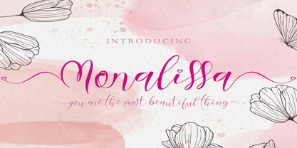 Monalissa is a very beautiful, high-quality font that is made with great love. This font can make your work more beautiful and elegant. This font is perfect for marketing your products, promoting your business, making quotes, weddings, invitation cards, logos, branding and status updates on social media, can also be used to beautify your beautiful moments, and others.
 - Attention Seeker by Hanoded,
$15.00 Attention Seeker does seek attention: it looks like a stencil font, and it sort of is, but it wasn’t made with stencils. It was made with a brush and ink on paper - just like that! Use Attention Seeker for your revolutionary posters, your books, your products or your posters, I am sure the end result will make heads turn.
 - Pineforest by Almarkha Type,
$29.00 Introducing our latest display typeface called Pineforest. A unique Fonts with vintage taste can make your lettering / logotype become more interesting. Pineforest fonts perfectly made to be applied especially in logo, and the other various formal forms such as logos,invitations, labels, magazines, books, packaging, fashion, make up, stationery, labels or any type of advertising purpose
 - Vinila by Plau,
$30.00 Grotesques can answer a really wide variety of design problems and go from small sizes to large without missing a beat. Vinila is Flora de Carvalho's take on the genre. The family’s multi-purpose intention comes from having 4 widths - from compressed to extended, each with 6 weights and obliques. Rhythm and music played an important part in the design of this font, which started off as the lettering for a Brazilian Music album. Its distinctiveness comes from having powerful ink traps that go from elegant and supple in the lighter styles to commanding and impactful in the heavier styles. A distinct rhythm is achieved, making it a strong face for editorial design, branding projects and so much more. Vinila is the ideal companion to expressive display faces, where it serves a supporting role with a marked presence. We use Vinila every day in our own brand identity. We've had some of the best designers use it and test it in many different environments, printed, digital, mobile and more (they really like it!). Also in the package, Vinila Variable is an experimental version of Vinila, where you can have a virtually infinite mix of weights, widths and slant, all from a single font file. Available when you license the complete family. Vinila pairs happily with our cheerful Manteiga , elegantly with our organic didone Tenez and mechanically with our monospaced Odisseia . What other matches can you think of?
 - Nathaniel by Mevstory Studio,
$25.00 Nathaniel The "Nathaniel " font family epitomizes beauty and elegance in every character. With two distinct styles, Regular and Italic, this font is the perfect choice to infuse sophistication into your design projects. Key Features: Elegance and Beauty: Nathaniel has been meticulously crafted to ensure each letter is visually captivating. It's an ideal choice for creating stunning quotes and long paragraphs in your designs. Feminine Appeal: This font is perfectly suited for designs with a feminine touch, such as fashion, magazines, and logos with a simple yet enchanting design. Artistic Pairings: Nathaniel seamlessly complements script fonts, enhancing the artistic appeal of your projects. Combine these two font styles to create unique and attention-grabbing designs. Recommended Uses: Inspirational Quote Designs: Use Nathaniel to create motivational and inspirational quotes for social media, posters, or merchandise. Fashion and Magazine Design: Nathaniel is the perfect choice to create a luxurious and feminine look in magazine layouts and fashion promotions. Simple and Classy Logos: Craft simple yet character-filled logos using Nathaniel to represent your brand with unmatched style. Nathaniel is the perfect fusion of beauty and functionality, elevating your design projects to the next level. With this font, you'll be able to create impressive and captivating works. Get Nathaniel today and start making your design projects stand out. Don't miss out on this opportunity! Get Nathaniel now and start inspiring the world with your captivating designs.
 - Grammatik by Letterhead Studio-VG,
$15.00 Grammatik was made in the end of 2004. This typeface is clear and simple hybrid between sans and serif styles, which was so popular late 90s. Use Grammatik as a display face for best results.
 - Eatboy by Figuree Studio,
$15.00 Say hello to Eatboy font. Made with love and joy. Comic look, Bold, Thick, so it will make your design more beautiful, cute, fun, and colorful. It comes In two awesome styles, regular and italic.
 - !Sketchy Times - Unknown license

- !MISQOT - 100% free

- Lust Hedonist by Positype,
$50.00 Check out the new Lust Pro & Lust Pro Didone to see how the series has grown and evolved. Confident, voluminous and versatile, Lust is an exercise in indulgence—an attempt to create something over the top and vastly useful. Lust Hedonist pushes contrast almost to the limit. The letterforms, especially the Script style are very self-indulgent for me, dare I say Hedonistic, and how I like to see letter masses taken to extreme contrast. The series unapologetically channels Herb Lubalin, but produced with a deliberate, contemporary twist. There is an intentional slyness infused in the letterforms—the extreme thick and thin lines flow effortlessly without becoming gratuitous. It’s always just enough, not too much. What makes the type series so appealing? The curves. When asked to describe the letterforms, most people unwittingly allude to the human form, using adjectives usually reserved for describing physical traits… creating all-too-familiar comparisons. Summerour has grown to accept this as unavoidable and reasonable given his acknowledgement of its influences and has provided nuances within the letterforms to accentuate that.
 - Plantin by Monotype,
$29.99 Plantin is a Renaissance Roman as seen through a late–industrial-revolution paradigm. Its forms aim to celebrate fine sixteenth century book typography with the requirements of mechanized typesetting and mass production in mind. How did this anomalous design come about? In 1912 Frank Hinman Pierpont of English Monotype visited the Plantin-Moretus Museum in Antwerp, returning home with “knowledge, hundreds of photographs, and a stack of antique typeset specimens including a few examples of Robert Granjon’s.” Together with Fritz Stelzer of the Monotype Drawing Office, Pierpont took one of these overinked proofs taken from worn type to use as the basis of a new text face for machine composition. Body text set in Plantin produces a dark, rich texture that’s suited to editorial and book work, though it also performs its tasks on screen with ease. Its historical roots lend the message it sets a sense of gravity and authenticity. The family covers four text weights complete with italics, with four condensed headline styles and a caps-only titling cut. Plantin font field guide including best practices, font pairings and alternatives.
 - Full Tools by Bülent Yüksel,
$9.00 Full Tolls is the younger brother of original Full Sans, Full Neue and Full Slab. Full Tools started with Social Media Icons. In the following days coming new icons. For example "Full Tools - Communication" and "Full Tools - Emojis" and mode. To take up less space and simplifying icons on the web and phone apps. All icons bigger 110% from another Full Brothers. Full Tools is the perfect font for web use. You can enjoy using it. EMOJI ICONS - Amazed - Angry - Beard - Crying - Dead - Dissapointed - Embarrassed - Evil - Friendly - Happyness - Happy - Hilarious - In-love - Indifferent - Kiss - Laughing - Lovely - Muted - Nerd - Quiet - Sad - Scaret - Smile - Stress - Sunglasses - Suprised - Suspect - Thief - Tongue - Wink SOCIAL MEDIA ICONS - Amazon, - Android, - Apple, - Bechance, - Bing, - Box, - Buffer, - Creative Market, - Crome, - Delicious, - Deviantart, - Dribbble, - Dropbox, - Etsy, - Facebook, - Facebook Like, - Facebook Unlike, - Flckr, - Firefox, - Foursquare, - Google+, - Grafiport, - Hi5, - Howcast, - Html5, - Instagram, - Klikstarter, - Linkedin, - Messenger, - Myspace, - Myfonts, - Opera, - Path, - Paypal, - Periscope, - Pinterest, - Plaxo, - Quora, - Reddit, - Rss, - Shutterstock, - Skype, - Snapchat, - Spotify, - Stumbleupon, - Twitter, - Trello, - Tumblr, - Vimeo, - Vine, - WhatsApp, - Wikipedia, - Wordpress, - Yelp, - Youtube You can enjoy using it.
 - Faber Fraktur by Ingo,
$22.00 A modern black-letter, so to speak. Composed of a few basic elements with a wide-quill ductus. Faber Fraktur was based on the idea that it must be possible to create a modern black-letter type. The typeface is ”constructed“ according to the same principles as a script without serifs: as few varied basic forms as possible, omission of frills which make the type difficult to read and repetition of similar forms. The typical contrasting strokes of the original handwritten black-letter script are retained nonetheless. The elements of this typeface were even pre-formed with the quill. All characters are reduced to their basic skeleton. The fanciness and manifold ”breaks“ or fractures typical of black-letter typefaces are considerably reduced to just a few essentials. Faber Fraktur is a very legible type perfectly suitable for long texts. It does not appear nearly as foreign and archaic as the old black-letter fonts. The capital letters especially have a charm of their own radiating a kind of playfulness in spite of their severe form.
 - Antica by Sudtipos,
$39.00 Antica has sharp triangular serifs, and in 8 weights with true italics, it forms a family that stylistically finds its origins in Latin styles of the nineteenth century. The font incorporates additional swashes, small caps and stylish alternates that advance the aesthetic from its roots and make it appropriate for modern design. Commonly named ‘Latin types’ did not vary in weight, but we decided to create Antica with a range that goes from thin to black and we also added extra curlicues to the letterforms. Antica borrows from the versatility and freedom granted to type founders of the nineteenth century – a time when the meteoric growth of mass-produced consumer goods led to an increased demand for publicity that needed fresh, attention grabbing typefaces. And as an homage to these Latin types we designed Antica to function well with an array of projects from stylized labels and formal editorial design requiring small type sizes to large-scale posters and billboards. The Antica family supports a wide variety of Latin alphabet-based languages.
 - ITC Merss by ITC,
$29.99ITC Merss proves that sometimes accidents work out just fine. Late one evening Eduardo Manso, an Argentinean graphic and type designer, spilled coffee on his desk. When he began to wipe up the mess, he noticed that one of the splashes looked like a roman letter 'l' - complete with serifs. This triggered his imagination. “What if a complete alphabet was created with this same irregular flow to the character designs?” ITC Merss was the result of Manso's experiments with “fluid” letter shapes. The oddly handsome design looks aged and spontaneous at the same time. Its irregular texture is striking-the result of careful modeling of character shapes. While Manso wanted to maintain the free-form character of spilled liquid, he also knew the individual letters had to work together with an underlying harmony. When not experimenting with typefaces - or spilled coffee - Manso creates award-winning graphic and publication designs. A contributor to the design magazine el Huevo (the Egg), he also writes articles on type and typography and is part of the publication's design team. - Atrament by Suitcase Type Foundry,
$75.00The Atrament font family was originally conceived in 2003 as the corporate display type family for Suitcase Type Foundry. Its original source of inspiration is the front cover of the Devetsil - Revolucni slovn’k almanac (1922), designed by Karel Teige. The lettering on this cover is a condensed sans serif with rounded stroke terminals. Atrament is significantly broader than the model and its characters are better balanced, reflecting the evolution of semi-condensed sans serifs throughout the 1960s. The horizontal strokes of both lower and upper case are less stressed than the vertical stems. Noteworthy are the unusual tiny gaps in the apex and vertex of letters with diagonal strokes, designed to prevent ink from spreading and smudging the letter shapes. This detail is one of the main features of the font's character. The general feel of the italics closely matches the strictly vertical, parallel character of the regular cut. When converting the family to OpenType the alternate character shapes from the Alternator weights were incorporated in the regular cut, which allows the user to switch selected characters from one shape to another within the same font. A number of glyphs and accents were corrected, and all the glyphs missing in the Suitcase Standard character set were added, along with the relevant kerning pairs. The individual weights of Atrament Std thus contain accented upper and lower case, small caps, alternate glyphs for most European languages, nine types of numerals, superscript characters, caps glyph versions, and much more. Its narrow proportions make Atrament the perfect choice whenever economy of space is a must. It is however not very well suited for setting long texts. Ideal for headlines and display use, it is perfect for situations where the text needs to make a great impact in a little space.

