10,000 search results
(0.292 seconds)
- Tomboy LP by LetterPerfect,
$39.00 Tomboy is a type design based on informal handwriting. Its presence on the page is friendly and easy to read, suitable for correspondence, brief text, and for display use in titles and headlines. Three weights -- Light, Medium & Bold -- allow Tomboy to speak in a wide range of voices.
 - Metafora by Dirtyline Studio,
$17.00 Metafora Sans is a contemporary display family with multifunctional workhorse designed to work best in any printed and on screen contexts, including logo design, brand identities, websites, packaging, poster and headline. The Typeface come in 13 weights, with Upright and Oblique each, for a total of 26 styles.
 - Wendy LP by LetterPerfect,
$39.00 The Wendy family is a cursive script provided in three weights -- Light, Medium and Bold. The design is an upright, casual handwriting style, with natural joins and connecting strokes. Wendy, in her various modes, projects a friendly persona, adding an approachable quality to headlines and short runs of text.
 - LGF Avadar by LGF Fonts,
$9.00 Avadar is a typeface with a fine serif of straight lines and an inner line that breaks the glyph in two. The type is indicated for use in large or very large sizes, especially for display graphics; the spacing between glyphs makes the readability of the text increase.
 - Canterbury Sans by Red Rooster Collection,
$45.00 Based on the Morris F. Benton for ATF in 1920, it was not completed for production until 1926. The serif version we released a few years ago was so popular, that we decided to design a complementary sans serif version in three weights, along with three corresponding Swash fonts.
 - Atrament by profonts,
$41.99 Another beautiful script design by German type designer Ralph M. Unger. Atramant is casual and easy, ideal for any setting in larger sizes. Still, due to its excellent legibility, it can also be used for short text blocks in smaller sizes. Atrament was originally designed for the URW++ FontForum.
 - Promenades - Personal use only

- Tempora LGC Uni - 100% free

- Soul Lotion by TypoGraphicDesign,
$19.00 CONCEPT/CHARACTERISTICS The typeface “Soul Lotion” is a sans serif font for display sizes. Constructed, clear and simply with monoline character. The round and unadorned look is modern & simple. APPLICATION AREA The modern, clear and simply sans serif font “Soul lotion” would be happy as a display typeface in headline size on the following areas and there simply feel good: Logos/Wordmarks, party flyer, album covers, CD covers, Poster design, video game design, and much more as display typeface for print and digital magazines, books and websites. TECHNICAL SPECIFICATIONS Headline Font | Display Font | Sans Serif Font “Soul Lotion” OpenType Font (Mac + Win) with 6 styles (regular, bold, light + 3x italic) & 354 glyphs. Incl. accents, alternative letters, ligatures & €. Desktop Font (.otf) + Web Font (.svg, .eot, .woff) KONZEPT/BESONDERHEITEN Die Schrift »Soul Lotion« ist ein serifenloser Font für Headlinegrößen. Konstruiert, klar und einfach mit gleichbleibender Strichstärke. Die runden und schnörkellosen Formen wirken modern & schlicht. EINSATZGEBIETE Die moderne, klare und einfache Sans Serif Schrift »Soul Lotion«, würde sich als Auszeichnungsschrift in Headlinegröße über folgende Einsatzgebiete sehr freuen und sich dort schlicht wohlfühlen: Logos/Wortmarken, Flyer für fast jede Party, PlattenCover, CD-Cover, PlakatDesign, Videospiel Design, als Headlineschrift für print und digitale Magazine, Bücher und Webseiten u.v.m. TECHNISCHE INFORMATIONEN Headline Font | Display Font | Sans Serif Font »Soul Lotion« OpenType Font (Mac + Win) mit 6 Schriftschnitten (regular, bold, light + 3x italic) & 354 Glyphen. Inkl. diakritisches Zeichen, alternative Buchstaben, Ligaturen & €. Desktop Font (.otf) + Web Font (.svg, .eot, .woff)
 - TT Backwards by TypeType,
$29.00 TT Backwards useful links: Specimen | Graphic presentation | Customization options About TT Backwards: TT Backwards is an experimental font project inspired by the USSR typography and fonts of the late 70s and early 80s. Shop signs, posters, and book design—this is where we drew the inspiration for our project. TT Backwards consists of two complementary font subfamilies, a Script and a Grotesque, each of them includes 5 typefaces in 5 different weights (Thin, Light, Regular, Bold, Black). TT Backwards Script is a noncontrast almost monolinear solid script inspired by shop signs, poster and book design of the USSR. TT Backwards Script features a large number of Latin and Cyrillic ligatures (more than 70 items), which allows to make the script versatile and sophisticated to the max. And thanks to the implementation of a huge number of context alternates, all lowercase letters are joined softly and without breaks, and they meet the uppercase letters beautifully and correctly. TT Backwards Script supports the following OpenType features: liga, case, ordn, frac, sups, sinf, numr, dnom, tnum, onum, pnum. TT Backwards Sans is a narrow grotesque, which takes us back to the book design of late 70s and early 80s with its ductile characters. It is created considering its use in the small text size. TT Backwards Sans has a number of pronounced peculiarities: high x-height, exaggerated extenders, and big visual compensators and ink traps. Apart from the basic visual solution, TT Backwards Sans contains two experimental stylistic sets, which markedly change the overall visual perception of the text. SS01 alters high-frequency symbols of the Cyrillic alphabet, and SS02 significantly changes the high-frequency symbols of the Latin alphabet. FOLLOW US: Instagram | Facebook | Website TT Backwards OpenType features: case, ordn, frac, sups, sinf, numr, dnom, tnum, pnum, liga, zero, salt, ss01, ss02. TT Backwards language support: Acehnese, Afar, Albanian, Alsatian, Aragonese, Arumanian, Asu, Aymara, Banjar, Basque, Belarusian (cyr), Bemba, Bena, Betawi, Bislama, Boholano, Bosnian (cyr), Bosnian (lat), Breton, Bulgarian (cyr), Cebuano, Chamorro, Chiga, Colognian, Cornish, Corsican, Cree, Croatian, Czech, Danish, Embu, English, Erzya, Estonian, Faroese, Fijian, Filipino, Finnish, French, Friulian, Gaelic, Gagauz (lat), Galician, German, Gusii, Haitian Creole, Hawaiian, Hiri Motu, Hungarian, Icelandic, Ilocano, Indonesian, Innu-aimun, Interlingua, Irish, Italian, Javanese, Judaeo-Spanish, Judaeo-Spanish, Kalenjin, Karachay-Balkar (lat), Karaim (lat), Karakalpak (lat), Kashubian, Khasi, Khvarshi, Kinyarwanda, Kirundi, Kongo, Kumyk, Kurdish (lat), Ladin, Latvian, Laz, Leonese, Lithuanian, Luganda, Luo, Luxembourgish, Luyia, Macedonian, Machame, Makhuwa-Meetto, Makonde, Malay, Manx, Maori, Mauritian Creole, Minangkabau, Moldavian (lat), Montenegrin (lat), Mordvin-moksha, Morisyen, Nahuatl, Nauruan, Ndebele, Nias, Nogai, Norwegian, Nyankole, Occitan, Oromo, Palauan, Polish, Portuguese, Quechua, Rheto-Romance, Rohingya, Romanian, Romansh, Rombo, Rundi, Russian, Rusyn, Rwa, Salar, Samburu, Samoan, Sango, Sangu, Scots, Sena, Serbian (cyr), Serbian (lat), Seychellois Creole, Shambala, Shona, Slovak, Slovenian, Soga, Somali, Sorbian, Sotho, Spanish, Sundanese, Swahili, Swazi, Swedish, Swiss German, Swiss German, Tagalog, Tahitian, Taita, Tatar, Tetum, Tok Pisin, Tongan, Tsonga, Tswana, Turkish, Turkmen (lat), Ukrainian, Uyghur, Vepsian, Volapük, Võro, Vunjo, Xhosa, Zaza, Zulu.
 - Dissert by Skiiller Studio,
$20.00 Dissert is a playful and unique display font with a charming feel. Get inspired by its unique authentic charm! What's include: Ligature PUA Encoded Characters - Fully accessible without additional design software. Basic Latin Language Support (AÀÁÂÃÄÅCÇDÐEÈÉÊËIÌÍÎÏÑOØÒÓÔÕÖUÙÜÚÛWYÝŸÆß ) How to access alternate glyphs? you can see it on this link ( http://goo.gl/1vy2fv )
 - LinkeHand Pro by Oliver Linke Type Foundry,
$12.50 LinkeHand Pro was based on the handwriting of Oliver Linke. Due to its rather compact appearance with short ascenders and descenders LinkeHand can be used with rather tight line spacing. Both Regular and Bold come with Small Caps and a multitude of special ligatures to make LinkeHand look really manually written.
 - Sontira by Brand Type,
$25.00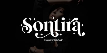 Sontira - Elegant Stylish Sontira is a stylish font that is chic, elegant and unique font that uses ligatures to smoothly link letters. Perfect for branding, logos, invitation, masterheads and more. Wish you enjoy our font and if you have a question, don't hesitate to drop message & I'm happy to help :)
 - Cornucurlia by Calligraplay,
$13.00 Cornucurlia is a carefully constructed typeface comprising curvaceously connected characters. Designed as a display font, use it for posters, signage, branding and any type-based artwork that needs stylish, standout lettering. Multi-lingual and with a range of symbols, the font includes 368 glyphs that link together with geometric curves.
 - Fast Freddy NF by Nick's Fonts,
$10.00An uncredited typeface from Photo-Lettering Inc. named Palisade Graphic was the inspiration for this Art Deco fantasy. Bold and brash, it adds undeniable impact to period-themed headlines. Both versions include the complete Latin 1252, Central European 1250 and Turkish 1254 character sets, with localization for Lithuanian, Moldovan and Romanian. - Slagless by Almarkha Type,
$29.00 Hello Introducing, Slagless - Urban Display Serif is unique font that uses 19 ligatures to smoothly link letters. inspired by the famous urban logo, perfect for the purposes of designing templates, brochures, videos, advertising branding, logos and more. Perfect for adding a unique twist to word-mark logos, monograms or pull quotes.
 - Black Delights by Mokatype Studio,
$19.00 Hello Introducing, Black Delights - Elegant Ligatures Connected Serif is an elegant and unique font that uses ligatures to smoothly link letters. Perfect for adding a unique twist to word-mark logos Black Delights has 16 ligatures as well making it super fantastic.Ligature can be turned off if required standard writing needs.
 - Neuzeit Office Soft Rounded by Linotype,
$29.99 Every year, more and more text is read directly on a computer screen in office applications, or from freshly printed sheets from a copier or laser printer. Clear, legible text faces are more imperative to office communication than ever before. Yet every worker desires a small bit of personality in the corporate world. Most office environments are only equipped with a few basic fonts that are truly optimized for use in text, with laser printers, and on screen. The Linotype Office Alliance fonts guarantee data clarity. All of the font weights within the individual family have the same character measurements; individual letters or words may have their styles changed without line wrap being affected! All numbers, mathematical signs, and currency symbols are tabular; they share the same set character width, ensuring that nothing stands in the way of clear graph, chart, and table design. In addition to being extremely open and legible, the characters in this collection's fonts also share the same capital letter height and the same x-height. The production and reading of financial reports is duly streamlined with the Linotype Office Alliance fonts. The Neuzeit Office family is designed after the model of the original sans serif family Neuzeit S, which was produced by D. Stempel AG and the Linotype Design Studio in 1966. Neuzeit S itself was a redesign of D. Stempel AG's DIN Neuzeit, created by Wilhelm Pischner between 1928 and 1939. Intended to represent its own time, DIN Neuzeit must have struck a harmonious chord. DIN Neuzeit is a constructed, geometric sans serif. It was born during the 1920s, a time of design experimentation and standardization, whose ethos has been made famous by the Bauhaus and De Stijl movements in art, architecture, and design. Upon its redesign as Neuzeit S in the 1960s, other developments in sans serif letter design were taken into account. Neuzeit S looks less geometric, and more gothic, or industrial. Separating it from typefaces like Futura, it has a double-storey a, instead of a less legible, single-storey variant. Unlike more popular grotesque sans serifs like Helvetica, Neuzeit S and especially the redesigned Neuzeit Office contain more open, legible letterforms. Neuzeit Office preserves the characteristic number forms that have been associated with its design for years. After four decades, Neuzeit has been retooled once again, and it is more a child of its age than ever before. Akira Kobayashi, Linotype's Type Director, created the revised and updated Neuzeit Office in 2006. His greatest change was to retool the design to make its performance in text far more optimal. Additionally, he created companion oblique to help emphasize text. The other three families in the Office Alliance system include Metro Office, Times Europa Office and Trump Mediaeval Office.Some weights of the Neuzeit Office are availabla as soft rounded versions. "
 - Refinery by Kimmy Design,
$10.00 Refinery is the newest font in the Evanston Collection of square typefaces. With a similar capital structure to Tavern and Alehouse, Refinery includes both lowercase and small caps, making it an ideal typeface for paragraph text settings. It also comes in a wide array of weights and widths, with 85 font files in total. DESIGN Refinery has it’s roots in early 20th century signage and saloon typography, but has been modernized - even future-ized - to fit the 21st century digital landscape. The design was aimed at providing a type family that could work in many modern design fields, from sports, tech and military to gaming, HUD, virtual reality and augmented reality. ENGINEERING Essentially. Refinery is a simple mono-linear square design has been expertly refined into an easy-reading sans serif typeface. It was designed to be used in both display and text settings. From hairline to black in ultra-narrow or extended, the wide array of weight and width options makes it easy to find the right font for each text need. SPECS Refinery not only includes 85 font files, but each one include a wide array of Opentype Extras that allow even further customization. • Stylistic Alternatives: Letters A W Y have a styling variation that rounds the pointed apex into a square curve. The S and 2 variation straightens the spine, making all curves in the alphabet read as 90º angles. • Small Capitals: A shortened version of the capitals for alternate header settings. • Titling Alternatives: In this typeface, this feature turns on lifted small caps. Take the small capitals, raise them to level with capitals and underline at the baseline. When multiple lowercase or small capital letters are typed in a row, the underlines connect, creating unique ligatures. • Figures: There are different figure styles for different text needs. Options include, proportional lining, tabular lining (for math), old style and small capitals. • Discretionary Ligatures: A little funk to this otherwise serious typeface. Letters with a long baseline or cap height stem - F, L, T - get elongated to hug a small capital vowel. Other ligatures include Co. and No. • Catchwords: These are common words that bring emphasis to a design. In English these words include ‘and’ ‘as’ ‘by’ ‘in’ ‘of’ ‘the’ ‘to’ ‘when’, among others. Refinery also includes multilingual catchwords of ‘el’ ‘la’ ‘oder’ ‘go’ ‘para’ ‘pour’ ‘und’ ‘y’, among others. For the full list, please check out the specimen images. EXTRAS To round the typeface off, a set of over 150 ornaments, icons, arrows, patterns and line breaks is included to provide complimentary graphics. These can be found in the Ornaments labelled font, it is recommended to use the Glyphs panel to select which text glyph is needed.
 - Minnak by Esintype,
$18.00 Minnak, as a whole geometric display type is our take on Square Kufic (Makili) style Latin script fonts, comes in eleven weights with linear progression. It is an Uniwidth typeface at the core. From Hairline to Black, all multiplexed weights take up the same space in width and can be used interchangeably. Supports wide range of Open Type features, with many stylistic alternates in 12 context. Minnak is also have a close relation with pixel fonts, because in spite of its based on Makili forms, it all started as a pixel font in the drawing stage before further steps came into play. The key difference between Minnak and Makili style is that the latter must have the exact square counters with no diagonal strokes, and any other components of a letterform must conform to be proportional. Such style-specific requirements determine the overall dimensions of the glyphs and therefore, there can be only minor differences between the typefaces. In Minnak, counters are rectangular because of its narrow and condensed proportions, but the Makili form influence is still manifest. This impression is best confirmed with Medium weight where negative spaces and stem thickness are equal. Contrast and virtually no optical correction were presented, as characteristic of its genre had to have equal horizontal and vertical line thicknesses. As per the minimal and authentic look of the type, all glyphs are drawn as straight or only as 45-degree diagonal strokes. The representation of the ‘diagonalless’ approach is preserved by stylistic alternatives, making its similarity in visual aesthetics clearly visible. Marks and punctuation is another feature that doesn’t follow the strict rules of the origin style. Although not a pixel font, all building parts of the glyphs in Minnak share the same unit precision as they are designed with pixel equivalents in mind. Even space characters are designed to match glyph widths, meeting the demands of certain typesetting or multi-line lettering compositions. With its Pseudo Ancient and Runic alternates, extention parts and ornaments included in all weights, Minnak is suitable for branding, logo and monogram designs, the screen titles and headlines, packaging, posters, book covers and more, where it shines at big sizes. Its pixel font-like appearance makes it a significant choice for the modern compositions. Thanks to mostly uniform width design, it is possible to use Minnak also as a system for lettering. This feature can be used as vertical fitting of the letters between the lines. As a casual expression in Turkish, “Minnak” is one of the seven typeface designs in Esintype's ancient scripts of Anatolia project, Tituli Anatolian series — representing Seljuk period in the medieval Anatolia and their tradition of architectural stone ornamentation.
 - Mrs Eaves XL Serif by Emigre,
$59.00 Originally designed in 1996, Mrs Eaves was Zuzana Licko’s first attempt at the design of a traditional typeface. It was styled after Baskerville, the famous transitional serif typeface designed in 1757 by John Baskerville in Birmingham, England. Mrs Eaves was named after Baskerville’s live in housekeeper, Sarah Eaves, whom he later married. One of Baskerville’s intents was to develop typefaces that pushed the contrast between thick and thin strokes, partially to show off the new printing and paper making techniques of his time. As a result his types were often criticized for being too perfect, stark, and difficult to read. Licko noticed that subsequent interpretations and revivals of Baskerville had continued along the same path of perfection, using as a model the qualities of the lead type itself, not the printed specimens. Upon studying books printed by Baskerville at the Bancroft Library in Berkeley, Licko decided to base her design on the printed samples which were heavier and had more character due to the imprint of lead type into paper and the resulting ink spread. She reduced the contrast while retaining the overall openness and lightness of Baskerville by giving the lower case characters a wider proportion. She then reduced the x-height relative to the cap height to avoid increasing the set width. There is something unique about Mrs Eaves and it’s difficult to define. Its individual characters are at times awkward looking—the W being narrow, the L uncommonly wide, the flare of the strokes leading into the serifs unusually pronounced. Taken individually, at first sight some of the characters don’t seem to fit together. The spacing is generally too loose for large bodies of text, it sort of rambles along. Yet when used in the right circumstance it imparts a very particular feel that sets it clearly apart from many likeminded types. It has an undefined quality that resonates with people. This paradox (imperfect yet pleasing) is perhaps best illustrated by design critic and historian Robin Kinross who has pointed out the limitation of the “loose” spacing that Licko employed, among other things, yet simultaneously designated the Mrs Eaves type specimen with an honorable mention in the 1999 American Center for Design competition. Proof, perhaps, that type is best judged in the context of its usage. Even with all its shortcomings, Mrs Eaves has outsold all Emigre fonts by twofold. On MyFonts, one of the largest on-line type sellers, Mrs Eaves has been among the 20 best selling types for years, listed among such classics as Helvetica, Univers, Bodoni and Franklin Gothic. Due to its commercial and popular success it has come to define the Emigre type foundry. While Licko initially set out to design a traditional text face, we never specified how Mrs Eaves could be best used. Typefaces will find their own way. But if there’s one particular common usage that stands out, it must be literary—Mrs Eaves loves to adorn book covers and relishes short blurbs on the flaps and backs of dust covers. Trips to bookstores are always a treat for us as we find our Mrs Eaves staring out at us from dozens of book covers in the most elegant compositions, each time surprising us with her many talents. And Mrs Eaves feels just as comfortable in a wide variety of other locales such as CD covers (Radiohead’s Hail to the Thief being our favorite), restaurant menus, logos, and poetry books, where it gives elegant presence to short texts. One area where Mrs Eaves seems less comfortable is in the setting of long texts, particularly in environments such as the interiors of books, magazines, and newspapers. It seems to handle long texts well only if there is ample space. A good example is the book /CD/DVD release The Band: A Musical History published by Capitol Records. Here, Mrs Eaves was given appropriate set width and generous line spacing. In such cases its wide proportions provide a luxurious feel which invites reading. Economy of space was not one of the goals behind the original Mrs Eaves design. With the introduction of Mrs Eaves XL, Licko addresses this issue. Since Mrs Eaves is one of our most popular typefaces, it’s not surprising that over the years we've received many suggestions for additions to the family. The predominant top three wishes are: greater space economy; the addition of a bold italic style; and the desire to pair it with a sans design. The XL series answers these requests with a comprehensive set of new fonts including a narrow, and a companion series of Mrs Eaves Sans styles to be released soon. The main distinguishing features of Mrs Eaves XL are its larger x-height with shorter ascenders and descenders and overall tighter spacing. These additional fonts expand the Mrs Eaves family for a larger variety of uses, specifically those requiring space economy. The larger x-height also allows a smaller point size to be used while maintaining readability. Mrs Eaves XL also has a narrow counterpart to the regular, with a set width of about 92 percent which fulfills even more compact uses. At first, this may not seem particularly narrow, but the goal was to provide an alternative to the regular that would work well as a compact text face while maintaining the full characteristics of the regular, rather than an extreme narrow which would be more suitable for headline use. Four years in the making, we're excited to finally let Mrs Eaves XL find its way into the world and see where and how it will pop up next.
 - Le Charisme by Prestige Artsy Studio,
$19.00 Le Charisme is a modern charismatic and timeless all-caps serif font that is perfect for any branding project. Le Charisme is also ideal for quotes, headings, or even wordmark logos. Le Charisme provides a beautiful touch of charisma and class to your projects. Le Charisme comes in with its official alternates and ligatures that are ideal to incorporate in your luxurious projects. The font is fully accessible by trying in lowercase and uppercase. I can't wait to see what you can do with Le Charisme.
 - Pueblito by Corradine Fonts,
$15.00 Pueblito is a hand drawn font with a rustic and antique appearance. Was inspired from old books and newspapers but express a very own personality and not necessary represent a specific classic style. The family consists of twelve fonts in six weights plus a set of ornaments in order to compose all kind of texts. Using Pueblito in your projects, you can obtain an original aged flavor and just by adding a subtle texture effect will help you to obtain the desired vintage look.
 - Mundial by TipoType,
$24.00 Mundial translates as “Worldwide”, this name is a statement: the idea of synthesizing characteristics from different traditions in a single typographic style. Here and there you can see gestures that are clearly associated with different eras and cultures, but not to be confused: the main characteristic of Mundial is the summary, the cohesion and the sum that results in more than each individual part. Mundial is a typeface for this time in which individual identity marks, are the best aid to build a world together.
 - Barock 1720 by SoftMaker,
$10.99 Blackletter is the classic “German” printing type. Starting in the 16th century and lasting well into the 20th century, most works in Germany were printed using blackletter types. Today, blackletter fonts are mainly used decoratively. If you want to communicate a feeling of old-world quality or nostalgia, blackletter fonts are the preferred choice – use them on signs, in brochures or on invitation cards. Barock 1720 is a classic blackletter font of its epoch which inspires you to create vintage-looking designs with ease.
 - Alethia Next by Pepper Type,
$40.00 Alethia Next is a grotesque sans-serif typeface with high contrast in all weights. It has been designed to serve as a display typeface in various editorial projects, such as magazines or corporate brochures, as a sans-serif pair to serif types of modern style. Alethia Next comes in 7 weights + matching italics and upright italics, each supporting numerous Latin-based languages as well as major Cyrillic languages including Bulgarian local forms. It is packed with OpenType features like ligatures, small caps, and numerous alternatives.
 - Hoax Vandal by Sipanji21,
$25.00 "Hoax Vandal" is a graffiti font designed with a monoline style, featuring consistent line thickness throughout the characters. Fonts in the monoline category maintain uniformity in stroke width, creating a clean and sleek appearance. In the context of graffiti, this style often provides a smooth and fluid look to the text, giving it a modern and artistic vibe. This font, "Hoax Vandal," with its monoline design, is suitable for various design projects where a graffiti-inspired typographic style with a clean and consistent appearance is desired.
 - America by Peliken,
$14.00 America otf color font. Letters and numbers in national flag design, stripes of red and blue, white stars ornament for festive decoration.You can use this font for design logos, quotes prints on t-shirts, Presidential election posters and other. OpenType-SVG Font was designed with Fontself Maker in Illustrator CC. WARNING Color fonts are pretty new technology - they currently show up in Photoshop CC 2017+, Illustrator CC 2018 and some Mac apps. Learn more about color font support on third-party apps here: https://www.colorfonts.wtf/
 - Scalter by Dirtyline Studio,
$25.00 SCALTER was designed in the early April and published in July 2020. Scalter Serif is inspired by the characteristics American vintage sign then the sans serif it’s combination retro typeface. All shape of this typeface is make strong and more contrast, giving a more dynamic and retro feel. Scalter are available in 5 Widths (Condensed – SemiCondensed – Normal – SemiExpanded – Expanded) with matches 4 style (Serif – Semi Serif – Sans Bold- Sans Black - Script) with a total 42 Styles. Also includes support for 26+ Latin (Extended) Languages.
 - Steno Pro by DBSV,
$10.00 About family “StenoPro” Short for stenography… The name of the font was taken from the method of high-speed writing (shorthand) with a special alphabet. In shorthand, the rule "write as you hear" applies, that is, spelling is not observed. Capitalization, accents, ghosts, and punctuation except the semicolon are removed. In narrow letters you have the advantage of more words in a limited space… This series is composed and includes dozen fonts with 633 glyphs each, with true italics, and supports of course: Latin, Greek & Cyrillic.
 - Legatum by Fontop,
$11.00 Legatum is a new look at a classical serif Roman font and inspired by Roman sycamore, columns and architectural details of the Eternal City. The shapes of the letters and perfectly balanced high-contrast makes each sign look elegant, sophisticated and eye-catching. Looks great in headlines of posters, text in magazines, books. Also can be used in logos and blog posts. Each font has Latin multi-lingual support as well as uppercase letters, lowercase letters, numbers and basic punctuations and all necessary ligatures and alternates.
 - Evcial by EVCco,
$20.00 Inspired by the elegant, rounded geometry of classic sans-serifs like Harry™ and Cirkulus™, Evcial was designed in 2000 to serve as the logo font for EVCco's website. The composition of each alpha-numeric glyph in Evcial is restricted solely to circular curves and lines of either 90 or 55 degrees, thus lending an air of chic consistency to this sophisticated typeface. Comes packaged in both TrueType and OpenType formats with standard complement of alpha-numeric glyphs, punctuation marks, mathematical symbols, and Western European diacritics.
 - Albrecht Duerer Fraktur Pro by SoftMaker,
$10.99 Blackletter is the classic “German” printing type. Starting in the 16th century and lasting well into the 20th century, most works in Germany were printed using blackletter types. Today, blackletter fonts are mainly used decoratively. If you want to communicate a feeling of old-world quality or nostalgia, blackletter fonts are the preferred choice – use them on signs, in brochures or on invitation cards. Albrecht Duerer Fraktur Pro is a classic blackletter font of its epoch which inspires you to create vintage-looking designs with ease.
 - Fred by E-phemera,
$20.00The Fred family is based on the casual hand lettering of Fred G. Cooper: cover artist, cartoonist, and letterer for Life magazine in the 1920s and '30s. His relaxed style captures the flavor of the Roaring Twenties, and the digital font was developed for use in the credits and title cards for a 1920s-style silent movie, The Call of Cthulhu. In an effort to keep the hand-lettered look, the OpenType font has numerous discretionary ligatures and contextual alternates, along with fleurons and ornaments. - Traveller by Holland Fonts,
$30.00A geometric design, published in Rick Poynor’s Typography Now 1 (Booth-Clibborn Editions, London UK,1991). Discussing these kinds of angular styles, the critic Rick Poynor noted that "fate has overtaken the angular post-constructivist type design of Neville Brody, Zuzana Licko and Max Kisman". Poynor described a process by which typefaces, once “fresh, unexpected, precisely attuned to the moment”, get used increasingly often in less and less appropriate contexts and end up looking "irredeemably passé". (Poynor, Rick, ‘American Gothic’ in Eye Magazine, 6/1992) - MFC Deco Diamond Monogram by Monogram Fonts Co.,
$19.00 MFC Deco Diamond Monogram finds its historical influence in a vintage monogram transfer sheet of unknown origin. We've digitally recreated it, adding missing characters to fill out the character set, and programming in functionality to make customization a snap. MFC Deco Diamond Monogram is capable of creating two or three letter monograms, either free-floating or surrounded by a selection of different frames. If you are looking for a diamond format monogram with deco influence, then you've found yourself your mark maker in MFC Deco Diamond Monogram.
 - Option by Vladimir Likh,
$10.00 Option is a modern condensed sans serif. Inspired by geometric architectural fonts. But despite the geometric construction every single letter was build based on optical evaluation. This approach makes Option more organic and lively in a text line. Option was created for wide spaces. Condensed and thin, but extremely sweeping vertically font makes your massage elegance and strong. The font functions great in many sizes and surroundings. The family comes in one weights plus italics. Creating of bold weight is underway. Options supports Cyrillic as well.
 - Circolino by Aspro Type,
$19.99 Circolino is calligraphic script typeface set that is inspired by the letterforms taught in Italian schools. Each letter combination is designed to tie in perfectly within the word. In this regard, many contextual alternatives and letter variants have been designed, especially to make a more calligraphic feel. The Circolino character set consists of two families: Circolino Classic and Circolino Sport. The Classic Family has an almost vertical tilt axis, while Sport Family has a much more pronounced tilt axis that gives it more dynamism and movement.
 - Aleut by Peliken,
$14.00 Tribal Aleut OTF color font. Native Historic font, traditional ethnic characters in style of customs and traditions of national culture. You can use this font for design logos, quotes prints on t-shirts and other. OpenType-SVG Font was designed with Fontself Maker in Illustrator CC. Contains only uppercase letters and digits. WARNING Color fonts are pretty new technology - they currently show up in Photoshop CC 2017+, Illustrator CC 2018 and some Mac apps. Learn more about color font support on third-party apps here: https://www.colorfonts.wtf/
 - Shelf Numbers JNL by Jeff Levine,
$29.00Shelf Numbers JNL recreates the small plastic pricing tags that were used on grocery, drug, variety and liquor stores shelves for many years. The number keys have alternates in the shift position with a cent sign alongside the numbers. Also included are various phrases such as "for", "each", "lb." in the A-L/a-l keystrokes, and there is an additional set of numbers in the M-V/m-v keystrokes with a decimal point to the right of each numeral for dollar amounts.

