10,000 search results
(0.042 seconds)
- Garagin Rock by Rodrigo de Carvalho,
$14.50 Garagin Rock was developed from the studies for the title of a publication called Garagin in 1999. Its use is indicated for the titles on posters and stuff like that, but feel free to dare. Anyway, it really was not made for small sizes and is not a WebFont obviously, but again, feel free to dare. May you notice something odd in the baseline position, this is to keep leading with a defined size. But of course you can change it in any editing program. Being a heavy typeface, use in moderation... or not! Garagin Rock Lite is a version with a limited set of characters.
 - Exo Soft by Polimateria,
$35.00 Exo Soft. Technology meets humanity. The geometric design got organic with carefully crafted smoothed edges. Exo Soft is a contemporary sans-serif font with a warm and humane feeling. It has an extended language support (both in Latin and Cyrillic) and an handful set of Opentype features. The 9 weights plus correspondent italics give Exo Soft a huge versatility. Because aesthetics are not everything Exo Soft was fine tuned in order to perform well both in screen and in print. The large x-height and open counters makes it function well even on small font sizes but the full potential of Exo Soft will be seen on headlines, branding and advertising.
 - Royale by Resistenza,
$39.00 With Royale, Resistenza reinvents the bifurcated Tuscan genre in a contemporary, warm and playful form. Royale Basic doesn't include ligatures or alternates. Rounded terminals, fabulous fancy fun spurs with elegant and extravagant flourishing - Royale comes in 8 weights and 4 widths which can also be layered to create polychromatic effects in another nod to the Victorian era these styles were popularised. While inspired by days gone past this Royale is far from a revival as unlike the classic Tuscans which inspired its structure Royale is monoline and sophisticated in its simplicity. Perfect for display and emphasis, Royale will command attention and leave a memorable impression wherever it is used.
 - Cullion by Greater Albion Typefounders,
$9.95 Cullion is a new departure for Greater Albion, being a modern Fraktur, embodying future trends sch as highly stylised glyphs, a single case of lettering and highly evolved letterforms. At the same time it can trace its inspiration back to blackletter traditions, and is inspired by the sort of ironwork to be found in a medieval portcullis. The resulting typeface can sit happily in traditional, modern or futuristic design work. As the gallery images suggest, it does rather lend itself to work with a 'horror' theme, but it could have many other uses too-even in religious work. Cullion is particularly effective in poster headings.
 - HeyPumpkin by Ingrimayne Type,
$14.95 HeyPumkin is a letterbat font designed for use in the late autumn, when the leaves are falling and the harvest is underway. October 31 is an especially good time to use it. The upper- and lower-case letters are almost identical. If you want a version of this face without the pumpkins, try Ingone. Buried in the font is another set of letters on pumpkins. They are on unicode characters in the 2400 block, circled digits and letters. These characters can also be accessed using the OpenType stylistic sets feature. (The alternative characters are further developed in a separate typeface, part of the InsideLetters family.)
 - Ascent Pro by Fontop,
$17.00 Ascent Pro – a modern geometric sans serif with an engaging character. Inviting and versatile, with ton of stylistic alternates and ligatures to choose AscentPro works perfectly for logos, headlines, posters, packaging, business cards and many more! Thinner fonts look great in text copy. All in all 18 fonts including obliques provide you with a huge number of design options. HOW TO ACCESS ALTERNATE CHARACTERS Open glyphs panel: In Adobe Photoshop go to Window - glyphs In Adobe Illustrator go to Type – Glyphs / or Window – Type - OpenType FEATURES: 18 weights and obliques Stylistic Alternates & Contextual Alternates Standard Ligatures & Discretionary Ligatures Numerals & Punctuation Fractions, Superscript & Subscript Multiple Latin Languages Supported
 - Severe by Gerald Gallo,
$20.00 Severe is a clean, contemporary, condensed, geometric font family. There are 2 fonts in the Severe family, Severe Lower Case and Severe Small Caps. The small caps versions has small caps in place of the lower case alphabet. The lower case and small caps versions have the same uppercase alphabet, numbers, punctuation, symbols and miscellaneous characters. In addition to the cap height numbers there are small cap height numbers in each. The Severe fonts are ideal for headlines, titles, branding, small blocks of text or wherever a fresh, contemporary, condensed font is desirable. Severe Lower Case and Severe Small Caps are sold only as a set priced at $20.
 - Gwen by Fontfabric,
$35.00Gwen is a variable type system in 7 weights. The complete font family consists of two subfamilies: the highly characteristic Display Serif family which shows its full potential and beauty in big sizes and a more subtle Text variation appropriate for smaller sizes. The variable font combines the best of both worlds and provides unique flexibility to switch between all of the font weights and the text and display style at the same time. The font supports Extended Latin and Cyrillic scripts and its main purpose is to be used in editorials, although it may find good implications in headlines, impactful landing pages, posters, and packaging. - Tadashi Faux by Twinletter,
$15.00 TADASHI is our newest display font, which was created with the goal of enhancing the appearance of your project in terms of theme harmony, distinctiveness, and differentiation, in order to produce an appealing and targeted look. This typeface is the solution to everything you’ve been searching for and needing. Logotypes, food banners, branding, brochure, posters, movie titles, book titles, quotes, and more may all benefit from this font. Of course, using this font in your various design projects will make them excellent and outstanding; many viewers are drawn to the striking and unusual graphic display. Start utilizing this typeface in your projects to make them stand out.
 - Teaspoon by Canada Type,
$29.95 Teaspoon was originally designed by Haley Fiege as a project-specific font in 2007, then completed and produced by Canada Type for commercial viability in 2008. With a personality that can only be described as “ironic cute”, it serves as a much needed alternative for the old overused poster faces, such as Cooper Black and Gill Sans Extra Bold. Words that look good set in Teaspoon include puppies, rainbows, salmonella poisoning and Tom Cruise. Teaspoon is available in all popular formats, comes with plenty of alternate characters, and supports a wider than normal range of Latin-based languages, as well as Cyrillic and Greek.
 - June Pro by Schriftlabor,
$33.99 June was first published in 2019 but it got a redesign and upgrade in the character set. It now supports Latin Extended and Vietnamese. It also has OpenType features such as stylistic alternates, case sensitive punctuation, small figures, arrows, superscript, subscript, fractions, and many more. June Pro was inspired by the work of Adrian Frutiger and his exploration into font design and legibility. June Pro is a modern sans-serif family in 10 weights ranging from Thin to Heavy with true italics. It was designed with legibility in mind. It is a versatile and distinctive font that makes it useful for various applications like editorial, web design, or branding.
 - Maxly by Kaer,
$19.00 Hey, friends! I’m here for you with my new colored font Maxly. All the letters in this font are colored brightly and vividly with colors overlay. You can use it in your corporate identity, in magazines, posters, clothes design, and others. --- *You can use color fonts in PS since CC 2017, AI since CC 2018, ID since CC 2019, QuarkXPress since 2018, Pixelmator, Sketch, Affinity Designer Since macOS 10.14 Mojave, Paint.NET Windows only.* *Please note that the Canva & Corel doesn't support color fonts!* --- What's included? * Colored and regular B&W styles * Numbers * Symbols * Multilanguage support If you have any questions or issues, please contact me: kaer.pro@gmail.com Best, Roman.
 - Adams by Canada Type,
$24.95 Adams is a revival and major expansion of Dolf Overbeek's Studio typeface and Flambard, its bold counterpart, originally published by the Amsterdam Type Foundry in 1946 and 1954. This digital version adds small caps and a new light weight. Adams is a simple upright, flat brush script, with stroke angles carefully designed to give the same color in all sizes. It is reminiscent of the sign lettering commonly found in the 1930s and 1940s. The Adams fonts are available in all popular font formats, and the character sets cover a wide range of codepages, including Central and Eastern European languages, Esperanto, Turkish, Baltic, Celtic/Welsh.
 - Agatha by Underground,
$25.00 2015 First Prize TipoType award. Agatha is a new typeface for titles and short texts in big sizes. It can be use both in editorial publishing and brand design. From gothic geometric bases, the letters resemble the Nordic style in order to be more feminine, rhythmical and vertical. The two versions, Regular & Outline, let the designer choose between two contrasts: one heavy version that emphasize the rhythm and a lighter one that intensifies the subtlety. The third version, Blossom, combines light and color with ornaments that highlight the style. The three fonts have in addition a ligature set and some decorative glyphs that increase the possibilities of use.
 - Lancea by Asenbayu,
$15.00 Lancea is a fancy sharp serif font. Inspired by medieval roman writing combined with the sharpness of a lance, Lancea is packaged in a font that has sharpness in each letter with an elegant shape that has a strong appeal. Lancea also gives it a sophisticated feel with a sleek and clean serif shape. Lancea typography can help you complete various projects such as luxury brand logos, journals, business cards, headline, products, social media posts, web, etc. There is a decorative alternative style feature for uppercase letters. If you are involved in a project that requires fancy and professional writing, Lancea is perfect to assist you in completing it. Thank you!
 - Impara by Hoftype,
$39.00 Impara was designed in 2010. It is a slightly contrasted sans serif with a lively stroke ductus and distinct humanistic characteristics. It represents a synthesis of linear coolness and classic elegance. It qualifies for informational text applications and, in display sizes, it reveals elaborate details. Impara comes in 10 styles in OpenType and TrueType format. Each font is equipped with an extended character set containing: standard and discretional ligatures, small caps, proportional lining figures, tabular lining figures, proportional old style figures, lining old style figures, matching currency symbols, fraction- and scientific numerals. Impara supports Western European as well as Central and Eastern European languages.
 - Milliard by René Bieder,
$39.00 Milliard is a sharp and contemporary family of 22 fonts, taking inspiration from grotesk typefaces developed in the early twentieth century. Its open counters on lowercase "a", "c" or "e" allow for great legibility in small text sizes, supporting an unobtrusive, clear and modern appearance. When set in headlines, Milliard reveals a part humanistic, part geometric voice ranging from elegant and open thin weights to athletic and powerful heavy weights. Milliard comes with many opentype features including stylistic sets, old style numbers, arrows and many more making it a perfect choice for professional type setting in any digital or analog surrounding that requires a clear and modern voice.
 - Strayhorn MT by Monotype,
$29.99 Strayhorn is a sans serif development of the popular typeface family, Ellington. Although classified as a sans serif, the Strayhorn font family has markedly flared stems and calligraphic terminal treatment. A fairly condensed face with vigorous letter shapes, Strayhorn makes an eye-catching display face and an economical, legible text type. The contrast between thick and thin strokes is more apparent than in most sans serif designs, resulting in an open, rather striking appearance on the page. Strayhorn is ideal for use in advertising, flyers, labels and packaging. It will also make a refreshing alternative to the more monotone sans serifs used in magazines, periodicals, newsletters etc.
 - Maintenance Stencil JNL by Jeff Levine,
$29.00 In the opening scenes of the 1938 Three Stooges comedy “Tassels in the Air” the Stooges are working as maintenance men inside an office building. Their immediate job requirement is to paint the tenants’ business names on the corresponding office doors with pre-cut stencils. Of course, they get it all wrong. Nonetheless, the stencils appear to be a hand cut sans serif design in a squared or ‘block’ style with rounded corners, and some of the applied lettering made for an interesting challenge to recreate as a typeface. The end result is Maintenance Stencil JNL, which is available in both regular and oblique versions.
 - Bodoni Campanile Pro by Red Rooster Collection,
$60.00 Bodoni Campanile Pro is a font that bridges the gap between a “fat” and a compressed traditional serif typeface. It was originally designed in 1936 by Robert H. Middleton for Ludlow. International TypeFounders exclusively licensed the family from the Ludlow Collection, and Steve Jackaman (ITF) produced a digital version in 1998. Jackaman completely redrew the font for its 2017 release. Bodoni Campanile Pro, much like its transitional status as a font, is successful in both formal and casual roles. The free-flowing aspects of the family, seen especially in the lowercase ‘g’ and the leg of the uppercase ‘R,’ give the family an air of elegance.
 - F2F Prototipa Multipla by Linotype,
$29.99The techno sound of the 1990s, a personal computer, font creation software, and some inspiration all came together to inspire the F2F (Face2Face) font series. Alessio Leonardi and his friends had the demand to create new unusual typefaces, which would be used in the leading German techno magazine of the day, Frontpage. Even typeset as small as 6-points, in nearly undecipherable layouts, it was a pleasure for the kids to read and try to decrypt the messages. The glyphs in F2F Prototypia Multipla have been turned into mini letter collages. Text set in this font will take on a quilt-pattern-like appearance. - Kinger by Twinletter,
$15.00 We designed Kinger as a display font with the notion of excellent graffiti writing in mind. We have polished Kinger into a typeface that is ideal for use in a variety of projects since when you use this font, your complete project will appear more beautiful and pleasant in the eyes of many people. This graffiti font is great for product logos, poster titles, headlines, packaging, film titles, logotypes, gorgeous writing, and trendy graffiti designs, among other things. Of course, if you utilize this font in your numerous creative projects, they will be perfect and outstanding. Use this typeface right away for your one-of-a-kind and remarkable projects.
 - Castellar MT by Monotype,
$29.99 Castellar is a capital letter typeface from John Peters, named after a location in the Alps. It first appeared in 1957 with Monotype. Peters modelled the design on the Roman script Scriptura Quadrata as it was used in the first two centuries of the Roman Empire. One distinguishing characteristic is the quadratic proportions of many letters, which are however mixed with circular and narrow forms. The original script was called Scriptura Quadrata because the ancient engravers used rectangular stone plates for their work. Castellar is a typical title typeface and is best used in large and very large point sizes to highlight its classic elegance.
 - Rimbomba by Muykyta,
$13.00 Rimbomba is a freehand style font with long ascenders and descenders and a steep slant making it elegant yet casual. It is inspired by writing letters by hand, as it was done before, with strokes that in the normal style imitate the tip of a pen and in the medium and bold styles they imitate a round pen stroke. It is a font with strength in its movements and finesse in its curves, which creates a homogeneous set that is easy to read and which produces a certain reading speed. It is complemented with stylistic alternatives for the beginning and the end of the words.
 - Ongunkan Northern Arabian Scrip by Runic World Tamgacı,
$49.99 The Ancient North Arabian scripts Ancient North Arabian is the name given to a group of scripts belonging to the South Semitic script family, which also includes the Ancient South Arabian alphabets (musnad and zabūr) and the vocalized alphabets used in Ethiopia for Geʿez, Amharic, etc. The Ancient North Arabian scripts were used both in the oases (Dadanitic, Dumaitic, Taymanitic,) and by the nomads (Hismaic, Safaitic, Thamudic B, C, D, and possibly Southern Thamudic). There are tens of thousands of inscriptions and graffiti in these scripts which were used in the period roughly between the sixth century BC and the fourth century AD. See the descriptions of the individual scripts below
 - Kaligane by ArimaType,
$18.00 Kaligane is a type family designed with passion. A geometric typeface, first designed in a muscular black weight with a high-powered dynamic typographic aesthetic used in various communications, and later developed in a lighter weight where the shape exhibits some vintage-inspired proportions. With these diverse influences, typefaces allow for the use of impressive displays and effective logo designs as well as the use of more subtle editorials in body text - with a natural inclination for effective and powerful advertising. Sports typography typically uses italics for added dynamism and impact, and Kaligane complies by offering a choice of three alternative italic shapes with different slants.
 - Villantez by Ilhamtaro,
$23.00 VILLANTEZ is a display that is basically a serif font that has been modified in such a way that there are breaks or distances at the body meeting of each letter, almost like in stencil letters. Creating a more attractive and different impression from other display serifs, this font can also be categorized in a more modern Victorian style by carrying a slight stencil modification. This font is also an all caps font with different letter and character heights in the uppercase and lowercase. To enable the OpenType Stylistic alternates, you need a program that supports OpenType features such as Adobe Illustrator CS, Adobe Indesign & CorelDraw X6-X7. Cheers!
 - Romantic Robusta by Supersemarletter,
$12.00 Romantic Robusta is a flowing handwritten font, described by an elegant touch. It is perfect for your favorite projects. Fall in love with its incredibly distinct and timeless style and use it to create spectacular designs! This font is PUA encoded which means you can access all of the glyphs and swashes with ease! Font Features : • Regular version • Character set A-Z in uppercase and lowercase • Ligatures in Lowercase and special • Alternates option • Numerals & Punctuation • Accented Characters • Multiple Languages Supported Recommended to use in Adobe Illustrator or Adobe Photoshop with opentype feature. If you have questions, just send me a message and I'm glad to help. Best Regards, Supersemar Letter
 - Another by Supersemarletter,
$10.00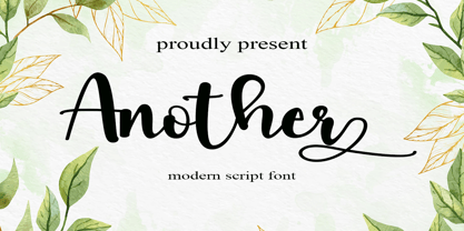 Another is a flowing handwritten font, described by an elegant touch, perfect for your favorite projects. Fall in love with its incredibly distinct and timeless style and use it to create spectacular designs! Provide ligatures with special make the design letter looks incredible. Honestly it works perfectly for headlines, logos, posters, packaging, T-shirts and much more. Font Features : • Regular version • Character set A-Z in uppercase and lowercase • Ligatures in Lowercase and special • Alternates option • Numerals & Punctuation • Accented Characters • Multiple Languages Supported Recommended to use in Adobe Illustrator or Adobe Photoshop with opentype feature. If you have questions, just send me a message and I'm glad to help.
 - Agatha by TipoType,
$25.00 2015 First Prize TipoType award. Agatha is a new typeface for titles and short texts in big sizes. It can be use both in editorial publishing and brand design. From gothic geometric bases, the letters resemble the Nordic style in order to be more feminine, rhythmical and vertical. The two versions, Regular & Outline, let the designer choose between two contrasts: one heavy version that emphasize the rhythm and a lighter one that intensifies the subtlety. The third version, Blossom, combines light and color with ornaments that highlight the style. The three fonts have in addition a ligature set and some decorative glyphs that increase the possibilities of use.
 - Handcraft by Artcity,
$19.00 Handcraft is a handwritten script font. This font is ideal for any design project that needs a more handmade look. Handcraft is a great way to add a touch of handcrafted charm to your next project. Central Europe is supported in the extended glyph set. Font contains 346 glyphs and includes some alternates, as well as others, all accessible via OpenType features. Remember to turn on contextual alternates and ligatures for the best experience. Handcraft /ˈhænd.krɑːft/ A skilled activity in which something is made in a traditional way with the hands rather than being produced by machines in a factory, or an object made by such an activity.
 - CA Cape Rock by Cape Arcona Type Foundry,
$39.00 CA Cape Rock, first released in 2007 and now reissued and expanded, is an impressive display typeface. Designed with a fat Clarendon and wood type in mind, the typeface’s bold and distinctive forms add spice and personality to any design that requires a strong display aesthetic. CA Cape Rock is particularly enjoyable for use in headlines and ideal for highlighted text. With already two dozen existing ligatures and many OpenType swashes, the new edition also received letters for use in the Central European and South Eastern European area. Cleaned and harmonized paths, a completely new kerning as well as a newly added Italic (Slanted) style are also among the new features.
 - Worthing by Greater Albion Typefounders,
$14.00 Worthing aims to combine Victorian charm with modern-day requirements for legibility and clarity, and we hope, demonstrates that traditional elegance still has its place in the modern world. Meanwhile, for those who are curious about the naming of our fonts, Mr Lloyd our designer was reading Mr Wells (H. G.) War of the Worlds recently. No doubt some of you will remember the part that Worthing in Sussex played in that story. Worthing is offered in three styles: regular, alternate and shaded. It's ideal for Victorian and Edwardian era inspired design work, posters and signage, as well as for book covers, chapter headings and so forth.
 - Bornholm Tejn Low by Trine Rask,
$25.00 Bornholm Tejn is named after a village »Tejn« on the only rocky island in Denmark »Bornholm« Bornholm Tejn Low is the lowercase variant of Bornholm Tejn, released in 2012, the first face in a series of rough stone cut typefaces, that shares proportions, but differs in any other aspect like different pieces of rock. It is a powerful face, but still very friendly. Good for very big sizes, but can be used for small texts, movie titles, cartoons … Bornholm Tejn Low has a large x-height which supports the heavy and black look of the typeface. It contains tabular and proportional old style and lining figures.
 - Tola by Agnieszka Ewa Olszewska,
$18.00 Tola is a modern, reversed-weight, experimental display font with a spirit of the 70s. Looks better in large sizes but in smaller thanks to the thick bottom makes also interesting effect. It’s based on my letter shape experiment. I was drawing one single letter in the hope to find interesting results. I started Tola font with the letter “G” and based on that shape I created the rest of the alphabet. Tola looks good in modern graphics. It contains uppercase, numbers, and some punctuation signs, and is multilingual. Perfect for logos, posters, and social media graphics that need a super superhero with a sentimental touch.
 - Canaro by René Bieder,
$30.00 Conceived as an exploration of geometrical type designs of the early twentieth century, Canaro was — in its first design stages — heavily rooted in that time period. During its development and the effort to give it a modern appearance, it turned into a contemporary font with a strong historical background, defined by legibility and functionality. In addition, the lack of spurs provide a unique but unobtrusive character and support the contemporary impression. Typographic features like alternative glyphs, ligatures, oldstyle numbers, arrows, fractions and other special characters, round up the family. Canaro is available in nine weights plus matching italics. Ranging from sharp and elegant thinner cuts to sporty and athletic heavy weights.
 - Badora by Twinletter,
$15.00 BADORA, a display font with a Japanese flair, is now available. We created this typeface using natural handwriting that has been modified in visual form so that it may be used in a variety of applications. This font will enhance any of your projects, particularly those with a casual and fun theme. Logotypes, food banners, branding, brochure, posters, movie titles, book titles, quotes, and more may all benefit from this font. Of course, using this font in your various design projects will make them excellent and outstanding; many viewers are drawn to the striking and unusual graphic display. Start utilizing this typeface in your projects to make them stand out.
 - Eckhardt Bold JNL by Jeff Levine,
$29.00 Eckhardt Bold JNL continues a series of sign painter-inspired type designs and is named in honor of the late Al Eckhardt, a talented sign man who was a good friend of Jeff Levine for about 18 years until his passing. The font is available in both regular and oblique versions and was inspired by an example found in the 1928 edition of E.C. Mattthews' "How to Paint Signs and Sho' Cards". Both squat and wide for maximum use in wall and window applications, the original name for the design is "Heavy Plug". Plug was the sign painter's term at the time for describing this type of letter form.
 - Ames' Text by Greater Albion Typefounders,
$16.00 Ames’ text is designed for use in its own right and also as a complement to our Ames’ Roman family. Ames’ text is a ‘New-Style’ Didone family offered in three weights and three widths. It is designed to embody clarity combined with contrast between horizontal and vertical strokes, but with sufficient stroke width in both directions to display well at small point sizes. All typefaces include small capital forms, new and old style numerals (and ‘small capital’ numerals for consistency). Ames’ text is distinctive enough for use in headings and titles, but comes into it own as a text face. Keep a lookout for our forthcoming Ames Display faces…
 - Ravenstonedale by Hanoded,
$15.00 Ravenstonedale is a village in Cumbria, England. There’s not much to see in this quaint village, but the landscape surrounding it is beautiful. This font was sort of based on a number of handwritten letters by English author D.H. Lawrence. It is not a true reflection of the man’s handwriting, though, as I had to design a lot of missing glyphs myself; it was merely an inspiration. Ravenstonedale comes in a slightly slanted ‘regular’ version and a more slanted ‘Italic’ version. In order to stay true to the handwritten nature of this script, I have added a lot of ligatures, plus all the diacritics you could hope for.