7,173 search results
(0.034 seconds)
- Minion by Adobe,
$35.00In designing Minion font, Robert Slimbach was inspired by the timeless beauty of the fonts of the late Renaissance. Minion was created primarily as a traditional text font but adapts well to today's digital technology, presenting the richness of the late baroque forms within modern text formats. This clear, balanced font is suitable for almost any use. - Minio by Linecreative,
$16.00 Minio is a cubical mechanic, futuristc display. It's fun and groovy with a bold personality. Perfect for logo, Brand,title or anything your creativity takes you. - Uppercase and lowercase letters - Punctuation - Numbers - Multilingual (Latin Western Europe)
 - ND Minion by NeueDeutsche,
$25.00 A whimsical and playful font that harks back to the charm of childhood toys and creative imagination. Inspired by classic peg and construction toys, this font brings a delightful twist to typography. It's as if each letter has been carefully sculpted from colorful pegs, inviting you to assemble words like a puzzle, creating your own visual narrative.
 - Minion 3 by Adobe,
$35.00Minion is a contemporary type family created by Robert Slimbach and released by Adobe Originals. Since its earliest release, Minion has proven to be a versatile typeface for text and display, used widely in books and in editorial design where readability and elegance are necessities. - XXII BLACK-BLOCK by Doubletwo Studios,
$22.22
- Back In Black by IKIIKOWRK,
$17.00 Proudly present Back In Black - Hand Brush Type, created by ikiiko. Back in Black is a hand-drawn brush font that attempts to reflect the urban vibe of suburban walls. The expressive stroke style of this typeface mimics the look of graffiti and other street art with bold strokes that produce striking, eye-catching graphics. Large-scale text elements work very well with this font. They can be used to produce a wide variety of designs, from playful and whimsical to edgy and rebellious. Additionally, a level of artistic expression unattainable with more conventional fonts is made possible by the strong strokes and asymmetrical shapes. This type is very suitable for making a poster, magazine layout, book cover, quotes, or simply as a stylish text overlay to any background image. What's Included? Uppercase & Lowercase Numbers & Punctuation Stylistic Ligature Multilingual Support Works on PC & Mac
 - Mignone - 100% free

- Mignon by Supfonts,
$10.00 My new font is beautiful and smooth modern calligraphic script with a straight baseline. And I also added a separate font with cute swashes at the beginning and at the end. You do not need special software, everything works simply and clearly :) Mignon will look beautiful on Christmas and holiday invitations, wedding invites and stationery, logos, and more. I love using it for emphasis words and pairing it with serifs. Test it out below to see how it could look for your next project! Includes: Uppercase and lowercase Numbers and punctuation Foreign language support Check out my blog: https://www.instagram.com/zloillev pinterest.com/dmitriychirkov7
 - Mission by Aerotype,
$29.00 - Mivron by Aah Yes,
$4.95Mivron is a stand-out type of sans-serif block text especially suited for headlines and display work. There's a wide range of accented characters making this font appropriate for a wide variety of languages. The zip contains OTF and TTF versions - only install one version of a font on the same machine, either the OTF or TTF, but not both as that could cause various conflicts and erratic behaviour. - Manson by Linecreative,
$18.00 Manson font , created because it was inspired by the shape of colossal stone pillars, a unique shape where at the waist the font structure is curved and this gives a solid impression. This font perfect for vintage and poster designs as well as for your logo design, brand image, retro poster, handwritten quotes, product packaging, merchandise and more What you get dear, you will get :
 - Mention by Meutuwah,
$12.00 Hello Font Lovers... Mention is another lovely modern signature font, which is combining the style of classic calligraphy with an modern style. combines from copperplate to contemporary typeface with a dancing baseline, modern and elegant touch. Including alternates, and ligatures. Languages supported: Breton, Catalan, Czech, Danish, Estonian,French, German, Hungarian, Icelandic, Italian, Romanian, Scottish Gaelic, Slovak, Latvian, Lithuanian, Norwegian, English, Finnish, Polish, Portuguese, Slovenian, Spanish, Swedish, Turkish, Welsh. Basically, all European languages that are based on latin alphabet. Can be used for various purposes such as headings, logos, wedding invitation, t-shirt, letterhead, labels, news, posters, badges etc. To enable the OpenType Stylistic alternates, you need a program that supports OpenType features such as Adobe Illustrator CS/CC, Adobe Indesign CS/CC, Adobe Photoshop CS/CC, CorelDraw X6-X7 & Microsoft Office. Mention, a font having characters move up and down like a dancer. This freestyle has a very unique style of signature and is very suitable for modern design. THANK YOU SO MUCH
 - Minister by Linotype,
$29.99Designed by M. Fahrenwaldt for the Schriftguss foundry in 1929, Minister font is a contemporary design based on Garalde types. The letters have an oblique stress, capitals are wide, serifs are prominently concave. Minister font has obvious calligraphic overtones, making it a good informal text face. - Milton by Mecanorma Collection,
$45.00 - Findon by MADType,
$21.00 Findon is a classic sans serif uppercase stencil typeface. It is reminiscent of the days before computers when the best way to reproduce letters quickly was to stencil them.
 - Marion by Typodermic,
$11.95 Step back in time with Marion, the transitional serif typeface that exudes a nineteenth-century flair. With its classic structure reminiscent of Century Roman, Marion stands out with a stroke treatment that’s closer to the timeless elegance of Baskerville. The inspiration for Marion comes from a diverse array of old metal typefaces, resulting in a design that’s uniquely historic and fascinating. One of the most distinctive features of Marion is the hammer claw shape of the serifs, adding a touch of industrial charm and a smokestack vibe. The font is available in Regular, Italic, Bold, and Bold Italic, allowing for a range of possibilities when it comes to design. With old-style numerals and standard f-ligatures, Marion offers the perfect balance between historical design and modern-day functionality. Additionally, it includes some eccentric discretionary ligatures and chirpy swash letters, adding a whimsical touch to your graphic design projects. Take your design to the next level with Marion. Its historically inspired design and unique features are sure to add a touch of elegance and sophistication to any project, making it the perfect choice for designers looking to create something truly remarkable. Most Latin-based European, Vietnamese, Greek, and most Cyrillic-based writing systems are supported, including the following languages. Afaan Oromo, Afar, Afrikaans, Albanian, Alsatian, Aromanian, Aymara, Azerbaijani, Bashkir, Bashkir (Latin), Basque, Belarusian, Belarusian (Latin), Bemba, Bikol, Bosnian, Breton, Bulgarian, Buryat, Cape Verdean, Creole, Catalan, Cebuano, Chamorro, Chavacano, Chichewa, Crimean Tatar (Latin), Croatian, Czech, Danish, Dawan, Dholuo, Dungan, Dutch, English, Estonian, Faroese, Fijian, Filipino, Finnish, French, Frisian, Friulian, Gagauz (Latin), Galician, Ganda, Genoese, German, Gikuyu, Greenlandic, Guadeloupean Creole, Haitian Creole, Hawaiian, Hiligaynon, Hungarian, Icelandic, Igbo, Ilocano, Indonesian, Irish, Italian, Jamaican, Kaingang, Khalkha, Kalmyk, Kanuri, Kaqchikel, Karakalpak (Latin), Kashubian, Kazakh, Kikongo, Kinyarwanda, Kirundi, Komi-Permyak, Kurdish, Kurdish (Latin), Kyrgyz, Latvian, Lithuanian, Lombard, Low Saxon, Luxembourgish, Maasai, Macedonian, Makhuwa, Malay, Maltese, Māori, Moldovan, Montenegrin, Nahuatl, Ndebele, Neapolitan, Norwegian, Novial, Occitan, Ossetian, Ossetian (Latin), Papiamento, Piedmontese, Polish, Portuguese, Quechua, Rarotongan, Romanian, Romansh, Russian, Rusyn, Sami, Sango, Saramaccan, Sardinian, Scottish Gaelic, Serbian, Serbian (Latin), Shona, Sicilian, Silesian, Slovak, Slovenian, Somali, Sorbian, Sotho, Spanish, Swahili, Swazi, Swedish, Tagalog, Tahitian, Tajik, Tatar, Tetum, Tongan, Tshiluba, Tsonga, Tswana, Tumbuka, Turkish, Turkmen (Latin), Tuvaluan, Ukrainian, Uzbek, Uzbek (Latin), Venda, Venetian, Vepsian, Vietnamese, Võro, Walloon, Waray-Waray, Wayuu, Welsh, Wolof, Xavante, Xhosa, Yapese, Zapotec, Zarma, Zazaki, Zulu and Zuni.
 - Million by Subectype,
$15.00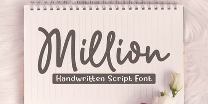 Million is a natural handwritten Script font. Its unique flow and easy signature style makes it perfect to use for invitations, logos, signatures, quotes, wedding, labels, packaging design, blog headlines or simply use it in your next design project. I hope you enjoy this font. If you have any questions please don't hesitate to drop me a message :) Thank You, Subectype
 - Melion by Owl king project,
$29.00 Melion is a typeface that comes with a family and ligatures, this font is very easy to apply and works very well for short letters or logo-based fonts, highly recommended for use with large print, or headlines for magazines, and products logo. Melion is very beautiful and good for working on a design that looks minimalist and elegant
 - Monton by Larin Type Co,
$12.00 Monton is a wonderful font family that includes from thin to black style as well as in oblique style, a total of 18 fonts. This is a condensed block sans-serif font that is perfect for titles, logos, branding, posters, flyers, website design, advertising, labels, packaging, web titles, text descriptions and much more. It is well readable and irreplaceable in modern design and can be used as a main or additional one.
 - Minima by Scriptorium,
$12.00 - Motion by Emigre,
$39.00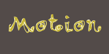
- Milcone by Letterhend,
$14.00 Introducing Milcone Sans, a versatile variable font designed to elevate your projects with a modern and professional touch. With its 7 weight variations, this font offers flexibility and adaptability to suit any design need. Whether it's for digital or print, Milcone Sans delivers a sleek and contemporary aesthetic that exudes professionalism. Features : Uppercase & lowercase Numbers and punctuation Alternates & Ligatures Multilingual PUA encoded We highly recommend using a program that supports OpenType features and Glyphs panels like many of Adobe apps and Corel Draw, so you can see and access all Glyph variations.
 - Minimo by Ahmet Altun,
$19.00 Minimo Font Family comes in 4 weights; Normals and Obliques. To have an eye-pleasing view, the corners are rounded and the lowercases are made smaller than the standard. With its soft structure, it is aimed to be legible even in the small sizes and also to be suitable for usage as webfont and application font. Moreover, with this font family, you can create eye-pleasing, cute and also nice works such as posters, printings, t-shirts, adds, magazines etc.
 - Minister by URW Type Foundry,
$35.99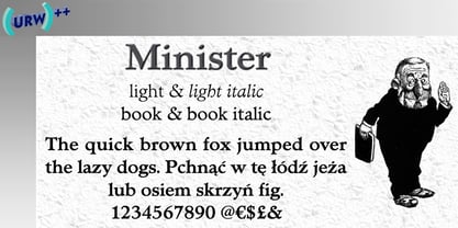
- Hinton by Dima Pole,
$15.00 Hinton is a modern, clean text font, including 840+ characters, many Opentype features, all European & Slavic symbols. It is calm, orderly and a bit perky. Hinton has a lightweight and pleasant design, so it fits well and easy to read. Its characters are simultaneously austere and elegant, and have their own flavor. Hinton includes all European and Slavic alphabets, Euro and other 8 signs of currencies. In addition to basic Latin and Russian there are German, Dutch, Spain, French, Romanian, Turkish, Czech, Polish, Croatian, Serbian, Ukrainian, Belorussian, Baltic, Scandinavian, Icelandic and others alphabets. Opentype features: stylistic alternates, manual kerning, standard ligatures, discretionary ligatures, small capitals, capitals to small caps, case, oldstyles numerals, tubular numerals, localized forms, stylistic set, historical forms, fractions, ordinals, numerators, denominators, slashed zero and others.
 - Micron by Jonahfonts,
$35.00 A graphic font with emphasis on legibility, dynamic and modern. Very suitable for a variety of applications.
 - Malion by Din Studio,
$29.00 Malion font is a modern and clean display font. The design of typeface will make your design more beautiful and inspiring. This font will suitable for any project, like branding, print template, logo and etc. Features: Accents (Multilingual characters) 64 Alternates PUA encoded Numerals and Punctuation (OpenType Standard)
 - Mentone by Paragraph,
$18.00 Mentone is a new general purpose typeface, an attempt at extending the line of the great sans-serifs of the previous century, Frutiger - Stone Sans - Myriad. The font has round corners and subtle chamfers, which are all but invisible at text sizes, but add an upbeat, irreverent expression at display sizes. The typeface is named after the beautiful bayside suburb of Melbourne, Australia, where the designer lives. This new version (2.01) was spaced and kerned by Igino Marini of iKern. The semibold cuts are now free!
 - Rincon by Rachel Kick,
$14.00 Rincon is a serif font with 201 glyphs including ligatures and alternatives. It was designed by Rachel Kick in Los Angeles, California. Inspired by beautiful serif while maintaining a friendly and approachable feel, Rincon is perfect for branding, display, or marketing. Rincon has the ability to hold it's own as a single word headline, or in a paragraph form. It also works well with simple sans serif or script font compliments. The ligatures increase its legibility and adjust each character to work perfectly with the character next to it.
 - Midian by Scriptorium,
$12.00 - Mission by Monotype,
$29.99 - CartoGothic Std - 100% free

- Bergamo Std - 100% free

- Parisine Std by Typofonderie,
$59.00 Ultra legible forceful sanserif in 32 fonts Parisine was born as official parisian métro signage typeface. This family of typefaces has become over years one of the symbols of Paris the Johnston for the London Underground or the Helvetica for the New York Subway. The Parisine was created to accompany travelers in their daily use: ultra-readable, friendly, human while the context is a priori hostile. Meanwhile, Parisine is now a workhorse and economical sanserif font family, highly legible, who can be considered as a more human alternative to the industrial-mechanical Din typeface family. More human, but not fancy: No strange “swashy” f, or cursive v, w etc. on the italics, to keep certain expected regularity, important for information design, signages, and any subjects where legibility, sobriety came first. Born as signage typeface family, the various widths and weights permit a wider range of applications. In editorial projects, the Compress version will enhances your headlines, banners, allowing ultra large settings on pages. The Narrow version will be useful as direct compagnon mixed to standard width version when the space is limited. The various Parisine typeface subfamilies Parisine is organised in various widths and subsets, from the original family Parisine, Parisine Gris featuring lighter versions of the usual weights and italics, Parisine Clair featuring extra light styles, to Parisine Sombre with his darker and extremly black weights as we can seen in Frutiger Black or Antique Olive Nord. Many years of adjustments were necessary to refine this complex family. Initially, Parisine was designed by Jean François Porchez in 1996 for Ratp to solely fulfil the unique needs of signage legibility. Parisine remain the official corporate typeface of the public transport in Paris, the worldwide capital for tourism, and now integral part of the French touch. Directly related, Parisine Office was initially created for Ratp’s internal and external communication, Parisine Office is available at Typofonderie too. Not connected with Ratp and public transports, Parisine Plus was created as an informal version of Parisine. Parisine: Introducing narrow and compressed families About Parisine Parisine helps Parisians catch the right bus Observateur du design star of 2007
 - Supernova Std by Martina Flor,
$79.00 Supernova is a new family that combines the spontaneity of a script typeface with the versatility of multiple weights and cuts. The development of script typefaces has largely been limited to variations in shape and proportion (and with the advent of OpenType technology, the addition of alternate letterforms). Their application has continued to be primarily linked to their emotional attributes, while roman types predominate in body texts. Supernova takes a step in a different direction and was conceived as a script typeface family comprised of several weights and cuts, including a versatile, eye-catching display version and a highly legible body-text version with five weights.
 - Apolline Std by Typofonderie,
$59.00 A Venetian serif in 6 styles The Apolline typeface family was created by Jean François Porchez as a means to study the transition from Renaissance writing into the first printing types. Rather than sticking to the method commonly used these days for the creation of revivals of Jenson or Bembo types, it seemed more interesting to try and get in the same mindset as those exceptional designers during this pivotal period in the history of typography. Thus Apolline is an exploration of the design methods used by people like Nicolas Jenson and his contemporaries for adapting handwriting with its multiple occurrences (a, a, a, b, b, b…) into single, unique signs (a, b…). Initially Jean François made drawings modelled after his own calligraphy. They were done at a very small size on tracing paper (2 cm high for the capitals) to preserve the irregularity of human handwriting. Besides emphasising the horizontal parts of the letter forms, the serifs were designed asymmetrically to reinforce the rhythm of the writing. The final drawings were produced at a large size (10 cm high for the capitals) to allow for subtle optimisation of specific details. The very narrow and fluid Apolline italic Influenced by various concepts for an ideal italic by Van Krimpen, Gill, etc. Apolline italic was designed at 8° degrees. Although the structure of the letterforms were informed by chancery scripts, the italic has full serifs like the roman. Very narrow and fluid, its unique design creates a good contrast when used in combination with its upright counterparts. Thanks to the presence of the serifs similar to roman typefaces it sets very neatly in large sizes. The next step was digitising the drawings with Ikarus (the pre-Bézier-curves era) to create the final roman and italic fonts. Two years later, when the family was expanded to six series the same method was used, this time with Fontographer. This was necessary for correcting a few problems caused by the conversion to Bézier outlines, and to add intermediate weights. Before the advent of feature-rich OpenType, quality type families consisted of several separate fonts for each weight to provide users with various sets of numerals, an extended ligature set and alternates, ornaments, and so on. Introducing Apolline Morisawa Awards 1993
 - Allumi Std by Typofonderie,
$59.00 Technology in mind in 12 fonts Allumi is a different font. Different from anything Jean François Porchez has designed in the past. Allumi is a sleek typeface designed with technology in mind. It’s a perfect font family for any communication concerning design, robotics, or functionality. Pushed to its extreme limits, the Allumi shapes are neither perfectly round or geometrically square. It’s a human design with a high tech touch. Allumi can be described as the Eurostyle (designed by Aldo Novarese in 1964) of the new century, mixed with Frutiger. Allumi is a serious typeface because of the unique design and sturdy form. The pure shapes can create a global presence today with an eye on the world of tomorrow. Two widths The Allumi family has been built around two series of widths, standard and extended. Italics have been carefully designed as slanted roman with all necessary optical and human corrections to create a perfect and neat italic. I Love Typography 2009
 - Mariné STD by TipoType,
$19.90Mariné STD is a geometric sans but with the softness of humanistic strokes. It’s mild contrast and multiple different styles allow Mariné to work well as both a text and display font. Mariné STD is a selected version of Mariné Family. - Ideal for print and identity works. - Works well for text or display uses. - Designed for web and apps. - Look serious or look casual. - Mencken Std by Typofonderie,
$59.00 An American Scotch remixed in 27 fonts Mencken has twenty seven styles, divided into three widths, three optical sizes, romans and italics. Generally, optical size typeface families belong to a same common construction. It falls into the same category of type classification, while presenting different x-heights or contrasts. Mencken is unique because it is designed according to different axis and optical sizes. Firstly, Mencken Text is a low-contrast transitional typeface, designed on an oblique axis, asserting horizontal with featuring open counters. Its capitals follow Didots to better harmonize the rest of the family. On the other side of the spectrum, Mencken Head (and narrow variations) is designed on a vertical axis, high contrast, in a contemporary Didot style. The Mencken is therefore a typeface answering to different sorts of uses, whose design is different according to its uses: from oblique axis in small size to vertical axis in large sizes. Vertical proportions (x-height, capitals height, etc.) were calibrated to be compatible with many Typofonderie typeface families. Lucie Lacava and I followed the idea launched by Matthew Carter few years ago for some of his typefaces intended for publications. From Baltimore Sun’s project to Typofonderie’s Mencken It is a bespoke typeface for American newspaper The Baltimore Sun started at the end of 2004 which marks the beginning of this project. The story started with a simple email exchange with Lucie Lacava then in charge of redesigning the American East Coast newspaper. As usual, she was looking for new typeface options in order to distinguish the redesign that she had started. At the time of its implementation, a survey of the newspaper’s readers has revealed that its previous typeface, drawn in the mid-1990s, was unsatisfactory. The Mencken was well received, some reader responses was particularly enjoyable: “It’s easier to read with the new type even though the type is designed by a French.” Why it is called Mencken? The name Mencken is a tribute to H. L. Mencken’s journalistic contributions to The Sun. According to the London Daily Mail, Mencken ventured beyond the typewriter into the world of typography. Because he felt Americans did not recognize irony when they read it, he proposed the creation of a special typeface to be called Ironics, with the text slanting in the opposite direction from italic types, to indicate the author’s humour. Affirming his irreverence, the Mencken typeface does not offer these typographic gadgets. Henry Louis Mencken (1880 — 1956) was an American journalist, satirist, cultural critic and scholar of American English. Known as the “Sage of Baltimore”, he is regarded as one of the most influential American writers and prose stylists of the first half of the twentieth century. He commented widely on the social scene, literature, music, prominent politicians and contemporary movements. Creative Review Type Annual 2006 Tokyo TDC 2018
 - Retiro Std by Typofonderie,
$59.00 Full of life Hispanic Didot in 2 optical sizes Retiro is a daring interpretation of Spanish typography. Severe, austere and yet, full of life, Retiro is a vernacular version of Castilian and Andalusian in a typical Didot. Named after a lovely park in Madrid, Retiro started life as a a bespoke typeface designed to give a unique voice to the magazine Madriz. In 2006, the founder of Madriz was looking for a Didot for his new magazine. The Didot is the archetypal typeface used in high-end magazines. Retiro is a synthesis of these high contrast styles mixed with an Hispanic mind. Result is then, after 2-3 years of work, a typeface with countless variations to establish typographic shades adapted to different sections and pages of the Madriz. In 2014, it was necessary to further revise the typeface before its launch at Typofonderie. In order to keep its originality, the unique weight was retained, but complemented with optical size variants to set highly contrasted headlines into various sizes, visually balanced. How to use Retiro optical sizes? Each font provided in Retiro family is named according to the scale of body size: 24 pt and 64 pt. Of course, these names are referring to the body sizes used in typographic design. In the “glorious old days,” the letterpress period, it was customary to cut punches directly to the size at which typefaces would be used. The punchcutter had to visually adapt his design to the engraving size. The aim was to optimize the best contrast and general weight, but also to respect both design’s and reader’s needs. In Retiro’s case, intended for large titling sizes, it’s an adaptation of this ancient practice for our contemporary uses. Although each font is named by a typographic point size, do not feel obliged to use this font at this precise size, but why not, in larger or smaller. It’s rather the concept of gradients that must be preserved in layouts, rather than strictly size numbers. It’s up to the designer to select the right font size for his own designs. Granshan Awards 2012 Creative Review Type Annual 2011 Designpreis 2011 Club des directeurs artistiques, 41e palmarès Type Directors Club 2010 Certificate of Type design Excellence


Page 1 of 180Next page