2,534 search results
(0.131 seconds)
- Apadana by Naghi Naghachian,
$100.00 Apadana is a new creation of Naghi Naghashian. Apadana design fulfills the following needs: A. Explicitly crafted for use in electronic media fulfills the demands of electronic communication. Apadana is not based on any pre-digital typefaces. It is not a revival. Rather, its forms were created with today's technology in mind. B. Suitability for multiple applications. Gives the widest potential acceptability. C. Extreme legibility not only in small sizes, but also when the type is filtered or skewed, e.g., in Photoshop or Illustrator. Apadana's simplified forms may be artificial obliqued in InDesign or Illustrator, without any loss in quality for the effected text. D. An attractive typographic image. Apadana was developed for multiple languages and writing conventions. Apadana supports Arabic, Persian, and Urdu. It also includes proportional and tabular numerals for the supported languages. E. The highest degree of geometric clarity and the necessary amount of calligraphic references. This typeface offers a fine balance between calligraphic tradition and the contemporary sans serif aesthetic now common in Latin typography.
 - Damavand by Naghi Naghachian,
$114.00 Damavand is designed by Naghi Naghashian. It is a Font family, in 5 weights, Light, Regular, DemiBold, Bold and Heavy. This font is a contribution to modernisation of Arabic typography, gives the font design of Arabic letters real typographic arrangement und provides more typographic flexibility. Damavand supports Arabic, Persian and Urdu. It also includes proportional and tabular numerals for the supported languages. Damavand design fulfills the following needs: A. Explicitly crafted for use in electronic media fulfills the demands of electronic communication. B. Suitability for multiple applications. Gives the widest potential acceptability. C. Extreme legibility not only in small sizes, but also when the type is filtered or skewed, e.g., in Photoshop or Illustrator. Nima’s simplified forms may be artificial obliqued in InDesign or Illustrator, without any loss in quality for the effected text. D. An attractive typographic image. Damavand was developed for multiple languages and writing conventions. Damavand supports Arabic, Persian and Urdu. It also includes proportional and tabular numerals for the supported languages. E. The highest degree of calligraphic grace and the clarity of geometric typography.
 - Ekbatana by Naghi Naghachian,
$75.00 Ekbatana is a new creation of Naghi Naghashian. Ekbatan design fulfills the following needs: A. Explicitly crafted for use in electronic media fulfills the demands of electronic communication. Ekbatana is not based on any pre-digital typefaces. It is not a revival. Rather, its forms were created with today's technology in mind. B. Suitability for multiple applications. Gives the widest potential acceptability. C. Extreme legibility not only in small sizes, but also when the type is filtered or skewed, e.g., in Photoshop or Illustrator. Ekbatana's simplified forms may be artificial obliqued in InDesign or Illustrator, without any loss in quality for the effected text. D. An attractive typographic image. Ekbatana was developed for multiple languages and writing conventions. Ekbatana supports Arabic, Persian, and Urdu. It also includes proportional and tabular numerals for the supported languages. E. The highest degree of geometric clarity and the necessary amount of calligraphic references. This typeface offers a fine balance between calligraphic tradition and the contemporary sans serif aesthetic now common in Latin typography.
 - Franklin Gothic by Linotype,
$45.99Franklin Gothic was designed by Morris Fuller Benton for the American Type Founders Company in 1903-1912. Early types without serifs were known by the misnomer "gothic" in America ("grotesque" in Britain and "grotesk" in Germany). There were already many gothics in America in the early 1900s, but Benton was probably influenced by the popular German grotesks: Basic Commercial and Reform from D. Stempel AG. Franklin Gothic may have been named for Benjamin Franklin, though the design has no historical relationship to that famous early American printer and statesman. Benton was a prolific designer, and he designed several other sans serif fonts, including Alternate Gothic, Lightline Gothic and News Gothic. Recognizable aspects of Franklin Gothic include the two-story a and g, subtle stroke contrast, and the thinning of round strokes as they merge into stems. The type appears dark and monotone overall, giving it a robustly modern look. Franklin Gothic is still one of the most widely used sans serifs; it's a suitable choice for newspapers, advertising and posters. - Pasargad by Naghi Naghachian,
$108.00 Pasargad is a new font family, designed by Naghi Naghashian. It is a Font family in 3 weights, Light, Regular and Bold. This font is a contribution to modernisation of Arabic typography, gives the font design of Arabic letters real typographic arrangement und provides more typographic flexibility. Pasargad supports Arabic, Persian and Urdu. It also includes proportional and tabular numerals for the supported languages. Pasargad design fulfills the following needs: A Explicitly crafted for use in electronic media fulfills the demands of electronic communication. B Suitability for multiple applications. Gives the widest potential acceptability. C Extreme legibility not only in small sizes, but also when the type is filtered or skewed, e.g., in Photoshop or Illustrator. Pasargad’s simplified forms may be artificial obliqued in InDesign or Illustrator, without any loss in quality for the effected text. D An attractive typographic image. Pasargad was developed for multiple languages and writing conventions. Pasargad supports Arabic, Persian and Urdu. It also includes proportional and tabular numerals for the supported languages. E The highest degree of calligraphic grace and the clarity of geometric typography.
 - Homayoon by Naghi Naghachian,
$102.00 Homayoon is a sans-serif sigle weight font designed by Naghi Naghashian. It is extremely legible even in very small size. This font is The contribution to modernisation of Arabic typography, gives the font design of Arabic letters real typographic arrangement und provides more typographic flexibility. Homayoon supports Arabic, Persian (Farsi ) and Urdu. It also includes proportional and tabular numerals for the supported languages. Homayoon design fulfills the following needs: A Explicitly crafted for use in electronic media fulfills the demands of electronic communication. B Suitability for multiple applications. Gives the widest potential acceptability. C Extreme legibility not only in small sizes, but also when the type is filtered or skewed, e.g., in Photoshop or Illustrator. Homayoon’s simplified forms may be artificial oblilqued in InDesign or Illustrator, without any loss in quality for the effected text. D An attractive typographic image. Homayoon was developed for multiple languages and writing conventions. Homayoon supports Arabic, Persian and Urdu. It also includes proportional and tabular numerals for the supported languages. E The highest degree of calligraphic grace and the clarity of geometric typography.
 - Dara by Naghi Naghachian,
$88.00 Dara is a sans-serif sigle weight font designed by Naghi Naghashian. It is extremely legible even in very small size. This font is The contribution to modernisation of Arabic typography, gives the font design of Arabic letters real typographic arrangement und provides more typographic flexibility. Dara supports Arabic, Persian ( Farsi ) and Urdu. It also includes proportional and tabular numerals for the supported languages. Dara design fulfills the following needs: A Explicitly crafted for use in electronic media fulfills the demands of electronic communication. B Suitability for multiple applications. Gives the widest potential acceptability. C Extreme legibility not only in small sizes, but also when the type is filtered or skewed, e.g., in Photoshop or Illustrator. Dara’s simplified forms may be artificial oblilqued in InDesign or Illustrator, without any loss in quality for the effected text. D An attractive typographic image. Dara was developed for multiple languages and writing conventions. Dara supports Arabic, Persian and Urdu. It also includes proportional and tabular numerals for the supported languages. E The highest degree of calligraphic grace and the clarity of geometric typography.
 - Ostad Arabic by Naghi Naghachian,
$64.00 Oustad Arabic is designed by Naghi Naghashian. It is a Bold headline font, in 1 weight. This font is a contribution to modernisation of Arabic typography, gives the font design of Arabic letters real typographic arrangement und provides more typographic flexibility. Oustad Arabic supports Arabic, Persian and Urdu. It also includes proportional and tabular numerals for the supported languages. OstadArabic design fulfills the following needs: A Explicitly crafted for use in electronic media fulfills the demands of electronic communication. B Suitability for multiple applications. Gives the widest potential acceptability. C Extreme legibility not only in small sizes, but also when the type is filtered or skewed, e.g., in Photoshop or Illustrator. Nima’s simplified forms may be artificial obliqued in InDesign or Illustrator, without any loss in quality for the effected text. D An attractive typographic image. Kasha was developed for multiple languages and writing conventions. Nima supports Arabic, Persian and Urdu. It also includes proportional and tabular numerals for the supported languages. E The highest degree of calligraphic grace and the clarity of geometric typography.
 - Once upon a whimsical time in the bustling town of Typeface Village, there lived a jovial and somewhat rotund font named Balloon. Oh, Balloon! With curves as bouncy and spirit as buoyant as its names...
- Oh, Tipbrush Script! Imagine taking a whimsical wander through a calligrapher's dream, where each stroke dances to the tune of elegance and charm—that's Tipbrush Script for you. Created by the wizard...
- The font "Cereal Killerz" by SpideRaY stands as a captivating typeface designed to evoke a sense of thrilling suspense and playful mischief. Crafted by the imaginative mind of SpideRaY, this font div...
- Egregio Script by Fontscafe,
$39.00 We at Fontscafe are forever trying to work on conniving up typography that will blend itself into your work space in a manner that will make you wonder how you ever managed without it…and that effort has led us to the birth of yet another all-new font for you! And this one like most of our others has a niche appeal although it is versatile as versatile can be. Now this is a font that can pretty much fit the bill when you want to send out an exclusive appeal but yet not overly formal. It is styled with fonts that cry out ‘eliteness’ and exclusivity, but without the part where it becomes so exclusive and classy that it goes way over people’s heads! The ‘Egregio’ can still connect on a very personal, almost friendly level with your audience while it remains in a class of its very own!
 - Snatched by Cititype,
$16.00 'Snatched' is a spontaneous handwriting. This name is taken from the slang term in the 2022 era to describe someone or something in a positive manner. This font consists of the same uppercase and lowercase, often referred to as 'all capital letterform', complete with numerals and punctuation. Composed in tends to widen form which is more like the typical handwriting of architects. This font looks like it was written with a marker or technical pen, very bold stylish and legible. For designers this is an interesting thing, the design looks very natural and rhythmic to beautify presentations and blue prints. Can be installed for CAD programs, Sekthup and other applications. This font is very suitable for various media related to handmade, craft businesses, logos, quotes, prints, social media posts, indie business, outdoor sports and other applications to strengthen the impression of handwriting and demand attention.
 - ALS Klinkopis by Art. Lebedev Studio,
$63.00 Yana Klink is an illustrator at Art. Lebedev Studio, whose works are often accompanied by lines of fancy text written in her own recognizable manner with long strokes and “beauty spots.” Once we needed to apply that style to a number of pieces of text, we decided to design a decorative script called Klinkopis. It comes in one weight (regular). Text set in Klinkopis looks best when arranged in waves, like the original. It is recommended to use large sizes—from 24 pt and up—and have no more than just a couple of lines that become an essential part of the artwork. Klinkopis is designed to use OpenType Contextual Alternates. To beautify your project even further, some characters can be manually replaced with their more intricate or plainer variations depending on the neighboring letters. Klinkopis features long descenders and ascenders, which requires large leading to avoid congestion.
 - Hempa Sans by Yukita Creative,
$9.00 Hempa Sans is a modern sans serif font family with a geometric touch. Consists of 16 Styles 8 upright and 8 inclined to match. Thin Weight - Black Designed with strong open-type features in mind. This font has alternate characters in Letters (G, M, R, g, k, r, t, u, y). Each weight includes extended language support for numbers, arrows, binders, and more. Great for graphic design and any display use. It can easily work for Web, Print, and more. This typeface comes with a standard 445 character set that supports more than 80 Latin-based languages.
 - Kristas by Dora Typefoundry,
$19.00 Krista's is an elegant classy serif display font with a uniquely styled ligature character set that connects letters smoothly. It also has 100+ binders, 115+ alternatives for uppercase and lowercase letters and multilingual support. This font is perfect for your creative projects like Logotypes, printed quotes, invitations, cards, product packaging, headers, Letterheads, Clothing, Web design, Magazines, Books, etc. FEATURE: Number of Glyphs : 457 Uppercase Lowercase Punctuation and Marks Symbol Alternate Ligatures & Characters This type of family has become the work of true love, making it as easy and fun as possible.I really hope you enjoy it! Thank you and good job.
 - Angkora Volk by Skinny Type,
$18.00 Angkora Volk - a stylish OpenType rich serif with letters that seem to dance and swirl in harmony - to form a unique & elegant typographic design. A large selection of interwoven Opentype binders and replacements, meaning lots of choice and variety in your final look. To access these OpenType features, you need Opentype-enabled software such as: Word, Textedit, Photoshop, Sketch, Pages, Keynote, Numbers, iBooks Author, QuarkXPress, Indesign and Illustrator. A wide variety of useful glyphs are included - see preview images of all glyphs. Angkora Volk also includes the full set: -uppercase and lowercase letters -multilingual symbols -number -punctuation -alternative style -fastener
 - Blingston Brush Font by madjack.font,
$18.00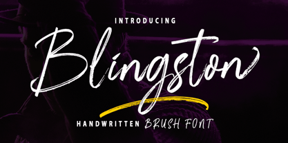 Blingston Brush. is a textured brush font, a contemporary approach to design, with handcrafted and natural underlines and also has alternatives & binders that make your designs more attractive. Suitable for use in title design. Such as clothes, invitations, book titles, stationery designs, quotes, branding, logos, greeting cards, t-shirts, packaging designs, posters, and others. Blingston Brush. equipped with Standard Characters upper and lower case, Punctuation, Numbers. And some glyph variations of OpenType features like Standard Ligatures and Stylistic Sets. Includes multiple multilingual support If you have any questions, feel free to message me :) Thank you so much for watching and enjoying it!
 - Ardiland by Dora Typefoundry,
$17.00 Introducing, Ardiland - a stylish serif with beautiful binders and substitutes! Ardiland is a modern serif font to apply to many graphic or editorial design projects. A classy, unique high contrast, and light binding style for your upcoming projects. for feminine logo signs, fashion & editorial design heads, branding projects, Apparel Branding, packaging, magazine titles, advertisements, T-shirts, postcards and other special occasions. Here's what's included: Alternatives & Ligatures Numbers & punctuation Character with accent Support Multiple Languages PUA encoded This type of family has become the work of true love, making it as easy and fun as possible. I really hope you enjoy it! Thank you
 - Garinstae Script by Pista Mova,
$19.00 Garinstae Script Pro, is modern and classic handwritten calligraphy, so soft, perfect for your next designs, such as logos, printed quotes, invitations, cards, product packaging, headers and anything else from your imagination. Garinstae Script Pro allows you to create custom dynamic text. You can access by turning on; Alternative Styles, Swashes and binders in Photoshop, Adobe Illustrator, Adobe InDesign or via the glyph panel like Adobe Illustrator, Photoshop CC, Let's go from regular characters to alternate characters to get the text with the layout of your dreams. Garinstae Script Pro also includes glyphs, punctuation, numbers and multilingual. Thank you for your visit
 - Baritta Script by madjack.font,
$18.00 Baritta is a modern script font made with brushes and ink, thick and irregular lines. It contains the complete set of lowercase, uppercase, alternative, binder, punctuation, numbers, and multilingual support. Get inspiration from the preview above. Baritta is perfect for use in watercolor designs or bold handwriting styles, such as blog headings, branding, t-shirts, weddings, social media, product design, stationery, advertisements, clothing, cover books, business cards, greeting cards, branding, merchandise, invitations and handmade quotes and more. Baritta features alternative OpenType styles, binders and international support for most Western Languages included. To enable the OpenType Stylistic alternative, you need a program that supports OpenType features such as Adobe Illustrator CS, Adobe Indesign & CorelDraw X6-X7, Microsoft Word 2010 or newer versions. How to access all alternative characters using Adobe Illustrator: https://www.youtube.com/watch?v=XzwjMkbB-wQ Baritta is coded with Unicode PUA, which allows full access to all additional characters without having special design software. Mac users can use the Font Book, and Windows users can use the Character Map to view and copy one of the additional characters to paste into your favorite text editor / application. How to access all alternative characters, using Windows Character Map with Photoshop: https://www.youtube.com/watch?v=Go9vacoYmBw If you need help or have questions, please let me know. I am happy to help :) Thank you & Happy Designing!
 - Morris Sans by Linotype,
$40.99 Morris Sans is a newly revised and extended version of a small geometric family of typefaces originally produced by Morris Fuller Benton in 1930 for ATF. His initial design consisted of an alphabet of squared capital letters with a unique twist that characterized its appearance: corners with rounded exteriors and right-angle interiors. The types were intended for use in the fine print found on business cards, banking or financial forms, and contracts. But over the ensuing decades, this design became a popular element in all sorts of design environments, and several foundries revived the typeface in digital form. Since digital fonts are bicameral, with slots for both upper and lowercase letters, new cuts of the type opted filled the lowercase slots with small caps. In 2006, Linotype commissioned its own version of the typeface-an extension for 21st century use. Under the advisement of Linotype's type director Akira Kobayashi, Dan Reynolds redrew the uppercase and added an original lowercase for the first time. Additionally, a number of extras were brought into the fonts, including six figure styles (tabular and proportional lining figures, tabular and proportional oldstyle figures, and special tabular and proportional small cap" figures). Small caps, which have become an iconic element over time, are accessible in each font as an OpenType feature. To differentiate this version from the original, Linotype's new family is named Morris Sans, in honor of Morris Fuller Benton. All fonts in the Morris Sans family are OpenType Com fonts; they include a character set capable of setting 48 European languages that employ the Roman alphabet, including all Central and Eastern Europe languages, those from the Baltics, and Turkish. This glyph coverage extends to the small caps as well. Morris Sans is a wide typeface, especially in its regular widths; the condensed faces set a more conventional line of text. The new lowercase letters are less geometric than the uppercase, except for those that share the same basic forms (e.g., c, o, and s). Instead of following this geometric trend, the new lowercase tends to strengthen the humanist elements that were present in several characters from the original type, including the uppercase D and the figures 5, 6, and 9. Morris Sans also sports a number of glyphic flares, like the stroke found on the original uppercase Q. Morris Sans is a clean, modern design best suited for headlines, advertising, posters, expressive signage (especially on storefronts), and corporate identity work."
 - FS Silas Sans by Fontsmith,
$80.00 The great enigma There are hidden depths to FS Silas Sans. First impressions are of a functional, multi-purpose typeface with a cool, edgy, angular character. Gaze into its eyes a little longer, though, and you'll detect a more nuanced, colourful personality, with full, open, satisfyingly squarish forms balancing the abruptness of the sharply-angled terminals and ascenders. Authoritative, official and stern on the outside; amiable and welcoming on the inside. You’re so Dane The designers, led by Phil Garnham, were trying to capture something straight-talking, authentic, and a little... Scandinavian. ‘We were thinking about some of the characters in Danish dramas that were on in the early stages of the font’s development, like The Killing and The Bridge,’ says Phil. ‘The police officers, that is, not the psychopathic killers. Smart and a bit cool, but with a warm heart.’ For a good Danish name, we settled on Silas. It was that or Hans-Christian. The finer points Silas Sans rewards close inspection. Study, if you will, its amply squarish forms, the roomy ‘o’ and ‘e’, in particular. Observe the angular ascenders and terminals of, for example, the ‘L’, ‘I’, ‘d’ and ‘i’, inferring the movement and lift of a pen. Consider the cuts to the ‘A’ and ‘v’ that create harmony with adjacent letters. And scrutinise the subtle ink traps set within the ‘A’ and ‘Y’ for reproduction at small sizes. A fine subject, we think you’ll agree, and available in a versatile range of weights to make (with FS Silas Slab) a typographic system with a comprehensive hierarchy.
 - Haarlemmer by Monotype,
$29.00 Haarlemmer is a recreation of a never-produced Jan Van Krimpen typeface that goes one step beyond authentic: it shows how he wanted it to be designed in the first place. The original, drawn in the late 1930s, was created for the Dutch Society for the Art of Printing and Books and was to be used to set a new edition of the Bible, using Monotype typesetting. Hence the problem: fonts for metal typesetting machines like the Linotype and Monotype had to be created within a crude system of predetermined character width values. Every letter had to fit within and have its spacing determined by a grid of only 18 units. Often, the italic characters had to share the same widths as those in the roman design. Van Krimpen believed this severely impaired the design process. The invasion of Holland in World War II halted all work on the Bible project, and the original Haarlemmer never went into production. Flash forward about sixty years. Frank E. Blokland, of The Dutch Type Library, wanted to revive the original Haarlemmer, but this time as Van Krimpen would have intended. Blokland reinterpreted the original drawings and created a typeface that matched, as much as possible, Van Krimpen's initial concept. While Van Krimpen's hand could no longer be on the tiller, a thorough study of his work made up for his absence. The result is an exceptional text family of three weights, with complementary italic designs and a full suite of small caps and old style figures. Van Krimpen would be proud.
 - Ernie by Jim Ford,
$39.99 Ernie is a new animated typeface by Jim Ford, intended as a complimentary serif design to Freeman Craw’s fun retro hit, Ad Lib. The serif drawings mimic the behaviors of Ad Lib, on a Clarendon-esque structure. The application of Ad Lib’s behaviors to a serif design highlights it's quirky characteristics; notably in the added contrast, the bending of serifs and the translation to Ernie’s ball terminals. The lowercase g is probably the most extreme example of this "translation." Ernie has a savvy system of text animation built in; with dualing lowercase alphabets, 34 ligatures, and an extensive glossary of custom words, all programmed to automatically make intelligent pseudorandom wordshapes. It's called RMS, aka the Randomagic System. The glossary of “buzz” words is based on the most common and powerful words in marketing and advertising, as well as words that are specific to Ernie’s intended uses.. Additionally, Ernie Alt provides the opposite randomization effects in lowercase text, thus reversing the rhythm of the bounce. Ernie Sorts is a bonus font which includes fun printers fists, expandable banners and other graphic elements. The Ernie character and cartoons were created by Johnny Sampson, as a visualization of the typeface, it's character and it's unique features.
 - Peach Lotus by Nathatype,
$29.00 It can be a tough challenge to present the best display for your projects, especially in limited options of fonts. For that reason, let us introduce you to our display serif font to amaze your audience with your projects. Peach Lotus is a display serif font we created by mixing the classical serif elements with big, bold-sized letters for you to impress and attract your audience. On top of that, it gives you more artistic, creative touches as a result of the display font combinations. A display font with thickly-lined and high contrast capital letters will produce a prominent display to strengthen the impressions delivered. In addition, you can apply this font for big-sized texts to be legible. Also, you can enjoy the available features here. Features: Multilingual support PUA encoded Numerals and punctuations Peach Lotus fits best for various design projects, such as brandings, posters, banners, headings, magazine covers, quotes, printed products, merchandise, social media, etc. Find out more ways to use this font by taking a look at the font preview. Thanks for purchasing our fonts. Hopefully, you have a great time using our font. Feel free to contact us anytime for further information or when you have trouble with the font. Thanks a lot and happy designing.
 - Dancebats by Canada Type,
$24.95 According to the two most popular statistics companies in England and North America, eight out of every ten people like to dance. Talk about useless information! But with such a market statistic, we thought there would be some collections of dingbats out there with dancers in them. And surprise, surprise; we found not even one! So this was our opportunity to be the first to issue such a collection, and we are very pleased with the results. Dancebats is a font of 75 silhouettes of people dancing. All kinds of dancing. Ballet, techno, slam, rock, swing, aerobic, hip hop, jump, lounge, and much more. Take a close look at the silhouettes and find out why these are shapes that belong on every party design, bar none. The Dancebats outlines were tweaked for use at all sizes, from the very large, as in posters and signs, to the medium height, as in party flyers, invitations and publications, to the very small, as in web banners and pin-on buttons. We are anticipating these silhouettes to be used soon all over posters, signs and web sites everywhere, so get your hands on a copy and give yourself some ammunition for your next party design.
 - Armatura by Nechit,
$25.00 Armatura — a bold, sporty font with a modern and futuristic alphabet design. Elevate your design projects to new heights with Armatura's cutting-edge typography, perfect for branding, headings, technology, digital media, movie titles, invitations, signatures, logos, labels, and much more! This modernist capital font is tailor-made for eye-catching headlines and captivating titles. Armatura boasts an extensive character set, including Latin, Cyrillic, and Arabic numerals, making it versatile and adaptable for diverse linguistic and cultural contexts. Key Features: Sporting Boldness: Armatura exudes energy and daring style, capturing attention and infusing dynamic flair into your designs. Versatility at its Best: This font seamlessly fits various projects, from large-scale advertising banners to petite cards. Embrace Technological Edge: Armatura effortlessly integrates with modern technology, ideal for digital and interactive media ventures. Multilingual Support: With Latin and Cyrillic alphabets, plus Arabic numerals, Armatura accommodates a multitude of languages and regions. Expressive Appeal: Its geometric forms and audacious details bring character and distinctiveness to every design element. Unleash the power of Armatura to make your projects stand out, commanding attention with a contemporary touch of uniqueness. This font is a must-have for ambitious and forward-thinking designers seeking to create something exceptional and truly captivating.
 - Praxis Next by Linotype,
$57.99 Praxis® Next has the same robust shapes and proportions as the original 1976 Praxis design. Its large x-height, substantial counters and open apertures guarantee high levels of legibility and reading ease in print and on screen. More weights, condensed designs and true cursive italics differentiate Praxis Next from the older design. Praxis Next shines where space is at a premium. The regular designs are modestly narrow while the condensed typefaces perform with grace in the most crowded of environments. The bold designs create powerful headlines and banners and the lighter weights are ideal for both long and short-form text copy. Because of its many weights and proportions, Praxis Next is also an ideal design to build a brand identity. Praxis Next Variables are font files which are featuring two axis and have a preset instance from Light to Ultra and Condensed to Roman. Pair Praxis Next with old-style designs like Bembo® Book and Stempel Garamond™ to create a dynamic typographic contrast. Or complement the design with its serifed counterpart, Demos® Next . Unger also drew ITC Flora® as an alternative italic design. Looking for something a little different? Pair Praxis Next with Masqualero™ .
 - Sun-kissed by Krafted,
$10.00 “Live in the sunshine. Swim in the sea. Drink the wild air.” ― Ralph Waldo Emerson Hey there sun-kissed beauties! Are you looking for a gorgeous handwritten font that’ll captivate your viewers and make your branding shine as bright as the sun? Introducing Sun-kissed - A Handwritten Font. With every hand-drawn stroke and curve, Sun-kissed will delight and add brightness, modernity, and fun to wherever it’s placed. Impress your party guests with gorgeous invitations, make a statement on your social media banners, and add a little bit of sunshine to your corporate identity. This stylish Handwritten font is also can be used for headings, logos, business cards, printed quotes, cards, packaging, and presentations. What you’ll get: Multilingual & Ligature Support Full sets of Punctuation and Numerals Compatible with: Adobe Suite Microsoft Office KeyNote Pages Software Requirements: The fonts that you’ll receive in the pack are widely supported by most software. In order to get the full functionality of the selection of standard ligatures (custom created letters) in the script font, any software that can read OpenType fonts will work. We hope you enjoy this font and that it makes your branding sparkle! Feel free to reach out to us if you’d like more information or if you have any concerns.
 - Burnt Rose by Krafted,
$10.00 Want to transport your audience to a world of wonder with your branding? Want your headings to spark happiness and engagement? Introducing Burnt Rose - A Modern Calligraphy Font. A modern and elegant handcrafted calligraphy font that’ll make your audience swoon and enhance your branding projects, printed materials, and website design. Every stroke and curve was created to capture the essence of elegance and style. Ideal for social media banners; posts, and ads, printed quotes, t-shirt designs, packaging, or even as a modern text overlay to any background image. Burnt Rose includes Ligature & Stylistic Sets as well as Multilingual Support to make your branding globally acceptable. Get ready to engage and captivate your audience with Burnt Rose. What you’ll get: Multilingual & Ligature Support Full sets of Punctuation and Numerals Compatible with: Adobe Suite Microsoft Office KeyNote Pages Software Requirements: The fonts that you’ll receive in the pack are widely supported by most software. In order to get the full functionality of the selection of standard ligatures (custom created letters) in the script font, any software that can read OpenType fonts will work. We hope you enjoy this font and that it makes your branding sparkle! Feel free to reach out to us if you’d like more information or if you have any concerns.
 - Hello Eiffel by Yumna Type,
$15.00 Being loyal to your same old font will make your designs plain and dull. You need a prominent font to live up your messages without losing the essence of the content itself. Time to welcome Hello Eiffel, a font to help you deliver your desired messages without omitting the whole design. Hello Eiffel is a display font in simple, yet interesting letter shapes with which you can strengthen your desired messages to deliver without distracting attention on the text content itself. Despite its simplicity, Hello Eiffel remains interesting in modern styles to enhance the design’s aesthetic value. Its letters are legible enough to be flexibly applicable for various text sizes, and it gives you a clipart as a bonus. You can enjoy the available features here as well. Features: Multilingual Supports PUA Encoded Numerals and Punctuations Hello Eiffel fits best for various design projects, such as brandings, posters, banners, headings, magazine covers, quotes, printed products, merchandise, social media, etc. Find out more ways to use this font by taking a look at the font preview. Thanks for purchasing our fonts. Hopefully, you have a great time using our font. Feel free to contact us anytime for further information or when you have trouble with the font. Thanks a lot and happy designing.
 - Odds by DearType,
$30.00 Say hello to Odds - a versatile, chunky casual sans with lots of personality! It’s fresh, friendly and easy to read. It is also a great mix of boldness and cuteness, so it definitely captures attention. The Odds family comes in five distinct fonts styles : - Odds - an artistic handwritten-style sans - Odds Sans - a typical neat and clean sans (caps and small caps which you can mix & match) - Odds Narrow - a cute handwritten narrow sans (uppercase and lowercase), and two awesome sets of goodies: - Odds Extras - borders, arrows, speech bubbles, etc. - Odds Symbols - palm leaves, plants, fruits and other useful objects. Odds works great on a variety of mediums from web to print, but you can find it particularly useful if you're designing food packaging (actually any packaging) and clothes. Other awesome usages include posters, signage, ads, printed and personalized cards, t-shirts, sale banners, everything kids related - merchandise, toys, you name it. Its quirky character and fat letters make up for bold and friendly presentation while the slender letters of the Odds Sans and Odds Narrow are perfect for plain text. And yes, all fonts have Cyrillic! They also have some neat ligatures and alternates to spice up your designs and create more interest!
 - Big Mock by Yumna Type,
$15.00 A font is a crucial element of a design, but it can be a complicated challenge to choose a proper font for your project. An improper design will likely damage your whole designs and make your hard work useless. That is why Big Mock is the perfect font for you. Big Mock is a display font with strong characters and unique styles to assist you to pop up your messages easily. It exists in uppercases and thick weights to show bold, prominent displays. The similar letters’ proportions and the low contrasts will affect the legibility rates. You can use such a font for big text sizes to be greatly legible. Big Mock gives you an extra clipart as a bonus. You can also make use of the available features here. Features: Ligatures Multilingual Supports PUA Encoded Numerals and Punctuations Big Mock fits best for various design projects, such as brandings, posters, banners, headings, magazine covers, quotes, printed products, merchandise, social media, etc. Find out more ways to use this font by taking a look at the font preview. Thanks for purchasing our fonts. Hopefully, you have a great time using our font. Feel free to contact us anytime for further information or when you have trouble with the font. Thanks a lot and happy designing.
 - Seatyio by Twinletter,
$14.00 Introducing our new Font named Seatyio This font is designed with a script model that is suitable for writing for outdoor and indoor events, such as traveling or for the title of any particular event. and to be sure this font is not only limited to that purpose but also very special for every need of your project, be it a formal or non-formal project, this font is still beautiful and elegant. start creating awesome designs with this font! This charming font also offers the beauty of abstract typography harmony for a wide variety of design projects, including digital natural handwriting for designs, quote designs, for social media business designs, advertisements, trademarks, food and beverage promotion banners, text, posters, a signature, and all designs require handwriting or whatever design you want. This font is equipped with uppercase, lowercase, numbers, punctuation marks, swhases and several variations on each character including multi-language. ================================================== This font is best suited for open type friendly applications. How to get alternative glyphs from open type fonts: http://adobe.ly/1m1fn4Y PUA Character Code - Fully accessible without additional design software. do not hesitate anymore start using this font. and Feel free to send any message you want to convey.
 - Resting by Nathatype,
$29.00 Font is the most important design element to increase your branding. However, it may be tricky and take quite a while to figure out the perfect font for your design. Resting is a perfect display serif font for any of your design projects. Serif font is a font type with sticky small lines on the letters’ edges expressing formal, classic nuances and more aesthetic, creative touches due to the display font combinations. This display font has thick, high contrast lines perfect for catching attention and creating firm impressions. In addition, use this font for big text sizes for a legibility reason and make use of the other interesting features to beautify your designs. Features: Stylistic Sets Ligatures Multilingual Supports PUA Encoded Numerals and Punctuations Resting fits best for various design projects, such as brandings, posters, banners, logos, magazine covers, quotes, headings, printed products, invitations, name cards, merchandise, social media, etc. Find out more ways to use this font by taking a look at the font preview. Thanks for purchasing our fonts. Hopefully, you have a great time using our font. Feel free to contact us anytime for further information or when you have trouble with the font. Thanks a lot and happy designing.
 - Scream Explode by Ditatype,
$29.00 It is crucial to pick a perfect font for your project designs as they should be as great as your fonts to help you deliver your messages and feelings accurately. We would like to introduce you to our display font to help you create dazzling, unique designs. This is the Scream Explode. It is designed in firm characters and unique styles to help you deliver your messages quickly. This capitalized, thick weight font creates a bold, prominent display. Moreover, the uneven edge lines on our display font will give extra creativity touches to show a unique, attractive display. In addition, you can apply this font for big text sizes to be legible and you can enjoy the available features here as well. Features: Alternates Ligatures Multilingual Supports PUA Encoded Numerals and Punctuations Scream Explode fits best for various design projects, such as brandings, posters, banners, headings, magazine covers, quotes, printed products, merchandise, social media, etc. Find out more ways to use this font by taking a look at the font preview. Thanks for purchasing our fonts. Hopefully, you have a great time using our font. Feel free to contact us anytime for further information or when you have trouble with the font. Thanks a lot and happy designing.
 - Settikef by Twinletter,
$14.00 Settikef is a handwritten script font with cute and cute nuances but still beautiful and elegant. This font is great for you to use as a title in your designs as well as great for writing names and words. and to be sure this font is not only limited to that purpose but also very special for every need of your project, be it a formal or non-formal project, this font is still beautiful and elegant. start creating awesome designs with this font! This charming font also offers the beauty of abstract typography harmony for a wide variety of design projects, including digital natural handwriting for designs, quote designs, for social media business designs, advertisements, trademarks, food and beverage promotion banners, text, posters, a signature, and all designs require handwriting or whatever design you want. This font is equipped with uppercase, lowercase, numbers, punctuation marks, swhases and several variations on each character including multi-language. ================================================== This font is best suited for open type friendly applications. How to get alternative glyphs from open type fonts: http://adobe.ly/1m1fn4Y PUA Character Code - Fully accessible without additional design software. do not hesitate anymore start using this font. and Feel free to send any message you want to convey.
 - Castre by Nathatype,
$25.00 Be a trendsetter and stand out with bold and sophisticated style font. The epic Castre. Castre is a serif font family to better charm your designing experiences. This package package to please you with a variety of choices for your own project consisting of eight different choices of thickness level. It is designed to be simple and easy to read without losing the modern feels. The uppercases design is paired with thin lines allow us to dive more into the world of modernity. Included: Castre Thin Castre Extra Light Castre Light Castre Regular Castre Medium Castre Semi Bold Castre Bold Castre Extra Bold Slay your design with Castre’s best features so you’ll look your best on what ever your design is, all the time. Features: Ligatures Multilingual Supports PUA Encoded Numerals and Punctuations Castre fits best for any design projects, such as posters, banners, logos, book covers, album covers, quotes, invitations, greeting cards, name cards, headings, printed products, merchandise, social media, etc. Find out more ways to use this font by taking a look at the font preview. Thank you for purchasing our premium fonts. If you have any further question or issues, don’t hesitate to contact. We’re happy to help! Happy Designing.
 - Fresh Lemons by Yumna Type,
$15.00 Your font choice is important because without the right font, you have a higher risk of failure to attract the audience's attention resulting in having a big trouble competing with competitors. A good font shows characters of your projects and makes them more prominent than the others. Therefore, Fresh Lemons is here to be the perfect, eye-catching font option. Fresh Lemons is a visually amazing display font with thin lines suitably applied for a more elegant, modern looking display. In addition, such a font shows professional, high quality nuances on your designs due to the simple forms and consistent proportions to be legible enough. You will receive a clipart as a bonus and you can also enjoy the available features here. Features: Ligatures Multilingual Supports PUA Encoded Numerals and Punctuations Fresh Lemons fits best for various design projects, such as brandings, posters, banners, headings, magazine covers, quotes, invitations, name cards, printed products, merchandise, social media, etc. Find out more ways to use this font by taking a look at the font preview. Thanks for purchasing our fonts. Hopefully, you have a great time using our font. Feel free to contact us anytime for further information or when you have trouble with the font. Thanks a lot and happy designing.