2,384 search results
(0.01 seconds)
- Wine Vat Stencil JNL by Jeff Levine,
$29.00 An image of a vintage metal stencil for the French wine region Côteaux du Tricastin [now Grignan-Les Adhemar] served as the inspiration for Wine Vat Stencil JNL. This condensed sans serif design is available in both regular and oblique versions.
 - 1790 Royal Printing by GLC,
$38.00 From 1702 to 1811 the French "Royal", then "Imperial", Printers, neglected Garamond and Fournier's designs and used only the font called "Romain du Roy", carved (1693 to 1723) by Philippe Grandjean by order of the king Louis XIV. 1790 Royal Printing was inspired by various variants of Romain du Roy that were in use during this period. Our sources were mainly official and legal documents printed in the late royal period, and in the beginning of the French revolution. There was no bold style. The 1790 Royal Printing Caps fonts contain small caps, plus titling caps for headlines as 1790 Royal Printing capitals are intended to be used preferably for text.
 - PGY - Personal use only

- Righton by Letterhend,
$13.00 Introducing, Righton - a luxurious font duo that brings a classy and luxury look. It contains two fonts, script and serif, which perfectly pair. They work great if you need a typeface for headlines, logotypes, apparel, invitations, branding, packaging, advertising etc. This typeface is comes in uppercase, lowercase, punctuation, symbols, numerals, stylistic set alternate, ligatures, and also has Multi-Lingual support. We hope you enjoy the font, please feel free to comment if you have any thoughts or feedback. Or simply send me a PM or email me at letterhend@gmail.com
 - Butter Tropical by Allouse Studio,
$14.00 Proudly Presenting, Butter Tropical a Handwritten Font Duo Original and Script. Both Fonts come with Multi-Lingual Support to fulfill your need. We highly recommend using a program that supports OpenType features and Glyphs panels like many of Adobe apps and Corel Draw, so you can see and access all Glyph variations. Butter Tropical is perfect for any tittle, logo, product packaging, branding project, megazine, social media, wedding, or just used to express words above the background. Enjoy the font, feel free to comment or feedback, send me PM or email. Thank You!
 - RMU Initials by RMU,
$20.00 Four fonts entirely of decorative initials of which the uppercase basic letters of RMU Initials One are occupied by Walthari initials, the lowercase ones by Eckmann initials, both released first by Rudhard’sche Gießerei, Offenbach, Germany, about 1900. RMU Initials Two consists of Jubilaeumsinitialen in the uppercases and Augsburger Initialen in the lowercases. RMU Initials Three comes with floral ornaments, whereby the lowercase initials can be colorized by yourself due to non-joining elements. RMU Initials Four consists of hand drawn initials by Rudolf Koch and letters of a former Klingspor font called Queen.
 - Plastilin by ParaType,
$25.00 Plastilin type family of two weights obtained its name due to the soft, curved, stroke terminals of characters (J, K, L, R and others) and the little pointed serifs, as if extruded from stroke plastic mass. The character set has a lot of additional Latin and Cyrillic ligatures, as well as several alternate letter forms. Plastilin was designed for ParaType by Oleg Karpinsky in 2005. It is for use both in display setting and short text passages. In 2008 the author added two weights (Light and Black) and improved letterforms of some characters.
 - Architype Albers by The Foundry,
$50.00 Architype Konstrukt is a collection of avant-garde typefaces deriving mainly from the work of artists/designers of the inter-war years, whose ideals have helped to shape the design philosophies of the modernist movement in Europe. Due to their experimental nature character sets may be limited. Architype Albers draws on early grid-based attempts by Josef Albers, in 1926, to design an alphabet by reducing the forms to purely geometric elements – the square, triangle and parts of a circle – and in the process creating an unusual stencil effect typeface.
 - Elbflorenz by RMU,
$35.00 Another jewel of the vast treasure of historical font designs was digged out and brought to life again. Due to the courtesy of the Quay Brothers, London, who yielded to me an age-old brochure of Albert Auspurg’s ‚Miami‘, released by Schriftguss in 1934, I was able to redesign this elegant font. This font which I called ‚Elbflorenz‘, a cognomen for Dresden, contains West and Central European type faces as well as those for Romanian and Turkish. To get access to the historical number sign please use either the OT feature additional ligatures or ordinals.
 - Tre Giorni by Eurotypo,
$60.00 Tre Giorni, is a variant of the "Due Giorni" font with the possibility of combining between the two. This useful writing font is very expressive, fresh, agile and organic. It comes in two styles: Solid and outline (just a little shine) Each font contains 571 glyphs with many OpenType features: standard and discretionary ligatures, stylistic alternates, decorative characters, old-style figures, small caps, titles, case sensitives, and ornaments. Specially designed for creating eye-catching headlines, logos, packaging, greeting cards, advertisements and websites. It also has good readability for longer texts.
 - Fosho by Chank,
$49.00 For more than 70 years the 10-foot tall letters displaying the word FOSHAY have illuminated the Foshay Tower in the Minneapolis skyline. However, the typestyle has never been made into a font before. This new modern font family, dubbed Fosho Book, is optimized for book print usage as well as functioning as big bold display type on screen. The Fosho fonts are available in three styles: Outlines, Dotted Bulb Inlines and Composite with both. You can use the three styles in overlapping colors for dramatic chromatic effects.
 - ITC Musclehead by ITC,
$29.99ITC Musclehead is the work of type designer Timothy Donaldson, a robust, densely packed handwriting typeface. It almost looks like brushwork but was in fact made with a ruling pen which Donaldson had bought from a company in Salem, Massachusetts. He says, The world's gone ruling-pen mad at the moment [late 1990s] and I was beginning to tire of all the skinny splashiness of the letters that most people were making with them. I wanted to do something heavy and robust with the tool, so that's what I did."" - Architype Van Doesburg by The Foundry,
$99.00 Architype Konstrukt is a collection of avant-garde typefaces deriving mainly from the work of artists/designers of the inter-war years, whose ideals have helped to shape the design philosophies of the modernist movement in Europe. Due to their experimental nature character sets may be limited. Architype Van Doesburg derives from the 1919 experimental geometric alphabet by Theo van Doesburg, whose work was heavily influenced by De Stijl theories, specifically rectangularity. The typeface has been constructed on the same 5 x 5 grid, and is limited by his ‘single alphabet’ theory.
 - Happiness Machine by Allouse Studio,
$16.00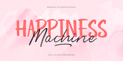 Proudly Presenting, Happiness Machine a cool Font Duo. Happiness Machine is perfect for any titles, logo, product packaging, branding project, megazine, social media, wedding, or just used to express words above the background. Happiness Machine come with alternates, underline style and also Multi-Lingual Support. We highly recommend using a program that supports OpenType features and Glyphs panels like many of Adobe apps and Corel Draw, so you can see and access all Glyph variations. Enjoy the font, feel free to comment or feedback, send me PM or email. Thank You!
 - Nat Grotesk by ParaType,
$30.00 Nat Grotesk family consists of 14 styles including 6 narrow ones. It has a half-closed sans serif design with simple and clear lettershapes. Due to compact proportions the face is very space saving, but nevertheless it is rather legible even in small sizes. The bold weights demonstrate increased contrast. The font is recommended for text and display typography as well as for headlines and advertising. It was designed by Natalia Vasilyeva and released by ParaType in 2007. The upgraded version with extended character set was released in 2009.
 - Freibeuter NR by Otto Maurer,
$23.00 FREIBEUTER NR is a typical Western font but this is based on a FAMOUS Motorcycle Club from the television that everyone knows. The word FREIBEUTER is the German version of pirate. FREIBEUTER did in earlier times what pirates do, but they do it with the government togetherness. NR stands for NIEDERRHEIN, this is the area where I live and work. The PATCH Version is the best way to make fast a nice Banner or Patch with this font. You can use the WrapTEXT tool in Illustrator or Photoshop to wrap the banner in al forms!
 - Drowsy Lunch by PizzaDude.dk,
$15.00 The inspiration for this font (as well as the name!) comes from a London cafe I visited years ago. I was fascinated with the handwritten menu - irregular and awkward, yet refreshingly charming. I did my best to recall that particular look by adding 4 slightly different versions of each lowercase letter. The name of the font comes from the speed of the waiter...or the lack of it! But luckily he took his time, otherwise I wouldn't have had the time to really look at the handwritten menu! :)
 - Boxed by Tipo Pèpel,
$18.00 Boxed typography is a new and extensive 18 weight typeface, brightly conceived and designed to look good on small screen devices, but offering also enlightened looks on paper. The semi-modular geometric font shapes seek to be fully responsive to the grid of screen«s pixels to deliver a crisp, fluid reading rate. Due to its extensive range of weights and subtle difference in thickness, compensating for the stain of characters between different CSS styles is really easy. It offers an extensive set of Latin characters, even the Cyrillic.
 - Classic Clips JNL by Jeff Levine,
$29.00 During the years of physically doing camera-ready paste-up work before the advent of the digital age, clip art books dominated the way stock art was added to a print project. Clip art books were eventually replaced by clip art CDs, DVDs and online download sites, just as the books themselves had replaced the stock photo engravings of the letterpress era. With the kind permission of Graphic Products Corporation, Jeff Levine Fonts offers up a sampling of images found within the pages of Graphic Source clip art books; aptly entitled Classic Clips JNL.
 - Twirrewyn by Hanoded,
$15.00 Twirrewyn is Frisian for ‘Whirlwind’. I have always liked the Frisian language; it’s like a crossover between English and Dutch. When I studied journalism in Zwolle (a city close to Fryslân) there were a lot of Frisian students and I did pick up a few words! Twirrewyn is a handmade font family: the fat version was made using a brush and ink; the light version was made using that same ink, but with a broken satay skewer instead of a brush. And yes, you have guessed right, we eat a lot of Satay! ;-)
 - MVB Peccadillo by MVB,
$39.00MVB Peccadillo is an interpreted revival of a metal typeface popular in the 19th Century, then known as Skeleton Antique. Highly condensed with extra short descenders, the face makes a big impact in a narrow space. Holly Goldsmith worked from letterpress-printed specimens of 96-point, antique metal type, deliberately retaining subtle distortions due to type wear and letterpress impression. Alan Dague-Greene, referring to printed samples of Skeleton Antique, adapted the design to create two additional optical sizes: “Eight” for smaller text and “Twenty-four” for subheads. - Momentic Yesterday by Flawlessandco,
$9.00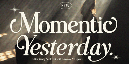 Momentic Yesterday is a Modern Font Duo that contains Serif and Italic Typeface also gives a feel of Elegant font type. There's some connected letters and some alternates that suitable for any graphic designs such as branding materials, t-shirt, print, business cards, logo, poster, t-shirt, photography, quotes .etc This font support for some multilingual. Also contains uppercase A-Z and lowercase a-z, alternate character, numbers 0-9, and some punctuation. If you need help, just write me! Thanks so much for checking out my shop!
 - Architype Van der Leck by The Foundry,
$50.00 Architype Konstrukt is a collection of avant-garde typefaces deriving mainly from the work of artists/designers of the inter-war years, whose ideals have helped to shape the design philosophies of the modernist movement in Europe. Due to their experimental nature character sets may be limited. Architype Van der Leck originates from the lettering that Bart Van der Leck created for ‘Flax’ magazine in 1941. The letterforms‘ restricted shapes and abstract, stencil-like forms reflect the strong geometric language of De Stijl and show influence from his abstract paintings.
 - Sign Letters JNL by Jeff Levine,
$29.00 A few scant examples of some condensed Roman style water-applied decals inspired Sign Letters JNL. The decals were once part of the gold and black "Signmaker" letters and numbers once manufactured by the Duro Decal Company of Chicago and were sold through hardware and variety stores across the country. The condensed letters (which were eight inches in height) did not sell as well as Duro's mainstay sizes of 1/2 inch to 3-1/2 inches and were discontinued long before the rest of the line was supplanted by self-adhesive lettering.
 - Xavier by CastleType,
$29.00 The Xavier family of typefaces is based on the delightful deco typeface called Ashley Crawford, originally designed in 1930 by Ashley Havinden. After designing Xavier Black (Serif) and Xavier Sans Black, I added Bold Sans, Medium and Medium Sans and finally added lowercase to the medium weights. Although more manageable than Ashley Crawford, Xavier, due to its very playful nature (splayed A, M, etc.) needs to be used with care, especially in terms of spacing. Xavier is a playful typeface and I have been particularly pleased to see it used in children's books.
 - Bodoni Classic Stencil by Wiescher Design,
$39.50 Bodoni Classic Stencil is another of my personal additions to the Bodoni Classic Family that Giambattista would have never made. In his days people had enough skill and the neccessary time to put beautiful handlettering on parcels and cases. No need for stencils! Today we do not need them either since shipping has gone barcode crazy, but for some reason stencil-letters are very much in fashion. Bodoni letters lend themselves perfectly to be stenciled so I just did the whole alphabet; not just the capitals. Yours, Gert Wiescher
 - Wezer by Putracetol,
$24.00 The Wezer - Display Bold Font Duo is a unique and bold typeface that breaks away from the conventional font styles. It offers two distinct versions: rounded and display, both designed to bring something entirely fresh to the table. The purpose behind creating this font was to introduce a one-of-a-kind typeface that stands out in the design world. Wezer is the ideal choice for projects that require a touch of quirkiness and originality, making it perfect for logos, branding, headlines, posters, titles, billboards, banners, and any design that dares to be different.
 - Heinz by Wiescher Design,
$39.50 Heinz is inspired by the poster design of Heinz Schulz-Neudamm for Fritz Lang’s famous silent movie Metropolis. Heinz Schulz-Neudamm did quite a lot of work for the German branches of big American movie companies like 20th Century Fox or MGM. His most famous work is probably the title lettering for the Metropolis movie. The original drawing for that poster sold in 2005 in London for 398.000 Pound Sterling (approx. US $ 600.000). I designed a completely new font in the feeling of Heinz’s lettering. Enjoy. Yours historically, Gert Wiescher
 - Scape by Reserves,
$39.99 Scape is a precisely drawn, contemporary stencil face built from a single weight rounded end stroke. The fine, linear rounded forms create a subtle contrast to the raw utilitarian nature of the stenciled characters. Extremely versatile, Scape is highly legible due to it’s upright, consistently balanced sans letterforms. Stylistically, it exemplifies refinement and clarity with an distinct edge. Features include: Precision kerning Expanded ligature set Alternate characters (O, _, ®) Alternate zero Extended language support (Latin-1 and Latin Extended-A) *Requires an application with OpenType and/or Unicode support.
 - Griffo Classico by Linotype,
$29.99Griffo Classico™ was produced by Franko Luin in 1993. It is a revival inspired by the types cut by Francesco Griffo for the Venetian printer Aldus Manutius at the end of the fifteenth century. The roman is based on the type Griffo cut in 1496 for Bembo's de Aetna," and the italic on a type he cut in 1501 for an edition of Virgil. Griffo did not make separate italic caps, so Luin designed his own for Griffo Classico. This is a serviceable family with five weights, including small caps. - Mr. Victoria by Gulce Baycik,
$10.00 Almost all of my works are conceived out of my love of illustration and handmade crafts. In this case, Mr. Victoria’s hand-lettered quality reflects its sensitivity and warmth. Mr. Victoria contains West European diacritics & ligatures and is highly suitable for international environments & publications. As an elegant & charming display typeface, Mr. Victoria shines with color and is suitable for impressive invitations, classy headlines and logotypes. Mr. Victoria also contains a group of mustache icons for you to glamorize your designs! Enjoy it you shall, as much as I did creating it.
 - Smoothing by Hanzel Space,
$25.00 Smoothing is a stylish modern calligraphic font in an original handwriting style. It's perfect for branding, wedding invitations and cards, and maybe for red wine labels. Smoothing includes a full set of beautiful upper and lower case letters, numbers, a wide variety of punctuation marks and 46 ligatures. All lowercase letters include initial and final strokes, giving a realistic handwritten style. What did you get, honey? Full Set of standard alphabet and punctuation Extra set of ending swashed lowercase Handwritten ligatures Thanks so much for checking out my shop! Happy creating! Cheers! Hanief - Hanzel Space
 - Carson by Supfonts,
$15.00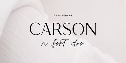 Carson Font Duo is a combination of a sophisticated serif typeface and a relaxed handwritten script. It has a contemporary and uncomplicated design that adds an elegant and tidy touch to various projects such as websites, logos, branding, social media quotes, wedding stationery, and more. I appreciate you visiting my shop. Don't hesitate to contact me if you have any inquiries. -Dima Carson Font Features: - Full Set of standard alphabet and punctuation - Ligatures - PUA Encoded - no special software needed to access extra characters - Language support: All European languages - Multilingual Characters AÁĂÂÄÀĀĄÅÃÆBCĆČÇĊDÐĎĐEÉĚÊËĖÈĒĘẼFGĞĢĠḠHĦIIJÍÎÏİÌĪĮĨJKĶLĹĽĻŁMNŃŇŅÑ OÓÔÖÒŐŌØÕŒPÞQRŔŘŖSŚŠŞȘẞTŤŢȚUÚÛÜÙŰŪŲŮŨVWẂŴẄẀXYÝŶŸỲỸZŹŽŻ aáăâäàāąåãæbcćčçċdðďđeéěêëėèēęẽfgğģġḡhħiıíîïìijīįĩjȷkķlĺľļłmnńňņñoóôöòőōøõœpþ qrŕřŗsśšşșßtťţțuúûüùűūųůũvwẃŵẅẁxyýŷÿỳỹzźžż
 - Tiemann by Linotype,
$29.99Tiemann Antiqua was designed by Walter Tiemann in 1923 and appeared with the Klingspor font foundry. It is one of the modern book typefaces created in the first half of the 20th century, but differed from most in its Modern Face forms. It displays the same strong stroke contrast and flat serifs but its proportions have more in common with those of neorenaissance fonts. Tiemann Antiqua is an elegant, legible font suitable for books and longer texts, but also found in headlines, newspapers and magazines due to its classic yet unusual appearance. - Slinkster by Will Ryan,
$- Big. Bold. Beautiful. Slinkster is an intricately unique display face created by carefully overlapping equally-sized circles. The geometric patterns formed become increasingly mesmerizing the larger the type is set. Slinkster works best for display, headers, logotypes, and any other large-scale applications that allow the viewer to become hypnotized by its complexity. Due to how detailed Slinkster is, you may experience some lagging as it can take a while to render. Like this font? Consider donating to encourage further development and new fonts! Donations accepted through this Paypal address: willryan042@gmail.com
 - Daddy's Hand by Breauhare,
$39.00 Daddy’s Hand is based on the actual handwriting of my dad. He always prided himself on his fine penmanship, and to see him write was kind of like watching a ballroom dance--his pen would smoothly and elegantly waltz across the paper as he wrote, gliding effortlessly. I know if he were alive today he would be quite honored that his handwriting is now a font. This font can be used for all sorts of elegant occasions or advertising, and has ligatures & alternate letters. Digitized by John Bomparte.
 - Harmony Embrace by Letterhend,
$14.00 Harmony Embrace is a font duo that seamlessly blends a signature script and chic serif font to create a modern and elegant look.The script font is perfect for creating a personal touch and adding a bit of flair to your designs, while the serif font adds a sense of professionalism and sophistication. Features : Uppercase & lowercase Numbers and punctuation Alternates & Ligatures Multilingual PUA encoded We highly recommend using a program that supports OpenType features and Glyphs panels like many of Adobe apps and Corel Draw, so you can see and access all Glyph variations.
 - Pleasure Point by Comicraft,
$39.00 Slocals! Check out the action of our radical new font, PLEASURE POINT! It's Bananas, Totally Tubular, Stoked and ready to ride some waves. Back in his grom days, Comicraftsman John JG Roshell could be found down at Pleasure Point, waiting for The Big One, and this is IT! Don't be a criddler, paddle hard and rip this font to your motherboard to keep it real every time you gun, rail or tail. And if you get rag dolled, dude, don't blow out your squeaker. Pleasure Point will hang loose and chillax you to the max.
 - Smiling Cat by Hanoded,
$15.00 Smiling Cat is a cute little font. It is an adaptation of and older font of mine: Harimau Dua. I have had many requests for a bold version of Harimau, so I started working on it, changed a few glyphs, redid the kerning and cleaned it up. Rather than adding it as an extra bold style to my existing font, I thought it’d be better to launch it as a new one. Smiling Cat is handmade, cute and quirky, it would be ideal for Children’s Book Covers. Comes with a litter of diacritics.
 - New Letter Gothic by ParaType,
$30.00 New Letter Gothic was designed for ParaType by Gayaneh Bagdasaryan based on monospaced Letter Gothic font by Roger Roberson, 1956–62. Due to clear and easy-to-read lettershapes of Letter Gothic the font is rather popular now for display and advertising matters. The idea was to create a font similar to Letter Gothic in lettershapes but with proportional widths of letters. For use in both display and text setting. New Letter Gothic has been adjudged an Award for Excellence in Type Design at Kyrillitsa ’99 International Type Design competition in Moscow, 1999.
