10,000 search results
(0.025 seconds)
- Rocket Clouds by Wacaksara co,
$18.00 Introducing our new font called Rocket Clouds inspired by Sythwave Style, 80's Music, and Neon Light Sign. This font offer the aesthetic style and retro mood for your design needed. The Rocket Clouds style has a universal and timeless design. This font uses style of classic sign typography. Rocket Clouds immediately engages you no matter what you use it for. It’s beautiful for product labels, houseware and text overlay to any background picture.
 - Senza by Blackmoon Foundry,
$40.00 Senza is a contemporary, neutral, all-purpose sans serif family designed by Elena Albertoni. It was specially designed for the use on screen. With open shapes and large x-heights Senza guarantees high legibility for body text in small sizes. Senza ’s character-set covers all European languages written in Latin alphabet including real small caps, ligatures, proportional and tabular figures. Senza comes in four weights from Light to Black with matching italics.
 - Vintage King by Putracetol,
$25.00 Introducing Vintage King. A retro bold script style font, come with clean and rough font version. Inspired from retro typography and lettering in the 70's and 80's combine with bold typography style. Vintage King is perfect for vintage and retro design, badge, logos,t-shirt, poster, branding, packaging, signage, book coverand so much more! Come with Opentype feature with a lot of alternates, its help you to make great lettering. This font is also support multi language. The extrude and shadow in the preview are not included in the package, it is used only for presentation purposes.
 - Mouse Memoirs Pro by Stiggy & Sands,
$29.00 Our Mouse Memoirs Pro was inspired by vintage Mickey Mouse, Beagle Boys, and Uncle Scrooge comic books put out by Walt Disney in the 50's and 60's. It nods to the Disney aesthetic with an all-around fun personality and truly animated look. The chipper letterforms engage the audience, while the SmallCaps and extensive figure sets expand the scope of use. Opentype features include: - SmallCaps. - Full set of Inferiors and Superiors for limitless fractions. - Tabular, Proportional, and Oldstyle figure sets (along with SmallCaps versions of the figures). - Stylistic Alternates for Caps to SmallCaps conversion.
 - Pina by Ramen,
$9.00 Pina is a typefaced based on Italian signage, incorporating simplified shapes for the letters and unique characters. The barebones S and the perfectly circular O are examples of the type of lettering you'd likely see on awnings. These letters have a thin footprint, and are quite condensed apart from certain letters like O and Q, which gives the font a unique bounce. It includes plenty of alternates, to letters like O, S, Q, R, K, and special ligatures for specific pairs. This font is named after my grandmother from Italy, Josephine, who was a wonderful figure in my life.
 - Victorian Supremacy by Burntilldead,
$14.00 With over a year of design and development, Victorian Supremacy is ready to help you and your clients make a statement by adding elegance and unique flair to your next design project. Victorian Supremacy inspired by letterheads from the late 1800's and early 1900's. Set includes four major styles and layered version (gradient, outline & extrude). Victorian Supremacy offers an expansive set of options, making it the perfect choice for books, magazines, packaging, branding and signage. From period style and Victorian to modern and elegant, Victorian Supremacy is strong and stately, yet elegant and decorous.
 - Newsprint JNL by Jeff Levine,
$29.00 Newsprint JNL has its origins in an online auction image of wood type. Only the lower case a-z were shown and the type design included an extra-wide 'g' and 's'. Expanding on this idea but narrowing the 's' a bit, Jeff Levine created a capitals set and all of the necessary additional characters - even adding a generous selection of accented characters not usually found in his display fonts. Regular, oblique, narrow, narrow oblique, wide and wide oblique versions are available. All styles offer crisp, clean lettering for headlines, window signage and other display text applications.
 - Ashington by Subectype,
$17.00 The Ashington is a Vintage retro font. Inspired from retro typography and lettering in the 70's and 80's combine with bold typography style. This font perfect for vintage and retro design, badge, logos,t-shirt, poster, branding, packaging, signage, book coverand so much more! *Note This font is not included with "Shadow/ Extrude", it was created manually for display purposes only You can try this tutorial if you want to make it. I made it in Corel DRAW software https://www.youtube.com/watch?v=S6BCkX_cywo Whats Include: Multilingual Support Alternate Letters ligatures Thankyou Subectype Studio
 - 1883 Fraktur by GLC,
$38.00 This family was inspired by the set of fonts used in the end of 1800s by the famous J. H. Geiger, printer in Lahr (Germany), especially these used to print an almanac for the year 1883. It is a Fraktur pattern, with two styles, as a few others incomplete fonts also used for this work were Blackletters from other patterns. Both were used in two size, for titles, subtitles, main text and notes. This font contains standard ligatures and German historical ligatures (German double s, long s, tz, ch, ck...) and diacritics. 1543 German Deluxe Initials may be used in complement this family.
 - Arterium by Burntilldead,
$14.00 Proudly prensent “Arterium” the classic Victorian typeface. Inspired by letterheads from the late 1800's and early 1900's. Set includes three major styles (Arterium Regular, Arterium Alternate & Arterium Side) and four sub styles version (slant, gradient, outline & extrude). The font really bring a good statement for your logo design and can be the image of a design. Arterium font is very unique and easy to apply to any media; t-shirts, posters, sign boards, letterhead and social media needs. Powered with opentype features that allow you to play full with hundreds of alternate characters, ligature, fraction & discretionary ligature.
 - Reardon AOE by Astigmatic,
$19.95 Disco lives on in the alphabet stylings of Reardon AOE. From its uber-fat letterforms to its hole punched counters, Reardon AOE started as a digitization of a film typeface called Joyce Black by LetterGraphics. This flashback typestyle was taken from its limited A-Z and numerals set and fleshed out to include an expanded language glyph set. Reardon AOE finds itself thrown into a late 70’s-early 80’s flashback frame of mind, appealing to all of the disco and video game typography of that time, ready to throw down the vibe for your designs.
 - Ragik Sans by Hurufatfont,
$29.00 Ragik; It is a low-contrast sans serif font family with two accents. The letters are designed with a clear and simple elegance, devoid of ornaments. The open terminals of the letters “S, C, G, s, a, c, e” are elegant and legible with their large open areas. It consists of 16 styles, from thin to heavy, with true italics. Ideal for modern typographic posters, packaging and branding designs. It comes with rich OpenType features. Alternating glyphs, elegant and functional ligatures. All number sets (tnum, onum, lnum, numr, denom, sinf, sups etc.) have a rich symbol library with ornaments and arrows.
 - Bakey by Reyrey Blue Std,
$14.00 Bakey is a modern and bold script typeface inspired from 60's and 70's script lettering. With bold high contrast stroke, fun character with a bit of ligatures and alternate stylistic. To give you an extra creative work. This font is perfect for to create logos, branding, stickers, shirts, signs, posters, quotes, instagram posts, procreate designs and more! Note This font is not included with "Shadow/ Extrude", it was created manually for display purposes only. Features : · All Uppercase and Lowercase · Number & Symbol · Supported Languages · Alternates and Ligatures · PUA Encoded Hope you enjoy with our font!
 - TXT101 by 101 Editions,
$19.00 TXT101 is a fresh, friendly typeface for mock text and borders. As a retro-cool digital successor to the pencil marks that were hand-drawn as placeholder text in the analog era, TXT101 includes 52 styles, from Arch to Zigzag, with a couple of loops, several slants, and a swell set of waves. If your final copy is TBD, use TXT101 to mock up roman, bold, italic or light. TXT101 looks GR8 and is EZ to set. BWTM! Corner pieces make TXT101 a complete and charming bordering typeface. All patterns come in four weights, so you can make frames and borders for everything from little labels to big broadsides. Corners (north, south, east, west) are TTLY a snap to select from their own stylistic sets. DIY: MIX & MATCH TO CREATE COOL PATTERNS! Many styles have aligning baselines, so glyphs will connect. Single- and double-line variations abound, and you can combine weights (light, regular, bold, black) as well as styles. BTW, feel free to insert word spaces or leave them out.
 - Behind The Nineties Sans by Casloop Studio,
$9.00 Introducing Behind The Nineties Sans - the perfect counterpart to our beloved font, "Behind The Nineties." This new sans-serif addition effortlessly captures the classic vibes of the 80’s and 90’s while infusing a contemporary touch for a timeless yet modern aesthetic. Key Features: Sans Serif Sophistication: "Behind The Nineties Sans" exudes sleek and modern elegance, offering a clean alternative to its serif predecessor. Regular and Italic Styles: Whether you prefer a straightforward look or a touch of italicized flair, this font provides versatility for all your design needs. Classic with a Contemporary Twist: Embrace the spirit of the 80’s and 90’s with a font that seamlessly blends classic elements with contemporary sophistication. Editorial Excellence: Elevate your editorial projects with the precision and clarity of "Behind The Nineties Sans," ensuring a polished and professional appearance. Luxury Serif Companion: Pair it with "Behind The Nineties" serif font for a cohesive design that radiates opulence and luxury. Dramatic Impact: Make a statement with the font's dramatic presence, capturing attention and adding a bold touch to your creative endeavors. Multi-language support including Western European, Central European, South Eastern European, South American, Oceanian, and even Esperanto. "Behind The Nineties Sans" is your go-to font for achieving a harmonious blend of nostalgia and modern flair. It's time to redefine classic design with this exquisite sans-serif typeface.
 - Electro by Thinkdust,
$10.00 Electro’s neon light inspiration gives it an interesting way to draw letters. Every part of this font could be part of a circuit board, with no lines doubling over or tracing the same path. The font stands out by occasionally taking shortcuts, such as in the E and S characters, which make up for many characters having to choose a longer route. Altogether, this constant state of quick then slow creates an unpredictability as of a surge of electricity or lightning bolt. Electro supports a number of languages with glyphs that keep up the electronic theme, and is perfect for party culture or futuristic science fiction. Like electric, this is the perfect font for shocking your audience.
 - Panther Fighter by Yoga Letter,
$17.00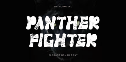 "Panther Fighter" is a modern and elegant brush font. This font is equipped with uppercase, lowercase, numerals, punctuations and multilingual support. It is suitable for logos, movie titles, Halloween, Christmas, business branding, ornaments, mock ups and others.
 - Reload Alt by Reserves,
$49.00 Reload Alt is a rounded industrial geometric display typeface available in four flexible and distinct weights. Features include: Slashed zero Romanian s accent language feature Extended language support *Requires an application with OpenType and/or Unicode support.
 - Reload Stencil by Reserves,
$49.00 Reload Stencil is a rectangular industrial geometric stencil typeface available in four flexible and distinct weights. Features include: Slashed zero Romanian s accent language feature Extended language support *Requires an application with OpenType and/or Unicode support.
 - Neurotic Roman JNL by Jeff Levine,
$29.00 The free-form, Art Nouveau hand lettering on the cover of the sheet music for 1915's "She Was All That a Pal Ought to Be" inspired Neurotic Roman JNL; available in both regular and oblique versions.
 - Big Limbo BT by Bitstream,
$50.99This freeform exercise in typographic design echoes the looseness of early 1960's advertising. Brian breaks almost every typographic rule we can think of — but so what? The bold letterforms of Big Limbo are anything but stuck! - Adobe Handwriting by Adobe,
$29.00A trio of fonts based on the handwriting of some of Adobe?s own designers. The three eponymous styles of the family ? Ernie, Frank, and Tiffany ? each have a unique flavor with its own rhythm and character. - Carambola by Hanoded,
$15.00 Carambola is a beautiful art deco typeface based on several posters from the 1920's. It is an elegant and stylish font with generous curves and sharp ends. Carambola is multilingual and comes in all caps only.
 - Galigo by Grontype,
$12.00 Galigo is a captivating hand-drawn font that seamlessly blends artistic flair with versatile functionality. This unique typeface showcases a delightful variety with both light and regular forms, allowing you to effortlessly convey different moods and styles in your projects. Whether you're designing invitations, posters, branding materials, or any other creative endeavor, Galigo provides the versatility to express your ideas with finesse. Features: Regular & Light Uppercase & Lowercase Basic Latin Glyphs Multilingual Support Numeral and Punctuation Ligatures & Alternates Thankyou for picking up this font, hope you enjoy it. Regard. Grontype
 - Behrensschrift iF Plus by Ingo,
$29.00 Peter Behrens’ renowned art nouveau type from 1902 – with ornaments. Newly revised and neatly digitalized by Ingo Zimmermann In 1902, Peter Behrens (1869–1940), architect, designer and typographer, created a new ”German“ type which became very successful very quickly for the Rudhard’sche Gießerei (foundry which later became Gebr. Klingspor AG) in Offenbach am Main. It served, for example, as the official German type for the world expositions in 1904 and 1910. Behrens himself writes about the development of this type ”...For the actual form of my type, I took the technical principle of the Gothic script, the stroke of the quill feather. The proportions of height and width and the boldness of the strokes of the Gothic letters were also decisive for me in producing a German character. A cohesive character could be hoped for by avoiding all non-necessities and by strictly carrying out the design principle of holding the quill at an angle…“ By the way, when “long s” is activated, the typographically correct “round s” is automatically placed at the end of the word so that you need only pay attention to the correct s on syllable endings within words. When using “long s,” you must ensure the correct use of the rules for the Fraktur font: “round s” is always at the end of the word, also in compound words. For those of you who want to be even more correct, read the corresponding article in >> Wikipedia. Peter Behrens also drew matching ornaments for his typeface – we have likewise carefully revised these decorative touches and arranged them into a font. The "Behrens-Schrift" fits best on all topics that have something to do with art history or the time around 1900.
 - Monoid - 100% free

- bulkyRefuse Type - Unknown license

- Call Me Ishmael NF by Nick's Fonts,
$10.00 That she blows! Another disco-era delight, this typeface is based on an Affolter and Gschwind release called Moby Dick. Both versions of this font support the Latin 1252, Central European 1250, Turkish 1254 and Baltic 1257 codepages.
 - Rockies by Subectype,
$17.00 Rockies is a Rough display font. It comes in a Regular and an italic version, so take your pick! This enchanting font is quirkiness and authenticity and will turn any creative idea into a true standout. Multilingual support.
 - Reload Alt Stencil by Reserves,
$49.00 Reload Alt Stencil is a rounded industrial geometric stencil typeface available in four flexible and distinct weights. Features include: Slashed zero Romanian s accent language feature Extended language support *Requires an application with OpenType and/or Unicode support.
 - Spice by BA Graphics,
$45.00An elegant new design with just a slight bit of flare. A face which will work for both headlines and text. Its delicate serif gives a bit of class while its swash 's' adds a touch of fun. - Ticket Booth JNL by Jeff Levine,
$29.00 The opening title card for 1940's "Two Girls on Broadway" was the basis for Ticket Booth JNL. A typical Art Deco typeface, its features include a squared letter shape with rounded corners and a thin character weight.
 - Handy Casual Condensed by My Creative Land,
$12.00 Handy Casual Condensed is an informal non-linking brush script that was inspired by hand lettering from 60's posters. This font combines a unique character with tons of Open Type features including ligatures, catchwords, stylistic alternates etc.
 - Velvet Script by Typadelic,
$19.00A pretty handwriting typeface. Smooth and feminine. You'll find an alternate "r" and "s" (Option 9 and Option 10 on the keyboard) which have a beginning stroke to achieve a finished look. Try it and see for yourself. - Westfield Nouveau JNL by Jeff Levine,
$29.00 The hand lettered song title on the sheet music for 1918’s ‘N’ Everything (from the Al Jolson show “Sinbad”) was the inspiration and model for Westfield Nouveau JNL, which is available in both regular and oblique versions.
 - Gerlick by Letterena Studios,
$17.00 Gerlick s a modern and classic serif typeface with a unique style & modern look. This typeface is perfect for an elegant & luxury logo, book or movie title design, fashion brand, magazine, clothes, lettering, quotes, and so much more.
 - Unadorned JNL by Jeff Levine,
$29.00 Unadorned JNL is the stripped down version of 2011's Troubador JNL; an ornate wood type font. With the inner ornamentation removed, this Western-influenced type design takes on a bolder look, yet retains its Victorian decorative charm.
 - Fairmont by Solotype,
$19.95This is one of the Victorian standards for job printing issued by the Barnhart Brothers and Spindler Foundry about 1891. It looks old without being decorative, a good counterpoint to fancier types in today¹s old fashioned typography. - M Lady PRC by Monotype HK,
$523.99 M Lady is a design inspired by Agfa Waddy’s rather elegant design comes with narrow proportion. M Lady is a rare condensed design in world of Chinese typefaces. Entry and finial points of strokes are squarish, with a sharp but small symmetric serif. It has a medium contrast to improve character recognition. Its thin stems (豎) make it suitable for fine print with minimal conglutination. Dots (點) are straight, reversely curved or round. Downstrokes (撇、捺), ticks (剔) and hooks (勾) are highly regular and consistent. Dots (點), downstrokes (撇、捺) and ticks (剔) are long, smooth, monolinear and curved with small symmetric serif and sometimes angled entry and finial points of strokes to create subtle sharpness in the midst of its softness and elegance, which is better for larger text print. Its features and construction create subtle sharpness in the midst of softness and slim elegance. It is best suited for casual subheading or display, set upright (non-slanted), non-condensed (naturally condensed).
 - M Lady HK by Monotype HK,
$523.99 M Lady is a design inspired by Agfa Waddy’s rather elegant design comes with narrow proportion. M Lady is a rare condensed design in world of Chinese typefaces. Entry and finial points of strokes are squarish, with a sharp but small symmetric serif. It has a medium contrast to improve character recognition. Its thin stems (豎) make it suitable for fine print with minimal conglutination. Dots (點) are straight, reversely curved or round. Downstrokes (撇、捺), ticks (剔) and hooks (勾) are highly regular and consistent. Dots (點), downstrokes (撇、捺) and ticks (剔) are long, smooth, monolinear and curved with small symmetric serif and sometimes angled entry and finial points of strokes to create subtle sharpness in the midst of its softness and elegance, which is better for larger text print. Its features and construction create subtle sharpness in the midst of softness and slim elegance. It is best suited for casual subheading or display, set upright (non-slanted), non-condensed (naturally condensed).

